10,000 search results
(0.019 seconds)
- Blang Haloc by Khurasan,
$9.00 Blang Haloc is a fun bold script font perfect for posters, logos, magazines, book covers, banners, and many more! Get this amazing freebie, and use it to create lovely designs!
 - Oturllis by Maulana Creative,
$14.00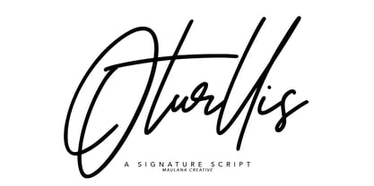 Give your designs an authentic handcrafted feel. "Oturllis Signature" is perfectly suited to signature, stationery, logo, typography quotes, magazine or book cover, website header, clothing, branding, packaging design and more.
 - Comicrazy by Comicraft,
$99.00 Originally created for exclusive use in Image's wildly successful GEN-13 title, Comicrazy was eventually made commercially available in response to inquiries from comic book creators all around the world!
 - Huntly by Rockboys Studio,
$25.00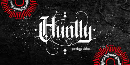 Huntly is an incredibly unique and distinct blackletter font. It will add a unique touch to your designs. Use it for tattoo designs, logos, posters, book covers, albums and more!
 - Hebrew Tsefat by Samtype,
$34.00 This is a beautiful typeface to invitations, posters, cover books and small texts. All diacritic marks for vocalization are present (Nikud), including shevana, kamats katan, cholam chaser and dagesh hazak.
 - The BM Tube font by Bitmap Mania is a unique and visually striking typeface that draws inspiration from the shapes and aesthetics of tubes and circular elements. Designed to stand out, the BM Tube fo...
- FS Lucas by Fontsmith,
$80.00 Pure and not-so-simple Maybe it’s the air of purity, openness and transparency that they transmit, but geometric typefaces are more popular than ever among leading brands. Based on near-perfect circles, triangles and squares, geometric letterforms look uncomplicated, even though making them readable is anything but – something the designers of the first wave of geometric fonts discovered nearly a century ago. Many of the world’s most recognisable brands in technology, retail, travel, food, manufacturing and other industries continue to be drawn to the straightforward, honest character that geometric fonts convey. Fontsmith set out in 2015 to develop a typeface in the same tradition, but optimised for the demands of modern brands – online and offline usage, readability and accessibility. And, of course, with the all-important Fontsmith x-factor built in. FS Lucas is the bold and deceptively simple result. Handle with care The letterforms of FS Lucas are round and generous, along the lines of Trajan Column lettering stripped of its serifs. But beware their thorns. Their designer, Stuart de Rozario, who also crafted the award-winning FS Millbank, wanted a contrast between spiky and soft, giving sharp apexes to the more angular letterforms, such as A, M, N, v, w and z. Among his inspirations were the colourful, geometric compositions of Frank Stella, the 1920s art deco poster designs of AM Cassandre, and the triangular cosmic element symbol, which led him to tackle the capital A first, instead of the usual H. The proportions and angles of the triangular form would set the template for many of the other characters. It was this form, and the light-scattering effects of triangular prisms, that lit the path to a name for the typeface: Lucas is derived from lux, the Latin word for light. Recommended reading Early geometric typefaces were accused of putting mathematical integrity before readability. FS Lucas achieves the trick of appearing geometric, while taking the edge off elements that make reading difficult. Perfectly circlular shapes don’t read well. The way around that is to slightly thicken the vertical strokes, and pull out the curves at the corners to compensate; the O and o of FS Lucas are optical illusions. Pointed apexes aren’t as sharp as they look; the flattened tips are an essential design feature. And distinctive details such as the open terminals of the c, e, f, g, j, r and s, and the x-height bar on the i and j, aid legibility, especially on-screen. These and many other features, the product of sketching the letterforms in the first instance by hand rather than mapping them out mechanically by computer, give FS Lucas the built-in humanity and character that make it a better, easier read all-round. Marks of distinction Unlike some of its more buttoned-up geometric bedfellows, FS Lucas can’t contain its natural personality and quirks: the flick of the foot of the l, for example, and the flattish tail on the g and j. The unusual bar on the J improves character recognition, and the G is circular, without a straight stem. There’s a touch of Fontsmith about the t, too, with the curve across the left cross section in the lighter weights, and the ampersand is one of a kind. There’s a lot to like about Lucas. With its 9 weights, perfect proportions and soft but spiky take on the classic geometric font, it’s a typeface that could light up any brand.
 - FS Lucas Paneureopean by Fontsmith,
$90.00Pure and not-so-simple Maybe it’s the air of purity, openness and transparency that they transmit, but geometric typefaces are more popular than ever among leading brands. Based on near-perfect circles, triangles and squares, geometric letterforms look uncomplicated, even though making them readable is anything but – something the designers of the first wave of geometric fonts discovered nearly a century ago. Many of the world’s most recognisable brands in technology, retail, travel, food, manufacturing and other industries continue to be drawn to the straightforward, honest character that geometric fonts convey. Fontsmith set out in 2015 to develop a typeface in the same tradition, but optimised for the demands of modern brands – online and offline usage, readability and accessibility. And, of course, with the all-important Fontsmith x-factor built in. FS Lucas is the bold and deceptively simple result. Handle with care The letterforms of FS Lucas are round and generous, along the lines of Trajan Column lettering stripped of its serifs. But beware their thorns. Their designer, Stuart de Rozario, who also crafted the award-winning FS Millbank, wanted a contrast between spiky and soft, giving sharp apexes to the more angular letterforms, such as A, M, N, v, w and z. Among his inspirations were the colourful, geometric compositions of Frank Stella, the 1920s art deco poster designs of AM Cassandre, and the triangular cosmic element symbol, which led him to tackle the capital A first, instead of the usual H. The proportions and angles of the triangular form would set the template for many of the other characters. It was this form, and the light-scattering effects of triangular prisms, that lit the path to a name for the typeface: Lucas is derived from lux, the Latin word for light. Recommended reading Early geometric typefaces were accused of putting mathematical integrity before readability. FS Lucas achieves the trick of appearing geometric, while taking the edge off elements that make reading difficult. Perfectly circlular shapes don’t read well. The way around that is to slightly thicken the vertical strokes, and pull out the curves at the corners to compensate; the O and o of FS Lucas are optical illusions. Pointed apexes aren’t as sharp as they look; the flattened tips are an essential design feature. And distinctive details such as the open terminals of the c, e, f, g, j, r and s, and the x-height bar on the i and j, aid legibility, especially on-screen. These and many other features, the product of sketching the letterforms in the first instance by hand rather than mapping them out mechanically by computer, give FS Lucas the built-in humanity and character that make it a better, easier read all-round. Marks of distinction Unlike some of its more buttoned-up geometric bedfellows, FS Lucas can’t contain its natural personality and quirks: the flick of the foot of the l, for example, and the flattish tail on the g and j. The unusual bar on the J improves character recognition, and the G is circular, without a straight stem. There’s a touch of Fontsmith about the t, too, with the curve across the left cross section in the lighter weights, and the ampersand is one of a kind. There’s a lot to like about Lucas. With its 9 weights, perfect proportions and soft but spiky take on the classic geometric font, it’s a typeface that could light up any brand. - Toverheks by Hanoded,
$15.00 A Toverheks in Dutch means 'witch' - well, actually it means 'magic witch' (it doesn't translate well). The reason for this kind of weird name is the nature of the font: it reminded me of a book of spells - the kind witches use. Toverheks is a didone-ish style font with some jagged edges and curly curls. It would be ideal for books (about witches, say) or posters or even postcards! Toverheks will leave you spellbound and bewitched. Comes with a kettle full of diacritics.
 - Copperplate Script by CastleType,
$39.00 One of the more elegant script fonts available, this design is based on calligraphic handwriting called "Copperplate" because of the copper plates that it was etched into for reproduction. This face is not related to Copperplate [Gothic] by the American type designer, F.W. Goudy. The name Copperplate comes from the fact that writing masters used to hand-write their books and then send them to an engraver who recreated all the subtle details onto copper plates, which where then used to print the handwriting books.
 - Champagne by Alandya TypeFoundry,
$19.00 Champagne is a beautiful and elegant script, perfect for designing branding, blog logos, print ads, book covers, film covers, apparel, cards, logos, posters, and more. OpenType features give you more alternatives in designing. To enable the OpenType Stylistic alternates, you need a program that supports OpenType features such as Adobe Illustrator CS, Adobe Indesign & CorelDraw X6-X7. There are additional ways to access alternates/swashes, using Character Map (Windows), Nexus Font (Windows), Font Book (Mac) or a software program such as PopChar (for Windows and Mac).
 - Tisdall Script by Fine Fonts,
$29.00 Tisdall Script is based upon the brush-drawn script lettering of Hans Tisdall, who was the designer of many distinctive lettered book jackets for Jonathan Cape in the 1950s. Michael Harvey, also a designer of lettered book jackets, long admired Tisdall’s style and so, with the blessing of his widow, designed this typographic tribute. The augmented Tisdall Script Plus version, has many alternative characters and ligatures, together with Opentype features, to enable their automatic substitution where the application in which they are used permits.
 - The Lazy Cat Writes by HIRO.std,
$14.00 The Lazy Cat Writes is Handwritten Font This font describes about funny, dynamic, informal, easy going, humanist, easy to use and will bring a good harmony when the letters are connected and paired each other. FEATURES - 3 Alternates Uppercase letters - Numbering and Punctuations - Multilingual Support - Works on PC or Mac - Simple Installation USE The Lazy Cat Writes works great in any poster, book, magazine, typeface, quotes, print, social media posts, e-book, and any projects that need semi casual and informal taste. Enjoy using! Thanks. HIRO.std
 - Brownie Fox by IKIIKOWRK,
$17.00 Introducing Brownie Fox - Fairytale Typeface, created by ikiiko. A vintage & classy decorative type that reminds us of fairy tale books when we were kids. This typeface is perfect for an books cover, illustration for kids, vintage poster, vintage product, packaging design, magazine header, poster, quotes, and so much more.. What's included? Uppercase & Lowercase Number & Punctuation Alternates & Swashes Multilingual Support Get also a good offer & FREEBIE at our site : www.ikiiko.com Enjoy our font and if you have any questions, you can contact us by email : ikiikowrk@gmail.com
 - P22 Platten Neu by IHOF,
$39.95 The P22 Platten font family has been revisited and expanded by designer Colin Kahn. Platten is based on lettering found in German fountain pen practice books from the 1920s (you may have seen the similar Speedball books in the US). This round tip pen lettering is comparable to the basic forms used in grammar school teaching alphabets, but with a few original characteristics. The Italic version has even more of these unusual features. Geometric and simple yet casual and timeless. Perfect for many uses.
 - Alfatih by PojolType,
$14.00 This Alfatih font is inspired by calligraphy writing, with modern classic characters. We can use this font for calligraphy book writing, Quran cover writing, film titles, t-shirt designs, magazine titles, web, posters, book titles, logos, country names, brands, billboards. Alfatih font, offers you: 1. Uppercase characters (All uppercase letters, 4 models) 2. Ligature (22 two-letter characters) and Alternate Styles 2. Ligature (8 characters three letters) with alternative styles, we can use it for logos 3. Multilingual Support (Europe Latin West), Numbers and Punctuation
 - Might Makes Right Pro BB by Blambot,
$9.00 Might Makes Right Pro BB is an all-purpose comic book dialogue font inspired by Bronze Age comics. It’s designed to compliment a wide variety of art styles. The opentype version has autoligatures to swap out adjacent, identical letter pairs for a more organic look, and a wide variety of European characters are included. This Blambot classic comic book dialogue family has been updated with even more European characters, improved spacing and kerning, contextual alternate correction of errant serif-I, and a fourth weight, plain Bold.
 - Supertuba by Tipos Pereira,
$10.00 Supertuba is a :) geometric sans vernacular humanist :) display type family with 6 weights. There's literally dozens of ligatures in this font so It works very well for flyers, package, stickers and posters, also you can use it as a text font if you're looking for something slightly bold. Supertuba has multilingual support and useful open type features. Letter boards that used to be seen in churches, dive bars and butcher shops are the main inspiration for this typeface. The name Supertuba came from an old supermarket that no longer exists in the city of Indaiatuba , I just believe this name is super fun (at least in Portuguese) and wanted to keep it alive. I was in Indaiatuba when I get started designing this typeface so this is fair enough. Supertuba the third piece of a particular trilogy of fonts that Stubby and Stubby Rough take part, from the lazy vernacular drawing to an unusual geometry. Enjoy!
 - Optimisti by Juliasys,
$26.00 Optimisti is Finnish for optimist – and it’s an optimistic, light-hearted feeling that this trio of handwriting fonts transfuses into all kinds messages and identities. Casual, playful and character-strong as they are, the three of them make a perfect team for headlines, slogans, teaser texts and brand naming. Besides the two original fonts – “Optimisti Smooth” and “Optimisti Sparkling” differing in outline structure and texture – “Optimisti Decor” now joined the game. Optimisti Decor is loaded with a multitude of artful elements that can convey a very festive atmosphere – or, on the contrary, ironically make fun of it. Its features are is especially striking when used in all-caps setting. Use the Optimists separately or together to make a humorous – or serious but always cordial impression in print, on the web, on packaging or even on your shopping bag … All Optimisti fonts have a Western European, a Central European and an Extended Cyrillic character set. They support approximately 100 languages.
 - Marvin by Canada Type,
$29.95 The objective of this font was to try and find out how far back in the designer's life this obsession with letters began. The challenge was to draw, from memory only, two sets of caps that recall older Looney Tunes and Merrie Melodies lettering. The experiment was a success, which means that the designer's got it bad since he was, like, four! The Marvin set includes three stylistic variations (Regular, Round and Shadow), with extensive multi-script language support covering Western, Central and Eastern European languages, as well as Cyrillic, Greek and Vietnamese. A few extra alternates and interlocking ligatures are also included, all adding up to over 650 characters in each font. And here we are. Marvin is a great cartoon font that can help you build your very own Illudium Q-36 Space Modulator, so you can trigger that earth-shattering kaboom. Then you're on your way to claim this planet in the name of Mars. Isn't it lovely, mm?
 - Beefcakes by Monotype,
$50.99 Inspired by butcher shop and supermarket window advertising, Beefcakes™ emulates "big brush” style lettering – with a contemporary twist. Not for the typographically timid, this is a design that makes a powerful and friendly statement in print and on screen. Advertising headlines, posters, cover art, menus and packaging are all in Beefcakes’ wheelhouse. While it would be a little crowded on small screens, big type in web sites and games are also part of Beefcakes kit-bag. Drawn by Jim Ford, Beefcakes’ big, sassy and playful shapes are sure to grab attention. Its letterforms are dense and sturdy – yet soft and welcoming as your mom’s old couch. The suite of Beefcakes fonts is available as all-caps designs with small caps, in roman, italic and shadow flavors. As a nod to the typeface’s inspiration, Beefcakes fonts also include a set of decorative abbreviations (lb, oz, kg, in, etc.) for bold signage and showcard-style displays.
 - Tintoretto by profonts,
$41.99 Tinteretto is a very beautiful, decorative Art-d�co font which is ideal for ad design about fine arts events and the world of arts and crafts as well as in restaurants, bars and for food packaging. Tintoretto harmonizes well with serif and sans serif fonts created at the beginning of the last century. It contains character sets for West and Central European as well as for Romania and Turkey. When Unger started his work on Tintoretto, he had the splendid idea of adding a Fill version to the original 3D characters. Combining both fonts make it even stronger and more beautiful. How to combine both fonts in order to achieve a color fill effect: Type your word or phrase and do not make any changes to the spacing or kerning. Duplicate or copy the original and change it to the Fill version (font change). Apply a color to the copy and position it exactly behind the original. See and love the result.
 - Marmellata Jar 01 by Fontscafe,
$39.00 When you think of marmalade or jam (that’s Marmellata in Italian), images of a happy breakfast table are conjured up into the mind, with of course the unforgettable emotive response accompanied. These emotions are exactly what our Marmellata fonts can conjure up for your designs as well (we agree, nothing can beat marmalade on a hot toast)! Our Jar 1 is ideal for all designs where you need to send across a feeling of care, childhood, comfort, motherhood or friendship...amongst all those ideas you will get on your own! With that classic breakfast table feel, you are sure to connect on a very comforting level with all those who view your designs using these fonts. May we suggest, these fonts go very well with unusually dull colours, and can add a spark of life to the most mundane of words! Try getting a taste of our Jar 2 if you want even more of the classic taste (sorry, touch!).
 - Eurocine by Monotype,
$31.99 Eurocine is an expansive display typeface – a square sans serif that’s perfect for titling, headlines, logotype and branding. This 36-font family is packed with features to make it supremely versatile. This typeface attempts to capture the mood of movie credits from European Cinema in the 1970s, with a focus on Giallo films in particular. In terms of style, Eurocine sits somewhere between Walter Baum and Konrad Friedrich Bauer’s Folio, and Aldo Novarese’s Eurostile. With Eurocine you get a more versatile typeface by way of its small caps and additional stylistic sets giving you extended caps, extended small caps, and petite caps, as well as upper and lowercase unicase. Creating typographic masterpieces of your own will be so much easier! Key features: • 6 Weights in Roman and Oblique • 3 Widths – Narrow, Regular, Wide • Extended Caps • Small Caps • Extended Small Caps • Petite Caps • Unicase • Old Style Figures • European Language Support (Latin) • 1,200 glyphs per font.
 - Announcement Board JNL by Jeff Levine,
$29.00 Many decades back, churches, schools and other buildings with a need to display an outdoor message often chose a sign making system utilizing characters silk screened onto metal pieces in a block chamfer style. Each piece had a crimp in the top of the metal which formed a hook to fit over the existing rails of a message panel. This allowed for a finished sign to be displayed within minutes, and a quick change of information was not very time-consuming. A popular version of these signs provided white letters and numbers on black backgrounds. This was the model for Announcement Board JNL, which is available in both regular and oblique versions. There are two different width blank panels on the broken and solid bars for those who wish to kern the letters tight to form a ribbon, however they were designed to have slight spacing in order to emulate the hand assembly of those vintage sign panels.
 - Mutamathil Taqlidi by Arabetics,
$39.00 The Mutamathil Taqlidi type family is the largest size member of the Mutamathil type style. It has one glyph for every basic Arabic Unicode character or letter and one additional, final-position, glyph for each Arabic letter that is normally connected with other letters from both sides in traditional cursive Arabic strings. With each glyph being slightly symmetrical around its vertical axis, this family is only suitable for right to left ordering. The Mutamathil Taqlidi family includes all required Lam-Alif ligatures and uses final position glyph substitutions, ligature substitutions, and marks positioning. Text strings composed using types of this family are non-cursive with stand alone isolated glyphs. The Mutamathil Taqlidi family includes both Arabic and Arabic-Indic numerals, all required diacritic marks, in addition to all standard English keyboard punctuations and major currency symbols. The fonts in this family support the following scripts: Arabic, Persian, Urdu, Pashtu, Kurdish, Baluchi, Kashmiri, Kazakh, Sindhi, Uyghur, Turkic, and all extended Arabic scripts.
 - Big Brush by Canada Type,
$20.00Big Brush is the result of me seeing Brush Script everywhere around me. Toronto signage is full of Brush Script. My last two trips to the West Coast showed me mostly Brush Script. Brush Script must be the most widely overused North American script font of all time. Don't we all know at least one restaurant or bar with its sign made in Brush Script? And aren't you just sick of the weird F, Q and T of Brush Script? Well, out with the old and in with the new. Big Brush was made as a replacement for Brush Script, and then some. While Brush Script has only the single familiar letters we all know, Big Brush comes in two fonts, so you can keep the design fresh the neat and keep them guessing at the same time. The next time you want to design something that calls for strong, fast brush calligraphy, do the world's bored eyes a favor and use Big Brush instead. - Plastic Fantastic by Hanoded,
$15.00 I have just returned from a trip to Malaysia, Java and Bali with my family: my wife had some family business there, so we turned it into a holiday. The last time I visited these places was 26 years ago and I knew things would have changed, but I wasn’t prepared for the ugly truth. Malaysia’s interior has been converted into one big oil palm plantation, Java is choked in plastic and Bali is one endless string of concrete hotels, restaurants and cheap tattoo parlours. Plastic Fantastic is not an ode to the many uses of plastic. It is a wake up call: we really need to stop using disposable plastic! You can start by implementing the Plastic Fantastic font family in your durable water bottle designs, the compostable bag holding your organic potato crisps or that big ole sign advertising your local food truck event. Or whatever it is you want to create. ;-)
 - Burner by Graffiti Fonts,
$29.99 Burner is an advanced, connecting, wildstyle graffiti font family including over 200 unique letters, numbers & symbols. The family includes outlines, fills, details and more. Mix and match glyphs from 3 alphabets, add end pieces and more. Repeating flames, arrows & flourishes & other embellishments are included. The Burner family includes 3 full alphabets in each of the 4 styles as well as numbers, punctuation and a wide array of arrows, bars , begining & end pieces. Like some of our earlier wildstyle typefaces such as RaseOne or WildStyle, the Burner font family is a layered type system made to work as a team. In nearly any application 2 or more styles can be easily layered to create advanced, multicolor, wildstyle pieces. This layering system provides a shortcut to time consuming effects such as sharp corners & variable widths on outlines, fills & details. The original glyphs were all drawn by hand taking inspiration from actual painted & drawn wildstyles from RaseOne spanning the late 90's to about 2006.
 - Thermal Shock by Hanoded,
$15.00 We used to have a composite worktop in our 'old' kitchen. It was cheap and the kitchen-guy warned us not to put any hot pans on the worktop, as it could crack due to Thermal Shock. Duh... When we installed our new kitchen, we opted for a ceramic worktop, which can handle hot pans being placed on it! Thermal Shock font is a very nice, handmade brush font. If you ever bought any brush fonts of mine, you will know that I almost always use Chinese ink and cheap brushes to create 'the look'. It is always a bit of a surprise how a Chinese ink brush font turns out: I created one the other day and it looked horrible, so it was banned.. Thermal Shock turned out to be a looker. Thermal Shock comes with one set of alternate glyphs, extensive language support (including Greek and Vietnamese) and a guarantee it won't crack in super hot designs.
 - Hyper Turfu by Bisou,
$10.00 Made in La Chaux-de-Fonds (Switzerland), HyperTurfu was born during the shooting of “The Return of Hyperturfu Xpress 2”. A GoPro on a lego electric train, meters and meters of rails, an empty industrial space, loads of puppets, paper, cardboard, pizza boxes, lights, hot glue and a bunch of friends preparing a one shot scene for a month. The title of the movie was made out of lego pieces, painted with golden spray and hanged over the rails. It was the first inspiration for this awsome superbold font. HyperTurfu is thought from ground up to give a strong impact. It’s gothic retro science fiction 80’s style makes it best suitable for metal music albums or posters. As the “Banco” font it works perfectly with short texts for advertisement, bar, cofee shops concert places or even fancy hairdresser. Just hang it over a pet shop and see what cool animals will come in.
 - Newercastle by Chank,
$49.00 Newercastle is the new incarnation of a popular Chank font formerly known as "Newcastle". A consistent fan favorite since its initial release in 2005, the distressed blackletter font is new and improved. This sinister script is now bulked up with all-new capital letters, a bit of punctuation, and smattering of new crowns, griffins and other heraldic doodads. Designer Kevin Hayes opted for an assortment of gritty old icons instead of more traditional punctuation, because he felt that's just the way this type of font could perform best for you, the font enthusiast. "At-signs and percentile glyphs just aren't believable in fraktur-style fonts," says Kevin. You benefit by getting a bit of clip art with the new font instead of boring old punctuation. Use the new bats indiscriminately to add a regal air to even the most mundane newsletter. Or use layer upon layer to add a rustic richness to a poster project. Enjoy this wicked, textural type and use it with extreme force.
 - Big River by Ana's Fonts,
$15.00 Big River is an elegant sans serif and handwritten font duo with lots of extras. It includes: - A wide sans serif font in three weights (with caps and small caps); - A handwritten font with a regular and slant version, and bonus swashes to give your designs a more natural look. Each font includes: - A-Z, a-z, 0-9, accents, punctuation and symbols - Contextual alternates (script) - Ligatures (script) This font duo makes it so easy to achieve beautiful and eye-catching designs, and is perfect for both short and longer texts. It can be used for making postcards and notes, creating logotypes, social media posts, branding and packaging, etc. Please note: No special software is needed in order to access the extras, as they are in a different font file. You can simply access them directly in your font bar (a-z for terminals in regular, A-Z for terminals in italic, and 0-1 for squiggles).
 - Lightbox 21 by Protimient,
$21.00 Lightbox 21 is a radical update of my previous version of a geometric sans serif. The design of the original Lightbox was fundamentally based on the idea of incorporating the proportions of the ‘Golden Ratio’ into each letterform; Lightbox 21 greatly improves on this concept by entirely abandoning it. The result is a much more readable, ‘natural’ typeface that retains elements of the original without being bound to it. Overall, Lightbox 21 has been designed to convey that classic feel of a geometric sans that makes the genre so tremendously enduring and versatile, as well as providing an effortless sense of class to whatever they are applied. Primarily intended for editorial work (i.e. short to medium length texts) or display settings, Lightbox 21 has a reasonably extensive character set, including support for Vietnamese, many currency symbols, arrows, and small caps. It also has OpenType support for nut fractions (via a stylistic set) and a barred alternate uppercase i and an alternate curled j.
 - Arabetics Detroit by Arabetics,
$39.00 Arabetics Detroit is a monoshape font family with a fixed single shape per each Arabic Unicode character. This font family supports all Arabetic scripts covered by Unicode Standards 6.1, and the latest Arabic Supplement and Extended-A Unicode blocks, including support for Quranic texts. It includes three weights: regular, bold, and light, each of which has normal and left-slanted (Italic) versions. The design of this font family follows the Arabetics Mutamathil style design principles utilizing varying x-heights and no glyph substitutions. The Mutamathil type style was introduced by the designer more than 15 years ago. The Arabetics Detroit font family includes all required Lam-Alif ligatures in addition to all soft vowel diacritics (harakat), which are selectively positioned with most of them appearing on similar high and low levels—top left corner—to clearly distinguish them from the letters. The Tatweel or Kashida lengthening character is a zero-width glyph.
 - Ico Phone by Setup,
$19.95 Ico Phone is a set of 115 symbols depicting anything that happens on the screen of a regular mobile phone. To name a few, there are Bluetooth and sync icons, signal bars, battery statuses, media playback icons, USB symbol, lock icon as well as a wifi signal strength indicator. The style of Ico is inspired by the look of symbols used on the classic monochrome LCD displays. The symbols are monolinear with rounded corners, composed of a smallest possible number of elements. In addition, the rounded style is accompanied by a second style with sharp corners and more detailed drawing. All symbols of Ico share the same width, making the font compatible with the LCD typeface ION. Together, they are the perfect sollution for LCD style typography. Ico Phone is a part of a larger set. Have a look at the other available Ico fonts and don't forget to check back soon for even more additions.
 - Koffiesta by Maulana Creative,
$14.00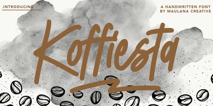 Give your designs an authentic handcrafted feel. � Koffiesta Handwritten Font� is perfectly suited to signature, stationery, logo, typography quotes, magazine or book cover, website header, clothing, branding, packaging design and more.
 - Cuivrerie by JBFoundry,
$19.98 Cuivrerie is a free interpretation of relatively common lapidary inscriptions in Burgundy. Letters fit together. Thus the engraver gains room and we lose legibility. No matter, we have forever to read !
 - Fidelity Caps by Jonahfonts,
$19.95 A tall upright CAP font with small caps. Now includes the Capital German double S (Eszett) ß. Applications include Captions, headlines, packaging, posters, ads, greeting cards, book jackets and/or covers.
 - Folfo by OrakArik,
$9.00 Folfo is a modern font with a casual handwritten and funny feel. It is suitable for use for your products, book covers, branding for your company, and also for setting text.