10,000 search results
(0.03 seconds)
- FHA Eccentric French by The Fontry,
$25.00 The curves are vintage and the serifs are big. They're so big that for years I never had the courage to tackle this intimidating font. But when fellow signmaker Frank Smith laid the groundwork for this intriguing typeface by Frank H. Atkinson, I couldn't pass on the opportunity to take it from paper to keyboard. After all, at over 100 years old, I felt this alphabet had never been given a proper, digital treatment. So how did this face survive the last century? Well, for those who don't know the history, it survived in Atkinson's ubiquitous book, Sign Painting, published first in 1908, the generational standard for anyone interested in sign-related type design. The layouts and lettering treatments in this book have influenced countless designers for more than a hundred years, but most haunting to me was this strange face with the big serifs. Well, I'm haunted no more. The work is done, the kerning is complete, and nothing but a mouse-click separates a very old idea from the modern world. It's wide, it's big, and with those crazy serifs, it is definitely eccentric-!!!
 - Logopedia Now Rounded by Bülent Yüksel,
$19.00 What makes "Logopedia Now Rounded" unique is that it has a strong body, upper and lower case letters are the same size and work in perfect harmony. All letters in the character have "alternatives" in various numbers. This feature provides you variety in your designs. It is possible to take your designs to the next level by using "Logopedia Now Rounded". "Logopedia Now Rounded" is ideal for especially logo design, advertising and packaging, branding and creative industries, banners and billboards and signage as well as web and screen design. "Logopedia Now Rounded" provides advanced typographical support for Latin-based languages. An extended character set, supporting Central, Western and Eastern European languages, rounds up the family. The designation “Logopedia Now Rounded 500 Regular” forms the central point. "Logopedia Now Rounded" comes 3 weights and italics total 6 types. The family contains a set of 543 glyphs. Classes and Features, Stilistic Style, Fractions and Old Style Numerator just one touch easy In all graphic programs. "Logopedia Now Rounded" is the perfect font for web use. Be sure to check out the other siblings of "Logopedia". Logopedia Now Logopedia Now Rounded Logopedia Next Logopedia Next Rounded You can enjoy using it.
 - Morris by HiH,
$10.00 Morris is a four-font family produced by HiH Retrofonts and based on the work of the very English William Morris. William Morris wanted a gothic type drawn from the 14th century blackletter tradition that he admired both stylistically and philosophically. He drew from several sources. His principal inspiration for his lower case was the 1462 Bible by Peter Schoeffer of Mainz; particularly notable for the first appearance of the ‘ear’ on the g. The upper case was Morris’s amalgam of the Italian cursive closed caps popular throughout the 12th through 15th centuries, a modern example of which is Goudy’s Lombardic Capitals. The gothic that Morris designed was first used by his Kelmscott Press for the publication of the Historyes Of Troye in 1892. It was called “Troy Type” and was cut at 18 points by Edward Prince. It was also used for The Tale of Beowulf. The typeface was re-cut in at 12 points and called “Chaucer Type” for use in The Order of Chivalry and The Works of Geoffrey Chaucer. Morris' objective is designing his gothic was not only to preserve the color and presence of his sources, but to create letters that were more readable to the English eye. ATF copied Troy and called it Satanick. Not only was the ATF version popular in the United States; but, interestingly, sold very well in Germany. There was great interest in that country in finding a middle ground between blackletter and roman styles -- one that was comfortable for a wider readership. The Morris design was considered one of the more successful solutions. Our interpretation, which we call Morris Gothic, substantially follows the Petzendorfer model used by other versions we have seen, with the following exceptions: 1) a larger fillet radius on the upper arm of the H, 2) a more typically broadpen stroke in place of the foxtail on the Q, which I do not like, 3) inclusion of the aforementioned ear on the g and 4) a slightly shorter descender on the y. We have included five ornaments, at positions 0135, 0137, 0167, 0172 and 0177. The German ligatures ‘ch’ & ‘ck’ can be accessed using the left and right brace keys (0123 & 0125). Morris Initials One and Morris Initials Two are two of several different styles of decorative initial letters that Morris designed for use with his type. He drew from a variety of 15th century sources, among which were Peter Schoeffer’s 1462 Mainz Bible and the lily-of-the-valley alphabet by Gunther Zainer of Augsburg. Each of the two initial fonts is paired with the Morris Gothic lower case. Morris Ornaments is a collection of both text ornaments and forms from the surrounding page-border decorations.
 - Erotica by Lián Types,
$49.00 “A picture is worth a thousand words” and here, that’s more than true. Take a look at Erotica’s Booklet; Erotica’s Poster Design and Erotica’s User’s Guide before reading below. THE STYLES The difference between Pro and Std styles is the quantity of glyphs. Therefore, Pro styles include all the decorative alternates and ligatures while Std styles are a reduced version of Pro ones. Big and Small styles were thought for better printing results. While Big is recommended to be printed in big sizes, Small may be printed in tiny sizes and will still show its hairlines well. INTRODUCTION I have always wondered if the circle could ever be considered as an imperfect shape. Thousands of years have passed and we still consider circles as synonyms of infinite beauty. Some believe that there is something intrinsically “divine” that could be found in them. Sensuality is many times related to perfectly shaped strong curves, exuberant forms and a big contrasts. Erotica is a font created with this in mind. THE PROCESS This story begins one fine day of March in 2012. I was looking for something new. Something which would express the deep love I feel regarding calligraphy in a new way. At that time, I was practicing a lot of roundhand, testing and feeling different kinds of nibs; hearing the sometimes sharp, sometimes soft, sound of them sliding on the paper. This kind of calligraphy has some really strict rules: An even pattern of repetition is required, so you have to be absolutely aware of the pressure of the flexible pen; and of the distance between characters. Also, learning copperplate can be really useful to understand about proportion in letters and how a minimum change of it can drastically affect the look of the word and text. Many times I would forget about type-design and I would let myself go(1): Nothing like making the pen dance when adding some accolades above and below the written word. Once something is mastered, you are able to break some rules. At least, that’s my philosophy. (2) After some research, I found that the world was in need of a really sexy yet formal copperplate. (3) I started Erotica with the idea of taking some rules of this style to the extreme. Some characters were drawn with a pencil first because what I had in mind was impossible to be made with a pen. (4) Finding a graceful way to combine really thick thicks with really thin hairlines with satisfactory results demanded months of tough work: The embryo of Erotica was a lot more bolder than now and had a shorter x-height. Changing proportions of Erotica was crucial for its final look. The taller it became the sexier it looked. Like women again? The result is a font filled with tons of alternates which can make the user think he/she is the actual designer of the word/phrase due to the huge amount of possibilities when choosing glyphs. To make Erotica work well in small sizes too, I designed Erotica Small which can be printed in tiny sizes without any problems. For a more elegant purpose, I designed Erotica Inline, with exactly the same features you can find in the other styles. After finishing these styles, I needed a partner for Erotica. Inspired again in some old calligraphic books I found that Bickham used to accompany his wonderful scripts with some ornated roman caps. Erotica Capitals follows the essentials of those capitals and can be used with or without its alternates to accompany Erotica. In 2013, Erotica received a Certificate of Excellence in Type Design in the 59th TDC Type Directors Club Typeface Design Competition. Meet Erotica, beauty and elegance guaranteed. Notes (1) It is supossed that I'm a typographer rather than a calligrapher, but the truth is that I'm in the middle. Being a graphic designer makes me a little stubborn sometimes. But, I found that the more you don't think of type rules, the more graceful and lively pieces of calligraphy can be done. (2) “Know the forms well before you attempt to make them” used to say E. A. Lupfer, a master of this kind of script a century ago. And I would add “And once you know them, it’s time to fly...” (3) Some script fonts by my compatriots Sabrina Lopez, Ramiro Espinoza and Alejandro Paul deserve a mention here because of their undeniable beauty. The fact that many great copperplate fonts come from Argentina makes me feel really proud. Take a look at: Parfumerie, Medusa, Burgues, Poem and Bellisima. (4) Some calligraphers, graphic and type designer experimented in this field in the mid-to-late 20th century and made a really playful style out of it: Letters show a lot of personality and sometimes they seem drawn rather than written. I want to express my sincere admiration to the fantastic Herb Lubalin, and his friends Tony DiSpigna, Tom Carnase, and of course my fellow countryman Ricardo Rousselot. All of them, amazing.
 - Vicky by Letritas,
$30.00 Vicky is a slab serif typeface for headlines designed with geometric proportions. Like all slab serif typographies, it has a very particular strength and robustness. The peculiarity of its forms, as it was born from geometrical figures, creates a cascade of delicate details and inner analogies that make it unique. Vicky is a joyful, happy and shiny typography marked by delicate forms, but with a very strong character. It was born to be soulmate of Liliana, another geometric typeface by Juan Pablo De Gregorio. When working with Liliana and Vicky, together with a compatible chromatic work, you can quickly generate very showy results especially when working on short texts. Vicky is optimal for being used in marketing assets, packaging design, magazines, branding, film captions, headlines, editorial, quotes, logos, corporate identity, and motion graphics. The italic version has a 8-degree slant. This feature is intended to convey a gorgeous feeling of tension, power, and agility. It’s very interesting to realize how the dynamism in the italic characters works when combined with the regular ones. The typeface has 9 weights, ranging from “thin” to “heavy”, and two versions: "regular" and "italic". Its 18 files contain 707 characters with ligatures, alternates, and swashes. It supports 219 Latin-based languages, spanning through 212 different countries. Vicky supports this languages: Abenaki, Afaan Oromo, Afar, Afrikaans, Albanian, Alsatian, Amis, Anuta, Aragonese, Aranese, Aromanian, Arrernte, Arvanitic (Latin), Asturian, Atayal, Aymara, Bashkir (Latin), Basque, Bemba, Bikol, Bislama, Bosnian, Breton, Cape Verdean Creole, Catalan, Cebuano, Chamorro, Chavacano, Chichewa, Chickasaw, Cimbrian, Cofán, Corsican Creek,Crimean Tatar (Latin),Croatian, Czech, Dawan, Delaware, Dholuo, Drehu, Dutch, English, Estonian, Faroese, Fijian Filipino, Finnish, Folkspraak, French, Frisian, Friulian, Gagauz (Latin), Galician, Ganda, Genoese, German, Gikuyu, Gooniyandi, Greenlandic (Kalaallisut)Guadeloupean, Creole, Gwich’in, Haitian, Creole, Hän, Hawaiian, Hiligaynon, Hopi, Hotc?k (Latin), Hungarian, Icelandic, Ido, IgboI, locano, Indonesian, Interglossa, Interlingua, Irish, Istro-Romanian, Italian, Jamaican, Javanese (Latin), Jèrriais, Kala Lagaw Ya, Kapampangan (Latin), Kaqchikel, Karakalpak (Latin), Karelian (Latin), Kashubian, Kikongo, Kinyarwanda, Kiribati, Kirundi, Klingon, Ladin, Latin, Latino sine Flexione, Latvian, Lithuanian, Lojban, Lombard, Low Saxon, Luxembourgish, Maasai, Makhuwa, Malay, Maltese, Manx, M?ori, Marquesan, Megleno-Romanian, Meriam Mir, Mirandese, Mohawk, Moldovan, Montagnais, Montenegrin, Murrinh-Patha, Nagamese Creole, Ndebele, Neapolitan, Ngiyambaa, Niuean, Noongar, Norwegian, Novial, Occidental, Occitan, Old Icelandic, Old Norse, Oshiwambo, Ossetian (Latin), Palauan, Papiamento, Piedmontese, Polish, Portuguese, Potawatomi, Q’eqchi’, Quechua, Rarotongan, Romanian, Romansh, Rotokas, Sami (Inari Sami), Sami (Lule Sami), Sami (Northern Sami), Sami (Southern Sami), Samoan, Sango, Saramaccan, Sardinian, Scottish Gaelic, Serbian (Latin), Seri, Seychellois Creole, Shawnee, Shona, Sicilian, Silesian, Slovak, Slovenian, Slovio (Latin), Somali, Sorbian (Lower Sorbian), Sorbian (Upper Sorbian), Sotho (Northern), Sotho (Southern), Spanish, Sranan, Sundanese (Latin), Swahili, Swazi, Swedish, Tagalog, Tahitian, Tetum, Tok Pisin, Tokelauan, Tongan, Tshiluba, Tsonga, Tswana, Tumbuka, Turkish, Turkmen (Latin), Tuvaluan, Tzotzil, Uzbek (Latin), Venetian, Vepsian, Volapük, Võro, Wallisian, Walloon, Waray-Waray, Warlpiri, Wayuu, Welsh, Wik-Mungkan, Wiradjuri, Wolof, Xavante, Xhosa, Yapese, Yindjibarndi, Zapotec, Zulu, Zuni.
 - Neo Retro by Set Sail Studios,
$17.00 Disclaimer: An unhealthy amount of energy drinks were consumed while creating this product Bring some loud, bright, and nostalgic fun to your designs with the Neo Retro font pack! Create bold, vibrant, 90s-inspired designs in just a few clicks—giving you more time to hang out at the mall, go to a drive-in, kick-ass at the arcade or go make the perfect mix-tape (you get the idea). Here's a run through the font family; Neo Retro Font • A high energy font with clean edges and sharp ends. An all caps font, but with a larger and smaller variation included as upper and lowercase sets. Neo Retro Alt Font • This is a second version of the Neo Retro Font, with a completely new set of upper & lowercase characters drawn in the same style. If you wanted to avoid letters looking the same each time to recreate a custom-made style, or try a different word shape, simply switch to this font for an additional layout option. Neo Retro Icons Font • A set of 36 fun, hand-drawn icons designed to match with the Neo Retro font. Includes doodles, shapes, zig-zags, underline swashes & more. Simply install as a separate font and type any A-Z or a-j letter to generate an icon. Language Support; English, French, Italian, Spanish, Portuguese, German, Swedish, Norwegian, Danish, Dutch, Finnish, Indonesian, Malay, Hungarian, Polish, Croatian, Turkish, Romanian, Czech, Latvian, Lithuanian, Slovak, Slovenian.
 - LiebeGerda by LiebeFonts,
$29.00 Go out into the wilderness. Cut down a tree. Stop and smell the roses. And then treat yourself with this unplugged, hand-lettered typeface. LiebeGerda is an effortless-but-refined, spontaneous-but-elegant brush font. She is ready for your next project, and she wants to add that little crafty something that makes the difference. Her natural breath of fresh air lets you escape those same old monotonous script fonts you’ve been using. After our successful first brush font, LiebeDoris, and our first interconnected script, LiebeLotte, we’re combining both genres and taking them to the next level: an interconnected brush script. OpenType magic varies LiebeGerda’s letterforms: Most characters have no less than three different variations that are automatically shuffled and inserted as you type. Plus, the “All-Caps” OpenType feature exchanges uppercase letters with less-swashy variants. Now you know why every one of the four styles contains more than 1,200 characters! Ulrike of LiebeFonts painted LiebeGerda’s four styles individually from scratch and carefully adjusted every detail by hand. Rather than being one typeface with different weights, LiebeGerda is a package of four individual fonts that go together really well. Ulrike’s high level of type-nerdy craftsmanship shows. When you use LiebeGerda, your designs will easily convince your audience that they’re looking at a hand-crafted piece of lettering. Feel free to add a few of the stacked ligatures like “the”, “for”, and “new” to round off the illusion. Last but not least, LiebeGerda has a lot more detail than most other brush fonts. That means there’s no ugly, lazy bézier artifacts in the brush traces. You can print words at billboard size, and people will still believe they smell the paint from your brush!
 - Rinzler AOE by Astigmatic,
$19.00 Rinzler AOE is a revival of a LetterGraphics film type called Caren. A modular, mechanical, sans-serif stencil all rolled up into one retro typeface. It's not an all-purpose typeface, it's not an everyday typeface, but it is a cool typeface for the right design projects. Rinzler AOE carries itself with a bold weighted style, and stencil cutouts that don't follow standard stencil formatting. It might be considered more of a techno stencil (if there is such a thing). It reminded me in a vague way of TRON, hence the main poster graphic styling, although it looks NOTHING like the Tron titling typeface. Nevertheless, it's a fun typeface that needed to be preserved and used again. WHAT'S INCLUDED: Extensive language support. Rinzler has accented and special characters that support the following languages: Afrikaans, Albanian, Basque, Bosnian, Breton, Catalan Cornish, Corsican, Croatian, Czech, Danish, Dutch, Embu, English, Esperanto, Estonian, Faroese, Filipino, Finnish, French, Galician, German, Hungarian, Icelandic, Irish, Indonesian, Italian, Kurdish, Leonese, Luxenbourgish, Malay, Maltese, Manx, Maori, Meru, Morisyen, North Ndebele, Norwegian Bokmål, Norwegian Nynorsk, Nyankole, Occitan, Oromo, Polish, Portuguese, Rhaeto-Romanic, Romanian, Scottish Gaelic, Scots, Serbian (Latin), Slovak, Slovenian, Spanish, Swahili, Swedish, Tagalog, Turkish, Walloon, & Welsh. One of my guilty pleasures is in taking the time to recreate historical typefaces as digital fonts, but a lot of incredible historical typestyles created as wood or metal or film type usually have bare bones character sets and have been lost or only exist as limited specimen proofs in old books. These typefaces may have more niché uses than modern typefaces, but I believe it is important nonetheless to preserve these typefaces for future generations. These typefaces, if nothing else, can often inspire new creations.
 - Zaftig Pro by Typeco,
$49.00Many current poster artists like to reference the graphic type styles that were popular in the ’60s and ’70s. Zaftig is a contemporary font that takes the geometric and blocky inspiration from that era but then steps off in a modern direction. At first glance, it may appear that the capitals of Zaftig all take up the same amount of space, but certain letters have been designed proportionally for a better flow. However, if the designer would prefer to stack the capital letters in even columns, like blocks, then one can use the Titling Alternates feature. In this feature the metrics of all the capital letters are the same, and certain letters have been designed narrower, allowing for seamless stacking. The space, bullet, asterisk have also been given the same monospaced metrics in this feature to make stacking easy. The Small Caps feature in Zaftig is designed so that the small cap glyphs are the same height as the lowercase. This allows the graphic designer not only the option of small caps, but also the ability to mix and match both kinds of letters to create a distinctive style. There are also alternate numerals in the Small Caps feature that match the height of the small caps. In Stylistic Alternates 1 you will find alternate designs for the Q, A, I, J, L, n, and u glyphs. Or you can find alternates in the Glyph Pallet of your favorite OpenType savvy application. Zaftig is more than it appears on the surface. This OpenType font contains over 1200 glyphs and language support. That makes it an international font which contains letters for most languages that use Latin, Central European, Cyrillic, and Greek scripts. - Le Havre Titling by insigne,
$24.00 Throughout time, history’s architects have incorporated some of the finest illustrations of type into their great works--cuneiform on Mesopotamian ziggurats; Greek etched into the temples of the gods; inscriptions marking the monuments of mighty Rome. From these Roman inscriptions specifically, we take our capital letters of today; and while we've lost the need for serifs over time, our current characters maintain the classical foundations, even after being distilled to their simplistic forms. Here’s where we have the basis for Le Havre Titling. This updated face is a carefully optimized version of Le Havre that uses purely capital lettering. Originally inspired by the golden period of the passenger ship and the French port that bid a rich bon voyage to so many famed, luxurious ocean liners of the Roaring Twenties and Thirties, the typeface includes an exciting array of ligatures that brings it into the present day and gives designers a tremendous amount of versatility in their work. With its seven weights, Titling looks equally at home on the side of a building as it does in a finely crafted invitation. With over five hundred glyphs, Le Havre Titling offers a multiplicity of options for your projects. Combine ligatures, play around with two sets of art deco forms, use original caps, and more; every one of these is obtainable with the OpenType functionality. The new design also shares five weights with the original Le Havre, allowing you to maximize your potential through its interchangeability. Titling’s Thin weights are delicate but not too fragile, and its geometric forms give each individual composition you create an exquisite and beautiful sense of emotion. Without a doubt, this fresh, fashionable take on the classical forms offers your reader refined, yet unanticipated approach as he or she travels through your text.
 - Antique Tuscan No 9 by HiH,
$8.00 Antique Tuscan No.9 was one of the earlier wood-type designs by William Hamilton Page. It was first shown among the specimens produced in 1859, shortly after Page entered into a new partnership with Samuel Mowry, owner of the Mowry Axle Company. The new company was named Page and Company and was located at the Mowry facility in the Greenville section of Norwich, Connecticut. Antique Tuscan No.9 is an extra-condensed version of the tuscan style that had been released in moveable type by Vincent Figgins of London in 1817 and had become so popular for advertising in the intervening years. Because of the extreme compression in the design, we might be tempted to describe it as "Triple-X," but that might be misleading. The analogy would, of course, be to clothing sizes, not movie ratings. Because of the compression, this typeface reads best when set extra-extra-extra large. For printing, we recommend 36 points or larger. For the screen, we suggest at least 72 points. An unusual and distinctive design, it is best used with discretion. If I were doing a term paper for school or submitting an article to a magazine for publication, I might use it for the title page, to grab someone’s attention. I would certainly not use it for the main body of text - not if I expected anyone to read what I wrote. If you wonder why we make this recommendation, take the Ten-Point challenge. Print this paragraph using Antique Tuscan No.9 and set the font size at 10 points. If you are young and blessed with good eyesight, you will probably be able to read it - with effort. So, here is the challenge: hand it to your Grandmother and ask HER to read it.
 - Ah, Chemical Gus! If fonts were characters at a science fair, Chemical Gus would undoubtedly be the eccentric, wild-haired inventor whose experiment table teems with bubbling potions and mysterious, ...
- Mandatory - Personal use only

- Monofill - Unknown license

- Dalek - Personal use only

- Susanna - Unknown license

- CheckerHat - Unknown license

- Otsuki Sama by Julmeme,
$19.00 Otsuki-Sama is a sophisticated mix between a serif and sans serif font design. Its elegant balance between heavy contours and subtle lines gives it a modern yet very rich look. Applicable for any type of graphic design, especially for headlines, posters and magazines.
 - Amarylis Paradise by Timurtype,
$14.00 Introducing by Timur type Proudly Present, Amarylis Paradise Amarylis Paradise A Handwritten Font Amarylis Paradise is perfect for product packaging, branding project, megazine, social media, wedding, or just used to express words above the background. Amarylis Paradise also multilingual support. Enjoy the font.Thank you!
 - TOMO Joseph by TOMO Fonts,
$12.00 Joseph is a slab-serif face designed by TOMO. With a wood type look - letterpress print, this fatty comes in handy when is time to design an informal —yet strong—looking communication piece. Imagine this typeface on a T-shirt, even a mug! Sweet.
 - Brittaney Memories by Timurtype,
$14.00 Introducing by Timur type Proudly Present, Brittaney Memories Brittaney Memories A Handwritten Font Brittaney Memories is perfect for product packaging, branding project, megazine, social media, wedding, or just used to express words above the background. Brittaney Memories also multilingual support. Enjoy the font.Thank you!
 - Arupala Grotesk by Jetsmax Studio,
$15.00 Arupala Grotesk is a Grotesk font this versatile typeface will grab readers’ Attention. This font was inspired by a character named H. Aroepala. This font is suitable for both formal and informal events and is also suitable for various types of print and digital media.
 - Lovely Orange by Almarkha Type,
$23.00 Lovely Orange – Fun Display Playful Sans full of charm . It will take any DIY-project to the next level! Lovely Orange is perfect for Craft , product packaging, product designs, label, branding projects, logo, wedding designs, social media posts, advertisements, watermark, invitation, stationery and any projects
 - Hills Eatery by Timurtype,
$14.00 Introducing by Timur type Proudly Present, Hills Eatery Hills Eatery A Handwritten Font Hills Eatery is perfect for product packaging, branding project, megazine, social media, wedding, or just used to express words above the background. Hills Eatery also multilingual support. Enjoy the font.Thank you!
 - EbuScript by Type-Ø-Tones,
$40.00 EbuScript by José Manuel Urós. OpenType, 1 style The very first font of Type-Ø-Tones, EbuScript, comes from the pen of José Manuel Urós —nicknamed Ebú in those times. Now it is still in our catalogue thanks to a completed and improved version.
 - Post Production JNL by Jeff Levine,
$29.00 A title card listing the supporting cast of the 1950 Humphrey Bogart and Gloria Grahame drama “In a Lonely Place” provided the hand lettered slab serif type design that served as the model for Post Production JNL – available in both regular and oblique versions.
 - Bitter Robusta by Timurtype,
$14.00 Introducing by Timur type Proudly Present, Bitter Robusta Bitter Robusta A Handwritten Font Bitter Robusta is perfect for product packaging, branding project, megazine, social media, wedding, or just used to express words above the background. Bitter Robusta also multilingual support. Enjoy the font.Thank you!
 - Hidden Beauty by Timurtype,
$14.00 Introducing by Timur type Proudly Present, Hidden Beauty Hidden Beauty A Modern Script Font Hidden Beauty is perfect for product packaging, branding project, megazine, social media, wedding, or just used to express words above the background. Hidden Beauty also multilingual support. Enjoy the font.Thank you!
 - Moralist Jameson by Timurtype,
$14.00 Introducing by Timur type Proudly Present, Moralist Jameson Moralist Jameson A Handwritten Font Moralist Jameson is perfect for product packaging, branding project, megazine, social media, wedding, or just used to express words above the background. Moralist Jameson also multilingual support. Enjoy the font.Thank you!
 - P22 Late November by IHOF,
$39.95 P22 Late November is a transitional Antiqua-inspired type design great for text and display uses. The name is derived from the dark, November night in which the design of the font began. The Pro version features fractions, ligatures and full Central European support.
 - La Veronique by My Creative Land,
$10.00 A hand written font family, created with the upcoming spring and sunshine in mind. It is full of alternates, swashes, ligatures and other open type features. You can use it for wedding invitations, thank you cards, quotes - the choice is only limited by your imagination!
 - Vandalust Graffiti by Sipanji21,
$18.00 Vandalust is a unique display font with a graffiti-like appearance. Use this font for any crafting project, apparel design, logotype, advertising, wall decoration, and pretty much anything that requires a personalized look. Take your designs to the next level with this stunning font!
 - P22 Nebiornaments by IHOF,
$24.95 P22 Nebiornaments contains over 100 ornaments based on the Italian Nebiolo Type Foundry designs of the 1950s. Many of these ornaments are designed to create complex patterns and continuous borders. The simple geometric shapes allow for endless combinations for a wide variety of uses.
 - Dorniela by Gholib Tammami,
$15.00 Introducing Dorniela, a charming and delightful font that brings a whimsical touch to your creative projects. With a name that evokes the magic of fairy tales and the essence of all things cute, Dorniela is your ticket to a world of adorable design possibilities.
 - Erratic Nouveau JNL by Jeff Levine,
$29.00 The title on the 1925 sheet music for “By the Light of the Stars” was hand lettered in an eccentric Art Nouveau type style with varying character shapes and line widths. This is now available as Erratic Nouveau JNL in both regular and oblique versions.
 - Millrich Moravian NF by Nick's Fonts,
$10.00Originally called Bohemian in the 1918 specimen book of the Miller and Richard Type Foundry of London and Edinburgh, this Jugendstil typeface still retains its freshness and quaint charm. Both versions of this font include the complete Latin 1252 and Central European 1250 character sets. - No Entry JNL by Jeff Levine,
$29.00 The hand lettered titles and credits from the 1958 war film “The Young Lions” command your attention with a bold block slab serif type style. This design has been digitally recreated as No Entry JNL, which is available in both regular and oblique versions.
 - Preferred Shares JNL by Jeff Levine,
$29.00 A bold, condensed slab serif face A July 9, 1935 trade paper ad for Paramount Pictures’ 1st quarter film releases sported hand lettering with chamfered slab serifs. This condensed type design is now available as Preferred Shares JNL in both regular and oblique versions.
 - Black Mystique by Timurtype,
$14.00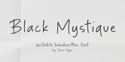 Introducing by Timur type Proudly Present, Black Mystique Black Mystique A Handwritten Font Black Mystique is perfect for product packaging, branding project, megazine, social media, wedding, or just used to express words above the background. Black Mystique also multilingual support. Enjoy the font.Thank you!
 - Kingdrops by Letterhend,
$19.00 Kingdrops is a cool script typeface. This font perfectly made to be applied especially in logo, and the other various formal forms such as invitations, labels, logos, magazines, books, greeting / wedding cards, packaging, fashion, make up, stationery, novels, labels or any type of advertising purpose.


