10,000 search results
(0.028 seconds)
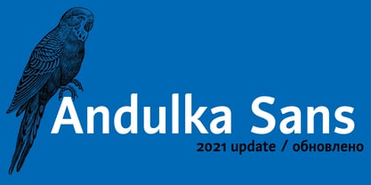
- Andulka Sans by Storm Type Foundry,
$55.00 - As of my last update in April 2023, LT Marathon is a remarkable font crafted by LyonsType, a studio or designer known for their dedication to creating visually compelling and functional typography. T...
- Playdates - Personal use only
- Pricetag - Personal use only
- ChrisMaster - Personal use only
- Adelaide - Personal use only
- La Babaca - Personal use only
- Brannboll Fet - Personal use only
- Phalang - Personal use only
- GelPenUpright - 100% free
- Janda Manatee Solid - Personal use only
- Kanagif Personal Use - Personal use only
- Escobeta One - Personal use only
- soul handwriting_free-version - Personal use only
- defatted milk - Personal use only
- Project Y - Personal use only
- Teddyber V1.1 - Unknown license
- Top Secret - 100% free
- Hancock - Unknown license
- Cartoonist - Personal use only
- Hawaii Killer - Personal use only
- Cookies - Unknown license
- Janda Quirkygirl - Personal use only
- Gipsiero - Unknown license
- Calan - Unknown license
- Shortbrush - Personal use only
- Bugebol, huomenna - Personal use only
- Express - Unknown license
- Baveuse - Unknown license
- Yurine Overflow - Personal use only
- Just Realize - Personal use only
- Donnie - Unknown license
- Little Days - Unknown license
- Chefs Slice Novice - Unknown license
- Komika Text - Unknown license
- My Nerd - Personal use only
- SoulMission - Unknown license
- cup Font - Unknown license
- Jayne Print YOFF - Personal use only
- ArmWrestler - 100% free


