10,000 search results
(0.021 seconds)
- Baskerville LT by Linotype,
$40.99 John Baskerville (1706-1775) was an accomplished writing master and printer from Birmingham, England. He was the designer of several types, punchcut by John Handy, which are the basis for the fonts that bear the name Baskerville today. The excellent quality of his printing influenced such famous printers as Didot in France and Bodoni in Italy. Though he was known internationally as an innovator of technique and style, his high standards for paper and ink quality made it difficult for him to compete with local commercial printers. However, his fellow Englishmen imitated his types, and in 1768, Isaac Moore punchcut a version of Baskerville's letterforms for the Fry Foundry. Baskerville produced a masterpiece folio Bible for Cambridge University, and today, his types are considered to be fine representations of eighteenth century rationalism and neoclassicism. Legible and eminently dignified, Baskerville makes an excellent text typeface; and its sharp, high-contrast forms make it suitable for elegant advertising pieces as well. The Linotype portfolio offers many versions of this design: ITC New Baskerville® was designed by John Quaranda in 1978. Baskerville Cyrillic was designed by the Linotype Design Studio. Baskerville Greek was designed by Matthew Carter in 1978. Baskerville™ Classico was designed by Franko Luin in 1995."
 - Kaufmann LT by Linotype,
$29.99Kaufmann font was designed in 1936 for the American Type Founders by Max R. Kaufmann, a letterer, typographer, and one-time art director for McCalls magazine. Kaufmann is a connecting script typeface with a smooth, slightly whimsical look. Its monoweight is unusual in a script type but allows for a nice texture on the page when it is combined with sans serif text type. The bold Kaufmann is fine display type. - Versailles LT by Linotype,
$57.99 The origins of the font Versailles go back to the 19th century in France when, with the introduction of lithography, alphabets could contain freer forms. The basic forms are Modern Face with triangular serifs. The direct influence for Versailles was the writing on the back of the memorial to Charles Garnier, the architect of the Paris Opera. Versailles is a classic font for advertisements, perfect for shorter texts and titles/headlines and it makes an impression of elegance and strength.
 - Biosymbols LT by Linotype,
$29.99 - Beluga LT by Linotype,
$29.99 Linotype Beluga is a part of the Take Type Library, winners of Linotype’s International Digital Type Design Contest. The font was designed by Hans-Jürgen Ellenberger to suggest the writing of the Middle Ages but without any specific models from that time. A distinguishing characteristic of the font is its pointed, effusive serifs, which give Beluga its feel of the Middle Ages or of mysticism. In spite of its dynamic character, Beluga is legible even in smaller point sizes, which makes it equally good for headlines as for shorter texts. Beluga combines well with sans serif, slab serif and constructed fonts.
 - LT Score - 100% free

- LT Streak - 100% free

- LT Makeup - 100% free

- LT Speak - 100% free

- LT Sculpture - 100% free

- LT Comical - 100% free

- LT Stopwatch - 100% free

- LT Sonoma - 100% free

- LT Saeada - 100% free

- LT Wave - 100% free

- LT Sip - 100% free

- LT Superior - 100% free

- LT Renovate - 100% free

- LT Beverage - 100% free

- LT Energy - 100% free

- Janda Everyday Casual - Personal use only

- Dom Casual EF by Elsner+Flake,
$35.00 - Poster Casual JNL by Jeff Levine,
$29.00 Poster Casual JNL is based on the hand lettered title on the cover of the 1929 sheet music for the song "Give Yourself a Pat on the Back"; touted at the time as being "the cheer-up song of England". Available in both regular and oblique versions, the font is perfect for applications where a less-formal look is desired in headlines or brief text.
 - Casually Nouveau JNL by Jeff Levine,
$29.00 The 1930 sheet music for “A Peach of a Pair” from Paramount Pictures’ “Follow Through” listed the stars and production credits in a wonderfully casual, free-form Art Nouveau hand lettering. This has been recreated digitally as Casually Nouveau JNL, and is available in both regular and oblique versions. For another Art Nouveau typeface with a free-form look, try the similarly named Casual Nouveau JNL.
 - Kitti Casual JF by Jukebox Collection,
$32.99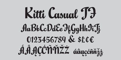
- The Executive Casual by Fontsgood,
$14.00 Introducing "The Executive Casual". A duo font with an elegant combination, a perfect blend of elegance, smoothness, and casualness. The Script style has a smooth and flowing handwritten style that adds a touch of charm and sophistication to any design and the Serif style is made to bring versatile and stylish, elegance. a perfect combination and harmonious look that works well for both formal and informal contexts. Whether you need a font for business cards, logos, magazines, or websites, this font will give your text a professional and refined appearance. Experience the perfect harmony of elegance and informality, tailored to meet the demands of today's discerning designers and creators. Elevate your projects with this font, and let your creativity take center stage.
 - Dom Casual SH by Scangraphic Digital Type Collection,
$26.00Since the release of these fonts most typefaces in the Scangraphic Type Collection appear in two versions. One is designed specifically for headline typesetting (SH: Scangraphic Headline Types) and one specifically for text typesetting (SB Scangraphic Bodytypes). The most obvious differentiation can be found in the spacing. That of the Bodytypes is adjusted for readability. That of the Headline Types is decidedly more narrow in order to do justice to the requirements of headline typesetting. The kerning tables, as well, have been individualized for each of these type varieties. In addition to the adjustment of spacing, there are also adjustments in the design. For the Bodytypes, fine spaces were created which prevented the smear effect on acute angles in small typesizes. For a number of Bodytypes, hairlines and serifs were thickened or the whole typeface was adjusted to meet the optical requirements for setting type in small sizes. For the German lower-case diacritical marks, all Headline Types complements contain alternative integrated accents which allow the compact setting of lower-case headlines. - Casual Deco JNL by Jeff Levine,
$29.00 The hand lettered sans serif title on the1931 sheet music for “(Potatoes are Cheaper-Tomatoes are Cheaper) Now’s the Time to Fall in Love” presented another opportunity to create a typeface from the wealth of unusual alphabets found on the covers of vintage and antique song sheets. However, it seems that even as late as the 1930s, song writers had the urge to pen long-worded titles for their musical compositions. This thirteen word verbal excursion became the model for Casual Deco JNL, which is available in both regular and oblique versions.
 - Nevison Casual EF by Elsner+Flake,
$35.00 - Casual Mark Script by Pedro Teixeira,
$14.00 Casual Mark Script with ligatures and alternate lowercase gives a personalized feeling to your work.
 - Eckhardt Casual JNL by Jeff Levine,
$29.00 Eckhardt Casual JNL was modeled from an example of poster lettering found in a 1941 Speedball® Lettering Pen instruction book. The font is named in honor of Jeff Levine's good friend, the late Albert Eckhardt, Jr. (owner of Allied Signs in Miami, Florida until his passing) and is one of a number of releases with a "sign painter" theme that comprise the "Eckhardt Series".
 - Casual Nouveau JNL by Jeff Levine,
$29.00 Free-flowing pen lettering of the Art Nouveau period took letter forms into interesting curves and angles. The style was embraced and revived by the 1960s counter-culture in its rock concert posters and record album covers. However, the source for Casual Nouveau JNL is a 1911 piece of sheet music entitled "Back to the Carolina You Love".
 - Handy Casual Condensed by My Creative Land,
$12.00 Handy Casual Condensed is an informal non-linking brush script that was inspired by hand lettering from 60's posters. This font combines a unique character with tons of Open Type features including ligatures, catchwords, stylistic alternates etc.
 - Casual Friday JNL by Jeff Levine,
$29.00An old rubber stamp printing set called the Aristocrat Sign Marker was the inspiration for this font from Jeff Levine. The letter shapes are truly reminiscent of the 1920s and early 30s with their casual playfulness, hence the font's name of Casual Friday JNL. To add a more nostalgic touch, the characters show slight imperfection of shape, as if hand-lettered. - Nevison Casual SH by Scangraphic Digital Type Collection,
$26.00Since the release of these fonts most typefaces in the Scangraphic Type Collection appear in two versions. One is designed specifically for headline typesetting (SH: Scangraphic Headline Types) and one specifically for text typesetting (SB Scangraphic Bodytypes). The most obvious differentiation can be found in the spacing. That of the Bodytypes is adjusted for readability. That of the Headline Types is decidedly more narrow in order to do justice to the requirements of headline typesetting. The kerning tables, as well, have been individualized for each of these type varieties. In addition to the adjustment of spacing, there are also adjustments in the design. For the Bodytypes, fine spaces were created which prevented the smear effect on acute angles in small typesizes. For a number of Bodytypes, hairlines and serifs were thickened or the whole typeface was adjusted to meet the optical requirements for setting type in small sizes. For the German lower-case diacritical marks, all Headline Types complements contain alternative integrated accents which allow the compact setting of lower-case headlines. - Welo Casual NF by Nick's Fonts,
$10.00Another tip of the hat to master draftsman Samuel Welo. His famous Studio Handbook was hand-lettered throughout, and provided the inspirations for many of Nick's favorite fonts. This little number is based on the unnamed style Mr. Welo used for much of his paragraph text. Use it when you want to convey homespun warmth and a handmade feel. Both versions of this font include the complete Unicode Latin 1252, Central European 1250 and Turkish 1254 character sets. - Casual Lunch JNL by Jeff Levine,
$29.00Casual Lunch JNL is a friendly, relaxed typeface that's perfect for headlines where legibility is important, but formality is optional. - Nevison Casual SB by Scangraphic Digital Type Collection,
$26.00Since the release of these fonts most typefaces in the Scangraphic Type Collection appear in two versions. One is designed specifically for headline typesetting (SH: Scangraphic Headline Types) and one specifically for text typesetting (SB Scangraphic Bodytypes). The most obvious differentiation can be found in the spacing. That of the Bodytypes is adjusted for readability. That of the Headline Types is decidedly more narrow in order to do justice to the requirements of headline typesetting. The kerning tables, as well, have been individualized for each of these type varieties. In addition to the adjustment of spacing, there are also adjustments in the design. For the Bodytypes, fine spaces were created which prevented the smear effect on acute angles in small typesizes. For a number of Bodytypes, hairlines and serifs were thickened or the whole typeface was adjusted to meet the optical requirements for setting type in small sizes. For the German lower-case diacritical marks, all Headline Types complements contain alternative integrated accents which allow the compact setting of lower-case headlines. - Casual Stencil JNL by Jeff Levine,
$29.00 Casual Stencil JNL was modeled from a set of stencils used for store display work that are reminiscent of brush style casual lettering made popular by sign painters and show card artists.
 - Casual Signage JNL by Jeff Levine,
$29.00 Alf Becker was a talented sign writer and a prolific contributor of unique alphabets to Signs of the Times magazine. More than one hundred of his designs were showcased in monthly installments with each new issue of the publication. One in particular is a casual, free form sans serif design which has been recreated digitally as Casual Signage JNL, and is available in both regular and oblique versions. Thanks to Tod Swormstedt of ST Publications for providing the reference material for this font.


