10,000 search results
(0.03 seconds)
- Juvenis by Storm Type Foundry,
$32.00Designs of characters that are almost forty years old can be already restored like a historical alphabet – by transferring them exactly into the computer with all their details. But, of course, it would not be Josef Tyfa, if he did not redesign the entire alphabet, and to such an extent that all that has remained from the original was practically the name. Tyfa published a sans-serif alphabet under the title Juvenis already in the second half of the past century. The type face had a large x-height of lower-case letters, a rather economizing design and one-sided serifs which were very daring for their time. In 1979 Tyfa returned to the idea of Juvenis, modified the letter “g” into a one-storey form, narrowed the design of the characters even further and added a bold and an inclined variant. This type face also shows the influence of Jaroslav Benda, evident in the open forms of the crotches of the diagonal strokes. Towards the end of 2001 the author presented a pile of tracing paper with dozens of variants of letter forms, but mainly with a new, more contemporary approach: the design is more open, the details softer, the figures and non-alphabetical characters in the entire set are more integral. The original intention to create a type face for printing children’s books thus became even more emphasized. Nevertheless, Juvenis with its new proportions far exceeds its original purpose. In the summer of 2002 we inserted all of this “into the machine” and designed new italics. The final computer form was completed in November 2002. All the twelve designs are divided into six variants of differing boldness with the corresponding italics. The darkness of the individual sizes does not increase linearly, but follows a curve which rises more steeply towards the boldest extreme. The human eye, on the contrary, perceives the darkening as a more fluent process, and the neighbouring designs are better graded. The x-height of lower-case letters is extraordinarily large, so that the printed type face in the size of nine points is perceived rather as “ten points” and at the same time the line spacing is not too dense. A further ingenious optical trick of Josef Tyfa is the figures, which are designed as moderately non-aligning ones. Thus an imaginary third horizontal is created in the proportional scheme of the entire type face family, which supports legibility and suitably supplements the original intention to create a children’s type face with elements of playfulness. The same applies to the overall soft expression of the alphabet. The serifs are varied; their balancing, however, is well-considered: the ascender of the lower-case “d” has no serif and the letter appears poor, while, for example, the letter “y”, or “x”, looks complicated. The only serif to be found in upper-case letters is in “J”, where it is used exclusively for the purpose of balancing the rounded descender. These anomalies, however, fit perfectly into the structure of any smoothly running text and shift Juvenis towards an original, contemporary expression. Tyfa also offers three alternative lower-case letters *. In the case of the letter “g” the designer follows the one-storey form he had contemplated in the eighties, while in “k” he returns to the Benda inspiration and in “u” adds a lower serif as a reminder of the calligraphic principle. It is above all the italics that are faithful to the tradition of handwritten lettering. The fairly complicated “k” is probably the strongest characteristic feature of Juvenis; all the diagonals in “z”, “v”, “w”, “y” are slightly flamboyant, and this also applies to the upper-case letters A, V, W, Y. Juvenis blends excellently with drawn illustrations, for it itself is modelled in a very creative way. Due to its unmistakable optical effect, however, it will find application not only in children’s literature, but also in orientation systems, on posters, in magazines and long short-stories. - Lemon - Unknown license

- Victor Moscoso by K-Type,
$20.00 The Victor Moscoso font is based on the 1960s psychedelic poster lettering of the artist Victor Moscoso. The letterforms are derived from some of his most celebrated Neon Rose posters of the late sixties, in particular the archetypical Moby Grape ‘Neptune’s Notion’ of 1967.
 - HARBER by bb-bureau,
$60.00 The name ‘HARBER’ comes from the first letters drawn. It is a sans serif family designed of dots on a grid, that gives it this round and rhythmic aesthetic. Only dots grow, approaching or moving away, changing the aspect of letters but keeping its characteristics.
 - The "id-Cinema-LightOT" font, designed by Inoue Masaru, is a charming and versatile typeface that offers a unique blend of elegance and whimsy, making it perfect for a wide range of creative endeavor...
- Merci by Atlantic Fonts,
$26.00 “Merci” is a playful, cool, hand-drawn font ready to mix things up with interchangeable upper and lower case letters and double letter ligatures. Get artsy, go graphic, feel the groove, and spread some love.
 - Cabernet Sauvignon by BA Graphics,
$45.00An elegant fine serif gives this font that unique beautiful charming feeling. This a great font for that real sophisticated high end look. Like a fine wine this font is sure to please your taste. - Rileyson by Club Type,
$36.99 Crisp contemporary Sans-serif family useful for clear, clean corporates, stylish branding letterforms or friendly, casual messaging too, with use of its capital and lower case ligatures, swash capitals, old style numerals and many ornaments.
 - Blugie by Cititype,
$12.00 Blugie is a tasty new font for all of your fun projects! It's a mixed-case font (uppercase and lowercase are all the same height) so you can mix and match letters within a word.
 - Alvairo Brilliante by Wildan Type,
$15.00 Introducing Alvairo Brilliante This font was created to look as close to a natural handwritten signature as possible by including lowercase swash, ligature and underlines. Perfect for any awesome projects that need hand writing taste.
 - Monthier by Aestherica Studio,
$9.00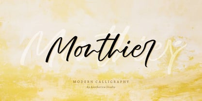 Monthier is a modern and original handwritten font perfect for branding projects, logos, wedding designs, social media posts, advertisements, product packaging, product designs, label, photography, watermark, invitation, stationery, and any projects that need handwriting taste.
 - Charterhouse by Device,
$29.00 A heavy obround sans with a high x-height and unusual lower-case spurs that flow up and into the bowl. This curve is mirrored in the ascenders. The alternates provide for closer, denser setting.
 - Sanderling by Atlantic Fonts,
$26.00 Sanderling is irrepressibly cheerful. Turn on discretionary ligatures to access double-letter ligatures for both cases, plus more chirpy ligatures designed to give flight to Sanderling’s lively character. Sanderling has the legs to make waves!
 - Comtype by Octopi,
$7.00 Ridiculously wide, mathematical and angular, and yet, looks good in vast blocks of text. Comtype is a cross and exaggeration between vintage computer text and old-school typewriter text. Five weights for your typesetting pleasure.
 - P22 Broadwindsor by IHOF,
$24.95 Broadwindsor is part of the "Staunton Script Family" of fonts designed by Ted Staunton for his historic novel. The Broadwindsor font is a neatly written script with capitals and lower case in a close relationship.
 - Aetherline by Hazztype,
$20.00 Aetherline is a captivating vintage monoline script font that gracefully marries the nostalgia of the past with the sleekness of modern design. With its carefully crafted, unbroken strokes, Aetherline evokes the essence of classic handwriting.
 - Unikled by Ingrimayne Type,
$12.95 Unikled a decorative calligraphic family inspired by the uncial style. The upper and lower cases are largely different and can be treated as two separate alphabets. It is available in two weights, plain and bold.
 - Mailbox Letters Two JNL by Jeff Levine,
$29.00Mailbox Letters Two JNL is the second typeface from Jeff Levine inspired by metal lettering used on mailboxes and homes. Each cast letter or number sat on a lower "rail" which was then slipped into a slot that held them firmly in place. Jeff's Inventory JNL looked close enough to the original type style to use as a model for this font, and for typographic purposes there are certain punctuation and other glyphs that "float" above the rail. Limited character set. - Caslon Titling by Monotype,
$29.99Monotype Caslon Titling was made available for hot metal casting in 1932. The capital Monotype Caslon Titling letters were based on types from the Stephenson Blake Foundry, previously the Caslon Foundry. Originally designed by William Caslon in the eighteenth century, Caslon is considered an old face although it has characteristics which were later found in the transitional typefaces. The Monotype Caslon Titling font has a distinctive style, generous width and strong color, ideal for use in advertising, magazines and on book jackets. - The Genghis Khan font is a unique and captivating typeface that evokes the essence of the Mongolian empire's legendary founder, Genghis Khan. It is designed to capture the rugged, raw, and powerful s...
- Moonlight Shadow - Personal use only

- Mainsail by Melvastype,
$29.00 Mainsail is a handwritten brush script font. It is casually written with dry brush pen, so it has this nice texture and flow. Mainsail has lots of alternates to make it look more like real handwriting; four sets of lower cases and two sets of upper cases. Mainsail is great option for logos, headlines and packaging. You can also use it in longer texts where you need this casual handwritten look. It will also combine well with sans and serif fonts. Mainsail has OpenType features that automatically makes text look more authentic. Discretionary Ligatures replaces other of two identical letters following each other. Contextual Alternates will unleash the full cycle of the alternates. It will cycle all four lower case sets to make the text look as natural as possible. Mainsail has also underline strokes in separate font called Mainsail Swash. It includes combined 52 different underlines, strokes and circles. With these you can add the final punch to your design.
 - Haakke by Dawnland,
$13.00 Haakke (or Håkke) - a casual, hand drawn (Stabilo OH pen, Fine) font with 4 alternates to all upper and lower case letters (a-z + å ä ö) as well as numbers for a realistic hand written look and feel! “Ligatures” have been created for double letters (TT, tt, ff, ll & LL (open type version of the font and open type compatible layout application required). Of course it holds all(?) the special characters that you will ever need. 451 glyphs... Haakke also includes symbols. Zodiak signs (letter a-l, upper case A-L write the corresponding name of the sign), planet signs (m-z, upper case M-Z write the corresponding name of the planet) triangles, squares and stars (from pentagrams (5 pointed) to Dodecagrams (12 pointed). (Write a 4, or shift-4 ("euro-sign", european keyboard, or "dollar sign", american keyboard) before your star or triangle and you will get a circle around it).
 - Imperial Tea by Hanoded,
$15.00 I am a coffee person, but two years ago, just before the whole Covid-thing happened, I came down with what I assumed to be the flu. It was a really nasty flu as well: I was down for 10 days or so and when I sort of recovered, nothing tasted the same. Coffee tasted like cardboard and I couldn't stand the taste of it, so I decided to drink tea instead. The 'supermarket tea' we have in Holland is quite bad and tasteless, so I ordered some proper strong English tea online and I have been drinking it ever since. Of course I was thinking of this when I created Imperial Tea font. Imperial Tea font was made with... yes, you've guessed it: Chinese ink and a brush. Imperial Tea is a nice, 'oriental-ish' looking font that comes with a set of alternate glyphs and an impressive language support, including Vietnamese and Greek.
 - Publica Sans by FaceType,
$- Publica Sans is a clean geometric typeface, equipped with a variety of OpenType features to give you all you need for great typography: Alternates, arrows, rare currency symbols, case sensitive forms, various sets of figures and discretionary ligatures. Publica Sans has two sisters: Publica Play and Publica Slab Take a close look at our gallery (especially ‘OpenType Features 1–6’) to discover the versatility of Publica Sans. Alternates Give your typography a certain spin with the variety of alternate letters provided. Currency You need to set prices in exotic countries? No problem: Publica Sans gives you loads of rare currency symbols. Case Sensitive Forms Sometimes you write in all caps and there are some symbols (e.g. brackets) that need some extra treatment to make it look perfect – that’s what case sensitive forms are for. Figures Publica Sans provides 6 sets of figures, like lining, tabular, oldstyle, numerators ... Discretionary Ligatures Ligatures can make your logo or headline look spicy. So there are plenty of them.
 - Voluta Script by Adobe,
$35.00Voluta Script is the work of Austrian designer Viktor Solt, created for use in a guide to the Austrian Gallery at Castle Belvedere. A volute (Latin voluta") is a spiral or scroll-shaped ornament used in the Baroque architecture of Castle Belvedere, similar to the swashes in this typeface. The castle was the historic residence of Prince Eugene of Savoy, one of the great military commanders of the 18th century and a prominent figure in Austrian history. When asked to create a typeface based on the calligraphy of the period to illustrate Eugene's epic, Solt turned for inspiration to Kurrent writing, a cursive blackletter style. Solt created a hybrid style that embodies the rhythm and basic forms of its ancestors, with large capitals, dark vertical strokes, and flourished beginning and ending characters. The typeface was designed to be used in sizes of 24 points and greater. Voluta Script allows designers to evoke the Baroque era or to lend a hint of majestic grace to contemporary typesetting." - 750 Latin Uncial by GLC,
$38.00 This font was inspired by the Latin script used in European monasteries from circa the 5th to 8th centuries, before the Carolingian “Caroline” (look at our 825 Karolus). It was a regular script, rounded, written slowly, used mainly for specially meticulous books, with a few ligatures, legible, but only with lowercase. The capitals consisted of enlarged lower cases, but here, we have preferred to use two slightly different patterns. Our lower cases are a synthesis from a lot of variants (mainly from the “First Bible” of Charles The Bald), the upper cases were mainly inspired from a 700’s manuscript from the abbey of Fécamp (France). We have adapted the font for contemporary users, differentiating between U and V, I and J, which has no relevance for ancient Latin scribes, and naturally with Thorn, Oslash, Lslash, K, W... punctuation and the usual accented characters which did not exist at the time. It can be used with 799 Insular Title.
 - Cattie by Aisyah,
$12.00 Cattie is a decorative font that features cat decorations. The font is cute and playful, with cat illustrations integrated into each character. It's perfect for adding a fun touch to your designs, such as greeting cards, posters, or children's books. The font is versatile and can be used for various projects, from lighthearted to more serious ones, and can add a unique touch to any design.
 - Potbank by Asdesign,
$50.00 Like many cities in the Midlands and North of England, Stoke-on-Trent has a rich history linked to making and industry. In Stoke’s case it was pottery. In the early 1900s bottle kilns could be seen covering the landscape of the six towns making up Stoke-on-Trent with hundreds of factories producing some of the best ceramics in the world. But by the 1990s most of these had gone. Torn down for development of housing or just left to rot. During the next few decades Stoke continued to change. The industry was in a decline and Stoke itself was seen as another poor midlands city with a dwindling industry. Then in 2008, Spode, one of the largest and most famousceramics factories in Stoke entered into administration. Pens cast aside, drawings left half finished, designs left in the turned-off kilns; Spode factory was abandoned. This was a real shock and the way everything was getting thrown into skips to be put on the tip was heartbreaking. Thankfully people salvaged some of the technical drawings, sketch design, old sample pieces and ceramics that people hard worked so hard on. Potbank has been in development over a number of years taking inspiration from the heritage and designs from the ceramics industry. It has a mixed Clarendon and Antiqua style structure with its main purpose to be used as a printed type.
 - Rock Show Whiplash - Unknown license

- Madgue by Sarid Ezra,
$15.00 Madgue is unique monoline font. You can use it many cases, such as awesome logo and more. This font contains ligatures, many stylistic alternates and a separate swash weight. This font is also supports multiple languages.
 - RMU Bowery by RMU,
$30.00 In the last decade of the 19th century, Bruce Type Founders, New York - among others - released this shaded typeface which they named Bowery. Carefully redrawn and digitized, RMU Bowery breathes fresh life into this great design.
 - Scrolls A by Wiescher Design,
$39.50 Scrolls A are a set of pictorial scrolls like signs of the zodiac, animals, dishes, flowers, symbols, decorative and Americana. They are beginning of last century American. Your I-found-them-somewhere type-designer, Gert Wiescher
 - Vespalogy by Almarkha Type,
$29.00 Vespalogy - Fonts with a vintage touch reminiscent of past designs, making your design needs look unique and classic style. It is perfect for any design project as Invitation,logo, book cover, craft or any design purposes.
 - Manga Master Pro BB by Blambot,
$10.00 Manga Master, the classic Blambot font, is now Manga Master Pro! It has been updated with new spacing, kerning, and hinting as well as new autoligs, manga translation glyphs, CAlts, fractions, barred-I correction and more!
 - Brothery by Almarkha Type,
$25.00 Brothery - Fonts with a vintage touch reminiscent of past designs, making your design needs look unique and classic style. It is perfect for any design project as Invitation,logo, book cover, craft or any design purposes.
 - Pixettish by Aah Yes,
$4.95Pixettish is a fun-font, a slightly ornamental sans serif typeface with curls to the upper and lower case characters. The zip files contain both OTF and TTF versions of the font - install one version only. - Flamenco Inline by ITC,
$29.99Flamenco is the work of British artist Tony Geddes. Its versatile display style has an inline contour decoration and a controlled yet casual appearance. Flamenco will guarantee visual excitement across a vast range of advertising applications. - PXL3287 by BW90,
$25.00 PXL3287 is pixel art font inspired by '80s space and sci-fi cartoons and arcade games. It contains more than 220 glyphs (capitals, lower-case letters, numbers, plus many other characters) and supports many european languages.
 - Neutrinos by Burghal Design,
$29.00Neutrinos includes seven assorted dingbats, and like all Burghal Design fonts, includes upper and lower case letters, as well as numbers, symbols, punctuation, and accented foreign characters. Neutrinos is cholesterol free and contains no artificial sweeteners.


