7,767 search results
(0.026 seconds)
- Orbitens by Maulana Creative,
$11.00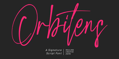 Orbitens is a fancy signature script font. With gel pen stroke, slanted and Unique Upper and lower characters with a bit of ligatures. To give you an extra creative work. Orbitens font support multilingual more than 100+ language. This font is good for logo design, Social media, Movie Titles, Books Titles, a short text even a long text letter and good for your secondary text font with sans or serif. Make a stunning work with Orbitens font. Cheers, MaulanaCreative
 - Shababa by Okaycat,
$24.50 Shababa is a hand-drawn 3-D font. The linework is fairly relaxed, mostly smooth with some distressed edges. There is lots of texturing from the pen strokes which becomes more evident at larger point sizes. This looseness enhances the smooth technicality of the properly extruded forms. With extended codepages for Cyrillic, Romanian, Turkish, Baltic & Central Europe, Shababa is suitable for multilingual environments & publications. It also features West European diacritics, ligatures & a sprinkling of dingbats for extra fun!
 - Carrot Juice by Hanoded,
$15.00 I like Carrot Juice a lot. I don’t drink it that often (and I should, really), but nothing beats a freshly squeezed glass of cold carrot juice!! Carrot Juice font is a lovely script font: handmade with love (and a rather cheap Chinese brush pen which I bought online). Carrot Juice will come in handy when you need that handmade look - cookbooks, websites and product packaging spring to mind. Comes with a abundant harvest of diacritics.
 - Komorebi by LiffeyType,
$9.00 Komorebi consists of handmade letters made with just a Stabilo pen. It is perfect for large scale texts and headlines. This font is suitable for posters, flyers, business cards or just a beautiful visual with a signature word. The family consists of three styles with both lower and upper case letters, accent characters and special characters. Though I personally recommend using all caps to give your words that bold touch, lower case works just as well!
 - Cicero by Présence Typo,
$36.00Cicero was the first typeface designed by Thierry Puyfoulhoux in 94. It is what could be called a semi-serif. Only the serifs which occur naturally when drawing letters with a flat nib pen have been retained. The absence of certain serifs allows for much tighter spacing. The remaining serifs still stabilize the baseline, although less effectively than a "full-serif" typeface. By borrowing features from both the sans and serif styles, Cicero truly stands at their crossroads. - Near Myth by Comicraft,
$19.00 The Norse Gods of Asgard, the Titans of Olympus and the Elders of Middle Earth have spoken! Their pronouncements have been carved in the solid rock across the mountains of Midgard and their Legend will now be known to many... 'cause JG --- our very own Mr Fontastic -- signed a license for comicbookfonts.com to make the typestyles of the gods commercially available. No really, he made a deal with Loki. Dipped his pen in his own blood and everything.
 - Bassy by ErlosDesign,
$15.00 Bassy is an incredibly stylish script font which will look stunning in a wide variety of contexts. Created with the help of an outstanding brush pen, this font will elevate your projects to the highest level. This font is PUA encoded which means you can access all of the glyphs and swashes with ease! The file you will get is: • Works on PC & Mac • Simple installation • Encoded PUA Character - Can be accessed completely without additional design software. Enjoy!
 - NorB Sketch by NorFonts,
$30.00 NorB Sketch is inspired from my NorB Felt Pen font, so trying a new technique of lettering. It is a handwritten text font witch can be used with any word processing program for text and display use, print and web projects, apps and ePub, comic books, graphic identities, branding, editorial, advertising, scrapbooking, cards and invitations and any casual lettering purpose… or even just for fun! It comes with 6 weights, Normal, Bold and Heavy each with their Italics.
 - Winooski by Oddsorts,
$29.00 A little goofy, a little nerdy, Winooski mixes loose pen-drawn gestures with legible forms to deliver a playful workhorse. It’s packed with goodies like small caps, ligatures, case-sensitive alternates, and broad linguistic support. It also sports extras like two styles of catchwords that can be fired up by flanking the desired word with either asterisks or underscores and discretionary ligatures for pricing. There are even easter eggs in the OpenType features for the scavenger hunters among us.
 - Auzhera by Floves Type,
$39.99 Looking to take your design game to the next level? Look no further than Auzhera Brush Font! Handmade from a real analog fude brush pen, this stunning handwritten font boasts a unique brushed texture that adds a natural, hand-written feel to any project. From bold headlines to understated designs, Auzhera Brush Font’s versatility is unmatched. Crafted with meticulous attention to detail, this font is perfect for creatives looking to add a touch of personality to their work.
 - Salto by Linotype,
$29.99 Salto was developed by Karlgeorg Hoefer and introduced in 1952 by the foundry Gebr. Klingspor in Offenbach. The capital letters were drawn with a brush, the lower case with a broad-tipped pen developed by Hoefer especially for the task. Salto reflects the Zeitgeist of the 1950s, appearing frequently in advertisements during the years of the Wirtschaftswunder. The font’s extravagance and dynamic quality arise from the contrast between the strong, zestful capitals and the more reserved lower case letters.
 - East Anglia - 100% free

- Renny Hybrid - 100% free

- B de bonita shadow - Personal use only

- Mirkwood Chronicle - 100% free

- Miama - 100% free

- !CRASS ROOTS OFL - Unknown license

- Anfalas - 100% free

- B de bonita - Personal use only

- Exo - 100% free

- Hollow Roachian Futhark - 100% free

- Nori by Positype,
$49.00 First, the important information…Nori is a hand-lettered typeface that contains over 1100 glyphs, 250 ligatures, 487 alternate characters, 125+ swash and titling alternates, lining and old style numerals. To make sure it is perfectly clear—Nori is the result of brush and ink on paper. The textures produced in each glyph are real and the imperfections are intentional and add to the sincerity of the letters. I say this to be as blunt as possible in order to avoid confusion and to frame what this typeface represents—calligraphic, handwritten letters captured digitally for their warmth and poetic variation for print and screen. Like my handwritten, calligraphic or brush-driven faces before it (the Baka series and the TDC2 2010 winning typeface, Fugu), Nori is a product of my analog and digital hand. To view the words and sentences formed by this typeface is to look at how my hands, yes hands, make letters. The fluidity, as well as the irregularity, is human, honest and intentional—to do so lets the brush I am holding breathe life into each letter. Once digital, any number of points and repetitive processes can’t mask its influences—and I like that. The brush, a simple instrument, my tool, my friend designed to emulate traditional Japanese sumi-e brushes... the Pilot Japan Kanji Fude brush pen. Each letter, each variation was written over and over again until I found the right combination. From there, each was scanned, digitized and optimized. Points were removed in order to ‘clean’ the glyphs up some but I did not want to compromise the integrity of the actual brush stroke. Once this base set of characters (about 350) were completed, the thoughtful manipulation of the glyphs, their gestures and forms were further expanded to solidify the embellishments used within the ligatures, alternates, swashes and additional features. This process was admittedly self-indulgent to an extent. I wanted the words created with this typeface to have the flexibility of variation and cohesiveness of movement that someone fluidly producing these letters by hand might have. I hope you enjoy this typeface as much as I did during the six months working on it. A specimen and style guide is included with the purchased of Nori.
 - Daitengu by Hanoded,
$15.00 I have always been fascinated by Tengu - a mythical creature from Japan. Tengu are usually depicted with a red face, a very long nose, white moustaches and a funny hat. They used to be regarded as harbingers of war, but over the centuries, their image softened and they became the protective spirits of mountains and forests. Daitengu means ‘greater tengu’ and stems from the Genpei Jōsuiki - an extended version of the ‘The Tale of the Heike’ - an epic account of the struggle between the Taira and Minamoto clans for control of Japan. So, now you know about tengu, end of the history lesson! Daitengu is an epic brush font. I made it with a soft brush and China ink (like most of my brush fonts), but instead of forming the glyphs I saw in my head, I let the brush do the work. A more ‘zen’ approach to brushwork if you will! The result is a messy, organic brush font with a lot of spirit. Comes with diacritics and double letter ligatures.
 - ATF Wedding Gothic by ATF Collection,
$59.00 Sporting broad, unadorned caps and just a dash of flair, ATF Wedding Gothic is like an engravers gothic at a black tie affair. It comes from the same tradition as other social gothics from the turn of the twentieth century, such as Engravers gothic and Copperplate. But where these are the faces of business cards and common announcements, ATF Wedding Gothic is a special occasion. Its swaying ‘R’ and ‘Q’, its characterful figures, and spritely-yet-sturdy insouciance make ATF Wedding Gothic well suited for tasteful engagements of all sorts. Yet there is much more here than the name implies. Originally offered long ago as metal type in a single, wide weight, this digital interpretation expands what was once a novelty design into a surprisingly versatile family of nine weights. An additional, narrower, standard width brings the count to eighteen fonts. From Thin to Medium, ATF Wedding Gothic retains the airy elegance of its source, while the heavier side of the family takes on an altogether different feel, more reminiscent of wooden poster type.
 - Absentia Display by DR Fonts,
$19.00 This modern display typeface expands the Absentia collection with an impactful option for headlines, titles and logos. Graced with the geometric DNA of its distinctive lineage, the new addition emerges as a refreshing alternative for large size typesetting. Absentia Display borrows design attributes from the Sans and Slab families, in the form of slanted finials (‘a’, ‘e’, ‘C’) and one-sided serifs (‘b’, ‘F’, ‘H’). But in contrast to its relatives' measured restraint, it distinguishes itself with uninhibited boldness. Featuring stencil face breaks, basic glyph components are either abridged or completely omitted, as the shoulder of lowercase ‘m’ or the diagonal stroke of capital ‘W’. Modular letterforms set this typeface apart with a stylish appearance; round diacritic dots (‘i’, ‘Ü’) and curved transitions (‘E’, ‘L’) breathe a lighthearted attitude. Designers can scale up and go loud with Absentia Display, available in ten weights with matching italics and two variable fonts. From the refined Hairline to the robust Black, this versatile family serves a wide range of needs and styles.
 - Siseriff by Linotype,
$29.99 The Siseriff family of types contains nine different styles, which were developed by the master Swedish typographer Bo Berndal in 2002. Siseriff is a contemporary slab serif face. Except for the Siseriff Black weight, all of the letters display a slightly condensed appearance that is coupled with a relatively uniform width throughout the alphabet. Siseriff's nine styles are distributed across five weights (Light, Regular, Semi Bold, Bold and Black). The Italic companions for these styles (Siseriff Black does not have an italic companion) are true italics. These redrawn italics add a higher degree of differentiation from the Roman weights than could be achieved with obliques alone. Many common Slab Serif families (e.g., Serifa) do not offer this degree of differentiation. This variety makes Siseriff the perfect choice for journalistic and editorial work, where a good hierarchy may be achieved solely by relying on the various weights available, and their italics. All nine styles of the Siseriff family are part of the Take Type 5 collection from Linotype GmbH."
 - Recta by Canada Type,
$24.95 Recta was one of Aldo Novarese’s earliest contributions to the massive surge of the European sans serif genre that was booming in the middle of the 20th century. Initially published just one year after Neue Haas Grotesk came out of Switzerland and Univers out of France, and at a time when Akzidenz Grotesk and DIN were riding high in Germany and Gill Sans was making waves in Great Britain, it was intended to compete with all of those foundry faces, and later came to be known as the “Italian Helvetica”. It maintains traditional simplicity as its high point of functionality, while showing minimal infusion of humanistic traits. It shows that the construct of the grotesk does not have to be rigid, and can indeed have a touch of Italian flair. While the original Recta family lacked a proper suite of weights and widths, this digital version comes in five weights, corresponding italics, four condensed fonts, and small caps in four weights. It also includes a wide-ranging character set for extended Latin language support.
 - Plantin by Monotype,
$29.99 Plantin is a Renaissance Roman as seen through a late–industrial-revolution paradigm. Its forms aim to celebrate fine sixteenth century book typography with the requirements of mechanized typesetting and mass production in mind. How did this anomalous design come about? In 1912 Frank Hinman Pierpont of English Monotype visited the Plantin-Moretus Museum in Antwerp, returning home with “knowledge, hundreds of photographs, and a stack of antique typeset specimens including a few examples of Robert Granjon’s.” Together with Fritz Stelzer of the Monotype Drawing Office, Pierpont took one of these overinked proofs taken from worn type to use as the basis of a new text face for machine composition. Body text set in Plantin produces a dark, rich texture that’s suited to editorial and book work, though it also performs its tasks on screen with ease. Its historical roots lend the message it sets a sense of gravity and authenticity. The family covers four text weights complete with italics, with four condensed headline styles and a caps-only titling cut. Plantin font field guide including best practices, font pairings and alternatives.
 - Silk Script by Canada Type,
$29.95Silk Script is a revival and elaborate expansion of a 1956 Helmut Matheis script called Primadonna, which strangely remained a metal face and never made the leap into the film age. Silk Script has the unmistakable high contrast and elegance of formal scripts, yet both its majuscules and minuscules show much more complex and visually appealing art than traditional copperplate or Spencerian calligraphy. When set properly, it adds just the needed extra touch of artistic flair to designs that are not visually satisfying with the usual high-contrast elegant scripts. Silk Script comes in two styles, with the Alt font containing form variations on almost every letter, allowing for flexibility and precision in choice typesetting. Plenty of more alternates are available throughout the character sets of both fonts. Both styles also boast expanded character sets that include support for Central and Eastern European languages, as well as Baltic, Celtic, Esperanto, Maltese and Turkish. Silk Script Pro unifies both styles in one font, for 550 characters of sheer elegance and handy OpenType features including stylistic alternates, discretionary ligatures and class-based kerning. - Sam Suliman by K-Type,
$20.00 Sam Suliman is a condensed display face supplied in three weights – Regular, Medium and Bold – plus a set of handy italics (obliques). All six fonts are included in the value family pack. The fonts are inspired by lowercase lettering on a Sarah Vaughan album cover designed by Sam Suliman in 1962, a style which contrasts sharp tight outer corners with soft rounded counters. The letters were perhaps influenced by a Solotype font called Herald Square, but without that font’s aversion to diagonals, and adding distinctive perky ascenders/descenders on the lowercase r, a, u, g and n. The Sam Suliman fonts also add the nubs to d, m, p, and q. Suliman was born in Manchester, England in 1927. After working for McCann Erikson in London, he moved to New York where he took on freelance work designing album covers, particularly celebrated are his striking minimalist designs for jazz records. He moved back to England in the early 1960s, designing many book jackets, film titles and fabrics, also working in Spain and India before settling in Oxford in the 1980s.
 - Retro Mango by Ahmad Jamaludin,
$19.00 Say hello to Retro Mango! The font that's as chunky as it is funky! Retro Mango is all about playful, bold vibes, with a dash of cuteness that's hard to resist, thanks to its soft corners. This font is like a friendly face you just want to hug, and it brings that fun-loving spirit to your designs :D Plus, you get three family styles to choose from: Regular, Bold, and Extra Bold to helps to create stunning logos, quotes, posts, blog posts, branding projects, magazine imagery, wedding invitations, and much more. What's Included? Retro Mango Main File Regular, Bold and Extra Bold version Instructions (Access special characters, even in Cricut Design) Unique Letterforms Works on PC & Mac Simple Installations Accessible in Adobe Illustrator, Adobe Photoshop, Microsoft Word even Canva! PUA Encoded Characters. Fully accessible without additional design software. Language Support: Danish, English, Estonian, Filipino, Finnish, French, Friulian, Galician, German, Gusii, Indonesian, Irish, Italian, Luxembourgish, Norwegian Bokmål, Norwegian Nynorsk, Nyankole, Oromo, Portuguese, Romansh, Rombo, Spanish, Swedish, Swiss-German, Uzbek (Latin) Thank you Dharmas Studio
 - Bernhard Gothic SG by Spiece Graphics,
$39.00 This design is one of the true gems to come out of the 1930s typeface era. Even though the face was originally designed to counter the invasion of European sans-serifs, it remains faithful to the principles found in its creator's poster work. Lucian Bernhard's lettering creation for American Type Founders is to this day a favorite among font connoisseurs worldwide. It has a unique personality. This deluxe version is packed with extras including the original oldstyle figures, alternates, and ligatures. A number of styles and alternate characters have been added to the family such as heavy italics, extra heavy italics, and capital figures. And an easier-to-identify "flagged" figure one and the new euro symbol are now located in each individual style. Bernhard Gothic is also available in the OpenType Std format. Lining and oldstyle figures, stylistic alternates, and additional discretionary ligatures are now combined in each style. These advanced features currently work in Adobe Creative Suite InDesign, Creative Suite Illustrator, and Quark XPress 7. Check for OpenType advanced feature support in other applications as it gradually becomes available with upgrades.
 - EraMax Radial by Our House Graphics,
$16.00 EraMax Radial is a geometric sans serif meant to be set BIG, for big statements. It's the perfect face for signage, packaging posters, branding and so on and on, where a strong voice is needed. It has a modern look that will work in a retro setting. Or, should that be a vintage look that will work in a modern setting. This is the first of what is to be a series to typefaces inspired by the original hand painted signage found in the TH&B train station in Hamilton Ontario. This classic Art Deco, Or, more precisely, Art Moderne building designed by the New York architectural firm of Fellheimer and Wagner and completed in 1933. The original lettering included about 75% of the uppercase letters only, so the balance of the uppercase and the lowercase plus all the other glyphs were extrapolated from the look and feel of the existing uppercase letters. Figures are based on the numerals on the station clock, with adjustments made to harmonised with the letters.
 - P22 Marcel by P22 Type Foundry,
$24.95 The font Marcel is named in honor of Marcel Heuzé, a Frenchman who was conscripted into labor during World War II. During the months Marcel was in Germany, he wrote letters to his beloved wife and daughters back home in rural France. Marcel’s letters contain rare first-person testimony of day-to-day survival within a labor camp, along with the most beautiful expressions of love imaginable. The letters — stained and scarred with censor marks — were the original source documents used by designer Carolyn Porter to create a script font that retains the expressive character of Marcel Heuzé’s original handwriting. The result of years of research and design work, P22 Marcel Script features more than 1300 glyphs. The font is a highly readable running script that includes textural details that capture the look of ink on paper. The font Marcel Caps is a hand-lettered titling face intended as a companion to the Script. Marcel EuroPost One and Two each feature more than 200 postmarks, cancellation and censor marks, and other embellishments found on historical letters and documents.
 - Beret by Linotype,
$29.99Brazilian designer Eduardo Omine designed his Beret family of typefaces in an attempt to create a warm counterpart to the clean, minimalist sans serif of the 20th Century. The most individual characteristics of Beret are the terminals at the ends of its vertical strokes. They are slightly bent", simulating a subtle flare. Like many classic sans-serif typefaces (e.g., the original Syntax and Univers), this family does not include true (calligraphic) italics. Instead, a masterful set of obliques has been created. As Stanley Morison articulated in the early 1920s and 30s, these slanted versions of the regular "roman" faces may even work better when one wishes to emphasize certain words or passages within a text. The Beret family of typefaces is suitable for numerous applications, in both text and display sizes. The following nine fonts make up the family's design: Beret Light, Beret Light Italic, Beret Book, Beret Book Italic, Beret Regular, Beret Medium, Beret Medium Italic, Beret Bold, and Beret Bold Italic. Beret was awarded an Honorable Mention in the 2003 International Type Design Contest, sponsored by the Linotype GmbH." - Huckleberry by Canada Type,
$24.95Huckleberry is a revival and expansion of a 1973 typeface called Mark Twain, which was G. Jaeger's reaction to the popularity of VGC's Eightball (also digitized and expanded as Orotund by Canada Type) from across the ocean. Jaeger's reaction was typical German efficacy, with majuscules that surpass their inspiration in art and humour, and minuscules that could have been just the thing if one wanted to make the Eightball lowercase friendlier. Back in its day, this font reached its own heights of popularity in Western Europe, but in the Americas it was less known because art nouveau faces were being made by the hundreds in the 1970s. Round, happy and bouncy, Huckleberry comes as a timely response to public demand for big and cheerful letters. Huckleberry is also very effect-friendly. Stretch it a bit, drop-shadow it, warp it, and it will still keep its cheer and communicate the message with a smile. Huckleberry comes in all popular formats, and contains plenty of alternates sprinkled throughout the character set. - Slate by Monotype,
$34.99 A typeface of grace, power and exceptional versatility, the Slate collection is a truly beautiful design that achieves stellar levels of readability, both in print and on screen. Created by the award winning type designer Rod McDonald, this six-weight sans serif family is a rare example of sublime aesthetics meeting world-class functionality. The typeface’s legible letterforms embody an amalgam of the best traits of both humanistic and grotesque letterforms. “I didn’t want a face with an ‘engineered’ look, or with any noticeable design gimmicks or devices,” admits designer McDonald. “I wanted a pure design. I confess that I was ruthless with any character that wanted to stand out from the rest.” The Slate collection is available in six weights with complementary italics, with slight changes in structure from the light to the black weights. Its light weight is reminiscent of early American sans. Whether for use in display work or in longer-form settings, few typefaces possess the beauty and power of this design, leaving the Slate family an excellent addition to any designer’s typographic quiver.
 - Platz Groteske FJ by Frncojonastype,
$27.00 fj Platz Groteske™ is the new font from frncojonastype project that culminates after almost 5 years of learning and development. fj Platz Groteske™ is a Neo-grotesk font with slight geometrical proportions with humanistic terminations. For this occasion, this font will show the normal version, however, the entire project contemplate condensed family, extended and the development of alphabets as Cyrrilic and Greek. This proposal is to improve the legibility in the Neo-grotesk fonts with generous gaps, vertical and square counter form and ascendents that exceed slightly the capitals. Counts with old numbers, small caps, modern numbers, tabular, numerators and denominators to fraccions, reference numbers to notes and formulas to face confidant and complex different stages. Ideal to editorial projects of informative content - scientific and titular of a huge impact because of the various alternative characters, stylistic options and a optometrical version to risky designers. To exclusive licenses and to follow the develop of this project, please visit frncojonas.com (WIP) Learn about upcoming releases, work in progress and get to know us better! Instagram: @frnco.jonas
 - Corporative by Latinotype,
$26.00 The first typeface developed by Latinotype Team. Corporative is a semi serif font that has a marked personality and distinctive traits, what makes it suitable to be used at large text sizes.Since it is a condensed font, it can also be used in smaller sizes. Corporative and Corporative Sans come with the Latinotype’s standard set of 350 characters, making it possible to use the font in 128 different languages. Corporative provides users with a wide range of characters, weights and widths for every project. By combining different variants,designers can achieve the best results. The family consists of 64 fonts: a basic family that includes 8 weights plus italics, an alternative family of 8 weights with matching italics and 2 condensed families, one regular and one alternative, both with italics. Latinotype has added new faces to its team. Latinotype Team nowcomprises: Javier Quintana, César Araya, Bruno Jara, Luciano Vergara and DanielHernández. Corporative was created by Latinotype Team and developed by Javier Quintana and César Araya, under the supervision of Luciano Vergara, Miguel Hernández and Daniel Hernández.
 - Rialto Piccolo dF by CAST,
$305.00 Rialto dF is a book face inspired by calligraphic tradition. Named after the famous bridge in Venice, it was conceived as a bridge between calligraphy and typography, roman and italic. It can also be thought of as an imaginary bridge between Italy and Austria, since it is the result of collaboration started in 1995 between the Austrian Lui Karner and Venetian Giovanni de Faccio. The letterforms of Rialto dF were drawn directly in digital format with a starting point deriving from humanistic letterforms memorized in the hearts, minds and the manual ability of its designers… As tradition demands, uppercase, numerals and punctuation are used in combination with italics – the same solution adopted by Francesco Griffo when he cut his first italic for the Virgil, the first of the octavo series printed and published in Venice by Aldus Manutius in 1501. Rialto dF comes in two optical weights: Piccolo, for up to 14 pt, and Grande for 16pt and above. Alternate characters and various dingbats are also provided and these are available through OpenType features developed by type designer and technician Karsten Luecke.


