10,000 search results
(0.032 seconds)
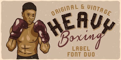
- Heavy Boxing by Vozzy,
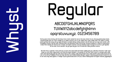
$10.00 - Whyst by Typotheticals,
$2.20 - The Phamelo by madeDeduk,
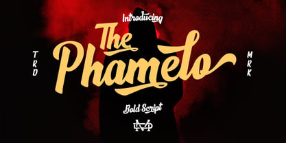
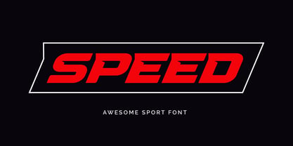
$18.00The Phamelo is a Modern bold script and this perfect for all your designs project, event and more. Feature - UPPERCASE - lowercase - Number & Symbol - International Glyphs - Alternative UPPERCASE - Alternative lowercase - Swashes If you need anything else just shoot me on email at: dedukvic@gmail.com Hope you enjoy it. - Speed by Artyway,
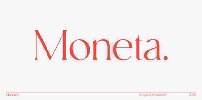
$16.00 - Moneta by Monotype,
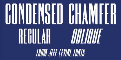
$35.99 - Condensed Chamfer JNL by Jeff Levine,
$29.00 - Lard Pro by The Type Fetish,
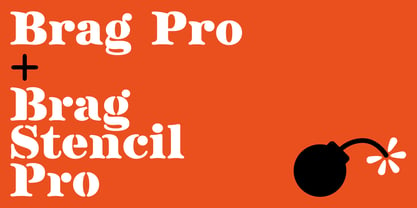
$25.00 - Brag Pro by Eclectotype,
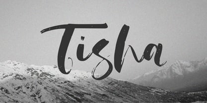
$36.00 - Tisha by Epiclinez,
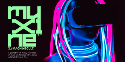
$18.00Tisha is an authentic brush display font. It has a bold, rough texture and as a result, it makes each of your creative designs stand out. So what's included : Basic Latin A-Z & a-z Numbers, symbols, and punctuations Swashes and ligatures Accented Characters : ÀÁÂÃÄÅÆÇÈÉÊËÌÍÎÏÑÒÓÔÕÖØŒŠÙÚÛÜŸÝŽàáâãäåæçèéêëìíîïñòóôõöøœšùúûüýÿžß Thank you - MuX1ne by Machine Cult,
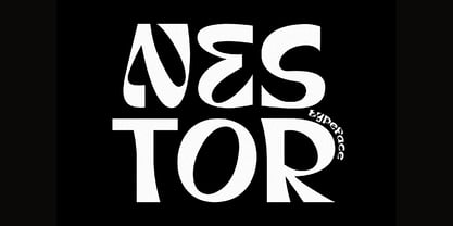
$14.00 - Nestor Quirky Typeface by Hipfonts,
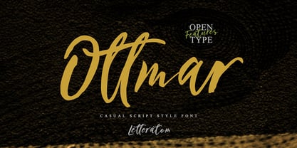
$18.00 - Ottmar by Atom,
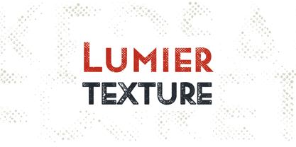
$17.00 - Lumier Texture by Tour De Force,
$15.00 - Movie Production JNL by Jeff Levine,
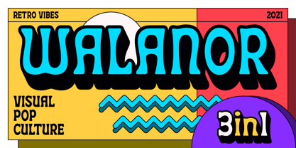
$29.00 - Walanor by Konstantine Studio,
$10.00 - Shabon Dama by Abdulrhman Saeed,
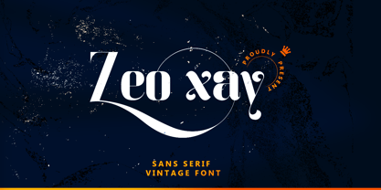
$19.99 - Zeo xay by Saxofont,
$25.00 - Michael by Tanincreate,
$10.00Michael Script - a casual handwritten style font with a range of ligatures, opentype stylistic ends, decorative swashes, perfect for any awesome projects that need handwriting taste. Suggested for logos, titles, body texts, branding, invitations and also when used along other fonts with strong and bold styles. - MC Mackley by Maulana Creative,
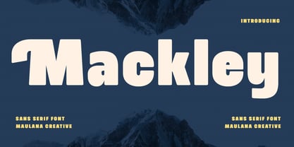
$14.00Mackley is a round extrabold sans display font. XBold stroke, fun character with a bit of ligatures and stylistic. To give you an extra creative work. Mackley font support multilingual more than 100+ language. This font is good for logo design, Social media, Movie Titles, Books Titles, a short text even a long text letter and good for your secondary text font with script or serif. Make a stunning work with Mackley font. Cheers, Maulana Creative - Denne's Aliens, crafted by the talented Denise Bentulan, stands out as an artistic font that presents a playful and imaginative twist on conventional typography. Its name alone evokes a sense of curi...
- Blocked Off by Kimberly Geswein is a delightful meld of whimsy and structure, capturing attention with its unique charm and playful aura. The font embodies a sense of creativity that's instantly reco...
- Kalenderblatt Grotesk is a true gem in the world of typography, crafted by the talented Dieter Steffmann. This particular font marries the enduring appeal of grotesque design with Steffmann's unique ...
- Mexcellent, a vibrant and retro-inspired font designed by Ray Larabie, transports its audience straight into the heart of the late 20th century's burgeoning pop culture with a particular nod to the n...
- The "Psychotic" font, though a hypothetical creation for this description, would likely embody a daring and unbridled aesthetic, resonating with themes of unpredictability and intense emotional expre...
- Antique by Storm Type Foundry,
$26.00The concept of the Baroque Roman type face is something which is remote from us. Ungrateful theorists gave Baroque type faces the ill-sounding attribute "Transitional", as if the Baroque Roman type face wilfully diverted from the tradition and at the same time did not manage to mature. This "transition" was originally meant as an intermediate stage between the Aldine/Garamond Roman face of the Renaissance, and its modern counterpart, as represented by Bodoni or Didot. Otherwise there was also a "transition" from a slanted axis of the shadow to a perpendicular one. What a petty detail led to the pejorative designation of Baroque type faces! If a bookseller were to tell his customers that they are about to choose a book which is set in some sort of transitional type face, he would probably go bust. After all, a reader, for his money, would not put up with some typographical experimentation. He wants to read a book without losing his eyesight while doing so. Nevertheless, it was Baroque typography which gave the world the most legible type faces. In those days the craft of punch-cutting was gradually separating itself from that of book-printing, but also from publishing and bookselling. Previously all these activities could be performed by a single person. The punch-cutter, who at that time was already fully occupied with the production of letters, achieved better results than he would have achieved if his creative talents were to be diffused in a printing office or a bookseller's shop. Thus it was possible that for example the printer John Baskerville did not cut a single letter in his entire lifetime, for he used the services of the accomplished punch-cutter John Handy. It became the custom that one type founder supplied type to multiple printing offices, so that the same type faces appeared in various parts of the world. The type face was losing its national character. In the Renaissance period it is still quite easy to distinguish for example a French Roman type face from a Venetian one; in the Baroque period this could be achieved only with great difficulties. Imagination and variety of shapes, which so far have been reserved only to the fine arts, now come into play. Thanks to technological progress, book printers are now able to reproduce hairstrokes and imitate calligraphic type faces. Scripts and elaborate ornaments are no longer the privilege of copper-engravers. Also the appearance of the basic, body design is slowly undergoing a change. The Renaissance canonical stiffness is now replaced with colour and contrast. The page of the book is suddenly darker, its lay-out more varied and its lines more compact. For Baroque type designers made a simple, yet ingenious discovery - they enlarged the x-height and reduced the ascenders to the cap-height. The type face thus became seemingly larger, and hence more legible, but at the same time more economical in composition; the type area was increasing to the detriment of the margins. Paper was expensive, and the aim of all the publishers was, therefore, to sell as many ideas in as small a book block as possible. A narrowed, bold majuscule, designed for use on the title page, appeared for the first time in the Late Baroque period. Also the title page was laid out with the highest possible economy. It comprised as a rule the brief contents of the book and the address of the bookseller, i.e. roughly that which is now placed on the flaps and in the imprint lines. Bold upper-case letters in the first line dramatically give way to the more subtle italics, the third line is highlighted with vermilion; a few words set in lower-case letters are scattered in-between, and then vermilion appears again. Somewhere in the middle there is an ornament, a monogram or an engraving as a kind of climax of the drama, while at the foot of the title-page all this din is quietened by a line with the name of the printer and the year expressed in Roman numerals, set in 8-point body size. Every Baroque title-page could well pass muster as a striking poster. The pride of every book printer was the publication of a type specimen book - a typographical manual. Among these manuals the one published by Fournier stands out - also as regards the selection of the texts for the specimen type matter. It reveals the scope of knowledge and education of the master typographers of that period. The same Fournier established a system of typographical measurement which, revised by Didot, is still used today. Baskerville introduced the smoothing of paper by a hot steel roller, in order that he could print astonishingly sharp letters, etc. ... In other words - Baroque typography deserves anything else but the attribute "transitional". In the first half of the 18th century, besides persons whose names are prominent and well-known up to the present, as was Caslon, there were many type founders who did not manage to publish their manuals or forgot to become famous in some other way. They often imitated the type faces of their more experienced contemporaries, but many of them arrived at a quite strange, even weird originality, which ran completely outside the mainstream of typographical art. The prints from which we have drawn inspiration for these six digital designs come from Paris, Vienna and Prague, from the period around 1750. The transcription of letters in their intact form is our firm principle. Does it mean, therefore, that the task of the digital restorer is to copy meticulously the outline of the letter with all inadequacies of the particular imprint? No. The type face should not to evoke the rustic atmosphere of letterpress after printing, but to analyze the appearance of the punches before they are imprinted. It is also necessary to take account of the size of the type face and to avoid excessive enlargement or reduction. Let us keep in mind that every size requires its own design. The longer we work on the computer where a change in size is child's play, the more we are convinced that the appearance of a letter is tied to its proportions, and therefore, to a fixed size. We are also aware of the fact that the computer is a straightjacket of the type face and that the dictate of mathematical vectors effectively kills any hint of naturalness. That is why we strive to preserve in these six alphabets the numerous anomalies to which later no type designer ever returned due to their obvious eccentricity. Please accept this PostScript study as an attempt (possibly futile, possibly inspirational) to brush up the warm magic of Baroque prints. Hopefully it will give pleasure in today's modern type designer's nihilism. - Tempest - Unknown license
- Art Lesson JNL by Jeff Levine,
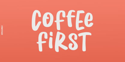
$29.00The hand-lettered title of a vintage Walter Foster "how to draw" book inspired the Deco-influenced alphabet of Art Lesson JNL. Bold and retro in nature, this typeface gets the message across in a straightforward way, yet still has a bit of a casual feel to it. - Coffee First by Epiclinez,
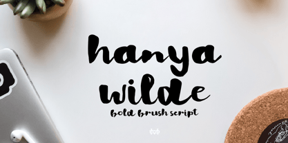
$18.00Coffee First is a bold handwritten font, carefully handcrafted to become a true favorite. Its casual charm makes it appear wonderfully down-to-earth, readable, and ultimately, incredibly versatile. Coffee First will look outstanding in any context, whether it’s being used on busy backgrounds or as a standalone headline! - Hanya Wilde by madeDeduk,
$16.00Really excited to introduce Hanya Wilde is a bold brush script! Hanya Wilde will be perfect for all your designs project. Hanya Wilde Included: Uppercase Lowercase Number & Symbol International Glyphs Alternative Ligature If you need anything else just shoot me on email at: dedukvic@gmail.com Hope you enjoy it. - Alquitran Stencil by RodrigoTypo,
$45.00Alquitran Stencil is a variant of Alquitran Pro. Alquitran stencil is specially designed for titles, with stencil effect.,Iin addition to Regular and Bold Alquitran Stencil also contains Rough and Rounded with additionally traces Extras (1-2) that are dingbats that support the text to look much more realistic. - Weekend Plans JNL by Jeff Levine,
$29.00 - Outdoor Cafe JNL by Jeff Levine,
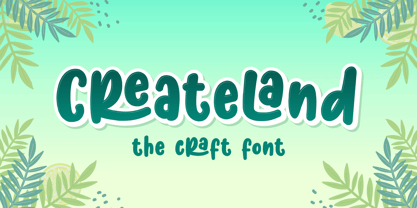
$29.00 - Createland by Awan Senja,
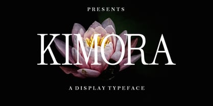
$14.00Createland is a bold display font, carefully handcrafted to become a true favorite. Its casual charm makes it appear wonderfully down-to-earth, readable and, ultimately, incredibly versatile. Createland will look outstanding in any context, whether it�s being used on busy backgrounds or as a standalone headline! - Kimora by Scoothtype,
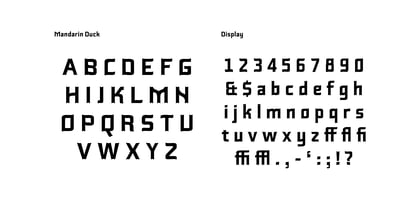
$9.00 - Mandarin Duck by Yasemin Varlik,
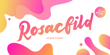
$10.00 - Rosacfild by Brithos Type,
$11.00Rosacfild is a bold script font. This fantastic typeface is best suited for headlines of all sizes, as well as for blocks of text that have both maximum and minimum variations. Use it to create standout headings, promote your online sales, Instagram quotes, business cards, t-shirts, and invitations. - Rush Turbo by Letterena Studios,
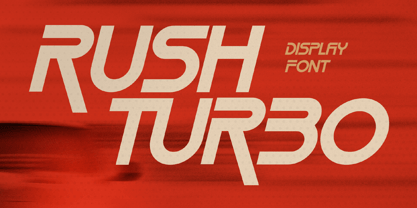
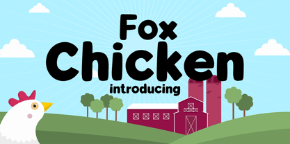
$9.00 - Fox Chicken by Fox7,
$12.00 - Morgan Nice Two by Mightyfire,
$10.00 - Churchward Legible by BluHead Studio,
$25.00Churchward Legible is an extensive typeface family designed by New Zealand type designer Joseph Churchward. A geometric sans serif, it is, as its name boasts, highly legible and readable on screen as well as in print. The family includes five weights from Light to Extra Bold, with companion italics.
