10,000 search results
(0.115 seconds)
- Bell Martellus by Chank,
$99.00 Full of texture and regal personality, Bell Martellus was derived from a book published in 1475 by Henricus Martellus entitled “Liber Insularum.” The writing style is based on the Carolingian Script created by the Emperor Charlemagne and his scribe, Alquin of York, in the 9th century A.D. This old world lettering comes with new world OpenType capabilities, including swash caps and small caps. The James Ford Bell Library at the University of Minnesota commissioned Bill Moran to develop this font as a means of introducing their amazing collection of rare books, maps and manuscripts to a wider audience. Once the historic script was fontified by Bill, it was forwarded to Chank Co, where we added some snazzy baubles for the discriminating typographer. Everybody can enjoy the antique genuine nature of Bell Martellus, but advanced OpenType users also get extra features in Adobe CS applications.
 - Antoinette Monogrammes by Dharma Type,
$19.99 Antoinette Monogrammes is a monogram font based on old embroideries in the early 20th century by Janon Co. This font includes Upright script capitals and Normal slanted script capitals and 24 fancy frames. By combining each letters and frames, you can make your own monogram. And Every letters and frames were added handwritten effect to make warm and handcrafted impression. How about making monogram for wedding card, scrap book, stamp, logo? Upright script capitals can be accessed by typing Uppercase keys(A, B, C ....) and Slanted script capitals by lowercase key(a, b, c ...). Frames are 0-9 and exclamation mark(!), at mark(@), number sign(#), dollar($), percent(%), ascii circumflex(^), ampersand(&), asterisk(*), left and right brackets(()), period(.), comma(,), less and greater(). You need to arrange and set the position manually to finish making monograms. Please use graphic applications such as adobe illustrator or photoshop but not microsoft word.
 - 1462 Bamberg by GLC,
$38.00 Font designed from that used in Bamberg by Albrecht Pfister, in early years of printing, exactly for a book titled "Ackermann Von Böhmen" writen in old German by Johannes Von Tepl, and decorated by a lot of splendid colored carved woods. This font include "long s", naturelly, as typically medieval, but any abbreviated characters, and, curiously no german "ß", no more than "W". (The only one I did found where a hand drawn one.) In addition, the "k" have not a German gothic form. Added, the accented characters, no longer existing on this time, and capitals when was a lack. A render sheet, in the font file, makes all easy to identify on a keyboard. This font is used as variously as web-site titles, posters and fliers design, editing ancient texts... This font supports as easily enlargement as small size, remaining readable, original and beautiful, especially in capitals.
 - Mountain by Volcano Type,
$29.00Mountain is a digital revival and extension of Teutonia, an old metal typeface released by the Roos & Junge type foundry (Offenbach am Main, Germany) in 1902. Teutonia’s design was popular during both the Art Nouveau and the Constructivist eras, where similar letterforms could be seen as far away as the Soviet Union. Although it slipped under the radar during the 1930s and 40s, this style feels extremely contemporary today. Mountain’s underlying geometric feeling is reminiscent of pixels and grids, suiting it for application with music and art, as well as history. Yet this typeface is not as static as it seems at first glance; playful diagonals—like those seen on the capitals D, L, P, and W—enliven the otherwise stern horizontal and vertical motion. Teutonia was a simple upper and lowercase display type. Mountain adds upon these by adding small caps and obliqued italic companions, rounding out this typographic toolkit. - DeSoto by Stephen Rapp,
$49.00 Warm and inviting— DeSoto is a titling face sure to add a touch of grace to many projects. Its name and inspiration come from a few letters in a 1958 DeSoto magazine advertisement. Many automobile ads back then used wide faces to create a feeling of luxury and elegance. DeSoto gives you that same feeling, but in a more contemporary fashion. DeSoto’s extended width characters show a hint of old school aesthetics. It comes in four styles all featuring a balance of caps and smallcaps. As a titling face, DeSoto will work in all kinds of setting; well… maybe not death metal flyers, but who knows? Taking advantage of OpenType programming, DeSoto features include alternate characters, fractions, oldstyle figures, ligatures, case-sensitive punctuation, ornaments and swashes, and Central European language support. All features, including ornaments, are included with each weight, taking full advantage of the OpenType format.
 - Aviator SG by Spiece Graphics,
$39.00 Aviator, also known as Ventura Slim, is based on an old 1930s lettering style popularized by Carl Holmes in his wonderful book on the subject. Angular and at the same time aerodynamic, this low-waisted typeface is great for tight-fitting headlines and other condensed titling situations. You may find it equally useful in developing company logos with a truly retro look. This resurrected digital version of Aviator comes with a convenient and stylish set of alternate characters and small figures. Now enjoy your flight! Aviator is now available in the OpenType Std format. Some new characters have been added to this OpenType version including stylistic alternates and historical forms. These advanced features work in current versions of Adobe Creative Suite InDesign, Creative Suite Illustrator, and Quark XPress. Check for OpenType advanced feature support in other applications as it gradually becomes available with upgrades.
 - Costanera by W Type Foundry,
$29.00 Costanera is a neohumanist typeface with both soft strokes and endings, which is inspired by 90s typefaces. It has an organic aspect and curved finials associated to the early calligraphy, while its straight angles give Costanera a technological and futuristic impression. Costanera weights go from thin to black, thus it can be used in short-impact phrases ideally using Black or Thin weight and extensive texts selecting the Book version. On the other hand, due to its calligraphic-futuristic features Costanera is perfectly suitable for different fields, such as vanguard technology, architecture, and signage topics. This typeface is composed of a Normal and Alternative version, adding 32 weights in total. Stylistic sets, small caps, ligatures, lining and old style numbers, fractions, circle numbers and arrows are part of the Opentype features. Moreover, this project comes with 790 glyphs that allows to write in 219 languages.
 - Bodoni Classic by Wiescher Design,
$55.00 I became interested in designing Bodoni Classic because of a lazy graphic designer at Jacques Damase publishing house. He had to change a single letter on a bookcover about J. B. BODONI. The French call him Jean Baptiste instead of Giambattista! And that unknown graphic designer just took any old “J” from some newly cut Bodoni. All the new Bodoni cuts have square serifs, whereas the originals had rounded serifs and slightly concave feet. The single letter “J” with the squared off serif was for me like a road sign to start redesigning the entire Bodoni family. That’s exactly what I started in 1993 and a dozen years later I am finished. Okay, I am still adding new Bodoni Classics, but those are my personal additions. Recently I designed a family of seven »Bodonian Script« fonts, that can be mixed with most of my Bodonis. Yours very retro, Gert Wiescher
 - Privilege Sign Two JNL by Jeff Levine,
$29.00 Unique and decorative signage for many drive-ins, motels, food stores and other businesses of the 1940s had what was referred to as “privilege signs” provided by one of the major cola brands. Consisting of the brand’s emblem on a decorative panel, the remainder of the sign would carry the desired message of the storekeeper (such as “Drive-In”) in prismatic, embossed metal letters. Inspired by the Art Deco sans serif style of those vintage signs, Privilege Sign Two JNL recreates the type design in both regular and oblique versions. The typefaces are solid black, but adding a selected color and a prismatic effect from your favorite graphics program can reproduce the look and feel of those old businesses. This is a companion font to Privilege Sign JNL, which recreates the condensed sans serif lettering of other privilege signs from the 1950s and early 1960s.
 - _a e i o u - Personal use only

- Telenovela NF by Nick's Fonts,
$10.00Here's a retooling of the Art Deco classic Novel Gothic, designed by Morris Fuller Benton and Charles H. Becker for American Type Founders in 1929. We've added a little sparkle to this classic with a reflected-highlight treatment, to help create attractive and commanding headlines. Both versions include the complete Latin 1252, Central European 1250 and Turkish 1254 character sets, as well as localization for Moldovan and Romanian. - Al Milky Sundae by Aluyeah Studio,
$129.00 Hello Aluyeaholics! Introducing Milky Sundae; the sweet and chic display font. Make your designs look absolutely delicious with Milky Sundae! With more than 370+ quick access alternates and ligatures at your fingertips, you'll have endless decorative possibilities to explore. Milky Sundae is your secret ingredient for adding a touch of sweetness and uniqueness. Spice up your projects with stunning alternates and ligatures that will have everyone craving for more!
 - P22 Cigno by IHOF,
$24.95 P22 Cigno is a new digitization of the 1950s Italian typeface by Aldo Novarese for the Nebiolo foundry. This semi-formal script has a definite mid-century European flavor suitable for menus, invitations and poster work. Along with the accurate rendition of the regular weight, designer Colin Kahn has added a lighter companion font for another variation on Cigno. Both fonts feature a full Western European character set.
 - JetJaneMono by Ingrimayne Type,
$9.00 JetJaneMono is a large family of sans-serif faces which are monospaced. It is very plain (plain=plane=jet). The font family has two widths and three weights, with each upright style paired with an italics style. These twelve fonts are then duplicated with another set in which small caps replace the lower-case letters. The typeface was created in 1994 and in 2021 the condensed widths were added.
 - Starless Shutters by PizzaDude.dk,
$16.00 Starless Shutters is my slightly rough handmade all-caps headline font. With its crunchy outline, the font is suitable for most things that needs an organic look. That could be organic products, children's books or toys, book covers or poster. I have added 4 slightly different versions of each letter, and they automatically cycles as you type - or you can manually choose the ones that suits you the best.
 - Floyal Rush by PizzaDude.dk,
$18.00 Floyal Rush is 100% handmade, it’s organic looking and super friendly in a funky wobbly way! Although inspired by grafitti, Floyal Rush has got this cartoon and whimsical vibe to it. I don’t know about using Flyal Rush for massive text, but I would suggest short words and shout-outs - but I dare you! Go ahead and challenge me! I have added 3 versions, which fit together: Solid, Shine and Regular.
 - LTC Goudy Text by Lanston Type Co.,
$39.95 Frederic Goudy designed this blackletter face based on Gutenberg's 42-line Bible. The Lombardic Caps were designed as an accompaniment to Goudy Text and are offered paired with the lower case as an alternate option. The Goudy Text Shaded is an inline variant that was added later by Lanston Monotype. Both varieties of capitals, as well as an expanded Central European character set, are offered in the Opentype set versions.
 - Meyer Two by Font Bureau,
$40.00 Meyer Two captures the early Hollywood flavor and nostalgia of silent-film intertitles. From 1922 through 1928, Mergenthaler Linotype cut five fonts to Louis B. Meyer’s personal specifications. Meyer Two, drawn in 1926, curiously combines Cleland’s ATF Della Robbia capitals of 1902 with lowercase and figures from ATF Post Monotone No. 2, also from the same period. Meyer Two was revived, with a Condensed added, by David Berlow; FB 1994
 - Rummy Tall by Bunny Dojo,
$23.00 Rummy, the stout, scrappy font inspired by sports branding and 1940s film, has grown up and is ready to take on new responsibilities. The result: Rummy Tall. Still powerful, precise, and packed with personality, Rummy Tall's added height brings with it even more versatile charm. Track Rummy Tall tightly for a sturdy foundation, or give Rummy Tall some breathing room for an unexpected air of nobility. Reach new heights!
 - Overskrift by PizzaDude.dk,
$17.00 Overskrift is headline in danish. My mind was set on making a font suitable for headlines, and that is exactly what this font is useful for - but, I found it suitable for many other things as well. I was thinking about packaging, posters, postcards and other things that needs a super legible handmade font! I have added 5 different versions of each letter, and they automatically cycle as you type!
 - Packard Patrician NF by Nick's Fonts,
$10.00Here’s a new take on the hand-lettered alphabet Oswald Bruce Cooper used in ads for the Packard Motor Company, later converted into a metal typeface by the Barnhard Brothers & Spindler foundry. This version has smoother outlines and an increased x-height, but retains all of the elegant charm of the original. Both versions of this font include the complete Unicode Latin 1252 and Central European 1250 character sets. - Lindau by SIAS,
$39.90 Lindau is a new take on the Jensonian Roman typeface genre. The idea was to combine the Venetian proportions with a conical shaping of the vertical parts. Lindau may be considered an alternative to fonts like Jenson, Centaur, Trump Medieval or Deepdene. Suitable for ads, stationary, branding and label design, headlines and short to medium-length text bodies. Lindau is layed out with comprehensive character support for every Euro-Latin language.
 - Comic Book by Kika Fonts,
$19.00 Designed by designer Tingnian Liu in 2015/10, Comic Book is a hand-drawn typeface specially designed for comic. Comic Book supports English, French, Spanish, Portuguese and German. It is a distinct choice for your comic book editorial challenge. Instead of adding rounded end to standard comic-type typefaces, Comic Book‘s squared ends were perfectly complementing the whole rounded style. It gives audience a cheerful feeling and makes them laugh.
 - Turquoise Inline by Resistenza,
$49.00 Turquoise Inline is a new version of our bestseller Turquoise This version of roman capitals is more focused on display use, with the details of an inline roman type. This font can be used, for ads, labels, wine labels, logo and all kind of display uses. Open Type features needs to be activated for all the ligatures and alternates. Enjoy it! We recommend to combine Turquoise Inline with Nautica Sottile & Auster
 - Karol Sans by Type-Ø-Tones,
$60.00 Karol Sans is the perfect companion for Karol, without being a literal translation of it. It has its own personality and offers a wider range of six weights and their italics which gives it added versatility. It has all the indispensable OpenType features for a text typeface like Small Capitals, different sets of figures, fractions and many others. The character set supports Latin, Central European, Baltic and Turkish languages.
 - Hard Luck by PizzaDude.dk,
$14.00 It's hard luck if you're designing a poster for a creative event, and you're looking for a good fontmatch. But it's not hard luck if you use this font for that particular purpose, because I designed it for that! How's that for good luck?! :) BTW, the font has a nice crunchy line (in all 3 versions!) and I have added 3 slightly different versions of each lowercase letter!
 - Millwal by RagamKata,
$16.00 Millwal is a vintage serif font. With many alternate features for each letter, Millwal provides flexibility and variety in the appearance of the text. Each letter has a unique alternative, adding a creative and eye-catching touch to your designs. From curvy shapes to artistic details, each character in this font displays a different kind of beauty and authenticity. Features : - Ligatures & Alternates - Letters, numbers, symbols, and punctuation - Multilingual Support
 - Al Crushider by Aluyeah Studio,
$90.00 Crushider Brush, inspired by the feeling when we see your crush, and you will see a lot of butterflies and your heart rate goes up. Crush + hider, mixed feelings that are addictive but you also want to get out of the situation. Very suitable for magazine, headline, website, ads, product package and all type of design project you have. Features: OpenType support Multilingual support (15 languages) PUA Encoded
 - Gianira by Scratch Design,
$9.00 Introducing Gianira Script is a modern handwritten with monoline shape font. This font will work for design such as poster, name card, quote, website landing page, title, packaging, clothing, prints ads, logos, branding projects, product packaging, mugs, shopping bags, t-shirts, book covers, name cards, invitation cards, greeting cards, label, photography, watermark, special events, etc. This font is complete with multi-language supports, uppercase & lowercase, punctuations, and stylistic alternates
 - Alternate Gothic Pro EF by Elsner+Flake,
$35.00 In 1903, the typeface family Alternate Gothic was developed for ATF (American Type Foundry) by Morris Fuller Benton. It was Benton’s intent to solve many diverse layout problems with the development of a narrow Sans with different width values. The Alternate Gothic enjoys great popularity to this day. Therefore, Elsner+Flake re-worked the typeface family, added all European fixed accents and complemented it with an Antique version.
 - Renulyia by Aisyah,
$12.00 Renulyia is a cute handwriting font that features a playful and casual style. It has a personal and unique touch, with strokes that mimic the look of hand-written letters. This font is perfect for adding a touch of cuteness to your designs, such as invitations, posters, or social media posts. The font is versatile and can be used for various projects, from informal to more formal ones.
 - Broodim by Twinletter,
$18.00 The Broodim Groovy font is unique, stylish, and fun. Having an anatomical shape between thin and thick lines makes it beautiful and visually unique from most other fonts. Your project can be made more stunning by adding this font. Not only that, but this font also features cool alternative letters and ligatures to add a unique flair to your projects. Make the most of your designs by using this font today.
 - Billabong by Type Associates,
$32.95 Billabong has its origins in the handlettered 40s and 50s script headings that seem to have endured especially in signage when style doesn't matter too much. Unlike today’s scripts Billabong is tightly spaced and Opentype font features allow for a myriad of ligatures to improve fit and evenness of color. Users can select their choice of strokes, ornaments and ending flourishes for added emphasis and style. Download comprehensive User Guide here.
 - Pastrami by Font Kitchen,
$9.99 Enjoy Font Kitchen’s all-natural Pastrami! This rounded geometric sans is served with a tall glass of ligatures, a heaping portion of all kinds of fractions, and your choice of stylistic alternates. Inspired by warm, whimsical typefaces of 70s American diners, Pastrami is perfect for adding a stylized charm to your next piece. Available in seven weights, Pastrami is sure to add a dash of flavor to your next project.
 - Thessallone by Wacaksara co,
$16.00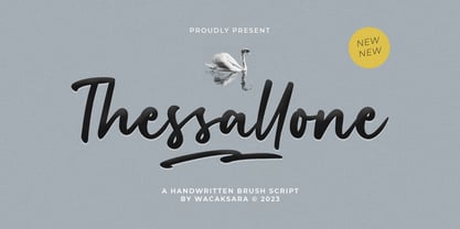 Thessallone is a handwritten brush script font. Perfect for adding a unique impression that looks natural like manual handwriting when opentype is active. This font is great for your next creative project such as Logotype, printed quotes, invitations, cards, product packaging, headers, letterhead, poster, apparel design, label, book cover and etc. Thessallone comes with uppercase, lowercase, numerals, punctuations and so many ligatures variation to let you customise your designs. Thanks
 - Beach Please Vintage by Resistenza,
$39.00 Beach Please Vintage Is a font family designed with pointed brush and watercolours adding a grunge-rough texture.After the success of Beach Please, we release a new version, keeping the relaxed and tender brush, a bit inspired by sign painting. The caps have a bizarre look because of the reversed contrast on some letters. We have a slanted, wide version for each weight. More about Opentype Features: https://bit.ly/opentype-rsz
 - Lazurski by ParaType,
$30.00 Designed at Polygraphmash type design bureau in 1984 by Vladimir Yefimov, with the addition of demi and demi italic. Based on a hot-metal typeface (1962) by Moscow book designer Vadim Lazurski (1909–1994), inspired by the early 16th century typefaces of Italian Renaissance. The typeface is useful for text and display composition, in fiction and art books. An 'expert set' was added by ParaType (ParaGraph) in 1997.
 - Mystery Show JNL by Jeff Levine,
$29.00 Mystery Show JNL was modeled after the hand lettered titles found on various early episodes of the 1950s TV suspense program "Alfred Hitchcock Presents". The design emulates characteristics found in Frederic W. Goudy's Copperplate Gothic [a sans serif of equal stroke weights with tiny spurs added], but is considered a serif font by the addition of the spurs. Mystery Show JNL is available in both regular and oblique versions.
 - Organic Respect by Bogstav,
$17.00 Organic Respect is my monospaced and organic slab serif font. Although the font is monospaced - which may not lead your mind to something organic - I did my best to make the letters appear vibrant and lively in an organic way. I've added 6 slightly different letters for you to choose from, and they automatically cycle as you type, or you can manually select them from the glyph menu.
 - Gronau by Zetafonts,
$35.00 Andrea Tartarelli discovered the letterforms that would inspire his Gronau family in a 1912 specimen that showcased the typeface Fette Reichs-Deutsch, designed by Wilhelm Gronau in 1902. Fette Reichs Deutsch has been digitised by Tartarelli as Gronau Fette. With Gronau Neue, Tartarelli tried to find a contemporary, gestural interpretation of blackletter shapes, adding a slightly calligraphic look and feel to the original hasty lines and energetic construction.
