10,000 search results
(0.051 seconds)
- Dottingham by Sharkshock,
$115.00 Dottingham is a vintage style display font with a look that will take you back to the Victorian era. Inspiration for this 2 member family came from signage, publications, and old advertisements that appeared not only in Europe, but North America as well during the 19th century. Exaggerated serifs, wispy strokes, and high contrast dominate the character set. For those looking for a bit more authenticity, a distressed version is available for a straight-out-of-the-box eroded look. This unique styling makes it a strong choice when attention is paramount to your project. Dottingham is equipped with Basic Latin, Extended Latin/diacritics, kerning, ligatures, fractions, and some alternates. Use it for a Pub logo, book cover, or restaurant menu.
 - Versal, crafted by the talented typeface designer Juan Casco, is a testament to the intricate blending of creativity and precision in typography. This font stands out for its elegant and distinctive ...
- JT Collect by OGJ Type Design,
$35.00 JT Collect is a hybrid sans-serif typeface for the 21st century that takes a playful approach to the type design heritages of Germany and Switzerland. Confidently built on a geometric structure and infused with elements from traditional grotesque typefaces, it hits the sweet spot between geo and grot. I developed JT Collect purely digitally, drawing from years of experience with analog type design. The letters aren’t based on one particular source but seek to merge different type genres from the first half of the 20th century and lift them to a contemporary quality level. JT Collect is less reserved than strictly geometric designs and brings some industrial workmanship and honesty into the game. The six weights plus three optical sizes of JT Collect offer what you need to make an impact. While cool and elegant in the Light weight, the fonts show more presence on the page as they grow bolder. To this end, I drew the letterforms with a slightly unrefined, brawny air in the bolder weights. This sets them apart from the perceived purity of more geometric designs. The Book weight is ideal for short texts and medium-length copy, and the forceful Bold makes wordmarks look crisp and lets headlines radiate cosmopolitan self-confidence. JT Collect is suitable as a primary typeface for branding, advertising, packaging, stationery, posters, documents, and websites from trades and industries as diverse as food & fashion, media & makers, culture & creators, games & gems, sports & startups. Use JT Collect for film titles or watch faces, for leaflets or store signs, for business cards or billboards: this font family is as adaptable as a chameleon (and like a chameleon, it’s never boring). Try it in different contexts. You won’t be disappointed. Its adaptability also makes JT Collect a great starting point for poised and persuasive font combinations. Even a sans/sans pairing is possible due to hybrid nature of JT Collect—something that’d be hard to achieve with most other sans-serif typefaces on the market. You can add to it a heavy slab from the OGJ library, like Temper Wide. You might go for a geometric or a grotesque typeface as secondary (text) typeface. Or you could set your body copy in a classic serif typeface such as Caslon, Sabon, or Plantin. That’s right: JT Collect is a true team player. Whether you need a grotesque or a geometric sans: try JT Collect. You can get the best of both worlds.
 - Phil Yeh by Comicraft,
$19.00 Since 1985, Cartoonists Across America & The World have been promoting literacy, creativity, the arts, and other positive issues using cartoons and humor. Founder Phil Yeh and his band of artists -- including Comicraft President and First (Flying) Tiger, Richard Starkings -- create books, paint murals, take part in school assemblies, conventions, conferences and other public events for all ages throughout the world! Cartoonists Across America & The World have worked in partnership with the Center for The Book in The Library of Congress and other organizations all over the world. They have painted more than 1000 murals in 49 of the United States as well as in Canada, Mexico, Italy, England, France, Germany, Hungary, The Netherlands, China, Taiwan, Singapore, and the Cayman Islands. So we made Phil a font 'cause he's a noble soul. Avoid Extinction -- Read, Reuse, Reduce and Recycle!
 - Seaside Resort NF by Nick's Fonts,
$10.00Lettering on a 1933 booklet about certain facilities in Italy -- can you guess what they might be? -- by the Bertarelli Design Studio of Milan inspired this decidedly different and engaging monocase face. If you're looking for something that says "casual elegance," this is it. This font contains the complete Latin language character set (Unicode 1252) plus support for Central European (Unicode 1250) languages as well. - Analogue Pro by Ingo,
$42.00 very traditional forms strongly slanted italic consistant proportions extraordinary ligatures swashes alternate letters alternate figures lower case l with a hooked “foot” Believe it or not, there are hardly any sans serif fonts in which the lower case letter l also has the hooked form of an l. Instead, we readers have to constantly distinguish whether we are seeing an uppercase I or a lower case l — just take a look at the word “Illinois”... The ingoFont Analogue was developed for exactly this reason. The intent: To create a pretty much »ordinary«, even classical font with its most striking characteristic being the inclusion of the “crooked l.” As a model, I used the »mother of all sans serifs«, Akzidenz Grotesk from Berthold, with its beginnings going back to the 19th century. Analogue is so to say a new interpretation of Akzidenz Grotesk from ingoFonts. All characters — following the model — have been newly designed. And if you want to emphasize the shape of the hooked foot even more, you can also activate the alternate styles for d, h, m, n (Style Set 1). Conversely, the alternate a somewhat softens the “hooked” impression (Style Set 2). The slanted versions — it isn’t truly a real cursive font — are noticeably stronger with 13° than the italics in comparable fonts, and were given a round e with a mind of its own which distinguishes itself considerably compared to the upright characters in the overall appearance of the font. More modern and formal solutions in detail were chosen for some of the characters, for example the M was given lightly slanted sides; the a reflects the curves of the s; the “feet” of a, l and t match; the flared legs of K and R became a “foot”, too. General proportions were carried over almost completely with no changes from Akzidenz Grotesk as well as the slanted trimming on the open forms of a, c, e, s; in comparison, C, G and S were given straight endings. Analogue contains many ligatures, even discretional ligatures, plus proportional, old style as well as tabular figures. All in all, at first sight Analogue brings back memories of the charm of its well-known predecessor; and yet, many small differences give Analogue an unmistakable certain something...
 - Pleiad by URW Type Foundry,
$39.99 Seven superb scripts, to be freely mixed with one another. Alone, each of them flows nicely, but combined they reach ultimate vitality and grace. The Pleiades are one of the most beautiful constellations in the sky, and in Greek mythology they were seven divine sisters. Luxurious freedom of choice and excellent readability make Pleiad the perfect face for a variety of projects, from stylish invitations to magazine ads, from poetry books to restaurant logos. Sometimes calm, sometimes flittering – but always fair and graceful – this sublime calligraphic type family will hold an everlasting fascination.
 - Vicentina by Eurotypo,
$39.00 Vicentina has been created starting from gothic cursive calligraphy, widely used in Italy during XIV century. The ductus of Vicentina has been derived from the documents redacted by Master Domenico Dominici from Vicenza, while most of the inspiration comes from books preserved in the archives of Orvieto Cathedral (Archivi dell'Opera del Duomo di Orvieto). As a result, Vicentina takes form with an elegant, but fast and simplified ductus respect to gothic graphs, rich in ligatures and with over 400 OpenType glyphs, in perfect harmony with the rules of readability of a modern typeface.
 - Oksana Text Narrow by AndrijType,
$33.00 Oksana Text Narrow is Oksana Text, narrower by 25%. Cyrillic and Latin, with real italics and swashed initials in six weights, is always slender.
 - Oksana Text by AndrijType,
$33.00 Oksana Text Narrow is Oksana Text, narrower by 25%. Cyrillic and Latin, with real italics and swashed initials in six weights, is always slender.
 - Illuminati by Fatchair,
$9.95Originally designed as an experiment in monospacing (Illuminati Mono), Illuminati is a mixture of sans-serif and serif. The Italics have some cursive features. - Belynos by Typomancer,
$24.00 Belynos, a simple and elegant didone. Plus a bit of triangular! Font family contains from Light to Black and suitable italic for various designs.
 - Rahere Sans by ULGA Type,
$18.98 Rahere is a humanist sans with subtle features that give the typeface a distinctive, warm appearance without distracting the reader. Legible at large and small sizes, Rahere is a versatile family suitable for a wide range of applications such as annual reports, advertising, brochures, catalogues, information signage, screen text and visual identities. For projects that need to convey a sense of authority or credibility, this is the ideal sans serif to use. The family consists of six weights ranging from light to extra bold with corresponding italics and the character set covers most of the major European languages. Each weight contains lining & non-aligning numerals in both proportional & tabular spacing. The tabular numerals share the same width across all weights and styles – a must for financial tables in annual reports. Spirited and lively, the italic lowercase is more cursive and calligraphic than the roman, although it harmonises perfectly, displaying enough character to create emphasis without looking out of place. When used on its own, for pull-out quotes or poetry, the italic exudes a charm that draws attention to the text. The typeface is named after Rahere, a 12th-century Anglo-Norman priest, who founded St Bartholomew's Hospital, London in 1123. I will always be indebted to Barts (as it is now commonly known) because in 2007 I was successfully treated for relapsed testicular cancer. Way back in 1992 I designed my first sans serif, Charlotte Sans, and although it was relatively successful, I was never really satisfied with the end result: not enough weights & italics, a small character set, lack of accented characters, and my design skills were still in their infancy. Whilst Rahere shares many common elements with Charlotte Sans, it is much more than just a reworking; it represents over 20 years of accumulated knowledge and experience as a designer.
 - Reimbrandt by IKIIKOWRK,
$19.00 Proudly Present Reimbrandt - Art Nouveau Type, created by ikiiko. Reimbrandt is a classic typeface that is a perfect representation of the timelessness and romance of the past, inspired by the beautiful Art Nouveau era. This alluring typeface transports you back to a time when elegance and grace were the norm. This font exudes beauty and romance with its simple, decorative shapes reminiscent of the painstaking craftsmanship of the Art Nouveau era. This typeface is perfect for an vintage vibes, classic & vintage poster layout, fashion look book, book cover, packaging, food & beverages and also good for quotes, or simply as a stylish text overlay to any background image. What's included? Uppercase & Lowercase Number & Punctuation Multilingual Support Works on PC & Mac
 - Pascual Ferry by Comicraft,
$39.00 The slick and sexy letterforms of Ace ACTION COMICS artist, Pascual Ferry, are the latest to join our MASTERS OF COMIC BOOK ART font line. Pascual's work on the SUPERGIRLS storyline in ACTION made us want to lick each page -- but, y'know, not when anyone was looking... we know they're just comic book characters, they're not REAL and we don't fancy them or anything -- Uhhh... so we were delighted when Pascual invited us to create this stylin' sans souciant family of fonts for him. All we asked for in return was this smokin' alternate cover for the next issue of HIP FLASK... Hey, don't lick your monitor, you might get an electric shock...
 - Sagarana by Eller Type,
$35.00 Sagarana is an elegant display typeface rooted in the style of romantic or didones letterforms; however, it is a sans serif with a cleaner appearance. The contrast and the vertical stress maintain the modern style, while the terminals, the finials, the proportions and the narrow look enhance its stylish personality. It could be suitable for editorial projects such as magazines, books or even for sophisticated environments, let’s say, fashion, department store, perfumes, cosmetics and so on. Sagarana was initially inspired by a Brazilian book cover from 50’s. The name itself combines the words “saga” (as in the English sense of “story”) and “rana,” a Tupi word (Indigenous language) that roughly means “showing similarities”.
 - Liceum by Posterizer KG,
$19.00 Liceum is a calligraphic script with attractive look, created in the name of Gymnasium in ancient Athens, where Aristotle and the Peripatetics taught philosophy. The OpenType feature includes Stylistic Alternatives, Swash, Ligatures, Discretionary Ligatures, more than 150 Dingbats and Ornaments, Diacritical, and Cyrillic letters. It allows you to mix and match letter pairs to fit your design into a harmonious typographic whole (headlines). Liceum font is attractive but classical, smooth, clean, simple, elegant, and very legible. Liceum is very suitable for various purposes and design of logos, posters, brands, t-shirts, letterhead, signage, book covers, magazines, invitations, labels, menus, fashion, stationery, letterpress, book covers, diplomas, certificates, greeting cards, packaging, and other beautiful and creative things.
 - Lemands by Arterfak Project,
$18.00 Lemands is a strong-sharp serif font in condensed height. Designed with medium contrast and inspired by the modern-classic typography and the High Octane Rock genre. The serif is quietly sharp and has assertive lines and curves, giving the letterform looks solid and strong as a display font. Lemands is a display typeface that is perfect for many purposes such as a headline, sub-headline, logo, and short body text for magazines, books, fashion, quotes, youth t-shirt, signboards, logos, and many more! Available in 4 weights: Regular - Book - SemiBold - Bold. A great choice for a brave concept! Zip file featured: Uppercase Lowercase Numbers Symbols Punctuation Standard ligatures Accents : ÀÁÂÃÄÅÆÇÈÉÊËÌÍÎÏÐÑÒÓÔÕÖØÙÚÛÜÝÞßàáâãäåçèéêëìíîïñòóôõöøùúûüýþÿ ĀāĂ㥹ĆćĈĉĊċČčĎďĐđĒēĔĕĖėĘęĚěĜĝĞğĠġĤĥĦħĨĩĪīĮįİıIJijĴĵĹ弾ĿŀŁłŃńŇňŌōŎŏŐőŔŕŘř ŚśŜŝŞşŠšŤťŦŧŨũŪūŬŭŮůŰűŲųŴŵŶŷŸŹźŻżŽžẀẁẂẃẄẅ Thank you, Ramz
 - Almost Perfect by Sensatype Studio,
$15.00 A Nostalgic Elegant Serif font that we created special for elegant branding needs, with unique shape will be ready to add value of your brand. It so nice to leverage designer or product owner that need solutions to make their design look more stylish and modern. And specially for Almost font, We prepared any characters to help you create unlimited variations for your creative needs. Almost Nostalgic Serif font ready with: Ready with Regular and Italic version Preview as a inspirations that you can do with Almost font Ready with Lowercase and Uppercase characters Wish you enjoy our font. :)
 - Basic Sans Narrow by Latinotype,
$29.00 Basic Sans Narrow is a narrower version of Basic Sans. It is a family of Grotesque features with a functional, neutral and seeming clean style that looks to keep a neutral (or basic) appearance on paper, but including lots of details that give it a unique personality. Basic Sans Narrow is a sans-serif typeface well-suited for publishing projects, medium-sized text, branding, posters, headlines and more! This font family comes in 7 weights—ranging from Thin to Black—plus matching italics and it has a set of 416 characters that support 206 different languages.
 - Neogrotesk by Los Andes,
$39.00 Not of the Alps but from Los Andes. It tastes a lot more like wine than cheese. Neogrotesk is a versatile and functional workhorse typeface with a neutral look and Latin flavor. The font includes multiple typographic features such as alternates, ligatures, small caps, case-sensitive punctuation, arrows as well as lining, old style and tabular figures. Neogrotesk is the perfect choice for editorial, corporate and advertising design. This 40-style type comes in 5 weights with matching italics and contains 770 glyphs. The complete set consists of 4 sub-families: Essential, Essential Alt, Pro and Small Caps.
 - Signage by Fontador,
$36.00 Signage is not made up of grid-based dots. They are optical corrected and there is always the same distance between the dots, with the aim to create more harmonic letterforms. The dots also vary gradually in size to reflect the thickening and thinning of strokes, giving the letterforms a sophisticated overall look. Signage comes up with 3 weights and 3 italics and is perfectly suited for logos, brands, magazines and special for signage systems and mobile devices. The language support includes Western, Central and Eastern European character sets, as well as Baltic and Turkish languages.
 - Heading by Sensatype Studio,
$15.00 Heading is an Unique sans serif display font that special created for Modern needs with unique style. A New Display font that we created special for Unique branding needs, with weird style that ready to add value of your brand. It's so nice to leverage designer or product owner that need solutions to make their design look more unique and urban. Heading Display Sans Serif font ready with: Lowercase and Uppercase characters Numbers and Punctuations Ready with Regular and Italic Style Preview as a inspirations that you can do with Heading font Available for PC and Mac Wish you enjoy our font. :)
 - Human Sans by Ian Farnam,
$20.00 Human Sans is a humanist sans serif font created as an experiment. The goal, how much a simple substitution of a small set of characters could change a font's nature. In its base form, Human Sans is a humanist sans serif geared toward text. However, through stylistic sets, it can adopt a myriad of different visual styles. This includes geometric alternates, uncials alternates, contextual swash caps, and the high and low midlines, typically seen in Art Deco lettering. These features are combinable for whatever look you may need. Human Sans comes with a full set of diacritics, in 9 weights and corresponding Italics.
 - Altruiste by ParaType,
$30.00 Altruiste is a decorative slab serif typeface with distinctive sharp features. It was inspired by the idea of duplicating elements, conveying typeface a unique look. It is austere, sophisticated typography marked by light shapes, yet of a strong nature. Altruiste is the perfect choice for a wide range of tasks such as creating logos, signboards, posters, invitation cards and more. The typeface is available in 5 weights, from hairline to regular with italics. Each style contains 600 extended Latin and Cyrillic characters. Altruiste was designed by Alexey Chekulaev in 2021, based on the light styles of the Postulat typeface.
 - Sella Mella by Crowntype Studio,
$12.00 Sella Mella is a script type family of four fonts. It is inspired by Lovely Fonts and has a soft and welcoming look. Sella Mella can be used for branding, packaging and wherever you need a script font that is easy to read and smooth. Sella Mella has many ties, strokes, and alternative characters that will make your designs unique and beautiful. You can also purchase Sella Mella as a Font Family and adjust the weight of Sella Mella seamlessly between Italic and Bold weights. Note that you need design software that supports the Font Family. Thank You...
 - Archimoto V01 by Owl king project,
$37.00 Archimoto V.01 Responded to the design of working drawing techniques in the world of architecture and letters on old stuff photography lens bodies, archimoto is designed with a more modern form, a little touch of detail in the corner area is so smooth that it aims to provide comfort to the eyes, by bringing 20 sizes including italic archimoto can be used more freely and can be adjusted more extensive exploration of its use. archimoto can be used as headlines and body text, the level of readability that looks comfortable makes the arrangement of letters more beautiful.
 - Naomi Style by Sensatype Studio,
$15.00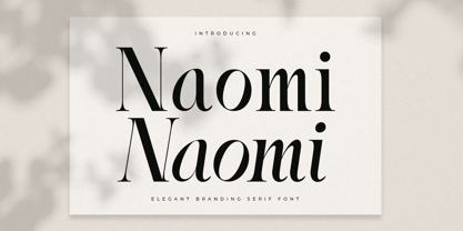 A Serif font that we created special for elegant branding needs, with extra ligature and alternates in unique shape will be ready to add value of your brand. It so nice to leverage designer or product owner that need solutions to make their design look more stylish and modern. And specially for Naomi font, We prepared any ligatures characters to help you create unlimited variations for your creative needs. Naomi Serif font ready with: Ready with Regular and Italic version Preview as a inspirations that you can do with Naomi font Ready with Lowercase and Uppercase characters Wish you enjoy our font. :)
 - Mohr Rounded by Latinotype,
$29.00 Mohr Rounded—the new version of the original Mohr typeface—features curved and softer terminals which make the font look more organic, warm and friendly. The Mohr Rounded family comes in three versions: normal, alt and italic, each with 9 weights, from Thin to Heavy, resulting in a total of 27 styles. The versatility of the font makes it suitable for a wide range of applications, from small text to high-impact headlines. Mohr Rounded also includes initial and terminal swashes in most of the uppercase and lowercase characters. This provides a greater range of uses such as branding, packaging and identity design.
 - Tide Sans by Kyle Wayne Benson,
$6.00 Tide Sans’ fresh, carefree, look makes you almost forget that you’re staring at a monitor and not on the beach. When Tide Sans is not surfing, you’ll find it at community college parties, giving free henna tattoos, or tossing a Frisbee to the dachshund next door. The Tide Sans family includes beautiful italics and an equally affable condensed set. Tide Sans does the work for you by providing a ridiculously large stylistic alternates set, fine tuned small caps, and a whole beach of alternate (amper)sands to feel between your toes. Also check out its kid brother, Tide Sans Condensed.
 - Edensor by Factory738,
$15.00 Edensor is a playful yet romantic serif. It teases your eyes with its curves yet still able to maintain its classy composure. The variety of weights provide a range of choices that will help you find the best typographic colour. The available stylistic Ligature and Alternate offer a perfect font for anything your creativity takes you. 2 Styles (Regular and Italic) Basic Latin A-Z and a-z Numerals & Punctuation Stylistic Alternates & Ligatures Multilingual Support for ä ö ü Ä Ö Ü ... Free updates and feature additions Thanks for looking, and I hope you enjoy it.
 - Kinn by Stawix,
$30.00 Kinn is an industrial san-serif typeface with an essence of squared structure inspired by a futuristic look. Kinn is robust but portray a friendly touch with a little roundness to its shape, it can also be very formal when it needs to but it is flexible and fun to use at the same time. Its wide proportion makes it ideally suited a wide range of modern applications and variety of usage from heavy display, headlines or even text. Kinn comes in 9 consecutive weights, each weight accompany with italics. Equipped with Alternates, Ligatures and 10 Cryptocurrency signs.
 - Ant Serif by LNP Fonts,
$9.99 Ant Serif is a font that can be used for advertising, logo creation, webfonts and more. The font comes in two styles, Regular and Italic and has all the characters in the Latin Basic, Additional and Extended scripts. The font's design came from my love of Marvel's Ant-Man and the Wasp logo. The typeface used, which was custom, was of interest for me, so I decided to create it as a font. It's not a perfect font, but I have put work to make sure it looked as decent as possible. Hope you'll enjoy it!
 - Starting Linup by Sensatype Studio,
$15.00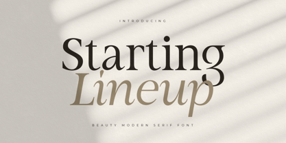 A Modern Beauty Serif font that we created special for elegant branding needs, with unique shape will be ready to add value of your brand. It so nice to leverage designer or product owner that need solutions to make their design look more stylish and modern. And specially for Almost font, We prepared any characters to help you create unlimited variations for your creative needs. Starting Lineup Beauty Modern Serif Font Family ready with: Ready with Regular and Italic version Preview as a inspirations that you can do with Starting Lineup font Ready with Lowercase and Uppercase characters Wish you enjoy our font. :)
 - Upcoming by Sensatype Studio,
$15.00 Upcoming is an Unique sans serif display font that special created for Modern needs with unique style. A New Display font that we created special for Unique branding needs, with weird style that ready to add value of your brand. It's so nice to leverage designer or product owner that need solutions to make their design look more unique and urban. Upcoming Unique Display Sans Serif font ready with: Lowercase and Uppercase characters Numbers and Punctuations Ready with Regular and Italic Style Preview as a inspirations that you can do with Upcoming font Available for PC and Mac Wish you enjoy our font. :)
 - Westbourne Serif by Typetemp Studio,
$20.00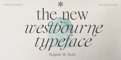 Westbourne Modern Serif Typeface is a stylish font It has both modern look. Comes with alternatives and ligatures, helps to create stunning logos, quotes, posts, blog posts. branding projects, magazine imagery, wedding invitations, and much more. WHAT'S YOU GET ? Westbourne Regular and Italic Unique Letterforms Works on PC & Mac Simple Installations Accessible in the Adobe Illustrator, Adobe Photoshop, Microsoft Word Fully accessible without additional design software. I really hope you'll get pleasure using Westbourne font and it will be perfect addition to your font collection! Contact me with an inbox message If you have any question. Thank you! Happy Creating.
 - Bogue by Melvastype,
$29.00 Bogue is a soft serif type family of 8 weights and matching italics. The soft forms gives it a friendly and approachable character with a hint of retro feeling. Bogue comes with a lots of stylistic alternates that makes it very versatile in various uses like logos, editorial design, branding, web design, package design and much more. You can use it to create short powerful phrases and headlines and also use it in longer text like lead paragraphs and body texts. So if you are looking for a versatile soft serif font with a friendly character you have found it!
 - Jessi Neue by Nois,
$18.00 Jessie Neue in a new Serif typeface inspired by popular '70s fonts mixed with grotesque touches. It has ligatures that make it more elegant and grotesque elements that give it a modern look and make it more versatile. Jessi Neue has a great performance in large body texts and also in high impact headlines. The family has four weights and also a variable version to give more creative freedom. It has 667 characters that covers the following languages: Basic Latin, Western European, Central European, South Eastern European, Vietnamese, Pinyin and Basic Greek. The italic version will arrive soon.
 - Grotesk Polski FA by Fontarte,
$39.00 Grotesk Polski FA developed in 1998-2006, was inspired by the Polish eminent pre-WWII text typeface - Antykwa Półtawskiego. Adam Półtawski designing his antiqua had took into consideration the special qualities of Polish language. He designed unique letters: k, w, y, z and R, K, Y. Another unique element of his typeface was polygonal dot. Grotesk Polski keeps all that shapes and goes further. It is a contemporary sans serif in four cuts: Regular, Italic, Bold and Stencil. The proportions of the typeface were rebalanced to give it a neo-grotesque form with a Polish twist.
 - Sourta by HansCo,
$15.00 SOURTA is a sharp italic and bold font with unique style that will make your design looks modern and futuristic. You can use this font for any purpose, especially to make logotype like a technology or sports logo brand. This typeface is comes in uppercase, lowercase, punctuation, symbols, numerals, etc also support multilingual. Highly recommended to use it in OpenType capable software - there are plenty out there nowadays as technology catches up with design. The OpenType features can be accessed by using programs such as Adobe Illustrator, Adobe InDesign, Adobe Photoshop Corel Draw X version, Afinity and more. Enjoy!