10,000 search results
(0.037 seconds)
- Corsa Grotesk by Typedepot,
$39.00 Corsa Grotesk is our very own tribute to two typographic giants: the Futura and Avenir typefaces. It is Designed with geometric simplicity in mind with well balanced strokes and modern touch. Generous proportions and x-height with more contemporary details - the single story ‘a’ and the horizontally barred ‘k’ being just two of many examples makes it shine in every jobs it takes. Corsa Grotesk blends the classic geometric aesthetics into a well-balanced font with generous proportions and minimal contrast. It features 10 weights ranging from Hairline to Black plus matching italics, as well as Cyrillic support for Bulgarian and Russian localizations. Filled with all the essential OpenType features like tabular figures, fractions, ligatures etc, it is a great choice for branding, advertising, user interfaces or any text that needs a bit of polish and a slick, present-day look that still feels familiar. With its 2.0 version we managed to polish the font even more. We revisited every path and fixed all the inaccuracies throughout. Corsa Grotesk now comes with way better and consistent spacing and kerning, just the right amount of contrast and balance. Live Tester | Download Demo Fonts | Subscribe
 - Sintesi Serif by FSdesign-Salmina,
$- Sans meets serif. Would you like to express tradition by using a contemporary font? Sintesi might be exactly what you are looking for. Sintesi stands for synthesis: the unification of serif and sans-serif into a contemporary font, which surprises with different facets depending on its application. In copy size Sintesi performs like a sans-serif. It is a compact and well readable font that fulfills all requirements of modern digital media. In larger sizes, Sintesi unfolds its traditional character. Now, its strong contrast and the perceptible feather-ductus stand out clearly, as we appreciate it in a historical old style face. Sintesi is completed by a suitable italic. Its cursive character has more to do with writing-speed than to moderate inclination. Therefore Sintesi may be well-suited for many other purposes, not only for emphasis. The whole font family consists of 20 styles and offers a wide range of Western and Eastern European special characters, typographical ligatures, uppercase, oldstyle and fraction figures. Sintesi (Serif) builds together with Sintesi Semi and Sintesi Sans an extended family. Start combining antiquity with modernity! Download a free trial version of Sintesi with a reduced character set. Check it out!
 - Lemonado by Melvastype,
$29.00 Lemonado is a type family drawn with a dry brush pen. It includes upright and italic scripts and all caps fonts with brush texture or with smooth edges. Lemonado Script is playful and slightly bouncing connecting script. It includes two sets of lower cases to increase the hand writing effect. By enabling Contextual Alternates from OpenType panel you can cycle these two sets and achieve variation. Lemonado Script also includes set of lowercases without connecting stroke, you can use those in the middle of words or automatically add them at the end of words by enabling Stylistic Set 1 at the OpenType panel. There are also set of lower cases with end swashes, you can automatically add these swashes to end of words by enabling Stylistic Set 2 at the OpenType panel. Also other alternate characters and underlines are included to give you even more possibilities to play with. Lemonado Caps has two sets of upper case letters, high and low ones. You can achieve this fun looking bouncing effect by varying them. Just enable Contextual Alternates from OpenType panel and those two sets will cycle.
 - Arthur Sans by SIAS,
$34.90 Arthur Sans is a new font design in the spirit of the Art Deco era, the age of elegance, stylishness and refinement. Use this unique typeface for distinctive personal stationary, outstanding business papers, captivating brochures and invitations; for marvellous posters, wonderful menus, hotel leaflets, exciting ads … for outstanding designs. You’ll find out that Arthur Sans is your friend for more than just fine typography. Five weights plus Italics – all equipped with a comprehensive Euro-Latin character set – will hardly leave anything to be desired. Additionally, the font Arthur Sans Regular contains an outstanding extra range of 70 ornamental characters, carefully designed to the very tone of the typeface, to give you a very special kick of extra value to enchant your designs. Alternatively, you can get this set of ornaments seperately, look at the Arthur Ornaments! Arthur Sans is but one part of a greater suite of exciting fonts: you may wish to also check out the sister fonts of the gorgeous Arthur Cabinet family, which will offer you another wonderful scope of fascinating typographic possibilities. For a matching Greek font go to Artemis. And finally, Arthur’s Irish friend is the fabulous Ardagh. __________________________________________________________________________________________
 - Cinta by Tipo Pèpel,
$21.00 We are really happy to introduce you to Cinta, a brand new elegant sans serif font designed for text. It has a humanistic skeleton, dressed up with a hand-made mechanical suit, which made it rush, audacious. A dedicated tribute to the breakdown of mestizo music rhythm, bright, dreamy but completely real. Full of a broad variety of weights and versions, it’s able to produce subtle changes in the typographic stain. Perfect to make delicate hierarchy both in web and text and show the world their family background undoubtedly. Prudent and thrifty, condensed forms and with a generous x-height, it almost accidentally saves space and avoids being a spendthrift. Discreet even in the italic, slightly slanted to produce a subtle change of look on web use, will make a delightful for the most exquisite users with the audacity of modernity. Classic but not silly. Generous in abundance, with small caps, old numerals, denominators and numerators, fractions, ligatures, all you need to survive in the new modern life of Opentype with elegance. Polyglot, with support for Latin languages, Central European and Cyrillic. A delicate friend who will delight ladies and gentlemen who are discerning and cosmopolitan.
 - Coil by Brownfox,
$44.99 Coil feels comfortable like a well-worn pair of shoes. It could easily pass for an assertive industrial European sans serif of the early 1960s with its slight reverse contrast, monotonous proportions, and squared-off curves, if not for its less predictable side. What appears initially as ellipses upon closer inspection turns out to be irregular shapes, closer to an inverted egg than an oval. The s looks topsy-turvy with its higher curve that is larger than the lower. Some terminal strokes overhang the bowl (as in the a), others open flat (as in the Q, the f, the j, and the t). The resulting effect shakes up this seemingly “retro” face just to make it new. Our midcentury recollections are slightly distorted and reinterpreted by this ironic typeface making it fresh while deceptively cozy and familiar. Coil’s high x-height and even texture make it readable even in small sizes despite its tight apertures. Available in four weights with their italics, with two sets of figures, fractions, and alternates for Extended Latin and Cyrillic scripts. Designed by Vyacheslav Kirilenko and Gayaneh Bagdasaryan, 2020-21.
 - Jeko by EllenLuff,
$39.00Jeko is an exciting geometric typeface with contemporary touches. It’s born from strong elementary shapes, with clean circles interwoven with modern cuts and sharp edges. It has a distinctive voice, retaining the simplicity and elegance of classic geometric typefaces with a fresh, stylish rework. It's bold in personality and fills the space without shouting, appearing refined and confident. It’s high X-height and strong capitals sustain a large amount of visibility across all weights, and have been optically corrected for even better legibility. It has been designed as a variable font to give lots of options and access to unique type looks; however it also includes nine weights to give just as much access to creativity to those without access to variable supporting software. Aventa’s matching italics sloped at a lively 11º help give it a full range of expressions. Its distinctive character and many variables make it a versatile, stylish workhorse, great for interfaces and design. Jeko is a re-designed form of the Aventa Typeface. Each font contains just over 570 glyphs with full Western, Central, Eastern European and Cyrillic language support. Check out Larken which is a great pair for Jeko. - FF Nort by FontFont,
$72.99 FF Nort™ has all the design attributes that make for an exceptionally versatile print and web typeface – and it benefits from a distinct personality. Equally at home in long-form text copy or billboard size headlines, the family knows few boundaries. There is also a handcrafted neo-grotesque quality to the design, giving FF Nort a friendly mien and separating it from other industrial strength sans serif typefaces. Terminals are clipped at 90° angles to the stroke and counters are slightly condensed, saving space with no loss of legibility. The light weights have a subtle elegance, while the bold are commanding. All eight weights, and their italic companions, enjoy a large character set, with support for most Central and several Eastern European languages – including Cyrillic and Greek. Drawn by Jörg Hemker, the inspiration for FF Nort came from Transport, the typeface designed for Britain’s highway signage. Transport is formal, intellectual, and a model for modern street signage, but it was not intended for small sizes or continuous reading. Hemker took the basic structure of Transport and rebuilt it into a design that’s perfect for a wide range of contemporary hardcopy and digital imaging projects.
 - 1514 Paris Verand by GLC,
$20.00 This set of initial decorated letters was inspired by a font in use in the beginning of 1500s in Paris. Exactly, we have used the set that Barthélémy Verand employed for the printing of Triumphus translatez de langage Tuscan en François, (from “Triumph” of Petrarque) in the year 1514. Some letters, lacked, have been reconstructed to propose a complete alphabet. It appears that the printer used some letters to replace others, as V, turned over to make a A, or D to make a Q. The original font’s letters were drawn in white on a black background only, but it was tempting to propose a negative version in black on white. It is used as variously as web-site titles, posters and flyers design, publishing texts looking like ancient ones, or greeting cards, all various sorts of presentations, as a very decorative, elegant and luxurious additional font. This font supports strong enlargements remaining very smart and fine. It’s original medieval hight is about one inch equivalent to about four lines of characters. This font may be used with all blackletter fonts, but works particularly well with 1543 Humane Jenson, 1557 Italic and 1742 Civilite, without any anachronism.
 - Solitas Slab by insigne,
$- Slab serif, meet the curves of Solitas. The new slab sister of insigne’s successful Solitas family will turn your head with its soft, but distinct look. Solitas Slab defies the typical feel of the robust slab category with her more compact structure and rounded corners to create a confident charm that complements everything sweet from cookies and puppies to whiskers on kittens. Solitas Slab offers you a full suite of 42 well-rounded fonts that read well both in print and online. Its round, open letter types make it quick to read, and the intermediate weights execute impeccably for copy, while bolder versions make expressive headlines and subheadings. Using its subtle geometry, its seven weights and three widths along with its optically adjusted italics tackle even the most complicated, ambitious typography with heart-warming grace and poise. Solitas Slab OpenType options include titling caps, small capitals, ligatures, ordinal characters, fractions, numerator and denominator as well as superscript and subscript. Solitas Slab also supports Western European, Central and Eastern European languages. Enjoy the softer side of Solitas Slab today for your packaging, web, or print. You’ll soon find this friendly font to be one of your favorite things.
 - Trapezoidal by Ingrimayne Type,
$9.00 The letters of Trapezoidal are like sheep: they do not like being alone but want to be part of a flock. Many of the individual letters of Trapezoidal look strange and unshapely in isolation because they are designed to fit into a pattern with other letters. That pattern is formed by alternating asymmetric trapezoids, with trapezoids that are wide at the top alternating with trapezoids that are wide at the bottom. The magic of the OpenType feature of contextual alternatives (calt) automatically alternates them. The fonts in the family are largely monospaced and have very tight letter spacing. (If for some reason one wants to use only one set of the letters, the letters will overlap unless one widens character spacing.) (If D and O are too similar, use the alternative versions of D.) The family has five weights and each weight has an italics formed by flipping the trapezoidal pattern over a vertical line. Like other alternating-character typeface families from IngrimayneType, this distinctive and visually-arresting family can be used for titles or advertising. (For another but very different typeface based on alternating trapezoids, see PoultrySign.)
 - Thorfin by Mans Greback,
$39.00 Thorfin is a sharp serif typeface. Drawn and created between 2020 to 2022, this modern lettering has a distinct personality while maintaining a regularity of a body text. Thorfin gives any project a smart character with its geometric shapes and crisp edges. The Thorfin family consist of 14 fonts, such as Thin, Light, Regular, Medium, Bold, Black and Italic. Also includes a variable font! Only one font file, but the file contains multiple styles. Use the sliders in Illustrator, Photoshop or InDesign to manually set any weight and width. This gives you not only the predefined styles, but instead more than a thousand ways to customize the type to the exact look your project requires. More info about Variable Fonts: https://mansgreback.com/variable-fonts The font is built with advanced OpenType functionality and has a guaranteed top-notch quality, containing stylistic and contextual alternates, ligatures and more features; all to give you full control and customizability. It has extensive lingual support, covering all Latin-based languages, from Northern Europe to South Africa, from America to South-East Asia. It contains all characters and symbols you'll ever need, including all punctuation and numbers.
 - VAG Rounded Next by Monotype,
$57.99 VAG Rounded Next brings a classic 1970s typeface up to date, keeping all of its easy going, approachable personality but adding some much-needed versatility and language support. Originally commissioned by Volkswagen, VAG Rounded remained in use by the company until the early 90s and has also been used by Apple, Skype and Myspace. Its enduring appeal lies in its appealingly rounded terminals, and its immediate, informal tone of voice. “When you look at the Volkswagen Beetle it has these curves that are timeless and legendary,” says Steve Matteson, who led the creation of VAG Rounded Next. “I think that's what stands out in this design – that friendly aesthetic, and the simple line and circle.” This new version offers 700 glyphs with pan European language support (including Greek and Cyrllic), as well as 10 weights of upright and italic styles. New display weights Shine and Rough – which create “chocolate popsicle” and “rust” effects – are begging to be used in branding, packaging and editorial projects, while the lighter weights are well suited for text. VAG Rounded Next Variables are font files which are featuring one axis and have a preset instance from Thin to Black.
 - Stray by Tour De Force,
$25.00 Stray might be the lonesome cowboy in this big odd world, but it's his just public façade. Stray is handsome player that works well with any team or in any environment. He doesn't have a horse, but he can be the one, he can carry any weight. OK, let's talk serious now: Stray is distinctive geometric sans serif family in 9 weights and matching Italics. By it's design, Stray flirts with humanistic typefaces in some elements, while on the other side, we can see vintage letter forms as well. It is well balanced typeface, fully legible in any (reasonable) size, with power to present versatile tasks and situations. Specific joining of letter stem and bowl is one of design characteristics of Stray, so it is not just another geometric sans family, it really differs in it's own details. Contains extended Latin character map support and Cyrillic (no localizations, sorry). As any serious working horse family, it is equipped with decent OpenType features like Small Caps (for basic Latin only), Fractions, Tabular Figures, Denominator, Numerator, Ordinals and Ligatures. It also comes with small interesting set of dingbats. This Stray is not homeless, he just looks for the proper job :-)
 - URW Dock by URW Type Foundry,
$35.99URW Dock is a contemporary geometric type family inspired by the square sans typefaces of the 60s, notably the Eurostile, which is still used in countless applications to the present day. Designed to meet today's requirements for a multifunctional font, this reinterpretation includes numerous enhancements and optimizations to ensure a professional use in today's digital age. Including a wide range of styles, an extended character set and a careful composition, it has the potential to give brands, artworks, and interfaces a modern, professional and unique touch. Its high legibility and clear informative and technological appearance are perfectly suitable for infographics, signage and way-finding systems. And especially when embedded in app, gaming and infotainment software it will display its strength. While the upright styles communicate a clear, professional and informative message, the italics express a technological, dynamic and forward-thinking spirit. An extensive language support, several figure sets and a wide range of OpenType Features will make the URW Dock font family a perfectly suitable partner for a wide range of print, web and app projects. For more information please have look at the URW Dock PDF Type Specimen. - ITC New Rennie Mackintosh by ITC,
$50.99 Looking to add a little Arts & Crafts flavor to your next project? Perhaps you just need a distinctive, new sans serif design? And one with a large international character set. In either case, ITC New Rennie Mackintosh™ may be the typeface for you. Its narrow proportions saves space, and the design shines at large sizes. While it can be an excellent typeface for Art Nouveau flavored labels, name tags and chapter call-outs, this is a suite of fonts that you can also turn to for a bevy of print and on screen uses. Games and apps, as well as print headlines and menus all benefit from ITC New Rennie Mackintosh’s vintage vibe. Based on Phill Grimshaw’s original 1996 design, Monotype Studio designers reimagined the iconic family, added lowercase characters, a new weight structure of light, regular and a more robust bold design; each with an italic counterpart. In addition, a large international character set that include support for many Western and Eastern European languages – including Cyrillic and Greek – give the family a deep typographic bench. An added benefit: the new designs can also be combined with Grimshaw’s original ornament and initial character fonts.
 - Nassim Latin by Rosetta,
$60.00 Nassim is a contemporary typeface for multilingual text-setting. With its lively texture and balanced rhythm, Nassim is a proven workhorse for a vast array of applications, from literature to the sciences, scholarly publications to contemporary news. Nassim Latin is stout in colour and resolute in its construction, standing up to the demands of long-form reading. But the heartiness that keeps it going is balanced with lively details: the asymmetric serifs and calligraphic modulation allude just enough to broad-nib flourishes to keep the reader alert and looking for what comes next. Nassim has always been ahead of the curve, bridging the distinct typographic traditions of Arabic and Latin without forcing the typographer into compromise. Nassim Latin offers upright and true italic styles across five weights, supporting more than 110 languages, and designed to pair harmoniously in multi-script settings with Nassim Arabic. Beyond that, it is equipped with smart OpenType features like small caps, case-sensitive punctuation, and a full palette of ranging numerals, fractions, and superior and inferior figures ensure that Nassim Latin is up to any task, be it print publications or delivering late-breaking online news.
 - BF Rotwang Pro by BrassFonts,
$39.99 The BF Rotwang™ Pro is a contemporary new edition and re-design of a formerly design by Guido Schneider. Named after the C.L. Rotwang, the inventor of the Mensch-Maschine from the film Metropolis (1925/1926), BF Rotwang plays with the character traits of high-contrast transitional serif typefaces and Didone-style typefaces. BF Rotwang is a typeface characterized by balanced elegance. It is sensitive, sophisticated and self-confident, but unobtrusive. The heavy weights have the power and dynamic for strong headlines and exciting logotypes, the lighter cuts the elegance and lightness for use in continuous text. All letters and characters are a touch condensed, so the typeface looks compact and works space-saving. BF Rotwang™ Pro supports up to 200 Latin-based languages. The family comes with 7 weights plus matching Italics. Each font contains more than 1.220 glyphs, featuring a wide range of alternate characters, small caps, figure sets, fractions, more than 35 ligatures, many currency symbols, special characters and other useful symbols. The style sets give you the option to individualize and adjust the typeface to the requirement of your design, without changing the general visual feeling.
 - Stanger by Dora Typefoundry,
$20.00 Stanger - a sans serif look with simple, clean and visual elegance with smooth curves and beautiful ligatures, A very versatile font that works in both large and small sizes. This font is suitable for a wide variety of projects such as: headlines, logos, labels, branding projects, magazines, homeware designs, product packaging, mugs, quotes, posters, and more. It can also be more expressive and fun, thanks to the many alternatives and binders that combine harmoniously in this font and make it more interesting and versatile. Try to change alternatives, binders and you will get many options for your project which will make it bold & beautiful. Features: • Full set of uppercase, lowercase • Ligatures • Alternative • A wide variety of numbers, symbols & punctuation • Characters with accents • Support Multiple Languages • PUA encoded WHAT IS INCLUDED: • Stanger – Regular • Stanger – Italic This type of family has become the work of true love, making it as easy and fun as possible. I really hope you enjoy it! I can't wait to see what you do with Stanger Display! Feel free to use the #Dora Typefoundry and #Stanger Display font tags to show what you've done visit my Instagram : https://www.instagram.com/doratypefoundry/ Thank you!
 - Nagham by Arabetics,
$45.00 Nagham was designed using uniform glyph thickness throughout and exaggerated letter heights to offer a vertical look and feel. It supports all Arabetic scripts covered by Unicode 6.1, and the latest Arabic Supplement and Extended-A Unicode blocks, including support for Quranic texts. This font family includes two letter spacing flavors: isolated for small text and overlapped for large or display text. The two flavors come with two weights, regular and bold, each of which has normal and left-slanted Italic versions. The script design of this font family follows the Arabetics Mutamathil Taqlidi style utilizing varying x-heights. The Mutamathil Taqlidi type style uses one glyph per every basic Arabic Unicode character or letter, as defined by the Unicode Standards, and one additional final form glyph, for each freely-connecting letter of the Arabic cursive text. Nagham includes the required Lam-Alif ligatures in addition to all vowel diacritic ligatures. Soft-vowel diacritic marks (harakat) are selectively positioned with most of them appearing on similar high and low levels—top left corner—, to clearly distinguish them from the letters. Tatweel is a zero-width glyph.
 - Thorngumbald by Fettle Foundry,
$10.00 Thorngumbald is a quirky and playful sans-serif typeface designed to provide a high level of differentiion between glyphs, aiding with reading fro dyslexic and vision impaired users. It’s also a great option for any organistaion or designer looking to use something a little different. There are five weights, ranging from thin to black, with matching italics. Thorngumbald features 885 glyphs, supporting a large nuber of latin languages, with thorough kerning for accented character combinations, polish alternatives for acute accents, oldstyle and tabular figures, expanded currency symbols, contextual, discretionary, and standard ligatures, mathmatical symbols, contextual alternatives, and more. Thorough kerning has been undertaken for non-English languages, making Thorngumbald the perfect choice for organisations that need to display information in different latin-based languages. Originally launched in 2022, Thorngumbald has been through a robust process of updates and refinements and is stronger than ever. Originally featuring a core RIBBI font set, the family has grown to include additional styles for when the occasion calls for something extra. Language support includes: Bosnian, Catalan, Czech, Danish, German, English, Spanish, Estonian, Finnish, French, Irish, Croatian, Hungarian, Icelandic, Italian, Lithuanian, Latvian, Maltese, Dutch, Norwegian, Polish, Portuguese, Romanian, Slovak, Slovenian, Albanian, Swedish, Turkish.
 - Velo Serif Text by House Industries,
$33.00 Velo leads layouts with a grand tour champion’s panache but is also a hard-working design domestique for text-heavy applications. Superelliptical shapes and sturdy serifs will keep pace with contemporary culture with an aesthetic agility that will never go out of style. Velo Serif includes sixteen fonts: Twelve display styles ranging from thin to black with complementary italics and four text styles designed for longer settings. Velo Serif Display features an increased x-height for more illustrative headlines while Velo Serif Text maintains a readable cadence in high word count environments. Designed by House Industries, Christian Schwartz, Mitja Miklavčič and Ben Kiel. FEATURES Text vs Display: Velo Text maintains the distinctive style of its Display siblings, but is enhanced for optimum legibility in running text settings. Key ligature combinations keep headlines and running text flowing smoothly. Velo Serif Text includes a complete small cap alphabet to add another typographic dimension to your layouts. Select Velo Serif figures include illustrative alternates to display numerical superiority. Like all good subversives, House Industries hides in plain sight while amplifying the look, feel and style of the world’s most interesting brands, products and people. Based in Delaware, visually influencing the world.
 - Graphit by HVD Fonts,
$40.00 Graphit is a typeface designed by Lit Design Studio & curated by HvD Fonts. It combines clear, geometric shapes with edgy yet finely-crafted details. Graphit features uncompromising characters such as G, Q, f, k and 1. It works well both for impactful headlines and for reading sizes. The type family consists of six weights plus matching italics. In early 2018, Livius Dietzel & Tom Hoßfeld started developing the typeface’s essential character and released a free font named after the studio, Lit. Just a few months later, Hannes von Döhren had a look at the typeface and suggested expanding it into a family – then publishing it with HvD Fonts. They drew every single letter from scratch, and also decided to give the font a new name — Graphit. The family features six low-contrast weights, ranging from Black to Thin. Every character has been crafted to give it a distinctive and individual feel. Medium, Regular and Light are optimized for usage in copy text. For smaller font sizes & longer body copy, the alternate character set features a double-story a and a simplified Q, f, r and t for improved legibility. All fonts are manually hinted for optimal performance on digital devices.
 - PF Benchmark Pro by Parachute,
$79.00 Benchmark Pro is a carefully structured geometric typeface which works amazingly well in body text due to its simplistic nature and large x-height. The design of Benchmark Pro started out as an attempt to convert the minimalistic structure of a technical and purely geometric design into a readable modern and friendly sans serif. This was achieved by selectively changing and turning the straight lines of the initial drawings into curves and applying legibility techniques to the transformed letterforms. These letterforms have a distinct personality which is bolstered by its angular curves and open counter terminals. The result is a contemporary text typeface that looks quite fashionable. Benchmark Pro gets away from the ultra modern and mechanical structure but keeps its display nature, it gets away from the classical but still remains legible. This robust san serif type family offers an extended character set which supports simultaneously Latin, Cyrillic and Greek. All Benchmark Pro font variants have a companion italic, rounding the total family members at 14 fonts. Each font includes more than 750 glyphs and is powered with 17 opentype features. PDF Specimen Benchmark on Behance
 - Premium Sans by ZeeshanFoundry,
$40.00 Premium Sans is a professional typeface which is aspired to solve the major typographic challenges in editorial, print, Graphic design, Commercial designs and other form of templates and documents such as pdf or ms word. It has four weights light, regular, semi bold, bold. Each with an italic profile, so in total it has 8 typefaces. We created this typeface to have attention of reader in Graphic commercial designs and as well as on editorial designs. The X-height plays a great role in readability of a typeface, so we tried to give it a reasonably high x-height with accordance to ascenders and descenders. We've engineered it in such a way that it can easily be paired with script, slab serif and serif typefaces. Premium sans is made on minimum required character set which will be handy while typing currency symbols like cents, dollars or euro and also be very useful when typing the characters consisting of diacritic. We've designed it in such a way that either you write a long content for editorial purposes or you create a typographic or graphic/commercial design it will look nice and fine which is the uniqueness of this font.
 - Baker Street by Kimmy Design,
$20.00 Baker Street was inspired by a recent trip to London, England where I happened upon a bustling pub with beautiful typographic signage. Early sketches created an array of specialized ligatures from which the font really took shape. The family is comprised of regular, italic, inline and a rustic textured style. Baker Street delivers a multitude of Opentype features, primarily including hundreds of discretionary ligatures that connect letter pairs through varying flourishes. These distinct ligatures are used in combinations between two capital letters, two lowercase letters, uppercase to lowercase pairs and specific number combinations. For a number of capital and lowercase letters, large swashes expand above and below the characters. Contextual swashes are also applied to some characters when placed at the beginning or end of a word. Stylistic Alternatives and Titling Alternatives offer distinct style variations to capital letters. Tabular Lining and Oldstyle Figures provide several numerical alternatives. Lastly, the family also includes two sets of ornaments created specially to work with Baker Street’s style. With all that, Baker Street provides each and every user the tools to solve their own case. The game is on!
 - Strima by Nicolas Deslé,
$24.90 Strima is a geometric sans serif typeface that stands for minimalism and legibility. With over 1000 glyphs and extensive language support Strima offers full professional typographic features. The Strima family consists of 4 weights: light, book, medium and bold.
 - Small Baguette by RA Studio,
$12.00 A great variable font with fun ligatures. Symbols are stretched vertically like a baguette. It is perfect for eye-catching signs, posters, headers, product packaging, book cover, logotype, apparel design and etc. Display font Extended latin & Cyrillic 599 Glyphs
 - Joyscript Two by Jonahfonts,
$35.00 Joyscript-Two is an upgrade of the 'Plain-Joyscript' Font containing many more ligatures which makes it much more versatile and may be applied to many applications including headlines, logos, ads, captions, packaging, bulletins, posters, books and greeting cards.
 - Funtasy by Mirror Types,
$20.00 Funtasy is a fun font. It mixes the formal rules of traditional types, and also has the beauty of informal fantasy types. It could be useful with kids clothes, children books, birthday invitations, and with more kid related items.
 - Lonila by Rastype Studio,
$16.00 Lonila Retro Script Font with Underline is a font that is suitable for poster designs, book covers, weddings and other designs according to retro-style tastes. Lonila Retro Script Font with Underline is also equipped with multi-language. Tags
 - Saga Arjuna by Saxofont,
$18.00 Saga Arjuna is a modern, elegant and luxurious font with custom alternatives and multilingual support. With a strong desire and grace, it can be used as a logo and title. Great for books, product packaging, advertisements, brands and more.
 - Black Stamp by Andrey Font Design,
$9.00 Black Stamp is a unique, strong, and original handwritten font. Natural and elegant, this font can be used on a wide variety of designs such as headlines, titles, headings, logos, branding, posters, invitations, books, and any other creative design.
 - Asmillione by Sibelumpagi,
$18.00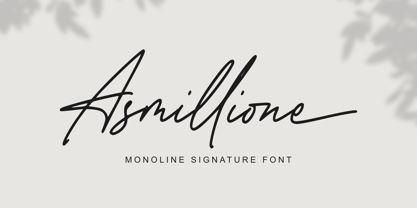 Asmillione is a monoline signature font with a handwriting feel. It comes with ligatures and alternates, also supports multiple languages. It’s perfect for logos, product packaging, wedding invitations, branding, headlines, signage, labels, signature, book covers, posters, quotes, and more.
 - Ninja Hirosi by Yoga Letter,
$16.00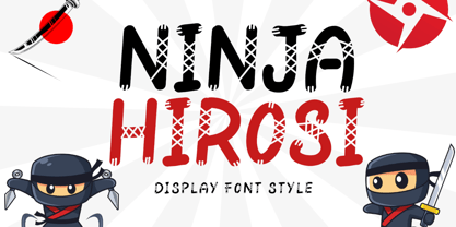 "Ninja Hirosi" is a very unique and cute display font. This font is equipped with uppercase, lowercase, numerals, punctuation, and multilingual support. Very suitable for comics, book titles, promotions, business branding, stickers, banners, branding, logos, film titles, and others.
 - Railway Depot JNL by Jeff Levine,
$29.00 A bold spur serif design found within the pages of the 1934 French lettering instruction book “L'Art du Tracé Rationnel de la Lettre” provided the inspiration for Railway Depot JNL, which is available in both regular and oblique versions.
 - Bundhers by Patria Ari,
$12.00 Bhunders - a fun handwritten typeface. With this font, you can use it for book and magazine cover, social media, headline, logo, crafts, merchandise, digital products, and more. This font available in Uppercase, Lowercase, Number, Symbol and also multilingual accent.
 - Being Strong by Subectype,
$15.00 Being Strong is a layered script and is inspired by bold, hand-lettered, vintage scripts. It includes OpenType features and additional accented characters, and is great for logotype, posters, badges, book covers, t-shirt designs, packaging and any more.
 - Abkad by limitype,
$17.00 ABKAD is a display font with a gothic style made with a more modern touch, perfect for your design projects such as merchandise, posters, book headlines, logos, etc. ABKAD is equipped with uppercase, numbers, punctuation, multilingual and unique alternate
 - Meigtan by Dicubit,
$10.00 Meigtan is a curly typeface/font designed with carefully handcrafted. This perfectly made to be applied in logo or branding, stationery, books, packaging, fashion, magazines, t-shirt, greeting or wedding cards, vintage design, novels, labels and many advertising purposes.