8,454 search results
(0.027 seconds)
- Civolis by Furiosum,
$- Civolis is a small and modest humanist sans family. Accompanied by a friendly italic, wide latin language support, oldstyle figures and ligatures, it is ready for a wide array of applications.
 - Gazeta Stencil Ds by Vanarchiv,
$31.00 This display stencil typeface is extension from Gazeta font family, where the letterform cuts are more mechanical without loosing their own natural structure. Italic versions are not available, only roman characters.
 - JH Flynn by JH Fonts,
$12.00 Jh Flynn is modern tall sans serif typeface; a variable type including eight weights: light / regular / medium / bold and the italics; Ideal for headlines, logo design, signage and short text paragraphs.
 - AeroScript by Hackberry Font Foundry,
$24.95AeroScript is a loose 50s style scribble script. - Lions Den by Jesse Tilley,
$19.95 A font inspired by 40s movie posters. Enjoy!
 - Starring by Jesse Tilley,
$19.95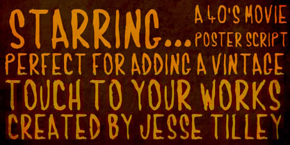 Another font inspired by 40s movie posters. Enjoy!
 - Typewriter by Monotype,
$29.00The Monotype Typewriter" series contains three typefaces. These were made to enable type to be set that could emulate output from real typewriters. Use where a typewritten look is required for reports, tabular work, where the fixed pitch nature of these faces is an advantage, technical documentation and correspondence. Typewriter Regular is the base style of the family. Typewriter Elite is lighter than Typewriter Regular, and is monotone in weight, being designed to retain readability even when multiple carbon copies are produced. Typewriter Gothic is a medium weight sans serif typewriter face designed to give good readability from a fixed pitch typeface. Originally made for daisy wheel printers, the Typewriter Gothic font is useful for tabular work, technical documents, correspondence and reports." - JWX Western by Janworx,
$19.95 The term Old West conjures up memories of vintage movies and TV shows featuring saloons and dancehall girls. Old wanted posters and cowboys. Rowdy prospectors in the Goldrush, mountains and lots of wide open space. Many of the lettering styles of those days are still in use, reflecting the past, present, and probably the future here. Western style fonts appear in the signage of bars, restaurants, casinos and ski areas. It's a style that speaks of the way it once was in a nostalgic way. This family of three fonts pays tribute to the Old West and its colorful history, with a semi-plain style, a decorated style, and a really lively rendition of our gaudy and raucous history from a century or more ago.
 - Printers in Marks by Proportional Lime,
$19.99 In the early days of printing it was soon recognized that there was a need to identify the printer and publisher behind the printed work. So these industrious people created marks to identify themselves to clients. This font contains over 160 marks dating back to the early years of printing with the likes of Fust, Ratdolt, Manutius, Caxton, and a whole host of others represented. Some of these printers were very influential and altered the course of history, some merely enabled the broader public to access the classics. Some were imprisoned and others helped foment revolutions. But all were riding the new current of this technology of moveable type that helped transform our world through the enabling of easily exchanging information.
 - 1-2-3 GO! - Personal use only

- verdy évolution - Personal use only

- Adelheid by Proportional Lime,
$4.99 Adelheid a wonderfully whimsical excursion into the realm of blackletter typefaces is a font based on a 16th century Swiss publication. With over 500 glyphs many things are added to make it a fully functional font. It is delivered in two flavors OTF, and TTF.
 - Span by Jamie Clarke Type,
$25.00 Span is a modern chiseled style family that flaunts its engraved heritage with sweeping serifs and sculptural forms. Bridging the contemporary and traditional, Span appears exuberant yet dignified. Designed primarily for luxurious headlines and titles, Span’s strong vertical stress is softened by elegant organic curves while its compact height accentuates the deep serifs. The family offers five weights, each with three widths and italics. The condensed styles provide an invaluable advantage when designing within narrow spaces. Span’s italics strike a balance between true italics and oblique letterforms to create a change in rhythm while preserving its chiselled style. A variety of additional features enhance Span's typographic capabilities including restrained swashes and flourishes are available in both roman and italic styles. Span also introduces an additional set of capitals for exceptional typographic control over uppercase settings. ‘Mid Caps’ sit midway between full-height capitals and lowercase letters and extend Span's title setting options to All Capitals, Capitals with Mid Caps and Capitals with Small Caps. Choose Span and take full control over your title settings and produce classic typography with statuesque poise. Overview: 30 styles comprised of 5 weights, 3 widths and accompanying italics Additional features include alternate characters, swashes, Small Caps and Mid Caps 987 glyphs per style See the Specimen Supported Languages: Albanian, Asturian, Basque, Breton, Bosnian, Catalan, Croatian, Czech, Danish, Dutch, English, Estonian, Faroese, Finnish, Filipino, French, Galician, German, Hungarian, Icelandic, Indonesian, Irish, Italian, Kurdish, Latin, Latvian, Lithuanian, Malay, Maltese, Moldavian, Norwegian, Occitan, Polish, Portuguese, Romanian, Samoan, Serbian (Latin), Slovak, Slovenian, Spanish, Swahili, Swedish, Tagalog, Turkish, Walloon, Welsh, Wolof, Zulu
 - Elido by Kontour Type,
$50.00 Elido (Odile in reverse) is the sans counterpart to the Odile type. Together they form a sans/serif superfamily with a wide range of variations for editorial use. Elido follows Odile’s proportions and matches the weight and typographic color of its serif twin. Elido is a sans with classical proportions. A slight geometric hint and open counters convey an airy feel. Elido’s family structure and relations within echo the conceptual approach of Odile. The arched stroke low off the stem reveals a script characteristic most pronounced in the Elido Upright Italic. This particular interpretation is gradually diminished in the Italic and becomes even less emphasized in the Regular. Six balanced weights, from an elegant Light to a pronounced Black, are in tune with three display solutions and a set of beautiful Ornaments. These variants allow for a diverse and multifaceted typography for the discerning type user. Sans serif initials amount to a rare finding. The charming monolinear Elido Initials come in two flavors, elaborate and rational, designed to hold their own in editorial and headline sizes. This type design boasts an extensive character set, many OpenType features including roman and italic Small Caps, five sets of numerals, beautiful ligatures, and many more. OT stylistic variants (with accents) offer a one-story “a” for the roman weights, alternate “g” and “s” designs for the italics, and a variant glyph “s” for the Upright Italic. These distinct qualities with its versatile and sincere traits make Elido an excellent choice for text and display use.
 - DarkPix, a font designed by the talented Juan Casco, exudes a distinct appeal that captures the essence of mystery and modern sophistication. At first glance, the font presents a bold personality, ch...
- Ongunkan Sweden Futhark by Runic World Tamgacı,
$40.00 Prior to 500 AD the 24-rune Elder Futhark was used in Sweden. From 500 AD until 800 AD there were many Futharks which were transitions from the 24-rune Futhark to one of the 16-rune Futharks. By the end of this period the 24-rune Futhark was completely out of use , and only 16-runes Futharks were in use. By 900 AD two different types of Shorttwigs-Futharks had been born. One was popularized in Norway and the other was used in the west (the British islands). By 1000 AD the adjustment of the runes to the Latin alphabet had begun, and several versions are found up until the Dalrunes, about 1700-1800 AD.
 - ITC Tyfa by ITC,
$29.99 Some words from the designer, Frantisek Storm... Designed by Josef Tyfa in 1959, digitalized by F. Storm in 1996. This Roman and Italic are well-known perhaps to all Czech graphic artists and typographers ever since their release. Although this type face in some details is under the sway of the period of its rise, its importance is timeless, in contradistinction to other famous types dating from the turn of the sixties which were found, after some time, to be trite. The italics live their own life, only their upper-case letters have the same expression as the basic design. Thin and fragile, they work excellently, emphasizing certain parts in the text by their perfect contrast of expression. When seen from a distance they are a little bit darker than the Roman face. Tyfa Roman was released in 1960 by Grafotechna in Prague for hot setting. Later on, Berthold produced letter matrices - "rulers" for Staromat devices, used for manual photosetting of display alphabets. In the eighties it was available on dry transfers of Transotype and today it is offered also by ITC. The meticulously executed designs of the individual letters in the 288 point size are arranged into a set of signs on a cardboard of about B2 in size. The yellowed paper reveals retouches by white paint on the ink. Blue lines mark the baseline, the capital line, the ascender and descender lines and the central verticals of the letters. With regard to the format of the flat scanner, the designs had to be reduced, with the use of a camera, to the format A4, i.e. to the upper-case letter height of about 30 mm. These were then scanned in 600 dpi resolution and read as a bitmap template to the FontStudio programme. The newly created bold type faces derive from Tyfa's designs of the letters "a", "n", "p", the darkness of which was increased further, approximately by 3%, to enhance their emphasizing function. The text designs have hairstrokes thickened by one third; the contrast between thin and thick strokes has been modified, in order to improve legibility, in sizes under 12 points. We have used electronic interpolation to produce the semi-bold designs. Josef Tyfa himself recommends to choose a somewhat darker design than the basic one for printing of books.
 - Narcis by VP Creative Shop,
$15.00 Introducing Narcis, the delightful retro bold script font that's bound to add a touch of nostalgia and flair to any project! This charming typeface boasts a unique blend of boldness and elegance, making it perfect for various design purposes. With its alternate and ligature glyphs, Narcis offers a wonderful range of creative possibilities. These additional characters add extra variety to your text, giving it a truly personalized and artistic feel. Whether you're designing a logo, poster, invitation, or any other project, Narcis' alternates and ligatures will help you achieve a distinct and eye-catching look. But that's not all! Narcis is also impressively versatile when it comes to language support, accommodating up to 87 languages. This means you can confidently express yourself in multiple languages without compromising on the font's aesthetics or legibility. Narcis comes in both regular and italic styles, allowing you to emphasize specific parts of your text or create a dynamic interplay between the two styles. The regular style offers a bold and confident appearance, while the italic style adds a touch of sophistication and movement to your design. Whether you're a seasoned designer or just starting on your creative journey, Narcis is sure to become your go-to font for adding that retro touch with a modern twist. Its warm and friendly demeanor will instantly win you over, making every project a joyful and visually captivating experience. So go ahead and give Narcis a try – you won't be disappointed! Language Support : Afrikaans, Albanian, Asu, Basque, Bemba, Bena, Breton, Chiga, Colognian, Cornish, Czech, Danish, Dutch, Embu, English, Estonian, Faroese, Filipino, Finnish, French, Friulian, Galician, Ganda, German, Gusi,i Hungarian, Indonesian, Irish, Italian, Jola-Fonyi, Kabuverdianu, Kalenjin, Kamba, Kikuyu, Kinyarwanda, Latvian, Lithuanian, Lower Sorbian, Luo, Luxembourgish, Luyia, Machame, Makhuwa-Meetto, Makonde, Malagasy, Maltese, Manx, Meru, Morisyen, North Ndebele, Norwegian, Bokmål, Norwegian, Nynorsk, Nyankole, Oromo, Polish, Portuguese, Quechua, Romanian, Romansh, Rombo, Rundi, Rwa, Samburu, Sango, Sangu, Scottish, Gaelic, Sena, Shambala, Shona, Slovak, Soga, Somali, Spanish, Swahili, Swedish, Swiss, German, Taita, Teso, Turkish, Upper, Sorbian, Uzbek (Latin), Volapük, Vunjo, Walser, Welsh, Western Frisian, Zulu How to access alternate glyphs? To access alternate glyphs in Adobe InDesign or Illustrator, choose Window Type & Tables Glyphs In Photoshop, choose Window Glyphs. In the panel that opens, click the Show menu and choose Alternates for Selection. Double-click an alternate's thumbnail to swap them out. Mock ups and backgrounds used are not included. Thank you! Enjoy!
 - Jenson Classico by Linotype,
$29.99In 1458, Charles VII sent the Frenchman Nicolas Jenson to learn the craft of movable type in Mainz, the city where Gutenberg was working. Jenson was supposed to return to France with his newly learned skills, but instead he traveled to Italy, as did other itinerant printers of the time. From 1468 on, he was in Venice, where he flourished as a punchcutter, printer and publisher. He was probably the first non-German printer of movable type, and he produced about 150 editions. Though his punches have vanished, his books have not, and those produced from about 1470 until his death in 1480 have served as a source of inspiration for type designers over centuries. His Roman type is often called the first true Roman." Notable in almost all Jensonian Romans is the angled crossbar on the lowercase e, which is known as the "Venetian Oldstyle e." In the 1990s, Robert Slimbach designed his contemporary interpretation, Adobe Jenson™. It was first released by Adobe in 1996, and re-released in 2000 as a full-featured OpenType font with extended language support and many typographic refinements. A remarkable tour de force, Adobe Jenson provides flexibility for a complete range of text and display composition; it has huge character sets in specially designed optical sizes for captions, text, subheads, and display. The weight range includes light, regular, semibold, and bold. Jenson did not design an italic type to accompany his roman, so Slimbach used the italic types cut by Ludovico degli Arrighi in 1524-27 as his models for the italics in Adobe Jenson. Use this family for book and magazine composition, or for display work when the design calls for a sense of graciousness and dignity. - AstroNaut by The Northern Block,
$29.00 AstroNaut is an 8 font family consisting of 4 weights with italics. It's angular construction takes influence from various science fiction films including: Blade Runner, Alien, Minority Report & 2001: A Space Odyssey.
 - Brasley by Nicolas Deslé,
$6.00 Here's Brasley, a geometric sans. Brasley is available in six weights - bold, semibold, medium, regular, light and thin - each with matching italics. It also includes contextual alternates, ligatures, fractions, arrows and shapes.
 - Ekaliptus by Yinon Ezra,
$9.90 Ekaliptus, Display Condensed and Humane Typeface, Containing 4 Weights + 4 Matched Italics, Can be used for Headlines and Logos. Two Styles that work well together to form a better tool for you.
 - Oksana Text Swash by AndrijType,
$25.00 Oksana Text Swash has swashed initials and ampersand for Oksana Text italics in six weights from Thin to Heavy. For all-in-one fonts please look to OpenType version of Oksana Text.
 - Meister Antiqua by RMU,
$35.00 Voilà, the Meister Antiqua font family, which was originally released by Typoart, Dresden, circa 1951, is again available as a remastered, modernized and digitized version, with swash caps integrated in the Italics.
 - GHEA Zartonk by Edik Ghabuzyan,
$40.00 This Typeface family include 6 Uprights and 6 Italics. This font family can be used as Display as well as text font. The font family includes Armenian, Cyrillic and Latin alphabet systems.
 - Rima by K-Type,
$20.00 Rima is a stencil display face with imposing slab serifs, designed to suggest strength, confidence, expertise and efficiency. Regular and Bold weights are included along with two handy italics (optically corrected obliques).
 - Octava by ParaType,
$30.00 PT Octava™ was designed at ParaType in 2001 by Vladimir Yefimov. The first (Cyrillic only) version named Scriptura Russica (1996) consisting of three styles (book, italic, bold) was commissioned by the Russian Bible Society. Lately the Latin letters and bold italic were added. Inspired by Lectura, 1969, by Dick Dooijes and Stone Print, 1991, by Sumner Stone. In spite of large x-height the typeface is both space saving and quite legible at small sizes. Expert fonts including small caps (book) and old style figures are available.
 - Oliva by Viktor Nübel Type Design,
$25.00 Oliva & Oliva Italic are two strong and funky display fonts. Influences came from typefaces like Futura Black by Paul Renner and Motter Ombra by Othmar Motter, but also Stilla by François Boltana and Allegro by Hans Bohn lay on the desk. All these ingredients were mixed to a new and contemporary type experience and packed in proper OpenType files Oliva & Oliva Italic are OpenType Pro, featuring full Western, Central European, Baltic, Turkish and also Cyrillic language support. They contain ligatures, superior numerals, and a stylish set of decorative ornaments and arrows.
 - Mado by Larin Type Co,
$15.00 MADO is a elegant serif font that includes two styles: regular and true Italic. This is a contrasting medium weight font and looks amazing in logos, branding, arranging wedding invitations, business cards, packaging, titles and much more, it is very readable and recognizable. This font includes alternates for Uppercase and Lowercase and ligatures for Lowercase, with them you can make your project more elegant and unique and italic style will add dynamics to your design, it also includes alternates and ligatures This font is easy to use has OpenType features.
 - Roxale Story by Reyrey Blue Std,
$16.00 Introducing - Roxale Story. a new fresh & modern serif with smooth curves. It comes with elegant style, classy, and contrasts, with features and consist of regular, italic and calligraphy italic. Roxale Story is perfect for luxury logo and branding, classy editorial design, woman magazine, cosmetic brand, fashion promotional, art gallery branding, museum, historical of architectural, boutique branding, stationery design, blog design, modern advertising design, card invitation, art quote, home decor, book/cover title, special events and any more. Features : · All Uppercase and Lowercase · Number & Symbol · Supported Languages · Alternates and Ligatures · PUA Encoded
 - Richard Starkings Brush by Comicraft,
$19.00 If you’re looking for lettering that’s a little fancy-schmancy, a little stylish, lively and free flowing, comic book lettering legend Richard Starkings has a bold, bodacious and exciting pen style for your font library! Richard Starkings Brush is exuberant and yet also quietly confident -- originally rendered with a Brush Pen, this slick new addition to the Comicraft library puts the Flam in Flamboyant. Includes four weights (Regular, Italic, Bold & Bold Italic) with automatic alternate letters, Western and Central European international characters, Vietnamese characters, and Comicraft's patented Crossbar I Technology.
 - Evil Schemes by Comicraft,
$19.00 Big Brother is watching you and vile Supervillains are afoot! The cunning characters involved in this font have devised a convoluted Machiavellian plot for world domination that encompasses mind parasites, twitter, deadly viruses in the public water system and possibly a nuclear dirty bomb in a downtown Metropolitan area to which they've strapped your girlfriend and a digital clock rapidly counting down to zero! Will Good Triumph and Defeat Evil?! Stay tuned... Features: Four fonts (Regular, Italic, Bold & Bold Italic) with upper and lowercase characters. Includes Western European international characters.
 - Ehrhardt MT by Monotype,
$29.99 The Ehrhardt name indicates that this typeface is derived from the roman and italic typefaces of stout Dutch character that the Ehrhardt foundry in Leipzig showed in a late-seventeenth-century specimen book. The designer is unknown, although some historians believe it was the Hungarian Nicholas Kis. Monotype recut the typeface for modern publishers in 1937 to 1938. Ehrhardt has a clean regularity and smooth finish that promote readability, as well as a slight degree of condensation, especially in the italic, that conserves space. Ehrhardt is a fine text face, especially for books.
 - Basile by Tipo,
$85.00 Basile is the conclusion of a process that began with the learning of italic handwriting in a roballos-Naab studio course. In this workshop I developed a variation of chancery handwriting which had a more pronounced wider than its historical model. While making the digitalization, the forms were modified to obtain a similar spirit to the one in the handwriting, but thinking about the text in small sizes. Also incorporating three sets of forms enlarged the family: italic, swash and extra swash. And the addition of initials and terminals sets.
 - ITC Bailey Sans by ITC,
$39.00ITC Bailey Sans is the first typeface family created by Kevin Bailey, a graphic designer in Dallas, Texas. He was once looking for an understated block serif for a design project and could find nothing suitable. Bailey began working on his own serif face but then found that the basics of his new design worked well as a sans serif and continued on that track. ITC Bailey Sans font is available in four weights: book, book italic, bold and bold italic and even has a companion serif display font, ITC Baily Quad Bold. - Cavita by Underground,
$29.00 Cavita typeface is a mix between both grotesque and calligraphic models: regulars have a rough grotesque spirit; while the italics where inspired in calligraphic gestures. All of these details are reinforced with an inverted modulation (horizontals strokes are thicker than usual). The italics seem to move away from the traditional concept of type system, but work very well along side. This typeface has very particular shapes and rhythm, it's different and identifiable from the rest, making it a very good option to use on every piece of design.
 - Bolded by We Make Font,
$16.00 Bolded is a new complete type family, designed and developed by creative professionals. Contains geometric and rounded features, optimized for both long texts and small screens and texts. The complete family offers seven weights divided between the basic, italic, condensed and condensed italic family. Created in 2022, Bolded has a modern and functional look, designed for the most diverse uses and projects. Bolded is a geometric rounded family that can meet the needs of the most varied professionals looking for a clean and elegant font family with a wide set of Latin characters.
 - Bandera Text by AndrijType,
$21.00 This serif typeface is a real workhorse. It is a modern tool for text design: extremely legible and well shaped. Bandera Text has six weights with original italics. It catches attention in headlines of posters and magazines or makes reading comfortable in plain texts. Don't forget to try Medium and Medium Italic faces for free. Bandera Text works well with Bandera (slab serif), Osnova (sans serif) and Bandera Display (contrast serif) fonts. Bandera is Spanish for ‘flag’. And Bandera is a symbol of Ukrainian fighting for freedom for many years.
 - Deviato by HandletterYean,
$10.00 I present to you a font that look casual and modest, Deviato. It was made to your need of a mono-line font that look simple in design and shows modesty on it’s appearance. Deviato is a mono-line font that suitable for your need of a font that can be applied in various way of design like logotype, personal or company branding, logo, quotes, daily typing font, greeting card, sticker, and many more. This font comes in regular, bold, italic, bold italic style and support multi-language.
 - Griffo Classico by Linotype,
$29.99Griffo Classico™ was produced by Franko Luin in 1993. It is a revival inspired by the types cut by Francesco Griffo for the Venetian printer Aldus Manutius at the end of the fifteenth century. The roman is based on the type Griffo cut in 1496 for Bembo's de Aetna," and the italic on a type he cut in 1501 for an edition of Virgil. Griffo did not make separate italic caps, so Luin designed his own for Griffo Classico. This is a serviceable family with five weights, including small caps.

