10,000 search results
(0.154 seconds)
- AmpleSoftPro by Soneri Type,
$60.00AmpleSoft Pro is an extended version of AmpleSoft type family. AmpleSoft Pro Includes Extended Languages Character Set for following: Azerbaijan, Belarus, Bulgaria, Czech Republic, Kazakhstan, Latvia, Lithuania, Polish, Romania, Russia, Slovakia, Ukraine, Uzbekistan, Vietnam. AmpleSoft Pro is a display type family, optical mono linear and a bit squarish in nature. It has smooth curve instead of sharp angle formed by the junction of two strokes, which is a prominent feature of its design. It is designed to be a little eye-catching yet legible. It has clear and distinguishable letterforms, which helps to elaborate and emphasis the message. It is graphically strong and command viewer's attention. The overall appearance of type is suitable in setting it as heading, title, headline, etc. The type family consists of six weights: Thin, ExLight, Light, Regular, Medium and Bold. - Fosho by Chank,
$49.00 For more than 70 years the 10-foot tall letters displaying the word FOSHAY have illuminated the Foshay Tower in the Minneapolis skyline. However, the typestyle has never been made into a font before. This new modern font family, dubbed Fosho Book, is optimized for book print usage as well as functioning as big bold display type on screen. The Fosho fonts are available in three styles: Outlines, Dotted Bulb Inlines and Composite with both. You can use the three styles in overlapping colors for dramatic chromatic effects.
 - Slam Bang Theater NF by Nick's Fonts,
$10.00This ultrabold headline font is basically patterned after the font Nubian Black, designed by Willard T. Sniffin for American Type Founders in the 1920s, but includes an unusual inline treatment of the caps. Named for the local television show on KFJZ-TV (later KTVT) in Fort Worth, Texas, that introduced a whole new generation of kids to the Three Stooges, and hosted by the erstwhile Icky Twerp. Both versions of this font contain the Unicode 1252 (Latin) and Unicode 1250 (Central European) character sets, with localization for Romanian and Moldovan. - Bodoni Highlight by Image Club,
$29.99Giambattista Bodoni (1740-1813) was called the King of Printers; he was a prolific type designer, a masterful engraver of punches and the most widely admired printer of his time. His books and typefaces were created during the 45 years he was the director of the fine press and publishing house of the Duke of Parma in Italy. He produced the best of what are known as modern" style types, basing them on the finest writing of his time. Modern types represented the ultimate typographic development of the late eighteenth and early nineteenth centuries. They have characteristics quite different from the types that preceded them; such as extreme vertical stress, fine hairlines contrasted by bold main strokes, and very subtle, almost non-existent bracketing of sharply defined hairline serifs. Bodoni saw this style as beautiful and harmonious-the natural result of writing done with a well-cut pen, and the look was fashionable and admired. Other punchcutters, such as the Didot family (1689-1853) in France, and J. E. Walbaum (1768-1839) in Germany made their own versions of the modern faces. Even though some nineteenth century critics turned up their noses and called such types shattering and chilly, today the Bodoni moderns are seen in much the same light as they were in his own time. When used with care, the Bodoni types are both romantic and elegant, with a presence that adds tasteful sparkle to headlines and advertising. This version of Bodoni was done by Morris Fuller Benton for American Typefounders between 1907 and 1911. Although some of the finer details of the original Bodoni types are missing, this family has the high contrast and vertical stress typical of modern types. It works well for headlines, logos, advertising, and text." - Beton by Linotype,
$29.99The Bauer Typefoundry first released the Beton family of types in 1936. Created by the German type designer Heinrich Jost, the present digital version of the Beton family consists of six slab serif typefaces. First developed during the early 1800s, by the 1930s slab serif faces had become one of many stock styles of type developed by foundries all over the world. Because of their distance from pen-drawn forms and their industrial appearance, they were seen as “modern” typefaces. (Their serifs kept them from being too modern.) The first slab serif typefaces were outgrowths of didone style text faces (e.g., Walbaum). As newspapers and advertising grew in importance in the western world (especially in “Wild West” America), type founders and printers began to create bigger, bolder typefaces, which would set large headlines apart from text, and each other. Through display tactics, businesses and industry could begin to visually differentiate their products from one another. This craze eventually led to the development of monster sized wood type, among other things. By the 20th Century, the typographic establishment had begun to tame, categorize, and codify 19th Century type styles. It was in the wake of this environment that Jost developed Beton. The Beton family is a type “family” in a pre-1950s sense of the word. Although six styles of type are available, only four of them fit in logical progression with each other (Beton Light, Beton Demi Bold, Beton Bold, and Beton Extra Bold). The other two members of the family, Beton Bold Condensed and Beton Bold Compressed, are more like distant cousins. They function better as single headlines to text set in Beton Light or Beton Demi Bold, of as companions to totally separate typefaces. - Hellschreiber by Jörg Schmitt,
$35.00 The birth of the monospaced types dates back to the past. There was a need for the creation of typesets for typewriters. The difficulty was to align the different glyphs in the same width. This led to particular problems with letters like “M” and “l”; the former seemed to be squeezed into the same width of all letters and the second one appeared way too streched. Despite – or perhaps because of – the impression of the typewriter is still popular with Graphic Designers. Nowadays there are even monospaced versions of primarily proportional types; for example the the Sans Mono designed by Lucas de Groot or the DIN Mono. Then again, why not the other way round?! In the first half of the Nineties, Erik Spiekermann developed a proportional type named ITC Officina based on the Letter Gothic. According to a survey on the 100 best fonts of all time conducted by FontShop, ITC Officina is in an eighth place, far ahead of its forerunner. This was the reason for me to create a wider design with a Serif and a Sans Serif based on the queen of all monospaced types – the Courier.
 - Cheap Fire - Unknown license

- Arthur - Unknown license

- SF Espionage Light - Unknown license

- SF Foxboro Script Extended - Unknown license

- BirminghamBold - Unknown license

- Geriatric - Unknown license

- SF Cartoonist Hand SC - Unknown license

- Roughie-Light - Unknown license

- ImperatorPlaque - Unknown license

- SF Espionage Heavy - Unknown license

- SF Espionage Medium - Unknown license

- SF Iron Gothic - Unknown license

- Butt Writer by Buttfaces,
$18.00ButtWriter is based on a typewriter's type with a rough halftone pattern applied to it. - Leitura Symbols by DSType,
$19.00Leitura Symbols is part of Leitura Type System and was specially designed for editorial purposes. - Babo by Nedamamo,
$15.00 A Handdrawn typeface that can be used to create almost all types of design projects.
 - Kaufmann by Bitstream,
$29.99 The most popular type of this kind, designed for ATF by M.R. Kaufmann in 1936.
 - Clarendon Extended by Wooden Type Fonts,
$15.00 A revival of one of the popular American Clarendon wooden types of the 19th century.
 - Birthday by Canada Type,
$34.95What do you imagine the ideal casual invitation font would look like? It has to be cheerful, inviting, legible, creative, and loads of fun. But first and foremost, it has to look like real handwriting. Fonts seeming like real handwriting are always a major task, and although Canada Type already has plenty of fonts that solve the “looks like handwriting” issue in a variety of ways, we're once again raising the bar a little higher with this one. Birthday is a massive package that crosses the traditional font/handwriting solution of 2-letter ligatures and waltzes into the land of 3-letter combinations. Plenty of them, too! The complete Postscript and True Type versions of Birthday ship with no less than five separate fonts full of nothing but ligatures. And for even more realism, an alternates font is also included in the package, for a total of seven fonts of happy handwriting that can be used anywhere and everywhere personalization is of importance to a layout. For layout artists with advanced typography tools that take advantage of the power of OpenType, Birthday Pro is a wunderkind. All the individual letter alternates are accessible through the Stylistic Alternates feature, the 2-letter ligatures through the standard Ligatures feature, and the 3-letter ligatures via the Discretionary Ligatures feature (for the technically inclined: this includes a nice liga-to-dlig crossover, where the maximum number of possible ligated letters is automatically chosen at the push of a button). If you enjoy using OpenType, Birthday Pro is definitely for you. If on the other hand you like your fonts in Postsript or True Type, it is advisable to keep a character map handy while using Birthday. You will need it to take advantage of the many, many alternates and ligatures distributed over the fonts. The next time someone asks you for the perfect casual invitation font is, look no further. And as usually is with Canada Type, quality fonts are more affordable than ever. - Emploi by ParaType,
$30.00 The type family includes two decorative designs that combine features of an italic typefaces and calligraphy. The elegant swashes and curls in upper case letters make the fonts rich and showy. Emploi Ingenue has rather developed decorative elements, and Emploi Travesti is more modest. Both fonts are intended for titles, display typography, especially advertising and for initials.
 - Grota Sans Rounded by Latinotype,
$26.00 Grota is back in its new Sans and Rounded versions. The complete family consists of 40 fonts, 10 different weights, cursives and an alt version. Grota Sans Rounded, designed by Eli Hernández and Daniel Hernández, is a grotesque font with Latin spirit. This type accompanies Grota Sans and Grota Unicase. It’s ideal for logos, brands, books, headlines, etc.
 - Serid by Samuel Vicente Types,
$22.00 SERID is a display font condensed and regular designed for editorial applications. Inverted contrast, features a serif hybrid that gives a decorative character and personality to the font. Being a display type, intended for use in titles or in small blocks of text, from 24pt. The name SERID comes from the combination of words “SERif” and “hybrID”, resulting SERID.
 - Kino MT by Monotype,
$29.99Kino font was designed in 1930 by Martin Dovey for the Monotype Corporation. Heavy in weight with the letters clipped at the top and bottom, Kino is unique among display types. Display typefaces with triangular serifs are sometimes called Latins and Kino is referred to as a serifless Latin. Use Kino font sparingly in informal display situations." - Love Pica by Sipanji21,
$16.00 Love Pica is a lovely Typeface with Ligature inside. It features gorgeous hearts in each letter which give it an incredibly romantic feel. this font suitable for valentine day poster, logo, t shirt, event banner and etc. you can use this font for any design, apparel, kids logo, logo type, with many Ligature for make your design awesome.
 - Juki by Illushvara,
$14.00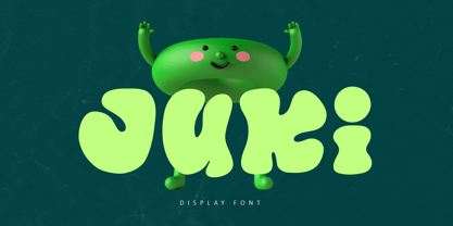 Juki is a handwritten font with bold display fun character. The groovy letters make this font great for logotype, headline, poster film, food packaging, magazine, labels or any type of advertising purpose. FEATURES : Uppercase, Lowercase, Number, Punctuation, Multilingual, PUA Encode, Opentype. If you have any question, don’t hesitate to contact me. Happy Designing !!! Thank You, Illushvara Design
 - Staufer Gotisch by RMU,
$35.00 Thannhaeuser’s mid-1930s display blacklettr font as a fresh and extended redesign called Staufer Gotisch. This font contains a bunch of useful ligatures, and it is recommended to activate both Standard and Discretionary Ligatures. To reach the numero sign, type the combination N-o-period und activate the OT feature Ordinals. The # key is occupied by the round s.
 - Academica Sans by Storm Type Foundry,
$53.00 Academica Sans was drawn with the aim of following the artistic features of Josef Týfa's fonts. It has the same proportions as the famous Academica, so both fonts can be successfully combined. It is suitable for all types of literature from scientific to poetry, but also for corporate identity and websites. It has a calm and timeless character.
 - Mercurius Script by Monotype,
$29.99 Mercurius Script font was designed by the Hungarian wood engraver and type designer Imre Reiner in 1957 for the Monotype Corporation. The expressiveness of this bold script typeface is the result of Reiner's use of a bamboo pen for Mercurius Script's elemental shapes. Used sparingly, Mercurius Script font gives even the dullest headlines genuine spirit and excitement.
 - Balig Script by Panatype Studio,
$7.00 Balig Script is signature pen script, available in 2 fonts with 2 styles ( Normal & Bold ), and includes Swashes. It's perfect for signatures, logo type, weddings, posters, brochure or any display use. Balig Script comes with more OpenType features like Stylistic Alternates, Initial Forms, Terminal Forms, and also Standard Ligatures make this font more natural and letter nicely.
 - Soapy Feelings by PizzaDude.dk,
$18.00 Soapy Feelings is my slightly rough-edged handmade fantasy (or perhaps even fairytale) font. I've added several swashes, which can be used for both starting and endings of words. I've also added 4 slightly different versions of each letter (and they automatically cycle as you type!) and lastly, of course Soapy Feelings has multilingual support! Caps Only Fonts
 - Karima by Zeenesia Studio,
$15.00 arima is a beautiful and feminine serif font created by a romantic and lovely look. Karima was built with Open Type features, stylistic Alternate and Ligature makes your project will be awesome!! Perfect for Branding identity, editorial projects, Logo design, web font, clothing branding, product packaging, magazine headers, or simply as a stylish text overlay to any background image.
 - Sunrays by Supfonts,
$14.00 Sunrays Display is a modern and elegant display with incredible unusual lines that makes it far from the typical classic serif. Font is an open type with clean shapes and precise kerning. It includes ligatures encoded by the PUA. Language support: All European languages Don't forget to subscribe so you don't miss out on the new awesome fonts Dima
 - Avalaqus by Amera Type,
$10.00 Avalaqus is a font inspired by certificate, labels, posters, F&B packaging and has ligatures with alternate style that can make your display better than before. You will get a decorative font, sans, serif with bold and outline styles. And you will also get a set of badges with the open type feature format that match this typeface
 - ASTRALYS by Cerri Antonio,
$37.00 Astralys is a linear decorative font, works very well as a type of identity logo, poster and 3d works. It continues the tradition of precedent Xova but with a hard linear impact. Its interesting to note that with it its possible to play with straight corners to create endless couplings geometric styles and beyond. Caps only fonts.
 - Printing Sorts JNL by Jeff Levine,
$29.00Over 75 images from the past and present comprise Printing Sorts JNL, another dingbat font from Jeff Levine paying tribute to the days of metal type and stock cuts. A PDF file is included with the font, showcasing the special feature that allows you to create arrows in varying lengths with just a few simple keystrokes.


