7,332 search results
(0.021 seconds)
- Red Letter by Ingrimayne Type,
$9.00 In late 1988 or early 1989 I noticed that the circular form of the sickle and the linear form of the hammer could be used to form all the letters of the alphabet. The result of that realization was RedLetter, a novelty or letterbat font. It is caps-only with the lower-case letters containing smaller versions of upper-case letters.
 - Infoma by Stawix,
$40.00 Infoma is designed based on simplicity results in easy and comfortable usage which allows Infoma to perform flawlessly in every layouts. If meticulous, flexible, eye-pleasing and easy to use typeface you are looking for, we recommend Infoma. Infoma consists of 18 styles from Line to Ultra, supporting many OpenType features, such as tabular numerals, inferiors & superiors, numerators & denominators, fractions, ligatures etc.
 - Cica by Alive Fonts,
$40.00 Ok, I'm allergic to cats and have never had one, but I can still create a typeface that embodies feline character! Cica combines the careful nature of cunning cats with the playfulness of kittens. It's simply fun to use and expresses multiple personalities depending on your choice of all upper case, lower case or mixing the two. Take Cica home with you today!
 - Teapot by Ingrimayne Type,
$9.00 Teapot is a font with letters on teapots. Upper-case letters have the handles on the right and lower-case characters have the handles on the left. The letters on the teapots are from the typeface InsideLetters. A revision in 2018 added some characters that can be used to create multicolored lettering. A pdf file here shows how to use them.
 - VTF Charisma by VarsityType,
$15.00 Like traditional athletic block typefaces, VTF Charisma is built with chiseled cornersand a rigid skeleton. However, an underlying formula of fervor and functionality emerges in execution. The typeface features traditional block tendencies that are challenged by expressive angles and deviations in line weight that harken to penmanship. Uniquely tapered terminals seen in letters like "a", "c", and "s" demonstrate a strong visual energy while increasing legibility. The legs of angled letterforms like the "A", "v", and "y" are cropped in a way that further reinforces this motif. These stylistic cues are employed throughout the family’s 7 weights, ranging from Thin to Black with an accompanying Oblique variant for each. VTF Charisma is equipped with a hefty 970 glyphs that support Small Caps, fractions, extensive Latin characters, stylistic alternates and more. Paired with its dynamic charm and strong visual appearance, the family’s horizon of capabilities broadens.
 - Monostep by YOKKMOKK,
$55.00 Monostep is not just another Typewriter. It can do so much more! It is available in five rigorously designed font styles; all of these come in Straight, Rounded and in Italics respectively. It contains geometric symbols as well as all of the characters of the Indo-European alphabet. What makes it so different, and thereby remarkable, are the 77 ligatures that combine letters in upper case, in upper case with lower-case letters and any combination of lower-case letters. Monostep is alive! It will be introduced into the typing script market with a highly characteristic corporate design. Various promotional gimmicks such as a specimen brochure, posters, a website, animations and a promo film with a distinct sound, including lyrics and a dance, make Monostep a truly recognizable label - they bring Monostep to life. That will make you want more: Let me see your Monostep! www.monostep.de
 - Thought by Scholtz Fonts,
$15.00 Thought, with its versatile five styles, is ideal for contemporary display work. It has style, flair, legibility, and interesting, flowing letter shapes. The Family: -- REGULAR - of medium weight - clear and legible; -- BLACK - for bolder statements and best readabilty; -- LINEAR 25 - light weight, mono width line -- LINEAR 45 - medium weight, mono width line -- ZEST - variable line, casual, exaggerated appearance Use a combination of styles for product branding, book covers, invitations, greeting cards. Thought has not been designed to be used in "ALL CAPS". The best effects for headings and subheads are obtained with an initial upper case letter followed by lower case characters. If you are using upper and lower case then it is not necessary to use kerning. Thought contains over 250 characters - (upper and lower case characters, punctuation, numerals, symbols and accented characters are present). It has all the accented characters used in most European languages.
 - Savourer by Cititype,
$12.00 It’s cute, it’s fun, and it’s mighty tasty: it’s Enjoy! A mixed-case font with lots of combination possibilities.
 - Love Cake by Rixdesigns,
$14.00 Use this font for your beautiful awesome projects. You will get: Lower Case and Uppercase Letters, Numbers, & Extended Punctuation
 - Rubens by Wooden Type Fonts,
$15.00 A sans serif with splayed ends, descenders of the lower case dropping below the baseline, very tall x-height.
 - Pencil Pusher JNL by Jeff Levine,
$29.00 The unusual hand lettering found on a piece of 1940s sheet music forms the basis for Pencil Pusher JNL.
 - FS Siena by Fontsmith,
$80.00 Eclectic FS Siena is a typeface with history, and not just in the sense of having its origins in classical Roman lettering. Fontsmith founder Jason Smith first committed it to tracing paper while still at college, instinctively redrawing letterforms based on Hermann Zapf’s Optima according to ‘what felt right’. When Krista Radoeva took up the challenge to edit and extend the typeface, she and Jason were determined to preserve its subtly nonconformist and eclectic spirit. Like a great dish, there are individual components throughout the character set that all add flavour, and need to be balanced in order to work together. The smooth connection of the ‘h’ ‘m’ ‘n’ and ‘r’ contrasts with the corners of the ‘b’ and ‘p’. The instantly recognisable double-storey ‘a’ – the starting point of the design – contrasts with the single-storey ‘g’ and the more cursive ‘y’. And only certain characters – ‘k’, ‘w’, ‘v’ and ‘x’ in the lowercase and ‘K’, ‘V’, ‘W’, ‘X’ and ‘Y’ in the caps – have curved strokes. Transitional FS Siena is a contrasted sans-serif typeface, blending classical elegance and modern simplicity. Its construction and proportions are descended from classical broad-nib calligraphy and humanist typefaces, with a high contrast between the thick and thin strokes. The angle of the contrast, though, is vertical, more in the character of pointed-nib calligraphy and modernist typefaces. This vertical stress helps to give FS Siena a strong, cultured presence on the page. Idiosyncratic italics The italics for FS Siena were developed by Krista to complement the roman upper and lower-case alphabets first drawn by Jason. Many of the letterforms are built differently to their roman counterparts: there’s a single-tier ‘a’, a looped ‘k’ and connections more towards the middle of stems, such as in the ‘m’, ‘n’ and ‘u’. These distinctions, along with generally much narrower forms than the roman, give the italics extra emphasis within body copy, where the two are side-by-side. In editorial, especially, the combination can be powerful. To cap it all… In his original draft of the typeface, Jason found inspiration in Roman square capitals of the kind most famously found on Trajan’s Column in Rome. In keeping with those ancient inscriptions, he intended the capitals of FS Siena to also work in all-upper-case text, in logotypes for luxury consumer brands and property developments, for example. A little added space between the upper-case letters lets the capitals maintain their poise in a caps-only setting, while still allowing them to work alongside the lower-case letterforms. The caps-only setting also triggers a feature called case punctuation, which adapts hyphens, brackets and other punctuation to complement the all-caps text.
 - Neuer Weltschmerz by Hanoded,
$15.00 About 7 years ago, I released a beautiful (imho) Art Deco inspired font called Weltschmerz. Weltschmerz was an all-caps font and I always wanted to do a lower case version as well. But as things so often go in life, I never found the time and forgot about it. Some time ago, I ‘rediscovered’ my good old Weltschmerz font and remembered that I wanted to create a lower case version. Without further ado: here is Neuer Weltschmerz (‘New Weltschmerz’). I redid the whole font, better kerning, better spacing, better looks… and with a proper lower case! I did keep the original handwritten look intact - because, well, it IS hand made!
 - Night Sky - Unknown license

- Science Noire by Fonts of Chaos,
$10.00 Science Noire is a special font with more than 154 glyphes, upper and lower case, punctuation, number and special characters.
 - Kolker Brush by TypeSETit,
$24.95 Kolker is a brushy script style based on the use of a camel hair brush. It's easy on the eye!
 - Cross Stitch Noble by Gerald Gallo,
$20.00 Cross Stitch Noble is based on upper case characters 43 stitches tall and contains the characters A-Z and period.
 - Piano Solo JNL by Jeff Levine,
$29.00 The hand-lettered name on a couple of 1940s-era piano course books was the basis for Piano Solo JNL.
 - Ghost Train by Aerotype,
$29.00 Ghost Train features slightly alternate glyphs A-Z in the lower case that can be used to differentiate consecutive characters
 - Relaxed Fit by BA Graphics,
$45.00A casual gothic easy-to-read font. Relaxed Fit works for so many applications: text, Headlines and anything in between. - La Pica Bonus by RodrigoTypo,
$29.00 La Picá bonus is a new version with lower case letters, styles and dingbats that represents the popular lettering style.
 - Hegorustow by Rometheme,
$12.00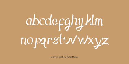 Hegorustow is a luxurious and classy handwritten font. This font looks vintage, elegant, readable, stylish, catchy and easy to use.
 - Think Straight by HIRO.std,
$20.00 Think Straight a Bold Display Font. This font describes about fun, dynamic, street style, headline, pleasure, humanist, easy going, and easy to use. FEATURES - Uppercase and Lowercase letters - Support Opentype Features - 89 Ligatures - Numbering and Punctuations - PUA Encoded Characters - Multilingual Support - Works on PC or Mac USE Think Straight works great in any branding materials, logotype, poster, print, headline, t-shirt, packaging, magazine etc. Enjoy using! Thanks.
 - Ghostbumps by Rometheme,
$25.00 Introduce our new font “Ghostbumps” is a scary display font, this font looks horror, cool, cartoon, playful, catchy and easy to use. Highlight : - Easy instalation - Work on PC or Mac - PUA Encoded Support - Basic Latin A-Z and a-z - Numbers - Symbols - No special software is required, The fonts can be opened and used in Adobe Illustrator, Adobe Photoshop, Adobe InDesign, even work on Microsoft Word.
 - Argone LC by Graphite,
$22.00 Argone LC is a handmade organic typeface family. It is a variant of Argone typeface, but has lower case letters. It comes in four weights– light, regular, bold and black, which is a feature not seen much in handmade typefaces. This makes Argone LC a versatile and flexible type family. There is also a version of Argone LC which only has upper case letters – Argone
 - Kotto Slab by Picador,
$29.00 Ultra Heavy Weight Font Champion – that's Kotto Slab. Bold curves and catchy endings. You can always count on Kotto – quirky posters, creative projects or long texts. That doesn't matter. Easy to use and easy to pair with other typefaces. Matching italics and opentype features will make your work faster. Try it with sans and serif fonts, especially with Praho Pro – you won't regret it.
 - Johabu by Monotype,
$29.99Johabu is based on Gebrochene Fraktur, a lighter softer sort of type, compared to the German forms of the same period. Johabu was drawn by Johannes Bureus, around 1620, cut and cast by Peter van Selow in Stockholm. Johannes Bureus, archaeologist and linguist, designed and let Selow cast runes in 1598, and he became the first Swedish keeper, archivist, of the National Record Office State Archives. - Katzenjammer by Hanoded,
$15.00 Katzenjammer is a German word meaning 'Cat's Wail' - it is used to describe a hangover. Katzenjammer font is a slightly eroded, squarish typeface, which would be ideal for headlines, packaging, posters and websites. This all caps font comes with different upper and lower case glyphs and a non-eroded set of alternates for the lower case - for those who like their alphabet nice and neat.
 - LineDrive by Ingrimayne Type,
$12.95 LineDrive was inspired by an obscure 19th century type design. It has no curved lines and what are normally circular elements in the lower-case letters are diamond-shaped. It might work best with only upper-case letters, which have a Victorian feel to them. In addition to the two weights of plain and bold, the family includes a shadowed version and an inline (or outlined) version.
 - Decour by Latinotype,
$26.00 Decour is a Slab Serif typeface that features low contrast between thick and thin strokes and whose proportions were based on those of Art Deco design. A big height difference between lower case and upper case letters makes Decour a very expressive font and well-suited for headings and subheadings. Its versatility also allows it to be used in other ways, such as publishing and retailing.
 - Sketchzone by Mozatype,
$13.00 Sketch Zone is a unique and interesting display font. Incredibly versatile, this font fits a wide pool of designs. Fall in love with its quirky style and use it to create spectacular projects! What’s Included : – Works on PC & Mac – Easy to use ( Installations ) – Easy Convert to webfont – Compabilty Windows, Apple, Linux, Cricut, Silhouette and Other cutting machines Thanks for downloading, and I hope you enjoy it!
 - Bluster by Ingrimayne Type,
$5.95 BlusterLeft and BlusterRight are distortions of the font ConcavexCaps. Both are caps only, but some of the shapes on the lower-case keys differ from the corresponding shapes on the upper-case keys. They family was named Bluster because I thought they have a wind-blown, flopping-in-the-breeze look. Others may see them as spooky or eerie, something that could be used for Halloween.
 - Soup and Salad JNL by Jeff Levine,
$29.00 Within the 1893 edition of the Barnhart Bros. & Spindler type specimen book is “Bisque”, a text and headline type face with a charmingly eccentric look. Some upper case characters take on more of a squarer look than others, while the lower case has a higher ‘x’ height. This type revival is now available as Soup and Salad JNL in both regular and oblique versions.
 - Espadrille by Atlantic Fonts,
$21.00 Step into your next project with comfort. Espadrille is handmade, clean, and friendly, without being loud. Appealing for a casual, but style conscious crowd - whether brightening t-shirts, posters, packaging, or publications, its one-height upper and lower case make it fun for creative blocks of text and mixing cases at will. It features double-letter discretionary ligatures as well as a few extras.
 - Anarckhie by Ingrimayne Type,
$12.95 Anarckhie is a decorative slab-serifed typeface with a calligraphic origin. The horizontal elements of the upper-case letters are below their midpoint, and the x-height of the lower-case letters is unusually small. There is some variation in the weights of the horizontal, vertical, and diagonal elements. The small x-height makes this typeface appear smaller than its point size would indicate.
 - Unger Script by profonts,
$39.99Unger Script is a script design which is obviously based on H. Matheis' Slogan typeface designed for Ludwig & Mayer in 1957. This very expressive script design is defined by its widely swinging upper case and its quite narrowly designed lower case characters. Ralph M. Unger redrew and digitized this font exclusively for profonts in 2001. His work is based on artwork taken from old font catalogues. - Hebrewish by JAB,
$18.00I decided to create Hebrewish because the only Hebrew Latino font I have ever seen didn't really live-up to my expectations. Each Roman letter and Arabic numeral in this font is based directly on one or more of the Hebrew characters. Originally I was tempted to create an upper case only - since there is no lower case in Hebrew that I know of. But, as this would have limited it's usefulness, I changed my mind and added a lower case also. Nevertheless, those who want to create very Hebrew looking text, need only use the upper case. I've also added some typical Judaic symbols for the artistic minded, e.g. David's star *, the Menorah ^(Jewish candelabrum) and brackets{ } based on this, as well as brackets [] which, used together, produce a 'Ten commandments' stone-tablet symbol(use this [~] for another version). In short, you can either have some fun with this font or use it for serious work - the choice is yours. - Blackduck by Eurotypo,
$60.00 “Blackduck” font is a typical Gothic, usually named “Blackletter” . This typeface was born with the name of “Textur” and developed from Carolingian cursive. It was used in the middle age as sacred script, became increasingly narrower, his vertical lines were emphasized and his strokes very compacted to save space. Along the time the early German print typefaces derived in others styles that were more readable such as Schwabacher and Fraktur, very popular in Germany and sometimes associated to the identity of the country. The font "Blackduck" was inspired mixing carefully the last two “Blackletters”. We try to joine some characteristics of both to reach good legibility without loosing the strong impact and powerfulness of the shapes. Some minuscules like the “o” “c” “e” “d” are rounded on both sides, while both strokes join in an angle at the top and at the bottom. Some other lower cases are formed by an angular and rounded stroke. This font contains a full set of OpenType features; swashes, stylistics alternates, old style figures (Arabic numeral were carefully shape integrated), ligatures and some extras ornaments were added to help in your design. "Blackduck" includes diacritic signs for Central European languages.
 - Cresta by James Todd,
$40.00 Loaded with personality and functionality, Cresta is built to look good while surviving the worst conditions. It is at home on screen and in a magazine. Its six weights are intended to be used everywhere. Unlike most typefaces, Cresta was built without a reference. For this project, everything design choice was based on what worked best for a workhorse sans serif family. Cresta was originally created as the primary typeface for this website. This meant it needed to work in copy, headlines, and navigation across all devices, browsers and operating systems. This meant it needed to be sturdy and have enough character to make it stand out from other UI typefaces. With its large x-height, ample counters, and giant apertures, Cresta is meant for easy utility in rough conditions. Even with all of this, that doesnít mean that its dull; as the weights increase, the style of Cresta becomes more appearant. This style is defined most apparently by the terminals on the lowercase r and the angle of the joins between the curved and straight strokes (such as in the connection on the n).
 - Cotillion Pro by Canada Type,
$39.95 Cotillion is an original design Jim Rimmer finished just before the turn of the century. Alongside its evidence of Jim's nostalgia at the deco type designs he was exposed to as a child, it distinctly shows a type designer who has become very comfortable with that rarest of design abilities: Bringing efficient typographic solutions to what is essentially a calligraphic endeavour. This design has all the elements of what made a traditional deco typeface display unmistakable elegance and luxury: The expressively low x-height, the precisely calculated upwards comfort and reserved grace of the vertical metrics, the subtle fusion of calligraphic ornamentation and clean minimalist type technique, and the unique indentity of the original lowercase flow. Cotillion was refined and remastered in 2012 to include a weath of aesthetic and functionality improvements. This Cotillion Pro set includes small caps, true italics, ligatures, seven types of figures, automatic fractions, extended Latin language support, stylistic alternates that include lowercase serif angle options, and plenty of extra OpenType features like caps-to-small-caps substitution, case-sensitive positioning, ordinals, and extended class-based kerning. At over 780 characters, each of the Cotillion Pro fonts is the equivalent of three fonts in one.
