10,000 search results
(0.032 seconds)
- Marchioness by MKGD,
$13.00 Marchioness is a typeface that was built on the same basic structure as Lady Edith. I considered making it a subset of Lady Edith but felt that its overall appearance projected a uniqueness that allowed it to stand on its own. Although still maintaining a definite Art Deco form, it differentiates itself from its parent font by possessing a more opulent, if not regal, construction. The bones may be that of Lady Edith, but the typeface itself is most certainly Marchioness. There is no lower case for Marchioness as it is a decorative font. The Upper case version serves both the upper and lower case keys. Marchioness has a glyph count of 389 and supports the following languages; Supported Languages: Afrikaans, Albanian, Asu, Basque, Bemba, Bena, Bosnian, Catalan, Chiga, Colognian, Cornish, Croatian, Czech, Danish, Embu, English, Esperanto, Estonian, Faroese, Filipino, Finnish, French, Friulian, Galician, German, Gusii, Hungarian, Icelandic, Indonesian, Irish, Italian, Kabuverdianu, Kalaallisut, Kalenjin, Kamba, Kikuyu, Kinyarwanda, Latvian, Lithuanian, Low German, Lower Sorbian, Luo, Luxembourgish, Luyia, Machame, Makhuwa-Meetto, Makonde, Malagasy, Malay, Maltese, Manx, Meru, Morisyen, North Ndebele, Norwegian Bokmål, Norwegian Nynorsk, Nyankole, Oromo, Polish, Portuguese, Romanian, Romansh, Rombo, Rundi, Rwa, Samburu, Sango, Sangu, Scottish Gaelic, Sena, Shambala, Shona, Slovak, Slovenian, Soga, Somali, Spanish, Swahili, Swedish, Swiss German, Taita, Teso, Turkmen, Upper Sorbian, Vunjo, Walser, Zulu
 - Zamoka by Eraky,
$9.00 ZAMOKA font is a display font of 2 weights Regular and Rounded, ideally suited for advertising and packaging, festive occasions, editorial and publishing, logo, branding and creative industries, poster and billboards as well as web and screen design. ............................................................................ ZAMOKA font provides advanced typographical support with features such as ligatures, case-sensitive forms, fractions, super and subscript characters, and stylistic alternates. It comes with a complete range of figure set options – oldstyle and lining figures, each in tabular and proportional widths.
 - Litto by VladB,
$12.00 The name of the font is taken from the concept "Littoral zone" - this is the part of the sea that is close to the shore. The width of the shore varies as a result of the tides. Hence the idea of my font family — changing the width of a character from condenced to extra expanded. Litto is a modern sans serif geometric font, includes upper and lower case characters, Latin and Cyrillic. Graphically, the characters have uniform thickness for all family.
 - Jonesy by Ksenia Belobrova,
$39.00 Jonesy is a funny modern looking script with a touch of vintage. It’s based on calligraphy and pretends to look like real lettering having almost 700 alternates and ligatures, organic forms and realistic connections. Jonesy is good for menu, packaging, posters and as a starting point for lettering and logos. All contextual alternates are built into the “Liga” feature that is turned on by default. However, when your work with the typeface, please make sure that “Liga” is turned on.
 - Smooth Brushings by Hanoded,
$20.00 When I was painting this font, I suddenly had the movie Cool Runnings (1993, directed by Jon Turteltaub) in my head. I had to name the font, so I came up with Smooth Brushings. Of course, this font has nothing to do with the movie. Smooth Brushings is an all caps brush font, which was made with a stiff brush and some China Ink. Upper and lower case glyphs can be mixed. It is a very legible and clear font, ideally suited for posters, product packaging and book covers.
 - Nannaula by UlianaShabanova,
$15.00 Welcome to the new font! A fun and playful handwritten font with universal letters that looks great in ALL CAPITAL letters or is regularly used in sentence cases. Perfect for book covers, children's books, birthday invitations, stationery, calendars, magazines, Instagram posts and more! Each letter is a tall, all caps typeface with lots of bouncy glyphs Please note that the Nannaula-colorvector font is COLOR and COLOR CANNOT be changed! BUT Nannaula-normal font is normal font and you can change the color:) Feel free to email me shabanovasprt@gmail.com if you have any questions. :)
 - Cancellaresca Script by ITC,
$40.99Alan Meeks designed Cancellaresca Script, a decorative, almost cheerful script typeface, in 1982. The details that grace Cancellaresca Script's forms, both capital and lower case, give the typeface its unique appearance. Its generous and flowing capitals are complemented by a more reserved lowercase. This font's elegance offers a variety of possibilities for headline or display use. - Humorist JNL by Jeff Levine,
$29.00 The May 7, 1936 issue of “The Film Daily” carried an ad for the Will Rogers Memorial Hospital Fund. (In August of 1935 Rogers, along with famed aviator Wiley Post died in a plane crash.) While the fundraising for the hospital was a serious event, Rogers is remembered as a humorist, hence the font’s name of Humorist JNL.
 - Rileyson by Club Type,
$36.99 Crisp contemporary Sans-serif family useful for clear, clean corporates, stylish branding letterforms or friendly, casual messaging too, with use of its capital and lower case ligatures, swash capitals, old style numerals and many ornaments.
 - Charterhouse by Device,
$29.00 A heavy obround sans with a high x-height and unusual lower-case spurs that flow up and into the bowl. This curve is mirrored in the ascenders. The alternates provide for closer, denser setting.
 - Sanderling by Atlantic Fonts,
$26.00 Sanderling is irrepressibly cheerful. Turn on discretionary ligatures to access double-letter ligatures for both cases, plus more chirpy ligatures designed to give flight to Sanderling’s lively character. Sanderling has the legs to make waves!
 - Unikled by Ingrimayne Type,
$12.95 Unikled a decorative calligraphic family inspired by the uncial style. The upper and lower cases are largely different and can be treated as two separate alphabets. It is available in two weights, plain and bold.
 - Publica Sans by FaceType,
$- Publica Sans is a clean geometric typeface, equipped with a variety of OpenType features to give you all you need for great typography: Alternates, arrows, rare currency symbols, case sensitive forms, various sets of figures and discretionary ligatures. Publica Sans has two sisters: Publica Play and Publica Slab Take a close look at our gallery (especially ‘OpenType Features 1–6’) to discover the versatility of Publica Sans. Alternates Give your typography a certain spin with the variety of alternate letters provided. Currency You need to set prices in exotic countries? No problem: Publica Sans gives you loads of rare currency symbols. Case Sensitive Forms Sometimes you write in all caps and there are some symbols (e.g. brackets) that need some extra treatment to make it look perfect – that’s what case sensitive forms are for. Figures Publica Sans provides 6 sets of figures, like lining, tabular, oldstyle, numerators ... Discretionary Ligatures Ligatures can make your logo or headline look spicy. So there are plenty of them.
 - FF Justlefthand by FontFont,
$65.99 Dutch type designer Just van Rossum created this script FontFont in 1990. The font is ideally suited for advertising and packaging, festive occasions, editorial and publishing as well as poster and billboards. FF Justlefthand provides advanced typographical support with features such as ligatures, small capitals, alternate characters, case-sensitive forms, fractions, and super- and subscript characters. It comes with tabular oldstyle and proportional oldstyle figures.
 - Roadstar by Kustomtype,
$25.00 Roadstar is a script designed in the style of the classic American advertising font from the 1940's-1950's. Roadstar is a retro brush-style script designed for logotype, packaging, posters, T-shirts, signage & design projects with a retro & vintage feel. Roadstar comes with two styles that both contain all upper and lower case characters, punctuation, numerals and mathematical operators, as well as all accented characters.
 - Amadeus by Classic Font Company,
$14.95Amadeus was inspired by an alphabet reputed to be used in the Papal Chancery in the 16th century. It has highly decorated capitals and to be used at its best requires a large point size. The lower-case characters have been deliberately made simple to contrast with the ornate capitals. Included within the font are many extra characters plus a complete set of framed numerals. - Inkster by Typadelic,
$19.00Inkster breaks all the rules. The serifs vary from letter to letter, if they have any serifs at all. The upper and lower case letters intermingle and the contrasting characters bounce all over the baseline. Loosely based on the character shapes of Frisco, I developed a tightly spaced calligraphic version and called it Inkster. Use this artistic font when youre looking for a distinctive style! - bearerFond by JOEBOB graphics,
$9.00 BearerFond has been in my pen for years and I've used this way of writing a lot on cassette cases. Anyone still using cassettes? Me neither, so in order to keep it alive I have made a font out of it and named it bearerFond; as in bearer bond, since it looks like it could be used on official documents. Nothing too official though.
 - Angry Brush by Joy Studio,
$13.00 Introducing ANGRY BRUSH - a very bitter display brush font made for all your resentful ramblings. Available only in upper case (shout mode) and with 17 different unique variations of every single character so it always looks fresh, with no duplicated letters in sight. You can either manually choose your preferred character, or let the contextual alternates rotate through each stylistic set whilst you type.
 - Return Pass JNL by Jeff Levine,
$29.00 Return Pass JNL is the solid version of Forward Passed JNL and can be used as a standalone font or in combination with Return Pass Fill JNL (the inline version with the main letters stripped away) for a dual color design. In some applications the inline fill may appear to create a cast shadow effect, so it may be necessary to manually adjust any overlaid copy.
 - Parallax by Gleb Guralnyk,
$13.00 Parallax is a modern, creative, geometric typeface with random contrast changes in the characters. It includes 26 contextual alternates that will help you to avoid similar letters in most cases. You can always exchange the letters using stylistic alternates feature. Parallax font have a multilingual support of west european languages, please check out all available characters on screenshot. Thank you and have a nice day!
 - Autorich Sans by Typia Nesia,
$20.00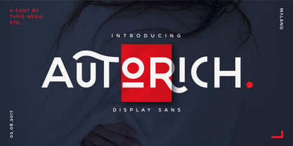 Autorich Sans is a display sans font, comes with 2 set of upper case (allcaps), 58 ligatures and some alternate. Great for brand identity, poster design, website / display, editorial, and more. **FEATURES :** * Basic A-Z * Numbers * Symbols * Stylistic Alternates * Standard Ligatures * Discretionary Ligatures * Oldstyle Figures * PUA Encode * Multilingual support Thank you for your purchase! and hope you're having fun with Autorich Sans ! Happy creating! Typia Nesia Studio
 - FF Erikrighthand by FontFont,
$65.99 Dutch type designer Erik van Blokland created this script FontFont in 1990. The font is ideally suited for advertising and packaging, festive occasions, editorial and publishing as well as poster and billboards. FF Erikrighthand provides advanced typographical support with features such as ligatures, small capitals, alternate characters, case-sensitive forms, fractions, and super- and subscript characters. It comes with proportional oldstyle and tabular oldstyle figures.
 - FF Aircraft by FontFont,
$41.99 French type designer Albert Boton created this display FontFont in 2002. The font is ideally suited for advertising and packaging, music and nightlife as well as sports. FF Aircraft provides advanced typographical support with features such as ligatures, alternate characters, and case-sensitive forms. It comes with a complete range of figure set options – oldstyle and lining figures, each in tabular and proportional widths.
 - Glence by Nine Font,
$25.00 Glence family is a geometric sans-serif type family with 9 weights, from thin to black,with corresponding italics. Glence is designed based on geometric shapes that looks simple and clean. Each font includes opentype features such as Stylistic Alternates, Proportional Figures, Tabular Figures, Numerator, Superscript, Subscript, Case-Sensitive, Denominators, Scientific Inferiors, Ordinals, Ligatures and Fractions. Glence will make your artworks better with its simple & clean shapes.
 - P22 Larkin by IHOF,
$24.95 This lettering style is unusual in that combines aspects of several lettering styles. It is essentially a Germanic Blackletter but with many romanized capital letters and also features an italic slant along with some italic lower case traits. It is evocative of “old world” craftsmanship and early 20th century romanticism. The font was developed based on the logo of the Lakin Company of Buffalo, NY circa 1900.
 - Agneia by Maculinc,
$15.00 Agneia is a display font with a line cut style on each letter to add a unique feel and is very helpful for layout design projects, posters, logos, brands, packaging, vintage and modern style designs or for any other design. Agneia is displayed in upper and lower case, and also comes with multilingual to support more of your needs. Email support: maculinc@gmail.com Thank you! Maculinc
 - Khamai Pro by DBSV,
$30.00 Khamai Pro is a first attempt at writing a monoline main feature of the curves. Completed after 17 months with many design twists,and also an attempt to provide a different visual design and style as Staccato: (dashed line) Rail: (double line) and Tribe: (triple line). This series of 16 fonts with 625 glyphs each includes true italics and supports Latin, Greek and Cyrillic.
 - Ottocento by Eurotypo,
$39.00 Ottocento is an elegant chancery cursive, derived from XIXth century Italian calligraphy. Slightly inclined and with a fast and marked ductus, this font is well balanced between thick and thin strokes and shows marked ascendings and descendings. Ottocento is rich in stylistic variations with its elaborated upper cases, and stylistically different in traits and different ligatures are considered to make the most of the many OpenType features.
 - Waterman by John Moore Type Foundry,
$20.00 Waterman is a display font, its form is based on the figure of a fluid, creating a texture of undulating forms, rhythmic and free to make reading a stream wave experience. Waterman comes in Regular and Bold. The letter shape was developed from the design of the letter "a" and “l” lower case. The curve model is related on a stylized form of a fluid wave.
 - mathieu by Gino Belassen,
$10.00 mathieu was created with a Krink K-60 marker – a paint marker that allowed gravity to dictate the outcome of each handwritten letterform. The font is the union of 26 mixed-case letters, 10 numbers, and roughly 100 glyphs, and has been seen in videos by artists Marshmello and Louis the Child. mathieu reflects Gino’s abstract style of writing, and reveals beauty in imperfection.
 - Running Hipster by Hanoded,
$15.00 Running Hipster is a tall, thin and all caps font with a funny name. The upper and lower case letters differ and can be mixed. You don’t necessarily have to use it to market your free range sheep woolen jumpers or organic button squash and soy based sour cream soup, feel free to use it for just about anything. Comes with a vintage amount of diacritics.
 - Jalliya by Madhaline Studio,
$25.00 Jalliya is a realistic signature font Vol. 2 that has its own uniqueness and characteristics from a signature font, because it is handwritten manually, so it has the impression of a true signature. This font is carefully crafted with a modern touch. This font looks elegant, luxurious, natural with a beautiful signature touch. Jalliya would perfect for photography, watermark, social media posts, advertisements, logos & branding, invitation, product designs, label, stationery, wedding designs, product packaging, special events or anything that need signature taste. Your download will include 4 font files; ~ Jalliya One, Two, Three, Four, Five, Six and Seven A hand-made, all characters signature font which has a complete set of A-z characters. Includes a range of multilingual support, punctuation, ligature & alternate. ~ Jalliya Tail 1 & 2 A bonus set of 104 Uppercase & Lowercase with tail. Simply select this font and type any A-Z & a-z character to create one of the bonus elements.
 - Flink by Identity Letters,
$25.00 The joy of pure geometry, revisited. Geometric typefaces are a staple in every typographer’s toolbox since the 1920s. It was a time when iconic faces such as Futura, Erbar, and Kabel appeared on the scene and turned the world of type upside-down. Inspired by those early giants as well as later epigones with a legacy of their own (such as 1970’s Avant Garde Gothic), Flink is the Identity Letters take on this genre, characterized by a clean and focused appearance. With neat shapes and the look of pure geometry, Flink adapts to a vast range of applications and topics, from the fine print in contract to website body copy to logo design to billboard-size slogans. Its x-height is considerably larger than in classic geometric sans-serif fonts; its proportions are harmonized as opposed to strictly constructed. This makes for a more contemporary look, setting it apart from the classics. To further reduce the rigidity of a purely geometric composition, you can replace some letters with more humanist alternates, such as a, g, j, etc. This font family comes along in 8 weights from Thin to Black. Each weight consists of an Upright and Italic version. There are more than 750 characters per style, including two stylistic sets that offer variations to the look and feel of Flink, making it even more versatile. Plenty of additional Open Type Features like ligatures, case sensitive forms, old-style figures, and symbols make Flink a valuable tool for the discerning typographer. Flink is the reimagination of a classic genre, designed to suit the needs of our time. ––––– Please note: There is an upgraded Version available: Flink Neue
 - Rotulona Hand - Personal use only

- Freundschafts-Antiqua AR by ARTypes,
$35.00Freundschafts-Antiqua AR is based on a 20th-century German type design. Freundschafts-Antiqua (which was also called Chinesische Antiqua) was designed by the Chinese calligrapher Yü Bing-nan when he was a student at the Hochschule für Grafik und Buchkunst at Leipzig in 1960. It was cast in 1964 by VEB Typoart, Dresden, in 9-pt and 28-pt (Didot). The design combines the best German traditions with the Chinese bamboo pen. It is a unique, wholly modern, yet quiet and dignified typeface which is well suited for text-setting in many sizes. The original design was carefully crafted with all non-kerning letters (none of the letters overhangs its side-bearings); the lower-case f was designed so that no ligatures were needed. The AR fonts include the type's ch and ck logotypes, monetary signs and all the standard accents. The letterfit of the original design is retained and, as can be seen in the attached printable .pdf, text composed at normal sizes is very agreeable indeed. Freundschafts-Kursiv AR A features old-style (non-lining) figures and 'kerning' letters; Freundschafts-Kursiv AR B contains lining (cap-height) figures and all non-kerning letters following the original design of the face. - Holland Gothic by URW Type Foundry,
$39.99 Blackletter fonts are timelessly beautiful and still very popular. At some point, it seems that every type designer discovers the beauty of these forms and the great pleasure in creating blackletter characters. Like also Dutch designer Coen Hofmann who, after designing Caxtonian Gothic, has designed yet another Blackletter font: Holland Gothic. Holland Gothic reminds of the 18th century »Duytsch« typefaces of Joan Michael Fleischmann and Christoffel Van Dyck. But Hofmann was mainly inspired by the Dutch calligraphers from the 17th and 18th century. Holland Gothic develops its full charm and beauty at larger sizes because of the hairlines in the upper case characters. To enable users composing texts in the style of our ancestors, Coen Hofmann added a series of pre-composed ligatures, also in combination with the long s, plus an alternate form for the lower case r which was used in combination with letters b, d, g, o, p, v, and w.
 - Hexonu by Ingrimayne Type,
$6.95 Hexonu is a weird, awkward, monospaced font family. In place of true lower-case letters, it has a second set of capitals that, through the magic of the OpenType contextual alternatives (calt) feature, automatically alternates with the set on the upper-case keys. If one wants to use only one set of letters, the contextual alternatives must be turned off and character spacing adjusted. Hexonu is another effort to create a font with alternating sets of letters (see PoultySign, Lentzers, and Caltic for others). The base shape for forming the letters is a lopsided hexagon that resembles an old coffin. In four of the six family members, the alternating shape is a distorted hour-glass. In the other two, coffin shapes heads-up alternate with coffin shapes heads-down. The family was created as an experiment with the calt feature and not for any particular use. It does not work as text but its bizarreness makes it appropriate for some poster and signage applications.
 - Roundup by Ingrimayne Type,
$10.00 The Roundup family was inspired by fonts from the late 19th century, though it is not based on any one of them. Roundup-Caps was the first of the group to be constructed. It has two sets of upper-case letters that have minor differences. It has reverse contrast, that is, the verticals are thinner than the horizontals. Unlike most of the "Old-West" fonts with reverse contrast, the serifs are not square but have an odd, rounded shape. Roundup-Regular replaced the second set of caps with lower-case letters. A bold style strengthens the vertical elements so that it no longer has reverse contrast. Both the regular and bold styles have matching oblique styles. Finally, there is a hollow version with a shadow to the lower right. This shadowed style has had its inside taken out, creating RoundUp-ShadowInside. The spacing is the same as RoundUpShadowed so it can be layered over RoundUpShadowed to easily create two-colored lettering.
 - Ribbonetter by Ingrimayne Type,
$5.00 Ribbonetter is an experimental font playing with the calt or contextual alternatives feature of OpenType. This feature alternates letters in ovals with letters in hourglass shapes to create a banner. The letters in the ovals will be determined by the start of the line, whether it starts by typing an upper-case or lower-case letter. Using layers, background color can be added (dot accent and ring characters) or the outline color can be changed (sterling and yen characters). The font may also be useful with the contextual alternatives turned off. Different amounts of character spacing may give interesting results. With default character spacing, ovals with will overlap. If you are typing numbers and want the start to be an oval, switch on OpenType style set 2. In at least one word processor (Pages 5 for Macintosh) the carriage return adds the shape assigned to the space character. If you encounter this, try adding a nonbreaking space (option-space on the Macintosh) before the carriage return.
