6,166 search results
(0.009 seconds)
- Dusk Til Dawn by Scholtz Fonts,
$19.95 As with Nocturne, Dusk til Dawn recalls the romantic, sophisticated Zeitgeist of the early 20th century, that nostalgic time "between the wars". It as a number of attractive ligatures and upper-case alternates. I have used Nocturne as a basis for Dusk til Dawn, given the font really bold down-strokes, reduced the width of some upper case characters and changed the shape of many lower case characters. Dusk til Dawn comes in two styles: Dusk til Dawn Regular, which uses the Art Deco convention of small x height, and long ascenders. This Display style is perfect for headers, posters, labels etc. Dusk til Dawn Book, which, with its higher x-height and slightly wider characters, is extremely legible and suitable for longer passages of smaller size text.
 - Stormtrooper by Comicraft,
$19.00 We've gathered the old characters together, and added a bunch of young new hotshots, to create the long-anticipated sequel to our STORMTROOPER font! The digitally remastered Special Edition STORMTROOPER is now a trilogy, with two new weights -- outlined ARMOR and inlined BLASTER -- each containing more than 100 autoconnecting letter combos*. Yes, you'd have to be crazy to attempt a font like this; our man JG certainly has courage... * Hutts, dewbacks and point blank misfired laser shots not included
 - English Grotesque by Device,
$39.00 English Grotesque is based on the proportions of an early 20th century signwriter’s sans, emphasising the characteristic idiosyncrasies of type of the period. Sharing a similar Roman circle-and-square construction as Gill Sans or Johnston Railway, it has a wide T and W, a narrow S, and a long-tailed R. The Roman alphabet did not include a lower-case, and therefore early sans-serifs tended to base theirs on handwritten or cursive models, resulting in more even character widths. English Grotesque, by contrast, carries the more characterful proportions of the capitals through to the lower case. Available in six weights, with optional alternative versions for the Q, &, £ and J.
 - Assegai by Scholtz Fonts,
$19.00 Named for the Zulu traditional spear, Assegai evokes the long, slim outline of the weapon, and the strength of the Zulu warrior. The font combines the irregular shapes of tribal African art with the simple, clean elegance of contemporary design. It is especially useful for headings, subheading, for shorter passages and also works as a body font since it has both upper and lower case and is striking and readable.
 - Buzz by Scholtz Fonts,
$21.00Buzz is a loose and informal grungy font with a modern, electric, zappy quality: The font is particularly useful for the promotion of products aimed at young and trendy consumers. It can be used for the design of: CD and DVD covers; clothing advertising and swing tags; magazines and advertising; and cosmetic packaging. It has been carefully letterspaced and kerned. It contains a full character set: all upper and lower case characters, punctuation, numerals and accented characters are present. - Sextan Cyrillic by deFharo,
$12.00 Sextan serif is a Cyrillic typeface family with 10 styles designed for editorial, corporate, advertising or web use. The excellent readability allows the use in long texts, the coherence of forms make these fonts have a great personality. The fonts have an extra set of lower case letters accessible through the Discretional Ligatures. Also support for Open Type Functions such as Old Style Number, Superiors, Inferiors, Dynamic Fractions, etc. Includes the Bitcoin symbol: b #
 - Sextan Serif by deFharo,
$12.00 Sextan serif is a typographic family with 10 styles designed for editorial, corporate, advertising or web use. The excellent readability allows the use in long texts, the coherence of forms make these fonts have a great personality. The fonts have an extra set of lower case letters accessible through the Discretional Ligatures. Also support for Open Type Functions such as Old Style Number, Superiors, Inferiors, Dynamic Fractions, etc. Includes the Bitcoin symbol: b #
 - Blue Parrot JNL by Jeff Levine,
$29.00The original inspiration for Blue Parrot came from a short scene in the classic film Casablanca. For just a few seconds, the exterior of Ferrari's Blue Parrot night club is shown, complete with a wonderful hand-lettered sign... all in capital letters. Blue Parrot JNL was originally released in 2006, and it wasn't long before a few people noted that the font would also look good with a lower case alphabet. The idea of adding in lower case kicked around for a couple of years until Jeff Levine finally completed a revision of the font. In this version there's also an expanded character set thanks to the creative input of Michael Hagemann of Font Mesa. - Eirinn by Linotype,
$29.99Eirinn was designed by Norbert Reiners for Linotype in 1994. Its forms are based on those of Irish scripts of the 7th and 8th centuries, an example of which can be found in the Book of Kells in Dublin. Characteristic of this style are for example the lower case f with its short cross stroke on the base line and long cross stroke above, the unusual form of the g, and the t, whose form is almost like that of a c. This style consisted of a mixture of lower case and capital letters at the time of its conception, but Eirinn has a full set of both lower case and capital alphabets. At first glance the viewer is reminded of ancient and indecipherable writings of the Celts before the forms of our contemporary letters and words become evident. Eirinn will lend a touch of mysticism and secrecy to any text. - Blackout SCF by Scholtz Fonts,
$21.00 Blackout SCF is a loose and informal grungy font with a modern, electric zappy quality. The font is particularly useable for the promotion of products aimed at young and trendy consumers. It can be used for the design of: CD and DVD covers; clothing advertising and swing tags; magazines and advertising; and cosmetic packaging. It has been carefully letterspaced and kerned. It contains a full character set: all upper and lower case characters, punctuation, numerals and accented characters are present.
 - Honey Dew by Hanoded,
$15.00 Right now it is melon time: the supermarkets are full of them: Galia, Honey Dew, Piel de Sapo… Back in Casa Hanoded we're quite happy with the abundance of melons! So, when I created this cute little font, naming it was easy. Honey Dew is a shaky all caps font with different upper and lower case glyphs. I created alternate letters for both upper and lower case closed glyphs (like a, b, d, o, etc.) - including their accented brethren (aacute, abreve, acircumflex), etc. There is an alternate & and @, plus the Æ, Œ, Ø, æ, œ, ø, þ and Þ. You should have guessed by now that Honey Dew comes with a whole stack of diacritics.
 - Wandering Pencil by Hanoded,
$15.00 I have a lot of pencils, but when I need one, they seem to have grown legs and have disappeared! When I decided I wanted to create a pencil font, it took me a long time to find the right pencil for the job! Wandering Pencil is a nice, handmade font. It is a bit shaky, a bit rough, but it does have class and will look nice on your designs! Comes with diacritics and double letter ligatures for the lower case.
 - Hotel Suite JNL by Jeff Levine,
$29.00 This is a digital reinterpretation of Walter Huxley's 1935 evergreen "Huxley Vertical", which was originally cast for American Type Founders. A timeless classic which has been in use since the Art Deco era, this version is known as Hotel Suite JNL. As in the original metal type, alternates for A,K,M,R,W and Y are available and can be found on their respective lower case keys. Hotel Suite JNL is available in both regular and oblique versions.
 - Magnetic Pro by Mostardesign,
$25.00 Magnetic Pro is a typeface inspired by typewriter characters with a mechanical aspect. Equipped for professional typography, this font family has many OpenType features such as small caps, case sensitive forms, tabular and old style figures, pro kerning, circled numerals, ligatures, and extra graphics. It comes in 8 weights with corresponding italics and it's suited for multiple purposes including display and editorial use, especially for advertising, long text, packaging and branding. Magnetic Pro has true italics with a 'mechanical script' aspect to give more style in long texts. It has also an extended character set to support Central and Eastern European as well as Western European languages. Magnetic Pro has also an extra graphics style for those who wants to add catchwords, special titles, arrows and geometric shapes to their creative projects.
 - Marlon Pro by Mostardesign,
$25.00 Marlon Pro is a soft sans serif font family characterized by its contemporary aspect and its warm touch. It provides advanced typographical support with features such as case sensitive forms, small caps, ligatures, alternate characters, fractions, slashed zero, circled gures, pro kerning...It comes with a complete range of gure set options – oldstyle and lining gures, each in tabular and proportional widths. It comes in 9 weights with corresponding italics and it's suited for multiple purposes including editorial use, web font, apps, digital ads, ebook, and also for advertising, long text, packaging and branding. As a modern sans serif font family, Marlon Pro Sans has true italics to give more style in long texts. It has also an extended character set to support Central and Eastern European as well as Western European languages.
 - Bocksay Mira by Trifásica Studio,
$9.00 Bocksay Mira is a text font family inspired by the manuscript Mira Caligraphiae Monumenta created between 1561 and 1596 by Georg Bocskay and Joris Hoefnagel for the Holy Roman Emperor. All shapes were taken from the original records in both regular and italic style: lower case (p. 5, 72), uppercase (p. 47, 121), small caps (p. 122, 7). The high contrast forms and the wide spacing makes this family suitable for long texts but also for titling uses, having always that calligraphic and stylish look. Find the original script here
 - Ultra Thin Stencil JNL by Jeff Levine,
$29.00 Online auctions offer a treasure trove of lost or forgotten merchandise, and many items pertaining to lettering just beg to be digitized into a typeface. Case in point is a partial set of brass stencils that were the visual model for Ultra Thin Stencil JNL. While most of the brass interlocking stencils available now and in the past have bold lettering for easy readability, this particular set consisted of condensed letters with thin lines. Available in both regular and oblique versions, they join a long list of stencil designs available from Jeff Levine Fonts.
 - 1522 Vicentino by GLC,
$60.00 This font is mainly inspired from the engraved characters of the small book known as “Operina”, or “The method and rules for writing cursive letters or chancery script” from the famous calligrapher Ludovico Vicentino Arrighi, published in Roma in 1522 and signed with simplicity “Ludovico Vicentino”. The font contains a large set of standard ligatures and alternative characters: two lower cases, four sets of standard capitals, long s and variants, titlings, each feature easy to use with OTF managing software. It is a pro font, containing Baltic, Eastern, Central, Western European and Turkish diacritics.
 - ITC Cherie by ITC,
$29.99Some words from the designer... Like long legs walking a runway in stiletto heels, ITC Cherie is both sophisticated and feminine. West coast designer Teri Kahan developed this art nouveau-style font into two distinct all capital alphabets – one with a “high waist”, placed in the capital position, and the other a “low-waist,” placed in the lower case position. They work separately or together, and this dual nature gives a designer the ability to make subtle changes in a logo or line of text. Additional flourished letters round out this versatile headline font. - Carot Display by Storm Type Foundry,
$45.00 Carot Display is made for book covers and posters, but will also shine in advertising and visual identity. The whole Carot system is built up from what has long been around; in any case, it was the intention: to evoke the already experienced visual reminiscences of today's spectacled people. We all have a tendency toward sentiment, which, with each new diopter, deepens to melancholy. Only good font can calm us down. I believe in the raw effect of “Carot” typefaces. The superfamily of 64 members offers a modern alternative for all types of design work.
 - ITC Cushing by ITC,
$29.99ITC Cushing has a long history. The typeface was originally designed by J. Stearns Cushing, a Boston-based book printer, and famous American type designer Frederic Goudy expanded it to include an italic weight. Under a special license from the American Type Founders, Vincent Pacella modified the design for ITC and added some additional weights. ITC Cushing is slightly condensed with large, bracketed serifs. Pacella changed the capital letters to better complement the lower case and replaced the sloping serifs of the italics to linear type serifs to produce ITC Cushing. - 1543 German Deluxe by GLC,
$38.00 This family was inspired by the sets of fonts used in 1543 by Michael Isengrin, printer in Basel (Germany) to print the splendid New Kreüterbuch...(New herbal...), with numerous nice pictures, the masterpiece of Leonhart Fuchs, father of the modern botany. It is a Schwabacher pattern, with three different sets of fonts, small (± 4mm for the upper case) in the main text, larger for titles (± 8mm for the upper case) and large Initials or lettrines (five lines of main text). This font contains standard ligatures and German historical ligatures (German double s, long s, tz, ch,...) and diacritics (special umlaut "e superscript" and "∞" unstead of dieresis with letters a, o and u,) naturally, we have added numerous letters lacking in the original to permit a contemporary use of the font. It can be used in complement with 1538 Schwabacher or/and 1534 Fraktur.
 - Pleiades - Unknown license

- TXT Hoopla by Illustration Ink,
$3.00What's all the "Hoopla" about? Try this unique, amusing font for scrapbooking and creative papercrafting. Its letters are thin, with a handwritten look. It's for the young, and young at heart. - Blufunken (side A) - Unknown license

- Meglaphoid - Unknown license

- American Gothic by MADType,
$24.00 A blocky and bold geometric sans with inner angles and outer curves. No ascenders; lower case characters are as big as the upper case. Mix cases for variety.
 - ITC Ludwig by ITC,
$29.99ITC Ludwig has an edge. It's nervous, tense - maybe even a little scary. Drawn by Italian designer Giuseppe Errico, ITC Ludwig refuses to be confined to a traditional baseline. Its twisted lowercase g" and an "e" that could double as an upside-down "a" both add to the design's spooky personality. As a young man, Errico studied to be a fine artist. He became a graphic designer only after a “long reflection period,” he says. His early training is evident in many of ITC Ludwig's suggestive qualities. There is far more to this face than cranking up the “distort” knob in Fontographer. Reflection and personal expression are at its core." - Scholz Secession by HiH,
$8.00 We named this font Scholz Secession. Fin-de-siecle Vienna, Austria is the source of this Jugendstil design from Schriftgiesserei Eduard Scholz. The original release was under the name Reklameschrift Secession. Most of the curve strokes look like commas to me. The letters are as soft and plump as the comforter on the bed I slept on in a Salzburg B&B many years ago. I was traveling with a college buddy and our next stop was Vienna. There a kind, young student named Hanna and her boyfriend took us under their wing. One of the places Hanna proudly showed us was Otto Wagner’s Majolika Haus, built in 1898, and only about 8 blocks from Secession Hall. Hanna explained to us that the style was called Jugendstil and represented Art Nouveau as interpreted within the framework of their culture. I even took a picture. After all, memories are part of who we are. Figures are old-style for text use. This font would not be my first choice for a spread sheet. Included are German ligatures ch (alt-0123) & ck (125), two period ornaments (135, 175) and lower case o and u with Hungarian long umlaut (215, 247)). A very likeable and easy-to-use font.
 - Augsburger by HiH,
$12.00 The Augsburger Family is a product of the Art Nouveau period in Germany and Austria, reflecting the darker, heavier Jugendstil approach typical of the Secession movement in these two countries. Originally released by H. Berthold AG of Berlin and Bauer & Co. of Stuttgart in 1902, Augsburger has been attributed to the designer Peter Schnorr. This current version represents a year-long revision of the Augsburger Family. All three fonts have been updated to eliminate duel encoding, harmonize metrics, and review all glyphs. In addition, the following features have been included in the individual fonts: Augsburger Schrift: a total of 249 glyphs have been added, for a total of 467 and an increase of 114%. New are Tabular Numbers, Small Caps, a variety of Ligatures and the refinement of all accents. Augsburger Initials: complete redesign of upper case, inclusion of upper case from Schrift instead of lower case, plus inclusion of small caps and a selection of appropriate ligature. Augsburger Ornamente: includes some additional glyphs. Augsburger may be purchased as a complete family or as individual fonts. Each font package includes both TTF and OTF versions to allow you to select what is most useful to you.
 - 1509 Leyden by GLC,
$49.00 This script font was inspired by the type used in Leyden by Jan Seversz to print Breviores elegantioresque epistolae [...], author Francesco Filfelo, circa 1509. The original font contains all lower case characters, except w, eth, thorn, lslash, oslash and so... and almost upper case. In addition, one set of small lombardic initials were also nearly complete. It take place instead of the Bold style (in only one package)offering a real and rare complete historical printing set... The original small "a" hight was 2,8 mm !, the upper case hight no more than nearly 5 mm, the initials hight almost 15 mm, covering nearly two lines. This font includes "long s", naturally, as typically medieval and also a few ligatures, but not any variants. We have entirely recreated some characters, upper, lower and initials, to fill gaps. It is used as variously as web-site titles, posters and fliers design, publishing texts looking like ancient ones, or greeting cards, all various sorts of presentations, menus, certificates, as a very decorative, elegant and unusual font, besides its historical scrupulous reality... This font supports enlargement as well as small size.
 - Ariana Pro by Mostardesign,
$25.00 Ariana Pro is a geometric font family. It provides advanced typographical support with features such as case sensitive forms, small caps, ligatures, alternate characters, fractions, circled gures, pro kerning…This typeface comes with a complete range of ligature set options. It comes in 9 weights with corresponding italics and it’s suited for multiple purposes including editorial use, web font, apps, digital ads and also for advertising, long text and branding. As a modern sans serif font family, Ariana Pro has also an extended character set to support Central and Eastern European as well as Western European languages.
 - Mato Sans by Picador,
$29.00 Legible and dynamic shape, tons of OpenType options, different scripts – that’s Mato Sans. Difficult small size, long text in Vietnamese, huge heading in Russian or table full of figures to create? It’s not a problem with this family. There are over 2000 glyphs in every weight with such features: superscript and subscript characters, tabular lining and old style figures, small caps, fractions, arrows or even case sensitive parenthesis. Mato Sans was designed for use in Latin as well as in Cyrillic script. Every font contains an extended set of Cyrillic characters including special, local glyphs for Bulgarian, Macedonian and Serbian.
 - Habano ST by Sudtipos,
$39.00 Habano is an eleganty flowing bold script with some very surprising traits. Taking its roots in both the art deco style and the kind of lettering used for pop culture, its minuscules are classy yet obedient, and its majuscules and figures are playfully round and memorable. This contrast in character between cases makes for an appealing display face that can turn simple words into images that are hard to forget. Once again, the unique lettering talent of Angel Koziupa makes itself evident through an alphabet that leaves the memory of its soft touch for long after it is initially perceived.
 - Holistic Haircut by Kitchen Table Type Foundry,
$16.00 My son Sam turned 12 and all of a sudden he cares for his hairdo. It needs to be just so, not too long, not too short, with a lot of gel to hold it in place. ;-) He just had a haircut when I was creating this font, so now you know where the Haircut part comes from. The Holistic part is something that sort of sounded ok. Holistic Haircut is a nice, handmade display font. It comes with wider and narrower glyphs for the upper and lower case AND a set of alternates that likes to party with the rest.
 - Fracture by Scholtz Fonts,
$21.00 Fracture is a broken font -- broken into many pieces -- yet it still conveys a powerful and modern message. It is a funky, in-your-face font that has strong overtones of modern rap and hip-hop culture. Its fragmented look brings to mind graffiti, contemporary youth culture, kids-on-the-move. Fracture is a must for movie posters, event posters, CD & DVD covers, clothing ads & swing tags, funky magazines, in fact, any product aimed at the young, trendy market. The font is letterspaced and kerned and has a complete character set (all upper and lower case, numerals and mathematical symbols and a complete set of accented and special characters).
 - Ongunkan Younger Futhark One by Runic World Tamgacı,
$40.00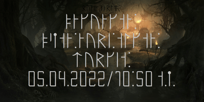 A variant of the young futhark runic script.
 - Cross Stitch Cursive by Gerald Gallo,
$20.00 Cross Stitch Cursive is based on upper case characters 16 stitches tall and contains the upper case characters A-Z, lower case characters a-z, small numbers 0-9, ampersand, exclamation and question marks, comma, and period.
 - Twigglee by Ingrimayne Type,
$9.95 Twigglee was inspired by the hand lettering on the plates in a 19th century book on ornaments by Owen Jones. It has no lower-case letters; the upper-case letters are simply repeated on the lower-case keys.
 - Cross Stitch Simple by Gerald Gallo,
$20.00 Cross Stitch Simple is based on upper case characters 8 stitches tall and contains upper case characters A-Z, lower case characters a-z, numbers 0-9, ampersand, exclamation and question marks, comma, period, colon, and semi-colon.


