10,000 search results
(0.023 seconds)
- FF Clair by FontFont,
$41.99 German type designer Ingrid Liche created this script FontFont in 1995. The family has 5 weights, ranging from Light to Black and is ideally suited for advertising and packaging, editorial and publishing as well as logo, branding and creative industries. FF Clair provides advanced typographical support with features such as ligatures, alternate characters, and case-sensitive forms. It comes with proportional oldstyle and proportional lining figures.
 - Rail Travel JNL by Jeff Levine,
$29.00 Here’s yet another interpretation of the classic “thick and thin” sans serif lettering most popular during the Art Deco era. This particular design comes to you through the courtesy of a hand lettered 1930s travel poster from the Pennsylvania Railroad. Some capitals are much wider than others, while the lower case ‘i’ is somewhat truncated. Rail Travel JNL is available in both regular and oblique versions.
 - Spicy Hour by PizzaDude.dk,
$17.00 Spicy Hour can be used for all your dishes and designs that needs that extra seasoning. Just mix, and you are ready to go! The ingredients includes contextual alternates, which in this case means that every letter has 5 different versions, which automatically cycles as you type. In other words, it spices up your text! Multilingual support is also a part of the dish!
 - BR Hendrix by Brink,
$30.00 A modern geometric grotesque type family of 16 styles. BR Hendrix is a fine balance of functionality and contemporary characteristics. Precisely drawn with a modern aesthetic in mind, Hendrix has familiar qualities associated with the classic grotesques, but combines them with a stronger geometric flavour. BR Hendrix provides advanced typographic support with features such as case sensitive forms, fractions, slashed zeros and multiple figure sets.
 - Kunstschau by Hanoded,
$15.00 The 1908 art exhibition in Vienna (Kunstschau 1908) featured works by Josef Hoffmann, Cark Otto Czeschka and Gustav Klimt, who showcased his famous painting 'The Kiss'. Kunstschau font was modeled on a stamp, designed by Austrian artist Bertold Löffler, for the 1908 exhibition. Kunstschau is a loose, handwritten font which comes with a distinct all caps upper and lower case, plus an extensive language support.
 - FF Dora by FontFont,
$68.99 The family has 5 weights, including a Display style, and is ideally suited for book and magazine design as well as small text. FF Dora provides advanced typographical support with features such as ligatures, small capitals, alternate characters, case-sensitive forms, fractions, and super- and subscript characters. It comes with a complete range of figure set options – oldstyle and lining figures, each in tabular and proportional widths.
 - Starbounder by Kustomtype,
$25.00 Kustomtype's "Starbouder" font is a cool stencil font family with a regular & oblique version. It contains all upper & lower cases. The "Starbouder" family is coordinated into letterforms, metrics, and weights to work better together. Why still looking for cool and decorative army, stencil and graffiti fonts for your posters, advertising, text, design, artwork, headtext, editoral design, magazines, etc. 'Starbouder is a decorative stencil & graffiti font'
 - Autorich Sans by Typia Nesia,
$20.00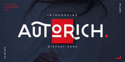 Autorich Sans is a display sans font, comes with 2 set of upper case (allcaps), 58 ligatures and some alternate. Great for brand identity, poster design, website / display, editorial, and more. **FEATURES :** * Basic A-Z * Numbers * Symbols * Stylistic Alternates * Standard Ligatures * Discretionary Ligatures * Oldstyle Figures * PUA Encode * Multilingual support Thank you for your purchase! and hope you're having fun with Autorich Sans ! Happy creating! Typia Nesia Studio
 - FF Erikrighthand by FontFont,
$65.99 Dutch type designer Erik van Blokland created this script FontFont in 1990. The font is ideally suited for advertising and packaging, festive occasions, editorial and publishing as well as poster and billboards. FF Erikrighthand provides advanced typographical support with features such as ligatures, small capitals, alternate characters, case-sensitive forms, fractions, and super- and subscript characters. It comes with proportional oldstyle and tabular oldstyle figures.
 - Sheldrake JNL by Jeff Levine,
$29.00 Sheldrake JNL is the second in a series of display fonts modeled from actual water-applied decals that were manufactured by the Duro Decal Company of Chicago (now Duro Art Industries). The font's name derives from the actual phone exchange for Duro, back in the days when a telephone listing had a name-number assignment for recognition. In this case, their number began as "SH(eldrake)-3".
 - FF Aircraft by FontFont,
$41.99 French type designer Albert Boton created this display FontFont in 2002. The font is ideally suited for advertising and packaging, music and nightlife as well as sports. FF Aircraft provides advanced typographical support with features such as ligatures, alternate characters, and case-sensitive forms. It comes with a complete range of figure set options – oldstyle and lining figures, each in tabular and proportional widths.
 - Glence by Nine Font,
$25.00 Glence family is a geometric sans-serif type family with 9 weights, from thin to black,with corresponding italics. Glence is designed based on geometric shapes that looks simple and clean. Each font includes opentype features such as Stylistic Alternates, Proportional Figures, Tabular Figures, Numerator, Superscript, Subscript, Case-Sensitive, Denominators, Scientific Inferiors, Ordinals, Ligatures and Fractions. Glence will make your artworks better with its simple & clean shapes.
 - Victory Speech Lower by Comicraft,
$49.00 Speak quietly but carry a big stick' as President Theodore Roosevelt once said... so, with so much heated rhetoric in the air this -- let's face it, EVERY -- Election season, we felt that it was important to put together a more dignified and sedate lower case edition of our popular Victory Speech font. Bad Hair and Big Sticks not included. See related font: Victory Speech
 - Bocadillo by Hanoded,
$22.00 A Bocadillo is a sandwich. I guess I was craving one when I had to name this font! Bocadillo is a sweet Brush script. It is all caps, but upper and lower case are different and like to mingle. It is an ideal font for product packaging, posters, book covers, postcards and big ‘I love you’ billboards. Comes with a generous helping of diacritics.
 - Quebra by Vanarchiv,
$55.00 Quebra is an extend display sans-serif font family with four widths (Extra Condensed, Condensed, Normal and Expanded) and ten weights, italics versions are available. The main strokes contain small breaks simulating modulated variations on the letterforms, these details are more present on large body sizes. All font versions contain Latin and Cyrillic encoding characters and also ligatures, case-sensitive forms, fractions, oldstyle and finally tabular figures.
 - FF Jackie by FontFont,
$47.99 Argentinian type designer Dario Muhafara created this script FontFont between 2003 and 2009. The family contains 4 weights and is ideally suited for advertising and packaging, festive occasions, film and tv, poster and billboards as well as software and gaming. FF Jackie provides advanced typographical support with features such as swashes, ligatures, alternate characters, case-sensitive forms, and stylistic alternates. It comes with proportional lining figures.
 - LTC Ornamental Initials by Lanston Type Co.,
$24.95 Little is known of the origin of these decorative Initial Caps. Series 448 at 24 point were a different design from the 36 point on which this digital version is based. In addition to the basic 26 characters, there is a negative version contained in the lower case position and a fill character (for two color caps) option in the number and punctuation key positions.
 - FF Letterine by FontFont,
$41.99 Italian type designer Alessio Leonardi created this display FontFont in 1995. The family has 7 weights, ranging from Regular to Black and is ideally suited for festive occasions, film and tv, music and nightlife as well as poster and billboards. FF Letterine provides advanced typographical support with features such as ligatures, alternate characters, and case-sensitive forms. It comes with proportional oldstyle and proportional lining figures.
 - Commuters Sans by Dharma Type,
$19.99 Commuters Sans is a daily type. Classic but Modern. Very simple geometry and wide type with warm clearness. Useful for both body-text and titling by their minimal glyph shapes and slightly wide and eye-catching proportion. Consists of eight weights and their matching italics. Supporting almost all latin languages. All-caps text for one line or a few is as wonderful as normal mixed-case typesetting.
 - Komunidad Hebrew Script by Jonahfonts,
$42.00 Komunidad is the Hebrew version of ”Quintana Light”. Suitable for logos and packaging statements. Invoking the OpenType / CONTEXTUAL variant produces the word terminals for all lower-case letterforms as well as diacritic letters. Final Hebrew Glyphs are also added. This can be done individually for each letter as well. Komunidad also contain alternative Swashes and TabOldstyle numerals. (OpenType-Variants may only be accessible via OpenType-aware applications.)
 - Cabarga Cursiva by ITC,
$29.00Cabarga Cursiva is the work of the father and son team of Demetrio E. Cabarga and Leslie Cabarga, both New York designers. The details of the sharp strokes almost give the impression of a knife blade, whether straight or curved like a scimitar. The capitals should be used only as initials and are complemented by a robust lower case alphabet as well as alternate forms and ligatures. - British Empire by Alan Meeks,
$45.00 British Empire is an attempt to re-create some of the typographic characterisics of countries within the former British Empire. It is a sans-serif with unusual up-facing serifs on some of the caps and the lower case round characters have flick round terminals Though designed as a headline face it still works well in limited text. There are four weights with four corresponding italics.
 - Madita by Hubert Jocham Type,
$39.00 Madita started with the idea of an upright sans script. Unlike other script typefaces, some of the characters look fairly constructed. The endings are either vertical or horizontal. On the other hand there are the swashes of a flowing script woven into the sans stroke that create an interesting tension. Madita is surprisingly legible, even in smaller sizes. The upper case letters even work in all caps.
 - Agneia by Maculinc,
$15.00 Agneia is a display font with a line cut style on each letter to add a unique feel and is very helpful for layout design projects, posters, logos, brands, packaging, vintage and modern style designs or for any other design. Agneia is displayed in upper and lower case, and also comes with multilingual to support more of your needs. Email support: maculinc@gmail.com Thank you! Maculinc
 - Art Deco Flowery Initials by Celebrity Fontz,
$19.99Art Deco Flowery Initials is a collection of richly decorated Art Deco letters set on a background of vines and blooming flowers. Includes one set of A-Z ornamental initials conveniently assigned to both the upper and lower case alphabet characters. Perfect for starting off the beginning of paragraphs in artistic publications, storybooks, fairy tales, and texts conveying the feel of the Art Deco period. - Skeleton Slab by Studio K,
$45.00 Skeleton Slab brings a new elegance to a classic form. I was thinking of calling it Ozymanidias, after Shelley’s poem, because it evokes memories of ancient runic inscriptions, but then I thought that was maybe a bit pretentious, and I decided I'd keep it simple and descriptive. Besides, I wasn't sure how to spell Ozymandias! Skeleton Slab has small caps in place of lower case.
 - Bernhard Fashion by Bitstream,
$29.99 This is an American face designed by Lucian Bernhard for ATF in 1929. An extra light face with tall ascenders and stylized bars that extend off to the left. The lower-case sits on the baseline and the much-taller-than-normal capitals have an imaginary baseline that sits about two-thirds of the distance from the real baseline to the bottom of the EM.
 - Ottocento by Eurotypo,
$39.00 Ottocento is an elegant chancery cursive, derived from XIXth century Italian calligraphy. Slightly inclined and with a fast and marked ductus, this font is well balanced between thick and thin strokes and shows marked ascendings and descendings. Ottocento is rich in stylistic variations with its elaborated upper cases, and stylistically different in traits and different ligatures are considered to make the most of the many OpenType features.
 - FF CrashBangWallop by FontFont,
$41.99 British type designer Rian Hughes created this display FontFont in 1994. The family has 6 weights, ranging from Light to Medium (including italics) and is ideally suited for festive occasions, logo, branding and creative industries, music and nightlife as well as software and gaming. FF CrashBangWallop provides advanced typographical support with features such as ligatures and case-sensitive forms. It comes with proportional lining figures.
 - ParaCaps by Paragraph,
$12.00 This decorative, headline or logotype geometric font consists entirely of uppercase letters. The glyphs of uppercase are rounder than their lowercase counterparts, allowing playful interaction within words, contrasting round and square shapes. The font is an extension of the Paragraph fonts family, however the capitals of ParaCap and lower case glyphs of Paragraph are not designed to be used together. That said, you are welcome to try :)
 - Braisetto by Adam Ladd,
$25.00 Braisetto is a handwritten, signature family with five weights, multiple alternates, and natural ligatures. Inky and expressive yet readable and functional, this typeface is designed to look personal and be useful in a variety of applications like branding, packaging, products, cards, and more. Features include multiple stylistic alternates, automatic double-letter ligatures, automatic title-case ligatures, initial stroke alternates, ending flair alternates, five weights, and matching ornaments.
 - mathieu by Gino Belassen,
$10.00 mathieu was created with a Krink K-60 marker – a paint marker that allowed gravity to dictate the outcome of each handwritten letterform. The font is the union of 26 mixed-case letters, 10 numbers, and roughly 100 glyphs, and has been seen in videos by artists Marshmello and Louis the Child. mathieu reflects Gino’s abstract style of writing, and reveals beauty in imperfection.
 - Knitting And Sewing Doodles by Outside the Line,
$19.00Knitting & Sewing Doodles are just that. If you type all caps you get 15 knitting icons and lower case is 15 sewing doodles. Knitting items include yarn, knitting, needles, ball winder, spinning supplies, stitch counter, etc. Sewing machine, buttons, thread, pin cushion, bobbin, thimble and needles, scissors, label, tape measure, darning egg, zipper, seam ripper, and pins, all in the Outside the Line style. - Lastero by Larin Type Co,
$15.00 Lastero this amazing handwritten font duo is light and elegant, will emphasize your personality in any project and will charm you with its signature. This font includes alternates for Uppercase and Lowercase, also a lot ligatures for lower case make your signature with them. You can use it to create logos, branding, t-shirts, book covers, stationery, marketing, blogs, magazines, cosmetics, signage, and more.
 - Running Hipster by Hanoded,
$15.00 Running Hipster is a tall, thin and all caps font with a funny name. The upper and lower case letters differ and can be mixed. You don’t necessarily have to use it to market your free range sheep woolen jumpers or organic button squash and soy based sour cream soup, feel free to use it for just about anything. Comes with a vintage amount of diacritics.
 - Bunken Tech Sans Wide by Buntype,
$49.00 The Bunken Tech Sans superfamily: A reminiscence of constructed fonts of the modern age designed with considerably cleaner forms. •See other members of the Superfamily: Bunken Tech Sans •For further details, view the Specimen PDF. Bunken Tech Sans Wide follows in the best tradition of the straight-lined and somewhat angular structures of its predecessors while offering a much more open and mild design. The shapes of the letters are therefore reduced to the most essential elements: The spurs on a, b, n and other lower case letters occur just as little as decorative or style details, the lightly rounded inside edges are more pleasing to the eye than certain historic role models and make for a harmonic, flowing style. Use In particular Bunken Tech Sans Wide stands out as an easy, distinctive headline font with its straight-lined, technical design. Open counters and large x-height make it equally suited for use in shorter texts. It is also perfectly complemented by Bunken Sans or Bunken Slab in longer texts (available soon). Features Available in 16 styles with widths ranging from Light to Heavy with associated Italics. All of the styles are very extensive: Support for at least 58 languages, Small Capitals, 9 number sets (e.g. Lining, Oldstyle, Tabular and Small Cap Figures), ligatures, alternate characters, numerous Opentype functions, and lots of other small features that make it more pleasant to work with the font on a daily basis as well as fulfilling typographic desires. Each style contains more than 870 characters! Each style is available in a professional (Pro) standard (Std) and Small Caps (SC) edition with a different range of functions. (Language support, OpenType features and number of glyphs). Details can be found on the respective pages. Bunken Tech Sans Wide is part of the Bunken Tech superfamily and is available in Condensed, Normal and Wide. Also of interest: The slab serif variation Bunken Tech Slab Features in Detail: 16 Weights: -Light -Book -Medium -SemiBold -Bold -ExtraBold -UltraBold -Heavy and corresponding Italics 3 Widths: -Condensed -Normal -Wide Alternate Characters: A, E, F, L, S, e, f, t, s, y, etc. Small Capitals 5 Sets of Figures: -Lining Figures -Old Style Figures -Tabfigures -Old Style Tabfigures -Small Cap Figures Automatic Ordinals Automatic Fractions Extended Language Support and more...
 - Times New Roman Windows compatible by Monotype,In 1931, The Times of London commissioned a new text type design from Stanley Morison and the Monotype Corporation, after Morison had written an article criticizing The Times for being badly printed and typographically behind the times. The new design was supervised by Stanley Morison and drawn by Victor Lardent, an artist from the advertising department of The Times. Morison used an older typeface, Plantin, as the basis for his design, but made revisions for legibility and economy of space (always important concerns for newspapers). As the old type used by the newspaper had been called Times Old Roman," Morison's revision became "Times New Roman." The Times of London debuted the new typeface in October 1932, and after one year the design was released for commercial sale. The Times New Roman World Version is an extension of the original Times New Roman with several other scripts like with the Helvetica World fonts. It is part of the Windows Vista system. The following code pages are supported:1250 Latin 2: Eastern European 1251 Cyrillic 1253 Greek 1254 Turkish 1255 Hebrew 1256 Arabic Note: The Roman and Bold versions include the arabic scripts but they are not part in the corresponding italic versions. 1257 Windows Baltic 1258 Windows Vietnamese
- Holland Gothic by URW Type Foundry,
$39.99 Blackletter fonts are timelessly beautiful and still very popular. At some point, it seems that every type designer discovers the beauty of these forms and the great pleasure in creating blackletter characters. Like also Dutch designer Coen Hofmann who, after designing Caxtonian Gothic, has designed yet another Blackletter font: Holland Gothic. Holland Gothic reminds of the 18th century »Duytsch« typefaces of Joan Michael Fleischmann and Christoffel Van Dyck. But Hofmann was mainly inspired by the Dutch calligraphers from the 17th and 18th century. Holland Gothic develops its full charm and beauty at larger sizes because of the hairlines in the upper case characters. To enable users composing texts in the style of our ancestors, Coen Hofmann added a series of pre-composed ligatures, also in combination with the long s, plus an alternate form for the lower case r which was used in combination with letters b, d, g, o, p, v, and w.
 - Leco 1988 by CarnokyType,
$18.00 The typeface LECO 1988 is another font family which belongs to LECO set. It is a display typeface, which is inspired by the title written on the bottle of lečo from 1988. Its typical features are embedded diacritics and significant black look with low contrast. Lower case is united with upper case and has several identical glyphs in both forms. Font contains alternative set of glyphs for letter „E“. Tabular numerals, superiors and inferiors and the full set of (glyphs - symbols) for languages using the Latin alphabet are also included in this font. LECO 1988 font family includes six specific styles: Regular, Blind, Gradient, Outline, Shadow and Stencil style. Those styles extend typographic options by mutual combination or overlapping, whilst every style share the identical metrics and kerning. Font format is Open Type with the support of several open type features. This typeface is suitable for creating logotypes, powerful posters or can be used as a headline display typeface.
 - Gloria Monoline by IM Studio,
$15.00 Gloria Monoline is a text serif with an editorial focus designed by Ikhsan Maulana. The idea for a typography job came from a design school letter-making exercise: Get a pair of scissors and some large sheets of paper, and start cutting. The resulting letters and the act of cutting them from paper inform the type design process, resulting in strong, simple shapes and open, inviting textures. The tone is crisp and straightforward. The classic letterforms, with a playful touch, give the design a personality that is both practical and spontaneous. The text weight is capable of adjusting copies at various sizes to print and render clearly on screen. Its lightest and heaviest weights work best at display sizes. Great care has been taken to save typists time with OpenType features including contextual punctuation and symbols to match case-sensitive, lower-case, and all-caps settings, as well as set images set for each use.