10,000 search results
(0.068 seconds)
- Kaleko 205 by Talbot Type,
$19.50 Kaleko 205 is inspired by the classic, geometric sans-serifs such as Gill Sans, but has shallower ascenders and descenders for a more compact look. It’s a well-balanced, versatile, modern sans, highly legible as a text font and with a clean, elegant look as a display font at larger sizes. It includes old style non-aligning (lower case) numbers, both proportional and tabular as well as accented characters for Central European languages. The Kaleko 205 family comprises of six weights, and is closely related to Kaleko 105. The most notable differences between the two variations, are the two-storey lower case a and g in Kaleko 205, where they are single-storey in Kaleko 105.
 - Kamerik 205 Text by Talbot Type,
$19.50 Kamerik 205 Text is the text specific variation of stablemate, Kamerik 205. With a shallower x-height and longer ascenders and descenders, its more traditional proportions make it more economical with space and better suited to continuous text. It's a well-balanced, versatile, modern sans, highly legible as a text font and with a clean, elegant look as a display font at larger sizes. The Kamerik 205 Text family comprises of four weights and includes old style non-aligning (lower case) numbers, both proportional and tabular as well as accented characters for Central European languages. It is closely related to Kamerik 105 Text, which offers variations in some characters, most notably a single storey lower case a and g.
 - Kamerik 105 by Talbot Type,
$19.50 Kamerik 105 is inspired by the classic, geometric sans-serifs such as Futura and Avant Garde, but has shallower ascenders and descenders for a more compact look. It's a versatile, modern sans, highly legible as a text font and with a clean, elegant look as a display font at larger sizes. It includes old style non-aligning (lower case) numbers, both proportional and tabular and accented characters for Central European languages. The Kamerik 105 family comprises of six weights, and is closely related to Kamerik 205. The most notable differences between the two variations, are the single-storey lower case a and g in Kamerik 105, where they are two-storey in Kamerik 205.
 - Kamerik 105 Text by Talbot Type,
$19.50 Kamerik 105 Text is the text specific variation of stablemate, Kamerik 105. With a shallower x-height and longer ascenders and descenders, its more traditional proportions make it more economical with space and better suited to continuous text. It's a well-balanced, versatile, modern sans, highly legible as a text font and with a clean, elegant look as a display font at larger sizes. The Kamerik 105 Text family comprises of four weights and includes old style non-aligning (lower case) numbers, both proportional and tabular as well as accented characters for Central European languages. It is closely related to Kamerik 205 Text, which offers variations in some characters, most notably a two-storey lower case a and g.
 - Eterea LC by Corradine Fonts,
$60.00 Eterea LC (Lower Case) is based in Eterea using the same Capitals but changing the lower case set. You can use this version of Eterea to give a more readable and soft aspect to your work.
 - Brandold by Krisp Designs,
$18.00 Brandold is based on the repetition of one shape, the equilateral triangle. Using these triangles as pixels I built a medieval-like font that looks new, but follows an old aesthetic. I chose to make this font because I hadn’t seen anything similar.
 - Vergennes by Scriptorium,
$18.00Vergennes is a decorative script font featuring ornate, calligraphic decorative initials based on 19th century metal type. It has a full character set with lower case and numerals, but the upper case initials are the standout feature - Asterx by Ingrimayne Type,
$7.95 In the 19th century typefaces with star-like serifs developed from the medieval type styles, retaining the sharp corners and peaks of some of the blackletter types but losing the flourishes on the upper-case letters. Asterx is in that tradition of star-footed typefaces, though it is not modeled on any particular one.
 - Cross Stitch Carefree by Gerald Gallo,
$20.00 Cross Stitch Carefree is based on upper case characters 10 stitches tall and contains the characters A-Z and period. Several characters extend above the capital line or below the base line.
 - Cross Stitch Discreet by Gerald Gallo,
$20.00 Cross Stitch Discreet is based on upper case characters 16 stitches tall and contains upper case characters A-Z, ampersand, exclamation and question marks, comma, period, colon, and semi-colon. The Gallo foundry now offers 174 font styles.
 - Mr Chalk by Thinkdust,
$10.00 Mr Chalk has a simple goal: being Mr Chalk. This font sets out to occupy a form indistinguishable from the real thing, and comes as close as ink will get. Looking at this font you can hear the scrabble of writing on a chalkboard, though the character is more of a mischievous child than a strict teacher. Round and free, Mr Chalk is a light and fluffy font ideal for an impersonal and friendly tone. If you're looking for another Chalk based font check out Lippy, a typeface for both lipstick and chalk based finishes!
 - Toxica - Unknown license

- FT Weapon Of Choice by Fenotype,
$19.00 A dingbat set with close combat weapons, guns, baseball bats, knives and other tools of violence.
 - Grindylow by Hanoded,
$15.00 In English folklore (in particular that of Yorkshire and Lancashire), Grindylow is a creature that dwells in rivers and lakes and is said to grab children who come too close to the water’s edge and drown them. It is thought the name Grindylow may be connected to the monster Grendel. Grindylow font does not grab children; it is a rather messy handmade brush font. I used a cheap brush and Chinese ink to create the glyphs. Comes with discretionary double letter ligatures for the lower case.
 - Helado by B2302,
$39.00 Helado is an elegant, modern sans-serif font, based on the idea to work as close as possible on the geometric forms of the circle and the square. Following swiss design classics Helado comes in these weights: LIGHT, REGULAR, BOLD and EXTRABOLD. Helado might be used as a headline font, for any kind of layout, it might also be transformed into that fashion label logotype you are working on. Have fun!
 - Vonnes by Font Bureau,
$40.00 Vonnes was designed by David Berlow working closely with Neville Brody on corporate redesign for Jim Von Ehre at Macromedia. Core weights are loosely based on Bauer’s Venus, 1907–1910. Berlow expanded the ideas behind the series to 56 fonts, the heart of the redesign. The Macromedia program was hailed as one of the most successful models of modern total design for innovative cutting edge companies; FB 2007
 - Akrux by Harvester Type,
$20.00 Akrux is a futuristic variable wide font. It is inspired by forms that are close to futurism, stars and space. Everything related to space, movies, cartoons, art, books, spaceships. Ideas came from everywhere. The font is suitable for headlines, posters, logos, large typography, magazines, everything related to cars and anything that can be futuristic and meaningful. It has great language support, and Cyrillic is planned in the future.
 - Graphen by Picador,
$24.00 Graphen family is a hand drawn typeface with 5 different weights. This font contains script that replaces glyphs with their alternates. It is based on checking the same glyphs in close range - not on a random appearance. Every weight was designed with attention to detail, so it can be used in small sizes and even on big posters. Weights include different features, such as dingbats or old style figures.
 - Kubikajiri by Hanoded,
$15.00 Kubikajiri is a scary, scratchy font, hand-made using India ink and a sharp, old-fashioned pen. You can use it for a variety of projects, like ads, posters and websites. Just be careful you don't lose your head...
 - Cross Stitch Noble by Gerald Gallo,
$20.00 Cross Stitch Noble is based on upper case characters 43 stitches tall and contains the characters A-Z and period.
 - Ardenwood by Scriptorium,
$18.00Ardenwood is based on a wood-carved alphabet from the early 1500s. It features gothic characters with elaborate floral decorations. The lower case has the more basic versions of the letters while the upper case characters are more extensively decorated. - Kandij by Hanoded,
$15.00 Kandij is a Dutch word and it means ‘Rock Sugar’. We Dutch use it in a lot of products, from ‘ontbijtkoek’ (a rye based spiced cake we sometimes eat for breakfast) to Fryske Sûkerbôle, A Frisian sweet bread. Kandij is a fat and happy font. I’d probably use it for any book or product aimed at children, as it has a certain lumpy cuteness. Comes with diacritics and swashes for the upper case letters.
 - Unger Script by profonts,
$39.99Unger Script is a script design which is obviously based on H. Matheis' Slogan typeface designed for Ludwig & Mayer in 1957. This very expressive script design is defined by its widely swinging upper case and its quite narrowly designed lower case characters. Ralph M. Unger redrew and digitized this font exclusively for profonts in 2001. His work is based on artwork taken from old font catalogues. - BeneCryptine by Ingrimayne Type,
$10.00 BeneCryptine is not based on any particular calligraphic type style. It has exaggerated upper-case letters and hyperactive lower-case letters that give it a wild and undisciplined look. It comes in four styles: the base style, a decayed variant, a shadowed style, and a final style that looks much like the base style but which has the spacing of the shadowed style. This last style can be layered with the shadowed style to easily create lettering with two colors.
 - Bene Crypt by Ingrimayne Type,
$10.00 BeneCryptine is not based on any particular calligraphic type style. It has exaggerated upper-case letters and hyperactive lower-case letters that give it a wild and undisciplined look. It comes in four styles: the base style, a decayed variant, a shadowed style, and a final style that looks much like the base style but which has the spacing of the shadowed style. This last style can be layered with the shadowed style to easily create lettering with two colors.
 - DT Skiart Lexiconic by Dragon Tongue Foundry,
$10.00 Apparently, Lexicon is the most expensive font in the world. ‘Skiart Lexiconic’ has been on a long growing path getting to where it is now. This font family was originally inspired by the san serif font ‘Skia’, by Mathew Carter for Apple. ‘Skiart’ was designed to feel more like a serifed font, but without any actual serifs. It took a small step between sans serif and serif fonts. Next on the path towards a serif font came Skiart Serif Mini, with tiny serifs added. This was a true serif font, although they were subtle. Then came ‘Skiart Serif Leaf’. and now... We present to you... DT Skiart Lexiconic. Having evolved from the Skiart family, we chose to give it the serifed styling of Lexicon. This is no way a copy or clone of Lexicon. It still has the basic bones of the original Skiart font, but the position, shape and size of the serifs were very much influenced by the world famous Lexicon font. DT Skiart Lexiconic is not the most expensive font in the world.
 - Little Humble by Zeenesia Studio,
$14.00 Introducing Little Humble Font Little Humble is natural kid font. It made based on real handwriting. It can be used for cafe or coffee shop menu lists on board, branding, invitations, watermarks, advertisements, product designs, labels, product packaging, book content, quotes and more. It came with number & punctuation, multilingual support, and PUA encode Hope you like this product.
 - Kaleko 205 Round by Talbot Type,
$19.50 Kaleko 205 Round is a rounded variation of Talbot Type font Kaleko 205. It's a well-balanced, versatile, modern sans, highly legible as a text font and with a clean, elegant look as a display font at larger sizes. The rounded terminals give it a friendly, approachable look. The Kaleko 205 Round family comprises of six weights and is closely related to Kaleko 105 Round. The most notable differences between the two variations are the two-storey lower case a and g in Kaleko 205 Round, where they are single-storey in Kaleko 105 Round.
 - Kaleko 105 Round by Talbot Type,
$19.50 Kaleko 105 Round is a rounded variation of Talbot Type font Kaleko 105. It's a well-balanced, versatile, modern sans, highly legible as a text font and with a clean, elegant look as a display font at larger sizes. The rounded terminals give it a friendly, approachable look. The Kaleko 105 Round family comprises of six weights and is closely related to Kaleko 205 Round. The most notable differences between the two variations are the single-storey lower case a and g in Kaleko 105 Round, where they are two-storey in Kaleko 205 Round.
 - Kettering 105 by Talbot Type,
$12.99 Kettering 105 is inspired by the classic, geometric slab-serifs such as Lubalin, but has shallower ascenders and descenders for a more compact look. It's a versatile, modern slab-serif, highly legible as a text font and with a clean, elegant look as a display font at larger sizes. It includes old style non-aligning (lower case) numbers, both proportional and tabular, as well as accented characters for Central European languages. The Kettering 105 family comprises of six weights and is closely related to Kettering 205, its more intensely Deco flavoured cousin.
 - Sleepy Time by Hanoded,
$15.00 Sleepy time… Ah, if only your kids would go to bed, close their eyes and drift off to sleep. This font was created when my son had some problems falling asleep: he'd cry, he wanted to sleep in a different bed, he wanted a different animal friend (he has Tij - a tiger, Meh - a sheep, Rafi - a giraffe, Moo - a cow, Woofy - a dog, Kikker - a frog). Sleepy Time font is an all caps typeface with uneven letters and a very different upper and lower case. It comes with all languages, including Cyrillic!
 - Cross Stitch Delicate by Gerald Gallo,
$20.00 Cross Stitch Delicate is based on upper case characters 21 stitches tall and contains the characters A-Z and numbers 0-9.
 - Neisya by Phoenix Group,
$13.00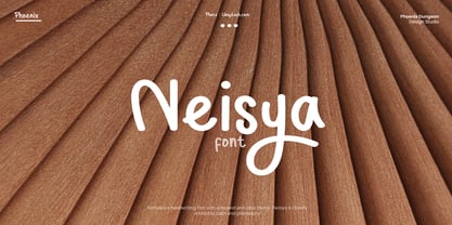 Neisya is a handwriting font with a relaxed and cozy theme, Neisya is closely related to calm and philosophy.
 - Cross Stitch Solid by Gerald Gallo,
$20.00 Cross Stitch Solid is based on upper case characters 14 stitches tall and contains the characters A-Z, numbers 0-9, and ampersand.
 - Colonial Press by Simeon out West,
$25.00 Colonial Press is a font based on serif typefaces designed by William Caslon I (1692-1766) and various revivals thereof. Caslon is cited to be the first original typeface of English origin, but some type historians point out the close similarity of Caslon's design to the Dutch Fell types, presumed to be the work of Dutch punchcutter Dirck Voskens. Colonial Press harkens to the look and feel of newspapers in Colonial North America around the mid 1700s without the rough edges commonly associated with colonial printing and many reconstructions. The rough quality of the American typeface is believed to be the result of oxidation from the exposure to seawater during the long voyage from England to the Americas. Colonial Press is a heavy font that retains some of the handcut quality of these fonts while smoothing out the irregularities that make many of these fonts so visually distracting at larger point sizes. For the italic version of this font, I chose to emulate the more ornate letterforms that I have encountered, giving the italic characters a more ornamental feel. Colonial Press comes with full punctuation and a 362 glyph character set for most Western European-based Latin alphabet languages. It is a font that is designed both for normal typing and for larger, decorative display.
 - Telegraph by ParaType,
$25.00 Telegraph font family was developed on the base of scanned images of telegraph printing machines. It consists of 4 styles: Natural is the most close to original scans with all defects of positioning and dirty print on the rough telegraph paper tape; Clean style uses cleaned contours, but keeps disorder in positioning; Straight is straightened along base line; Clean Straight style has self-explaining name. The fonts can be used for imitation of wire texts and in advertising and display typography. Upgraded version with extended character set was released in 2011 by ParaType. Designer Gennady Fridman.
 - Publica Sans by FaceType,
$- Publica Sans is a clean geometric typeface, equipped with a variety of OpenType features to give you all you need for great typography: Alternates, arrows, rare currency symbols, case sensitive forms, various sets of figures and discretionary ligatures. Publica Sans has two sisters: Publica Play and Publica Slab Take a close look at our gallery (especially ‘OpenType Features 1–6’) to discover the versatility of Publica Sans. Alternates Give your typography a certain spin with the variety of alternate letters provided. Currency You need to set prices in exotic countries? No problem: Publica Sans gives you loads of rare currency symbols. Case Sensitive Forms Sometimes you write in all caps and there are some symbols (e.g. brackets) that need some extra treatment to make it look perfect – that’s what case sensitive forms are for. Figures Publica Sans provides 6 sets of figures, like lining, tabular, oldstyle, numerators ... Discretionary Ligatures Ligatures can make your logo or headline look spicy. So there are plenty of them.
 - Korolev by Device,
$39.00 DF Korolev is a 72 weight geometric sans serif family based on lettering by an anonymous Soviet graphic designer from the propaganda displays at the Communist Red Square parade in 1937. It has been named in honor of Sergey Pavlovich Korolyov, or Korolev, considered by many to be the father of practical astronomics. Rational and robust, it is also elegant and refined. Tracings done in Illustrator over a photograph featuring this type pinned down some of the basic character shapes. These were then imported into FontLab, where the full glyph complement was developed. The lower-case has been designed from scratch, and adheres to the structural logic of the uppercase as closely as possible. The complete Korolev super-family includes standard, italic, condensed, and compressed versions, each in five weights. Try the ‘rounded’ and ‘rough’ companion families. The Alternate families come with a double-story “a”.
 - Regulator Nova by Device,
$39.00 A high lower-case x-height geometric sans with open counters, Regulator Nova is extremely legible at text sizes and in extended settings while the range of weights also make it suitable for headlines. The stoke terminals are all cut at close to 90 degrees, lending a sharp precision to the characters. Alternate versions of the g, j, r, w, K, R, W, # and ampersand are available in both upright and italic, and can be toggled on and off in the Opentype panel or the Glyphs palette. Clean, elegant and legible, Regulator Nova has a classical proportions based on a circumscribed circle and square, and shares structural similarities to early sans serifs such as Rudolf Koch’s Kabel, while adopting more British forms for the M and R. Regulator Nova is an extension and reworking of Regulator, now with extra weights, reweighed italics, Opentype-savvy alternates and a full European character set.
 - Roncesvalles by Scriptorium,
$12.00Roncesvalles is based on samples of medieval calligraphy. It features a traditional lower case character set with unique decorative capital letters featuring unusual flourishes.
