10,000 search results
(0.319 seconds)
- Kitra 77 by LightHouse,
$49.00Kitra 77 was one of the studies to Hamuel Nine Five. Though at first glance we can find several similarities, a closer look will reveal a completely different font in color and proportion. Kitra 77 is an OpenType/TTF Unicode font. - Artime by John Moore Type Foundry,
$14.95 Artime is a dynamic display font based on strong graphic elements with rectilinear forms. Artime came in two style forms; a solid one called Flat and a decorative form with crisscrossed of vertical lines called Deco. Artime comes with Open Type features and interesting ligatures. Both forms are ideal for creating logos and headlines.
 - Finador by Julien Fincker,
$24.00 Finador is a modern, soft geometric sans family. The functional style of a geometric sans has been soften by open apertures and rounded corners. This makes it functional and friendly. The default version has open, modern apertures. Stylistic Set 2 includes the whole set with closed, classic apertures. A slightly different look. It´s like having a second font in just one font. So it´s up to you to choose the right look for your projects. The Finador family includes 8 weights, from thin to heavy + their matching italics. With 900+ glyphs per style it supports over 200+ latin based languages, includes an extended currency symbol set and a lot of Open Type Features like small caps, ligatures, fractions, alternates and many more. The lightest and boldest weights are good for display usage, while the middle weights can be also used for body text. As a versatile allrounder Finador supports almost every of your needs. It has the ability to become your next favorite workhorse family.
 - Komet by Jan Fromm,
$45.00 Komet is a sturdy typeface with a calm and upright feel. Although it derives inspiration from classical English sans-serifs, it’s not too closely related to that model. Komet, instead, feels rather more lively and contemporary. Its compact spacing, low stroke contrast and heavy dots and accents give it an almost monolinear quality. The diagonals are slightly curved and the counters of the round letters such as b, o and q are generously wide. The muted, understated middle weights are built for extended body copy, while Komet’s thin and dark weights look brisk and assertive and make for subtly expressive headlines. Komet is an ideal choice for editorial design, branding and corporate design. The Komet family comes in eight weights with matching italics, from Thin to Black. The glyph set of each font contains around 520 glyphs and provides good everyday support for most Latin-based languages. For a wider range of advanced OpenType features, Komet Pro is also available.
 - Nameplate JNL by Jeff Levine,
$29.00 Two attractive cast metal door signs reading "Men" and "Ladies" from back in the Art Deco era inspired the idea for Nameplate JNL. The left parenthesis key starts the border decoration, and the right parenthesis key closes it off. Nameplate JNL has just a basic A-Z and numeral set; the letters "floating" within the parallel lines of the border to form complete nameplates, apartment numbers or any similarly encased words. A period, comma, apostrophe and dash are on their respective keys. A small blank space is on the left bracket key, a medium space is on the right bracket key and a large space is on the left brace key. There is a small, complete frame on the right brace key. For names such as "MacDonald" or "McIntyre", the small "ac" is on the colon key and the small "c" is on the semicolon key. No kerning has been applied in order to give the type more of an antique, "mechanically assembled" look.
 - Bonkard by Twinletter,
$15.00 Bonkard is a font created with great care to meet all of your requirements. Your project will be more flawless if you use this font; everyone will think it’s attractive and charming. We completed this font with standard and thick-thin families, so you may use it for subtitles and text titles because we made it with ease and flexibility in mind for you to use in all types of special projects. Not only that, but the unique shape of each letter is something we pay close attention to so that your customers fall in love at first sight. This graffiti font is great for product logos, poster titles, headlines, packaging, film titles, logotypes, gorgeous writing, and trendy graffiti designs, among other things. Of course, if you utilize this font in your numerous creative projects, they will be perfect and outstanding. Use this typeface right away for your one-of-a-kind and remarkable projects.
 - Size by SD Fonts,
$34.00 Retro style is hip, so are early 20th century poster fonts. Size is based on these extra condensed letter forms. In the 19th century the need to communicate commercial messages on limited poster space brought up extremely condensed fonts creating a new typographical look. Since not really legible in small sizes these fonts nearly disappeared with the change in the commercial communication in the 20th century. For a couple of years now, these extra condensed fonts have a revival copying the exact historical appearance of its predecessors. Size, though also seeking the inspiration in the historical draft, furthermore aims to interpret this compressed look in a more vivid way by not closing in on the open counters of the round letters, but having its stroke endings slightly curved. Since other characters are defined by straight strokes, Size displays a look more vital and candid, but still distinct, compared to its historical predecessors.
 - Frigga by Sudtipos,
$49.00 Frigga is a typeface that settles its roots in the Baroque Dutch tradition of text typefaces and northern european type forms. Carefully crafted for an optimum balance between its solid historic structure and a refreshing repertoire of organic forms, where blossoms its contemporary spirit and natural beauty. In the page, spread on long text settings a feeling of comfort and closeness, while in headlines and display use, it reveals itself more exuberant and plentiful of details. Is beautiful, timeless, lush, elegant and smooth like nordic mead. Fully equipped to realize your wildest editorial dreams, Frigga came in 20 styles, with more than a 1000 glyphs per style, alternates, ornaments and borders, old style and tabular figures, small caps and plenty of OpenType features to fulfill any type of editorial need. Named after the nordic goddess Frigga (also called Frejya), taking as a reference the romantic mythos of its cultural representation, the solemn presence and her warm, gentle embrace.
 - Grantig by Julien Fincker,
$19.99 Grantig is a bold serif display typeface. Inspired by the opening titles of old western movies, the genre of western slab serifs has been translated into a modern context and adapted to today's needs. As a result, it breaks free from the chains of its genre and opens up to many themes. Grantig is the german word for grumpy. With its massive serifs and strictly rounded curves, it comes particularly close in character to the grumpy Western heroes of days gone by, always in the presence of his two leaning companions, Slant and Backslant. With Grantig, it is particularly easy to create eye-catching and type-accentuated headlines. Its expressive nature makes it particularly suitable for editorial, packaging and advertising. With its 482 characters, Grantig covers the language usage for many Latin-based languages. At the same time, it has the most important open type features, such as lining and oldstyle figures, alternate characters, and arrows.
 - Forgotten Melody by Anmark,
$12.00 I’m pleased to introduce new handwritten font Forgotten Melody. Forgotten Melody comes in two styles: Regular and Extras. This font includes ligatures and a full set of lowercase alternates to make your text as close to a natural handwritten script as possible. Forgotten Melody Regular is an elegant, modern, feminine font. Uppercase letters are ideal for your wedding monograms and logos. Use this font for wedding invitations, branding, packaging, magazines, letterpress address, social media, restaurant menus, greeting cards, headers and so on. Forgotten Melody Extras is a symbol font (includes 62 hand drawn musical and floral elements). You can use these characters either separately or in combination with Forgotten Melody Regular (or any other fonts). The symbols are perfect for creating your own logo, greeting cards, photo overlays, scrapbooking, writing letters and just for fun! The font has extensive language support, it includes English and European latin-based languages: French, Italian, Spanish, Portuguese, German, Swedish, Norwegian, Danish, Finnish and others.
 - Bizarries by Typephases,
$25.00 This series, with 104 illustrations in three files, collects original ink drawings with absurdities, bizarre people, whimsical personalities and risky behaviors! There is a very peculiar sense of narrative in the sucession of characters, even if they came out rather spontaneously and their order is random.With a vintage look and feel, these people seem to come out of a time capsule from Victorian times. Almost everything in the Bizarries (and also in their close relatives, our Illustries, Whimsies, Ombres, Absurdies and Genteta dingbats) is invented and drawn with no references —just a handful of images were sketched from historical photography. These illustrations can be very useful for a variety of projects, either in black and white, or colored in a paint or drawing application. You can use them at any size, from a small spot illustration to a huge poster, depending on your needs. The outlines remain crisp and clear no matter how much you enlarge, reduce, distort or tweak their shapes.
 - Biofolio Ultimate by Formatype Foundry,
$30.00 Behance Biofolio Ultimate is geometric Grotesk typeface exploration proportion and simplicity in typeface, Inspired by the elegant plainness seen in many of the less common 20th centuries sans Comes in 10 weights matching Italics —20 fonts in all, Biofolio Ultimate supports around 150 languages in the Latin based languages, Designed with multiple OpenType features, such as powerful stylistic alternates, case-sensitive forms, contextual and stylistic alternates. The standard numerals set encompasses tabular figures and symbols, superiors and inferiors, numerators and denominators, plus fractions.
 - Elfin by Lindstrom Design,
$29.00 A fanciful reinterpretation of the elvish type found inside the ring in J. R. Tolkien's "Lord of the Rings". Elfin has a very small x height with large ascenders and descenders. Unlike most scripts, Elfin characters connect from the x height, not the base line. If you're looking for a magical, Disneyesque, fairies-prancing-about type, you need Elfin. Elfin contains upper and lower case letters, old style figures (numbers), punctuation, foreign accents. Indulge the Peter Pan that lurks within!
 - Marseille by Louise Fili Ltd,
$35.00 Marseille is an Art Deco-inspired typeface which is based on Louise Fili’s iconic cover design for the hauntingly beautiful Marguerite Duras novel, The Lover. The font is available in six irresistible weights: thin, light, regular, medium, semibold, and bold. Each weight features both caps and lower case, and supports over 200 languages. Marseille will satisfy all your typographic needs, from book jackets to monograms to packaging, logos, and even wedding invitations—timelessly elegant, with a distinctive flair that exudes La Belle France.
 - Rohn by Nine Font,
$29.00 Rohn is a modern squarish typefamily with a large x-height. Its letterforms are based on the shape of square with rounded corners. With particular details and large x- height, it is more legible at small sizes both on screen and paper. It has seven weights from Thin to Black with corresponding oblique styles and each weight includes ligatures, fractions, old style numbers, case-sensitive forms and more. Rohn is ideally suited for branding, logo, packaging, magazine, poster and editorial design.
 - Die Bruecke by Hanoded,
$15.00 Die Brücke was a group of German expressionists which formed in Dresden in 1905. Members of the group include Erich Heckel, Fritz Bleyl, Ernst Ludwig Kirchner and Karl Schmidt-Rottluff. Much of the group's work was influenced by primitivism and medieval woodblock printing. Die Bruecke font was based on a printed invitation for an art exhibition from 1906. Although the font is all caps, upper and lower case glyphs differ and can be interchanged. Of course Die Bruecke comes with extensive language support.
 - Darker Marker by Hanoded,
$15.00 Darker Marker is just what the name suggests: I found a very big fat marker in a local stationary store, bought it, came home and went to work on this font. Darker Marker is a very clear, very easy to read marker font. It is all caps, but upper and lower case differ and can be interchanged. Darth Vader would have said: “come to the dark side” and I believe you should. Darker Marker comes preloaded with all the diacritics you need.
 - Decour Soft by Latinotype,
$26.00 Decour Soft is the rounded-edged version of Decour. It is a slab serif humanist low contrast typeface. The overall design also features strong curves, making it a very friendly face. The font retains the original elegant features of Decour—based on Art Deco design—such as high contrast between upper and lower case characters. Decour Soft is a suitable font for logotypes and packaging. Its design also allows it to be used with certain elegance in book titles and magazines subheadings.
 - School by Monotype,
$39.00The School font family is a popular design based on a grade school alphabet. The School fonts allow teachers to create custom hand-lettered exercise sheets and classroom signage. Five variations are available. The plain style and its corresponding bold will create hand-lettered stand-alone text. The lined style and its corresponding bold superimposes a set of three guidelines on the plain style. A dashed style is also provided in case a teacher prefers the centerline to be dashed instead of solid. - Packing Heat by Hanoded,
$16.00 I came across a photo of Al Capone and some of his henchmen when searching the internet for something completely unrelated. We don’t have a history of notorious gangsters in Holland, so I was intrigued by Capone all of my life. Packing Heat is 1930’s slang for ‘carrying a gun’, which I thought befitted this handmade font with an early 20th century look. Packing Heat comes with multilingual support and a set of alternates for the lower case glyphs.
 - FF Folk by FontFont,
$41.99 Italian type designer Maurizio Osti and American type designer Jane Patterson created this display FontFont in 2003. The family contains 4 weights and is ideally suited for advertising and packaging, music and nightlife as well as poster and billboards. FF Folk provides advanced typographical support with features such as ligatures, alternate characters, case-sensitive forms, and stylistic alternates.The font was based on the original alphabet created by Ben Shahn in 1940. It comes with proportional lining and tabular lining figures.
 - Keitana MF by Masterfont,
$59.00 A practical font family with 2 weights for all your day by day headlines, signage etc. An extended sans serif typeface with rounded endings that provides unique bold appearance without losing legibility.
 - Bodrum Sans by Bülent Yüksel,
$19.00 You can download usiful link: Bodrum Sans PDF Type Specimen Bodrum Sans is a sans serif type family. Designed by Bülent Yüksel in 2018/19. The font, influenced by style serifs, popular in the 1920s and 30s, is based on optically corrected geometric forms for better readability. Bodrum Sans is not purely geometric; it has vertical strokes that are thicker than the horizontals, an “o” that is not a perfect circle, and shortened ascenders. These nuances aid in legibility and give Bodrum Sans a harmonious and sensible appearance for both texts and headlines. Bodrum Sans provides advanced typographical support for Latin-based languages. An extended character set, supporting Central, Western and Eastern European languages, rounds up the family. The designation “Bodrum Sans 14 Regular” forms the central point. "Bodrum Sans" is available in 10 weights (Hair, Thin, Extra-Light, Light, Regular, Meduim, Bold, Extra-Bold, Heavy and Black) and 10 matching italics. The family contains a set of 650+ characters. Case-Sensitive Forms, Classes and Features, Small Caps from Letter Cases, Fractions, Superior, Inferior, Denominator, Numerator, Old Style Figures just one touch easy in all graphic programs. Bodrum Sans is the perfect font for web use.
 - Bodrum Style by Bülent Yüksel,
$19.00 "Bodrum Style" is a serif Style family designed by Bülent Yüksel in 20018/19. The font, influenced by serif styles that were popular in the 1920s and 30s, is based on optically corrected geometric forms for a better readability. "Bodrum Style" is not purely geometric; it has vertical strokes that are thicker than the horizontals, an “o” that is not a perfect circle, and shortened ascenders. These nuances help the legibility and give "Bodrum Style" an harmonious and sensible appearance for both texts and headlines. Bodrum Style provides advanced typographical support for Latin-based languages. An extended character set - supporting Central, Western and Eastern European language - rounds up the family. “Bodrum Style 14 Regular” forms the central point. "Bodrum Style" is available in 10 weights (Hair, Thin, Extra-Light, Light, Regular, Medium, Bold, Extra-Bold, Heavy and Black) and 10 matching italics. The family contains a set of 650+ characters. Case-Sensitive Forms, Classes and Features, Small Caps from Letter Cases, Fractions, Superior, Inferior, Denominator, Numerator, Old Style Figures just one touch easy In all graphic programs. Bodrum Style is the perfect font for web use. Enjoy using it.
 - Bodrum Slab by Bülent Yüksel,
$19.00 “Bodrum Slab” is a slab serif type family. Designed by Bülent Yüksel in 20018/19. The font, influenced by style serifs, popular in the 1920s and 30s, is based on optically corrected geometric forms for better readability. “Bodrum Slab” is not purely geometric; it has vertical strokes that are thicker than the horizontals, an “o” that is not a perfect circle, and shortened ascenders. These nuances aid in legibility and give “Bodrum Slab” a harmonious and sensible appearance for both texts and headlines. Bodrum Slab provides advanced typographical support for Latin-based languages. An extended character set, supporting Central, Western and Eastern European languages, rounds up the family. The designation “Bodrum Slab 14 Regular” forms the central point. “Bodrum Slab” is available in 10 weights (Hair, Thin, Extra-Light, Light, Regular, Meduim, Bold, Extra-Bold, Heavy and Black) and 10 matching italics. The family contains a set of 650+ characters. Case-Sensitive Forms, Classes and Features, Small Caps from Letter Cases, Fractions, Superior, Inferior, Denominator, Numerator, Old Style Figures just one touch easy In all graphic programs. Bodrum Slab is the perfect font for web use.
 - Premier by ITC,
$29.99Premier font was designed by Colin Brignall. Premier Lightline displays all the elegance and sophistacation of the 1920s and 30s and consists of a refined lowercase with high ascenders and generous capitals which can also be used alone. Premier Shaded is an all caps typeface which provides a robust counterpart to the fine elegance of Premier Lightline. Premier Shaded should be used with close or ever overlapping letter spacing and is ideal for strong, eye-catching headlines. - Baraka by Typophobia,
$20.00 Baraka - in Swahili - a blessing. It is a simple, block-like typeface closed in cuboids. It was created and designed in Tanzania, Africa. It contains 183 gliphs, which due to their simplicity, which consisted in cutting out letters from rectangles using as little light as possible, makes an impression and is in fact a very heavy display typeface. It was created primarily for posters and labels, where thanks to its modularity and form enclosed in a limited geometric figure
 - Sequel Rounded by OGJ Type Design,
$35.00 Sequel Rounded is a post-Max Bill font, developed in close cooperation with the Max Bill Georges Vantongerloo foundation in Switzerland. MAX BILL Last universal scholar, most important design teacher of the 20th century: There are superlatives, always very enthusiastic, when the importance of Max Bill is discussed. The trained silversmith studied at the Bauhaus, with personalities such as Josef Albers, Paul Klee and Oskar Schlemmer. He worked as an architect, later as sculptor and designer.
 - Amostely Signature by Kotak Kuning Studio,
$15.00 Amostely Signature is a handwritten signature script with a natural & stylish flow. This font has a multitude of natural looking ligatures in its OpenType features - making the font look as close to natural handwriting as possible. This collection of scripts is perfect for personal branding. Amostely Signature Font is perfect for many different projects such as logos & branding, invitation, stationery, wedding designs, social media posts, advertisements, product packaging, product designs, label, photography, watermark, special events or anything.
 - MGN Goddess by Morgana Studio,
$17.50 MGN Goddess is a serif typeface released in 2022. The liquified lines in several characters of Goddes create an exquisite, unworldly touch. To magnify its beauty, the typeface has a dissolving lobe and tapering spurs that stand out among the others. The overall feminine and exclusive impressions of the font delivers are closely related to Parisian nuances. Therefore, this magical typeface is suitable for use for posters, logos, and headlines, especially for fashion and beauty products.
 - Amirah Brillone by Kotak Kuning Studio,
$17.00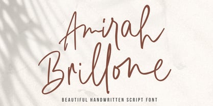 Amirah Brillone is a handwritten signature script with a natural & stylish flow. This font has a multitude of natural looking ligatures in its OpenType features - making the font look as close to natural handwriting as possible. This collection of glyphs is perfect for personal branding. Amirah Brillone is perfect for many different projects such as logos and branding, invitations, stationery, wedding designs, social media posts, advertisements, product packaging, product designs, labels, photography, watermark, special events or anything.
 - Donittan Story by Kotak Kuning Studio,
$17.00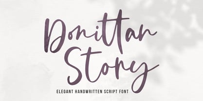 Donittan Story is a handwritten signature script with a natural & stylish flow. This font has a multitude of natural looking ligatures in its OpenType features - making the font look as close to natural handwriting as possible. This collection of glyphs is perfect for personal branding. Donittan Story is perfect for many different projects such as logos and branding, invitations, stationery, wedding designs, social media posts, advertisements, product packaging, product designs, labels, photography, watermark, special events or anything.
 - Aliykit Open by John Moore Type Foundry,
$35.00 Aliykit Open a decorative OpenType font generated from geometry with parallel lines of open and closed forms, by the way they can fit inside the Art Deco style but is part of the design influence of Venezuela in the area of art and cinetic art, his set of characters includes letters for western and eastern European languages and Cyrillic, also provides several ligatures that link between them. It is ideal for decorative display headlines to large sizes.
 - Silk Sans Display by SilkType,
$47.50 Silk Sans Display is the sans version of the high-contrast typeface Silk Serif. The main feature of the font family is the disconnection between the bowls and the stems. However, the bowl is very close to the stem, creating the illusion of connection. Silk is delicate and legible — but above all, it is sophisticated. Silk Sans Display is available in 7 weights, from Extra Light to Black, and supports Western, Central and South-Eastern European languages.
 - Ongunkan Rhaetian Script by Runic World Tamgacı,
$60.00 Rhaetic or Raetic (/ˈriːtɪk/), also known as Rhaetian, was a Tyrsenian language spoken in the ancient region of Rhaetia in the eastern Alps in pre-Roman and Roman times. It is documented by around 280 texts dated from the 5th up until the 1st century BC, which were found through northern Italy, southern Germany, eastern Switzerland, Slovenia and western Austria, in two variants of the Old Italic scripts. Rhaetic is largely accepted as being closely related to Etruscan.
 - Mariné by TipoType,
$19.90 Mariné is a geometric sans but with the softness of humanistic strokes. It’s mild contrast and multiple different styles allow Mariné to work well as both a text and display font. It also includes an Up version and calligraphic features that add a touch of informality. Mariné is available in an extended family and is the close cousin of Amelia (available at MyFonts.com). All differences between Mariné and Amelia appear in the italic and Up versions.
 - Serp and Molot by ParaType,
$30.00 Designed for ParaType in 2003 by Tagir Safayev. The typeface was inspired by some of the Cyrillic letterforms of Sergey Chekhonin (1878-1936). Chekhonin belonged to the World of Art group, which is so closely associated with the flowering of Russian book and theater design at the beginning of the 20th century. For use in advertising and display typography. Serp & Molot has been adjugded Award of Excellence in Type Design of 'bukva:raz!' ATypI International Type Design Competition, 2001.
 - Shutterbug JNL by Jeff Levine,
$29.00 On April 20, 1950, film comedian Jerry Lewis indulged his love of cameras by opening up Jerry Lewis’ Camera Exchange on Vine Street in Hollywood. It closed in 1951. Thanks to an image preserved within newsreel footage of the shop’s grand opening night, a glimpse of the post-Art Deco signage with its unusual, block style lettering inspired a digital version. Highly unusual and best for novelty projects, Shutterbug JNL is available in both regular and oblique versions.
 - Municipal Pool JNL by Jeff Levine,
$29.00 A photo of the now closed [circa-1953] Lowell Municipal Pool (at 1601 N. 28th St.) in Boise, Idaho shows the words “Municipal Pool” formed into the cement of the entrance to the above-ground swimming facility. Both the lettering and building entrance designs harken back to the Art Deco era and the sign features stencil-like characters. This inspired a typeface aptly named Municipal Pool JNL, and is available in both regular and oblique versions.
 - PLatinum by Letterhead Studio-IG,
$35.00 The pLatinum family was created in 1998. Ink, scanner, Fontographer and as a result Regular and Italic styles of pLatinum typeface. Kyrillitsa'99 International type design competition Award winning typeface. The design style is “Irregular Serif”. The glyphs of pLatinum roman are reminiscent of the Russian types of early eighteenth century—especially in the smaller point sizes. An Italic, surprisingly close to the handwriting copybooks of mid-eighteenth century, is a later addition to the design.