10,000 search results
(0.019 seconds)
- Colmcille by Monotype,
$29.99Colmcille was designed by a Gaelic scholar, typographer and printer, and first released by Monotype for composition casting in 1936. The design intention was to provide a Gaelic looking type which worked well as a roman text face. The digital version of the Colmcille font family has been made in collaboration with the designer's son, Dara O Lochlainn. A number of changes have been made, including a new set of figures and the addition of a bold weight. Although originally designed as a text face, Colmcille can be used for advertisements, flyers, in fact wherever a touch of Gaelic charm is required. - Fast Food by Breauhare,
$35.00 Fast Food is a font based on the former (and now revived) logo of a hamburger chain. It has that look of the 1970s & 1980s, yet also has a futuristic, alienesque, sci-fi look about it. It can be used for projects aimed at consumers waxing nostalgic for their good old days, or for movie posters or books about the great final frontier, and much more. There’s an alternate uppercase E & F, both of which are really stylin'! You may even develop such an appetite that you'll want to supersize your order! Digitized by John Bomparte.
 - Merlin by Linotype,
$29.00Linotype Merlin is part of the Take Type Library, which features the winners of Linotype’s International Digital Type Design Contest from 1994 to 1997. This font was designed by Anne Boskamp and its alphabet consists exclusively of capital letters. At the same time aggressive and sensitive, Merlin looks as though it were scratched onto paper with a pen tip saturated with ink. Like characters from another time, the letters fall into place and make an impression which is both vulnerable and strong, lively and reserved. Merlin’s historical roots lie in the archaic pictograms in the caves of Stone Age civilizations. - Butterfly Ball by Hanoded,
$15.00 The Butterfly Ball and the Grasshopper's Feast is a 70's concept album/rock opera by Deep Purple's Roger Glover. The music video to Love Is All, featuring a lute playing frog in a cape, must be one of the best videos ever made. At least, I believe so. When working on this font, the song popped up in my head (it is still there), so I decided to name this cute, cartoonish font after the album. Butterfly Ball is a fun and happy typeface with rounded glyphs and an uneven baseline. Of course it comes with a hallucinatory range of diacritics.
 - Welmock by Keristyper Studio,
$14.00 Welmock is a display/decorative font based on a vintage royal fantasy font with modified ornaments that make it look prettier. This font is good for logo design, Social media, Movie Titles, Books Titles, short text even long text letters, and good for your secondary text font with sans or serif. Featured: Standard Uppercase & Lowercase Numeral & Punctuation Multilingual : ä ö ü Ä Ö Ü ß ¿ ¡ Alternate & Ligature PUA encoded We recommend programs that support the OpenType feature and the Glyphs panel such as Adobe applications or Corel Draw. so you can use all the variations of the glyphs. Hope you enjoy our fonts!
 - News Gothic BT by Bitstream,
$29.99 The standard American sanserif of the first two thirds of the twentieth century, prepared for ATF by Morris Fuller Benton in 1908 under the name News Gothic, with a matching lightface known as Lightline Gothic. Linotype’s Trade Gothic follows News Gothic except for its widely-spaced straight-sided boldface based on ATF Alternate Gothic No.3. Linotype matches News Gothic Bold, a boldface version that originated at Intertype, with Trade Gothic Bold No.2. Ludlow Record Gothic follows News Gothic more loosely. News Gothic BT™ font field guide including best practices, font pairings and alternatives.
 - Timernis by Aga Silva,
$19.99 Timernis is humanist multilingual contrast sans serif available in eight weights from thin to black. All caps have this super elegant, classic proportions old school look and is based on 1940 stone engraving commemorative plaque. The engraving itself boasted sophisticated clean look and was a joy to look at. All caps: Would suit display usage such as: signage, titles, headers, engravings, high end packaging. Do try putting space between the letters in your selected word for suave and chic feel. Expanded round shapes are prevalent in lowercase, which is legible in small sizes and pleasant to the eye.
 - Binny Old Style by Monotype,
$29.99Binny Old Style is based on type designs originally cut in Scotland about 1863. Binny Old Style shows the influence of the types cut by William Caslon but was an attempt to make a modernized version by eliminating some of Caslon's more archaic features. It was cut by some American foundries at the end of the nineteenth century and by Lanston Monotype for mechanical composition, in 1908. Binny Old Style was named after Archibald Binny, a Scotsman who established a type foundry in Philadelphia in 1796. The Binny Old Style font is ideal for small point size settings in newspaper advertisements, catalogues etc. - Azuza by Parkinson,
$20.00 In the 1990s I drew a text face for the San Francisco Chronicle. It was based on W. A. Dwiggins’ Electra and incorporated many features of the Linotype Legibility Series: More compact, with a taller lowercase X-height, etc. That type was called Electric and it was the Chronicle’s text face for nearly a decade, surviving several redesigns. From that, I made Azuza, a more detailed and sensitive style. Azuza was recognized in the TDC2 type competition in 2001. Then it went into hibernation as a Type 1 font family. Today it is back. Six fonts. Open Type.
 - Creamy Bubble by Balpirick,
$15.00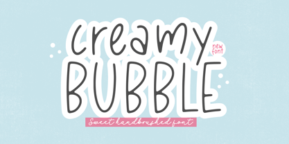 Creamy Bubble - a Sweet Handbrushed Font that's clean, elegant and perfect for a range of design projects! With its smooth, effortless lines and understated sophistication, this font is the perfect choice for those who want a modern look that's still timeless in its appeal. Crafted with precision and care, this font is incredibly versatile and can be used for a range of design projects, including logos, branding, invitations, packaging, and more. With its simple yet refined aesthetic, it's sure to make a lasting impression on anyone who sees it. - also multilingual support Enjoy the font! Feel free to comment or feedback! Thank you!
 - Rams by TipografiaRamis,
$30.00 RAMS is a Sans Serif type family of four weights with matching italics. The typeface’s design was influenced by the geometric style of Sans Serif faces of the 30s. The letter shapes – based on geometric forms – have been optically corrected for better legibility, thus enabling geometric concepts to be adapted by typographic tradition. While the typeface is intended for use in display sizes, it is also quite legible in text and is well suited for editorials. Rams is released in OpenType format with extended support for most Latin languages and includes some opentype features – proportional/tabular figures, slashed zero, ligatures, fractions...
 - Chippewa Falls by Chank,
$49.00 In the spirit of the old days, before water sparkled and before typefaces were known as fonts, Chank is proud to introduce Chippewa Falls the font. This font comes with fancy swirly uppercase letters and stout small caps for lowercase, as well as a heart-warming story. Chank rescued this former custom font from an abandoned design proposal. He gave it some TLC and before long a retro typeface emerged, with lettering worthy of good old fashioned sleigh rides and candy canes. Enjoy this font as you would a cup of hot cocoa next to a potbelly stove on a snowy day.
 - Work Crew Stencil JNL by Jeff Levine,
$29.00 In the 1949 Paramount comedy "My Friend Irma" (a film based on the popular radio series that introduced America to Dean Martin and Jerry Lewis), an opening gag set-up involving excavation work utilizes street barricades which inspired Work Crew Stencil JNL. Placed along the site, different advisories are stenciled upon barricades warning of the work in progress. The scatterbrained Irma (Marie Wilson) walks straight through the construction, oblivious as to what's going on around her and steps right into the open hole dug into the sidewalk (a scene she reprises in 1950's "My Friend Irma Goes West").
 - ITC Jiggery Pokery by ITC,
$29.99ITC Jiggery Pokery is the work of British freelance designer Carol Kemp. ITC Jiggery Pokery evolved from lettering for a project which needed to be quirky, wacky and fun," says Kemp. "The name came to me as the letters appear to jig along - it just seemed to fit. 'Jiggery Pokery' is London Cockney slang which has a variety of meanings. It's used to describe behavior such as 'ducking and diving', trickery, juggling (especially of financial matters!), or 'hanky panky'. My grandparents were Cockneys, and my uncle would use colourful rhyming slang which I loved to hear as a child."" - Urania by Hoftype,
$49.00 Urania is a new approach to early sans serif typefaces, in particular Ferdinand Theinhardt’s types which came out at the beginning of the 20th century. Urania is not an adaption, but a new interpretation of familiar and successful formal features, transformed into a contemporary look. The Urania family consists of 18 styles and it comes in OpenType format with extended language support for more than 40 languages. All weights contain ligatures, proportional lining figures, tabular lining figures, proportional old style figures, lining old style figures, matching currency symbols, fraction- and scientific numerals, matching arrows and alternative characters.
 - Stella Ann by Jukebox Collection,
$32.99 Stella Ann is another great addition to the script fonts of the Jukebox collection. Named after the designer's maternal grandmother, Stella Ann is a beautiful flowing calligraphic style font. It is both bold and strong, yet warm and graceful, just like its namesake. Perfect for wedding invitations, business cards, scrapbooking and much more! Jukebox fonts are available in OpenType format and downloadable packages contain both .otf and .ttf versions of the font. They are compatible on both Mac and Windows. All fonts contain basic OpenType features as well as support for Latin-based and most Eastern European languages.
 - Phosphate Pro by Red Rooster Collection,
$60.00 Phosphate Pro is an all-caps sans serif font family with an inline weight, and was created by Steve Jackaman (ITF) and Ashley Muir in 2010. The original Phosphate was published by International TypeFounders, and the family was based on the ‘Phosphor’ typeface created by Jakob Erbar for Ludwig and Mayer, circa 1922-30. Jackaman created a condensed variant, 'Phosphate Condensed Pro,' in 2017. Phosphate Pro has incredible presence, and its power shines in display format. Apple, who is notoriously selective about their software choices, included Phosphate Pro in the system fonts for Apple’s OS X 10.10 Yosemite.
 - Buckley by Laura Worthington,
$23.00 Buckley is a condensed, hand-lettered font based on characters created with my favorite vintage fountain pen: a Waterman Ideal #2. Its textured strokes reveal its ink-on-paper origins, while randomized contextual alternates cycle through letterforms as you type, for a convincing and handwritten look. Buckley’s friendly, happy, and casual appearance helps make packaging, greetings, and storybooks charming and approachable. See what’s included! http://bit.ly/2c98p0L This font has been specially coded for access of all the swashes, alternates and ornaments without the need for professional design software! Info and instructions here: http://lauraworthingtontype.com/faqs/
 - ITC Lintball by ITC,
$29.99Eric Stevens's latest typeface, ITC Lintball, combines two unusual features: its letterforms are based on the serifless lettering inscribed in stone by the ancient Greeks, yet the wobbly edges of the strokes, and especially the slightly wider “lintballs” on the ends, suggest lettering done on paper with a modern felt-tip pen. The ball motif is carried through in the fat dot under the raised capital O, and in the similar dot used in place of a crossbar in the capital A. There's an angularity to many of the strokes, especially in the lowercase, that gives Lintball its distinctive character. - Nettle Sans by Duck Soup Design,
$11.00 Influenced by Blackletter type and highway fonts, the Nettle Sans font family sets out to be both a quirky and confident headline font (at the heavier weights), and an easily legible body font for print or screen (at the lighter weights). Careful attention was taken in choosing distinct shapes for each letter to maximise legibility, and to balance a daring experimental form with function. Through its brutal angled cuts out of the ends of tapered links, ink-traps, ascenders and descenders, Nettle Sans' defining motif offers a visual language that communicates speed, efficiency, advancement and the "cutting edge".
 - Skarpa by Aga Silva,
$23.99 This is long awaited thorough revision to Skarpa family. The revision has inculded both another look at letter shapes as well as kerning and metrics of the files. The shapes encapsulated in this font stem from old time architectural drawings hand executed at drawing board with tracing paper and rapidographs. Think of lettering stencils sliding across the tracing paper and craftily exectuted drawing descriptions. The font is based on geometric forms devoid of excessive flourishing. Would suit modern designs either in fashion, technology or laboratory setting. Would look good on door plaques in pharmacy or simple drawer plaques - especially Medium or Bold specimen.
 - Sweet Cakery by Balpirick,
$15.00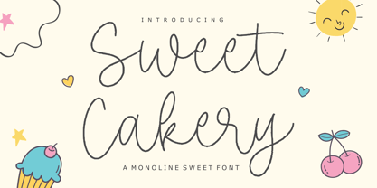 Sweet Cakery - a monoline Sweet Font that's clean, elegant and perfect for a range of design projects! With its smooth, effortless lines and understated sophistication, this font is the perfect choice for those who want a modern look that's still timeless in its appeal. Crafted with precision and care, this font is incredibly versatile and can be used for a range of design projects, including logos, branding, invitations, packaging, and more. With its simple yet refined aesthetic, it's sure to make a lasting impression on anyone who sees it. - also multilingual support Enjoy the font! Feel free to comment or feedback! Thank you!
 - ITC Grimshaw Hand by ITC,
$29.99 ITC Grimshaw Hand is based on the handwriting of its British designer, Phill Grimshaw. Warm and lively, this typeface has the look of spontaneous handwriting with a little extra panache. Note the jaunty k, the swooping f, the simply stylish s, and the absolutely zingy cap Q and R. Grimshaw designed this face in 1995, at a time when he was also playing the guitar and mandolin. Handwriting fonts give an air of intimacy to the graphic design of advertising pieces, packaging, invitations, greeting cards - and ITC Grimshaw Hand has the touch of sweet music in its enthusiastic strokes.
 - Praho Pro by Picador,
$29.00 Praho Pro is a part of Warsaw Types – a project based on Warsaw’s local typographic heritage. The project, presented at the Museum of Praga, is a collaboration of 12 young Polish typographers. Praho Pro is a multilingual family inspired by the unique, historical character of Praga district of Poland's capital - Warsaw. High contrast, thin serifs, sharp terminals and large x-height are key features for distinctive headlines. The whole family consist of 9 weights and real italics, small caps, superscript and subscript letters, oldstyle, tabular figures and fractions. It covers latin and cyrillic script. Every weight has almost 2000 glyphs.
 - LeBrush by PeGGO Fonts,
$39.00 LeBrush is a contemporary Roman typeface based on real brush lettering, in 10 styles from Thin to ExtraDark, inspired on the classic Roman proportion of the “Capitalis Monumentalis” present into the Trajan Column and another Greek architectural structures. The “LeBrush classic” weight was specially developed to easily design ‘Movie titling’ graphics, cover books & magazines and posters. More skilled designers and pro-Users can even set the type, in a very smart way, in logotypes and labels as well, using its multiple advanced opentype options and extra ornamental sets. Lowercases allowed users to work in lecture size requirements.
 - Hearth Stone by Mightype,
$15.00 Hearth Stone Script is a modern calligraphy font with the current handwriting style, this font is perfect for branding, wedding invites, magazines, mugs, business cards, quotes, posters, and more, you can try first if you want to buy this font. Hearth Stone Script is equipped with 309 glyphs. With so many glyphs, you can choose the letters according to your liking. There are many variations and options for each letter, so you can customize based on your design needs. This font contains: Hearth Stone Script OTF If you have any question, do not hesitate to contact me by email: mightype89@gmail.com
 - Montigny by Eurotypo,
$48.00 Montigny is a contemporary calligraphic font with classical roots, based on an 18th-century roundhand script. It is carefully designed, with a special emphasis on the connection of the letters, with high ascenders to give rise to the ornaments of the different letters. There is a special search for high readability. This font contain 585 glyphs, in addition, a wide selection of alternates and ligatures is included, to preserve the qualities of handwriting, in order to accommodate various design aesthetics. These alternatives are automatically applied through an advanced programming scheme or manually through several OpenType features.
 - Magenta Basket by Balpirick,
$15.00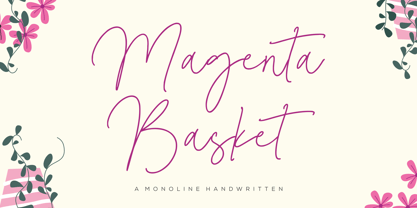 Magenta Basket - a Monoline Handwritten that's clean, elegant and perfect for a range of design projects! With its smooth, effortless lines and understated sophistication, this font is the perfect choice for those who want a modern look that's still timeless in its appeal. Crafted with precision and care, this font is incredibly versatile and can be used for a range of design projects, including logos, branding, invitations, packaging, and more. With its simple yet refined aesthetic, it's sure to make a lasting impression on anyone who sees it. - also multilingual support Enjoy the font! Feel free to comment or feedback! Thank you!
 - Local Groceries by Invasi Studio,
$15.00 Inspired by the hand-painted paper signs typically seen in grocery stores during the 1920s to 1970s. This is now available in a digital format that still has the appearance and feel of hand-painted letters. Take a look at a few samples in the thumbnails to see what you can do with them. Local Groceries comes with a combination pairing font. It combines both regular and script fonts. Local Groceries is suitable for vintage and contemporary marketing, branding, merchandise, and packaging designs. Features: Uppercase & Lowercase Numerals & Punctuation Alternates and Ligatures Multilanguage Supports 60+ Latin based languages
 - Burger Honren by IRF Lab Studio,
$12.00 Burger Honren is a beautiful collection of fonts, consisting of scripts, monolines and serifs. In this collection you will see fonts in various styles. With their help, many options open up for you to create your projects, both in vintage and modern styles. The script fonts in this collection provide both charisma and charm, crafted with care and complemented by alternatives and strokes. Serif comes in 10 styles and it is possible to choose the required style for your design. This font is PUA encoded which means you can access all the glyphs and sweeps easily!
 - M Hei PRC by Monotype HK,
$523.99 Although traditional Heiti typefaces may not be as lively as Songti, the modesty of M Hei makes is enduring and stand out from other similar typefaces. M Hei’s design is based on the hallmarks of traditional Heiti typefaces: it has little to no thick-thin contrast in strokes and has square cut terminals. Its dots (點), ticks (剔) and downstrokes (撇、捺) are subtly curved and longer than usual; all stems (豎) and crossbars (橫) remain simple and clear; and hooks (勾) appear rounded. Together they make a harmonious form which is clean but pure, classy but contemporary.
 - Rougant by Mans Greback,
$59.00 Rougant is a unique sans-serif typeface. Drawn and created in 2021, this lettering has a distinct vintage style and a strong personality. Use it for a motorcycle logotype or any graphic with a rock'n'roll vibe. Provided in three styles: Rougant Regular/Solid, Rougant Rough and Rougant Bold. Rougant is built with advanced OpenType functionality and has a guaranteed top-notch quality. It has extensive lingual support, covering all Latin-based languages, from North Europa to South Africa, from America to South-East Asia. It contains all characters and symbols you'll ever need, including all punctuation and numbers.
 - Karamelia by PizzaDude.dk,
$20.00 Karamelia is my grungy hand drawn brush script. Uppercase is pretty steady, while the lowercase dances and bounces in an unpredictable way. The font has got at lot of of OpenType features such as swashes, ligatures and stylistic alternates - which easily makes your text look more like authentic handwriting. I can think of loads of great opportunities in which this font would look absolutely great ... invitations, weddings, café menus, birthdays, various greeting cards ... or maybe even a loveletter?! I could mention more, but I think I got your fantasies started! Go crazy with Karamelia, and the world will love you for it!
 - Jonathan Andrea by Ergibi Studio,
$20.00 JONATHAN ANDREA A font combination, Modern signature and elegant Sans, we made this font with care and detail touchwhich makes the perfect font combination that you can apply for your design that needs an elegant touch, classy looks, and minimalist. perfectly for headlines, wedding, social media, logos, posters, packaging, T-shirts,coffee shops, restaurants, magazine’s headers, signs or gift/post cards,cafe’s and weddings or any type of advertising purpose. What's Included : Standard glyphs Ligatures International Accent Works on PC & Mac Simple installations If there is a problem, question, or anything about my fonts, don't hesitate to ask! Big Thanks ~ Ergibi Studio
 - Coats by Piñata,
$9.90 We've created a lively antiqua that is perfect for short emotional inscriptions. Coats will warm you up on a cold day and add a little kindness and easiness into any layout. Lines typed with this typeface start “trembling” in long texts, so be careful to use this family for special occasions and in small amounts. Imagine: on a cold day, you've just arrived home from a frosty walk to be rewarded with a cup of hot cocoa topped with marshmallows. We call this feeling the Coats effect. Add to your collection this unique font family that works perfectly in the contemporary digital age.
 - Staple by Ajeet Mestry,
$50.00 Staple is a Display Font. Each letter and number is made up of a clever arrangement of staples. Together, they retain the simplicity and beauty of a perfectly folded stapler pin. This creates a font that provides very good readability, solid shape and simple elegance that makes it perfect for use as a display font. To add elegance to the font, the letters and numerals are designed to retain the pin identity across all characters. Care has been taken so that the pins do not overlap. Nor are the pins bent or twisted into unnatural shapes to create the characters.
 - Frontage by Juri Zaech,
$20.00 Frontage is a charming layered type system with endless design possibilities using different combinations of fonts and colors. Achieve a realistic 3D effect by adding the shadow font or just use the capital letters of the regular and bold cut for stark artwork. The typeface’s design is based on a simple grid, which creates the friendly, handcrafted look of facade signs. It is generously spaced for maximum impact of your message. As a display typeface Frontage loves color and is suitable for headlines and logotypes. Details include 224 characters in six styles and manually edited kerning.
 - Kuenstler 165 by ParaType,
$30.00 Bitstream typeface based on Koch Antiqua by Rudolph Koch (Klingspor, 1922). Koch Antiqua, also known as Locarno and Eve, is the most popular face of one of the great lettering artists of the 20th century. This delicate display face has a small x-height, very tall ascenders, and main strokes that taper gracefully downward. Koch-Antiqua appeared extensively in advertising between the wars. A refined letterform, it is best used sparingly for a distinctive look in advertising, book, and job work. Two weights of Cyrillic version including alternative lc characters were developed by Isabella Chaeva and released in 2008 by ParaType.
 - Budare by fragTYPE,
$14.00 Budare is a geometric font family that rebelled to find its own identity within an ocean of other typefaces of the same style. Its design is based on the shape of the wrought iron plate used in Venezuela and other countries to make arepas and other foods. Its appearance is strongly defined by basic geometric shapes such as the circle and its upright style is accompanied by rotated italics "rotalics" that complement its rebellious spirit. Because of its strong display characteristics, its best uses are focused on posters, branding, titles and anything that needs a strong graphic emphasis.
 - Softie by Tail Spin Studio,
$20.00This typeface was designed to be used as the page heading font for MyFonts. Originally only the letters needed to make up the required phrases were drawn. Then amazingly enough, people started asking where they could get the font, so I decided to complete the character set, and named it Softie. This name was chosen because the round and rather bulbous shapes that make up the letters reminded me of marshmallows. Softie, almost good enough to eat. The Bold version, called Softie Bloated, was added in late 2003. Rumor has it that the name came to Steve after Thanksgiving dinner.