10,000 search results
(0.04 seconds)
- Centuria by Catopodis,
$35.00 Centuria is a sanserif humanistic family. Unlike many sanserif fonts, Centuria has modulated strokes and a moderate x-height. Centuria has a contemporary design with a soul of early grotesque fonts. Its slightly condensed letterforms and its short descenders allow a considerable amount of text per column. Centuria is very readable at small sizes! It is suitable for use in: newsletters, magazines, newspapers or just for any simple editorial application. Works very well in continuous text, short paragraphs or headlines. Provides a balanced and friendly texture. Match very well with Century.
 - Kaliendric by IbraCreative,
$17.00 Kaliendric, a luxury serif typeface, epitomizes elegance and sophistication in the realm of typography. Its meticulously crafted serifs and refined letterforms seamlessly blend tradition with a contemporary aesthetic, creating a visual harmony that captivates the discerning eye. The typeface exudes a sense of opulence and prestige, with each character embodying a delicate balance between timeless design and modern sensibility. Kaliendric’s graceful strokes and subtle details contribute to its distinctive character, making it a perfect choice for prestigious branding, editorial design, and other high-end applications where a touch of refined luxury is essential.
 - Gerbera by Brownfox,
$44.99 Gerbera is a new sans-serif with a distinct personality that fuses geometric and organic elements. It is at once hip and quaint, clear yet idiosyncratic, restrained but sensual. Its deliberately varied classical capital proportions and geometric structure are balanced by slightly reversed stress and pinched terminals on curved strokes. This versatile font comes in five weights with their italics and offers a variety of Open Type features, including small caps, alternate characters and punctuation, five sets of figures, and CE, Baltic, and Cyrillic support. Designed by Gayaneh Bagdasaryan & Vyacheslav Kirilenko, 2014-2022.
 - Lyster by Mans Greback,
$58.00 Lyster is a hand-painted script typeface, built and created by Måns Grebäck in 2020. Its brush strokes makes the typeface the ultimate blend between modern and classic. The balanced weight and tilt result in velocity, flow and a friendly but energetic vibe. Lyster comes as Lyster Regular and Lyster Bold, and each style contains a full OpenType compatible alternate alphabet and ligatures. The font contains all characters you'll ever need, including all punctuation and numbers. It has an extensive lingual support, covering all Latin-based, European languages.
 - Povetarac Display by Tour De Force,
$25.00 Povetarac Display font family is part of Povetarac Superfamily together with Povetarac Sans and Povetarac Didone. Available in 6 weights and one variable font file, Povetarac Display relays on lively uppercase proportions that took inspiration from vintage typefaces. It is well balanced, elegant and fully recognizable high contrasted sans serif family. One of its characteristics are straight and wide terminals. With sharp overhang, Povetarac Display works pretty well in all situations – from editorial use to branding, websites or just titles. Comes with 3 Stylistic Sets, SmallCaps and Fractions and extended Latin character map.
 - Fine Food by Jeff Levine,
$29.00 A 1942 photograph showing the exterior of the famous Hollywood restaurant Sardi’s and it’s unusually lettered sign was the inspiration for Fine Food JNL. Classically Art Deco, the Sardi’s sign had an ‘S’ looking like an inverted ‘J’ with a flat tail, a traditional ‘A’ replaced by a triangle and the ‘R’ composed of a ‘D’ with a diagonal extension. These elements were balanced against more traditional [but complementary] characters to retain the novel charm of the original signage. Fine Food JNL is available in both regular and oblique versions.
 - Benn by Factory738,
$5.00 Benn is a bold and strong font family. Inspired by a car shape, it's sturdy uncompromising style is felt through the controlled letterforms and fluid touches. A balance of hard lines and smooth curves. Benn works great in any branding, poster, logos, magazines, films. The different weights give you full range to explore a whole host of applications, while the alternate glyphs give a fluid and modern feel to any projects. Eight styles Alternate glyphs are available Numbers & Punctuation Extensive Language Support Thanks for having a peek at Benn.
 - Scritta Nuova by Anatoletype,
$16.00 Scritta Nuova was born to transpose my personal handwriting and evolved today into a smart typeface that maintains the original feel with improved legibility and visual balance. The steady rhythm and roundness of Scritta Nuova give the impression of a smooth, girlish and gentle writing. It also evokes retro calligraphic styles taught in Italian schools around the 1950s, which might have influenced in one way or another my original handwriting. Note that the capital letters can be nicely set next to each other without overlapping, unlike script typefaces with swashy capitals created as initials.
 - South Island by Rook Supply,
$14.00 The goal with South Island was to make a font that looked authentically handwritten. Each character had to perfectly flow into the next and maintain a nice balance between variation and legibility. The typeface retains all the texture and grit of the original handwritten characters, making it especially powerful when used for large headers. South Island comes in a regular version, and a second version which contains alternate versions of each letter A-Z (both upper and lowercase). Try pairing it up with a more traditional serif or sans serif font for endless possibilities.
 - Naive Line by S&C Type,
$8.00 Naïve Line is an unusual handwritten serif font designed by Fanny Coulez and Julien Saurin in Paris. Our goal was to draw a font with finely irregular lines that give a human and whimsical feeling. We designed five weights, finely balanced, to assure a good readability whatever the size. This font is part of our Naïve superfamily that contains lot of variations: Line, Inline, Serif, Sans Serif, and a special Art Deco one. Just click on our foundry name to see them all! We hope you will enjoy our work. Merci beaucoup!
 - Mayari by Lurinzu Studios,
$16.00 “Mayari" is an elegant and expressive display typeface that is inspired by the characteristic and vibes of female warrior in Filipino Mythology named: Mayari. Mayari is the “goddess of moon”. This typeface holds the perfect balance of expressiveness as a display whilst also holds well of being a body type. This typeface is best used when you want to express elegance, class and sophistication in your designs. *This font includes letters, numbers, multi-language, and all essential marks needed. * Two(2) weights are currently available for this typeface: Regular and Italic
 - Nelona by Mega Type,
$15.00 Nelona An elegant font designed when in a creative mood and perfect shape, inspired by the bold, natural look of serifs so beautiful for today's fashion. bold, balanced and varied, born for luxury and beauty. including uppercase letters, numbers, and various kinds of punctuation. Nelona is perfect for invitations, logos & branding, photography, advertising, watermarks, social media posts, product packaging, product designs, labels, wedding designs, stationery, special events or anything else needed to create a theme. Hope you enjoy our fonts and if you have any questions, feel free to message & I'll be happy to help :)
 - Anargya by IbraCreative,
$17.00 Anargya is a timeless beauty classic serif typeface that exudes elegance and sophistication. Its meticulously crafted letterforms showcase a harmonious balance between thick and thin strokes, creating a sense of timeless grace and legibility. With a refined, high-contrast design, Anargya brings a touch of traditional charm to contemporary designs, making it a versatile choice for branding, editorial, and luxury aesthetics. Its gracefully tapered serifs and graceful curves imbue it with an air of sophistication and refinement, making it a perfect choice for projects that demand a timeless, classic typographic style.
 - Four Seasons by Latinotype,
$39.00 Four Seasons is a display handwritten typeface inspired by nature and its four seasons. The font was designed by Coto Mendoza and Luciano Vergara during the winter of 2010 and 2013. Four Seasons’ real handmade stroke allows for an authentic lettering and makes the font perfect for photography and illustration composition. Four Seasons comes with an extensive character set and includes OpenType features such as titlings, endings, initials, swashes, ligatures and alternates plus a sweet set of ornaments, dingbats and words, all inspired by branches, leaves and flowers.
 - Anything by Supersemarletter,
$10.00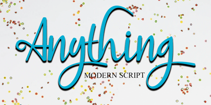 Anything is a handwritten script style in Uppercase and Lowercase feel nice balanced. Provide ligatures with special character make the design letter looks incredible. Honestly it works perfectly for headlines, logos, posters, packaging, T-shirts and much more. Font Features : • Regular version • Character set A-Z in uppercase and lowercase • Ligatures in Lowercase and special • Alternates option • Numerals & Punctuation • Accented Characters • Multiple Languages Supported Recommended to use in Adobe Illustrator or Adobe Photoshop with opentype feature. If you have questions, just send me a message and I'm glad to help.
 - Linotype Algologfont by Linotype,
$29.99Linotype Algologfont is part of the Take Type Library, chosen from the contestants of Linotype’s International Digital Type Design Contests of 1994 and 1997. Designed by German artist Bjorn Hansen, the font contains exclusively capital letters and the forms of the characters look like branches or driftwood bent to form an alphabet and punctuation. The font is very flexible and can give text either a myterious and strange impression or a free and natural one, dependent on context. Linotype Algologfont is best suited to headlines in larger point sizes. - ITC Novarese by ITC,
$40.99 Novarese font is the work of designer Aldo Novarese. He created 218 typeface cuts but as he was writing his book, Alfabeta, he decided to include only those he considered indispensable. He divided his fonts into 4 categories and in the designing of Novarese, took the best characteristics of each group and combined them into this font. In the style of Latin stone scripts of the second century BC. Novarese is a well-balanced and relatively wide text font with classic forms. ITC Novarese™ font field guide including best practices, font pairings and alternatives.
 - Histadia by IbraCreative,
$17.00 Histadia is a strikingly modern chic serif typeface that seamlessly blends timeless elegance with contemporary aesthetics. Its graceful, high-contrast letterforms exude sophistication and versatility, making it an ideal choice for a wide range of design projects. The font’s crisp lines and refined serifs convey a sense of refined luxury, while its clean, minimalist detailing ensures legibility and impact in both print and digital applications. Histadia captures the essence of classic serifs while embracing a modern sensibility, making it a versatile choice for those seeking a harmonious balance between tradition and innovation in typography.
 - Sraben Grotesk by Yukita Creative,
$14.00 Sraben Grotesk is a beautiful, versatile font that's perfect for all kinds of projects! It features balanced and harmonious proportions, plus bold variations to make certain elements stand out. This font offers classic characteristics inspired by Grotesk typography, making it an ideal choice for posters, flyers, brochures, brand identity designs, and magazine layouts. Whether you're looking to create something new or bring a creative twist to an existing project, Sraben Grotesk can be the perfect choice. Let its clean aesthetic fuel your imagination and inspire you as you achieve your design goals!
 - Kecumik by IbraCreative,
$17.00 Kecumik, a stunning Glamour Serif typeface, seamlessly blends elegance with modern sophistication. Its graceful letterforms exhibit a harmonious balance of curves and serifs, exuding a timeless allure that captivates the eye. Kecumik’s intricate details and refined strokes contribute to its distinctive personality, making it an ideal choice for projects that demand a touch of glamour and a nod to classical aesthetics. Whether used in editorial design, branding, or luxury packaging, Kecumik’s versatile charm elevates any visual composition, embodying a sense of refined beauty that resonates across diverse design applications.
 - Aprex Sans by S6 Foundry,
$20.00 Aprex Sans perfectly balances the minimalist quality associated with contemporary sans with flair within the width of the counters and comfortable, breathable apertures. — Throughout weights and sizes, the typeface has great legibility and good contrast between positive and negative space, making it stunningly versatile. — With a seamless combination of contemporary details and classic styles, Aprex Sans draws inspiration from the mid-century humanist and grotesque typefaces, and its solid and straightforward structure is characterized by angular connections between curves and stems. Aprex Sans is geometric in nature with humanist qualities rooted in the Swiss tradition.
 - Le petit cochon by Nantia.co,
$12.00 Le Petit Cochon is an adorable chubby typeface. It is a cute font that has a great variety of applications with multilingual support. Chubby Font Le Petit Cochon is a lettering font with Greek (of course), Latin characters and diacritics. The font is hand crafted, but still is maintaining it’s legibility and balance so it can be used in packaging or logotypes and branding. Especially if you are looking for a font for Instagram cute quote posts or any other social media content, this typeface is the perfect match for you!
 - Vernata by IbraCreative,
$17.00 Vernata, an enchanting and elegant serif font, captivates with its timeless sophistication and refined charm. Each letter is meticulously crafted, embodying a perfect balance of curves and straight lines that exude a sense of grace and luxury. The delicate serifs add a touch of classic flair, while the overall design maintains a modern sensibility. The spacing and proportions of Vernata are expertly calibrated, ensuring readability and an effortless flow of text. Whether used for invitations, branding, or editorial design, Vernata brings a magical allure to any project, seamlessly blending tradition with contemporary aesthetics.
 - Acello by Craft Supply Co,
$20.00 Acello – Geometric Sans Serif Font Modern Simplicity Acello, the Geometric Sans- serif font, effortlessly infuses modern simplicity into your display designs. Clean lines and a sleek aesthetic captivate your audience, ensuring a contemporary appeal. Versatile Elegance Crafted for diverse display purposes, Acello seamlessly adapts, adding a touch of versatile elegance to logos, headlines, and more. Its adaptability ensures a refined look for any visual project. Readability Redefined Prioritizing clarity, Acello’s balanced proportions enhance readability. Each character is meticulously crafted for optimal legibility, ensuring your message is clear and accessible to all.
 - Brewery No 2 Paneuropean by Linotype,
$103.99An entry in the Second Linotype Design Contest, Linotype Brewery, designed by Gustavs Andrejs Grinbergs, became part of the TakeType Collection in 1997. Brewery No 2 represents a significantly improved version of its precursor, and the typeface has been both extended and enhanced. When asked about prototypes, Grinbergs cites German typefaces of the early 20th century. It is thus not surprising that the characters of Brewery™ No 2 are based on geometrical forms. However, this is no mere synthetic Grotesque-derived typeface. It has significant contrasts in line thickness and triangular line terminals that are not unlike serifs, placing it in the middle ground somewhere between a Grotesque and serif font. The contrast between the features of a synthetic Grotesque and an Antiqua gives the characters of Brewery No 2 their distinctive charm and is the distinguishing attribute of this contemporary typeface. Additional vibrancy is provided by bevelled line endings (as in the case of the 'E' and the 'F'), the circular punctuation marks and the slight curve of the descending bar of the 'k'. Thanks to a generous x-height and its open counters, Brewery No 2 is also highly legible in small point sizes. Only in its bolder versions is another aspect of Brewery No 2 apparent; Grinbergs has here made the linking elements more rectangular and has emphasized the counters, so that the Bold variants of Brewery No 2 exhibit elements typical of a broken typeface. Brewery No 2 is available in seven finely graduated weights, ranging from Light to Black. Every variant has a corresponding, slightly narrower Italic version. In addition, the lowercase 'a' is given a closed form, the 'e' is more rounded and the 'f' has a descender. The character sets of Brewery No 2 leave nothing to be desired. In addition to small caps and ligatures, there are various numeral sets with old style and lining figures for setting proportional text and table columns. In its most extensive form (the Pan-European variant), Brewery No 2 can be used to set texts in many languages that employ the Latin alphabet and also texts in international languages that use Cyrillic or monotonic Greek orthography. Although some of the features of Brewery No 2, such as the tiny serifs, are only evident in the larger point sizes, this typeface is not just at home when used to set headlines. Brewery No 2 also cuts a good figure in short or medium length texts. This contemporary typeface with its formally elegant quality looks good, for example, on posters, in newspapers and promotional material. It can also be used for websites as it is also available as a web font. - Brewery No 2 by Linotype,
$40.99 An entry in the Second Linotype Design Contest, Linotype Brewery, designed by Gustavs Andrejs Grinbergs, became part of the TakeType Collection in 1997. Brewery No 2 represents a significantly improved version of its precursor, and the typeface has been both extended and enhanced. When asked about prototypes, Grinbergs cites German typefaces of the early 20th century. It is thus not surprising that the characters of Brewery™ No 2 are based on geometrical forms. However, this is no mere synthetic Grotesque-derived typeface. It has significant contrasts in line thickness and triangular line terminals that are not unlike serifs, placing it in the middle ground somewhere between a Grotesque and serif font. The contrast between the features of a synthetic Grotesque and an Antiqua gives the characters of Brewery No 2 their distinctive charm and is the distinguishing attribute of this contemporary typeface. Additional vibrancy is provided by bevelled line endings (as in the case of the 'E' and the 'F'), the circular punctuation marks and the slight curve of the descending bar of the 'k'. Thanks to a generous x-height and its open counters, Brewery No 2 is also highly legible in small point sizes. Only in its bolder versions is another aspect of Brewery No 2 apparent; Grinbergs has here made the linking elements more rectangular and has emphasized the counters, so that the Bold variants of Brewery No 2 exhibit elements typical of a broken typeface. Brewery No 2 is available in seven finely graduated weights, ranging from Light to Black. Every variant has a corresponding, slightly narrower Italic version. In addition, the lowercase 'a' is given a closed form, the 'e' is more rounded and the 'f' has a descender. The character sets of Brewery No 2 leave nothing to be desired. In addition to small caps and ligatures, there are various numeral sets with old style and lining figures for setting proportional text and table columns. In its most extensive form (the Pan-European variant), Brewery No 2 can be used to set texts in many languages that employ the Latin alphabet and also texts in international languages that use Cyrillic or monotonic Greek orthography. Although some of the features of Brewery No 2, such as the tiny serifs, are only evident in the larger point sizes, this typeface is not just at home when used to set headlines. Brewery No 2 also cuts a good figure in short or medium length texts. This contemporary typeface with its formally elegant quality looks good, for example, on posters, in newspapers and promotional material. It can also be used for websites as it is also available as a web font.
 - Craft by Alfareaniy,
$200.00 Craft is a unique and cool kids font model. The horror and sharp shape makes your design very stunning
 - LD Bostonian by Illustration Ink,
$3.00Celebrate the Revolution that brought about our great country and freedoms! LD Bostonian is unique and rooted in history. - KG Counting Stars by Kimberly Geswein,
$5.00 The uppercase letters have no stars and the lowercase letters have stars. This provides 2 unique options for titles.
 - Chiland by Hitype,
$15.00 Chiland is a bold fun display typeface with unique style. Excellent for branding, packaging, advertising, logo, poster, print, etc.
 - Rosse by Letterara,
$10.00 Rosse features an irregular baseline, making it the perfect font to give your designs a fun and unique feel!
 - Rejoicingly by Get Studio,
$15.00 Rejoicingly is a sweet marker handwritten font. It comes with unique lower and uppercase plus numbers, punctuation & multilingual letters.
 - GG Dingbats by Gerald Gallo,
$20.00 Contains an assortment of ornaments from the other Gerald Gallo ornament fonts plus additional unique ornaments totaling 182 ornaments.
 - KG Luck Of The Irish by Kimberly Geswein,
$5.00 This quirky handwritten font is unicase and unique. The 4-leaf clover can be accessed via the bar key (|).
 - Meposa by Typodermic,
$11.95 Meposa is more than just a typeface; it is a bold statement of individuality and creativity. It’s a unique, tough, and quirky design that defies convention. Meposa’s mixed-case letters with open apertures deviate from the traditional roots of wood-block typography, bringing a fresh and modern twist to an old-school classic. This hybrid typeface is an amalgamation of various design elements from different eras and cultures. The result is a unique and mesmerizing typeface that defies categorization. Meposa also draws inspiration from the 1970s custom van culture, where artists and designers would showcase their creativity by customizing their vehicles with bold and colorful graphics. This typeface channels that same spirit of creativity and individuality, inviting you to break the mold and think outside the box. With historical wood type influences, Meposa pays homage to the timeless and authentic craft of typography. Yet, it also features retro-tech and modern design elements, resulting in a truly one-of-a-kind typeface that bridges the past and the present. In summary, Meposa is a unique and tough display typeface that is both historical and modern, quirky and bold. Its mix of design influences makes it an ideal choice for anyone looking to break the mold and stand out from the crowd. Whether you’re a graphic designer or a creative professional, Meposa is sure to leave a lasting impression. Most Latin-based European writing systems are supported, including the following languages. Afaan Oromo, Afar, Afrikaans, Albanian, Alsatian, Aromanian, Aymara, Bashkir (Latin), Basque, Belarusian (Latin), Bemba, Bikol, Bosnian, Breton, Cape Verdean, Creole, Catalan, Cebuano, Chamorro, Chavacano, Chichewa, Crimean Tatar (Latin), Croatian, Czech, Danish, Dawan, Dholuo, Dutch, English, Estonian, Faroese, Fijian, Filipino, Finnish, French, Frisian, Friulian, Gagauz (Latin), Galician, Ganda, Genoese, German, Greenlandic, Guadeloupean Creole, Haitian Creole, Hawaiian, Hiligaynon, Hungarian, Icelandic, Ilocano, Indonesian, Irish, Italian, Jamaican, Kaqchikel, Karakalpak (Latin), Kashubian, Kikongo, Kinyarwanda, Kirundi, Kurdish (Latin), Latvian, Lithuanian, Lombard, Low Saxon, Luxembourgish, Maasai, Makhuwa, Malay, Maltese, Māori, Moldovan, Montenegrin, Ndebele, Neapolitan, Norwegian, Novial, Occitan, Ossetian (Latin), Papiamento, Piedmontese, Polish, Portuguese, Quechua, Rarotongan, Romanian, Romansh, Sami, Sango, Saramaccan, Sardinian, Scottish Gaelic, Serbian (Latin), Shona, Sicilian, Silesian, Slovak, Slovenian, Somali, Sorbian, Sotho, Spanish, Swahili, Swazi, Swedish, Tagalog, Tahitian, Tetum, Tongan, Tshiluba, Tsonga, Tswana, Tumbuka, Turkish, Turkmen (Latin), Tuvaluan, Uzbek (Latin), Venetian, Vepsian, Võro, Walloon, Waray-Waray, Wayuu, Welsh, Wolof, Xhosa, Yapese, Zapotec Zulu and Zuni.
 - Sodra by Harvester Type,
$20.00 Sodra is a wide-accented antiqua with sharp serifs and hints of futuristic forms. This typeface emerged from a passage in the Manifesto del Futurismo by Filippo Tommaso Marinetti. One short word was the inspiration and the guidance for the creation of this font. An attempt to create something unique and distinctive, an attempt to add a bit of futurism to something historical. The special aesthetics and expressiveness the type conveys will make you look closely at each letter and draw attention to your design. The font has been in development for a long time and painstaking work has been done on it. Large language support, about 470 characters and almost 4,000 kerning pairs. Hinting and testing the font itself in business and in a wide variety of applications. The uses of the type are very wide. Whether it's a branding, logo, identity or merch, a headline or product design. The nature of typeface is not limited to something rough and gloomy, on the contrary, it all depends on how you look at it. I've shown you my point of view, you in turn will see yours!
 - FF DIN Slab Variable by FontFont,
$419.99 FF DIN: the famous, faithful and first revival of DIN 1451. FF DIN originates in the lettering models from the German standard DIN 1451, and is considered the perfect standard typeface due to methodical and engineered design. FF DIN Slab is a robust compliment to the FF DIN family. Designed by Antonia Cornelius and Albert-Jan Pool, it offer designers tools to create greater rhythm and design depth. FF DIN Slab’s proportions have been meticulously aligned with its Sans origins, offering the perfect balance between positive and negative space. The serifs are assertive, sturdy and balanced, they are engineered to emphasis a strong horizontal flow through text, a grounded utility and assurance in headlines. The result of this attention to detail is a typeface that harmonizes beautifully with other FF DIN styles. Pushing font technology to its limits, FF DIN Slab is also available as a Variable font. Allowing creatives to design hyper specific variations which thrive in any design space, and even seamlessly animate movement from one state to the next. FF DIN Slab distinctively carries on its parent’s DNA, speaks the same native language — but with a strong peculiar dialect. It expands the DIN family worthily — independent but integrated — and opens totally new possibilities of uses with the whole DIN family.
 - FF DIN Slab by FontFont,
$50.99FF DIN: the famous, faithful and first revival of DIN 1451. FF DIN originates in the lettering models from the German standard DIN 1451, and is considered the perfect standard typeface due to methodical and engineered design. FF DIN Slab is a robust compliment to the FF DIN family. Designed by Antonia Cornelius and Albert-Jan Pool, it offer designers tools to create greater rhythm and design depth. FF DIN Slab’s proportions have been meticulously aligned with its Sans origins, offering the perfect balance between positive and negative space. The serifs are assertive, sturdy and balanced, they are engineered to emphasis a strong horizontal flow through text, a grounded utility and assurance in headlines. The result of this attention to detail is a typeface that harmonizes beautifully with other FF DIN styles. Pushing font technology to its limits, FF DIN Slab is also available as a Variable font. Allowing creatives to design hyper specific variations which thrive in any design space, and even seamlessly animate movement from one state to the next. FF DIN Slab distinctively carries on its parent’s DNA, speaks the same native language — but with a strong peculiar dialect. It expands the DIN family worthily — independent but integrated — and opens totally new possibilities of uses with the whole DIN family. - Rustery Mirages by Fikryal,
$25.00 Introducing Rustery Mirage, a striking modern serif font that effortlessly blends timeless elegance with contemporary flair. With its sleek and sophisticated design, Rustery Mirage is the perfect choice for projects that demand a touch of refinement and versatility. Crafted with meticulous attention to detail, Rustery Mirage exudes confidence and professionalism. Its clean lines and balanced proportions create a harmonious balance between classic charm and modern aesthetics. The font’s serifs add a touch of traditional grace, while it's sleek curves and subtle flourishes lend a fresh and stylish appeal. Rustery Mirage is highly legible, making it an excellent choice for various applications. Whether you’re designing branding materials, editorial layouts, website headers, or social media graphics, this font will effortlessly enhance your project’s visual impact. Its versatility allows it to shine in both print and digital mediums, adapting seamlessly to any design environment. Experience the allure of Rustery Mirage and elevate your designs to new heights. Captivate your audience with this modern serif font that exudes elegance, versatility, and a touch of contemporary sophistication. Let Rustery Mirage be your go-to choice for creating stunning typographic masterpieces that leave a lasting impression. If you have any questions please don’t hesitate to contact me follow my Instagram: @fkryall Thank you
 - Seraya by Ahmad Jamaludin,
$17.00 New Contemporary Style for you, Seraya! Seraya - is a unique contemporary and classic serif typeface. We add random thickness that makes the font look memorable, so perfect when you need something classy but not boring. Seraya - Sharp letter with smooth curves creating unique glyphs that are perfect for interesting header of magazines, wordmark logos, and typographic posters. File Included Seraya TTF, OTF, SVG, WOFF Unique letterforms Works on PC & Mac Simple Installations Accessible in Adobe Illustrator, Adobe Photoshop, Microsoft Word even work on Canva! PUA Encoded Characters Fully accessible without additional design software. Come and say hello over on Instagram! https://www.instagram.com/dharmas.studio/ Dharmas Studio