4,973 search results
(0.018 seconds)
- Cartoon Characters Volume 1 by Celebrity Fontz,
$24.99
- Cartoon US Presidents Dingbats by Pedro Teixeira,
$3.00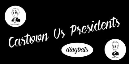
- KG Flavor And Frames Six by Kimberly Geswein,
$5.00
- Arston Stencil EF by Elsner+Flake,
$32.00 - Palm Canyon Drive by RetroSupply Co.,
$19.00
- Linotype Bariton Paneuropean by Linotype,
$92.99 - MLB Red Sox - Unknown license

- Instant Soup Mix - Unknown license

- Romance Fatal Pix - Personal use only

- Look sir, droids! - Unknown license

- SF Piezolectric SFX - Unknown license

- SF Piezolectric SFX - Unknown license

- KR Wintry Mix - Unknown license

- Pica Hole - SIM - Unknown license

- The Mix Office by LucasFonts,
$59.00 - Nexus Mix Pro by Martin Majoor,
$49.00
- Celonius Mark XIX by Vic Fieger,
$2.99 - Mixed Tape Rough by Ksenia Belobrova,
$29.00
- Sitting Pretty JNL by Jeff Levine,
$29.00
- Fou Mixed Pro by URW Type Foundry,
$49.99 - Intellecta Mixed Script by Intellecta Design,
$23.90 - Mixed Messages JNL by Jeff Levine,
$29.00 - Calligraphia Latina Mixed by Intellecta Design,
$22.90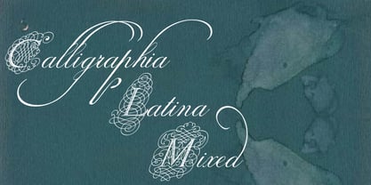
- Mix String Cheese by Mix Fonts,
$13.00
- Mixed Drinks JNL by Jeff Levine,
$29.00
- Mixed Capital Style by Intellecta Design,
$23.90 - Si Brot! - 100% free

- Gagarin Star Mix Cyrillic - Unknown license

- KR Rice N Stix - Unknown license

- Sil Vous Plait NF by Nick's Fonts,
$10.00 - Sis Boom Bah NF by Nick's Fonts,
$10.00 - Ink Spots JNL by Jeff Levine,
$29.00
- (afGiHmtV)* - Unknown license

- Double Pivot by Trequartista Studio,
$25.00
- Anime Ace - Personal use only

- Karaoke Superstar BV - Unknown license

- Anime Ace - Personal use only

- chocolat_bleu - Personal use only

- Sam is my Name - Unknown license

- Negatori - Unknown license


