10,000 search results
(0.043 seconds)
- PF DIN Text by Parachute,
$79.00 The purpose of the original DIN 1451 standard was to lay down a style of lettering which is timeless and easily legible. Unfortunately, these early letters lacked elegance and were not properly designed for typographic applications. Ever since its first publication in the 1930’s, several type foundries adopted the original designs for digital photocomposition. By early 2000, it became apparent that the existing DIN-based fonts did not fulfil the ever-increasing demand for a diverse set of weights and additional support for non-Latin languages. Parachute® was set out to fill this gap by introducing the PF DIN series which has become ever since the most comprehensive and sophisticated set of DIN typefaces. It was based on the original standards but was specifically designed to fit typographic requirements. Its letterforms divert from the stiff geometric structure of the original and introduce instead elements which are familiar, softer and easier to read. The first set of fonts was completed in 2002 as a group of 3 families which included condensed and compressed versions. With its vast array of weights, the extended language support, but most of all its meticulous and elaborate design, it has proved itself valuable to numerous design agencies around the world. Ever since its first release, it has been used in diverse editorials, packaging, branding and advertising campaigns as well as a great number of websites. It was quoted by Publish magazine as being “an overkill series for complex corporate identity projects”. The whole PF DIN Text type system (with normal, condensed and compressed styles) includes 45 weights from Hairline to Extra Black including true-italics. Additionally, every font in the Pro series is powered by 270 very useful symbols for packaging, environmental graphics, signage, transportation, computing, fabric care. There are 2 versions to choose from: The PRO version is the most powerful. All weights support Latin, Cyrillic, Greek, Central/Eastern European, Romanian, Baltic and Turkish, with 20 advanced opentype features including small caps. The standard STD version is more economic. All weights support Latin, Central/Eastern European, Romanian, Baltic and Turkish, with 18 advanced opentype features including small caps. In 2010 Parachute® released 4 new families DIN Monospace, DIN Stencil, DIN Text Arabic and DIN Text Universal. All these are complemented by the popular DIN Display version. Altogether the Parachute DIN series is a set of 8 superfamilies with a total of 96 weights.
 - Groundage by Mofr24,
$11.00 Groundage is a Gothic Blackletter font that offers three styles: Outline, Regular, and Shadow. With its bold and clean calligraphic strokes, this typeface boasts a modern-vintage look that exudes elegance and masculinity. Its Y2K-inspired design makes it perfect for stylish posters, marketing materials, logotypes, and headlines. Additionally, it is great for art and craft projects, y2k-streetwear designs, and much more. What sets Groundage apart from other Gothic Blackletter fonts is its unique combination of traditional and modern design elements. Its clean lines and bold strokes give it a contemporary feel while its Blackletter roots pay homage to its historical origins. Groundage also includes both Latin and Cyrillic character sets, making it a versatile option for a range of projects. This font pairs well with other modern-vintage fonts and looks great alongside sans-serif fonts for contrast. Its three styles allow for versatility in design and can be used for a variety of creative projects. Groundage was designed with the intention of creating a stylish, masculine font that could be used in a variety of contexts. Its Y2K-inspired design concept was chosen to evoke nostalgia while still feeling fresh and modern. The combination of traditional Blackletter elements with a contemporary twist creates a unique aesthetic that stands out from other fonts in its category. Groundage is not based on any historical design, but its Blackletter roots pay homage to centuries of typographical tradition. Its modern twist on the classic Gothic style creates a unique and versatile font that can be used in a range of creative projects.
 - Congratulatory by Dmitriy Shchetinskiy,
$19.00 Congratulatory consist of 36 Cyrillic calligraphic greetings for different events. Greetings are original and handwritten. This font makes it possible to use high quality calligraphy in your projects - greeting cards, certificates, invitation cards, letters of commendation etc.
 - Congratulatory Happy Birthday by Dmitriy Shchetinskiy,
$19.00 Congratulatory Happy Birthday font consist of 36 calligraphic greetings letterings. Letterings are original and handwritten. This font makes it possible to use high quality calligraphy in your projects - greeting cards, certificates, invitation cards, letters of commendation etc.
 - Congratulatory Womens Day by Dmitriy Shchetinskiy,
$19.00 Congratulatory Womens Day font consist of 36 calligraphic greetings letterings. Letterings are original and handwritten. This font makes it possible to use high quality calligraphy in your projects - greeting cards, certificates, invitation cards, letters of commendation etc.
 - Madriz by SilverStag,
$14.00 Introducing Madriz, a slab serif font with a retro feel that's perfect for any project that needs a touch of old-school charm. With over 32 fonts in one font family, Madriz offers a wide range of styles to suit any need. You can choose from Thin to Black weights and Regular to Extra Expanded widths to create your perfect look. Madriz is inspired by the old-school signage of Madrid, Spain. The name "Madriz" is actually the affectionate nickname that Madrileños, the people of Madrid, gave to their city. The font's bold, blocky letters capture the essence of Madrid's vibrant and historic streets. Madriz's versatile nature makes it a great choice for a wide range of projects. Its bold, retro style is perfect for showcasing heritage brands or giving a modern touch to classic designs. Madriz can also be used to create a sense of nostalgia, making it ideal for retro-themed projects or campaigns. Here are some of the ways you can use Madriz: Titles and headings: Madriz's bold, eye-catching style is perfect for titles and headings. Text blocks: Madriz's wide range of weights and widths makes it suitable for text blocks, from body copy to large paragraphs. Logos and branding: Madriz's retro charm makes it a great choice for logos and branding. With its 32 font styles and support for over 90 languages, Madriz is an incredibly powerful tool for any designer. It can be used to create a variety of looks, from classic and elegant to modern and edgy. Whether you're working on a print project, a web design, or an app, Madriz has the potential to make a lasting impression. Madriz is the perfect font for anyone who wants to add a touch of old-school charm to their designs. With its wide range of styles and features, Madriz is sure to make a statement in any project. Would you like to get 5 completely free fonts worth over $75? No tricks, no hidden words, terms or anything. Just subscribe to my newsletter, make sure to check your email to approve the subscription, add me to your contacts so that the emails don't end up in spam folder and you will get 5 fonts for free. The fonts are packed with alternates, ligatures and some even come with extra goodies. Happy creating everyone!
 - Sturdy by Hackberry Font Foundry,
$24.95 Sturdy is designed to be as black as possible yet still legible. As an OpenType Pro font it has my normal complement of around 500 characters. New to this font I have added what I call ordinals: first through tenth in addition to Caps, lowercase, small caps, lining, oldstyle, and small caps figures, ligatures, and so on.
 - Abort Mission by PizzaDude.dk,
$12.00 This is the kind of letters I drew in school back in the 1980ies. I would never have guessed that I would do the same thing like 40 years later! I remember making a simple space game for my VIC-20 computer, and I needed some "data letters" (as I called it) - as far as I can remember, this is close to what I made 40-like years ago. Also, I was inspired by the well known series "Stranger Things" - you know, all that 80ies theme stuff took me down memory lane! :) Anyway, all the letters are handdrawn, using a squared paper as guide - at it may look simple, but it took me quite some time to finish this font (hence the name!)
 - Erotica by Lián Types,
$49.00 “A picture is worth a thousand words” and here, that’s more than true. Take a look at Erotica’s Booklet; Erotica’s Poster Design and Erotica’s User’s Guide before reading below. THE STYLES The difference between Pro and Std styles is the quantity of glyphs. Therefore, Pro styles include all the decorative alternates and ligatures while Std styles are a reduced version of Pro ones. Big and Small styles were thought for better printing results. While Big is recommended to be printed in big sizes, Small may be printed in tiny sizes and will still show its hairlines well. INTRODUCTION I have always wondered if the circle could ever be considered as an imperfect shape. Thousands of years have passed and we still consider circles as synonyms of infinite beauty. Some believe that there is something intrinsically “divine” that could be found in them. Sensuality is many times related to perfectly shaped strong curves, exuberant forms and a big contrasts. Erotica is a font created with this in mind. THE PROCESS This story begins one fine day of March in 2012. I was looking for something new. Something which would express the deep love I feel regarding calligraphy in a new way. At that time, I was practicing a lot of roundhand, testing and feeling different kinds of nibs; hearing the sometimes sharp, sometimes soft, sound of them sliding on the paper. This kind of calligraphy has some really strict rules: An even pattern of repetition is required, so you have to be absolutely aware of the pressure of the flexible pen; and of the distance between characters. Also, learning copperplate can be really useful to understand about proportion in letters and how a minimum change of it can drastically affect the look of the word and text. Many times I would forget about type-design and I would let myself go(1): Nothing like making the pen dance when adding some accolades above and below the written word. Once something is mastered, you are able to break some rules. At least, that’s my philosophy. (2) After some research, I found that the world was in need of a really sexy yet formal copperplate. (3) I started Erotica with the idea of taking some rules of this style to the extreme. Some characters were drawn with a pencil first because what I had in mind was impossible to be made with a pen. (4) Finding a graceful way to combine really thick thicks with really thin hairlines with satisfactory results demanded months of tough work: The embryo of Erotica was a lot more bolder than now and had a shorter x-height. Changing proportions of Erotica was crucial for its final look. The taller it became the sexier it looked. Like women again? The result is a font filled with tons of alternates which can make the user think he/she is the actual designer of the word/phrase due to the huge amount of possibilities when choosing glyphs. To make Erotica work well in small sizes too, I designed Erotica Small which can be printed in tiny sizes without any problems. For a more elegant purpose, I designed Erotica Inline, with exactly the same features you can find in the other styles. After finishing these styles, I needed a partner for Erotica. Inspired again in some old calligraphic books I found that Bickham used to accompany his wonderful scripts with some ornated roman caps. Erotica Capitals follows the essentials of those capitals and can be used with or without its alternates to accompany Erotica. In 2013, Erotica received a Certificate of Excellence in Type Design in the 59th TDC Type Directors Club Typeface Design Competition. Meet Erotica, beauty and elegance guaranteed. Notes (1) It is supossed that I'm a typographer rather than a calligrapher, but the truth is that I'm in the middle. Being a graphic designer makes me a little stubborn sometimes. But, I found that the more you don't think of type rules, the more graceful and lively pieces of calligraphy can be done. (2) “Know the forms well before you attempt to make them” used to say E. A. Lupfer, a master of this kind of script a century ago. And I would add “And once you know them, it’s time to fly...” (3) Some script fonts by my compatriots Sabrina Lopez, Ramiro Espinoza and Alejandro Paul deserve a mention here because of their undeniable beauty. The fact that many great copperplate fonts come from Argentina makes me feel really proud. Take a look at: Parfumerie, Medusa, Burgues, Poem and Bellisima. (4) Some calligraphers, graphic and type designer experimented in this field in the mid-to-late 20th century and made a really playful style out of it: Letters show a lot of personality and sometimes they seem drawn rather than written. I want to express my sincere admiration to the fantastic Herb Lubalin, and his friends Tony DiSpigna, Tom Carnase, and of course my fellow countryman Ricardo Rousselot. All of them, amazing.
 - Lustra by Grype,
$16.00 Since the early 1980's, the automotive industry has been developing geometric/technical style logotypes for car chrome labels. The styles are ripe with inspiration for great font families, but surprisingly, many of these sleek logotypes are lacking an expansive family to enhance and express their brand in a richer sense, becoming true brand workhorses. The Lustra family finds its origin of inspiration in the HYUNDAI automotive company logo, and from there expands to an 8 font family of weights. Lustra celebrates the techno display styling of the inspiration logotype, transcending its brand inspired origin to give birth to a font family that pulls on modern and historical styles. It inherits a sturdy yet approachable style with its uniform stroke forms and curves, and goes on to include a lowercase, numerals, and a comprehensive range of weights, creating a straightforward, uncompromising collection of typefaces that lend a solid foundation and a broad range of expression for designers.
 - Anultra Slab by Eclectotype,
$40.00 Anultra Slab is, you guessed it... An ultra bold slab serif! Anultra Slab is a hard hitting headliner, designed to be set LARGE. Because it's a single weight typeface, no compromises were necessary to get it interpolatable with other weights, so it is as bold and tight as I intended. Features include automatic fractions, case-sensitive forms, ligatures, stylistic alternates for non-descending J and Q, and a 3D 'xtrude' style, which can be layered behind the regular to create two colour, photo-lettering style text. Very seventies. Very cool. A companion typeface, Alight Slab , is available at the other end of the weight scale, but there are no weights in between. You're no middle-weight designer, so why use middle-weight fonts?!
 - Freigeist by René Bieder,
$29.00 The story of Freigeist is a journey into the past, back to the early grotesk fonts and long before Helvetica and Co were standard fonts in operating systems. For what we take for granted today is the result of innovation and pioneering spirit of type foundries such as Caslon or Stephenson Blake in the 19th century, whose expressive designs are mostly forgotten today. The Freigeist family captures this untamed spirit — hence the name (German for “free spirit”) — and puts it into a contemporary context, resulting in a multi-faceted family with a wide range of applications, font styles and features for modern typesetting. Design Details Unlike other modern grotesk typefaces like Helvetica or Univers, Freigeist is characterized by a warm and dynamic appearance. It draws inspiration from various historical models such as Caslon’s Doric or the Grotesque variants of Stephenson Blake. Particularly noticeable are the narrow terminals, the serpentine S or the dynamic g in combination with ascenders that reach to the cap-height only. Italics Many italic grotesk fonts are strongly oriented towards their upright counterparts. Unfortunately, this often means that they cannot do justice to their actual task, which is to highlight words or sections of a text. The italic cuts of Freigeist try to remedy this situation by using the greatest possible formal distance while reinforcing the untamed spirit. What adds to this, is a reminiscent of handwritten forms, which can be found in a, n, y or g, as well as the German sharp s or the ampersand. Alternate Characters Alternative letterforms are ideal for customizing the overall appearance of a text, for usage in logos or they can even work as custom fonts for companies. Freigeist comes with ten stylistic alternatives that are easy to insert via the Opentype window, such as the single-storey a, a tail-less version of the a for compact text, when uses in condensed widths or a dialed down version of the r. Languages Freigeist has a built-in support for Latin and Cyrillic based languages and covers more than 210 languages. Opentype Features and Symbols The family comes with many opentype features to support modern typesetting. This includes ligatures, different number sets or alternative shapes for texts set in all caps. Styles Freigeist is available in five widths (XCon, Con, Normal, Wide, XWide) and six weights (Thin, Light, Regular, Medium, Bold, Black). Including the accompanying italics, the family comes in 60 cuts that are suitable for any application. Testfonts If you like to test the fonts before buying the full version, please follow the link below: https://www.renebieder.com/test-fonts Update 1 A lot has changed in this first update. It is more than just a 1.01 or 1.02. It is actually the 2.0! I’ve gone through all! single glyphs of the 18 master files, making the family more sharp and even a bit more modern. I’ve added some new opentype features and redesigned the italics, because I wasn’t happy enough with the result. I’ve added new kerning pairs, new metrics, and even new glyphs. Please check my website for more details on the new design and overview about the opentype features and alternate shapes. If you purchased the Freigeist family already, thanks a lot!! It is the most advanced family that I published so far. I hope that you’re happy with this new version. Thanks!
 - Lanka Curves by Thilanka Weerawardana,
$12.00 Lanka Curves is a curly font, with traditional Sri Lankan art curves mixing with modern design elements. It houses more than 200 Glyphs, and can be used as typographical art, as well as a typeface. It's a very versatile font that works great in large and medium sizes. You will be pleased to use the many option of alternates and ligatures, to create nice different rhythms and balances in your creative works. INSIDE IDEA - In the Sri Lankan art alphabet, the teacher will initially give the ‘Wakadeka’ design (two-tone pattern) first. That pattern made out of curve shapes. The student should tune it up properly until he practices his hand. ‘LANKA CURVES’ typeface is dragged as it exposes the shapes in traditional Sri Lankan designs. Download & enjoy my fonts for your creative works. Lanka Curves best use for logos, invitations, fashion industry, jewelry industry, decorative designs & whatever you might need, Lanka Curves make it.
 - Hyper Turfu by Bisou,
$10.00 Made in La Chaux-de-Fonds (Switzerland), HyperTurfu was born during the shooting of “The Return of Hyperturfu Xpress 2”. A GoPro on a lego electric train, meters and meters of rails, an empty industrial space, loads of puppets, paper, cardboard, pizza boxes, lights, hot glue and a bunch of friends preparing a one shot scene for a month. The title of the movie was made out of lego pieces, painted with golden spray and hanged over the rails. It was the first inspiration for this awsome superbold font. HyperTurfu is thought from ground up to give a strong impact. It’s gothic retro science fiction 80’s style makes it best suitable for metal music albums or posters. As the “Banco” font it works perfectly with short texts for advertisement, bar, cofee shops concert places or even fancy hairdresser. Just hang it over a pet shop and see what cool animals will come in.
 - Offhand Brush by PintassilgoPrints,
$24.00 Offhand Brush is a fast and spontaneous brush font with quite a messy feel, a great option for book covers, packaging projects, album art, web titles, and even small chunks of text. It looks messy, but don't get it wrong: on the inside, it's a laborious piece of work, with four alternates for each Latin letter and two for numerals, as well as two options for Cyrillic and Greek letters. To make things even more uneven, there are still a few different letter designs programmed to pop up when specific combinations of three or four glyphs appear in the text. These are managed by the OpenType 'Standard Ligatures' feature, although they are far from standard and are not quite ligatures. And why so? Because this way it will usually be on by default, making the font way more interesting. Hey, wait! There are some ornaments too. And a couple of contextual kerning pairs, hell yes! Use it big!
 - Versatile EP by Borges Lettering,
$9.00 Versatile EP is a powerhouse of 9 fonts that make design and logo creation effortless. While other sans-serif fonts tend to be rigid and cold, Versatile stands out with it's warm and natural feel. It's generous x-height aids in its legibility and function, and the forms are classic yet modern allowing this font to live up to its name as a truly versatile workhorse for your next design or layout. Use it by itself, or in combination with Versatile 7 layer font package (Sold Separately.) https://www.myfonts.com/fonts/charlesborges/versatile-bold/ Versatile EP contains 3 body styles, and 6 shadow fonts including striped and solid in different weights. Versatile EP is not just for the Graphic Designer. It's well suited for the Sign Maker, Cricut and Silhouette users, and anyone else who uses a vinyl plotter. It weeds beautifully in cut vinyl. Its different layers allow the user to stack multi-colored vinyl to create one a kind signs and displays. Versatile EP is ideally suited for advertising and packaging, logo, branding and creative industries, poster and billboards, signage as well as web and screen design. What's included: 9 Fonts included in for one low price: 3 body fonts and 6 different shadows. 1,462 Glyphs (Characters) in each font for a total of 13,158 Glyphs per style pack. Over 200 Languages supported including Cyrillic, Bulgarian Cyrillic and Greek. A massive library of Alternate Characters: Latin, Extended Latin and Cyrillic Alternates including their Diacritic and Small Cap counterparts. Superscripts, Subscripts, Numerators, Denominators, and Scientific Inferiors. Small Caps in Latin, Extended Latin and Cyrillic include Numbers, Punctuation, Diacritics and Alternates. Extended currency symbols including Bitcoin. Fun assortment of speech bubbles. Unlimited fractions. PUA Encoded Versatile EP makes designing fun!
 - Echo Soul by Set Sail Studios,
$14.00 Introducing Echo Soul; a free-flowing and carefree brush font duo, hand painted with love. Echo Soul speaks from the heart and doesn't hold back. With elongated brush strokes and a natural flow, it's the perfect choice for handwritten quotes, product packaging, and logo designs with a personal and affectionate touch. The Echo Soul family consists of; 1. Echo Soul • A handwritten script font containing upper & lowercase characters, numerals and a large range of punctuation. 2. Echo Soul Alt • This is a second version of Echo Soul, with a completely new set of lowercase characters. If you wanted to avoid letters looking the same each time to recreate a custom-made style, or try a different word shape, simply switch to this font for an additional layout option. 3. Echo Soul Sans • An all-caps font containing uppercase-only characters, perfect for supporting text to compliment the Echo Soul Script font. Also includes numerals and a large range of punctuation. Stylistic Alternates • Are also available for several lowercase characters - these have elongated tails and look great when placed at the end of a word. These can be used by turning on 'Stylistic Alternates' in OpenType capable software, or accessing via a Glyphs panel.
 - Monik by Sensatype Studio,
$15.00 MONIK is a A New Elegant Classy Serif Font A serif that we created special for elegant branding needs, with extra ligature and alternates in unique shape will be ready to add value of your brand. It so nice to leverage designer or product owner that need solutions to make their design look more classy and modern. MONIK serif font ready with: Ready 3 Weights (Light, Regular, and Bold) Preview as a inspirations that you can do with MONIK font Ready with Lowercase and Uppercase characters Wish you enjoy our font. :)
 - Horst by PintassilgoPrints,
$29.00 Inspired by Laatzen’s Bilderbogen etchings by the extraordinary artist and printmaker Horst Janssen, this font is packed with Open Type features that allow the creation of unique typographic pieces. Besides the set of automatic discretionary ligatures, this all-caps font also comes with two extra stylistic sets, so there are 4 versions for each letter (plus the variations contained in the ligatures). When working with ligatures turned on, the carefully handcrafted kerning table takes advantage of overlapping some ligatures with its neighbor letters, multiplying ligatures performance. An unmistakable original font to create outstanding design works!
 - Selentingan by Sulthan Studio,
$12.00 Introducing Selentingan Script! This font is specially created for those of you who need a touch of elegance to design your next projects with perfect and amazing results. A very beautiful and interesting script with a perfect line for use for various purposes like titles, signatures, logos, correspondence, wedding invitations, letterheads, nameplate, labels, bulletins, posters, badges, Branding, Greeting Cards, etc. Selentingan Script is built with OpenType features and includes start and end. It comes with OpenType Stylistic set, Initials, swashes, ligatures and everything to add a touch to your design. Also supports other languages.
 - Magista Winter by Agny Hasya Studio,
$12.00 Magista Winter Is a Fun Holiday Typeface With a Concept of the End of the Year Events Such as Christmas, New Year, and Winter. It Comes in 2 (Two) Styles (Regular & Slant) and Is Created With Some Alternate and Ligature. Featured with Uppercase and lowercase, Numeral and punctuation, Multilingual Support, and Opentype Features Perfect for Your Design Projects Like Advertising, Branding, Posters, Sale Signs, Product Designs, Special Events, Book Covers, Cards, Merchandise, Labels, Product Packaging, and More. Have Fun Creating and designing with Magista Winter Thank you! agnyhasyastudio
 - Havard by Adam Fathony,
$12.00 Started with a base of geometric shape, Havard is a Strong and Sturdy display font with an industrial feeling, college style, vintage look, and sporty and athletic theme. Best use for this family is for headlines, display, logotype, clothing, or any short text. Havard includes 12 styles, starting with a regular, regular with inline, shadow, bevel. All of the style also have rough version. Since some of them are connected you can mix and match to use it for a layered fonts, just combine what you like as I created on a design sample above.
 - Boomsong by Alit Design,
$20.00 BOOMSONG is a stunning font that combines the beauty of blackletter and the elegance of script styles. It features a unique mix of these two styles, creating a perfect balance between boldness and refinement. The font includes 858 glyphs, offering a wide range of options for all your design needs. With its unique alternates and ligatures, BOOMSONG allows you to create custom lettering that stands out and captures the eye. It supports PUA encoding, ensuring that you can access all glyphs and symbols, even in non-standard software. BOOMSONG is perfect for projects that require a touch of beauty and sophistication. Its concept of “beauty in the dark” adds an intriguing element to your designs, making them stand out from the rest. With support for multiple languages, BOOMSONG is a versatile font that can be used for various purposes, from branding to invitations, book covers, and more. Language Support : Latin, Basic, Western European, Central European, South European,Vietnamese. In order to use the beautiful swashes, you need a program that supports OpenType features such as Adobe Illustrator CS, Adobe Photoshop CC, Adobe Indesign and Corel Draw. but if your software doesn’t have Glyphs panel, you can install additional swashes font files.
 - Arlen by Groteskly Yours,
$45.00 Meet Arlen, a funky, variable type family in 36 styles. Inspired by 20th century hand-painted signs and the visual culture of the 1980's, Arlen adds a little extra to this already charismatic mix. Arlen is a display sans serif that can be freely used for larger bodies of text. Among its most prominent visual features are high contrast, flaring stems and dynamic letterforms. With 860 characters in each font, Arlen supports most Latin-based languages and offers a large number of extra characters, dingbats, alternate glyphs, ligatures, and punctuation marks. Some of the most useful OpenType features are included too, such as Case-Sensitive Punctuation, Stylistic Alternates, Tabular Figures, Fractions, Localization, and a lot more. Some letters and characters come in two versions: thin and bold, and you can easily alternate between the two using a corresponding stylistic set. Arlen is a cheerful typeface that conveys kindness, good cheer, and only good vibes. It would feel at home both in digital and print mediums; it can be used in advertising, editorial design, social media, web design, packaging, or personal design projects. With versatility at its heart, Arlen would be a perfect typeface for large design systems that require multiple styles for typesetting.
 - Crushine Brush by Siwox Studios,
$49.00 Crushine is a casually and quickly written brush script Fonts. Letters are made with brush pen on a paper. Then scanned and carefully drawn into vector format. There is just a handmade typeface so it looks good in small and big sizes. These elements gives Crushine its organic, authentic and laid-back characteristics. Crushine is not textured brush font. It's contemporary approach to design, handmade natural with an less regular baseline. Suitable for use in title design. Such as apparel, invitations, books tittle, stationery design, quotes, branding, logos, greeting card, t-shirt, packaging design, poster and more. Crushine includes a complete set of uppercase and lowercase letters, as well as multi-language support, numbers, punctuation, ligatures. Crushine has 2 versions. Crushine Brush Script & Crushine Brush Alternative. It has small differences in each character to add natural nuances on fonts. This is not a family typeface. Thank you!
 - Manstein by Gold Type,
$16.00 Manstein Script is one of the Elegant script fonts that comes with a very beautiful character change, a kind of classic copper decorative script with a modern touch, designed with high detail to present an elegant style. Manstein Script is interesting because the typeface is pleasing to the eye, clean, feminine, sensual, glamorous, simple and very easy to read, because of the many luxurious letter connections. I also offer a number of decent stylistic alternatives for some of the letters. The classic style is very suitable to be applied in various formal forms such as invitations, labels, restaurant menus, logos, fashion, make up, stationery, novels, magazines, books, greeting / wedding cards, packaging, labels or all kinds of advertising purposes. . . Manstein supported With OpenType features with alternative styles and elegant ligatures. The OpenType features don't work automatically, but you can access them manually and for best results your creativity will be required in combining variations of these Glyphs. I highly recommend using a program that supports OpenType features and the Glyphs panel such as Adobe Illustrator, Adobe Photoshop CC, Adobe InDesign, or CorelDraw, so that you can view and access all variations of Glyphs. How to access all alternative characters using Adobe Illustrator: https://www.youtube.com/watch?v=XzwjMkbB-wQ How to access all alternative characters, using the Windows Character Map with Photoshop: https://www.youtube.com/watch?v=Go9vacoYmBw If you need help or have any questions, let me know. I'm happy to help. Thanks & Happy Designing
 - Tempting by RGB Studio,
$19.00 Tempting Script is one of the Elegant script fonts that comes with a very beautiful character change, a kind of classic copper decorative script with a modern touch, designed with high detail to present an elegant style. Files Include : Basic Latin A-Z and a-z Numbers Symbols PUA Encode Multilanguage Support Tempting Script is interesting because the typeface is pleasing to the eye, clean, feminine, sensual, glamorous, simple and very easy to read, because of the many luxurious letter connections. I also offer a number of decent stylistic alternatives for some of the letters. This font perfectly made to be applied especially in logo, and the other various formal forms such as invitations, labels, logos, magazines, books, greeting / wedding cards, packaging, fashion, make up, stationery, novels, labels or any type of advertising purpose. Tempting has 349+ , including multiple language support. With OpenType features with alternative styles and elegant. The OpenType features don't work automatically, but you can access them manually and for best results your creativity will be required in combining variations of these Glyphs. I highly recommend using a program that supports OpenType features and the Glyphs panel such as Adobe Illustrator, Adobe Photoshop CC, Adobe InDesign, or CorelDraw, so that you can view and access all variations of Glyphs. Thanks and have a wonderful day, If you have any questions, please get in touch with us Don't forget to check out our other products.
 - Grand Atlantic by Fenotype,
$35.00 Grand Atlantic is a powerful display package by Fenotype. It’s a genuine Brush script packed with features and Swoosh extras and it’s a striking condensed flared serif in two weights, designed with the same sharp edges on the flares as the Brush. Together they make stunning logotypes, posters or headlines. On top of that there’s a “Printed” version of each. Printed versions are the same but with rugged outlines and a print texture. Grand Atlantic is great for creating powerful identities for artisanal coffee brands, craft beer, organic juice or a sports teams. Grand Atlantic Brush is equipped with Standard Ligatures and Contextual alternates that help keeping the connections between letters smooth. They’re automatically on as you should normally keep them. On top of that Grand Atlantic Brush has Stylistic, Titling and Swash Alternates for standard characters if you need more ornamental letters and if you want to break up the rectangular word shapes. There’s even more alternates in the glyph palette, making it total more than 600 glyphs. Grand Atlantic Swoosh contains 52 shapes designed to go with the Brush. There’s many “terminal swashes” that you can put in the end of a word and it will connect to the last letter, and swirl under the word from there.
 - Swissa Piccola by Jeremia Adatte,
$30.00 The Swiss typewriters were famous for their unique precision. As complex digitalizations and macro shots were a start for the inspiration and studies, each character has been carefully re-crafted from the ultra high def scans of the printouts made on a special bleed-proof paper. Today’s characters such as @, euro sign and most of accents have been crafted according the original alphabet design. The idea was to digitize and keep a saving of the original typewriter including all its functions (e.g. underlining key) . It’s surprisingly very legible at small sizes. Thanks to an x-height tighter and more spaced, a glyph design less detailed and more neutral/simple than other fonts found on american or italian typewriters. The final artwork can be set at very large sizes due to the highly detailed glyph design. Swissa Piccola Regular is loaded with more than 150 glyphs created with the typewriter to avoid letter repetition in a word. This OpenType feature can be accessed through the 'discretionary ligatures' option. Plus it comes with two stylistic sets : one with an original underlining feature, another with a slashed-x feature. In which all characters are unique and also have been originally typed with the typewriter. It contains more 600 glyphs in total. The two features are separated in another two fonts (Swissa Piccola Slashed x and Underlined) in case a non OT-savvy app is used. If you wish to obtain exactly the same prints as the original Swissa Piccola typewriter, you should set your font at 11.3 pt and 19.5 pt of line spacing. The Swissa Piccola font was originally offered in a dedicated limited edition packaging.
 - Trumania EEN - 100% free

- Realstin by Ajibatype,
$19.00 Realstin is a luxurious serif with an elegant style. It seduces your eyes with its curves yet still manages to maintain its classy serenity, it’s perfect for branding, logos, invitations, long texts, and many more of your other needs.
 - PT Root by ParaType,
$40.00 PT Root is a contemporary sans serif with strict, laconic forms. It’s a versatile typeface that provides a wide range of possibilities. Regular style works great in long texts (both on screen and in print), as well as in the interfaces. Medium and Demibold are good for signage, while the lightest and boldest styles look great in large sizes and are suitable for the brand identity. PT Root is a sans serif with 10 weights and a variable version. Its character set includes extended Latin and extended Cyrillic, three arrow variants, fractions, index numbers and letters. PT Root automatically lifts dashes and brackets with the case change. Its characters have stylistic variants, including the single-storey a, a strikethrough zero and some local alternates for Bulgarian and Serbian Cyrillic. PT Root can work in a project both independently and in pairs. Contemporary serif typefaces are the best text companions for it — try for example PT Serif, Yefimov Serif or Scientia. In case PT Root is the only text typeface in the project, then combine it with serious typefaces, such us technical (Din Condensed as an example) or pronouncedly contemporary typefaces, including postmodern ones, from Stapel or Spile to Helsa.
 - Pokelor by Nathatype,
$29.00 Pokelor is a display serif font beautifully designed with harmony between function and beauty showing you elegant, modern yet less formal impressions. The little hooks’ continuity elements help the eyes to keep flowing from one letter to another. With wide spaces and easily noticeable letters, this font is truly legible with which you can apply for any text sizes. Furthermore, enjoy the interesting features available in this font. Features: Stylistic Sets Multilingual Supports PUA Encoded Numerals and Punctuations Pokelor fits best for various design projects, such as posters, banners, logos, magazine covers, quotes, headings, printed products, invitations, name cards, merchandise, social media, etc. Find out more ways to use this font by taking a look at the font preview. Thanks for purchasing our fonts. Hopefully, you have a great time using our font. Feel free to contact us anytime for further information or when you have trouble with the font. Thanks a lot and happy designing.
 - Inkarus by Scratch Design,
$10.00 Introducing Inkarus a playful font with a bold and all uppercase characters style. This font is perfect for posters designs, packaging, logotype, title, label, print ads, gift card, magazine title, movie title, sign, and the beautiful and curvy shape will give your designs that alternative look to your creative work looks innovative. Amazing curvy was hand-drawn and make the outlines look irregular and beautiful. This font has a lot of hand-lettered looks and the characters give a retro or urban feel. Inkarus has a serif style but can collaborate with sans-serif style together because the modern bold sans serif typeface has been the alternatives and ligatures of this font. Combine that bold shapes together will make your work a more unique, retro attitude. Ligatures Inkarus has 32 ligatures that you can turn on via the glyphs panel in Adobe applications. The ligatures make a innovative difference in the look of this font. It switches out between serif and sans serif styles that make your designs look still unity. Opentype The Alternatives and Ligatures use OpenType features. First, you will need a design app to access these options an application such as Adobe Photoshop, Illustrator, or InDesign. Alternatives All lowercase a,d,e,h, I, j,k,l,m,n, p,r, t, r you can switch out letters for other and makes your design look more like hand-lettering and innovative although you using in a repetitive way. Inkarus font includes; All uppercase characters 32 ligatures option Support for multi-languages characters Punctuation, Symbols, and Numbers Alternative lowercase characters ( a,d,e,h, I, j,k,l,m,n, p,r, t, r ) The font format is OTF So what you are waiting for? Grab it fast this font and make your innovative design. If you have any questions drop me a message.
 - Thuressia Script by Picatype,
$12.00 Thuressia Script is casual and pretty with lots of swashes. It can used for various purposes. such as logos, product packaging, wedding invitations, branding, headlines, signage, labels, signature, book covers, posters, quotes and more. Thuressia Script features OpenType stylistic alternates, ligatures and International support for most Western Languages is included. To enable the OpenType Stylistic alternates, you need a program that supports OpenType features such as Adobe Illustrator CS, Adobe Indesign & CorelDraw X6-X7, Microsoft Word 2010 or later versions. How to access all alternative characters using Adobe Illustrator: https://www.youtube.com/watch?v=XzwjMkbB-wQ Thuressia Script is coded with PUA Unicode, which allows full access to all the extra characters without having special designing software. Mac users can use Font Book , and Windows users can use Character Map to view and copy any of the extra characters to paste into your favourite text editor/app. How to access all alternative characters, using Windows Character Map with Photoshop: https://www.youtube.com/watch?v=Go9vacoYmBw If you need help or have any questions, please let me know. I'm happy to help!
 - Ethylene by dotHK Studio,
$18.00 Ethylene Display Font come with masculine themes. It matches applies in some designs such as the logotype, brand, packaging, quotes, music poster, t-shirt, cover book and more custom design. The features uppercase, lowercase, numeral, punctuation & symbol, multilingual support. Ethylene Display Font This font has been equipped with OpenType features and has many glyphs. and of course by having many of these glyphs will be able to choose the letters according to your liking, lots of variations and options for each letter, so you can customize your design choices and also have other languages supported. This font is perfect for use with programs that support OpenType features like Adobe Photoshop Cs / Adobe Photoshop CC, Adobe Illustrator CS / Adobe Illustrator CC, Adobe Indesign and Corel Draw and many more programs that support OpenType, and I've also included a special alternative so you can use any program, this font can be used by everyone. if you have any question, please feel free to contact me by email. Thanks and congratulations designing.
 - Belgiana Script by Mega Type,
$10.00 Belgiana Script is elegant calligraphy font. This font is casual and pretty with swashes. It can used for various purposes. such as logo, product packaging, wedding invitations, branding, headlines, signage, labels, signature, book covers, posters, quotes and more. Belgiana Script features OpenType stylistic alternates, ligatures and International support for most Western Languages is included. To enable the OpenType Stylistic alternates, you need a program that supports OpenType features such as Adobe Illustrator CS, Adobe Indesign & CorelDraw X6-X7, Microsoft Word 2010 or later versions.How to access all alternative characters using Adobe Illustrator: https://www.youtube.com/watch?v=XzwjMkbB-wQ Belgiana Script is coded with PUA Unicode, which allows full access to all the extra characters without having special designing software. Mac users can use Font Book , and Windows users can use Character Map to view and copy any of the extra characters to paste into your favourite text editor/app. How to access all alternative characters, using Windows Character Map with Photoshop: https://www.youtube.com/watch?v=Go9vacoYmBw If you have any question, don't hesitate to contact me by email : megatype04@gmail.com Thanks & Happy Designing!
 - Resgak by Kulokale,
$30.00 Resgak is a contemporary serif font with 20 fonts, ranging from thin to extra black with its matching italics, Resgak offers many possibilities to be applied in many graphic or editorial projects. Lighter weights are suitable for body text, and the heavier weights are perfect for striking headlines. Resgak is perfect for many different projects such as logos and branding, invitations, stationery, social media posts, advertisements, printed quotes, product packaging, product designs, labels, photography, watermark, special events and many more. This font is encoded with Unicode PUA, which allows full access to all additional characters without having special design software. Mac users can use Font Book, and Windows users can use Character Map to view and copy one of the extra characters to paste into your favorite text editor / application. I highly recommend using a program that supports OpenType features and Glyphs panels such as Adobe Illustrator, Adobe Photoshop CC, Adobe InDesign, or CorelDraw, so you can see and access all Glyph variations. We hope you enjoy the font and have fun! Thank You.
 - Molandika Script by Great Studio,
$16.00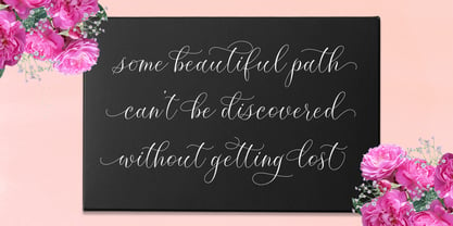 Molandika Script is elegant calligraphy font, designed to convey elegance and style. It is slender, feminine and friendly, This font is casual and pretty with swashes. Can used for various purposes. such as logos, product packaging, wedding invitations, branding, headlines, signage, labels, signatures, book covers, posters, quotes and more. Molandika Script features OpenType stylistic alternates, ligatures and International support for most Western Languages is included. To enable the OpenType Stylistic alternates, you need a program that supports OpenType features such as Adobe Illustrator CS, Adobe Indesign & CorelDraw X6-X7, Microsoft Word 2010 or later versions. How to access all alternative characters using Adobe Illustrator : https://www.youtube.com/watch?v=XzwjMkbB-wQ Molandika Script is coded with PUA Unicode, which allows full access to all the extra characters without having special designing software. Mac users can use Font Book , and Windows users can use Character Map to view and copy any of the extra characters to paste into your favourite text editor/app. How to access all alternative characters, using Windows Character Map with Photoshop : https://www.youtube.com/watch?v=Go9vacoYmBw
 - Apollonius by Typogama,
$25.00 Apollonius is a high contrast, display typeface designed by Michael Parson. Packed with Opentype features, this single weight font offers a whole range of options that designers can explore and play with to create stunning layouts.
