10,000 search results
(0.074 seconds)
- Magistoe by Masinong Studio,
$15.00 Magistoe script a new fresh & modern script with a handmade calligraphy style, decorative characters and a dancing baseline! So beautiful on invitation like greeting cards, branding materials, business cards, quotes, posters, and more. Magistoe script come with 274+ glyphs. The alternative characters were divided into several Open Type features such as Swash, Alternates Set. The Open Type features can be accessed by using Open Type savvy programs such as Adobe Illustrator, Adobe InDesign, Adobe Photoshop Corel Draw X version, And Microsoft Word. And this Font has given PUA unicode (specially coded fonts). so that all the alternate characters can easily be accessed in full by a craftsman or designer. To enable the OpenType Stylistic alternates, you need a program that supports OpenType features such as Adobe Illustrator CS, Adobe Indesign & CorelDraw X6-X7. There are additional ways to access alternates, using Character Map (Windows), Nexus Font (Windows), Font Book (Mac) or a software program such as PopChar (for Windows and Mac). For use in office word, you all can read the following article to access alternate glyphs: http://www.magpiepaperworks.com/blog/using-opentype-fonts-in-microsoft-word/ If you have any question, don't hesitate to contact me by email masinong.studio@gmail.com Thanks and happy designing :-) Thank You for purchase!
 - Hoverunit by Typodermic,
$11.95 Introducing Hoverunit: the typeface that will take your design projects to new heights! This font is a throwback to the golden age of sci-fi, with a twist of modern creativity that will give your work an unmistakable edge. Inspired by the magnetic ink typefaces of the 1960s, Hoverunit has been brought back to life with a futuristic twist. Its sharp angles, sleek lines, and retro-futuristic feel make it the perfect choice for your next sci-fi-themed project. Whether you’re designing a book cover, movie poster, or album art, Hoverunit will give your work a unique and creative look. The Hoverunit typeface is available in a range of weights and styles, so you can use it for everything from headlines to body copy. And with its unique design, it’s sure to capture the attention of anyone who sees it. So why settle for boring, traditional typefaces when you can take your designs to the next level with Hoverunit? Try it today and see for yourself why this font is the perfect choice for all your creative projects. Most Latin-based European writing systems are supported, including the following languages. Afaan Oromo, Afar, Afrikaans, Albanian, Alsatian, Aromanian, Aymara, Bashkir (Latin), Basque, Belarusian (Latin), Bemba, Bikol, Bosnian, Breton, Cape Verdean, Creole, Catalan, Cebuano, Chamorro, Chavacano, Chichewa, Crimean Tatar (Latin), Croatian, Czech, Danish, Dawan, Dholuo, Dutch, English, Estonian, Faroese, Fijian, Filipino, Finnish, French, Frisian, Friulian, Gagauz (Latin), Galician, Ganda, Genoese, German, Greenlandic, Guadeloupean Creole, Haitian Creole, Hawaiian, Hiligaynon, Hungarian, Icelandic, Ilocano, Indonesian, Irish, Italian, Jamaican, Kaqchikel, Karakalpak (Latin), Kashubian, Kikongo, Kinyarwanda, Kirundi, Kurdish (Latin), Latvian, Lithuanian, Lombard, Low Saxon, Luxembourgish, Maasai, Makhuwa, Malay, Maltese, Māori, Moldovan, Montenegrin, Ndebele, Neapolitan, Norwegian, Novial, Occitan, Ossetian (Latin), Papiamento, Piedmontese, Polish, Portuguese, Quechua, Rarotongan, Romanian, Romansh, Sami, Sango, Saramaccan, Sardinian, Scottish Gaelic, Serbian (Latin), Shona, Sicilian, Silesian, Slovak, Slovenian, Somali, Sorbian, Sotho, Spanish, Swahili, Swazi, Swedish, Tagalog, Tahitian, Tetum, Tongan, Tshiluba, Tsonga, Tswana, Tumbuka, Turkish, Turkmen (Latin), Tuvaluan, Uzbek (Latin), Venetian, Vepsian, Võro, Walloon, Waray-Waray, Wayuu, Welsh, Wolof, Xhosa, Yapese, Zapotec Zulu and Zuni.
 - Cyber Graph by Digitype Studio,
$16.00 Cyber Graph is a rounded futuristic font with 2 styles light and regular. This font is very suitable for headlines, logos, movie titles, game titles, labels, sci-fi magazines, packaging, or all kinds of advertising purposes. This font is equipped with PUA Encoded so that the OpenType feature (ligatures & Stylistic alternates) can be accessed on design software such as Adobe Illustrator, Adobe Photoshop, Adobe InDesign, and even work on Microsoft Word. To access all characters in Microsoft Word "click Insert-Symbol-More Symbols" If you have any questions, don't hesitate to contact us; we will be happy to help. Support for 82 languages Afrikaans, Albanian, Asu, Basque, Bemba, Bena, Breton, Catalan, Chiga, Colognian, Cornish, Croatian, Danish, Dutch, Embu, English, Esperanto, Estonian, Faroese, Filipino, Finnish, French, Friulian, Galician, German, Gusii, Hungarian, Indonesian, Irish, Italian, Kabuverdianu, Kalenjin, Kamba, Kikuyu, Kinyarwanda, Lithuanian, Lower Sorbian, Luo, Luxembourgish, Luyia, Machame, Makhuwa-Meetto, Makonde, Malagasy, Manx, Meru, Morisyen, North Ndebele, Norwegian Bokmål, Norwegian Nynorsk, Nyankole, Oromo, Polish, Portuguese, Quechua, Romansh, Rombo, Rundi, Rwa, Samburu, Sango, Sangu, Scottish Gaelic, Sena, Serbian, Shambala, Shona, Soga, Somali, Spanish, Swahili, Swedish, Swiss German, Taita, Teso, Turkish, Upper Sorbian, Uzbek (Latin), Volapük, Vunjo, Walser, Zulu.
 - Summer Safari JNL by Jeff Levine,
$29.00 Inspired by an image of a 1960s rock and roll concert poster for “The Beach Boys Summer Safari”, this typeface captures the casual, informal lettering of the main headline and makes it available digitally. Evoking sunny days of fast cars, pretty girls and riding the waves, the playfully hand lettered Summer Safari JNL is available in both regular and oblique versions.
 - Buddy by Hackberry Font Foundry,
$24.95 Buddy is the new companion sans for Contenu, the book font family designed for my book on font design design. Originally, I called it Compagnon, but that seemed to pompous. Then I called it Aide, but that was too formal and dry. It's a loose, free, easy to read sans, so when my wife suggested Buddy, it clicked. This is the 4-font Buddy family of Regular, Italic, Bold, & Bold Italic. I made a new, more limited feature set for these fonts due to their designed usage, but there are still small caps, small cap figures, oldstyle figures, numerators, and denominators. The bold is closer to a black, and the italics are only slightly slanted obliques. If you need a strong black in caps, use the small caps of the bold.
 - Kaneda Gothic by Dharma Type,
$19.99 Kaneda Gothic is a whole new basic gothic. Philosophically, Kaneda Gothic is the one of the niche answers in the interspace between these antinomies. Image of near-future and giant metropolis in 80s, 90s vs our real life in the 2010s,20s. What we acquired by Industrial, scientific developments vs our emotional demands, imagination in our brain. Design transition in short period of time vs the consistency of real function which laid along the human history. Technically, Kaneda Gothic has a geometric letterform which called “gaspipe” or “Gothic” in woodtype era. But Kaneda has very sharp curves and lines for contemporary demands, that is to say, impact and clearness. Geometric and clear letterform is perfect for eye-catching part such like company logo, movie title and picture’s captions. Consists of seven weights and their matching italics. Supporting almost all latin languages.
 - Masonic Lodge by Eclectotype,
$20.00 As part of the day job I had to trace an old hand drawn logo of a Masonic Lodge from a very poor scan. When I finally got to the end of it I had almost a whole alphabet and I really liked the hand drawn uneven quality, so I made up the rest of the letters and set about making it into a font. I roughened up all the edges for an even older look, added a host of OpenType features and hey presto, Masonic Lodge was born. There are two versions of each letter and number which automatically alternate when contextual alternates are set, more alternates for O and o characters, a good amount of interlock style L and T ligatures (uppercase) and a square & compass ornament. Use it for pub signs, secret society meetings, monster movie titles and pub menus.
 - Plate Gothic by Monotype,
$29.00Around the turn of the twentieth-century, Steel and copper plate engraving was the most sophisticated and expensive method for producing business cards, stationery, and formal announcements. In engraved printing, the image is incised, or engraved into a hard, flat plate. Ink is applied to the plate, and then wiped off; leaving only the ink that is trapped below the surface in the incised areas. When the paper is pressed against the flat plate, the ink is drawn out of these areas and transferred to the paper. The results are twofold: printing which sits above the surface of the paper, and the reproduction very delicate lines and shapes. For business and formal printing, engraved printing was, and is, considered the best. The problem is that not everybody can afford the best. Type foundries, in the early 1900s, figured that if they could produce a typeface for traditional printing, which had appearance of engraving, they would be able to satisfy the needs of those forced to live with modest printing budgets. Engravers faces were born. Fredric Goudy’s Copperplate Gothic was one of the most popular. Plate Gothic is a version of this style updated for digital technology. It has all the charm and charisma as the metal type and yet is perfect for today's needs. - Bodoni Classic Deco by Wiescher Design,
$39.50 Bodoni Classic Deco is against all rules. Giambattista Bodoni himself would probably hate me for doing it; he was a real purist. The whole idea of the Bodoni typeface is no embellishments and here I go and decorate those nice clear letters. Shame on me! But I find this is a very nice and useful typeface for all kinds of cards and certificates. So I just did it for all of you out there that are not born purists, but want a little embellishment to their lives. And to make things worse, I added a Small Caps cut. I even decorated it. Enjoy! Yours, breaking all the rules, Gert Wiescher
 - FM Secessionist by FontMeister,
$24.95 Art Nouveau typeface ‘Secessionist’ draws inspiration from Wiener Secessionist Joseph Maria Olbrich's handwriting, as seen on his architectural drawings from the 1920’s. You can use these fonts to create posters, greeting cards, scrapbooks, CD labels, T-shirts, coffee mugs, digital videos websites and banners.
 - Sonny Gothic by W Type Foundry,
$25.00 Sonny Gothic is our most rational-geometric typefamily until so far. It’s inspired by the geometric style of the 70s, specifically by Herb Lubalin’s work. Since we were students, we have been gazing Lubalin’s logos, typefaces and magazines as inspiration that still lives in our subconscious. At first, we made a pure geometrical typeface with modern caps proportion, then we combine those proportions with the 70s traditional caps ligatures. It was at that point that we knew Sonny Gothic was ready to arise. Even though Chile is not the origin of a modern visual culture, for us geometric typefaces and Lubalin’s work are one of the most attractive aesthetics of the creative realm, and therefore, this is our homage. Designed with powerful opentype features, each weight includes alternate characters, ligatures, fractions, special numbers, arrows, extended language support and many more… Perfectly suited for the several areas of graphic design. Learn about upcoming releases, work in progress and get to know us better! On Instagram W Foundry On facebook W Foundry wtypefoundry.com
 - P22 CoDependent by IHOF,
$24.95 P22 CoDependent is a revival of the Independant typeface from 1930 created by Dutch designer Johannes Nicolaas Coenraad Collette along with Jos Dufour from Belgium. Independant was released in metal by the Belgian division of the Amsterdam Type Foundry in commemoration of the 100th anniversary of the independence of Belgium from the Netherlands. Despite the name, the two fonts contained in the set, Regular and Shadow, are not codependent upon each other. They can be used alone, but together they can create a dynamic two-color option. There have been other fonts inspired by and revived directly from Independant, but this version adheres the original design with the added consideration of how the shadow version will overlap.
 - Bluster by Ingrimayne Type,
$5.95 BlusterLeft and BlusterRight are distortions of the font ConcavexCaps. Both are caps only, but some of the shapes on the lower-case keys differ from the corresponding shapes on the upper-case keys. They family was named Bluster because I thought they have a wind-blown, flopping-in-the-breeze look. Others may see them as spooky or eerie, something that could be used for Halloween.
 - Leaf Spring by Letterara,
$14.00 leaf spring is a refined and delicate handwritten font. This lovely script font has a wide spectrum of applications ranging from greeting cards to headlines and is guaranteed to add a romantic feel to your next project. It will turn any design project into a true stand-out. Add it to your most creative ideas and notice how it makes them come alive! This font is PUA encoded which means you can access all of the amazing glyphs and swashes with ease! It also features a wealth of special features including alternate glyphs, swashes, and ligatures.
 - Libertat by Elyas Beria,
$9.00 In a not-too-distant future, humanity was ruled by a powerful, technologically advanced empire known as the Synod. The Synod controlled all forms of communication, and through this, they controlled the minds of the people. But a small group of rebels, known as the Resistance, had managed to evade the Synod's surveillance and formed a secret underground movement. They were determined to overthrow the Synod and restore freedom to the people. One of the Resistance's key members was a young artist named Trystån. He had a unique talent for creating powerful, visually striking posters that captured the spirit of the Resistance's message and spread it to the masses. Trystån had just completed a new poster, one that would be critical to the Resistance's plans. It depicted a single, outstretched hand holding a traditional Kimarii laser staff, with the words "Libertat!" emblazoned across the top. The poster featured a striking and powerful font that perfectly captured the spirit of the Resistance's message. The font was a combination of bold lines, elegant confident curves, and strong angles, giving it a sense of strength and determination. The lettering was large and prominent, filling up much of the poster, making it hard to miss. The letters seemed to be almost carved into the surface, giving the impression of something that was permanent and unshakable. The font was colored in dark shades, and was a sans serif typeface, that gives the message a very modern and current feel yet also feels vintage and retro, connecting the present with the struggles of the past. And with multilingual support, the typeface ensured that the message of the Resistance could be disseminated in every language on the planet. The background was minimalistic and in contrast, with a neutral palette, with just a hint of a sand-like color, representing the harsh conditions of the land that the people were fighting for their rights. The focus was all on the lettering, and how it conveyed the message. The poster was indeed a moving piece of graphic design, with its strong, striking font, and powerful imagery. It was clear that Trystån had put a lot of thought and care into its design. The poster, he hoped, would connect with people on an emotional level and inspire them to rise up against the oppression of the Synod Empire. The poster was set to be distributed at a major rally in the capital, where the Resistance was hoping to gain the support of thousands of citizens. But the Synod was not about to let this happen. They had long suspected the existence of the Resistance and had been working to infiltrate their ranks and discover their plans. The night before the rally, the Synod launched a surprise raid on the Resistance's hideout, capturing Trystån and several other members of the Resistance. Trystån was thrown into sand pits and interrogated by the Synod's top agents. They wanted to know everything about the Resistance's plans, including the details of the poster and the rally. Trystån, knowing the importance of the poster, refused to give in, even under the harshest of conditions. Meanwhile, the rally was drawing near, and the Resistance was desperate to get the poster out to the public. They knew that it was their only hope of gaining the support they needed to overthrow the Synod. They came up with a plan to smuggle the poster out of the hideout, but it would be a risky endeavor. As the rally began, the Resistance made their move, slipping the poster into the hands of the crowd. Trystån's poster had made a big impact in the rallies, and soon it became the symbol of hope for the resistance, and the visual representation of their struggle for freedom. The poster had become the catalyst for the revolution, and it would be remembered for many years to come as the symbol of the fight for freedom and democracy. The image of the outstretched hand holding the Kimarii laser staff struck a chord with the people, and they began to rise up against the Synod's oppression. Trystån, still locked away in the sand pits behind a stasis feild, could only imagine the scene unfolding outside. But he knew that his work had helped to spark a revolution, and he felt a sense of pride and accomplishment. The Resistance, with the help of the rally, was able to overthrow the empire, and Trystån was released, celebrated as a hero and hailed as the artist who helped to bring about the new era of freedom and democracy. The poster Trystån had designed had become the symbol of a new era, and it would hang in museums and public places as a reminder of the power of resistance and art, in the face of oppression. Features: regular and light weights numbers and punctuation multilingual characters
 - Bella Copia by Vincenzo Crisafulli,
$29.00 Bella Copia is a font dedicated to the world of childhood, to the writing of primary school children, but can also be used to compose texts or express essential concepts. It can be used for food, fashion, logos and much more. The clarity in the sign wants to express simplicity and immediacy. As far as possible, what is "not needed" has been taken away from individual glyphs. In the illustrations an attempt has been made, by combining images with fonts, to express the concept of cleanliness, simplicity and clarity. It is composed of 314 glyphs to try to embrace as many languages as possible.
 - Royal Lodge by Putracetol,
$28.00 Royal Lodge - Display Sans Serif Font. Royal Lodge font makes for more fun, trendy and more lively. This font is inspired by the extra bold font style and well balanced curves.This font has a surprise from alternate that will make your work even more beautiful. This font is perfect for a professional touch which makes it even more unique and classic. But this font is also suitable for logos, branding, greeting cards, invitation cards, advertisements, titles, healines, book titles, stickers, packaging, quotes, posters, t-shirts/apparel, billboards and others. The alternative characters were divided into several Open Type features such as Swash, Stylistic Sets, Stylistic Alternates, Contextual Alternates, and Ligature. The Open Type features can be accessed by using Open Type savvy programs such as Adobe Illustrator, Adobe InDesign, Adobe Photoshop Corel Draw X version, And Microsoft Word. This font is also support multi language.
 - Staylucky by Nathatype,
$29.00 It can be a tough challenge to find a perfect font for your aesthetic projects to create an everlasting nuance. Handwriting fonts have prominent displays and nuances, but they often rely on old-fashioned script fonts. Therefore, Staylucky is here to give you the best. Staylucky is a script font created to be a visually attractive handwriting which is perfect to express modern, elegant nuances with personalized designs to amaze readers and to protrude your messages. It is made in cursive styles in which the letters are interconnected. Details on each letter show high contrast and curvy wipes on each edge. Its complicated forms made it more suitable to apply for big, short texts. You can also enjoy the available features here as well. Features: Ligatures Stylistic Sets Multilingual Supports PUA Encoded Numerals and Punctuations Staylucky fits best for various design projects, such as brandings, invitations, greeting cards, name cards, quotes, printed products, merchandise, social media, etc. Find out more ways to use this font by taking a look at the font preview. Thanks for purchasing our fonts. Hopefully, you have a great time using our font. Feel free to contact us anytime for further information or when you have trouble with the font. Thanks a lot and happy designing.
 - Vox Round by Canada Type,
$39.95 Vox Round is the softer version of the Vox family. The original brief for Vox was a extensive monoline typeface that can be both precise and friendly, yet contain enough choice of seamlessly interchangeable variants for the user to be able to completely transform the personality of the typeface depending on the application. Basically, a sans serif with applications that range from clean and transparent information relay to sleek and angular branding. When the first version of Vox was released in 2007, it became an instant hit with interface designers, product packagers, sports channels, transport engineers and electronics manufacturers. This new version (2013) is the expanded treatment, which is even more dedicated to the original idea of abundant application flexibility. The family was expanded to five weights and two widths, with corresponding italics, for a total of 20 fonts. Each font contains 1240 glyphs. Localization includes Cyrillic and Greek, as well as extended Latin language support. Built-in OpenType features include small caps, caps to small caps, four completely interchangeable sytlistic alternates sets, automatic fractions, six types of figures, ordinals, and meticulous class-based kerning. This kind of typeface malleability is not an easy thing to come by these days.
 - Harri by Blancoletters,
$39.00 Harri –“stone” in Basque language– is a display font based on the peculiar letter forms used in signs and fascias all over the Basque Country. This idiosyncratic lettering style, very often used as an identity signifier, evolved from ancient inscriptions carved on gravestones which can still be found in the French part of the Basque Country (Behe Nafarroa, Lapurdi and Zuberoa).Harri takes some of its more significant features from those engraved letter forms, but also from the current overemphasized shapes derived from them, while keeping in sight their antecessors: the Romanesque inscriptions and ultimately the Roman Capitals. Gerard Unger once said “the black version of a font is a caricature of the regular”. This may explain how the odd heavy shapes in use in the Basque Country today might have evolved from their engraved roots, which are already an interpretation of Romanesque and Roman letter forms. This evolution is echoed in Harri through its weights, from the clean formal Roman-inspired light to the extreme expressive Basque-style extra bold.
 - Vernacular Sans by jpFonts,
$19.95 The Vernacular trilogy was designed by Swiss designer Hans-Jürg Hunziker, who had worked for Adrian Frutiger in Paris for many years. Based on the concept of a transitional Linear Antiqua, he has developed a colorful bouquet of typefaces that contain the entire spectrum of typefaces for book design and corporate identity. Thanks to his "Swiss school" and his outstanding skills, he has succeeded in giving the typefaces a particularly noble and sympathetic expression. In addition to the Sans family, there is a Serif family and a Clarendon family, each of which, including the separately drawn italics, is equipped with 12 font weights that are finely tuned to one another. Each of the 3 font styles develops its own character, but thanks to a concept that brings the different font styles closer together, they also work well together and complement each other perfectly. Sans and Clarendon have a vertical axis and similar endings in contrast to the Serif, which has a traditional diagonal axis and horizontal endings. The straight stems and the proportions are used as an element to stress the closeness of the typeface-trilogy. They thus share a comon feature. All fonts contain tabular and proportional figures as well as old style figures. Small caps and small cap figures are also available in all fonts. In addition, some fonts have alternative characters available via style set, such as «g», which can be used to further vary the typeface. Vernacular offers all the options for well-kept typesetting for print and web - for small and large orders.
 - Vernacular Serif by jpFonts,
$19.95 The Vernacular trilogy was designed by Swiss designer Hans-Jürg Hunziker, who had worked for Adrian Frutiger in Paris for many years. Based on the concept of a transitional Linear Antiqua, he has developed a colorful bouquet of typefaces that contain the entire spectrum of typefaces for book design and corporate identity. Thanks to his "Swiss school" and his outstanding skills, he has succeeded in giving the typefaces a particularly noble and sympathetic expression. In addition to the Sans family, there is a Serif family and a Clarendon family, each of which, including the separately drawn italics, is equipped with 12 font weights that are finely tuned to one another. Each of the 3 font styles develops its own character, but thanks to a concept that brings the different font styles closer together, they also work well together and complement each other perfectly. Sans and Clarendon have a vertical axis and similar endings in contrast to the Serif, which has a traditional diagonal axis and horizontal endings. The straight stems and the proportions are used as an element to stress the closeness of the typeface-trilogy. They thus share a comon feature. All fonts contain tabular and proportional figures as well as old style figures. Small caps and small cap figures are also available in all fonts. In addition, some fonts have alternative characters available via style set, such as «g», which can be used to further vary the typeface. Vernacular offers all the options for well-kept typesetting for print and web - for small and large orders.
 - Vernacular Clarendon by jpFonts,
$19.95 The Vernacular trilogy was designed by Swiss designer Hans-Jürg Hunziker, who had worked for Adrian Frutiger in Paris for many years. Based on the concept of a transitional Linear Antiqua, he has developed a colorful bouquet of typefaces that contain the entire spectrum of typefaces for book design and corporate identity. Thanks to his "Swiss school" and his outstanding skills, he has succeeded in giving the typefaces a particularly noble and sympathetic expression. In addition to the Sans family, there is a Serif family and a Clarendon family, each of which, including the separately drawn italics, is equipped with 12 font weights that are finely tuned to one another. Each of the 3 font styles develops its own character, but thanks to a concept that brings the different font styles closer together, they also work well together and complement each other perfectly. Sans and Clarendon have a vertical axis and similar endings in contrast to the Serif, which has a traditional diagonal axis and horizontal endings. The straight stems and the proportions are used as an element to stress the closeness of the typeface-trilogy. They thus share a comon feature. All fonts contain tabular and proportional figures as well as old style figures. Small caps and small cap figures are also available in all fonts. In addition, some fonts have alternative characters available via style set, such as «g», which can be used to further vary the typeface. Vernacular offers all the options for well-kept typesetting for print and web - for small and large orders.
 - Twinkle Magic by Balpirick,
$15.00 Twinkle Magic is a Lovely Modern Script Font. Twinkle Magic is an enchanting handwritten font. This versatile script font has a wide spectrum of applications ranging from greeting cards to headlines and is guaranteed to add a romantic feel to your next project. This font is PUA encoded which means you can access all of the beautiful glyphs and swashes with ease! Twinkle Magic also multilingual support. Uppercase & Lowercase font Stylistic Alternates Ligatures Symbols & Punctuation OpenType Features. Enjoy the font, feel free to comment or feedback, send me PM or email.
 - Joyful Juliana Pro by CheapProFonts,
$10.00 This is Kimberly Gesweins own handwriting, named for a sweet California friend of hers. Kimberly has spotted the original free version of this font in use in the far outskirts of China, and now - with the expanded language support - this Pro version can also be used in more remote parts of the western world. ALL fonts from CheapProFonts have very extensive language support: They contain some unusual diacritic letters (some of which are contained in the Latin Extended-B Unicode block) supporting: Cornish, Filipino (Tagalog), Guarani, Luxembourgian, Malagasy, Romanian, Ulithian and Welsh. They also contain all glyphs in the Latin Extended-A Unicode block (which among others cover the Central European and Baltic areas) supporting: Afrikaans, Belarusian (Lacinka), Bosnian, Catalan, Chichewa, Croatian, Czech, Dutch, Esperanto, Greenlandic, Hungarian, Kashubian, Kurdish (Kurmanji), Latvian, Lithuanian, Maltese, Maori, Polish, Saami (Inari), Saami (North), Serbian (latin), Slovak(ian), Slovene, Sorbian (Lower), Sorbian (Upper), Turkish and Turkmen. And they of course contain all the usual "western" glyphs supporting: Albanian, Basque, Breton, Chamorro, Danish, Estonian, Faroese, Finnish, French, Frisian, Galican, German, Icelandic, Indonesian, Irish (Gaelic), Italian, Northern Sotho, Norwegian, Occitan, Portuguese, Rhaeto-Romance, Sami (Lule), Sami (South), Scots (Gaelic), Spanish, Swedish, Tswana, Walloon and Yapese.
 - Abort Mission by PizzaDude.dk,
$12.00 This is the kind of letters I drew in school back in the 1980ies. I would never have guessed that I would do the same thing like 40 years later! I remember making a simple space game for my VIC-20 computer, and I needed some "data letters" (as I called it) - as far as I can remember, this is close to what I made 40-like years ago. Also, I was inspired by the well known series "Stranger Things" - you know, all that 80ies theme stuff took me down memory lane! :) Anyway, all the letters are handdrawn, using a squared paper as guide - at it may look simple, but it took me quite some time to finish this font (hence the name!)
 - Shell Mera by Putracetol,
$24.00 Shell Mera is a slab serif inspired by 1970s cowboy and sheriff posters but made flexible enough for everyday use. What makes this font unique is the difference in the height of each character. The baseline is also not the same, so it makes this font seem irregular Shell Mera best uses for title, invitation, heading, cover, poster, logos, quotes, product packaging, merchandise, social media & greeting cards and many more The alternative characters were divided into several Open Type features such as Swash, Stylistic Sets, Stylistic Alternates, Contextual Alternates, and Ligature. The Open Type features can be accessed by using Open Type savvy programs such as Adobe Illustrator, Adobe InDesign, Adobe Photoshop Corel Draw X version, And Microsoft Word. This font is also support multi language.
 - Choosing by OKSHUtypeCO,
$12.00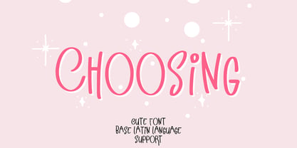 Choosing - a new fresh handmade calligraphy font. Very suitable for greeting cards, branding materials, business cards, quotes, posters, and more!This font are perfect for wedding postcard. Or you can create perfect and unique design of your logo, blog, stationery, marketing, magazines and more :) Features : UpperCase & Lowercase Numerals & Punctuations Multilingualcharacters(AÀÁÂÃÄÅCÇDÐEÈÉÊËIÌÍÎÏNÑOØÒÓÔÕÖUÙÜÚÛWYÝŸŸ ÆŒßÞàáâãäåæçèéêëìíîïðñòóôõöøùúûüýÿ)
 - Alt Fat by ALT,
$- Do you like fat fonts? Well here is a free one from me. Regular & Italic both free. Fat is a caps only font. Because of that if you type something with caps on, as you can see is typing in Greek I decide to make it like this since there no lowercase letters.
 - Bugmansta by OKSHUtypeCO,
$12.00 Bugmansta - a new fresh handmade calligraphy font. Very suitable for greeting cards, branding materials, business cards, quotes, posters, and more!This font are perfect for wedding postcard. Or you can create perfect and unique design of your logo, blog, stationery, marketing, magazines and more :) Features : UpperCase & Lowercase Numerals & Punctuations Multilingualcharacters(AÀÁÂÃÄÅCÇDÐEÈÉÊËIÌÍÎÏNÑOØÒÓÔÕÖUÙÜÚÛWYÝŸŸ ÆŒßÞàáâãäåæçèéêëìíîïðñòóôõöøùúûüýÿ)
 - Sporting by OKSHUtypeCO,
$14.00 Sporting- a new fresh handmade calligraphy font. Very suitable for greeting cards, branding materials, business cards, quotes, posters, and more!This font are perfect for wedding postcard. Or you can create perfect and unique design of your logo, blog, stationery, marketing, magazines and more :) Features : UpperCase & Lowercase Numerals & Punctuations Multilingualcharacters(AÀÁÂÃÄÅCÇDÐEÈÉÊËIÌÍÎÏNÑOØÒÓÔÕÖUÙÜÚÛWYÝŸŸ ÆŒßÞàáâãäåæçèéêëìíîïðñòóôõöøùúûüýÿ)
 - MultiType Gamer by Cyanotype,
$- MultiType Gamer, an all caps typeface focused in display purposes. 24 styles with retro gaming vibes. This is the second release of an expanding multiverse of mixable fonts. The whole family of typefaces has been designed to work at big sizes and display purposes such as branding, headlines, thumbnails, posters and animations. You can swap between the three additional alternate sets through all the styles to add diversity to your composition, even in Cyrillic. MultiType Gamer is inspired by fonts from video games, arcades and variable fonts. Have fun mixing all the styles in your projects.
 - Marne by Eurotypo,
$30.00 “Marne” is a new font inspired by letter designs from the 80's but updated. Standing out for its condensation, its angular touch, its slight slant and its thick and thin lines, “Marne” is the perfect mix of elegance and informality. Open Type features include a full complement of international characters, alternatives and ligatures. With all this, the text will look alive and dynamic, without the monotony of repeated letterforms. “Marne” can be the choice to create titles, logos and posters for branding and packaging, invitations, greeting cards, magazine and book covers, children's material, fashion, and wherever you want!
 - UT Laurelle by Uniontype,
$20.00 Laurelle is a polished and smooth script family. The family consists of light, regular, bold and press styles. Laurelle provides advanced typographical support with contextual alternates, final forms, ligatures and swashes. This font also includes Cyrillic, with all OpenType features. It is most suitable for the headlines of all sizes, as well as for the text blocks. Laurelle is versatile and can be used on cards, posters, merchandise, book covers, websites, packaging, and basically anywhere you like. The overall feel of the font is warm, elegant and informal and it is perfect if you want to convey a sense of friendliness and style.
 - Be Bright by Seniors Studio,
$13.00 Be Bright is a sweet elegant handbrushed calligraphy font. It has a varying baseline with separate swashes that can be applied to the beginning and ends of all lowercase letters. Painted on paper, then scanned, vectorized and carefully made into a font. Be Bright includes several ligatures and international support for most western languages. For the separate swashes font, type lowercase a-z for the beginning swashes and end swashes (access to the glyphs panel is not available, just add swashes manually). The font is perfect for branding, logos, greeting cards, wedding stationery, quotes and more.
 - P22 Posada by P22 Type Foundry,
$24.95 Mexican printmaker Jose Guadalupe Posada (1851-1913) created a massive variety of material—broadsheets, cards, advertisements, posters, etc.—which largely represented a defense of the common man and a manifestation of the horrible and gruesome events of the day. Posada often cut his own lettering that looked like more decorative versions of Gothic wood types. His most notable imagery comes from his Calaveras celebrating the Day of the Dead. Calaveras often represent effigies of living people depicted as skeletons going about their daily activities. These are often humorous and playful in a way that helps bridge this world with the beyond. This font family contains two small caps style fonts and one Extras font containing 60 images.
 - Sica Condensed by dooType,
$30.00 The Sica Family was designed in order to address issues related to technology, while maintaining humanistic forms. Thus, a font with square shapes emerged, but with smooth curves and slightly rounded terminals making it friendly. The family has three widths – condensed, normal and expanded – each of them with six weights and their respective italics, resulting in 36 fonts. With particular details and open shapes that increase legibility, it can be used for both text compositions as well for display sizes. It has 774 glyphs, covering more than 50 languages, as well as ligatures, lining, oldstyle, tabular and proportional figures, fractions, superiors, inferiors, and small caps, all of them accessible through OpenType features.
 - Sica Expanded by dooType,
$30.00The Sica Family was designed in order to address issues related to technology, while maintaining humanistic forms. Thus, a font with square shapes emerged, but with smooth curves and slightly rounded terminals making it friendly. The family has three widths – condensed, normal and expanded – each of them with six weights and their respective italics, resulting in 36 fonts. With particular details and open shapes that increase legibility, it can be used for both text compositions as well for display sizes. It has 774 glyphs, covering more than 50 languages, as well as ligatures, lining, oldstyle, tabular and proportional figures, fractions, superiors, inferiors, and small caps, all of them accessible through OpenType features. - 1532 Bastarde Lyon by GLC,
$38.00 Font designed from work by an anonymous printer in Lyon (France) to print the French popular novel Les Grandes et inestimables Chroniques du grand et enorme geant Gargantua [...] in 1532. The original font has a relatively small number of characters. This font include a “long s”, as typicaly medieval, but also a few ligatures . A render sheet, enclosed with files help to identify them and accented or special others characters on keyboard. It can be used as web-site titles, posters and fliers, editing ancient texts, menus or greeting cards as a very decorative font... Although this font remains clear and easy to read from 8 or 9 points on screen, it is clearly designed for print works.
 - Sica by dooType,
$30.00The Sica Family was designed in order to address issues related to technology, while maintaining humanistic forms. Thus, a font with square shapes emerged, but with smooth curves and slightly rounded terminals making it friendly. The family has three widths – condensed, normal and expanded – each of them with six weights and their respective italics, resulting in 36 fonts. With particular details and open shapes that increase legibility, it can be used for both text compositions as well for display sizes. It has 774 glyphs, covering more than 50 languages, as well as ligatures, lining, oldstyle, tabular and proportional figures, fractions, superiors, inferiors, and small caps, all of them accessible through OpenType features.