5,670 search results
(0.034 seconds)
- Bell Ring by Seemly Fonts,
$12.00 Warmth and friendliness are at the heart of Bell Ring, a handwritten font that captures the essence of the season. Its distinct charm makes it an ideal choice for a wide spectrum of design projects, where your creativity knows no bounds.
 - Wires and Cowboys - Unknown license

- Nemo - Unknown license

- Illustrate IT - Unknown license

- Spiraling - Unknown license

- 1 - Personal use only

- Dash Wisher by PizzaDude.dk,
$15.00 The name Dash Wisher is a wordplay. The letters of the font are also quite playful - you never know what comes next, when typing. There is no exact x-heigh, the baseline is jumpy, the descender and ascender are messed up...there are no real rules for Dash Wisher! But with all that in mind, it comes out surprisingly legible, which means it does have a wide range of use. Let your fantasy and imagination break the boundaries and Dash Wisher do the rest - or maybe the other way around! :) I've added both ligatures to substitute double letters and a set of alternate letters as well.
 - Corpesh by Typotheticals,
$4.00 Corpesh was drawn in Adobe Illustrator during the wee hours of the night. It is a single weight set of fonts, no bold version. As is/was much of what I have done over the last year, it was created purely to pass time. As a self taught amateur in this field, I only do this for the enjoyment it brings me. This typeface is being released early, at the same time as 'Brainstroke', for exactly the same reason that typeface is, that being a health crisis. I know this typeface is not complete, with, as mentioned, no bold version, and probably never will have.
 - Wistar Type by Ana's Fonts,
$15.00 Wistar Typewriter is a monospaced typewriter font in two styles: Regular and Faded, in both vector and SVG versions, with dashed line and underline alternatives and a bonus caps font, for a total of 14 fonts. This font family is versatile and ready to use in modern and retro designs alike. With its soft realistic texture, Wistar looks great in both long or short texts, in digital collages, branding and packaging, social media posts, logotypes, etc. Software requirements for the SVG font: Photoshop CC2017+ // Illustrator CC2018+ No SVG support? No problem! The font includes a vector version of the font that keeps its textured goodness.
 - LeDrôle Lettering Pro by Ingo,
$40.00 The Comic-Script by ingoFonts In the past cartoons used to be lettered by hand. Hardly anyone does this today. The reason is, because hardly anyone has nice handwriting these days, so there are practical advantages in having a special font. However the font should still look like it’s been written by hand. Well, most script fonts don’t meet this requirement. The LeDrôle Lettering is a computer font, but closely resembles genuine handwriting. The model for the LeDrôle Lettering is my personal handwriting, as can be seen on the example of the Biró Script, which is also an ingoFont. The habit of capitalization comes from the Romanic and Anglo-Saxon countries. Depending on the purpose they are designed in three significantly bolder weights. In order for the typeface to actually look handwritten, it needs to have clearly visible irregularities. These are not found only in the shapes of the individual letters. Even though LeDrôle Lettering is all in capital letters, the characters of uppercase and lowercase letters are clearly different. Additionally, many alternative shapes are used, which are automatically applied when the OpenType “Ligatures” feature is activated. Thus, there are no identical double letters or numerals, and many character combinations are defined as ligatures with alternative forms.
 - Great Sage NF by Nick's Fonts,
$10.00This pseudo-Egyptian fantasy originally was named Karnac, and was unearthed in the pages of the 1888 American Type Founders Specimen Book. This version derives it name from a continuing character from Johnny Carson's stint on the Tonight show. Both versions of this font include the Unicode Latin 1252 and 1250 Central European character sets, with localization for Moldovan and Romanian. - Dem Bones by Greater Albion Typefounders,
$3.50 Dem Bones is a bit of fun-display alphabet (capitals), numbers and punctuation assembled out of the sort of knobbly ended bones that dogs used to gnaw on in all the best childrens cartoons and comics. Thing Gnasher and Gnipper or Spike and Tyke. Dem Bones is particularly apt at Halloween, but can introduce some un at any time of the year...
 - Sleepless by Gassstype,
$27.00 Introducing of our new product Sleepless is a hand drawn Horror Brush font and dramatic movement. This font is great for your next creative project such as logos, printed quotes, invitations, cards, product packaging, headers, Logotype, Letterhead, Poster, Label, and etc. Best for project that need horror vibes , horror poster, childrenbook, cartoon, comic . You can activate Ligature OpenType panel design more interesting.
 - Winter Swash by Illushvara,
$14.00 Hello, Introducing a new font Winter Swash inspired by graffiti style. It's bold, dramatic, urban styled display font. Add this font to your favorite creative ideas and notice how it makes them come alive like a poster, kids flyer, merchandise, quotes, branding, cartoon, comic and more. If you have any question, don’t hesitate to contact me. Happy Designing !!! Thank You, Bayu Suwirya
 - Rolla Cossta by Gassstype,
$25.00 Rolla Cossta - Handwritten Brush Font . Introducing of designs look modern, unique and fun. It’s perfect for labels, quotes, posters, DIY projects, branding, packaging, greeting cards, websites, photos, photography overlays, signs, window art, scrapbooking, tags and so much more!our new product that inspired by Street Tagging, graffiti style with a fun theme very good for graffity poster, flyer, childrenbook, cartoon, comic etc
 - Frozen Tree by Epiclinez,
$18.00 Frozen Tree is a thick lettered yet friendly display font. Whether you are using it for cartoon-related designs, children's games, quotes, titles, brand names, book covers, posters, or just any creation that requires a touch of joy, this font is a great choice. So what's included : Basic Latin A-Z & a-z Numbers, symbols, and punctuations Accented Characters : ÀÁÂÃÄÅÆÇÈÉÊËÌÍÎÏÑÒÓÔÕÖØŒŠÙÚÛÜŸÝŽàáâãäåæçèéêëìíîïñòóôõöøœšùúûüýÿžß Thank you
 - Fresh Fruit by Mvmet,
$18.00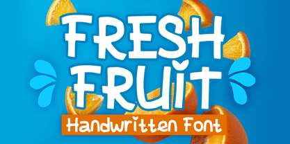 Fresh Fruit is a display playful font that will be the perfect addition to any of your projects. You can use this font for many design ideas such as stickers, t-shirt designs, amazing logo designs, magazine or book covers, comics, cartoon drawings, and many more. Fall in love with its incredibly versatile style, and use it to create lovely designs!
 - DT Sticky Stones by Dragon Tongue Foundry,
$10.00 Inspired by early cool cartoon fonts, early rock and hippie posters, I created the casual 'DT Stoner Toon' font. Then by adding strategic dots to add a little more quirkiness to the mix, I came up with this organic 'DT Sticky Stones' font. Please use with contextual ligatures turned on when possible. These letters like to adapt to their neighbours.
 - HenHouse AOE by Astigmatic,
$19.95 HenHouse is an offbeat comic sans-serif typestyle full of wonky bounce. Inspired by the 1962 Merrie Melodies cartoon titled “Mother was a Rooster”, this typeface has all of the spunk of its source. The end result, a lively tribute to its origin, easy to read and fun to look at, a perfect typeface for childrens' books, advertisements, and playful designs!
 - Antipodes by Green Type,
$28.00 Antipodes is a decorative reverse contrast font family. Designed for use in outdoor advertisements, branding, packaging. Antipodes is also perfect for movies and cartoon, video games and mobile apps. Antipodes contains latin, cyrillic and greek gliphs. There is also standard and discretionary ligatures. Any style comes with a wide range of OpenType features: fractions, proportional and tabular figures, contextual alternates, and much more.
 - Wicked Butter by Toudji Studio,
$19.00 Wicked Butter is a display font inspired by writing styles for young children, such as animated cartoons, comic posters, and so on. This font is bold but sharp and bouncy, which makes it look more playful but still strong. This font also comes with several combined letter variations. but you can still use wicked butter for many print and digital needs.
 - Wildest Jungles by Letterhend,
$17.00 Wildest Jungle is a textured display font with cartoon vibes. This font perfectly made to be applied especially in logo, and the other various formal forms such as invitations, labels, logos, magazines, books, greeting / wedding cards, packaging, fashion, make up, stationery, novels, labels or any type of advertising purpose. Features : Uppercase & lowercase Numbers and punctuation Alternates & Ligatures Multilingual PUA encoded
 - Mother Hen AOE by Astigmatic,
$19.95 Mother Hen is an offbeat comic latin typestyle full of quirkiness and bounce. Inspired by the 1965 Looney Tunes cartoon titled “Highway Runnery”, this typeface has all of the spunk of its source. The end result, a lively tribute to its origin, easy to read and fun to look at, a perfect typeface for childrens' books, advertisements, and playful designs!
 - Comic Bold Large by Mvmet,
$12.00 Comic Bold Large is a fun bold cartoon display font for your everything needs! You can use it for anything ranging from t-shirts and clothing, for your kids book designs, kids party needs, greeting cards, stickers, posters, banners, or anything that needs a bold and fun touch. Try it to create fabulous designs and feel the fun and cheering vibes with it!
 - A Likely Story by Comicraft,
$39.00 Finally an animated alphabet with a tall tale to tell -- perfectly suited to putting words in the mouths of mutts, talking tigers and anthropomorphic animal characters of all kinds. The precise thick and thin pen strokes of these eight versatile weights are well suited to gag strips, classic cartoons and maybe even that internet meme you've been thinking about for weeks!
 - Letterpress Extras JNL by Jeff Levine,
$29.00 Letterpress Extras JNL gathers more re-drawn images from the rich trove of vintage letterpress cuts. There's plenty of pointing hands and decorative ornaments, a few cartoons and some assorted miscellany. Also included are images of dip pen nibs from an old catalog and a decorative border set. To access the pen points, use the shift key and type any numeral key.
 - Mad Scientist by Comicraft,
$19.00 Working on The Lab late one night, evil comic book genius Scott Christian Sava realized there was something missing from his graphic experiment! No, not slugs and snails or puppydogs' tails, nor sugar, spice, everything nice and formula 'X'....No, what his nefarious scheme was missing were the actual numbers and letters with which he could complete his equation! BRILLIANT! What he needed was something antiseptically clean and readable, even at small sizes for megalomanical rambling as well as the 5 point type under the Bio-Hazard logo that nobody really reads, and yet also bouncy and energetic enough for the inevitable sound effects that might follow exclamations such as: "IT'S ALIVE!" or "IT JUST-MIGHT-WORK!" Thanks to those awfully nice chaps at Comicraft, MadScientist is now available to evil geniuses everywhere, and guaranteed Laboratory tested.* *On reanimated human beings reconstituted from bones and organic body parts and organs from local charnal houses. No animals or small children were hurt during the creation and use of this font. Well, not yet, anyway. Artwork by Lew Stringer
 - Edison by HiH,
$12.00 Edison, is it Victorian or is it Art Nouveau? While this typeface may be found in Petzendorfer’s Treasury of Art Nouveau Alphabets, I believe the decorative spirals are more Victorian than “New Art.” To me, they looked tacked on, rather than organic -- with the industrial mechanics of a coiled spring, rather than the tendrils of a growing plant as the philosophical wellspring. Originally released by ATF in 1894 as Houghton, this typeface was re-released shortly thereafter by Bauer and Berthold in Germany as EDISON. Please do not make the mistake of thinking the font we offer here is no better than freeware fonts in cheap rip-off collections. This font has a set 218 characters and represents many hours manipulating the bezier curves to produce acceptable results. Available freeware fonts are often little more than raw scans with little accuracy of letterform. The muddy line intersections are a dead give-away. Frequently all you get is the alphabet itself. No numbers, no punctuation and don't even think about diacriticals. The font we offer represents a tremendous value. Considering the hours of work involved, I have no business charging so little. I could make better money cooking hamburgers or bagging groceries. But we want very much to encourage you to purchase and enjoy these fascinating historical typefaces and are making it as easy as possible for you to do so. So please encourage us and order Edison today.
 - Plebia by Greater Albion Typefounders,
$5.95 The 1930s, 40s and 50s contribute many elegant and clean font families to the design canon. Plebia—the plain font—is Greater Albion's homage to that elegant design canon. The basic design is offered in a range of decorative forms chosen to preserve this basic simplicity: shadowed, outline and a subtle semi-serif. Use this font in signposts, labels and posters, anything that needs to get its message across with impact regardless of visual distance. Bring back the spirit of the middle years of the last decade.
 - Carbonara by Hanoded,
$20.00 Carbonara. Nope, it's not the pasta sauce, but a nice, grungy typewriter font, made using a pre-war typewriter, some oil and a stack of old-fashioned carbon paper sheets. You can use it to give your designs some oomph. Comes with a whole bunch of contextual and stylistic alternates.
 - Afternoon Edition JNL by Jeff Levine,
$29.00 Afternoon Edition JNL is another classic typeface (with Caslon influence) re-drawn from screen captures of vintage newspaper headlines. The font joins Final Edition JNL, Evening Paper JNL and Morning Paper JNL as a mini-collection of type styles used to grab a reader's attention in the 1930s, 1940s and 1950s.
 - Latchboy - Unknown license

- Walt Disney Script - Personal use only

- FARSCAPE - Personal use only

- Publication JNL by Jeff Levine,
$29.00If Publication JNL looks very familiar, this is no accident of design. It is Jeff Levine’s rendering of De Vinne, a classic typeface designed in honor of T.L. De Vinne (circa 1890-91) and given the gentle nuance of emulating hand-set type. - Symptomatic by Hanoded,
$15.00 No, rest assured - I am not ill. I just liked the letter combination of Symptomatic! Symptomatic is a messy connected brush script. Use if for your book titles, posters and product packaging. Comes with double letter ligatures and a whole lotta diacritics.
 - ITC Gamma by ITC,
$29.99ITC Gamma font is the work of designer Jovica Veljović. Named after the third letter of the Greek alphabet, ITC Gamma has almost no sharp corners. Its serifs, stroke endings and terminals are all rounded, a feature best seen in larger point sizes. - Cellophane Tape JNL by Jeff Levine,
$29.00 Cellophane Tape JNL is a stripped-down and slightly modified version of Eckhardt Trilinear JNL with open-ended letters. While the name Cellophane Tape JNL is nostalgic (tape is no longer made from cellophane), its still a fun, novelty font for many applications.
 - CC Angular by Okaycat,
$24.50 Angular is all angular. This font has no curves! Dingbat symbols & icons replace a handful of the generally unused alternate characters, to make this font extra fun & useful. Angular is extended, containing West European diacritics & ligatures, making it suitable for multilingual environments & publications.
 - Millport JNL by Jeff Levine,
$29.00Millport JNL is another retro-design font with a look closer to hand-lettering than formal typesetting. Use it for headlines, titles, signs, posters and point-of-sale items. No matter what the application, Millport JNL looks clean and retains its nostalgic feel.


