1,898 search results
(0.013 seconds)
- Reba Samuels by Samuelstype,
$24.00 Reba Samuels is based on the 2007 release Rebecca Samuels. While Rebecca was largely intended for text use Reba aims to be more versatile with an extended weight scope and added cut varieties. While Rebecca’s slab character is developed in the Reba serif, the ’seriffed’ italic of Rebecca is abandoned in favor of a simple italic sans, better matching the serif in plain text. The weight extremes are very useful for headlines while the middles do better in text. The robust and angular shapes of the serif matches the straightforward sans. The extreme contrast between the thin and the black cuts opens up great opportunities in any design project.
 - Salvation by Device,
$39.00 Rough and ready, bold and urgent. Or playful and fun in bright colours. The original letters were cut from actual potatoes, then scanned in and converted to vector outlines. Lighter and more heavily inked versions were used for the three variants. Using Opentype character-substitution technology, Salvation rotates through three versions of each letter to create a naturally uneven printed effect. Unlike hot metal type, the potatoes were cut the right way around. This produced reversed prints, which were then flipped back in Photoshop. Originally produced for Hughes' Get Lettering activity book, the font was then extended to cover numbers, punctuation and full European language support.
 - Marilyne by Silverdav,
$15.00 Marilyne is a modern calligraphy font with handwritten, sophisticated flows. It is full of hearts and glyphs. It is perfect for branding, wedding invites, and cards. Marilyne includes a full set of lovely and swashes lowercase letters, multilingual symbols, numerals, punctuation and ligatures. Also it includes: -short lowercase beginning and ending swashes (This is so perfect for invitations, monograms) -long lowercase beginning and ending heart swashes. Marilyne includes 12 beginning and ending swashes lowercase The font has a smooth texture, so it would be perfect for all types of printing techniques you can do embroidery, laser-cut, gold foil, and is ideal for cutting.
 - Toy Story by Shape Studio,
$10.00 We are proud to present our new font. Name of the font is TOY STORY. Toy Story is a fun handwritten font filled with handwritten charm and personality! It is the perfect choice for crafters with lawn mowers, as it is extremely smooth for optimal cutting performance. Toy Story is a fun font that's bold and smooth enough to cut with the Cricut & Silhouette crafting machine, for Titles for children's books, scrapbooks, logos, icons, phrasesor quotes for winter greeting cards (Halloween or New Year holidays), photo overlays, short phrases, children's books, gift shop tags, presentations on social media Pinterest, Instagram, Facebook, or others. Thank you!
 - Maintenance Stencil JNL by Jeff Levine,
$29.00 In the opening scenes of the 1938 Three Stooges comedy “Tassels in the Air” the Stooges are working as maintenance men inside an office building. Their immediate job requirement is to paint the tenants’ business names on the corresponding office doors with pre-cut stencils. Of course, they get it all wrong. Nonetheless, the stencils appear to be a hand cut sans serif design in a squared or ‘block’ style with rounded corners, and some of the applied lettering made for an interesting challenge to recreate as a typeface. The end result is Maintenance Stencil JNL, which is available in both regular and oblique versions.
 - ITC Digital Woodcuts by ITC,
$29.99ITC Digital Woodcuts font is the work of Timothy Donaldson. Although made on a computer, each character has the look of a block of wood with a character cut into it. The forms are made entirely of lines, typical of how the result would be if they were truly cut into wood. ITC Digital Woodcuts is a capital letter alphabet including both white letters on a black background and black letters on a whitish background which looks as though the bark of the piece of wood was chiseled away for the effect. Donaldson suggests alternating the black version with the white to create a three dimensional effect. - Type Warmers JNL by Jeff Levine,
$29.00 The name Type Warmers JNL traces its lineage to small catalog booklets issued by Indianapolis' Cobb Shinn for his line of letterpress cuts; of which a few can be found included within this typeface. Presumably type could "warm up to" these stock illustrations and work hand-in-hand to deliver the message, hence the "Type Warmers" sobriquet. Originally known for illustrating many attractive and comical postcards of the early 1900s, Shinn moved into the field of purchasing stock art and redistributing them as electrotypes or "cuts", the predecessor to today's digital clip art. A number of the cartoons he sold can be found in the Shinn Kickers JNL font.
 - Blue Venom by Linecreative,
$16.00 Blue Venom is a unique typography with a modern style, Each letter is cut into two parts, the first consists of three labyrinthine combined lines and the other is a diagonal cut line, so that the combination of these two parts into one letter that looks stunning , and each letter consists of four character choices, two character choices for numbers, and equipped with Ligatures (Opentype feature) All character options are included in one font. You can use alternatives in most major image editors, just find the Glyps (Alternate) menu item there. For example, in Adobe Illustrator you need to select the Window / Type / Glyphs menu item.
 - Bouncer by Ingrimayne Type,
$6.95 The letters in Bouncer are round because they all begin as a ball and then have parts of the ball cut away. Bouncer was one of the earliest typefaces from Ingrimayne Type. Lower-case letters are smaller versions of the upper-case letters. BouncerTwo, designed twenty years after the original Bouncer, continues playing with the idea of making letters by cutting out parts of a circle, but in this case the circles are interlocking. All letters are upper-case but some of those on the lower-case keys differ from those on the upper-case keys. BouncerTwo is eye-catching but not highly legible.
 - Sliced by ArtyType,
$29.00 The name of this robust typeface is adopted quite literally from the slice taken out of certain characters. The same sliced angle is also applied to many of the terminals, creating a clean-cut styling throughout the family. Tilted versions emphasise the descriptive name further, with an implied cutting stance. Wider versions go even further still, taking on a more thrusting, squat dynamic compared to the condensed styles. The standard Sliced family is complemented by Sliced Open, a lighter, more open set which extends the versatility and design flexibility of the typeface and comprises a total of 14 font styles, all with extended European character sets.
 - VVDS The Dickens Tale by Vintage Voyage Design Supply,
$10.00 The Dickens's Fairytale – it's a new chapter of VVDS products - The collections of fancy display fonts which will include many typefaces that will be perfectly combined not only with each other, but also with other collections of this series. As a result, you will get a large collection of beautiful fonts and graphics that will help you create beautiful designs without having to look for anything else. All these collections are inspired by classic books design of XIX and XX centuries like Franklin's Library Classic Collection and modern publishing houses like Barnes & Nobel Collectible Editions. This collection is the first one and including 12 font files. The Serif presented in two styles - cutted and normal. The cutted style has two weights - Regular and Bold. Also, there are two types of shadows - block and offset. Plus decor for cutted serif. The cherry on top - curly calligraphic Script with Swirl calligraphy elements for decoration. The both of types has many Open Type Features as Oldstyle Figures, Fractions, Stylistic Alternates and ending lowercase letters for script. • OTF & WEB • Multilingual
 - Parisian Ornamentals by Celebrity Fontz,
$24.99Beautiful, richly ornamented shadowed letters in the Empire fashion, similar to the fonts of the Parisian type founder J. Gille', cut around 1810. Includes one set of A-Z ornamental initials conveniently assigned to both the upper and lower case alphabet characters. - Vocalist JNL by Jeff Levine,
$29.00 Vocalist JNL is a bit of a novelty Art Deco typeface based on hand lettering from some 1940s sheet music. Using the classic "thick and thin" style of the day, a number of letters and numbers have wedges cut out of their designs.
 - Sweet Mia by Angele Kamp,
$24.00 Sweet Mia is a playful modern calligraphy font with a dancing baseline. This sweet font has nice smooth lines and is perfect for crafters and cutting machines. Sweet Mia will look gorgeous on cards, mugs, quotes, logos and all your other lovely projects.
 - Hermaphrodite by Volcano Type,
$29.00Hermaphrodite was developed for the Bastard Project and had its origin in the idea of applying the process of an Antiqua on a Grotesque. In other words, a Grotesque font was drawn calligraphically and then digitized. Some inconvenient corners were simply cut off. - Classroom JNL by Jeff Levine,
$29.00A set of old die-cut cardboard letters and numbers used by teachers directly on bulletin boards or for tracing was the inspiration for Classroom JNL. In turn, these letters take their cue from typefaces such as Franklin and earlier wood type designs. - Advertisers Gothic by Monotype,
$29.99AdvertiserÆs Gothic Light, from a volume of headline fonts, was designed by Robert Wiebking in 1917. Wiebking was a skilled type engraver from Chicago who created his own pantographic machine, used to cut punches drawn by other successful type designers, including Frederic Goudy. - Tough Cookie by Hanoded,
$15.00 Tough Cookie is a handmade font that looks like it has been cut out. It comes in three varieties that work together really well. Use it for your book covers and product packaging, or (if you’re a tough cookie) for your christmas cards…
 - Common Stencil JNL by Jeff Levine,
$29.00 Common Stencil JNL takes a vintage lettering stencil from the 1980s with imperfectly bent cutting dies [which unintentionally gave the characters a distressed or "grunge" look] and recreates it in a digital form. The design is available in both regular and oblique versions.
 - Rosart by ARTypes,
$35.00Rosart is a digital version of the 2-line great primer letters cut by J. F. Rosart for Izaak & Johannes Enschedé in 1759 (Enschedé no. 811). When the AR type is set at 50 pt it will match the size of the original. - Electroz by 4RM Font,
$30.00 Electroz font is a techno themed font made with futuristic values, made with condensed width and slanted cuts at the corners of the letters making this font look cool and have a strong futuristic value. suitable for use in futuristic-themed designs
 - Poultry And Fish JNL by Jeff Levine,
$29.00 The image of an old enamel sign advertising poultry inspired Poultry and Fish JNL, which is available in both regular and oblique versions. Horizontal cut-through lines within the Art Deco-era hand lettering adds to the uniqueness of this type design.
 - Meter Room JNL by Jeff Levine,
$29.00 The design idea for Meter Room JNL comes from a vintage brass hand-cut stencil of the words "High Voltage". What makes this stencil font a bit different than others is the placement and angle of some of the "breaks" within the letters.
 - P22 Cage by P22 Type Foundry,
$24.95 Based on the handwriting and sketches of American experimental composer John Cage, this set was produced in conjunction with The Museum of Contemporary Art in Los Angeles and the John Cage Trust. This unique collection includes 52 graphic extras culled from the composer's notes and scores, as well as the "Cage Silence" font inspired by Cage's seminal work 4' 33".
 - Callistera Script by Sarid Ezra,
$15.00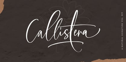 Callistera Script is a natural also expressive font that contain lowercase, uppercase, symbol, and also mult- language support. It comes with ligatures, contextual alternates, stylistic alternates, swashes, and also underline. Callistera Script also suitable for logo branding, beautiful fashion design, suitable for wedding invitations, or handwritten quotes. Also with PUA encoding. For another questions, please send a mail to saridezra@gmail.com. Thank You!
 - Unjustified NF by Nick's Fonts,
$10.00 No secret here: this typeface was inspired by the opening credits for the television series "Justified." Alternate upper and lowercase letter to achieve the effect, or—in OpenType-savvy programs—activate the Contextual Alternates (calt) feature. Thin numbers can be found in these positions: ~^{}[]|\<>. Both versions of this font support the Latin 1262, Central European 1250, Turkish 1254 and Baltic 1257 codepages.
 - Kamuy by Andinistas,
$39.95 Kamui is a font designed by Carlos Fabian Camargo G. and used to write headlines. Its strategy makes it ideal for covers and advertisements with Japanese-style manga comics requiring latin style. Precisely its purpose was inspired by typographical classics such as Mistral by R. Excoffon and Zapfino by H. Zapf that then were diluted by separate strokes as blackletter calligraphy. However, high doses of miscegenation and lettering untimely torn between 50% esthetic and 50% legibility. That way his radical expression is highly profitable for composing and designing words and phrases with Eastern look. And more importantly, the writing seems drawn quickly with thin-tipped brush staining over a rough surface, from that process comes the idea of corroded outlines and changes in contrast. In conclusion, some diagonal strokes, horizontal, curved and vertical stand or hide from their simulation of scarcity or abundance of ink clots. That way each stroke seems inconsistent, footprint of the 423 brush drawing glyphs in Regular Kamuy. In that sense, the OpenType features included are: Standard Ligatures, Contextual Alternates, discretionary ligatures, swash, stylistic alternates, alternatives for titles, ordinals, fractions. And to end the Variable “Kamuy Dingbats” has is 52 fictitious drawings and zamurais.
 - Cíclope by Andinistas,
$19.95 Cíclope is a typeface family designed by Carlos Fabián Camargo in 2012 and used to write the headlines. Its idea is based on an army of stone soldiers that with their size and strength cause earthquakes. Under this concept he obtained stencil and sans serif letters with monstrous shapes and torn counterforms. Its usefulness as well as readability consists in imitate rocks with scars and cracks. For that reason, Cíclope family has three sizes, each with their respective italics distributed at different levels of corrosion. In addition, each file contains 260 glyphs useful for designing words and phrases with systematically eroded treatments for advertisement material. Thus Cíclope works as a raw material in the exploration of new graphic design. Finally, Cíclope concept has grotesque, geometric and humanistics letters roots that seem disastrous but each and every detail has been planned with high definition drawing. Most importantly, it expresses a big amount of grunge style with cracked edges and medium contrast between thin and thick strokes. In that sense, the writing seems impaired and special for design of logos, posters, flyers, brochures and worn, crusty or demolished graphic design.
 - Warhol by Andinistas,
$34.00 Warhol is a font family designed by Carlos Fabian Camargo. Its 3 fonts work in groups or independent. His carefree soul lies in the sensibility, creativity and abstract motivations listening to the album: The Velvet Underground & Nico released in 1967. Preparations for his typographic design were illustrated by imagining extravagant, fascinating and hard-to-resist ideas, That is why his brushstrokes of the alphabet were born of irregularity, with naive character and expressive drawing, notable with the discordance and instability of drawing by Andy Warhol, infiltrated with pop folk art and artisan harmony. Warhol is a font family offers uppercase, lowercase and numbers that work at the beginning, middle or end of words, achieving calligraphic expressiveness. In that order of ideas Warhol font family offers the following vantages: • Warhol Script (694 glyphs): handwritten letters drawn with a thin-thickness tool, simulating interesting imperfections in their contours and connections. * Warhol Script Bold (694 glyphs): Thick letters that appear to be drawn with a brush of inflated and irregular thickness • Warhol Extras (140 glyphs): Words with letters written with pen, highlighting meaningful criteria that function as perfect companions between words designed in Warhol Script and Bold.
 - Artemis JY by JY&A,
$39.00Mark Geard’s Artemis is a contemporary humanist sans serif. Its flourishes and unusual cuts give the typefaces huge distinctiveness—yet they remain highly legible. Glyphs begin with something that resembles a serif, leading the eye across their body and on to the next letter. - Moving Message JNL by Jeff Levine,
$29.00 A vintage printer's cut for the masthead of the "Fed-O-Gram" (a monthly publication of the Farm Bureau Federation, Inc.) had its title set in letters that emulated a moving message board. This design formed the basis for what is Moving Message JNL.
 - Dunkelbunt by PintassilgoPrints,
$20.00 Dunkelbunt is freely inspired by works and words of the wildly eccentric artist, architect and designer Friedensreich Hundertwasser. It’s an all caps font, with 2 cuts for each letter, loaded with imaginative energy and organic forms that will certainly make your designs shine. Enjoy!
 - Salad Bar JNL by Jeff Levine,
$29.00 Hand-cut wooden letters belonging to a long-defunct salad bar's signage were offered for sale in an online auction. The casual look of the lettering, the hand crafted feel and the rounded ends made for the perfect inspiration for designing Salad Bar JNL.
 - Sergury by Ingrimayne Type,
$5.00 Sergury is an ultra-bold typeface formed by cutting circular elements from rectangular blocks. It is caps only and is so bold that it is almost unreadable. The three tall styles were added in 2021. Sergury is a variation of Porker, another experimental typeface.
 - MBF Modifi by Moonbandit,
$15.00 Modifi is a straight cut modern monospace font. This typeface is inspired by the digital monotone living in urban lifestyle. Modifi has a few alternates to supply you with variety in your work and is perfect as a headline, title, branding, logo and many others.
 - Baseface by Attractype,
$9.00 Baseface is a sans serif font family with a basic shape, simple and clean design. With a choice of six font styles, it is suitable for various typography designs, general text, text effects, logos, web pages, lettering, laser cutting, t-shirt design and others.
 - Typoskript Pro by RMU,
$35.00 In 1968 Hildegard Korger’s Typoskript was cut by Typoart in Dresden, Saxony. This freshly redrawn and digitized version was extended to include Central European, Baltic and Turkish letterforms, and possesses various OTF features. It is well suited for invitations, lyrics, poems and related things.
 - Balaeno by Iwm Design,
$10.00 Balaeno seamlessly combines modern sophistication, technological innovation, sporting spirit, and timeless elegance into one captivating font. With its sleek design and sharp lines, the font not only reflects contemporary trends but also exudes cutting-edge technological vibes suitable for a range of design projects.
 - Dynamic Outfit by PizzaDude.dk,
$17.00 Dynamic Outfit is actually another one of my fonts (Universitet) cut and slightly rotated into a grunge font. To make the font more realistic and grungy, I have added 8 different versions of each letter - and these different versions automatically cycle as you type!
 - Loopo Stencil by Little Fonts,
$15.00 Loopo was created as an experiment with rotating forms. The cut of the stencil shows the rotation and creates a reference to motion throughout the font. Characters are created by manipulating the rotations of the stencil which gives the font a round and fluid look.