10,000 search results
(0.054 seconds)
- Romance Song JNL by Jeff Levine,
$29.00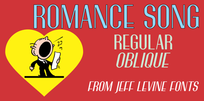 The hand lettered Art Deco sans serif lettering used for the opening titles of the 1941 melodrama “Penny Serenade” (starring Cary Grant) inspired a digital revival. Romance Song JNL is available in both regular and oblique versions.
 - Vogie by 38-lineart,
$170.00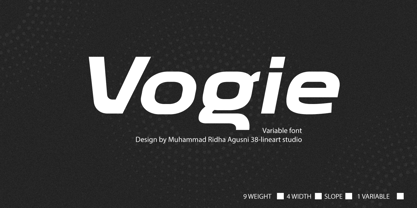 Vogie is a sporty and modern sans serif font, comes in 4 widths, 9 weights and is available in regular and oblique. 62 fonts encapsulated in one variable font makes "vogie" more modern and easy to use.
 - Office Manager JNL by Jeff Levine,
$29.00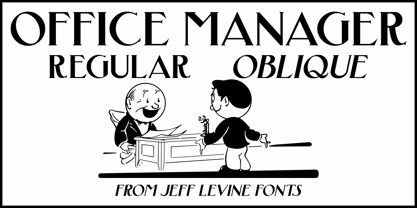 “Stillson” is an Art Nouveau-influenced font found within the pages of the 1881 Barnhart Bros. & Spindler type specimen book. The digital revival is called Office Manager JNL, and is available in both regular and oblique versions.
 - Amelaryas by Hishand Studio,
$15.00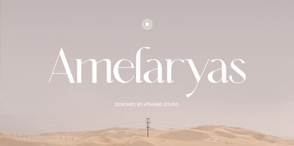 Amelaryas is beautiful serif font with elegant and premium shape that can be used for logos, branding, invitations, stationery, wedding designs, social media posts, and much more. Complete with ligatures alternates regular italic icon kerning multilingual support
 - Toy Letters JNL by Jeff Levine,
$29.00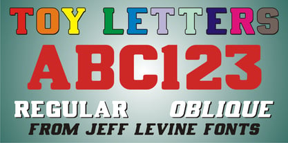 A vintage set of die-cut letters and number by Village Toys (circa 1930s or 1940s) featured a playful, bold serif typeface. This is now available digitally as Toy Letters JNL, in both regular and oblique versions.
 - Western Territory JNL by Jeff Levine,
$29.00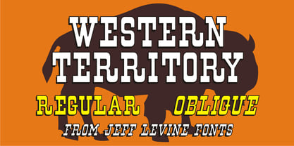 Browsing through images of old wood type for sale, a Western type design with some interesting character variations made the perfect subject for a digital revival. Western Territory JNL is available in both regular and oblique versions.
 - Groovy Tuesday JNL by Jeff Levine,
$29.00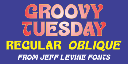 Hand lettering from the 1965 movie poster for “The Loved One” – a classic 1960s spurred serif design with added curly-tailed terminals was the working model for Groovy Tuesday JNL – available in both regular and oblique versions.
 - Roadside Diner JNL by Jeff Levine,
$29.00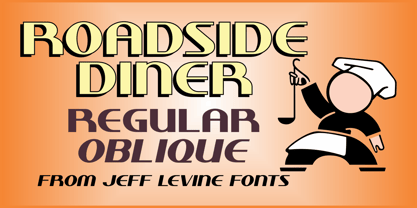 The hand painted signage from a 1950s era photo of the Miami Diner Restaurant in Miami, Florida inspired the digital version of its 1940s-influenced lettering. Roadside Diner JNL is available in both regular and oblique versions.
 - F2F OCRBczyk by Linotype,
$29.99The original OCR B was designed for optical character recognition systems and was therefore monospaced. Designer Alexander Branczyk made a more typographically tuned and fitted version, with both regular and bold weights, and called it OCRBczyk™. - Musical Comedy JNL by Jeff Levine,
$29.00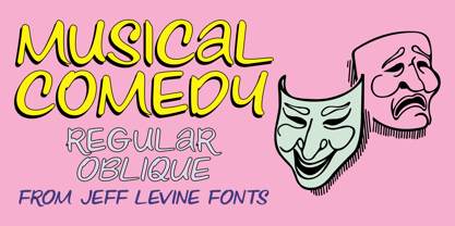 The hand lettered show card brush lettering in the trailer for the 1960 musical comedy “Bells are Ringing” (starring Dean Martin and Judy Holliday) inspired Musical Comedy JNL, which is available in both regular and oblique versions.
 - Roman Stencil JNL by Jeff Levine,
$29.00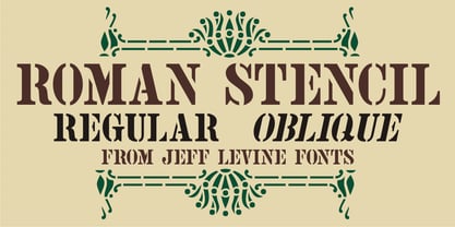 Roman Stencil JNL is a condensed version of the classic Roman typeface found on many vintage hand-punched brass stencils made for packing and shipping merchandise. This digital interpretation is available in both regular and oblique styles.
 - Galeb by Tour De Force,
$25.00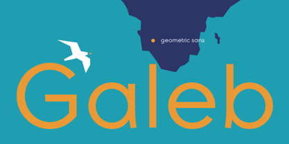 Galeb is simple geometric sans font family in 4 weights - Light, Regular, Bold and Black, ideal for corporate and editorial projects. With angled stem endings, Galeb gives enough impression to be used as display font as well.
 - Textile Stencil JNL by Jeff Levine,
$29.00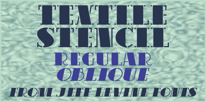 An ad from the 1930s for a Spanish company called Intex Textiles featured some hand lettering in a bold and unique stencil design. This is now available as Textile Stencil JNL, in both regular and oblique versions.
 - Public Safety JNL by Jeff Levine,
$29.00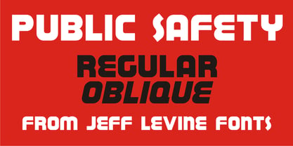 Public Safety JNL was inspired by a 1940s-era health poster issued through the WPA (Works Progress Administration). The font’s bold, blockish sans lettering commands attention and has been made available in both regular and oblique versions.
 - Abdo Screen by Abdo Fonts,
$49.50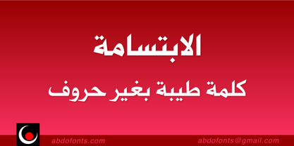 Abdo Screen is a very simple Naskh font for satellite channels, presentations, videos and advertisements. it comes in sixth weights Thin, Light, Regular, Medium, Bold and Black. This font also contains some of Stylistic Sets and Ligatures.
 - Formal Event JNL by Jeff Levine,
$29.00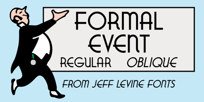 The hand lettered actors’ credits on a title card from the 1937 film “Shall We Dance” served as the model for Formal Event JNL – an Art Deco sans serif font available in both regular and oblique versions.
 - Fellya by Stripes Studio,
$20.00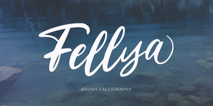 Fellya a new very attractive brushed font with a natural, detailed and perfect texture.Fellya is perfect for branding projects, logos, product packaging, posters, invitations, greeting cards, news, blogs, everything including personal charm and more.
 - Brestonk by Dhan Studio,
$18.00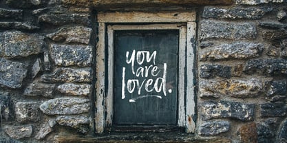 Brestonk is a new font with textured stroke detail, also provided some ligatures and extra swashes. Perfect for projects posters, logos, product packaging, invitations, greeting cards, brands, news, blogs, everything including personal charm etc.
 - Aaux Next Wide by Positype,
$22.00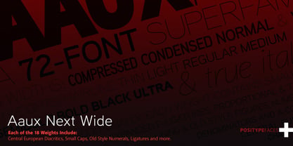 When the original Aaux was introduced in 2002, I intended to go back and expand the family to offer more versatility. Years went by before I was willing to pick it up again and invest the proper time into building a viable and useful recut. Just putting a new designation and tweaking a few glyphs here and there would not do the designer or the typeface justice; instead, I chose to redraw each glyph's skeleton from scratch for the four main subsets of the super family along with their italics. Each glyph across the super family is 'connected at the hip' with each style—each character carries the no frills, simple architecture that endeared so many users to it. The new recut expands the family to an enormous 72 typefaces! The original has spawned Compressed, Condensed and Wide subsets—all with corresponding weights—for complete flexibility. Additionally, all of the original weight variants have all been incorporated within the OpenType shell: Small Caps and Old Style Figures are there along with new tabular figures, numerators and denominators, expanded f-ligatures and a complete Central European character set.
 - Aaux Next by Positype,
$22.00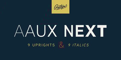 When the original Aaux was introduced in 2002, I intended to go back and expand the family to offer more versatility. Years went by before I was willing to pick it up again and invest the proper time into building a viable and useful recut. Just putting a new designation and tweaking a few glyphs here and there would not do the designer or the typeface justice; instead, I chose to redraw each glyph's skeleton from scratch for the four main subsets of the super family along with their italics. Each glyph across the super family is 'connected at the hip' with each style—each character carries the no frills, simple architecture that endeared so many users to it. The new recut expands the family to an enormous 72 typefaces! The original has spawned Compressed, Condensed and Wide subsets—all with corresponding weights—for complete flexibility. Additionally, all of the original weight variants have all been incorporated within the OpenType shell: Small Caps and Old Style Figures are there along with new tabular figures, numerators and denominators, expanded f-ligatures and a complete Central European character set.
 - Aaux Next Cond by Positype,
$22.00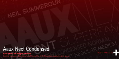 When the original Aaux was introduced in 2002, I intended to go back and expand the family to offer more versatility. Years went by before I was willing to pick it up again and invest the proper time into building a viable and useful recut. Just putting a new designation and tweaking a few glyphs here and there would not do the designer or the typeface justice; instead, I chose to redraw each glyph's skeleton from scratch for the four main subsets of the super family along with their italics. Each glyph across the super family is 'connected at the hip' with each style—each character carries the no frills, simple architecture that endeared so many users to it. The new recut expands the family to an enormous 72 typefaces! The original has spawned Compressed, Condensed and Wide subsets—all with corresponding weights—for complete flexibility. Additionally, all of the original weight variants have all been incorporated within the OpenType shell: Small Caps and Old Style Figures are there along with new tabular figures, numerators and denominators, expanded f-ligatures and a complete Central European character set.
 - Aaux Next Comp by Positype,
$22.00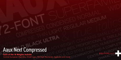 When the original Aaux was introduced in 2002, I intended to go back and expand the family to offer more versatility. Years went by before I was willing to pick it up again and invest the proper time into building a viable and useful recut. Just putting a new designation and tweaking a few glyphs here and there would not do the designer or the typeface justice; instead, I chose to redraw each glyph's skeleton from scratch for the four main subsets of the super family along with their italics. Each glyph across the super family is 'connected at the hip' with each style—each character carries the no frills, simple architecture that endeared so many users to it. The new recut expands the family to an enormous 72 typefaces! The original has spawned Compressed, Condensed and Wide subsets—all with corresponding weights—for complete flexibility. Additionally, all of the original weight variants have all been incorporated within the OpenType shell: Small Caps and Old Style Figures are there along with new tabular figures, numerators and denominators, expanded f-ligatures and a complete Central European character set.
 - Carmen is a font that encapsulates both elegance and versatility, making it an exquisite choice for various design projects. At its core, Carmen is a typeface that balances classic sensibility with m...
- "Child's Play" isn't just a font; it's a joyride back to the days of yore, when the toughest decision of the day was choosing between crayons or markers. This font mimics the erratic yet sincere hand...
- CRAY AN? by Skydog is an intriguing and visually captivating font that manages to transport users back to their childhood days, evoking memories of carefree doodles on the edges of notebooks. This fo...
- Banks and Miles by K-Type,
$20.00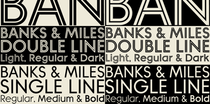 K-Type’s ‘Banks & Miles’ fonts are inspired by the geometric monoline lettering created for the British Post Office in 1970 by London design company Banks & Miles, a project initiated and supervised by partner John Miles, and which included ‘Double Line’ and ‘Single Line’ alphabets. The new digital typeface is a reworking and extension of both alphabets. Banks & Miles Double Line is provided in three weights – Light, Regular and Dark – variations achieved by adjusting the width of the inline. Banks & Miles Single Line develops the less used companion sans into a three weight family – Regular, Medium and Bold – each with an optically corrected oblique. Although the ‘Banks & Miles Double Line’ and ‘Banks & Miles Single Line’ fonts are based on the original Post Office letterforms, glyphs have been drawn from scratch and include numerous adjustments and impertinent alterations, such as narrowing the overly wide Z and shortening the leg of the K. Several disparities exist between the Post Office Double and Single Line styles, and K-Type has attempted to secure greater consistency between the two. For instance, a wide apex on the Double Line’s lowercase w is made pointed to match the uppercase W and the Single Line’s W/w. Also, the gently sloping hook of Single Line’s lowercase j is adopted for both families. The original Single Line’s R and k, which were incongruously simplified, are drawn in their more remarkable Double Line forms, and whilst the new Single Line fonts are modestly condensed where appropriate, rounded letters retain the essentially circular form of the Double Line. Many characters that were not part of the original project, such as @, ß, #, and currency symbols, have been designed afresh, and a full set of Latin Extended-A characters is included. The new fonts are a celebration of distinctive features like the delightful teardrop-shaped bowl of a,b,d,g,p and q, and a general level of elegance not always achieved by inline typefaces. The Post Office Double Line alphabet was used from the early 1970s, in different colours to denote the various parts of the Post Office business which included telecommunications, counter services and the Royal Mail. Even after the Post Office was split into separate businesses in the 1980s, Post Office Counters and Royal Mail continued use of the lettering, and a version can still be seen within the Royal Mail cruciform logo.
 - Katarine by Suitcase Type Foundry,
$75.00From today's point of view Katarine has a rather unusual origin. Initially an all-caps display face, what was to become the Medium weight of the family was augmented with a lower case, then the character set was completed by adding all the missing glyphs. The next step was the creation of the Light and the Bold weights with matching Italics. This working method compromised the relationships between the characters across the different weights After some consideration the decision was made to start over and draw the complete family from scratch. This time the "conventional" process was followed — first the Light and Bold weights were designed. Those extremes were used to interpolate the Regular, Medium and Semibold weights. When compared to the original, the glyphs of the new fonts are slightly wider. The construction of the letters is sturdy, with an x-height that varies from the heaviest to the lightest weights. The relationship of the stem weight between the horizontal and vertical strokes is carefully balanced. Characters are open and firm; the italics have room to breathe. The original fonts included two sets of small caps — Small Caps and Petite Caps. However neither set were suited for emphasis, with the Small Caps being too tall and the Petite Caps too short. We decided to replace them both with one set of traditional small caps, slightly taller than the x-height, perfectly suited for emphasis in text usage. The original version of Katarine was partly incorporated into the new OpenType versions. Thus most of the original arrows, frames and boxes can be found in the new Katarine. Each individual weight now contains 830 glyphs, nine sets of numerals, small caps, numerous ligatures and fractions. An additional font named Numbers contains numerals in circles and squares, and is now augmented with accented caps and a number of terminal alternatives, which can easily be accessed through stylistic sets. We also added two extra variants, Experts Regular and Experts Black (in inverted form). Katarine Std preserves the solid construction and excellent legibility of the original family, but has now become a fully featured OpenType typeface. Katarine is suited for a broad range of applications, from simple layouts to intricate corporate systems. It is the typeface of choice where the cold, austere character of modern sans serifs are inappropriate, yet simple shapes and good legibility are required. - Gothic Hand Dirty by TypoGraphicDesign,
$15.00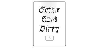 Headline Font | Display Font | Raw Handwritten Script Font Gothic Hand Dirty with 2 styles (regular, bold) & 58 glyphs.
 - Sabang by Typehill Studio,
$12.00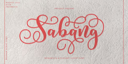 Sabang Script is a new modern script font with an irregular baseline. Trendy and feminine style. Sabang Script looks lovely on wedding invitations, thank you cards, quotes, greeting cards, logos, business cards and more. Perfect for using in ink or watercolour. Including initial and terminal letters, alternates, ligatures and multiple language support. To enable the OpenType Stylistic alternates, you need a program that supports OpenType features such as Adobe Illustrator CS, Adobe Indesign & CorelDraw X6-X7, Microsoft Word 2010 or later versions. There are additional ways to access alternates/swashes, using Character Map (Windows), Nexus Font (Windows), Font Book (Mac) or a software program such as PopChar (for Windows and Mac).
 - Bernandes by Letterday Studio,
$20.00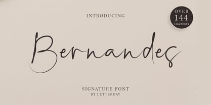 Bernandes is a new modern script font with an irregular base line. Trendy and feminine style. Bernandes looks beautiful in wedding invitations, thank you cards, quotes, greeting cards, logos, business cards, and more. Perfect for use in ink or watercolors. Includes initial and terminal letters, alternatives and support for many languages. To enable the OpenType Stylistic alternative, you need a program that supports OpenType features such as Adobe Illustrator CS, Adobe Indesign & CorelDraw X6-X7, Microsoft Word 2010 or newer versions. There are additional ways to access alternatives / swashes, using Character Maps (Windows), Nexus Fonts (Windows), Font Books (Mac) or software programs such as PopChar (for Windows and Mac).
 - Weitalic by Wilhelm Eckert,
$48.00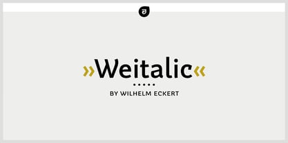 The aim of the project was to create a new type family for corporate and editorial design. The resulting humanist sans serif Weitalic has strict and angular strokes, but at the same time possesses a calligraphic look – an interplay of contrasts. Thanks to the very eye-catching features the result is a distinctive typeface that looks good in both the headline and the area of body text. With its 8 weights with matching italics and numerous OpenType features Weitalic is prepared for professional and complex typographic work. The fonts have an extended character set to support Central and Eastern European as well as Western European languages.
 - Wistina Script by Black Studio,
$15.00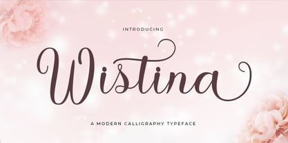 Wisterya Script is a new modern script font with an irregular base line. Trendy and feminine style. Wisterya Script looks beautiful in wedding invitations, thank you cards, quotes, greeting cards, logos, business cards, and more. Perfect for use in ink or watercolors. Includes initial and terminal letters, alternatives and support for many languages. To enable the OpenType Stylistic alternative, you need a program that supports OpenType features such as Adobe Illustrator CS, Adobe Indesign & CorelDraw X6-X7, Microsoft Word 2010 or newer versions. There are additional ways to access alternatives / swashes, using Character Maps (Windows), Nexus Fonts (Windows), Font Books (Mac) or software programs such as PopChar (for Windows and Mac).
 - Regards Script by DonyaDesign,
$15.00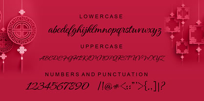 Regards Script is a new modern script font with an irregular baseline. Trendy and feminine style. Regards looks lovely on wedding invitations, thank you cards, quotes, greeting cards, logos, business cards and more. Perfect for using in ink or watercolour. Including initial and terminal letters, alternates and multiple language support. To enable the OpenType Stylistic alternates, you need a program that supports OpenType features such as Adobe Illustrator CS, Adobe Indesign & CorelDraw X6-X7, Microsoft Word 2010 or later versions. There are additional ways to access alternates/swashes, using Character Map (Windows), Nexus Font (Windows), Font Book (Mac) or a software program such as PopChar (for Windows and Mac)
 - Sweet Love Script by Typehill Studio,
$12.00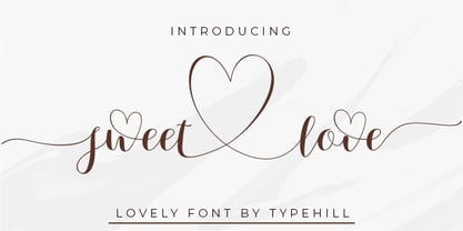 Sweet Love is a new modern script font with an irregular baseline. Trendy and feminine style. Sweet Love looks lovely on wedding invitations, thank you cards, quotes, greeting cards, logos, business cards and more. Perfect for using in ink or watercolour. Including initial and terminal letters, alternates, ligatures and multiple language support. To enable the OpenType Stylistic alternates, you need a program that supports OpenType features such as Adobe Illustrator CS, Adobe Indesign & CorelDraw X6-X7, Microsoft Word 2010 or later versions. There are additional ways to access alternates/swashes, using Character Map (Windows), Nexus Font (Windows), Font Book (Mac) or a software program such as PopChar (for Windows and Mac).
 - Lovey Dovey by Typehill Studio,
$10.00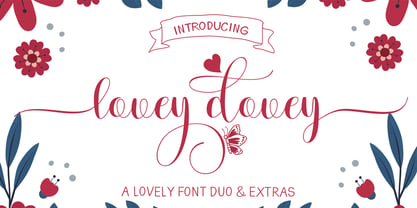 Lovey Dovey is a new modern script font with an irregular baseline. Trendy and feminine style. Sweet Love looks lovely on wedding invitations, thank you cards, quotes, greeting cards, logos, business cards and more. Perfect for using in ink or watercolour. Including initial and terminal letters, alternates, ligatures and multiple language support. To enable the OpenType Stylistic alternates, you need a program that supports OpenType features such as Adobe Illustrator CS, Adobe Indesign & CorelDraw X6-X7, Microsoft Word 2010 or later versions. There are additional ways to access alternates/swashes, using Character Map (Windows), Nexus Font (Windows), Font Book (Mac) or a software program such as PopChar (for Windows and Mac).
 - Gracelya Script by Shape Studio,
$10.00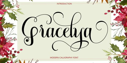 Gracelya is a new modern script calligraphy font with an irregular baseline. It looks lovely on wedding invitations, thank you cards, quotes, greeting cards, logos, business cards and more. Perfect for using in ink or watercolour. Includes initial and terminal letters, alternates, ligatures and multiple language support. To enable the OpenType Stylistic alternates, you need a program that supports OpenType features such as Adobe Illustrator CS, Adobe Indesign & CorelDraw X6-X7, Microsoft Word 2010 or later versions. There are additional ways to access alternates/swashes, using Character Map (Windows), Nexus Font (Windows), Font Book (Mac) or a software program such as PopChar (for Windows and Mac).
 - Oh Sweet Pea by BA Graphics,
$45.00A fun, goemetric, rounded new look. - Holo by Missin Glyphs,
$25.00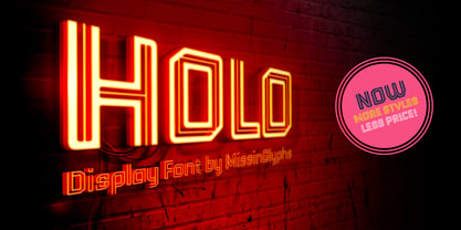 Inspired by 'Neon Sign' lettering, Holo is a modern, modular, mechanical & industrial display font constructed entirely with polygonal shapes. Holo is suitable for large display settings like sports jerseys, shop fronts, billboards and neon signs.
 - Graffiti Classic by Robert Arnow,
$25.00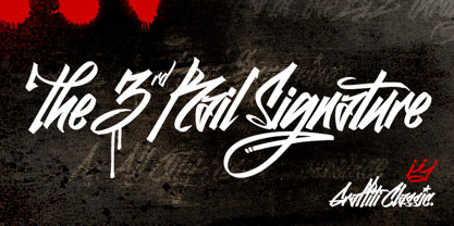 Graffiti Classic is a graffiti font that blends the improvisational urban quality of graffiti with the smoothness and regularity of a typeface. Growing up in Brooklyn, graffiti appeared to me as an explosion of expression and color in a sea of concrete. Inspired, I became a graffiti artist and practiced in both notebooks and subway tunnels. While I moved on to somewhat more traditional art forms in future years, with Graffiti Classic I pay homage to my artistic roots in a calligraphy marker/tag font. Like my other fonts, the entire Graffiti Classic font is spaced letter to individual letter so that the spacing will work smoothly, in spite of the expressiveness and irregularity of the forms. The Graffiti Classic family also includes an ornaments font, “Taglets,” which has clouds, underlines, arrows, crowns, halos and more to add flavor to your designs.
 - Artimas by Hackberry Font Foundry,
$24.95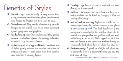 The Artimas family is the new book design font family developed out of Aramus. These new serif typefaces are readable and graceful — part of my development of a series of book families. Aramus was very popular for a single font release of a text font. This new book font family retains the looseness of the original with radically different font metrics and many shape “corrections”. In fact, Artimas continues a genuine new path for this foundry This new font family for book design continues a turn toward more “traditional” x-heights of around a third of the point size.The Artimas print production font family is six new OpenType Pro fonts with Caps, lowercase, small caps, & figures to go with each of those character sets. There are many ligatures, a few swashes, fractions, numerators, denominators, and ordinals to infinity. This family of fonts is a joy to read and easy to use for text or display.