8,897 search results
(0.015 seconds)
- Braston by Dora Typefoundry,
$23.00 Introducing our new typeface, Braston - A modern, unique and decorative serif typeface that comes with a binder and alternative characters that are perfect for creating variety in your designs. Braston is a mix of sweet curves with lowercase sets and strong impact fonts for uppercase sets making it even more elegant this typeface will allow you to create stunning and original layouts for print and web, Branding, Logo Design, invitations, quotes, blog headers , posters and advertisements. use it endlessly. Features • Full set of uppercase, lowercase letters • Ligatures • Alternates • Numbers, symbols & punctuation • Characters with accents • Supports Multiple Languages • PUA Encoded WHAT’S INCLUDED • Braston – Regular This type of family has become a work of true love, making it as easy and enjoyable as possible. I really hope you enjoy it! I can't wait to see what you do with Braston! Feel free to use the #Dora Typefoundry tag and # Braston font to show what you've done Thank You!
 - Zilvertype Pro by Canada Type,
$29.95 Right on the heels of the tremendous popularity wave that made Hollandse Mediaeval the most used Dutch typeface during the Great War years, Sjoerd H. de Roos was asked to design a 15 point type for De Zilverdistel, Jean François van Royen’s publishing company. So between 1914 and 1916, de Roos and van Royen collaborated on the typeface eventually known as Zilvertype, and which both parties viewed as an improved version of Hollandse Mediaeveal. Like Hollandse Mediaeval, Zilvertype was based on the Jenson model, but it is simpler, with more traditional metrics, lighter and more classic in color. This Pro digital version of Zilvertype comes expanded in all directions. It contains a roman, a bold and an italic. Each font contains over 685 glyphs, including small caps, eight different sets of figures, plenty of ligatures, some Dutch ornaments, and extended language support covering most Latin languages. Zilvertype Initials is also there to round out this distinctively Dutch text family and make it ideal for immersive text design.
 - Parchemin by Scholtz Fonts,
$19.95 The name “Parchemin” is derived from the word in old English for “parchment.” Our modern word “parchment” changed its spelling to conform with French spelling practices during the French occupation of England. The font was created to suggest an informal but antique form of handwriting written on parchment with a quill pen. The scratchiness of the old quill pen is conveyed in the roughness of the characters. The font was loosely based on the font Queen. Use this font whenever you want to suggest rough informality or antique handwriting. The characters have been letter-spaced and kerned in such a way that they join perfectly with one another giving a completely convincing imitation of genuine handwriting. The font is fully professional in terms of its character set. It contains more than 235 characters — (upper and lower case characters, punctuation, numerals, symbols and accented characters are present). In fact, it has all the accented characters used in the major European languages.
 - Manicuore by PintassilgoPrints,
$29.00 Manicuore is a hand-drawn typeface inspired by Italian movie posters by the prolific movie poster artist Symeoni (a.k.a. Sandro Simeoni). Being a talented and skilled painter, portraitist and illustrator, Symeoni enjoyed a long and fruitful career and was remarkably productive during the sixties and seventies. He counts over 3,000 works to his credit, which truly fed the imagination of several generations. This all-caps font brings different lettershapes on upper and lower case slots, which work as alternates, providing handy options to spice up your compositions. When using it in OpenType savvy applications just turn on contextual alternates feature to instantly cycle lettershapes – a one click way for adding spontaneity while also preventing neighbor double letters from using the same glyph. To put the icing on the cake, Manicuore brings a cool set of graphic elements that match the typeface look and feel. An inspiring toolbox for creative lettering designs. Now... Lights! Camera! Action!
 - Omni by ArtyType,
$29.00 Typefaces don't simply appear fully formed to a designer, even with a clear concept in mind, they evolve naturally during the design & development process. Out of the current 'Artytype' collection, Omni has evolved the most, being a stripped back off-spring from several exploratory exercises. At first glance and particularly at small scale, you'd be forgiven for thinking the basic characteristics have a conventional outlook; but on closer inspection, it's own distinctive, clean cut, subtle styling becomes apparent, revealing enough personality to stand alone or complement a wide variety of projects; subsequently, it's a font that won't go out of style quickly and may even become a modern classic in time. The Omni family has 2 distinct styles, sans and serif, each style being available in 4 weights; all 8 fonts have slanted options to match making a total of 16 fonts. Dictionary definition of OMNI: Combining form - Of all things, in all ways or places. Quite an apt name for a font with ubiquitous aspirations.
 - Doretypo by Rosario Nocera,
$10.00 Doretypo was born accidentally, during the design of a poster for a jazz festival in Rome. I was going to realize a typesetting, but I could not find the right character and decided to draw the letters I needed, starting from the first letter of the headline, capital M. I was looking for a lettering able to evoke musical notes, where each letter could be linked to the following one, to the previous one, to the largest at the top and the smallest at the bottom. From this idea doretypo came to life gradually. In the beginning there were a few medium capital letters with very few glyphs, but given the good results I decided to decline in light and bold, integrating minuscule letters, for a whole of 374 glyphs. Today doretypo OpenType is a family of fonts with three weights, 374 glyphs, supporting about 57 languages, ligatures standard, plus a new “NY”. Moreover, each glyph can be used individually to create textures and graphic symbols.
 - Selectric Melt by Indian Summer Studio,
$45.00 A classical 20-th century's (1900s to 1980s) typewriter font for both text and large display usage, titles, signage... A new thicker version of Selectric (2016), as if typed using not a thin carbon ribbon but a coarse fabric one. Both are available on a different models of Selectrics. Made after rare enough samples of the same style used during 1980s in the USSR. Based on the actual letter proportions of the original typewriter Selectric (2016) (Cyrillic ball). This time not monospaced as before, but proportional. The single known so far previous typewriter vector typeface with this 'ink blotting' effect (similarly expanded serifs) as in Dodo (2008) is ITC American Typewriter (1974; by Joel Kaden and Tony Stan) and all its hand drawn analogs from 1980s (and perhaps before). Which, in turn, is resembling ATF Bulletin Typewriter's (1925, 1933; by Morris Fuller Benton) overall proportions, geometry, and even had some natural ink expands in its paper sample (but not by design, as I see it).
 - Garamond Rough Pro by Elsner+Flake,
$59.00 With its animated contours, and set in an appropriate size, the Garamond Rough typeface attempts to simulate printed hot metal typesetting. Its roughened edges make it appear softer and less crisp, and, thus, takes the harshness out of the type image. The size of the offered type complement as well as the number of its affiliated symbols makes it ideal for differentiated text setting. Furthermore, its display types make surprising visual accents possible. The origins of the design of Garamond Rough go back to the middle of the 16th century. They are ascribed to Claude Garamond who was one of the first typographers who designed typefaces specifically for the setting of books. During the course of the past centuries and decades, many different variations and new design interpretations of the Garamond typeface were developed to accommodate the most diverse typesetting and printing practices in many different countries. As such, today’s designers can take advantage of a comprehensive digital repertoire for text and display applications. Translation Inga Wennik
 - Geller by Ludka Biniek,
$29.00 A truly faithful ally for every designer looking for fresh yet familiar and reliable font choice. Geller was created as a part of graduation project in Typowa Pracownia at Academy of Fine Arts in Warsaw. It is a typeface family especially intended for newspapers, magazines, and advertising. Geller family comes in two optical sizes - headline and text, so it is a complete solution for editorial purposes. During the design process, the technical needs of certain typographic fractions were examined. The capital letters were specially and purposely designed: its modern proportions (derived from Didone fonts) with optimized inner lights as well as short ascenders and descenders work very well within titles and leads. In addition to a wide range of OpenType features, Geller contains bullets & dingbats providing many possibilities of entry points in editorial design. Compact diacritics, proportionally tall x-height, narrow letter construction, all these features allow easy typesetting of narrow text columns and spreads.
 - Bennet Banner by Lipton Letter Design,
$29.00 Bennet, Richard Lipton’s spirited serif superfamily, was inspired by Moth Design’s logotype and stationery system for the North Bennet Street School in Boston. Initially modest in concept, Bennet grew to an expansive suite of 96 fonts tuned for editorial use. The three widths of Bennet’s Display and Banner sizes—Regular, Condensed, and Extra Condensed—are ideal for precise fitting of newspaper and magazine headlines. Lipton developed graded text styles for the series, offering users precise variations to help compensate for varying degrees of ink spread on different types of paper stock during the printing process. For example, because of ink absorption, the lightest grade—Bennet Text One—printed on low-quality newsprint stock will have the same gray value as the darkest grade—Bennet Text Four—on superior coated paper. (Bennet Text Two is the default grade and offered here.) Bennet also provides for a stellar reading experience in digital media, its carefully considered details vibrant yet legible on-screen.
 - Selectric Century by Indian Summer Studio,
$45.00 Also known as Schoolbook. 900+ glyphs. After Linn Boyd Benton's and Morris Fuller Benton's 1894 lower contrast version of Scotch Modern, Didone. The part of the large project on revival and further development (by drawing many additional glyphs) of the 20th century’s typewriters’ fonts. And especially the most famous, versatile and beautiful typewriter: IBM Selectric’s golfball fonts, lost for the civilization for many decades after ‘80s, not being created since then in digital vector form. This new sub-project started in July 2018 for the restoration of the most beautiful classical typefaces, used during the 20th century on the extremely rare now IBM Selectric Composer typewriters / desktop publishing systems. Together with Nick Hamze and the Right Reverend Theodore Munk, the collectors of old typewriters. IBM showed the perfect taste by developing these best historical book typefaces of the human civilization for typewriters. So people could type then using both the real book faces, and the famous classical ones.
 - Babetta by Viktor Nübel Type Design,
$- Babetta is a display typeface that comes with some decorative typographical features. Alongside a set of arrows and flower icons, it also includes an alternative ›E‹, some special diacritic marks, a wavy ›S‹ and a series of ligatures. It features 5 weights, a special ›Neon‹ version and supports a wide range of Latin languages. This typographical tool box provides a large and playful variety of options for headlines and logotypes. Babetta supports Latin and Cyrillic languages. The initial inspiration for Babetta was an illuminated vintage shop sign—that of a famous bookstore in Berlin called Karl-Marx-Buchhandlung that dates back to the days of East Germany. During the course of the design process, this slightly shabby historical original was kissed by an Italian Art Deco beauty and has blossomed into a new typeface with its own special charm. The aim was not to preserve the original lettering, but to use it as a starting point for typographical exploration.
 - Hyper Turfu by Bisou,
$10.00 Made in La Chaux-de-Fonds (Switzerland), HyperTurfu was born during the shooting of “The Return of Hyperturfu Xpress 2”. A GoPro on a lego electric train, meters and meters of rails, an empty industrial space, loads of puppets, paper, cardboard, pizza boxes, lights, hot glue and a bunch of friends preparing a one shot scene for a month. The title of the movie was made out of lego pieces, painted with golden spray and hanged over the rails. It was the first inspiration for this awsome superbold font. HyperTurfu is thought from ground up to give a strong impact. It’s gothic retro science fiction 80’s style makes it best suitable for metal music albums or posters. As the “Banco” font it works perfectly with short texts for advertisement, bar, cofee shops concert places or even fancy hairdresser. Just hang it over a pet shop and see what cool animals will come in.
 - Inglesa by Sudtipos,
$59.00 In the past, in Argentina, it was common to attend to calligraphy classes during the first years of high school. That experience left a mark on me that over the years mixed up with my practice as a type designer. “Caligrafía Inglesa” is, basically, the spanish translation for the copperplate calligraphic style. This was the initial idea that led the spirit of the project, but from the beginning it started to develop a typographic personality of its own. The new Inglesa font comes in 6 weights –from a skinny monolinear to an elegant black– with a companion set of roman caps. The harmony in both styles transmits as a result, a strong english spirit but with a fresh latin spice, assuring the perfect combination for any elegant design. Inglesa Script includes a vast amount of alternates, endings and swashes, allowing the designers to create infinite combinations making any design unique. The Inglesa family supports a wide range of Latin alphabet-based languages.
 - Mc Lemore by Galapagos,
$39.00Back when OpenType hadn't yet opened and Apple was developing the Line Layout Manager called GX Typography I created a test font that I name after my stepdaughter, Kristen (now ITC Kristen). Not wanting to offend my wife I started on a font project and gave her name to this new set of glyphs, Roberta. Unfortunately, the name was already in use so I needed to find another name for the fonts. After September 11th I decided that there were people I'd met during my life who were truly cut from the cloth of the hero. Master Sargent McLemore of the 75th Ranger Battalion was one of these people. I met the Sarge when I was in basic training at Fort Gordon. I saw him 2 weeks before he died in 1970. All of the heroes we see on the silver screen pale in comparison to this man. John Wayne and Clint Eastwood both have played the type well, both could have taken lessons from the Sarge. - Brandon Text by HVD Fonts,
$40.00 Brandon Text is the companion of the famous Brandon Grotesque type family. It has a higher x-height than the Grotesque version and is optimized for long texts, small sizes and screens. This sans serif type family of six weights plus matching italics was designed by Hannes von Döhren in 2012. Influenced by the geometric-style sans serif faces that were popular during the 1920s and 30s, the fonts are based on geometric forms that have been optically corrected for better legibility. Brandon Text has a functional look with a warm touch and works perfectly together with Brandon Grotesque . It is manually hinted and optimized for screens, so it will be a good choice for Websites, eBooks or Apps. The whole Brandon series is equipped for complex, professional typography with different sets of numbers, alternate letters, fractions and an extended character set to support Central and Eastern European as well as Western European Languages.
 - Adecion by Dora Typefoundry,
$15.00 Adecion is designed for maximum visual and emotional impact. Its four weights excel in posters, social media, headlines, large format print - and anywhere else you want to get noticed. Hidden between straight lines and firm confidence is a hint of charm and mischievous character; Adecion gives your words a powerful sound as well as fun to use. Perfect for graphic design and any screen use of your projects such as branding, magazines, editorials, wedding invitations, logo design, posters, social media, and more! FEATURES: • 4 Font weight • Uppercase & Lowercase • Alternative Uppercase • Numbers & Punctuation • Characters with accents • Supports Multiple Languages WHAT'S INCLUDED: • Adecion - Light. • Adecion - Regular. • Adecion - Bold. • Adecion - Extra Bold. This type of family has been the work of real love, making it as easy and enjoyable as possible. I really hope you enjoy it! I can't wait to see what you do with Adecion! Feel free to use the #Dora Typefoundry tag and the # Adecion Display font to show what you've been up to!
 - ITC Modern No. 216 by ITC,
$40.99 Modern typefaces refer to designs that bear similarities to Bodoni and other Didone faces, which were first created during the late 1700s. Ed Benguiat developed ITC Modern No. 216 in 1982 for the International Typeface Corporation (ITC). Showing a high degree of contrast between thick and thin strokes, as well as a large x-height, this revival is more suited to advertising display purposes than the setting of long running text, or books. Many traits in Benguiat's design are worth further notice. The thick stems of the roman weights have a very stately, solid presence. Their thin serifs have been finely grafted on, a masterful solution to the challenge of bracketing presented by Modernist designs. The italic weights have a very flowing, script-like feel to them, and the letters take the form of true italics, not obliques. The ITC Modern No. 216 family contains the following font styles: Light, Light Italic, Medium, Medium Italic, Bold, Bold Italic, Heavy, and Heavy Italic.
 - Activate - Unknown license

- Mars Brands by Sign Studio,
$15.00 Mars Brands is a beautiful and smooth serif font created for a romantic and lovely look. It is equipped with many ligatures and alternative characters from uppercase to lowercase. Mars Brands is perfect for greeting cards, wedding invitations, posters, logotypes, product branding, and much more.
 - Themoment by Almarkha Type,
$29.00 Themoment is a Playful Display Font that will make your designs look modern, unique and fun with 23 Ligatures. It’s perfect for labels, quotes, posters, DIY projects, branding, packaging, greeting cards, websites, photos, photography overlays, signs, window art, scrapbooking, tags and so much more!
 - Heylands by Namara Creative Studio,
$16.00 A monoline handwritten script gives a clean and modern look with a natural & stylish flow. an incredible addition to your font library. This font is perfect for creating branding logos, typography quotes, greeting cards, wedding invitations, and more. Thanks and have a wonderful day.
 - Wagner Silhouette NF by Nick's Fonts,
$10.00This roly-poly, rollicking display font is based on a design from the 1946 book Blue print text book of sign and show card lettering by Charles Louis Henry Wagner, who seems to have had an aversion to combination words (like blueprint, textbook and showcard). - Post Production JNL by Jeff Levine,
$29.00 A title card listing the supporting cast of the 1950 Humphrey Bogart and Gloria Grahame drama “In a Lonely Place” provided the hand lettered slab serif type design that served as the model for Post Production JNL – available in both regular and oblique versions.
 - La Veronique by My Creative Land,
$10.00 A hand written font family, created with the upcoming spring and sunshine in mind. It is full of alternates, swashes, ligatures and other open type features. You can use it for wedding invitations, thank you cards, quotes - the choice is only limited by your imagination!
 - Dylan Copperplate by Wiescher Design,
$29.00 Dylan-Copperplate is my newest addition to the ever growing family. The small flicks of the burin add an elegant touch to the solid font-design. Very handsome and useful for all kinds of invitations and business-cards as well as for classy advertising.
 - Bonjour Sydney by Reyrey Blue Std,
$14.00 Bonjour Sidney. A stylish, modern and feminine font that will look awesome on logos, branding materials, wedding and event stationery, social media overlays, cards and so on. Bonjour Sidney includes full set of lovely uppercase and lowercase letters, multilingual symbols, numerals, punctuation, ligatures and swashes.
 - Kingdrops by Letterhend,
$19.00 Kingdrops is a cool script typeface. This font perfectly made to be applied especially in logo, and the other various formal forms such as invitations, labels, logos, magazines, books, greeting / wedding cards, packaging, fashion, make up, stationery, novels, labels or any type of advertising purpose.
 - Alamanda by Goodigital13,
$20.00 Alamanda will be great for any projects including : branding, logo, stationery, business card, signage, flyer, brochure, and more. Almost all industries will be fall for this typeface: wedding, events, real estate, architect, law firm, florist, gardening, makeup artist, travel, hotel, musician, and many more .
 - Junk Food by Vozzy,
$10.00 Introducing a vintage label font named Junk Food. This strong typeface is perfect for lettering on vintage style posters, t-shirts, greeting cards, logo etc. This font family contains 6 fonts including effects fonts: Regular, Shadow, Shadow FX, Texture, Texture FX, Shadow And Texture.
 - Bow Tie by Pedro Teixeira,
$16.00 Bow Tie, a slight textured, organic and elegant signature. This modern, stylish but legible script is handy for logo, poster, headlines, invitations, cards and all display needs. The OpenType Features are: stylistic alternates that cover all latin language and cyrillic, ligatures and discretionary ligatures.
 - Hot ink by Stripes Studio,
$20.00 Hot ink a new attractive font that is brushed in a very natural way, detailed and with a perfect texture. Additionally you also have Hot ink Underlines. Perfect for branding, logos, product packaging, posters, invitations, greeting cards, news, blogs, everything needing personal charm, and more.
 - After Dark BB by Blambot,
$20.00All good things happen After Dark! This handwritten font has delicate, long lowercase characters and huge, care-free caps. Both dangerous and feminine, perfect for signing your signature, After Dark has a large assortment of European characters to assist in your late-night adventures. - Mustine by GlyphStyle,
$15.00 Mustine is a natural handwritten font, a beautiful writing font with natural line movement that makes it beautiful and majestic. This handwritten font is perfect for covers, watermarks, branding, names, business cards, products, logos, etc. – Font feature Uppercase, Lowercase, Numerals & Punctuations, Ligature, Swashes, Multilanguage
 - Sophia Bella by madeDeduk,
$15.00 Sophia Bella is a gorgeous handmade signature font. It includes more than 170 ligatures to make everything look natural handmade signature and is perfect for poster design, book covers, merchandise, fashion campaigns, newsletters, branding, advertising, magazines, greeting cards, album covers, and quote designs and more.
 - Tweet Lesson by Gassstype,
$23.00 Tweet Lesson is All Caps Handwritten Playful Display Font that will make your designs look modern, unique and fun. It’s perfect for labels, quotes, posters, DIY projects, branding, packaging, greeting cards, websites, photos, photography overlays, signs, window art, scrapbooking, tags and so much more!
 - LoveChristmas by Karandash,
$20.00 Following the success of our LoveHearts, valentine inspired ornaments, we decided to show our love for Christmas. With more than 170 hand drawn unique designs, LoveChristmas is the perfect choice for designing Christmas greeting cards and gift wraps as well as letter signatures and accessories.
 - My Dear Watson NF by Nick's Fonts,
$10.00This simple, charming script is based on the handlettering of Carl Holmes, from Walter T. Foster art book entitled ABC of Lettering. Elementary! Both versions of this font include the complete Latin 1252 and CE 1250 character sets, with localization for Romanian and Moldovan. - Sweet Titling No. 11 by Sweet,
$39.00 Sweet Titling No. 11 is a 2009 addition to the Sweet Collection of engraved lettering styles from the 20th Century. This obscure, art deco design would have been used for engraved letterhead, business cards, etc., and likely first appeared in the 1920s or ’30s.
 - Household by Goodigital13,
$20.00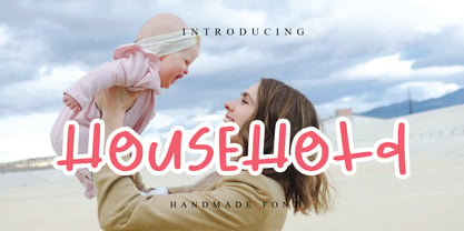 font suitable for logo, branding, greeting card, poster and any design that you create. andwritten font is a natural & modern handwritten font. I’ts Perfect for logo, invitation, stationery, wedding designs, social media posts, advertisements, product packaging, product designs, label, photography, watermark, special events or anything.
