8,897 search results
(0.031 seconds)
- Christmas Mint by Brithos Type,
$11.00 Christmas Mint is a friendly, fresh, rich, and elegant handwritten font. It is ideal for holiday-themed greeting cards and for any crafting project that requires a romantic touch.
 - Weisshorn Brush by Bal Studio,
$12.00 Weisshorn Brush is a new brushed textured font which includes extra swashes. Perfect for brand projects, logos, product packaging, posters, invitations, greeting cards, news, blogs, everything including personal charm.
 - Brooklyn Syndrome by Krakenbox Studio,
$12.00 Brooklyn Syndrome is a modern, cool, squared lettered and bold display font. It will elevate a wide range of crafting ideas, from cards, to branding, labels and much more.
 - Bauhaus Bugler by Breauhare,
$35.00 Bauhaus Bugler’s design never appeared in Harry Warren’s 6th grade class newsletter The Broadwater Bugler but its design came about during that same period in 1975. Because of this, it has been officially designated an honorary Bugler font! Its theme of broad curves that leap over and under conjure visions of fashion and high-end department stores with their dress boxes and shopping bags, plus hair products, cosmetics, couture, and other stylish personal merchandise of the highest caliber. Bauhaus Bugler also has an art deco flavor, especially when all capitals are used. It comes with two alternate versions of the upper and lower Y to give users more freedom of choice. Put Bauhaus Bugler in your “haus” today! Be sure to check out Bauhaus Bugler Soft also! Digitized by John Bomparte.
 - Envoy by Tim Rolands,
$20.00 Envoy is a serif type inspired primarily by Garalde oldstyle types like those of Claude Garamond. As such, it is particularly well suited for book and magazine text. Characteristic details more typical of Venetian oldstyle faces serve to give Envoy just a bit more personality. The base family includes regular, italic, bold, bold italic and small capitals. Expert sets add ligatures and alternate letterforms. Display sets include letterforms customized for titling. Originally designed in 1995 and 1996, for the 1996 Morisawa International Typeface Design Competition, Envoy was later revived, completed and publicly released in 1998. During the initial design, the family was known as Truman in honor of Northeast Missouri State University becoming Truman State University, but the name was changed to Envoy prior to entry in the competition.
 - Sign Stickers JNL by Jeff Levine,
$29.00 In the early 1960s, the Duro Decal Company of Chicago, Illinois added to its line of water-applied decal lettering a retail sign cabinet of die-cut, pressure sensitive vinyl letters and numbers. Four of the six sizes offered for sale were cut from white plastic with a black outline and a secondary gold inline for a tri-color effect. Sign Stickers JNL emulates as closely as possible the look of these nostalgic pieces, complete with the slight shifts in line weight due to hand-cut silk screens and the printing process. For those of you who prefer to make your own multi-colored letters, a three piece fill font set is available for the low price of a single font purchase. Combine the backfill, midfill and frontfill layers for a truly retro look!
 - BLT Balfour by Black Lab Type,
$12.00 BLT Balfour : Art Deco Revival Font Balfour is a modern Art Deco typeface revival. Built from historic references in architecture during this time period, Balfour exudes class and elegance, yet still honors the style with unapologetic bold geometric forms. Pay close attention to the letterforms B and R, and how their extreme x-heights play off of the elongated strokes of C, D and G. Unique features throughout the character set make it less predictable and more unique than any Art Deco typeface before it. The geometry of this typeface plays from one letter to the next. Fill and Outline styles work well in headlines, logos and large type. The Line style is effective at all sizes and can be used in combination with other styles to achieve visual hierarchy.
 - Sentinel by Comicraft,
$19.00 Common use(s) of Comicraft's All-new, All-different SENTINEL font include FACTOR-X, X-MAN, GENERATION NEXT and X-CALIBRE. Possible Side Effects: This font should not be used if you are trapped in a world you never made or a world full of people that hate and fear you. Prolonged exposure to this font during an Age of Apocalypse may cause fatigue, muscle soreness, first degree burns and immobility. Contraindications in Homo Superior may manifest as an outbreak of large purple automatons. Interactions: Before using this font in either regular or bold doses, notify your doctor of any recent exposure to mechanoids, synthezoids or paranoid androids. Reprogrammed Sentinel has improved spacing and kerning, Western & Central European accents, alternate lettershapes, and a new Interlocking Mode with over 100 connecting letter combinations!
 - Acolyte by Altered Ego,
$45.00An elegantly refined typeface with a subtle wedge serif, the character shapes of Acolyte STF set a rhythm of light and dark like windows in a cathedral. Standing tall (as in condensed!) and respectful, Acolyte STF is aptly named as a companion to any design, packaging and advertising. Acolyte will illuminate your designs with a display typeface reminiscent of European 20th century letterforms. Its distinctive letterforms are slightly chiseled and angular with curves in just the right places. Wrapped in an aura of mystery, Acolyte's origins are from condensed typefaces, with an understated gothic feel. Available for Macintosh and Windows, Acolyte will set an edgy tone for all of your design needs. Complete with an Adobe-standard character set, this font also includes the Euro and is cross-platform compatible. - Linkus by João Henrique Lopes,
$25.00 The name ‘Linkus’ makes reference to the internet and its power to unite humanity, as well as to Linkus’ distinctive design, where the whole character is unified by a single, unbroken line – without sacrificing its elegance and readability. Linkus is based on the aesthetic decision of having a single, unsplit line forming every character, with a smooth transition of the different line directions, in order to strenghten the unity of form and create a singular fluxus throughout the glyph. Different from most other futuristic fonts (e.g. Slazer), who have an aggressive look, Linkus has a more sensible, refined aura. This display futuristic typeface is meant to be used whenever the subject is technology, cellphones, electronics, internet, computers or science in general, as Linkus creates a feeling of modernity, cleanness, efficiency and high-tech sophistication.
 - Sixties Stencil JNL by Jeff Levine,
$29.00 Probably one of the most unusual applications of a stencil took place in 1964 when Union Carbide [then-owner of the still-new line of "Glad" brand plastic wrap and storage bags] sponsored a $100,000 contest to match up a stencil of their logo in order to win a prize. The magazine ad told of how one thousand lucky participants would win $100 by simply taking a die-cut stencil of the brand name to the store and overlaying it on the logo printed on the food wrap box to see if it aligned perfectly. The hand-lettered title proclaiming "match the stencil and win" was done in a casual sans design and reflected the cheerfulness of many typestyles found in ads during the late 50s and early 60s.
 - Nimbus Sans L by URW Type Foundry,
$89.99The first versions of Nimbus Sans have been designed and digitized in the 1980s for the URW SIGNUS sign-making system. Highest precision of all characters (1/100 mm accuracy) as well as spacing and kerning were required because the fonts should be cut in any size in vinyl or other material used for sign-making. During this period three size ranges were created for text (T), the display (D) and poster (P) for small, medium and very large font sizes. In addition, we produced a so-called L-version that was compatible to Adobe’s PostScript version of Helvetica. Nimbus was also the product name of a URW-proprietary renderer for high quality and fast rasterization of outline fonts, a software provided to the developers of PostScript clone RIPs (Hyphen, Harlequin, etc.) back then. - Sixties Pin Buttons JNL by Jeff Levine,
$29.00 During the turbulent era of the 1960s, the youth of America found various ways to protest against "The Establishment". Whether it was campus unrest, protest songs, sit-ins or other methods, the message was the counter-culture movement. Arising from this disenchantment with traditional social standards, a small but effective means of protest arose that made no sound, yet spoke volumes - the pin button. Statements against the war in Vietnam, free love, drug use and other messages popped up on little metal discs pinned to tee shirts, suspenders, head band and hats. Sixties Pin Buttons JNL recreates twenty-six of these messages in both white on black (upper case keys) and black on white (lower case keys). Blank buttons in both white and black are found on the parenthesis keys.
 - Jigger Statz by Poole,
$32.00During the spring of 2006, while creating this typeface, I was reading Praying For Gil Hodges, by Tom Oliphant, who grew up a Brooklyn Dodgers fan. I grew up a Los Angeles Dodgers fan. My mother worked as secretary to the president of the old Triple A LA Angels Baseball Team. In 1952 when she was pregnant with me, she left the team. They gave her an autographed baseball and a puppy named Angel. That's the dog I grew up with. Toward the end of the book the author talks about Gil Hodges' favorite ballplayer, a slugger for the LA Angels, Jigger Statz. I thought, could it be? My mother died two years ago and I got the team baseball. Sure enough, the first name after the dedication to my mother was Jigger Statz. - Opticum by ParaType,
$25.00Font family Opticum is not just a set of fonts, it’s a maze construction kit that hides letters inside. Each inscription is a little brain-twister with variable difficulty, where the level is defined by the style. The third one is the most difficult. When you type with these fonts you fill the space entirely without spaces because characters in the fonts don’t have side bearings and the leadings are set to zero. This converts you into an artist who produces geometric abstractions containing verbal messages. Texts set with this font not only catch an eye, but keep it for a long time. The duration of attention period can be adjusted by selection of the font style. The third one keeps longer. Opticum was designed by Erken Kagarov and released by ParaType in 2009. - Terry Junior by Monotype,
$40.99 Terrance Weinzierl's Terry Junior typeface is a perfectly imperfect design – one that retains the marks of the brush used to create it and harks back to the craft required to hand make letterforms. Originally drawn during a Monotype Font Marathon, Weinzierl later refined the typeface digitally – adding an Inline version and designing alternates that replicate the irregularity of real-life brush scripts. “It has a natural, cheery and bold appearance,” says designer Terrance Weinzierl. “It's young, but not wild. Painted, but not sloppy. A sign painter's apprentice, perhaps.” Terry Junior is an obvious choice for designers and brands communicating with younger audiences, but would also work well on book covers, packaging, and in digital environments that need a little bit of extra playfulness. The family includes five fonts, including an Inline version.
 - Martini Script by Scholtz Fonts,
$19.00 Martini Script is a cool, retro script with its origins in the hand-lettered ads of the 40s and 50s. During the second half of the 20th century, the introduction of new technologies, along with a change of taste, brought about the demise of hand lettering skills. We have attempted to revive this hand lettered look in the design of Martini Script. Martini Script has a casual, friendly, stylish charm, and is extremely versatile. The font comes in two styles; Martini Script Regular and Martini Script Fat, which work together to create a dynamic, confident look, perfect for a variety of applications, from posters and signs, to book and music covers and product packaging. Martini Script has standard OpenType features, and language support includes all European character sets.
 - Leipziger Antiqua by profonts,
$41.99 The original typeface was designed by Albert Kapr between 1971 and 1973 for Typoart in Dresden. Kapr was the font designer and teacher as well as book author on type design of former East Germany. He also was an expert on this kind of type design, and thus, it is no surprise that he created Leipziger Antiqua, a design combining features of both Latin and broken scripts. The result is a stunning and unique gem from earlier times although it does not come along too distinguished or artsy. The digital version of Leipziger Antiqua was developed by Ralph M. Unger exclusively for profonts in 2005. During the work, Unger fell so deeply in love with this typeface that he couldn't help but add an expert font with small caps etc.
 - Hopfen by Sudtipos,
$39.00 During many years I have been exploring the translation from lettering or calligraphy to type design. Lately I have been designing more big sans and serif families plenty of weight. One of the main things about Hopfen is to bring back the german lettering of Bentele, who also inspired my fonts Semilla and Bowling Script, to a more versatile and useful world. Hopfen has the spirit from the past but with today's flow, it comes in 5 weights, full of swashes, endings and alternates. We imagine it being used from Breweries to book covers, from packaging to movie posters but we prefer to let our costumers to find the better use. When you license the complete Hopfen set we will include the variable version of the set so that you can find the right weight.
 - Public Figure by Hanoded,
$15.00 During the Covid pandemic, I noticed that a lot of public figures (politicians, actors, influencers and even kings and princesses) had to apologise for not following the social distance rules, the lockdown rules or the 'stay at home' rules. They threw parties, went on holidays abroad and - in general - made a nuisance of themselves. When I finished this font, I decided to call it Public Figure! Public Figure is quite a neat, handmade font. It doesn't stick to the rules (but does like to keep up appearances), likes to party (but manages to stay safe) and brightens up your work (without being too gaudy). Public Figure comes with two alternate sets for the lower case glyphs (that cycle as you type) and a massive amount of diacritics, including Vietnamese.
 - Tropicano JNL by Jeff Levine,
$29.00 Before 1959, in pre-Castro Havana, Cuba, the preeminent nightclub was the Tropicana. During the regime of Fulgencio Batista, Cuba was resplendent with nightclubs and gambling casinos catering to [mostly] the North American tourists; which brought it the title of the Monte Carlo of the Americas. Although Cuba (and the world as a whole) has changed vastly over the decades, the hand-lettered logo of the Tropicana Night Club has survived, and has been reproduced as a complete digital font called Tropicano JNL (a slight twist to the club's name). At first the font seems to be awkward, crude and amateurish, but in taking a second look, there's a playful charm to it. Additionally, this font can double as a "spooky" font for the Halloween season, monster parties and in other similar themes.
 - Salo by Borutta Group,
$39.00 SALO – is a hybrid of two Italian typographic worlds. The serif version refers to the beautiful and sophisticated typefaces found on the signs of cafes, restaurants, and fashionable boutiques. Its complemented by the sans variant, inspired by Italian modernism and road signage. All styles are based on the same core but with a totally different expressions. The biggest challenge during the project was designing all of the glyphs compatible to work as a 100% variable font. In the OTF version, SALO has 4 varieties: Serif, Semi Serif, Semi Sans and Sans. The family of these typefaces is suitable both for posters, magazine headlines, and branding purposes where the character will count. It is worth experimenting and combining different varieties with each other. (This font cannot be used to create a logo with the phrase "FRANCO").
 - 1651 Alchemy by GLC,
$38.00 This family is a compilation created from a Garamond set in use in Paris circa 1651, but similar to those, eroded and tired, that were in use during centuries to print cheap publications, as well as in Europe than in America, and from a large choice of printed symbols—all specially redrawn—used for alchemical, pharmaceutical and astrological books, covering 1550 to late 1800s period. Each alphabet is doubled by a slightly different one, and a special OTF encoding allows to give an irregular effect with never the same twin letters in a single word. The Normal style is enriched by small caps, and the Italic style by Swashes. A lot of symbols, too, are given twice with differences. This font may be used with our calendar specialized 1689 Almanach.
 - Carousel by ITC,
$40.99Carousel is a fat faces display type designed by Gary Gillot in 1966. Fat faces were offshoots of the modern, or Didone, typefaces that were de rigueur during the early 1800s. These fat faces were among the first typefaces to be used solely for advertising purposes. Naturally, they were always used in larger point sizes, in display functions. Carousel could be called an optimization of these old advertising typefaces. With high x-heights, ultra contrast between thick and thin strokes, and perfectly engineered drawing techniques, Carousel is a highly crafted typeface. Give it a spin in your next advertising campaign! Carousel's fine thin strokes are very graceful in their appearance, and lend a strong, yet soft, feminine feeling to anything they touch.If you like Carousel check out wearing Annlie, another fat face from 1966." - Summer of Love by Mysterylab,
$14.00 It's the Summer of Love all over again with this groovy psychedelic font. Designed in 2019, this typeface harks back to the carefree days of the late 1960s. Whimsical and offbeat with its swaying verticals, it nonetheless remains one of the more legible reimaginings of the genre, sporting all of the handlettered vibe of posters and album covers from the original hippie era, but with polished color and weight that evens out the legibility even at relatively small point sizes. Predominantly a unicase font, with a couple of alternate glyphs from upper to lowercase, Summer of Love works best as a large headline face, and benefits greatly from twisting and morphing the type blocks as was common during the original psych era. It's a real groove machine, baby.
 - Tiqqun by Harvester Type,
$20.00 Tiqqun appeared as a font for a monumental, but at the same time futuristic design. During the creation process, many variations for each glyph came to mind. Therefore, it was decided to create an entire system of alternative options. As a result, we have more than 130 alternative characters and as many as two full-fledged alternative sets. The font contains monumentality, brutality, futurism, rigor and uniqueness of some forms. As a result, Tiqqun has become a font system that can cover a large range of your design needs: Prints on clothes, logo, packaging, banner, title, text, poster, merchandising, identity, branding or product design. - 360+ Glyphs - 130+ Alternative Glyphs - Supports 80+ Languages - Special Symbols and Features - 2 Full Alternative Set - OT Features: aalt, case, kern, ordn, salt, sups, ss01-09
 - ALS Meringue by Art. Lebedev Studio,
$63.00 Meringue, a transitional serif face, is designed specially for modern glossy magazines. It is ideal for fashion photography, fashion publications and mag covers, and can be used for headings and captions, as well as for body copy. The italic version, with its wave-like vertical strokes, creates yet more stylishly expressive feel. Text set in Meringue has an elegant weightless look, and the strongest effect can be achieved with high-quality printing. The typeface includes old style figures, ligatures, and alternative characters that allow creating truly versatile design by means of typography. Designers may also find Meringue perfect for beautiful presentations, invitations and other special occasion papers. Meringue was designed during the Type and Typography course at the British Higher School of Art and Design, supervised by Ilya Ruderman.
 - Roadhouse by Kimmy Design,
$10.00 Roadhouse is a layering typeface family that is part of the greater Evanston type collection, which is inspired by American typefaces commonly used at the turn of the century leading up to Prohibition. Roadhouse reflects the style of lettering used on tavern signage and printed ephemera during the early 20th century. The family comes with 31 layering fonts, from top layers like bevels, highlights, stripes, outlines, as well as extruding and drop layers. It also includes 2 script fonts, upright and oblique, as well as 9 complimentary text fonts for smaller text settings. Either get the entire family of extrusions, bevel angles or the basic family with ready to use fonts that don’t need to be layered. Roadhouse is a great display typeface for logos, branding, packaging, and advertising.
 - Easy Breezy Type by Hipfonts,
$17.00 Introducing Easy Breezy, a font that effortlessly transports you to a bygone era of carefree charm and nostalgic beauty. Inspired by the retro styles of the past, this vintage gem captures the essence of a relaxed and laid-back vibe. Its flowing letterforms and playful curves breathe life into your designs, exuding a sense of whimsy and joy. With Easy Breezy, your projects will radiate a delightful vintage aura, whether you're designing invitations, branding materials, or signage. Let this font whisk you away to a world of sunny days, gentle breezes, and endless possibilities. Embrace the effortless beauty of Easy Breezy and create designs that capture the heart with their timeless appeal. Experience the nostalgia, embrace the freedom, and let your creativity soar with Easy Breezy at your fingertips.
 - Crispbake by Hanoded,
$15.00 A crispbake is a kind of cracker or rusk you eat for breakfast. At least, in Holland we do. They are called 'beschuit', they are round and they come in a pack of 13 (which is a baker's dozen). It turns out that this odd number of crispbakes in a pack comes from the fact that the ovens they were baked in held 13 crispbakes in a row and it was easier to pack them like that. So, should this question pop up during a game of trivial pursuit, you now know the answer! Crispbake font is a crunchy brush font. Completely handmade using a brush and Chinese ink. This fresh all caps font comes with a set of alternate glyphs and extensive language support, including Vietnamese and Greek.
 - Razom Script by DizajnDesign,
$39.00 Razom Script is a typeface with deep roots in pointed brush calligraphy that takes advantage of current font technology to go beyond handwriting and reach new limits. A successful blend between printed and handwritten letterforms is visible when comparing upper and lowercase. The weight of the typeface evolve in a way that pushes the limits of a script typeface to suggest new uses. Normally, families are developed in weights, not proportions. Also, having several weights in a script family is rather rare. But in Razon Script, as the fonts gain weight, big differences show up in the font outlines: the thin weight looks soft and delicate but as we examine darker variables, they also seem to get broken. The counters of the letters rotate from vertical to horizontal during this process.
 - Plantin Infant by Monotype,
$29.99Plantin is a family of text typefaces created by Monotype in 1913. Their namesake, Christophe Plantin (Christoffel Plantijn in Dutch), was born in France during the year 1520. In 1549, he moved to Antwerp, located in present-day Belgium. There he began printing in 1555. For a brief time, he also worked at the University of Leiden, in the Netherlands. Typefaces used in Christophe Plantin's books inspired future typographic developments. In 1913, the English Monotype Corporation's manager Frank Hinman Pierpont directed the Plantin revival. Based on 16th century specimens from the Plantin-Moretus Museum in Antwerp, specifically a type cut by Robert Granjon and a separate cursive Italic, the Plantin" typeface was conceived. Plantin was drawn for use in mechanical typesetting on the international publishing markets. Plantin, and the historical models that inspired it, are old-style typefaces in the French manner, but with x-height that are larger than those found in Claude Garamond's work. Plantin would go on to influence another Monotype design, Times New Roman. Stanley Morison and Victor Larent used Plantin as a reference during that typeface's cutting. Like Garamond, Plantin is exceptionally legible and makes a classic, elegant impression. Plantin is indeed a remarkably accommodating type face. The firm modelling of the strokes and the serifs in the letters make the mass appearance stronger than usual; the absence of thin elements ensures a good result on coated papers; and the compact structure of the letters, without loss of size makes Plantin one of the economical faces in use. In short, it is essentially an all-purpose face, excellent for periodical or jobbing work, and very effective in many sorts of book and magazine publishing. Plantin's Bold weight was especially optimized to provide ample contrast: bulkiness was avoided by introducing a slight sharpening to the serifs' forms." - DNP Shueitai by DNP,
$225.00 Shueitai is a typeface that has been undergoing development for more than a century, starting from the days when Dai Nippon Printing Co., Ltd. (DNP) was still known as Shueisha. As Japan underwent rapid modernization during the early years of the Meiji era, Shueisha, believing that printing was a business befitting a modern civilized society, began operations with a focus on letterpress. Before long the company expanded into developing its own typefaces. In 1912 it completed a full range of Mincho type, in sizes from Sho-go (#0 size, 42pt) through Hachi-go (#8, 4pt), which it called "Shueitai" a new style that came to form one of the two mainstreams of Japanese typefaces and continues to have a significant influence on font design even today. The Shueitai typeface is distinguished by abundant variations matching the size of type and the changing demands of the times. Whether it is the spirited and powerful Sho-go, the delicate and flowing San-go (#3, 16pt), or the bright and solidly reassuring Shuei-Mincho L, all Shueitai typefaces share a vibrant brushwork that adds an expression of eloquence and a burst of brilliance to every printed word. Currently, Shueitai is composed of 17 kinds of fonts useful for various purposes. The world has witnessed vast changes in the environment surrounding the printed world, with the tran-sition first from letterpress to Desktop Publishing, and most recently to e-books. But no matter how this environment might evolve, the written word remains the basis of communication, and the importance of beautiful and readable typefaces stays unchanged. In preparation for the changes that will inevitably come during the future, DNP will continue to evolve the Shueitai designs from now on. Through its continual reinvention, Shueitai, a typeface consistently adopted at the vanguard of the industry, perhaps represents Japanese innovation at its very best.
 - Plantin Headline by Monotype,
$29.00Plantin is a family of text typefaces created by Monotype in 1913. Their namesake, Christophe Plantin (Christoffel Plantijn in Dutch), was born in France during the year 1520. In 1549, he moved to Antwerp, located in present-day Belgium. There he began printing in 1555. For a brief time, he also worked at the University of Leiden, in the Netherlands. Typefaces used in Christophe Plantin's books inspired future typographic developments. In 1913, the English Monotype Corporation's manager Frank Hinman Pierpont directed the Plantin revival. Based on 16th century specimens from the Plantin-Moretus Museum in Antwerp, specifically a type cut by Robert Granjon and a separate cursive Italic, the Plantin" typeface was conceived. Plantin was drawn for use in mechanical typesetting on the international publishing markets. Plantin, and the historical models that inspired it, are old-style typefaces in the French manner, but with x-height that are larger than those found in Claude Garamond's work. Plantin would go on to influence another Monotype design, Times New Roman. Stanley Morison and Victor Larent used Plantin as a reference during that typeface's cutting. Like Garamond, Plantin is exceptionally legible and makes a classic, elegant impression. Plantin is indeed a remarkably accommodating type face. The firm modelling of the strokes and the serifs in the letters make the mass appearance stronger than usual; the absence of thin elements ensures a good result on coated papers; and the compact structure of the letters, without loss of size makes Plantin one of the economical faces in use. In short, it is essentially an all-purpose face, excellent for periodical or jobbing work, and very effective in many sorts of book and magazine publishing. Plantin's Bold weight was especially optimized to provide ample contrast: bulkiness was avoided by introducing a slight sharpening to the serifs' forms." - Billy Ohio by Alit Design,
$10.00 Introducing Billy Ohio Typeface which has a fast dry brush style. So it looks natural like a handmade. This font is best used for your design project that has a concept of fun, brave and sporty. Can also be applied to the design of a logotype, header website, make some lettering a quote, t-shirt design etc. Billy Ohio has two font styles that are similar but different, namely Billy Ohio Dua and Billy Ohio Swash of dry brush formatted like a used font. Billy Ohio Typeface deserve to be in your fonts collections because it is unique and has many options of alternative glyphs.
 - Another Day - Personal use only

- Tawattype II - Unknown license

- VA Fluttered Lashes by V Anderson Designs,
$14.00 Fluttered Lashes is a handwritten monoline font with both discretionary and standard ligatures to give your products that handwritten feel. It's perfect for greeting cards, fun branding, and crafting files.
 - LD Enquirer by Illustration Ink,
$3.00Have you Enquired lately? It's time...so choose the thick lines and slightly uneven character placement of LD Enquirer...perfect for light-hearted scrapbook pages, journaling, greeting cards, and tags. - Pogba by Mr. Typeman,
$14.00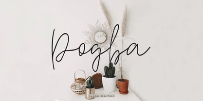 Pogba is a stylish calligraphy font with an amazing and natural style. Pogba is perfect for branding & logo projects, also suitable for packaging, wedding invites and cards and so on.

