10,000 search results
(0.019 seconds)
- LOLO Dingcats by Okaycat,
$24.50LOLO Dingcats are here! Need some cats? Find just about any kind of cat you can imagine here. Not just a A-Z & 0-9 font, LOLO Dingcats has many extra characters. Check it out! There's a mother cat nursing kittens, a cat curled up sleeping, running cats and sleeping cats.There are black cats, white cats and striped cats. Even cats you might not expect: a pirate cat, a cat with an afro, even a robot cat -- and MORE! A must-have for any serious cat lover! - Shine Himawari by Andrey Font Design,
$14.00 Shine Himawari is a romantic, beautiful and light script font. It can be used for each of your favorite creations, such as wedding invitation, birthday cards, thank you cards, or pretty much any design that requires a customized touch. This font is PUA encoded, which means you can access all of the glyphs and swashes with ease!
 - Above the Sky by My Creative Land,
$29.99 Please welcome a new brush written font family Above the Sky which also includes a long requested all-caps marker font, the one you can use to add a “secondary” text to your designs. All fonts make good companions and can be used for all sorts of type-based creations, quotes, branding, merchandise, packaging, invites, greeting cards and so on. You will be over the moon when you find out all Above the Sky possibilities. The brush script has tons and tons of alternates, ligatures, swashes - more than 1200 glyphs are here to serve you well. It can be successfully combined with the Condensed font or/and with the Marker font included in the package. The brush drawn Design Extras font makes the whole thing even better!
 - Old Wood JNL by Jeff Levine,
$29.00 One of the charming features of vintage wood type is the unusual interplay of stroke widths or letter shapes that can vary from character to character. In today's world of digital perfection, a set of letters, numbers and punctuation marks must conform to rigid standards of uniform lines, balanced curves and other form-and-function rules that has often removed the human feel from the overall type design. While this is fine when applied to most text fonts and some modern display faces, Old Wood JNL is a simple throwback to an earlier time when type design was an artistic, not engineering endeavor. Modeled in part from vintage source material, this wood type design retains that charming imperfection of a time long passed.
 - Mike Kunkel by Comicraft,
$29.00 Yes it's true, from time to time those awfully nice chaps at Comicraft have been known to create fonts for artists simply because We Love Their Work. Affable HEROBEAR AND THE KID kreator, Mike "He's just like your Favorite Uncle" Kunkel was lettering his beautiful children's comic strip with a font used by many, many other comic strip creators. John "JG" Roshell put a stop to all that and created a font based on Mike's own unique hand lettering style and now we make it available to you so that you can bring a little bit of Mike's Magick to your own warm and fuzzy work... because the Mike Kunkel font will help you remember your childhood... pass it on.
 - Good Eatin Pro AOE by Astigmatic,
$24.95 A heavy weight - softened sans serif that is not only friendly, but easy on the eyes. Good Eatin was inspired by the title screen from the 1942 Warner Bros. cartoon titled, "Dog Tired". The original all capitals setting had a charming & quiet nature to it, which became even more pronounced when drawn out to include a lowercase set. Later expanded upon to include a Small Caps set, Good Eatin Pro achieves a wider, even more electric appeal. Loaded with personality, Good Eatin Pro is joyful and stands out without being an eyesore, and while being based on vintage lettering it has a contemporary feel.
 - Shows Gracious by Jafar07,
$17.00 Shows Gracious is taken from the word luxury that underlies this font, a classic theme with a subtle touch in every node of the alphabet, although classic, this font is highly recommended for designers, because of the classic design trend but not too far from ancient when used today. has several ligatures and alternatives that can add to the uniqueness of your design, very suitable for use as logos, branding, headlines, magazines, wedding cards, and others.
 - Haggard Nova by TipografiaRamis,
$39.00 Haggard Nova is the new edition of Haggard fonts (designed in 2011). The new typeface is an upgraded version of an old wedge serif font, with careful refinements to glyph shapes, and the extension of glyph amounts which enabled support of more Latin languages. Haggard Nova is released in eight styles with small caps, and true italics, and contains OpenType features. This typeface can be used for editorials and print designs, as well as text and headlines.
 - Ondemande by Stefani Letter,
$14.00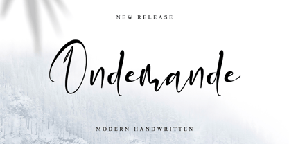 Ondemande feels equally charming and elegant. It looks stunning on wedding invitations, thank you cards, quotes, greeting cards, logos, business cards, and every other design which needs a handwritten touch. This font is PUA encoded which means you can access all of the glyphs.
 - Bernhard Modern by Bitstream,
$29.99Bernhard Modern was designed in 1937 by Lucian Bernhard for ATF. It is his personal version of the small x-height engravers’ old styles popular at the time. A perennial best-seller, Bernhard Modern remains popular in a wide variety of design and typesetting uses more that 60 years after its initial release. Bitstream’s version offers a wide array of typographer sets, including alternates, extensions, small caps and italic swashes. - Aron Wergel by madeDeduk,
$12.00 Aron Wergel is a Futuristic sans come with two style regular and rough. You can explore and combine creating rhythm and texture for comfortable reading. Use this font for any branding, product packaging, invitation, quotes, headline, label, poster, logo etc. Feature Uppercase & Lowercase Number & Symbol International Glyphs Multilingual support Alternative Ligature Feel free to drop us a message any time and follow my shop for upcoming updates Hope you enjoy it.
 - Muscle by Positype,
$15.00 Muscle came from the original sketches for Sneakers. At the time my concentration with Sneakers was to create a curvier, chunkier display. I left Muscle behind, thinking it was too masculine. Rather than discard those original sketches, I decided to make it even heavier, reduced the total number of weights, create a function small cap system that when integrated with the lowercase makes a great biform component for short display settings.
 - Deco Of Tomorrow JNL by Jeff Levine,
$29.00 On occasion, when seeking retro source material for font designs, one can unearth interesting examples of typography that bridges decades with its ahead-of-its-time style. The songwriter credits on one particular piece of vintage sheet music had both the Art Deco influence but took on more of a techno look that was popularized in the 1980s. This hybrid of generations is the basis for Deco of Tomorrow JNL.
 - Fructosa by Typo5,
$14.95This unique type treatment was born after working in a mixture between a pixel based font and a retro logo. With lot of details it looks great a bigger sizes, but you can also apply it to write long sentences or even as body text! This font was chose as the official online font of our favorite band Foo Fighters some time ago, when it was just a work in progress. - Weeping Willow by Hanoded,
$15.00 I have always liked Weeping Willows, they sort of remind me of China. During my years as a tour guide, I spent a lot of time in China and I can tell you that the Chinese love weeping willows - they plant them everywhere! Weeping Willow was created using a Japanese brush pen (bought in China actually…). It comes with double letter ligatures and a bunch of swashes as well.
 - Sign Department JNL by Jeff Levine,
$29.00 For decades - until the advent of affordable computer-generated signage - die-cut display letters were used for many applications. Stores, theaters, schools, charities and religious organizations would have their local sign shop design attractive posters and show cards utilizing these sturdy cardboard letters and numbers, giving a three-dimensional effect to the message. Sign Department JNL recreates one of the many styles of letters available at the time.
 - Roller Hesoon by TypeClassHeroes,
$16.00 Retro and refined you can explore and combine creating rhythm for comfortable reading. Roller Hesoon supports more than 100 Latin-based languages and has extensive Cyrillic and Greek support for languages like Russian, Bulgarian, Ukrainian, and many more. Feature Uppercase & Lowercase Number & Symbol International Glyphs Multilingual support Alternative Ligature Cyrillic & Greek Feel free to drop us a message any time and follow my shop for upcoming updates. Hope you enjoy it.
 - Black Borough by sizimon,
$25.00 Black Borough is brush font, hand-painted with extra attention to quick-strokes and dry textures. Very cool for logos, name tag, handwritten quotes, product packaging, merchandise, social media & greeting cards. And very easy to make design t-shirts and other products. Very save time in making the design of a product. It contains a full set of lower & uppercase letters, a large range of punctuation, numerals, and multilingual support.
 - Molaste by madeDeduk,
$14.00 Molaste is a retro font come with 80's retro style serif. You can explore and combine creating rhythm for comfortable reading. Vintage and refined use this font for any branding, product packaging, invitation, quotes, headline, label, poster, logo etc. Feature Uppercase & Lowercase Number & Symbol International Glyphs Multilingual support Alternative Ligature Feel free to drop us a message any time and follow my shop for upcoming updates Hope you enjoy it.
 - Bleeding Ink by Mvmet,
$20.00 Bleeding Ink is a rough hand-drawn display font but still fun and playful in the same time. It works great for creating cool designs that scream for attention. It’s ideal for anything ranging from t-shirts, book designs, restaurant menu, blog writing, greeting cards to stickers, or anything that needs a casual touch. Fall in love with its incredibly cool style, and use it to create lovely designs!
 - Annexia by Koshemare Studio,
$10.00 Annexia is a serif font with a several styles from Light to Bold. Serifs and stretched letters connect two times the past and the future, creating a perfect present. This font doesn't have a specific mood. Depending on the tasks, it can show itself in different ways. The font is perfect for both text, headlines, and branding. The font was designed by Pavel Bruev and released by Koshemare studio in 2021
 - Elsewhere by Comicraft,
$29.00 Someday, a long time from now, in a galaxy not so very far away, you'll find yourself Suddenly transported to the nether-realms of Elsewhere, bathed in the light of the mystic moons of Meanwhile... While you're waiting for that day, check out this font by John "JG" Roshell. It may not provide you with the same transcendental experience, but JG assures us that it really is the next best thing.
 - Poster Project JNL by Jeff Levine,
$29.00 An online image of a grid page [circa 1930s] showing teachers how they and their students could create cut-out letters and numbers inspired Poster Project JNL. The typeface is available in both regular and oblique versions. A crude, yet charming simplicity to the lettering can help replicate old time school bulletin boards and posters, or simply provide a less formal typographic approach when that is needed for a project.
 - Dragon Drop by Elemeno,
$25.00Thick, wide and medieval, Dragon Drop would feel at home in Arthurian times. The name is an obvious play on words that the designer saved for a long time before creating the right font to use with it. Looks best at larger sizes. - Mineola by Haiku Monkey,
$10.00 Mineola got tired of being like all the other serifed fonts, got some hip body art, and moved to the cool part of town. But every so often, when no one's watching, Mineola puts on a light blue oxford shirt and listens to top 40 radio.
 - Jelly Ball by Yumna Type,
$15.00 Finding a perfect font for your project which always looks good in different display types can be a complicated task. Furthermore, the right font choice determines the success and the failure of your project. Unfortunately, if you fail to find the perfect one, you will waste your time, money and energy. Therefore, we would like to introduce you to Jelly Ball, a perfect font for any different display types without decreasing the legibility. Jelly Ball is a display font in round shapes on the letters’ edges to produce different effects on different applications. Generally, such a display font shows amazing, fresh, modern expressions to highlight important messages, to attract readers’ attention, and to beautify the display as well. The letters’ forms and proportions are relatively consistent enough to be legible. An extra bonus given is the clipart. You can also enjoy the available features here. Features: Multilingual Supports PUA Encoded Numerals and Punctuations Jelly Ball fits best for various design projects, such as brandings, posters, banners, headings, magazine covers, quotes, invitations, name cards, printed products, merchandise, social media, etc. Find out more ways to use this font by taking a look at the font preview. Thanks for purchasing our fonts. Hopefully, you have a great time using our font. Feel free to contact us anytime for further information or when you have trouble with the font. Thanks a lot and happy designing.
 - Lancelot Pro by Canada Type,
$39.95 When type historians look back on Jim Rimmer, they will consider him the last type designer who just couldn't let go of metal type, even though he was just as proficient in digital type. Lancelot is one definite case in point: A face designed and produced in digital as late in the game as 1999, only to spring onto the new millenium a couple of years later as a metal type cast in three sizes. That was Jim, a time traveler constantly reminding the craft of its origins. This particular time machine was originally designed as a simple set of attractive caps that emphasize the beauty of the variable conventional dialogue between the drawing tool and the intended final form, and the one exchanged within the totality of the forms themselves. Jim designed two weights, with contrast and counterspace being the main difference between them. In 2013, the Lancelot family was remastered and greatly expanded. Lancelot Pro is now a wonder of over 840 glyphs per font, including smaller versions of the caps in the minuscule slots, and alternates and ligatures that can transform the historic spirit of the original design into anything from half-uncial to outright gothic. Language support goes beyond the extended Latin stuff, to cover Cyrillic and Greek as well. 20% of the Lancelot Pro family's revenues will be donated to the Canada Type Scholarship Fund, supporting higher typography education in Canada.
 - Ringtail by Din Studio,
$25.00 Every font designer has their own favorite font type, which you do not need to find as it takes too much time to figure it out for you until you can match it with a perfect font. Ringtail has the best answer to your needs. Ringtail is a font containing two font types to use together or separately: sans serif and script fonts. Sans serif font has firm, modern, simple looking lines without curvy edges. Meanwhile, the script font has curvy lines in water paint or ink textures. The textures are extra lines added to each letter and to the background letter patterns. A textured script font looks more artistic and more detailed than the other ordinary script fonts to show elegant, romantic impressions in your designs. Additionally, script font can be applied for adding extra visual contrasts to designs with sans serif font. Features: Stylistic Sets Ligatures Multilingual Supports PUA Encoded Numerals and Punctuations Ringtail fits best for various design projects, such as brandings, posters, banners, logos, magazine covers, quotes, headings, printed products, invitations, name cards, merchandise, social media, etc. Find out more ways to use this font by taking a look at the font preview. Thanks for purchasing our fonts. Hopefully, you have a great time using our font. Feel free to contact us anytime for further information or when you have trouble with the font. Thanks a lot and happy designing.
 - Andron MC by SIAS,
$99.00 The font series Andron MC introduces a new feature to the repertoire of the Andron family: middlecase glyphs (intermediate between upper- and lowercase) – and uncial letters. Middlecase glyphs reach a medium height compared to full caps height and lowercase x-height. However, ‘uncial’ means the historic transitional lettershapes of the medieval ages which have gained no status in the bicameral typographic system of modern times. In all three of the Andron MC fonts middlecase (“MC”) glyphs dwell on the lowercase positions. These are coined in uncial fashion in the MC Uncial and MC Medieval fonts but appear as capital glyphs in MC Capital. The same variation occurs with the uppercase positions: whereas standard Roman/capital glyphs are there in MC Uncial and MC Capital, MC Medieval features uncial majuscules here instead. At the end that makes three different combinations of uncial and capital sorts. These fonts can be used for a great variety of purposes. The uncial sets are particularly well-suited for any typographic matter related to the middle ages. MC Capital is a worthwhile alternative choice when titling is to be possibly set in CAPITALS or Small caps. Andron MC adds a fascinating new aspect to the classical Andron fonts family. It enhances again the unique scope of typographical possibilities Andron is praised for since quite some time now. All three Andron MC fonts support full Latin, Greek (monotonic), Coptic and Gothic character ranges. Each font contains about 1000 glyphs.
 - Hyperspit by PizzaDude.dk,
$20.00Hyperspit is really the CAPS of my other font Family Cat. They are just messed up pretty good! - Anulika by Bosstypestudio,
$12.00 Anulika is a new calligraphy font which is fresh, funny, interesting and with a cute heart that can be connected. It is suitable for greeting cards, branding materials, business cards, quotes, posters, and more!
 - Glaudusa by Bosstypestudio,
$12.00 Glaudusa is a new calligraphy font which is fresh, funny, interesting and with a cute heart that can be connected. It is suitable for greeting cards, branding materials, business cards, quotes, posters, and more!
 - Spleeny by Galapagos,
$39.00A gentle breeze on a warm summer's day. A cozy gathering of friends and family around a crackling fire. The sweet aroma of freshly baked cinnamon bread. A slow walk in the autumn woods, light sparkling down through the multi-colored leaves. Billowing white clouds against a stark azur sky, leisurely floating past the tops of palm trees. What do these idyllic scenes all have in common? A: Most people can never find the time to enjoy any of them. B: These are just some of the things you would never try to describe using a crankish font like Spleeny Decaf GD. Just as ITC Fontoon was designed to be used with the many critters that populate the "Toonie" series of fonts, Spleeny Decaf GD was created by Steve Zafarana for use in the balloned dialogue portions of a new panel cartoon feature currently under development. Spleeny Decaf GD is the first completed font in a family that ranges from the jittery san serif Spleeny Espresso GD to the sedate and serifed Spleeny Asleep GD. Each font in the series appears a little more relaxed and staid than its predecessor. None of them however, will find themselves being used for the text of any legal documents. Spleeny Decaf GD is the perfect font to use when the weight of the message is leaning towards the light and jocular side of things. So remember, if your documents are starting to put you on edge, it may be time to switch to decaf. Spleeny Decaf GD that is. - Ever Looser by Azetype,
$12.00 Presenting Ever Looser! A Wild Brush Font with a distinct texture. You can type by Mix & Match to get a unique combination. It looks original and can be used for all your project needs. Each glyph has its own uniqueness and when meeting with others will provide dynamic and pleasing proximity. This font can be used at any time and any project. As you can see in the presentation pictures above, Ever Looser looks 'wild' on design projects. So, Ever Looser can't wait to give its touch to all your design projects such as environmental campaigns, quotes, poster design, book cover design, promotional materials, t-shirt, hoodie, product packaging, simply as a text overlay to any background image, etc. Besides that, Ever Looser also has some ligature that gives a surprise when you type certain characters combinations. The ligatures are TT, LL, ll, oo, and rr. What's Included? 1. Ever Looser • Comes with uppercase, lowercase (small caps), ligatures, numeral, punctuation, symbols, and multilingual support (Afrikaans, Albanian, Catalan, Danish, Dutch, Estonian, English, Finnish, German, Icelandic, Indonesian, Italian, Malay, Norwegian, Portuguese, Spanish, Swedish, Zulu, and Many More). 2. Ever Looser Untextured • It's a clean version and comes with uppercase, lowercase (small caps), ligatures, numeral, punctuation, symbols, and multilingual support (Afrikaans, Albanian, Catalan, Danish, Dutch, Estonian, English, Finnish, German, Icelandic, Indonesian, Italian, Malay, Norwegian, Portuguese, Spanish, Swedish, Zulu, and Many More). 3. Extra Swashes • 7 'wild' swashes (every version) that make your design looks natural. Just type S_1 S_2 S_3 S_4 S_5 S_6 S_7 to feature it. We really hope you enjoy it!
 - Promethian by insigne,
$19.99Dynamic, strong and athletic. Promethian brings fire to your designs. - Semilla by Sudtipos,
$79.00 I spend a lot of time following two obsessions: packaging and hand lettering. Alongside a few other minor obsessions, those two have been my major ones for so many years now, I've finally reached the point where I can actually claim them as “obsessions” without getting a dramatic reaction from the little voice in the back of my head. When you spend so much time researching and studying a subject, you become very focused, directionally and objectively. But of course some of the research material you run into turns out to be tangential to whatever your focus happens to be at the time, so you absorb what you can from it, then shelf it — like the celebrity bobblehead that amused you for a while, but is now an almost invisible ornament eating dust and feathers somewhere in your environment. And just like the bobblehead may fall off the shelf one day to remind you of its existence, some of my lettering research material unveiled itself in my head one day for no particular reason. Hand lettering is now mostly perceived as an American art. Someone with my historical knowledge about lettering may be snooty enough to go as far as pointing out the British origins of almost everything American, including lettering — but for the most part, the contemporary perspective associates great lettering with America. The same perspective also associates blackletter, gothics and sans serifs with Germany. So you can imagine my simultaneous surprise and impatience when, in my research for one of my American lettering-based fonts, I ran into a German lettering book from 1953, by an artist called Bentele. It was no use for me because it didn't propel my focus at that particular time, but a few months ago I was marveling at what we take for granted — the sky is blue, blackletter is German, lettering is American — and found myself flipping through the pages of that book again. The lettering in that book is upbeat and casual sign making stuff, but it has a slightly strange and youthful experimentation at its heart. I suppose I find it strange because it deviates a lot from the American stuff I'm used to working with for so long now. To make a long story short, what’s inside that German book served as the semilla, which is Spanish for seed, for the typeface you see all over these pages. With Semilla, my normal routine went out the window. My life for a while was all Bezier all the time. No special analog or digital brushes or pens were used in drawing these forms. They're the product of a true Bezier process, all starting with a point creating a curve to another point, which draws a curve to another point, and so on. It’s a very time-consuming process, but at the end I am satisfied that it can get to pretty much the same results easier and more traditional methods accomplish. And as usual with my fonts, the OpenType is plenty and a lot of fun. Experimenting with substitution and automation is still a great pleasure for me. It is the OpenType that always saves me from the seemingly endless work hours every type designer must inevitably have to face at one point in his career. The artful photos used in this booklet are by French photographer and designer Stéphane Giner. He is very deserving of your patronage, so please keep an eye out for his marvelous work. I hope you like Semilla and enjoy using it. I have a feeling that it marks a transition to a more curious and flexible period in my career, but only time will tell.
 - Hello Agatha by Zeenesia Studio,
$12.00 "Hello Agatha" - a delightful font pair with a handy set of illustrations This font duo consists of a beautiful script and a playful caps serif font. Together or separate they are perfect for tshirt design, quotes, mug, bag canvas, greeting cards, branding, stationery design, social media, packaging, prints and many more! If you combine them with the illustrations - you can create even more typographic designs, logos, labels and seasonal cards Hello Agatha script comes with tons of alternates for each lower case letter and a selection of standard ligatures so the possibilities are endless. It supports multiple languages and offers PUA encoding. The doodles make this font so perfect.
 - Ernest & Emily by Nicky Laatz,
$15.00 I’d like to introduce you to Ernest and Emily :) ....The happiest font duo you'll ever meet :) They are completely in love with each other, and always get along like a house fire :) Ernest and Emily consist of two lovingly handwritten fonts. A brushed quirky-casual script, and a playful all-caps sans-serif font. Perfect for Type-based creations, branding, websites, merchandise, packaging, quotes, invites, greetings and so much more! All they need is a blank canvas, and they work their magic for you! The brush script comes in 3 variants - Regular, Slanted and Upright- each with its own twist to fit the look you need. Four sweet little heart glyphs can be found by typing the characters { } and [ ] individually. Well now that I've introduced you, I'll let you get properly acquainted! :)
 - Way Kambas by Redy Studio,
$17.00 Way Kambas – Modern Calligraphy Fonts Hello, I’m Way Kambas. I’m a modern calligraphy font with thin strokes and beautiful movements. Way Kambas is natural, stylish, and a perfect combination of traditional calligraphy and modern design. Combining thin strokes with beautiful movement, this font is built to bring any design project to life. You can use me for every design project as well (especially for wedding invitations, quote, greeting cards, and any romantic/love project). Way Kambas features: A full set of upper & lowercase characters Numbers & punctuation Ligatures Lowercase beginning swashes Lowercase ending swashes Some lowercase alternates PUA Encoded Characters – Fully accessible without additional design software. Feel free to give me a message if you have a problem or question. Thank you so much for taking the time to look at one of our products.
 - Maritote by I Can Be Your Type,
$20.00While designing a logotype for a client, she described herself as "loud and colorful." Thinking about some eras in typefaces that portrayed this idea, I instantly thought of the "Roaring 20s" and the Prohibition era where the cinema is starting to take off and the Italian mafia are running the bars. (Which is coincidental because my client has family connections to Al Capone.) One of the most iconic typefaces designed for these times was Broadway by Morris Fuller Benton in 1925. This typeface was the zeitgeist of Broadway, the big city, theater, and cinema, which can now be seen in use almost everywhere an old family run cinema is located. Using the heavy influences of the thick and thin contrast of this typeface, Maritote brings the charm of Broadway into the 21st century.