10,000 search results
(0.032 seconds)
- Bright Diamond by Zeenesia Studio,
$15.00 Bright Diamond - Handwritten Font Bright Diamond is a script and regular handwritten font with a simple and classy style, this font is great for your next creative projects such as watermark on photography, logo design, wedding, invitation, quotes, book cover, business card, and many other design project. From business cards to photo watermarks. We hope you enjoy the font, please feel free to comment if you have any thoughts or feedback. Thanks for purchasing and glad to help you!
 - Monka by DYSA Studio,
$19.00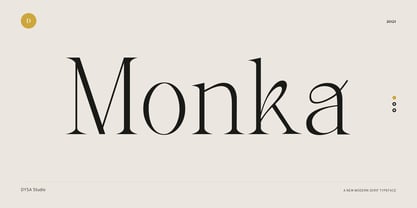 Monka is a New Modern Serif Typeface. This another collection of Serif is perfect for your next branding project, excellent for your business. Monka have a smooth edges, so this font gives an authentic handcrafted feel style. Monka is perfect choice for people looking for clean, modern, minimalist, elegant, beauty design styles. Suitable for almost any graphic designs such as logo, branding materials, business cards, gift cards, t-shirt, cover, thumbnail, print, poster, photography, quotes .etc
 - Bassy by ErlosDesign,
$15.00 Bassy is an incredibly stylish script font which will look stunning in a wide variety of contexts. Created with the help of an outstanding brush pen, this font will elevate your projects to the highest level. This font is PUA encoded which means you can access all of the glyphs and swashes with ease! The file you will get is: • Works on PC & Mac • Simple installation • Encoded PUA Character - Can be accessed completely without additional design software. Enjoy!
 - The great by Sulthan Studio,
$14.00 The great display font. The great -This font is perfect for modern projects, quotes, shirt designs, websites, branding, children's designs, svg designs, blogs, logos, invitations and more! The great - includes alternative characters. Coded with Unicode PUA, which allows full access to all additional characters without having special design software. Mac users can use Font Book. Windows users can use the Character Map to view and copy one of the additional characters to paste into your favorite text editor.
 - Wedding Doodles Too by Outside the Line,
$19.00Wedding Doodles Too is the follow-up font to the popular Wedding Doodles. This font gives you all you need to make your own invitations, announcements, RSVP cards, save your date cards and thank you notes. Font includes 3 sets of hand-lettered words… save our date, thank you and RSVP. Just add a wedding cake, flowers, top hat, wedding bell, heart or flower and you are done. Check out Wedding Doodles, you may need both. - Off Side by HansCo,
$15.00 Off Side is a bold and chunky lettered display font. Add this font to your creative ideas and notice how it will make them stand out. This texture is very detailed. Off Side is suitable for logos, product branding, printable templates, posters, flyers, shirts, or for text overlay to any background image. This font comes with a FULL CAPS, numbers and punctuation + standard multilingual support in ALL CAPS. We recommend using Adobe Illustrator or Photoshop. Ennjoy!
 - Vilonti by Owl king project,
$39.00 Vilonti a new font family from the Owlking project Vilonti designed by ilen nalishawa. a font that carries 20 weights including italics in it. Vilonti inspired by the legendary logo of sports products, so our desire arose to create a font that looks clean, simple, professional, and can be applied more broadly, both for font based logo design needs, or for making paragraphs or sentences. We hope Vilonti can collaborated with your imagination. Let's start desiging. be happy.
 - Angatha by Amelia Studio,
$13.00 Angatha in a beautiful handwritten style. Equipped with 350 glyphs. Angatha is perfect for branding projects, home appliance design, product packaging, use in business cards, invitation cards, etc. Simply as a stylish text overlay onto a background image or anything that requires a touch of elegance. To enable OpenType Stylistic alternates, you need a program that supports OpenType features such as Adobe Illustrator CS, Adobe Indesign & CorelDraw X6-X7, Microsoft Word 2010 or a later version.
 - Laftale by Midvel,
$12.00 Fresh script font, Laftale. Laftale help you to make brush font easily. Laftale is casual script typeface with clean characters. This font comes in three style, regular, Italic, and bold. This font is perfect to design especially poster, logo, apparel, book cover, greeting card, birthday card, quotes, advertising poster, and anymore. Explore Opentype features to get unique combination. Feature : · Uppercase · Lowercase · Number · Punctuation · Multilingual (Accented Letters) · Ligature · Swash · Contextual Alternate · Style set (01-03) · PUA Encoded Characters
 - Ringlings by Yanky Goldman,
$29.00 Ringlings stems from Yanky Goldman’s quest for a fresh and innovative display font that subtly attracts. Thus, this lively, dancing-in-the-sun typeface was created. Ringlings is ideal for logo design, package design, headlines and more. This single-stroke, semi-serif font family includes over 1,100 glyphs including uppercase, lowercase, stylistic sets, titling, petite caps, deco caps, ligatures, borders & ornaments and more. It supports most Latin and European languages. Ringlings is airy, light and quite versatile.
 - Rotally by DYSA Studio,
$19.00 Rotally is a New Modern Serif Typeface. This another collection of Serif is perfect for your next branding project, excellent for your business. Rotally have a smooth edges, so this font gives an authentic handcrafted feel style. Rotally is perfect choice for people looking for clean, modern, minimalist, elegant, beauty design styles. Suitable for almost any graphic designs such as logo, branding materials, business cards, gift cards, t-shirt, cover, thumbnail, print, poster, photography, quotes .etc
 - Mahezty by DRM Works,
$19.99 Mahezty is a modern, bold and fashionable serif display font. This font is imposing and features uniquely shaped letters, and as a result, it will easily match a wide range of creations that require a distinct touch. Mahezty is perfect choice for people looking for modern, minimalist, elegant, clean, beauty design styles. Suitable for almost any graphic designs such as identity, business cards, branding materials, gift cards, t-shirt, cover, thumbnail, print, poster, photography, quotes .etc
 - Angolla by Letterafandi Studio,
$14.00 Angolla is a fabulous, elegant, and modern display font that’ll engage your audience and make your branding stand out. This stylish font can be used for a host of different content needs and projects. Perfect for social media branding projects, fashion designs, printed quotes, or even as a stylish text overlay to any background image and many more! This font is PUA encoded which means you can access all of the glyphs and swashes with ease!
 - Asterisp by Typodermic,
$11.95 Asterisp is a set of gorgeous 4,5,6,7,8,9,10,12 and 13-sided asterisks in a bevy of styles. A few flashes, flowers, stars, splats and balloons are included along with outlined and 3D variations. They can be used on their own, or strung together to make fetching borders. Asterisp comes with a visual guide to take the guesswork out of choosing the symbol you need. Warning: using oversized, thirteen-sided asterisks in your layouts can be highly addictive!
 - Lalalo by Cuda Wianki,
$25.00 Lalalo is a casual, modern sans-serif font family based on hand-lettering. It's oval letter shapes provide soft and friendly appearance. Lalalo font is very legible with a warm touch perfectly suited for children books. Lalalo family consists of 6 weights ( Extra Light, Light, Regular, Semibold, Bold, ExtraBold). You can use it with normal fill or outlined. You can mix various colors and stroke widths to gain interesting results. There is also a set of nice frames available.
 - An Electronic Display LED LCD LED7 Seg 3 by Fortune Fonts Ltd.,
$15.00 * For when you need the most realistic looking electronic display. * See User Manuals Main advantages: - Spacing between characters does not change when entering a decimal point or colon between them. - Custom characters can be produced by selecting any combination of segments to be displayed. Low cost electronic displays have a fixed number of segments that can be turned on or off to represent different symbols. A digital watch would be the most common example. Fonts typically available for depicting electronic displays are often in the artistic style of these common LED or LCD displays. They provide the look-and-feel, but fall short when technical accuracy is required. Failure to represent an accurate and consistent representation of the real thing can be a cringe-worthy experience for the product design and marketing team, or even the hobbyist for that matter. To solve this problem, Fortune Fonts has released a range of fonts that accurately depict the displays typically found on low cost electronic devices: watches, answering machines, car stereos, alarm clocks, microwaves and toys. These fonts come with numbers, letters and symbols predefined. However, they also allow you to create your own segment combinations for the custom symbols you need. When producing manuals, marketing material and user interfaces, accuracy is an all-or-nothing concept. Instructions in the user manual describe how to turn these fonts into realistic displays according to your own design, in the manner of the images above. If you cannot see a license option for your specific application, such a license may be purchased from here. By purchasing &/or using &/or distributing the fonts the buyer user and distributor (including Monotype Imaging Inc. & Monotype Imaging Hong Kong) agree to (1) indemnify & hold harmless the foundry, for any consequential, incidental, punitive or other damages of any kind resulting from the use of the deliverables including, but not limited to, loss of revenues, profits, goodwill, savings, due to; including, but not limited to, failure of the deliverables to perform it’s described function, or the deliverable’s infringement of patents, copyrights, trademarks, design rights, contract claims, trade secrets, or other proprietary rights of the foundry, distributor, buyer or other parties (2) not use the fonts to assist in design of, or be incorporated into, non-software displays
 - Good Times by Typodermic,
$11.95 Introducing Good Times, the techno-inspired typeface that will take your designs to the next level. With its wide, capsule-shaped design, Good Times is perfect for high-tech, sports, and scientific themes. The letterforms were inspired by the lettering used on Pontiac cars from 1989-1994 and is designed with straight lines, simple forms, and unconnected strokes. Whether you’re designing for a futuristic tech company or a cutting-edge sports brand, Good Times has you covered. The font comes in seven different weights, including oblique styles, so you can choose the perfect weight for your project. For a more edgy look, check out Good Times Bad Times, a rusty texture variant that adds a rugged feel to your designs. And with OpenType technology, you can automatically substitute common letter pairings with customized ones for a genuine chipped metal aesthetic. But that’s not all. If you’re looking for lowercase letters, be sure to check out Good Timing, the follow-up to Good Times. With its sleek, modern look, Good Timing is the perfect complement to Good Times, offering even more design possibilities. So whether you’re creating a high-tech ad campaign or a scientific presentation, Good Times is the font that will make your design stand out. With its distinctive capsule-shaped design and versatile weights, you can create designs that are both bold and sophisticated. So why wait? Try Good Times today and see the difference for yourself! Most Latin-based European writing systems are supported, including the following languages. Afaan Oromo, Afar, Afrikaans, Albanian, Alsatian, Aromanian, Aymara, Bashkir (Latin), Basque, Belarusian (Latin), Bemba, Bikol, Bosnian, Breton, Cape Verdean, Creole, Catalan, Cebuano, Chamorro, Chavacano, Chichewa, Crimean Tatar (Latin), Croatian, Czech, Danish, Dawan, Dholuo, Dutch, English, Estonian, Faroese, Fijian, Filipino, Finnish, French, Frisian, Friulian, Gagauz (Latin), Galician, Ganda, Genoese, German, Greenlandic, Guadeloupean Creole, Haitian Creole, Hawaiian, Hiligaynon, Hungarian, Icelandic, Ilocano, Indonesian, Irish, Italian, Jamaican, Kaqchikel, Karakalpak (Latin), Kashubian, Kikongo, Kinyarwanda, Kirundi, Kurdish (Latin), Latvian, Lithuanian, Lombard, Low Saxon, Luxembourgish, Maasai, Makhuwa, Malay, Maltese, Māori, Moldovan, Montenegrin, Ndebele, Neapolitan, Norwegian, Novial, Occitan, Ossetian (Latin), Papiamento, Piedmontese, Polish, Portuguese, Quechua, Rarotongan, Romanian, Romansh, Sami, Sango, Saramaccan, Sardinian, Scottish Gaelic, Serbian (Latin), Shona, Sicilian, Silesian, Slovak, Slovenian, Somali, Sorbian, Sotho, Spanish, Swahili, Swazi, Swedish, Tagalog, Tahitian, Tetum, Tongan, Tshiluba, Tsonga, Tswana, Tumbuka, Turkish, Turkmen (Latin), Tuvaluan, Uzbek (Latin), Venetian, Vepsian, Võro, Walloon, Waray-Waray, Wayuu, Welsh, Wolof, Xhosa, Yapese, Zapotec Zulu and Zuni.
 - An Electronic Display LED LCD LED7 Seg 2 by Fortune Fonts Ltd.,
$15.00 * For when you need the most realistic looking electronic display. * See User Manuals Main advantages: - Spacing between characters does not change when entering a decimal point or colon between them. - Custom characters can be produced by selecting any combination of segments to be displayed. Low cost electronic displays have a fixed number of segments that can be turned on or off to represent different symbols. A digital watch would be the most common example. Fonts typically available for depicting electronic displays are often in the artistic style of these common LED or LCD displays. They provide the look-and-feel, but fall short when technical accuracy is required. Failure to represent an accurate and consistent representation of the real thing can be a cringe-worthy experience for the product design and marketing team, or even the hobbyist for that matter. To solve this problem, Fortune Fonts has released a range of fonts that accurately depict the displays typically found on low cost electronic devices: watches, answering machines, car stereos, alarm clocks, microwaves and toys. These fonts come with numbers, letters and symbols predefined. However, they also allow you to create your own segment combinations for the custom symbols you need. When producing manuals, marketing material and user interfaces, accuracy is an all-or-nothing concept. Instructions in the user manual describe how to turn these fonts into realistic displays according to your own design, in the manner of the images above. If you cannot see a license option for your specific application, such a license may be purchased from here. By purchasing &/or using &/or distributing the fonts the buyer user and distributor (including Monotype Imaging Inc. & Monotype Imaging Hong Kong) agree to (1) indemnify & hold harmless the foundry, for any consequential, incidental, punitive or other damages of any kind resulting from the use of the deliverables including, but not limited to, loss of revenues, profits, goodwill, savings, due to; including, but not limited to, failure of the deliverables to perform it’s described function, or the deliverable’s infringement of patents, copyrights, trademarks, design rights, contract claims, trade secrets, or other proprietary rights of the foundry, distributor, buyer or other parties (2) not use the fonts to assist in design of, or be incorporated into, non-software displays
 - An Electronic Display LED LCD LED7 Seg Platz by Fortune Fonts Ltd.,
$15.00 * For when you need the most realistic looking electronic display. * See User Manuals Main advantages: - Spacing between characters does not change when entering a decimal point or colon between them. - Custom characters can be produced by selecting any combination of segments to be displayed. Low cost electronic displays have a fixed number of segments that can be turned on or off to represent different symbols. A digital watch would be the most common example. Fonts typically available for depicting electronic displays are often in the artistic style of these common LED or LCD displays. They provide the look-and-feel, but fall short when technical accuracy is required. Failure to represent an accurate and consistent representation of the real thing can be a cringe-worthy experience for the product design and marketing team, or even the hobbyist for that matter. To solve this problem, Fortune Fonts has released a range of fonts that accurately depict the displays typically found on low cost electronic devices: watches, answering machines, car stereos, alarm clocks, microwaves and toys. These fonts come with numbers, letters and symbols predefined. However, they also allow you to create your own segment combinations for the custom symbols you need. When producing manuals, marketing material and user interfaces, accuracy is an all-or-nothing concept. Instructions in the user manual describe how to turn these fonts into realistic displays according to your own design, in the manner of the images above. If you cannot see a license option for your specific application, such a license may be purchased from here. By purchasing &/or using &/or distributing the fonts the buyer user and distributor (including Monotype Imaging Inc. & Monotype Imaging Hong Kong) agree to (1) indemnify & hold harmless the foundry, for any consequential, incidental, punitive or other damages of any kind resulting from the use of the deliverables including, but not limited to, loss of revenues, profits, goodwill, savings, due to; including, but not limited to, failure of the deliverables to perform it’s described function, or the deliverable’s infringement of patents, copyrights, trademarks, design rights, contract claims, trade secrets, or other proprietary rights of the foundry, distributor, buyer or other parties (2) not use the fonts to assist in design of, or be incorporated into, non-software displays
 - An Electronic Display LED LCD LED7 Seg dots 2 by Fortune Fonts Ltd.,
$15.00 * For when you need the most realistic looking electronic display. * See User Manuals Main advantages: - Spacing between characters does not change when entering a decimal point or colon between them. - Custom characters can be produced by selecting any combination of segments to be displayed. Low cost electronic displays have a fixed number of segments that can be turned on or off to represent different symbols. A digital watch would be the most common example. Fonts typically available for depicting electronic displays are often in the artistic style of these common LED or LCD displays. They provide the look-and-feel, but fall short when technical accuracy is required. Failure to represent an accurate and consistent representation of the real thing can be a cringe-worthy experience for the product design and marketing team, or even the hobbyist for that matter. To solve this problem, Fortune Fonts has released a range of fonts that accurately depict the displays typically found on low cost electronic devices: watches, answering machines, car stereos, alarm clocks, microwaves and toys. These fonts come with numbers, letters and symbols predefined. However, they also allow you to create your own segment combinations for the custom symbols you need. When producing manuals, marketing material and user interfaces, accuracy is an all-or-nothing concept. Instructions in the user manual describe how to turn these fonts into realistic displays according to your own design, in the manner of the images above. If you cannot see a license option for your specific application, such a license may be purchased from here. By purchasing &/or using &/or distributing the fonts the buyer user and distributor (including Monotype Imaging Inc. & Monotype Imaging Hong Kong) agree to (1) indemnify & hold harmless the foundry, for any consequential, incidental, punitive or other damages of any kind resulting from the use of the deliverables including, but not limited to, loss of revenues, profits, goodwill, savings, due to; including, but not limited to, failure of the deliverables to perform it’s described function, or the deliverable’s infringement of patents, copyrights, trademarks, design rights, contract claims, trade secrets, or other proprietary rights of the foundry, distributor, buyer or other parties (2) not use the fonts to assist in design of, or be incorporated into, non-software displays
 - An Electronic Display LED LCD LED7 Seg dots1 by Fortune Fonts Ltd.,
$15.00 * For when you need the most realistic looking electronic display. * See User Manuals Main advantages: - Spacing between characters does not change when entering a decimal point or colon between them. - Custom characters can be produced by selecting any combination of segments to be displayed. Low cost electronic displays have a fixed number of segments that can be turned on or off to represent different symbols. A digital watch would be the most common example. Fonts typically available for depicting electronic displays are often in the artistic style of these common LED or LCD displays. They provide the look-and-feel, but fall short when technical accuracy is required. Failure to represent an accurate and consistent representation of the real thing can be a cringe-worthy experience for the product design and marketing team, or even the hobbyist for that matter. To solve this problem, Fortune Fonts has released a range of fonts that accurately depict the displays typically found on low cost electronic devices: watches, answering machines, car stereos, alarm clocks, microwaves and toys. These fonts come with numbers, letters and symbols predefined. However, they also allow you to create your own segment combinations for the custom symbols you need. When producing manuals, marketing material and user interfaces, accuracy is an all-or-nothing concept. Instructions in the user manual describe how to turn these fonts into realistic displays according to your own design, in the manner of the images above. If you cannot see a license option for your specific application, such a license may be purchased from here. By purchasing &/or using &/or distributing the fonts the buyer user and distributor (including Monotype Imaging Inc. & Monotype Imaging Hong Kong) agree to (1) indemnify & hold harmless the foundry, for any consequential, incidental, punitive or other damages of any kind resulting from the use of the deliverables including, but not limited to, loss of revenues, profits, goodwill, savings, due to; including, but not limited to, failure of the deliverables to perform it’s described function, or the deliverable’s infringement of patents, copyrights, trademarks, design rights, contract claims, trade secrets, or other proprietary rights of the foundry, distributor, buyer or other parties (2) not use the fonts to assist in design of, or be incorporated into, non-software displays.
 - An Electronic Display LED LCD LED14 Seg 1 by Fortune Fonts Ltd.,
$15.00 * For when you need the most realistic looking electronic display. * See User Manuals Main advantages: - Spacing between characters does not change when entering a decimal point or colon between them. - Custom characters can be produced by selecting any combination of segments to be displayed. Low cost electronic displays have a fixed number of segments that can be turned on or off to represent different symbols. A digital watch would be the most common example. Fonts typically available for depicting electronic displays are often in the artistic style of these common LED or LCD displays. They provide the look-and-feel, but fall short when technical accuracy is required. Failure to represent an accurate and consistent representation of the real thing can be a cringe-worthy experience for the product design and marketing team, or even the hobbyist for that matter. To solve this problem, Fortune Fonts has released a range of fonts that accurately depict the displays typically found on low cost electronic devices: watches, answering machines, car stereos, alarm clocks, microwaves and toys. These fonts come with numbers, letters and symbols predefined. However, they also allow you to create your own segment combinations for the custom symbols you need. When producing manuals, marketing material and user interfaces, accuracy is an all-or-nothing concept. Instructions in the user manual describe how to turn these fonts into realistic displays according to your own design, in the manner of the images above. If you cannot see a license option for your specific application, such a license may be purchased from here. By purchasing &/or using &/or distributing the fonts the buyer user and distributor (including Monotype Imaging Inc. & Monotype Imaging Hong Kong) agree to (1) indemnify & hold harmless the foundry, for any consequential, incidental, punitive or other damages of any kind resulting from the use of the deliverables including, but not limited to, loss of revenues, profits, goodwill, savings, due to; including, but not limited to, failure of the deliverables to perform it’s described function, or the deliverable’s infringement of patents, copyrights, trademarks, design rights, contract claims, trade secrets, or other proprietary rights of the foundry, distributor, buyer or other parties (2) not use the fonts to assist in design of, or be incorporated into, non-software displays
 - AF LED7Seg 1 by Fortune Fonts Ltd.,
$15.00 * For when you need the most realistic looking electronic display. * See User Manuals Main advantages: - Spacing between characters does not change when entering a decimal point or colon between them. - Custom characters can be produced by selecting any combination of segments to be displayed. Low cost electronic displays have a fixed number of segments that can be turned on or off to represent different symbols. A digital watch would be the most common example. Fonts typically available for depicting electronic displays are often in the artistic style of these common LED or LCD displays. They provide the look-and-feel, but fall short when technical accuracy is required. Failure to represent an accurate and consistent representation of the real thing can be a cringe-worthy experience for the product design and marketing team, or even the hobbyist for that matter. To solve this problem, Fortune Fonts has released a range of fonts that accurately depict the displays typically found on low cost electronic devices: watches, answering machines, car stereos, alarm clocks, microwaves and toys. These fonts come with numbers, letters and symbols predefined. However, they also allow you to create your own segment combinations for the custom symbols you need. When producing manuals, marketing material and user interfaces, accuracy is an all-or-nothing concept. Instructions in the user manual describe how to turn these fonts into realistic displays according to your own design, in the manner of the images above. If you cannot see a license option for your specific application, such a license may be purchased from here. By purchasing and/or using and/or distributing the font, the buyer, user and distributor (including Monotype Imaging Inc. & Monotype Imaging Hong Kong) agrees to (1) indemnify and hold harmless the font foundry and neither the font foundry nor distributor is responsible to the buyer or user or any other party for any consequential, incidental, special, punitive or other damages of any kind resulting from the use of the deliverables including, but not limited to, loss of revenues, profits, goodwill, savings or expected savings, due to; including, but not limited to, failure of the deliverables to perform it’s described function, or the deliverable’s infringement of patents, copyrights, trademarks, design rights, contract claims, trade secrets, or other proprietary rights of the foundry, distributor, buyer or other parties, (2) not use the fonts to assist in design of, or be incorporated into, non-software displays.
 - Address Sans Pro by Sudtipos,
$39.00 History is always in sight; it is constantly being reconsidered and reformulated in the context of now. We see approaches to art, fashion, textiles, homewares, furnishings … not to mention music, graphics and everything else that culturally enriches our daily lives, revisited and made anew for today. Address Sans indulges in the spirit and aesthetics of mid-century Modern – Italian industrial design, sleek coffee makers, stylish cars, seductive jazz pressed on vinyl – with a charm and charisma that defies time. It evokes history but is decisively created for today. Its design, in reality, is rooted in the condensed structure and block modulation of early 1950s German lettering intended for use in street signage, but when we started to work on the various weights and widths, the result was a set of fonts in a style similar to the typographic work developed by Butti and Novarese in the 60s. The multitude of potential applications for Address Sans then became clear. In a range of 3 widths and 8 weights each, Address Sans includes little verses, true italics, small caps and numerous alternative signs for a total of 48 fonts. The result is a functional typeface that is effortlessly seductive, with geometric features and design details that ooze cool, and take it away from mere reinterpretation towards typographic forms that adapt perfectly for contemporary use.
 - Akagi by Positype,
$25.00 Akagi started as a rough sketch while on a really long plane ride to Tokyo in 2007. I wanted to develop a sans that was a complete departure from my successful Aaux Pro (now Aaux Next) sans serif family. Whereas Aaux and its siblings are rather unforgiving and stark in their presentation, I wanted this new sans serif to "smile" at you when it's on the page. When the plane landed and I realized I did not sleep through the 15 hour trip, my brain shut off, the laptop closed and I hopped in the car to the hotel—forgetting the "new sans" folder on my desktop. Fast forward a few months and I found myself seeing a lot of crisp, rigid, robot-like sans serif typefaces everywhere... I enjoy these new crop of faces but wanted to see something "friendlier" and remembered my earlier sketch work. The groundwork was there screaming at me to complete and Akagi arose from the ashes. To be truly satisfied with it personally, a great deal of time was spent trying to create a harmony between line and curve in an attempt to show that you can be crisp, clean and legible and still keep some personality. The Light and Fat weights (regular and italic) are my favorites and I hope to see them as the workhorses of the typeface.
 - Tazugane Info by Monotype,
$187.99 Tazugane Info is a screen-ready Japanese font family, that follows on the debut of Monotype's first original Japanese typeface – Tazugane Gothic. It offers a more restrained personality, with calligraphic design details pared back to create a geometric letterform – a good alternative for designers looking for a matter-of-fact alternative to the warmer Tazugane Gothic tone of voice. Tazugane Info was updated to support the “Reiwa” new era symbol. Reiwa can be written as two kanji: 令和. This update to Tazugane Info includes Reiwa designed as a single ligature and is encoded as U+32FF. “While Tazugane Gothic fits perfectly when your job requires an organic and friendly tone of voice, Tazugane Info provides a more solid look,” says Kobayashi. “I hope that having two options will make it easier to choose an appropriate tone of voice to convey information or brand messaging.” Its strokes create a smooth uninterrupted flow that's designed for use on-screen. Although books, newspapers and magazines are traditionally set vertically in Japan, smartphones, information panels and car navigation systems are all set horizontally – and Tazugane Info has been tailored to this environment, featuring a new set of kana phonetic symbols. Tazugane Info is available in 10 weights, and includes the complete set of kanji and latin found in Tazugane Gothic.
 - Jelly Ball by Yumna Type,
$15.00 Finding a perfect font for your project which always looks good in different display types can be a complicated task. Furthermore, the right font choice determines the success and the failure of your project. Unfortunately, if you fail to find the perfect one, you will waste your time, money and energy. Therefore, we would like to introduce you to Jelly Ball, a perfect font for any different display types without decreasing the legibility. Jelly Ball is a display font in round shapes on the letters’ edges to produce different effects on different applications. Generally, such a display font shows amazing, fresh, modern expressions to highlight important messages, to attract readers’ attention, and to beautify the display as well. The letters’ forms and proportions are relatively consistent enough to be legible. An extra bonus given is the clipart. You can also enjoy the available features here. Features: Multilingual Supports PUA Encoded Numerals and Punctuations Jelly Ball fits best for various design projects, such as brandings, posters, banners, headings, magazine covers, quotes, invitations, name cards, printed products, merchandise, social media, etc. Find out more ways to use this font by taking a look at the font preview. Thanks for purchasing our fonts. Hopefully, you have a great time using our font. Feel free to contact us anytime for further information or when you have trouble with the font. Thanks a lot and happy designing.
 - Touch Tone by Jeff Kahn,
$29.00 Touch Tone introduces a condensed lowercase and oblique italics to the uppercase font inspired by the "Dr. Strangelove" movie titles – designed by Pablo Ferro. Touch Tone's naive hand-drawn strokes rely on a quirky variable width-brush. They are looser, more textured, tactile, more informal, with quirky nervous lines. A family of four fonts: it includes two weights, light and medium, and both with roman and italics. All the fonts include the same patterns and ornaments. However, many of the “medium” font weight ornaments are beefed up to visually match. Touch Tone utilizes OpenType features. It imitates handcrafted lettering by including 2 glyphs for each U&lc letter (4 sets) – all kerned with care. This medley avoids a repetitious appearance so each sentence looks original and hand-drawn. The uppercase includes two widths – extra condensed and extended. Add whimsy and eccentricity by mixing the extra condensed caps with extended caps and the lowercase alphabet. Use the Contextual Alternates, or Stylistic Alternates features panel, or select the alternates in the Glyphs palette. Touch Tone includes oldstyle numerals, a variety of retro patterns, dingbats, speech bubbles, icons, banners, graphic arrows and ornaments. Each font includes 403 glyphs. Suitable for display or text and many European alphabets. Purchase both weights, roman and oblique italics to emphasize words. Touch Tone combines cool graphics and patterns with OpenType. Generously apply Touch Tone for added warmth and a "Rat Pack" groovin' message.
 - Manstein by Gold Type,
$16.00 Manstein Script is one of the Elegant script fonts that comes with a very beautiful character change, a kind of classic copper decorative script with a modern touch, designed with high detail to present an elegant style. Manstein Script is interesting because the typeface is pleasing to the eye, clean, feminine, sensual, glamorous, simple and very easy to read, because of the many luxurious letter connections. I also offer a number of decent stylistic alternatives for some of the letters. The classic style is very suitable to be applied in various formal forms such as invitations, labels, restaurant menus, logos, fashion, make up, stationery, novels, magazines, books, greeting / wedding cards, packaging, labels or all kinds of advertising purposes. . . Manstein supported With OpenType features with alternative styles and elegant ligatures. The OpenType features don't work automatically, but you can access them manually and for best results your creativity will be required in combining variations of these Glyphs. I highly recommend using a program that supports OpenType features and the Glyphs panel such as Adobe Illustrator, Adobe Photoshop CC, Adobe InDesign, or CorelDraw, so that you can view and access all variations of Glyphs. How to access all alternative characters using Adobe Illustrator: https://www.youtube.com/watch?v=XzwjMkbB-wQ How to access all alternative characters, using the Windows Character Map with Photoshop: https://www.youtube.com/watch?v=Go9vacoYmBw If you need help or have any questions, let me know. I'm happy to help. Thanks & Happy Designing
 - Temet Nosce by Artisticandunique,
$25.00 Temet Nosce - Serif font family - Multilingual - 6 Styles Temet Nosce Serif font family help you develop your creative projects with its 6 styles and multilingual supports. It was inspired by the famous saying from ancient Greek mythology. The characters that make up its structure were influenced by the carved letters in the old stone inscriptions. According to ancient Greek and Roman authors, there were three maxims prominently inscribed upon the Temple of Apollo at Delphi: "know thyself", "nothing too much" and "give a pledge and trouble is at hand". Their exact location is uncertain; they are variously stated to have been on the wall of the pronaos (forecourt), on a column, on a doorpost, on the temple front, or on the propylaea (gateway). The date of their inscription is also unknown, but they were present at least as early as the 5th century BC. Although the temple was destroyed and rebuilt several times over the years, the maxims appear to have persisted into the Roman era (1st century AD), at which time, according to Pliny the Elder, they were written in letters of gold. This font comes with uppercase, lowercase, punctuation, symbols and numbers, ligatures and multilingual supports. Ideal for books and magazines, editorials, headlines, websites, logos, branding, advertising and more. This font family can meet your needs in all creative projects, modern and classic. With this font you can create your unique designs. Have a good time.
 - Lancelot Pro by Canada Type,
$39.95 When type historians look back on Jim Rimmer, they will consider him the last type designer who just couldn't let go of metal type, even though he was just as proficient in digital type. Lancelot is one definite case in point: A face designed and produced in digital as late in the game as 1999, only to spring onto the new millenium a couple of years later as a metal type cast in three sizes. That was Jim, a time traveler constantly reminding the craft of its origins. This particular time machine was originally designed as a simple set of attractive caps that emphasize the beauty of the variable conventional dialogue between the drawing tool and the intended final form, and the one exchanged within the totality of the forms themselves. Jim designed two weights, with contrast and counterspace being the main difference between them. In 2013, the Lancelot family was remastered and greatly expanded. Lancelot Pro is now a wonder of over 840 glyphs per font, including smaller versions of the caps in the minuscule slots, and alternates and ligatures that can transform the historic spirit of the original design into anything from half-uncial to outright gothic. Language support goes beyond the extended Latin stuff, to cover Cyrillic and Greek as well. 20% of the Lancelot Pro family's revenues will be donated to the Canada Type Scholarship Fund, supporting higher typography education in Canada.
 - Stat Text Pro by Jure Kožuh,
$45.00 www.Stat-Type.com Complementary Type Family Stat Display Pro Stat Text Pro is an information design sans serif type family which was developed as a complementary to Stat Display Pro. Stat Text Pro retains many characteristics of its display counterpart, while giving readability a greater importance. It has simpler letter shape details which enable it to accomplish a constant rhythm whiles being read. Its main intended use is to accompany Stat Display Pro in places where longer passages of text are needed. In this way the visual character of the composition is retained and at the same time readability of text is given attention. As its display counterpart it has a large character set with multiple weights, which are defined by optimal size ratio, wide aperture and balanced counters. It contains nearly 700 glyphs, including diacritics, ligatures, small caps, old–style figures, arrows and more. This enables it to achieve wide language support. It consists of four weights (Light, Regular, Medium, Bold) which are accompanied by their corresponding obliques. Stat Text Pro type family has higher than average x height (72% of cap height) which is accompanied by matching ascender and descender size ratios. The development of the type family was based on research in legibility to achieve highly legible letter shapes, while not diminishing their visual character. A detailed description of Stat Pro type family is available at Stat-Type.com where a DEMO font can be downloaded.
 - Kadupul Flowers by Gatype,
$12.00 Kadupul Flowers is an incredibly unique handwritten,The shape is modern and style is very natural.modern calligraphy font. Masterfully designed to become a true favorite, the name of this font is also inspired by the name of a flower that is popular in the world this font has the potential to bring each of your creative ideas to the highest level! Kadupul Flowers features a varied baseline, gorgeous glyphs, and stunning alternatives. Hand-drawn design elements allow you to create many beautiful typographic designs in an instant like branding, web design and editorial, prints, crafts, quotes, It's great for logotypes, wedding invitations, romantic cards, labels, packaging, spelling of names and others. Kadupul Flowers includes OpenType stylistic alternates, ligatures and International support for most Western Languages. To enable the OpenType Stylistic alternates, you need a program that supports as Adobe Illustrator CS, Adobe Indesign & CorelDraw X6-X7, Microsoft Word 2010 or later versions. How to access all alternative characters using Adobe Illustrator: https://www.youtube.com/watch?v=XzwjMkbB-wQ Kadupul Flowers is coded with PUA Unicode, which allows full access to all the extra characters without having special designing software. Mac users can use Font Book , and Windows users can use Character Map to view and copy any of the extra characters to paste into your favorite text editor/app. How to access all alternative characters, using Windows Character Map with Photoshop: https://www.youtube.com/watch?v=Go9vacoYmBw
 - Polar by Daniel Uzquiano,
$150.00 Polar is a sans-serif grotesk with characteristic ink traps and rounded vertexes. Polar is a variable font. It is versatile, modern, elegant and neutral. It can be displayed in a range from 200 to 900 in its weight axe to play many different roles. The font has 5 predefined instances, Thin Display, Light, Regular, Bold and Heavy Display, in two styles, regular & italic, with 716 glyphs each of them. Polar has 25 OpenType features such as ligatures, fractions, stylistic alternates, localized forms, old-style figures, etc. It can be suitable for long texts. It also works great as a perfect display font for all caps headings, especially with its thin and heavy weight variants. Polar covers Latin, Central European characters & supports 101 languages: Afrikaans, Albanian, Asu, Basque, Bemba, Bena, Breton, Catalan, Chiga, Colognian, Cornish, Croatian, Czech, Danish, Dutch, Embu, English, Esperanto, Estonian, Faroese, Filipino, Finnish, French, Friulian, Galician, Ganda, German, Gusii, Hungarian, Igbo, Inari, Sami, Indonesian, Irish, Italian, Jola-Fonyi, Kabuverdianu, Kalaallisut, Kalenjin, Kamba, Kikuyu, Kinyarwanda, Koyraboro Senni, Koyra Chiini, Latvian, Lithuanian, Lower Sorbian, Luo, Luxembourgish, Luyia, Machame, Makhuwa-Meetto, Makonde, Malagasy, Maltese, Manx, Meru, Morisyen, Northern Sami, North Ndebele, Norwegian Bokmål, Norwegian Nynorsk, Nyankole, Oromo, Polish, Portuguese, Quechua, Romanian, Romansh, Rombo, Rundi, Rwa, Samburu, Sango, Sangu, Scottish, Gaelic, Sena, Serbian, Shambala, Shona, Slovak, Soga, Somali, Spanish, Swahili, Swedish, Swiss, German, Taita, Tasawaq, Teso, Turkish, Upper, Sorbian, Uzbek (Latin), Vietnamese, Volapük, Vunjo, Walser, Welsh, Western Frisian, Yoruba, Zarma, Zulu.
 - Gibon by Juraj Chrastina,
$29.00 Gibon draws inspiration from the fascinating comic book universe, inhabited not only by many legendary superheroes, monsters and superbadass antiheroes, but also by its own legendary typefaces. Every cartoonist and hand letterer needs a pencil, a T-square and on and on. For digital lettering, books Gibon is an option. This handy toolkit helps you easily letter your comic strips, but even if you have nothing to do with cartooning, this bundle can simply add some comic book feel to your design or make some noise with layered sound effects. The basic font for speech balloon inking is Gibon Lettering, while Gibon Bold and Heavy let you emphasize certain text. Gibon Bold is further developed as a multilayer type where different styles are designed to be overlaid on top of each other, letting you work with built-in shadows, 3D effects and outlines to create striking SFX. Gibon Balloons offers different types of layered speech balloons and a few halftone patterns. The OpenType contextual alternate feature is set to automatically apply the random effect using two sets of glyphs. Traditionally, comic books are lettered in caps only, which explains why Gibon is an all caps font. To easily access alternate characters they are encoded as lowercase letters. For example, type the uppercase “I” to access the crossbar “I” and the lowercase “i” to access the crossbar-less “I”. Turn on stylistic set number one to use only crossbar-less “I”.
 - Madurai by insigne,
$24.75 The rounded forms found in Chennai have proven to be one of insigne's more popular designs for web-based company logotypes. Now, insigne's new superfamily Madurai takes its popular predecessor to a new level, offering a wide range of complementary fonts. Madurai removes Chennai's rounded stems and then adjusts the character width to account for its reduction in geometry, resulting in a balanced sans-serif face with humanist touches that works well for extended text. The Madurai family has a full range of six weights from thin to black and includes Condensed and extended options for a total of 36 fonts. All members of the Madurai series include a wide variety of OpenType alternates. Madurai is equipped for complex professional typography, including alternates, small caps and plenty of alts, including "normalized" capitals and lowercase letters that include stems. The face also has a number of numeral sets, including fractions, old-style and lining figures with superiors and inferiors. OpenType-capable applications such as Quark or the Adobe suite can take full advantage of automatically replacing ligatures and alternates. You can find these features demonstrated in the .pdf brochure. Madurai also includes the glyphs to support a wide range of languages, including Central, Eastern and Western European languages. In all, Madurai supports over 40 languages that use the extended Latin script, making the new addition a great choice for multi-lingual publications and packaging. For your next project, explore the fantastic potential of Madurai.
 - Ringtail by Din Studio,
$25.00 Every font designer has their own favorite font type, which you do not need to find as it takes too much time to figure it out for you until you can match it with a perfect font. Ringtail has the best answer to your needs. Ringtail is a font containing two font types to use together or separately: sans serif and script fonts. Sans serif font has firm, modern, simple looking lines without curvy edges. Meanwhile, the script font has curvy lines in water paint or ink textures. The textures are extra lines added to each letter and to the background letter patterns. A textured script font looks more artistic and more detailed than the other ordinary script fonts to show elegant, romantic impressions in your designs. Additionally, script font can be applied for adding extra visual contrasts to designs with sans serif font. Features: Stylistic Sets Ligatures Multilingual Supports PUA Encoded Numerals and Punctuations Ringtail fits best for various design projects, such as brandings, posters, banners, logos, magazine covers, quotes, headings, printed products, invitations, name cards, merchandise, social media, etc. Find out more ways to use this font by taking a look at the font preview. Thanks for purchasing our fonts. Hopefully, you have a great time using our font. Feel free to contact us anytime for further information or when you have trouble with the font. Thanks a lot and happy designing.
 - PG Grotesque by Paulo Goode,
$30.00 This is my interpretation of Edel Grotesk – a “lost typeface” from circa 1914 produced by Johannes Wagner GmbH of Ingolstadt, Germany. PG Grotesque is definitely not a revival, or even a faithful reproduction of that typeface as I was unable to source enough accurate references. What I have done is take the essence and unique characteristics of that typeface and brought this forgotten gem right into the 21st century. The full family features 99 fonts spread across 9 weights and 6 widths. PG Grotesque is also available as a single variable font so that you can fine tune the width, weight, and italic angle to your exact preference. Distinctive features include high-waisted capitals, a straight-legged capital ‘R’, and flattened arches in the ‘a’ and ‘g’ glyphs. Using PG Grotesque will give your typography a distinctly retro feel with its vintage heritage inherent in every character. You will find this is an incredibly versatile typeface with added value from its extensive language coverage along with small caps availability at the click of a button. PG Grotesque will prove to be a valuable asset in your type arsenal. Test drive PG Grotesque today – both the Regular and Italic fonts are offered as a free download. See full details and hi-res images at https://paulogoode.com/pg-grotesque Key features: 9 Weights 6 Widths 99 Fonts Small Caps Old Style Figures European Language Support (Latin) 550+ Glyphs per font
 - Andron MC by SIAS,
$99.00 The font series Andron MC introduces a new feature to the repertoire of the Andron family: middlecase glyphs (intermediate between upper- and lowercase) – and uncial letters. Middlecase glyphs reach a medium height compared to full caps height and lowercase x-height. However, ‘uncial’ means the historic transitional lettershapes of the medieval ages which have gained no status in the bicameral typographic system of modern times. In all three of the Andron MC fonts middlecase (“MC”) glyphs dwell on the lowercase positions. These are coined in uncial fashion in the MC Uncial and MC Medieval fonts but appear as capital glyphs in MC Capital. The same variation occurs with the uppercase positions: whereas standard Roman/capital glyphs are there in MC Uncial and MC Capital, MC Medieval features uncial majuscules here instead. At the end that makes three different combinations of uncial and capital sorts. These fonts can be used for a great variety of purposes. The uncial sets are particularly well-suited for any typographic matter related to the middle ages. MC Capital is a worthwhile alternative choice when titling is to be possibly set in CAPITALS or Small caps. Andron MC adds a fascinating new aspect to the classical Andron fonts family. It enhances again the unique scope of typographical possibilities Andron is praised for since quite some time now. All three Andron MC fonts support full Latin, Greek (monotonic), Coptic and Gothic character ranges. Each font contains about 1000 glyphs.
 - Amanah Script by Alifinart Studio,
$15.00 Amanah Script is a handwritten font with a casual and modern calligraphy style. This font offers a large number of Stylistic Alternates, as well as beginning and ending swashes. This font has a total of 1660 glyphs, including capital letters, lowercase, numeral and punctuation, multilingual accents, swashes, and includes a large number of stylistic alternates and heart swashes (for lowercase letters). Amanah Script can be used for wedding card designs, invitation, best for photographer, traveling, blogging watermark or craft. Key Features: - Multilingual Accents - Stylistic Alternates up to 15 choices - Has a heart connected feature - Activate Stylistic Alternate by simply adding "period" (.) and “number” (1-15) to each lowercase letter. - Has ligature features so that the letters connect well together - Has OpenType and PUA Encodes feature. As I mentioned earlier, Amanah Script has a large number of Stylistic Alternates features, up to 15 options for lowercase letters. Interestingly, you can activate all Stylistic Alternates that are owned by each letter, just by typing; letter + period + number. For example: a.1 a.2 a.3 or b.1 b.2 b.3 and so on. As for activating the heart connected for each lowercase letters is quite easy, just by typing; letter + underscore + underscore + underscore + letter. For example: a___a or b___b and so on. If there are things you want to ask, don't hesitate to contact my email. Alifinart Studio alifinart@gmail.com Thank you.