10,000 search results
(0.041 seconds)
- Azorath by Sryga,
$22.00 Introducing Azorath, a groundbreaking typeface that marries the bold, unyielding lines of brutalist architecture with graceful fluidity and gentle curves. Azorath's unique design defies convention, capturing attention with its juxtaposition of strength and elegance. Each glyph, meticulously crafted, tells a story of innovation and versatility, making it perfect for both powerful headlines and delicate text. Azorath is your canvas for creating captivating narratives that leave a lasting impression. Elevate your projects with Azorath, where raw power meets graceful finesse in the world of typography.
 - Love You Baby by Ake,
$12.00 Love You Baby Font is the epitome of adorable handwritten charm! This delightful font is crafted with love and is perfect for adding a touch of sweetness to any design project. Whether you're creating greeting cards, invitations, logos, or social media graphics, Love You Baby Font will make your creations truly standout. Its versatile nature and captivating strokes ensure that your designs exude a warm and lovable vibe. Don't miss out on this enchanting font it's sure to bring smiles and love to your creative endeavors!
 - Wacko Guido by Olivetype,
$18.00 Introducing Wacko Guido, the quirky and charismatic handwritten brush font that is bound to turn heads. With its unique style, this font is perfect for creating eye-catching posters that will captivate your audience at first glance. Its playful yet professional design allows it to seamlessly blend into any branding project, giving your company a distinctive and memorable touch. Wacko Guido Font features : Standard Latin Numbers, symbols, and punctuations Multilingual Support. Fully accessible without additional design software Simple Installations Works on PC & Mac Thank You.
 - Orange Blast by Olivetype,
$18.00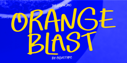 Experience the vibrant energy of Orange Blast, a playful handwritten display font that can make your designs pop! With its bold and dynamic strokes, this font is perfect for adding a playful yet professional touch to any project. Whether you’re designing logos, posters, or social media graphics, Orange Blast delivers a burst of creativity that captivates and engages your audience. Orange Blast features : Standard Latin Numbers, symbols, and punctuations Multilingual Support. Fully accessible without additional design software Simple Installations Works on PC & Mac Thank You.
 - Spaceline by Din Studio,
$29.00 Hi, Everyone! If you’re looking for a modern and futuristic font to captivate your audiences or customers then we’ve got the font for you! Introducing Spaceline - A Futuristic Display Font This typeface with futuristic style looks very interesting for loads of different projects and promotions. It is perfect to be used on your website, for your social media branding, Pinterest banners, printed products, and more! Features: Multilingual Support PUA Encoded Numerals and Punctuation Caps only fonts Thank you for downloading premium fonts from Din Studio
 - Gloomie Saturday by Timurtype,
$14.00 Introduced by Timurtype Studio! Gloomie Saturday is a Bubbly Handwritten Font this font captures the charm of handcrafted elegance with our cheerful handwritten font collection – where every word dances with personality. Enhance your designs and captivate your audience with custom lettering art. Let your words sparkle with the magic of authenticity. Explore our cheerful fonts and make your message stand out! Gloomie Saturday Font also supports multilingualism. Enhance your designs with our original fonts, feel free to comment or provide feedback, Enjoy the fonts 😊 Thank You
 - Semisonic by Putracetol,
$26.00 Semisonic is a captivating modern display font that defies convention and stands out from the ordinary. It seamlessly blends the essence of modernity with a fusion of sans serif and decorative elements, creating a font that's truly exceptional. This unique font is the perfect choice for those seeking to make a bold statement in their designs. Whether it's a logo, branding materials, invitations, packaging, posters, headlines, business collateral, greeting cards, magazines, or any other creative project, Semisonic will add a touch of individuality and originality.
 - Bittermoon by Prioritype,
$12.00 Modern script font with an elegant and captivating concept. You can use it in designs such as logos, photographer watermarks, business cards, creative posts, branding, business, wedding invitations, crafts and many more because they have interesting features and characters. See some of the previews above for reference. Features: -Uppercase -Lowercase -Numeral -Punctuation -Multilingual -Ligature -Alternate -Swash Note : Open with a program that supports the Opentype feature and an glyphs panel is available to see more alternative characters. Sample programs like Adobe Illustrator and the like!
 - Glis by BXS Type,
$10.00 The Glis font is a unique expression of authenticity, meticulously hand-drawn to bring a touch of charming personality to your designs. With rounded and slightly irregular strokes, Glis is more than just typography; It's a visual experience that adds artisanal charm and a sense of warmth to your creations. Each character is carefully designed to convey a relaxed and welcoming aesthetic, providing a visually captivating approach to your typographic compositions. Try Glis to infuse a dose of originality and softness into your designs. **Uppercase
 - Herra Maddison by Jinan Studio,
$20.00 Herra Maddison is the embodiment of modern elegance, offering you an exquisite script font with exceptional swashes and multilingual support. Whether you’re a designer working on wedding themes, branding, or promotional materials, this font will elevate your work, infusing it with a timeless and stylish charm that captivates the eye and the heart. Make Herra Maddison your choice for sophisticated, elegant designs that leave a lasting impression. Features A set of uppercase and lowercase glyphs Number, symbol, and punctuation Multilingual Support Alternates and ligatures PUA encoded
 - Boomber Rockstar by Din Studio,
$29.00 Hi, Everyone! If you’re looking for a modern and artistic font to captivate your audiences or customers then we’ve got the font for you! Introducing Boomber Rockstar - A Grafiti Font This typeface with artistic style looks very interesting for loads of different projects and promotions. It is perfect to be used on your website, for your social media branding, Pinterest banners, printed products, and more! Features: Standart Ligatures Multilingual Support PUA Encoded Numerals and Punctuation Thank you for downloading premium fonts from Din Studio
 - Parteys by Craft Supply Co,
$20.00 Introducing Parteys – Brush Script Dynamic and Captivating: Parteys – Brush Script is a font that exudes dynamism with its varied stroke widths, making it perfect for creating eye-catching displays. Expressive Brush Strokes: This font boasts expressive brush strokes that give your text a lively and energetic appearance, making it ideal for projects that demand a touch of excitement. Versatile Design Possibilities: Parteys – Brush Script offers versatility in design, suitable for a wide range of creative applications, from posters and invitations to branding and social media graphics.
 - Bergins by Craft Supply Co,
$20.00 Discover Bergins – Grotesque Sans Serif Modern Aesthetic Initially, Bergins captivates with its modern grotesque aesthetic. Designed meticulously, it embodies a fresh and contemporary vibe, ensuring visual appeal and innovation in design. Clarity and Precision Additionally, clarity reigns in its design. Every stroke and curve in Bergins speaks precision, offering optimal readability across various platforms and sizes, facilitating diverse applications. Versatility Unleashed Moreover, Bergins exhibits remarkable versatility. It seamlessly integrates with a multitude of design layouts, from digital platforms to printed materials, enhancing adaptability and usability.
 - OregonDry is a font meticulously designed by Pat Snyder that evokes a distinctive and captivating essence of rustic charm and vintage appeal. This font stands out with its unique take on the serif ge...
- Le Tarot by Struvictory.art,
$16.00 Le Tarot is a modern serif font with celestial motives. The font is created in classic proportions and decorated with the moon and stars. Le tarot includes stylistic alternates and ligatures. The font is suitable for the design on the theme of astrology, mysticism, spirituality, witchcraft, magic, esotericism. Le Tarot has extensive language support, it includes English, French, German, Italian, Spanish, Portuguese, Danish, Norwegian, Swedish, Finnish, Estonian, Turkish. Le Tarot includes stylistic alternates for symbols: A, a, D, d, G, g, J, j, M, m, O, o, T, t, U, u, W, w. There are also ligatures: Ka, La, Ma, OO, Ra, aa, am, ka, ko, la, lo, ma, mm, mo, oo, ra, rm, ro, rr, tt, xa, za.
 - akaFrivolity - 100% free

- HWT Tuscan Extended by Hamilton Wood Type Collection,
$24.95 Tuscan wood types cover a fairly wide range of styles, and there is sometimes confusion over what is classified as a Gothic Tuscan and what is considered an Antique Tuscan. HWT American Chromatic and P22 Tuscan Expanded are more precisely faces of the Antique Tuscan variety. Gothic Tuscans are generally absent of the heavy serifs typically associated with their Antique Tuscan brethren (although decorative bifurcation of terminals can imply serifs). Additional internal decoration with spikes along the stems gives some Tuscans their distinctive look, these faces are often described as “Circus Types.” Tuscan Extended is an extremely wide design, with a distinctive slab crossbar running through the center of most characters. Each letter is a complex system in its own right. This typeface is best used very large in short headline work. The style defies falling clearly into either the Antique Tuscan or Gothic Tuscan category. The new HWT version of Tuscan Extended has been meticulously redrawn by Frank Grießhammer. During production, he also incorporated a number of new letterforms, bringing the font to over 300 characters (including a full ASCII character set and Central European accented characters).
 - Cooper Screamers by Wordshape,
$- In 1925, at the request of Barnhart Brothers & Spindler, the foundry he worked for, Oswald Bruce Cooper designed a wide selection of "screamers", oversized exclamation points used to grab attention in display advertising. The foundry rushed the screamers into production, much to Cooper's dismay. Cooper was disappointed with the final form of the screamers– they were designed in assorted weights to match the assorted Cooper series of typefaces, as well as in a variety of other formal solutions- squaredoff, incised, wavy, Tuscan, and rounded. Cooper's working design methodology was to re-draw his projects a number of times in order to refine the formal results. However the screamer project was hastily cut by the head of BB&S's matrix engraving room in fourteen sizes from the initial sketches, causing Cooper to fire off a fiery missive stating, "Everything I draw is bum the first half-dozen times I draw it; the trouble with these is that I drew them only once!" This typeface is the result of researching Cooper's original drawings and series of engraved proofs for the screamers, as well as the original Screamer type specimen. Cooper Screamers have never been available before in digital format.
 - ITC Quay Sans by ITC,
$41.99 London-based designer David Quay designed ITC Quay Sans in 1990. One of the precursors to the long run of functionalist European sans serif faces that has been a dominating force in type design since the 1990s, ITC Quay sans is based on the proportions of 19th Century Grotesk faces. Grotesk, the German word for sans serif, defines an entire branch of the sans serif movement, which culminated in the 1950s with the design of Helvetica. ITC Quay Sans is made up of very simple, legible letters. The weights of the strokes throughout the alphabet vary very little. Microscopic flares on the ends of each terminal add a bit of dimension to the design. This helps prevent the onset of the monotony, a danger when one repeats countless near mono-weight stroked letters throughout a large body of text. ITC Quay Sans is a very readable face; it works equally well in all sizes. Six fonts of the ITC Quay Sans typeface are available: Book, Book Italic, Medium, Medium Italic, Black, and Black Italic. ITC Quay Sans is similar to Hans Eduard Meier's Syntax, and Tim Ahrens' Linotype Aroma."
 - Jack Knife by Mike Zuidgeest,
$14.00 The "Jack Knife" font is a unique, handcrafted font that perfectly captures the spirit of the medieval time period. With its spiky, pointy design, this font exudes strength, courage, and boldness – making it the perfect choice for anyone looking to add a touch of daring to their brand. The sharp, jagged edges of the "Jack Knife" font give it a rugged, rustic feel that is both timeless and modern. Its bold, thick strokes make it easy to read even from a distance, while the intricate details and delicate curves add a touch of elegance and sophistication. Whether you're looking to create a bold, daring logo for a whisky brand or add a touch of adventure to your design, the "Jack Knife" font is the perfect choice. Its unique design and versatile style make it suitable for a wide range of projects, from branding and packaging to advertising and social media. So if you're looking for a font that embodies the spirit of the medieval period and exudes strength, courage, and boldness, look no further than the "Jack Knife" font – the perfect choice for anyone who wants to make a bold statement with their design.
 - FS Sammy by Fontsmith,
$80.00 Chalky Spritely and full of personality, FS Sammy is a hand-drawn font with a chalky texture, available in one weight only. Give Sammy a run in branding, packaging or billboard advertising for a fresh, informal, honest personality. Calligraphic Too many script fonts have a rushed and thrown-together feel about them. It’s a deceptively complex feat to achieve forms that hold together neatly in text yet still have the breezy, natural air of real handwriting. That’s FS Sammy: considered and crafted. Pencil FS Sammy was originally drawn for a drinks manufacturer by Fontsmith’s calligrapher, Sehmi Satwinder, who made handwritten impressions with a large soft pencil on textured watercolour paper. The digital interpretation of Sehmi’s letters was pushed to its limits and, after a lot of experimentation, a balanced alphabet was achieved. Texture and spirit FS Sammy’s success and uniqueness within the script font category is down to its versatility. In the large text of billboard advertising or headlines, all of its texture comes to life, and small, on menus or booklets, it conveys all of the spirit and personality of a considered piece of handwriting.
 - Sketchen by Mike Zuidgeest,
$10.00 Hey there! As the proud creator of Sketchen, I'm stoked to introduce you to my latest font creation! Sketchen is a sketch style font that's just perfect for outdoor advertising and menus. Imagine a beachy vibe, summer vibes, and a whole lot of fun – that's what Sketchen brings to the table! I designed Sketchen to capture the essence of summertime and the carefree attitude of beach life. With its playful, hand-drawn style, Sketchen adds a whimsical touch to any design project. Whether you're creating a menu for a tiki bar or promoting a surf competition, Sketchen is the perfect font to convey a sunny, laid-back feeling. Sketchen's bold, eye-catching letters ensure that your designs won't be missed. And with its relaxed, playful vibe, it's sure to make a splash in any setting. So why not give Sketchen a try and see what kind of summery designs you can come up with? With Sketchen, you can add a touch of fun to all your outdoor advertising and menu design projects. So let your creativity run wild and see where Sketchen takes you!
 - Jatukiy by Twinletter,
$13.00 Introducing “JATUKIY Font” – Unleash Playful Creativity! Meet JATUKIY Font, your passport to a world of playful design possibilities. Designed with a whimsical touch, this display font brings a burst of fun to your projects. JATUKIY Font is your go-to choice when you want to infuse energy and a hint of cheekiness into your designs. Whether it’s children’s books, party invitations, or anything that needs a playful twist, this font is your creative ally. The distinctive style of JATUKIY Font is a visual treat. Its playful, bouncy characters instantly grab attention and leave a lasting impression. Let your designs speak volumes with the lighthearted charm of JATUKIY Font. Crafted with precision, this font’s unique design ensures that your message is delivered with a delightful twist. It adds a touch of humor and personality, making your content unforgettable. With JATUKIY Font, you have the power to create designs that stand out from the crowd. Infuse your projects with creativity, laughter, and a dash of whimsy, all with the help of JATUKIY Font. Elevate your design game and let your imagination run wild with this playful typeface. – PUA Encoded Characters – Fully accessible without additional design software.
 - Plinc Goliath by House Industries,
$33.00 Vincent Pacella was a true giant of hand-lettering and typeface design. Of the dozens of styles he designed for Photo-Lettering and International Typeface Corporation, his dominant Goliath towers above the rest. The font is perhaps best known from Herb Lubalin’s American flag that the design legend created for Print magazine’s 40th anniversary cover. Pacella takes “slab” serif to heart with this colossally-proportioned font, using brawny stroke endings and minimal curves to create a powerful figure for maximum visual impact. Take advantage of Goliath’s superior stature to make viewers take notice in industrial settings, sports branding, and oversized outdoor media applications. For comparatively modest musings in accompanying running text, consider partnering it with a comparatively spartan slab serif like Municipal. Or, team up Goliath with a faceted fellow heavyweight like United Sans. Originally drawn in 1970, Goliath was digitized by Ben Kiel with Adam Cruz in 2011. GOLIATH CREDITS: Typeface Design: Vincent Pacella Typeface Digitization: Ben Kiel, Adam Cruz Typeface Production: Ben Kiel Like all good subversives, House Industries hides in plain sight while amplifying the look, feel and style of the world’s most interesting brands, products and people. Based in Delaware, visually influencing the world.
 - Hortensia by Canada Type,
$24.95 Hortensia, designed around 1900 by Emil Gursch for his own Berlin foundry, is a typeface most expressive of the post-Victorian aesthetic that was all the rage in both Europe and America during the second half of the 19th century and up until the Great War. It is a reduced aesthetic of sharp points and natural curves that almost want to apologize for their own elegance, but clearly embody the simple excitement about the blossoming of industry and crafts during the period. This deco script trend would get a re-run for about a decade on either side of the second World War — especially in the entertainment and financial industries — before giving way to art nouveau and big brush faces. Hortensia was Gursch's most popular typeface, used extensively and prominently in many beautiful type catalogs, and a commonly seen design element in Germany for quite a while after its release. This digital version brings plenty of fixes and additions to the original metal Hortensia design, including many alternates sprinkled throughout the character set, and support for a wide range of Latin-based languages (including Central European, Baltic, Turkish and Welsh).
 - Romp by Positype,
$30.00 With all ego aside, Romp was designed and influenced by my daughter, Angel. For some time now, she has wanted me to design a font based on her handwriting. But each time I sit down to do it, I run into more that she needs to do and redo. On a recent attempt, I ran into the same situation again. Instead of moving on to something else, I decided to whip out a sumi brush and start making letters...for me, type design is something a little ‘serious’ and never a time to just have fun. This typeface proved that notion wrong—it really was fun. As a result, each letter encouraged another and the design grew...and grew! The happy result spawned 3 separate sets of letters & numerals (small caps and some ligatures too!). Using the beauty of OpenType, these 3 sets have been fused into one, randomly generating font set. If you are using any type of OpenType enabled application, then the Romp Pro typeface is the way to go. They include everything found in the 3 separate variants for each style as well as entirely expanding offering of additional small cap and ligature sets.
 - Sagrantino by Monotype,
$50.99 Sagrantino™ shines at large sizes – and in vibrant colors. Think big posters, commanding headlines, massive banners and oversized packaging. Set headlines in the Highlight or Shadow designs and running copy in the Regular – all on the same page! Sagrantino could be called the Lava Lamp of fonts. It’s slick, glossy, retro and futuristic. Somehow, it’s fresh and quirky-classic at the same time. This is a design that challenges you to think outside the text box. In fact, Sagrantino is so lively, it took three Monotype typeface designers, Karl Leuthold, Juan Villanueva and Carl Crossgrove, to draw it. Because it’s a script, Sagrantino pairs perfectly with just about any other design – except another script. Maintain the futuristic retro vibe by combining Sagrantino with a typeface like Biome™ or Neo™ Tech. Looking for a counterpoint? Try a cool sans like Avenir® Next or Univers® Next. OpenType® Pro fonts of Sagrantino enable automatic insertions from a crowd of fancy ligatures and delightful alternate characters – in addition to offering an extended character set supporting most Central European and many Eastern European languages.
 - Quijote Sauvage by Lián Types,
$45.00 It was in the beginning of 2008 when I designed a font named Quijote, its predecessor. In the middle of 2009, I looked at it again and thought it could be a good idea to make an update of it. Variables and Features: Quijote Sauvage Pro is the most complete variable. It includes all the ligatures, alternates and swashes. It has the OpenType function in order to alternate glyphs easily when running applications which support this. The font is also offered separately. Quijote Sauvage Standard has the right glyphs to get an equilibrium between wildness and softness. It includes standard and discretionary ligatures. Quijote Sauvage Stylistic has the sharpest glyphs. Its decorative traces are discreet in order not to have problems as regards legibility. Its upper case are less wild than the other variables. Quijote Sauvage Text is the most discreet of its partners. This one was thought in order to improve legibility. Its ascenders and descenders are shorter, so the words are easier to read in small sizes. Quijote Sauvage Contextual, Swash and Titling, are the ones with wonderful terminals. They decorate words, adding a wonderful look of wildness or passion.
 - Ana by LetterPalette,
$35.00 Ana is a chromatic typeface consisting of 26 uppercase Latin characters, inspired by arabesque patterns from the nineteenth century. Programmed to enable users to easily create multicolored drop caps and initials, this decorative display typeface features a different ornament for every letterform, which fits perfectly with its glyph shape. This ornament is usually more luxurious on the left side of the letter, while on the right it is scarce, so that the body text can be placed close to the initial. These initials are valuable for use in large sizes, like posters, magazines, packaging design, fairy tales, and so on. The final forms of the initials consist of 5 parts which can be individually colored. There are 5 font files named Ana Layer A, Ana Layer B, and so on. A font user can manually create a multicolored initial with these font files, if there is no possibility to use the Contextual Alternates option. To do that, it is necessary to make 5 layers in the page layout software. Then, the corresponding character should be placed on each layer, so that Ana Layer A is on the lowest layer and Ana Layer E is on the highest one. Note that the glyph shapes are contained in the lower case positions. In contrast, the font file named Ana is programmed, so it is possible to create a multicolored initial with the Contextual Alternates command. There is no need for additional layers, everything happens on a single layer. First, the Contextual Alternates command (usually under OpenType menu) should be disabled. Then, using lower case key, type the desired character 5 times and apply color to them. Select them all and turn on the Contextual Alternates. Also, the font file Ana comes with a set of ‘black’ initials that can be used just like any other non-color typeface. The ornamental versions are contained in the uppercase positions, while the letters without the ornaments are in the lower case. With the font file Ana Monochrome one can only get the monochrome initials. Ornamental letters are contained in the upper case positions, while the letterforms without the ornaments are in the lower case.
 - Venturing into the wild, imaginative world of typography, we find the JFJungleRock font by Jester Font Studio, a creation that encapsulates the untamed essence of adventure and the whimsical allure o...
- Sylar Stencil is a typeface characterized by its distinct approach to the stencil design ethos, blending the functional charm of traditional stencil fonts with contemporary flair. Unlike conventional...
- Ah, Equestrian by Darrian, a font that prances gracefully across the page like a well-groomed stallion at the Kentucky Derby. This isn't your average, run-of-the-mill typeface. Oh no, it carries the ...
- The XXII DONT-MESS-WITH-VIKINGS font is a bold and striking typeface that pays homage to the ferocity and distinctive culture of the Norse Vikings. This font embodies the strength, adventure, and mys...
- BlaxSlabXXL is an intriguing and bold font created by the talented typographer Manfred Klein. As its name suggests, it is a slab serif font, distinguished by its robust and blocky serifs that project...
- The "PR Viking 01" font, created by Castles & Crypts, is a stylized typeface that draws significant inspiration from the historical and cultural elements of the Viking era. Designed to evoke the rugg...
- Pariphoom Compressed by Jipatype,
$27.00 ขอแนะนำ Pariphoom Compressed ส่วนเสริมของฟอนต์ Pariphoom ด้วยอักษรอันโฉบเฉี่ยวและทันสมัย เหมาะสำหรับงานออกแบบหลากหลายประเภท ด้วยอักษรแบบ sans-serif condensed และมุมโค้งมน แบบอักษรนี้ให้ความสมดุลที่ระหว่างความเป็นทางการและความเข้าถึงได้ง่าย ชื่อปริภูมิมาจากภาษาไทย แปลว่า “Space” และเช่นเดียวกับชื่อของมัน ฟอนต์นี้สามารถให้พื้นที่มากขึ้นในงานออกแบบของคุณ ไม่ว่าคุณกำลังสร้างสื่อสำหรับสร้างแบรนด์ พัฒนาแคมเปญการตลาด หรือออกแบบเว็บไซต์ Pariphoom Compressed มอบความยืดหยุ่นและความอเนกประสงค์เพื่อให้ได้รูปลักษณ์ที่คุณต้องการ Pariphoom Compressed มาพร้อมกับรูปแบบที่แตกต่างกันถึง 18 รูปแบบ สิ่งนี้ทำให้คุณมีตัวเลือกมากมายและมีความยืดหยุ่นในการใช้งานในหลากหลายบริบท นอกจากนี้ ฟอนต์นี้รองรับหลายภาษาสำหรับภาษาต่างๆ มากมาย แต่นั่นไม่ใช่ทั้งหมด Pariphoom Compressed มาพร้อมกับฟีเจอร์ Opentype เจ๋ง ๆ เช่น Small Caps และ Tabular ซึ่ง Small Caps เป็นวิธีที่ยอดเยี่ยมในการเพิ่มความหลากหลายให้กับงานออกแบบของคุณโดยใช้ตัวพิมพ์ใหญ่แทนตัวพิมพ์เล็ก ในขณะเดียวกัน Tabular ก็สมบูรณ์แบบสำหรับการสร้างตารางและจัดตำแหน่งตัวเลขเพื่อให้ดูเป็นระเบียบมากขึ้น โดยรวมแล้ว Pariphoom Compressed ทำให้เป็นตัวเลือกที่ยอดเยี่ยมสำหรับนักออกแบบที่ต้องการสร้างผลงานการออกแบบที่น่าจดจำและมีประสิทธิภาพ Introducing Pariphoom Compressed, a extended of Pariphoom with sleek and modern typeface that is perfect for a wide range of design projects. With its condensed sans-serif design and rounded corners, this font offers a unique balance of professionalism and approachability. Derived from the Thai language, the name Pariphoom means "Space" and just like its name suggests, this font can give you more space in your design. Whether you're creating branding materials, developing marketing campaigns, or designing websites, Pariphoom Compressed offers the flexibility and versatility you need to achieve your desired look. Pariphoom Compressed comes with 18 different styles. This gives you plenty of options to choose from and the flexibility to use it in various design contexts. Additionally, this font offers multi-language support for a wide range of languages. But that's not all – Pariphoom Compressed comes with some cool Opentype features such as Small Caps and Tabular. Small Caps are a great way to add variety to your design by using small capital letters instead of lowercase letters. Meanwhile, Tabular is perfect for creating tables and aligning numbers for a more organized look. Overall, Pariphoom Compressed making it a great choice for designers who want to create memorable and effective design projects.
 - Devil Inside by Ditatype,
$29.00 Devil Inside is a spine-chilling display font that will send shivers down your spine. Designed in a large, bold font, this typeface demands attention and exudes an aura of darkness. Each letter is meticulously crafted with a square shape, high contrast, and haunting brush details, adding an eerie and sinister touch to the font. The large size of the letters enhances the font's ominous presence, making it impossible to ignore. The square shape of each letter adds a sense of rigidity and sharpness, while the high contrast brings an element of drama and intensity. These design choices contribute to the font's unsettling and sinister look, immersing the viewer into a world of darkness and fear. The brush details in Devil Inside give the font an organic and handcrafted appearance, as if it were inscribed with ancient symbols by a malevolent force. These haunting details add a sense of craftsmanship and enigma, creating an atmosphere of mystery and foreboding. For the best legibility you can use this font in the bigger text sizes. Enjoy the available features here. Features: Alternates Multilingual Supports PUA Encoded Numerals and Punctuations Devil Inside fits in headlines, logos, movie posters, flyers, invitations, branding materials, print media, editorial layouts, headers, and any horror-themed project. Find out more ways to use this font by taking a look at the font preview. Thanks for purchasing our fonts. Hopefully, you have a great time using our font. Feel free to contact us anytime for further information or when you have trouble with the font. Thanks a lot and happy designing.
 - Mid Century Sans by Dharma Type,
$19.99 Mid Century Sans (MCS) is composed of high-geometric shapes. László Moholy-Nagy —professor in the Bauhaus— said “Typography is a tool of communication. It has to be communication in its most intense form. The emphasis must be on absolute clarity since this distinguishes the character of our own writing from that of ancient pictographic forms.” As same as you can see in modern typefaces in the early twentieth century, MCS has very efficient, clear and minima letterforms. There are not any decorative parts in the skeleton of letters. At the same time, Mid Century Sans has one more feature. In the middle of the twentieth century, one big movement which was called Mid-century modern had occurred. The Mid-century modern movement in the U.S. was an American reflection of the International and Bauhaus movements and it was slightly more organic in form and less formal than the International Bauhaus-style. In other words, it was friendly and stylish. We added Mid-century-spices to the Bauhaus-modernism. The basic letter form is geometric yet it has very friendly strokes and human touch. Mid Century Sans consists of 8 weights and their matching Italics for a wide range of usages. Farther, Mid Century Sans is supporting international Latin languages and basic Cyrillic languages including Basic Latin, Western Europe, Central and South-Eastern Europe. Also MCS covers Mac Roman, Windows1252, Adobe1 to 3. This wide range of international characters expands the capability of your works. Lowercase "a" has OpenType stylistic alternates for advanced typography.
 - SST Japanese by Monotype,
$236.99 Designed for global branding and supporting 93 languages, the SST® typefaces blend the organic readability and controlled structure of modern sans serif designs. In combining these attributes, the SST family is understated, versatile – and sure to be a timeless design. The SST Japanese Pro family has 6 fonts in total. It spans four weights from ultra light to bold, and has two condensed weights to further expand the family’s vast range of uses. SST’s subtle design traits provide a quietly handsome and consistently friendly typographic presence that can be used for just about any typographic application. Broad range branding applicability, combined with coverage for almost a hundred languages, makes SST one of the most widely accessible and usable typefaces available. Originally designed in partnership with the global consumer brand, Sony, the SST family is one of the most comprehensive type families available. Since extensive multi-lingual support was a critical design goal from the beginning, Akira Kobayashi, Monotype type director and primary designer on the project, turned to a network of local designers around the world for their individual language expertise. As a result, the details – which could be as subtle as stroke curvature and width – are consistent across Latin, Greek, Cyrillic, Arabic and multiple Asian languages. SST performs equally well in print and on-screen and the designs can be used at very small sizes in packaging and catalogs; while massive print headlines – even complicated wayfinding projects — pose no stumbling blocks to the family’s typographic dexterity.
 - Fightever by Ditatype,
$29.00 Fightever is an expressive script font that embodies the boldness and energy of a brushstroke. With its interconnected letters and dynamic design, this typeface brings a sense of movement and liveliness to your projects. The defining feature of Fightever lies in its connected brush style, where each letter flows seamlessly into the next. This interconnectedness creates a sense of continuity and fluidity, resembling the strokes of a brush gliding effortlessly across the canvas. The result is a script font that feels organic and natural, with each letter forming a harmonious composition. Fightever captures the essence of artistic expression. The font exudes a sense of raw energy and passion, as if every letter is infused with the brushstroke's vibrant movement. This dynamic style adds a touch of personality and uniqueness to your designs. Enjoy the various features available in this font. Features: Alternates Multilingual Supports PUA Encoded Numerals and Punctuations Fightever perfect for logos, branding materials, invitations, or any design project that calls for a touch of handcrafted charm. This font will also work on designs related to art, fashion, hand-lettering, or any project that requires a personal touch, this font will bring an authentic and expressive feel. Find out more ways to use this font by taking a look at the font preview. Thanks for purchasing our fonts. Hopefully, you have a great time using our font. Feel free to contact us anytime for further information or when you have trouble with the font. Thanks a lot and happy designing.
