10,000 search results
(0.045 seconds)
- Primaria by PeGGO Fonts,
$18.00 Primaria is a display font, inspired on the very first basic handwrite style teaching at primary school, designed in cursive and print styles in three weights each one: light, Regular and Bold, considering stylistic and typographic needs, it also contain OpenType initial lowercase alternative forms in order to get better links in those case where pairs of letters could be look better. Recommended playful and friendly design, teaching and learning stuff, children toys projects, food & drink and soft stuff.
 - Akagi Pro by Positype,
$29.00 Akagi Pro is a complete rebuild and expansion of my popular Akagi typeface. Contemporary, clean, simple and friendly continue to serve as the adjectives for an expansion that includes 250+ additional characters per weight, many new ligature options, expanded stylistic alternates, 4 sets of figures, new symbols, case-sensitive punctuation, superscripts, subscripts, ordinals, expanded language support and two new styles that provide even more flexibility within the lighter weights of the family. When I designed Akagi in 2007, I wanted this new sans serif to "smile" at you — with this new expansion, I hope you smile back. Akagi Pro is economical while keeping a distinctive, expressive personality on the page that distinguishes it from among many of the mechanical/rigid/emotionless sans out there without becoming cliché. Perfect for the page and the screen, the flexible weights available allow for pinpoint selection at whatever size. Each style of Akagi Pro has a robust character set made even more functional with expansive OpenType features. A typesetter's dream — case-sensitive punctuation, tabular and proportional variants of lining and oldstyle numerals, true italics, small caps, expansive language support, an alternate 'g' and 'y', highlight a wealth of features of the typeface. This versatility infused within Akagi Pro will allow it to assume both roles of the utilitarian workhorse and light-hearted go-to typeface — and make the user happy.
 - Armont by HansCo,
$15.00 Armont is a Vintage typeface font, it will add an old-time charm to any design project. This collection of font is perfect for everything your project with vintage, retro, wild or organic style. Features : Uppercase & Lowercase ( in All Caps ) Numbers & Punctuation Multilingual Alternate character & ornament How to access alternate / ornament ? : https://hanscostudio.com/tutorial/ Enjoy!
 - Cooraline by Scratch Design,
$9.00 Introducing to you, Cooraline! Comes with 2 fonts style! Cooraline it's retro, psychedelic, bold, playful, and really unity together in your design to give it that retro feel. This font has an authentic groovy style that is perfect for making any project like a header, logo, quote, layout magazine, poster, packaging and label design, etc. Better which is use it on the 60s until 80s design project, this font will give some old-school touch to your design projects. Back in the psychedelia era Cooraline came with open-type features such as ligatures and extra clip art, and the other alternative Cooraline Shadow consists of underwater elements that suit with underwater atmosphere, so you can combine these two fonts to make an amazing retro, psychedelic with undersea vibes in your project designs.
 - Tobi Next by RodrigoTypo,
$35.00 Tobi Next is the improved version of Tobi pro, which in the extended version contains 213 ligatures, contains Greek and Cyrillic, as well as contains its basic version at a lower cost
 - Floki by LetterMaker,
$39.90 Floki is a contemporary condensed sans serif with sixteen styles ranging from extralight to extrabold and accompanying italics. The amount of styles, condensed proportions and large character set make Floki suitable for various uses such as infographics, packaging, branding, advertising and editorial design. Floki’s aesthetics are distinctly modern and they have a hint of softness which comes from sublty curving the diagonal strokes in letters such as A and V. This feature really shines when you set text in tightly set caps as big as possible. Stylistically Floki leans more to the humanist sans serif but it has a flavour of geometry in its shapes as well. The result of this combination of features is a highly usable typeface with a clear voice of it's own. All styles feature small caps and multiple sets on numerals including lining figures, old style figures, tabular figures, small cap figures, numerators, denominators, superiors, inferiors and fractions. Floki has latin extended character set making it well suited for multilingual typography.
 - Parteys by Craft Supply Co,
$20.00 Introducing Parteys – Brush Script Dynamic and Captivating: Parteys – Brush Script is a font that exudes dynamism with its varied stroke widths, making it perfect for creating eye-catching displays. Expressive Brush Strokes: This font boasts expressive brush strokes that give your text a lively and energetic appearance, making it ideal for projects that demand a touch of excitement. Versatile Design Possibilities: Parteys – Brush Script offers versatility in design, suitable for a wide range of creative applications, from posters and invitations to branding and social media graphics.
 - Linotype Irish Text by Linotype,
$29.99Linotype Irish Text is part of the Take Type Library, chosen from the contestants of Linotype’s International Digital Type Design Contests of 1994 and 1997. German artist Torsten Weisheit designed this font based on Irish scripts of the 5th century. Characteristic of this style is the mixture of upper case letters in the mostly lower case alphabet and vice versa. The letters look as though written with a broad tipped pen and have triangular serifs, displaying a decorative tendency akin to that of Irish calligraphy. Linotype Irish Text is intended exclusivley for headlines in large point sizes. - Unleash by Gassstype,
$23.00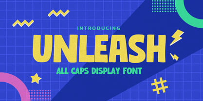 Hello Everyone, introduce our new product UNLEASH is All Caps Display Font with a natural feel. This handmade font will make your design has a beautiful natural touch for each details. It is perfect for any design project as Invitation,logo, book cover, craft or any design purposes. UNLEASH is Inspired by Food Logo style and combination with Unique Craft style. that will fulfill your design needs for quotes,sporty theme, logotype, wordmark, etc. This has many opentype features and support multi language. This font is PUA encoded which means you can access all of the magical glyphs with ease!
 - Zarlino by Patricia Lillie,
$29.00 Zarlino is an original typeface in the Blackletter style. It does not solidly adhere to any of the historical Blackletter classifications, but draws from all of them, with some characters owing more to the Roman than the Fraktur. Zarlino Delux includes three complete sets of upper case, ranging from the simple to the embellished to the even more embellished, two complete sets of lower case, and two more sets of embellished alternates for selected lower case characters. These alternates are available through Stylisitic Sets in OpenType aware applications. For use in non-OpenType aware applications, Zarlino Delux comes with a set of separate, standard fonts, one for each style. These standard fonts are also available for individual purchase. Zarlino was named by my cousin, a musician. Gioseffo Zarlino was a sixteenth century composer and musical theorist. Among other things, he offered detailed advice on the setting of words to music. With its blends of the old and the new, the simple and the ornate, Zarlino is suitable for many uses, from the elegant to the aggressive.
 - Force Of Habit by Kitchen Table Type Foundry,
$15.00 I am not really a creature of habit, but when I start working on a new font, I make myself a cup of coffee first. I guess you can call that a habit, so I decided to name this font Force Of Habit. Force Of Habit is a nice brush font - made with a cheap pencil that I borrowed from the kids’ colouring box and my trusted (and seemingly ever flowing) Chinese ink. Force Of Habit comes with extensive language support, some alternates and - quite possibly - a faint smell of freshly roasted coffee..
 - Polar Press by Attype Studio,
$14.00 Polar Press is a vintage all caps font with 2 styles: clean and rough, and includes 22 ligatures. Polar Press is a strong font and is perfect for branding, logos, invitations, stationery, social media posts, product packaging, merchandise, blog design, game titles, retro style design, Book/Cover Titles and more.
 - 1689 GLC Garamond Pro by GLC,
$42.00 This typeface family was inspired by a set of fonts, designed in the Garamond style, used for an edition of Remarques critiques sur les œuvres d’Horace by “D.A.E.P.”, published in Paris in 1689 by two different booksellers: Deny Thierry and Claude Barbin. We can see some differences in comparison with our “pure” Garamond (see our 1592 GLC Garamond), particularly in the lowercase of the Normal style and the uppercase of the Italic. Unfortunately, we know neither the name of the punchcutter, nor that of the printer. This complete font set contains small caps, fractions all the way up to 1999/1999, historical and standard ligatures, and all of the fleurons contained in the edition (Normal style only). The alphabet covers all Western, Eastern and Central European languages (including Celtic diacritics) and Turkish.
 - Borgis Pro by RMU,
$45.00 Borgis Pro is a robust Clarendon-style font family, intended for use in body texts even on rough papers as well as in web design. All styles include small caps and oldstyle figures. Users who want to type in the Serbian language and take the Italic style should activate the OT feature Stylistic Alternatives.
 - Postillon by RMU,
$30.00 Herbert Post’s (1903-1978) blackletter fonts redesigned for nowadays’ use. Both font styles contain adorning swash caps. Typing N, o, and period, and activating the OT feature Ordinals produces an oldstyle number sign.
 - Garamond #3 by Linotype,
$40.99Opinion varies regarding the role of Claude Garamond (ca. 1480–1561) in the development of the Old Face font Garamond. What is accepted is the influence this font had on other typeface developments from the time of its creation to the present. Garamond, or Garamont, is related to the alphabet of Claude Garamond (1480-1561) as well as to the work of Jean Jannon (1580–1635 or 1658), much of which was attributed to Garamond. In comparison to the earlier Italian font forms, Garamond has finer serifs and a generally more elegant image. The Garamond of Jean Jannon was introduced at the Paris World’s Fair in 1900 as Original Garamond, whereafter many font foundries began to cast similar types. Morris F. Benton’s Garamond appeared in 1936 and is based on the forms of Jean Jannon, which already displayed characteristics of the Transitional style. - Garamond Classico by Linotype,
$29.99Opinion varies regarding the role of Claude Garamond (ca. 1480–1561) in the development of the Old Face font Garamond. What is accepted is the influence this font had on other typeface developments from the time of its creation to the present. Garamond, or Garamont, is related to the alphabet of Claude Garamond (1480–1561) as well as to the work of Jean Jannon (1580–1635 or 1658), much of which was attributed to Garamond. In comparison to the earlier Italian font forms, Garamond has finer serifs and a generally more elegant image. The Garamond of Jean Jannon was introduced at the Paris World’s Fair in 1900 as Original Garamond, whereafter many font foundries began to cast similar types. Garamond Classico is based on the forms of Jean Jannon, which already displayed characteristics of the Transitional style. - Youther by Letterhend,
$15.00 Youther is a font duo with layered style. Yes, you can make a fancy typography only with these fonts, and without any plugin or action. This font family contain the fabulous script and also comes with caps font. Youther is perfect to be used as logotype, badges and labels! This has many OpenType features like ligature, stylistic alternate, contextual alternate, swash, and more, as well as and support for multiple languages.
 - Range Sans by Eclectotype,
$36.00 This is Range Sans, the sans-serif counterpart to Range Serif . It can be categorized as a grotesque, with the idiosyncratic angular details from the serif family making themselves known in the arches and bowls of the lower case. The range of weights is larger than Range Serif, with two more weights at the lighter end of the spectrum. The weights from light to black correspond to their seriffed sisters, so can be interchanged with them freely while maintaining a similar text color and vertical metrics. This is useful for adding emphasis; Range Sans is deliberately lacking an italic, but the italics from Range Serif work better than you might expect in running text, particularly for the light and regular weights. Range Sans has a contemporary, somewhat geometric look that lends itself to uses such as corporate identities, minimalist graphic design, and logos. The middle weights do work well in running text, however, with the angled details being less noticeable at small sizes. Designed for demanding typography, supporting most Latin-based languages, Range Sans is equipped with true small caps for all weights, an array of numeral styles (proportional- and tabular- lining and oldstyle figures, small cap figures, numerators, denominators, superscripts and subscripts/scientific inferiors), automatic fractions, a set of useful arrows, case-sensitive forms, and a range of currency symbols including recent additions: Turkish Lira, Indian Rupee and Russian Ruble.
 - Calypso E by Typolar,
$72.00 Founded on a rigid structure of modernist type, Calypso E has a determined tone without an authoritative tang. It is an updated interpretation of a Neo-grotesque model Egyptian with a hint of Humanist lightness in its forms. Seriously big x-height, square basic form and sturdy serifs create firm text regardless of the weight. This makes Calypso E well suited for various media, from sharp plotter images to low-res television screens. Calypso E includes four suitable body copy styles. Book, Regular, Normal and Medium can be applied according to, for example, the size of text and quality of paper. All styles in the family are equipped with an expanded character set, small caps, case sensitive forms, discretionary ligatures and much more to make even the most elaborate typographic detailing possible.
 - Seuchter Experimental by HiH,
$10.00 Seuchter Experimental is a product of the fertile Jugendstil period in Austria. Drawn by Bruno Seuchter, about whom little biographical information is available, the design first appeared in Seuchter’s publication, Die Fläche, in 1902. Die Fläche means “surface or expanse,” presumably a reference to a “tabula rasa” or clean slate. The implication is one of starting anew, rejecting the past and searching for fresh, different modes of visual expression — which is exactly what Art Nouveau attempted to do. Seuchter Experimental is a quirky and light-hearted font. Ligatures include AT, AV, CH, CK, FJ, LO and ST. Although basically an all-cap font, several of the accented letters in the lower case position represent the oft-seen desire to keep the accents below cap-height. The a-umlaut at 228 and u-umlaut at 252 reflect Seuchter’s original design. For a discussion of the difference between a diaresis and an umlaut, see Appendix B of Bringhurst’s The Elements of Typographical Style. In the meantime, give this font room to breathe.
 - Calcis by Eurotypo,
$24.00 “Chalkís” or “Chalkida” was the capital of the Euboea island in old Greece. The name derived from the Greek and it means copper - bronze. Colonist from this area founded several important cities in the Magna Graecia, such as Cumae (coastal area of Southern Italy), where our alphabet come from. At the beginning, first scribes draw the signs in mono-line, but later on, the influence of materials, tools and the skill of calligraphers, developed the refinement of the lettering. “Calcis” is a family of sans serif fonts, characterized by its austere, functional and clear style, emerged from straight lines and primary shapes; but enriched by the contribution of countless anonymous calligraphers who have polished and embellished their forms over the years. “Calcis” is presented in five weights and italic style. It has good legibility in small sizes, elegance and strong visual impact in headlines as well. Each font of the family contain 377 glyphs with accurate kerning pairs careful controlled, and advanced typographical support with OpenType features such as: old style numerals, ligatures, discretional ligatures and case-sensitive forms. It also contain diacritics for Central European languages.
 - DIN Next by Monotype,
$56.99 DIN has always been the typeface you root for—the one you wanted to use but just couldn’t bring yourself to because it was limited in its range of weights and widths, rendering it less useful than it could be. The century-old design has proven to be timeless, but modern use cases demanded an update, which resulted in DIN Next—a versatile sans serif family that will never go out of style. This classic design turned modern must-have includes seven weights that range from light to black, each of which has a complementary italic and condensed counterpart. The family also included four rounded designs, stretching the original concept’s range and core usability. DIN Next also boasts a suite of small capitals, old style figures, subscript, superscript and several alternate characters. A quintessential 20th-century design, its predecessor DIN was based on geometric shapes and was intended for use on traffic signs and technical documentation. Akira Kobayashi’s update made slight changes to the design, rounding the formerly squared-off corner angles to humanize the family. Rooted in over 100-years of history, it’s safe to say that there will always be a demand for the DIN design, and thanks to DIN Next, now it’s as usable as it is desired. Wondering what will pair with it perfectly? Check out Agmena™, Bembo® Book, Cardamon™, Joanna® Nova, FF Quadraat® and Quitador™. Featured in: Best Fonts for Logos, Best Fonts for Websites, Best Fonts for Tattoos
 - Pinkus by Hanoded,
$20.00 Pinkus is a nice, uncomplicated serif font. It was hand drawn on plain white copy paper, hence the roughness. Pinkus is an all-caps affair, but upper and lower case letters can be interchanged. Pinkus can be used on posters, postcards, books, magazines and whatever else you fancy. Enjoy!
 - Cirque by Matt Frost,
$25.00 Cirque is a lively Western/Circus/Victorian/Whatever font—it'll fit in wherever you want to stick it to old Tschichold and make something cool instead. Mix up caps and lower case for curious results. To see more check out the Frost Foundry page at http://facebook.com/frostfoundry
 - Forest Ghost by Kaer,
$19.00 Forest Ghost is a font family with Regular and Textured styles. You'll get a playful font for your Scary corporate identity, Circus emblem, Halloween posters, Rock'n'roll flyer, Tattoo studio, Western-style design, and etc. Font features: All-caps, numbers, punctuation, and multilanguage support. Please feel free to request to add characters you need: kaer.pro@gmail.com
 - Warzone by Arterfak Project,
$23.00 Warzone is a minimalist techno font. Based on sans serif design, developed to techno style with the minimalist stencil concept and sharp edges. Quipped with extra alternate characters that give you more variations on your design. This font has geometric shapes that are perfect for a futuristic theme, techno, digital, sci-fi, and hipster style. Warzone is an all-caps font that has a solid version in the lowercase. A great choice to apply for many purposes. Thank you and happy designing!
 - Local Market by Cultivated Mind,
$30.00 Local Market is a wonderful handmade font and art collection. Local Market comes in three font styles, multiple weights, extras, labels, and banners. The handwritten font styles include Local Market Basic, Display, and Script. Extras come with hand-drawn market animals, market food, catchwords, numbers, symbols, kitchen tools, farm icons, leaves, and ornaments. Local Market works perfectly for restaurants, catering, markets, cafés, and marketing.
 - Comenia Sans by Suitcase Type Foundry,
$75.00Comenia Sans was designed in the framework of a unique typographic project for all types of schools. It is a complementary face for Comenia Serif, released by our friends at Storm Type Foundry. Comenia Sans has a lot in common with its serif sister: the height of both upper and lower case, the length of ascenders and descenders, and the general weight. This makes the two perfect partners which work well even when set side by side in a single line of text. Comenia Sans does, however, lack all serifs, ornamental elements and stroke stress variation. All these elements freshen up the feel of long texts, but for shorter texts use, they are not necessary. Despite that, Comenia Sans retains the soft, friendly character of its big sister, as well as a few tiny details which lend it its unique character without compromising legibility or utility. Open counters give all letters an airy feel and permit enough variation in construction. This is why the face works well even in multiple-page texts. All its letters are easily distinguished from each other, so the reader's eyes are not strained. Diacritics and punctuation harmonize with both upper and lower case. As usually, all diacritical marks fully respect conventional shapes of accents and they are perfectly suitable for Czech, Slovak, Polish and other Central European languages, where a lot of diacritics abounds. Similarly to the renaissance italics which refers to the cursive forms, Comenia Sans introduces novel shapes of some characters drawing from the hand-written heritage. This is most apparent in the single-bellied a, the simplified g, and the stem of f which crosses the baseline and ends with a distinct terminal. In the text, emphasized words are thus distinguished not only by the slant of letters, but also by the shapes of the letters themselves. All twelve styles contain set of small caps, suitable for the names, in the indexes or the headlines in longer texts. Legibility in small sizes under 10 points was at the center of designers' attention, too. This is why the counters of a, e and g are large enough to prevent ink spread in small sizes, both on-screen and in print. After all, the font was specifically optimized for screen use: its sober, simple forms are perfectly fit to be displayed on the computer screen and in other low-resolution devices. When used in the context of architecture, the smoothness of all contours stands out, permitting to enlarge the letters almost without limit. A standard at the Suitcase Type Foundry, each style of Comenia Sans boasts a number of ligatures, an automatic replacement of small caps and caps punctuation, a collection of mathematical symbols, and several types of numerals which make it easy to set academic and other texts in an organised, well-arranged way. For the same purpose, fractions may come in handy, too. Apart from the standard emphasis styles, the family also contains six condensed cuts (each set has the same number of characters), designated for situations where space is limited or the need for striking, poster-like effect arises. Comenia Sans is the ideal choice for the setting of magazines, picture books, and navigation systems alike. Its excellent legibility and soft, fine details will be appreciated both in micro-typography and in poster sizes. Although it was designed as a member of a compact system, it will work equally well on its own or in combination with other high-quality typefaces. - Hamptons BF by Bomparte's Fonts,
$40.00 Hamptons BF is a beautiful, elegant sans serif with dramatic individuality. A font that steps out in Art Deco style. As a design movement Art Deco came into prominence during the 1920s and 30s when forms were typically sleek, symmetrical, geometric or highly stylized. Today the influence of this enduring style can be clearly seen in architecture, industrial design, fashion, art, graphic design, and yes, even type design. Art Deco style exemplifies luxury, glamour and modernity. I believe Hamptons BF captures something of that retro look in a nod to the past without ever looking dated, all the while retaining a contemporary flair. Named after the well-known New York resorts synonymous with style and elegance, this gothic or sans serif type is based upon University Roman, an early 1970s serif design which in turn was influenced by yet another serif design called Forum Flair (late 1960s); and that in turn owes its pedigree to the late 1930s’ Stunt Roman, which is the original source of inspiration for all of these. Quite a family tree! There’s dynamic interplay between certain wide, full-round letters such as C, D, G, O, P, Q, R, S and narrow ones like A, E, F, H, K, L, M, N, U, etc. This contrast repeats throughout certain lower case letters and serves to create a unique look of distinction. Light and Regular weights communicate a romantic, feminine appeal while the Bold offers a complementary emphasis. The font is somewhat versatile as in addition to its primary purpose for display, Hamptons BF also succeeds in settings containing short blocks of large text. It’s right at home in a variety of typographic environments: branding, packaging, signage logos, magazine headlines, invitations, menus, trendy cafes and more. Among the included OpenType features are Stylistic Alternates, Automatic Ligatures and Fractions. There is extended language support for Western, Central and Eastern Europe and Turkish.
 - Cristal Text by Johannes Krenner,
$5.00 »Cristal Text« has nice to read lower case letters. It contains 636 letters per font style and some Open Type features: Different stylistic alternates and different sets of numerals. It is not monospaced: Therefor it stays not true to an underlying grid like it’s bigger brother »Cristal True«. But this offers a better legibility. The basis of this font is a Union-Jack or sixteen-segment display (SISD). I have found myself in the need of a precise and well-made font, that simulates the look of such a LCD display. Also it should offer enough letters and language support for the whole European region as well as different font styles.
 - Freaky Vibes by Blankids,
$20.00 Elevate your design with the distinctive charm of “Freaky Vibes Font”, a unique font that seamlessly blends rugged textures with contemporary style. This versatile font is meticulously crafted to add character and personality to your projects, making it an ideal choice for various creative applications. Key Features: Unique Texture: The font boasts a captivating rough texture that exudes authenticity and individuality, setting it apart from conventional typefaces. Versatility: “Freaky Vibes Font” is designed to meet diverse design needs. Whether you’re working on branding, logotypes, displays, posters, or even food-related projects, this font is your go-to choice for a touch of rustic elegance. Bold Presence: Make a statement with the bold and impactful presence of “Freaky Vibes Font.” Its strong and confident strokes command attention, ensuring your message is conveyed with style. Perfect for: Branding: Establish a memorable and distinctive brand identity with the unique flair of “Freaky Vibes Font.” Logotypes: Craft logos that stand out and leave a lasting impression with this font’s rugged yet refined aesthetic. Display and Poster Design: Infuse your designs with a bold and eye-catching appeal, perfect for grabbing attention in displays and posters. Food-related Projects: Capture the essence of artisanal and rustic culinary experiences with a font that complements the visual language of the food industry. Embrace the rustic charm and modern appeal of “Freaky Vibes Font” – a font that goes beyond letters and becomes a visual signature for your creative endeavors.
 - Stoutface SC - Personal use only

- Clown by Tereza Smidova,
$20.00 Layering of individual styles forms the basis for the sans typeface Clown. The font family comprises 18 various styles that precisely fit together. Simply cover one style over another to create over 150 original typefaces to freshen up your work. Clown is a striking headline font that would work well for a retro-style café, bar or club and evokes the style of a Wild West saloon. A similarly decorated typeface was popular for decorating posters and advertisements in the early 19th century. The font family contains uppercase letters and diacritics for most Latin languages, figures, arrows and currency symbols.
 - Harmonique by Monotype,
$31.99 Harmonique is an incised serif typeface designed for both text and display purposes. It’s a type family of two styles that work in harmony together to add distinction and personality to your own typographic compositions. Harmonique’s low contrast forms have the appeal of a humanist sans serif typeface. Its subtly flared terminals evoke the craft and skill of a signwriter’s steady hand, creating an authentic and pleasing aesthetic. Harmonique Display is more calligraphic in its structure – as if drawn by a wide-nibbed pen. This style is accentuated by aggressively barbed serifs and chiselled arcs in its counters and bowls. These strong characteristics help to define a flamboyant, confident style that will provide impact and flair to your headlines, titles and identity designs. Practical features include 48 ligatures that will enhance titling possibilities with their all-capital pairings – these are accesssed by turning on Discretionary Ligatures and then selecting either Sylistic Set 1 or 2. There are also a number of alternate caps that will subtly enhance your titles and headlines – access these via Stylistc Sets 3 and 4. Small Caps are included too (along with their matching diacritics) – adding another layer of versatility to this typeface. Proportional Lining figures are available as an option if you prefer them to the default Old Style figures. There are 32 fonts altogether, with 8 weights in roman and italic from Light to Ultra in both text (low contrast) and display (high contrast) styles. Harmonique has an extensive character set (650+ glyphs) that covers every Latin European language. Key features: 8 weights across two styles in both roman and italic 48 Ligatures 11 Alternates Small Caps Full European character set (Latin only) 650+ glyphs per font.
 - Pencil by Ingrimayne Type,
$9.95 Imagine that you had a bunch of pencils of various sizes and you wanted to make a set of letters with them. You would probably come up with something similar to one of these three typefaces. It is caps only, but some of the characters on the lower-case keys are different from those on the upper-case keys.
 - Yarikha by ActiveSphere,
$30.00 Yarikha is a geometric display font and works best in display applications, such as posters, logos and titles. It has five weights: regular, semibold, demibold, bold and extrabold, each available in italic, making a total of ten styles. Each style has a full upper and lower-case, accents, punctuation and a selection of monetary symbols.
 - Morthena by Blankids,
$24.00 Hello i came back with a new product, this is Morthena Script, this is a copperplate style font that looks classic, vintage and retro but still looks elegant, luxurious and georgeous. Morthena is a little different from some existing fonts, I made a slightly different shape and added an alternative character with a more decorative shape as well I added 35 different swashes that you can use easily, please see this video how to using this font: https://www.youtube.com/watch?v=mwp1yyOko4s&feature=youtu.be
 - Vacation Resort JNL by Jeff Levine,
$29.00 The hand lettered cast and production credits for the 1942 music comedy “Holiday Inn” (starring Bing Crosby and Fred Astaire) inspired Vacation Resort JNL, which is available in both regular and oblique versions.
 - Bonedigger by Hanoded,
$15.00 For some reason I had Paul Simon’s song ‘You Can Call Me All’ in my head when I was busy working on this font, so I just had to call it Bonedigger. Bonedigger does not dig bones, but it does have ‘heavy bones’, as it is quite big. Bonedigger is seriously eroded and would look great on book covers and product packaging. It comes in a lovely regular and italic style and a seriously twisted inline style (with, of course, its own italic). As the song goes: With a knick-knack paddywhack, give the dog a bone, this old font came rolling home.
