10,000 search results
(0.032 seconds)
- Diecast by Device,
$39.00 A companion piece to Mulgrave, this font is the intermediary design between the chunky Victorian style that Mulgrave reproduces and the Ministry of Transport sans introduced in 1933 and digitised as Ministry. Although they date from between 1910 and 1933, these signs show the beginnings of several features Ministry later incorporated, notably the thinner strokes and the more modern forms of the G, M, R and S. The letter widths are approaching a monospace - the L, F and E are relatively wide compared to the W and M, a feature that may have something to do to the casting process. These idiosyncracies were all ironed out when the first version of the MOT alphabet was produced. The Device digitization, as with Mulgrave, stays true to the worn and repainted original metal source material and preserves the unusual widths.
 - Nauman Neue by The Northern Block,
$39.95 Nauman Neue is a modern humanist sans serif typeface made for the screen. Broad open letter forms are combined with precise geometry to create a functional and legible font that’s ideal for web and on-screen applications. In 2021 Nauman was expanded to sixty styles, including two helpful widths condensed and semi-condensed. Included in the font are 900 characters per style, ten weights and three widths with matching italics. Opentype features consist of seven numerals variations, including inferiors, superiors, fractions, tabular, lining, and old style. It also has alternate lowercase a, e, I, M, small caps, arrows and language support covering Western, South, Central Europe and Vietnamese.
 - ITC Gema by ITC,
$29.99ITC Gema is the work of Brazilian graphic designer Claudio Rocha. It was first written in a small size to keep the surface irregularity of a non-coated paper when enlarged for use as a display font," says Rocha. Many strokes do not quite join, giving Gema the visual effect of a stencil typeface, the distinguishing characteristic of the font. "Some characters have my own handwriting gestures," says Rocha, like elongated endings and angular shapes. Gema comes complete with an unusual variety of ligatures and alternate characters." - Cal Roman Capitals by Posterizer KG,
$16.00 Calligrapher Roman Capitals Font, is one of the calligraphic group of fonts called “21 alphabets for Calligraphers“. All graphemes are taken from calligraphic pages written on traditional Imperial (Roman) calligraphic stile. This font is ideal for calligraphic sketches or for imitation of ancient manuscripts. Font contains Small Caps and all the Latin glyphs.
 - Brightland by Pixesia Studio,
$23.00 Introducing Brightland - Condensed Sans Serif Font Brightland is a condensed sans serif font that comes in four distinct styles - solid, solid italic, line, and line italic. This versatile font is perfect for use in a wide range of design projects, including branding, advertising, and packaging. Its clean, modern aesthetic makes it suitable for use in a variety of settings, and its four different styles allow you to create a wide range of looks. The solid style of Brightland is straightforward and uncomplicated, making it perfect for use in headlines and titles. The solid italic style adds a touch of flair, while the line style is light and airy. And the line italic style is perfect for creating a more playful, imaginative look. FEATURES - All Caps - Numbering and Punctuations - Multilingual Support - Works on PC or Mac - Simple Installation - Support Adobe Illustrator, Adobe Photoshop, Adobe InDesign, also works on Microsoft Word Hope you Like it. Thanks.
 - 1543 Humane Petreius by GLC,
$42.00 The regular style of this family was inspired from the typeface used in Nuremberg, Germany, by Johannes Petreius in 1543 to print the famous “De Revolutionibus Orbium Coelestium,” the well-known mathematical and astronomical essay by Nicolaus Copernicus. Petreius was also using an original italic style, as he did for the “De Sculptura” by Gaurico Pomponio, in 1542. Unfortunately, nobody seems to know who was the punchcutter of this Jenson-style font. Also included is a title file, containing initials (without diacritics) and small caps (with diacritics). In our three styles (Regular & Italic + Titling), font faces, kerning and spacing are as closely as possible identical to the original. This Pro font is covering Western, Eastern and Central European, Baltic and Turkish languages, with standard and long-s ligatures in regular and italic styles. Both have twin-letter ligatures, but the italic style has extra (genuine) ligatures for f and t with vowels.
 - Broggitto by Letterara,
$16.00 Broggitto is a beautiful incredibly versatile serif font duo. It perfectly combines a beautiful serif with an elegant brush sans serif. This font was created with care and given a lot of features to make it look very attractive. These styles are ready to be used together and give your designs a modern and unique look! Broggitto font suitable for all design projects. This font is PUA encoded which means you can access all of the glyphs.
 - Arfelick Feather by Ergibi Studio,
$20.00 Proudly Present Arfelick Feather. This Fonts Comes is a bold connected script font with a clear style and dramatic movement. Every single letters have been carefully crafted to make your designs looks better. inspired by urban script fonts with beautiful letters that create fonts that are modern, tendy and elegant. Arfelick Feather came with opentype features such stylistic alternates, stylistic sets & ligatures good for logotype, poster, badge, book cover, tshirt design, packaging and any more. Best Regards Ergibi Studio
 - Leidener by Talavera,
$40.00 This font family is inspired by printed work made by the Elzevir family back in the XVIIth century at Leiden (NL). They worked with material from several type designers, but further investigations sends us to the tracks of one in particular: Robert Granjon. Granjon italics were way ahead of his time, making some really beautiful signs like swashy ampersands and minuscule v letters. This font also contains old style figures in the same fashion as they were printed, like the flipped number 8 and open forms in 6 and 9. This is as much a revival as an original design, because of their weights bold and heavy (both with italics) that were inspired on some titles. In this font you can also find a lot of ligatures, small caps, diacritics and even a fleuron for each weight and variation. Leidener came up from two books: Constantini Imperiatoris (1611) and Exercitationum Mathematicarum (1657), printed by Louis and John Elzevir on their Leiden Workshop, back in the day.
 - Cinnabar Brush by Hanoded,
$15.00 Cinnabar Brush is a font named after a mineral - mercury sulfide to be precise. I quite like the name and the color, so naming a font after it made sense. Cinnabar Brush is a very bold, very outspoken brush font. It is all caps, but upper and lower case glyphs differ and can be mixed. It is a bit on the heavy side, so I wouldn't set a text in it. Use Cinnabar Brush for posters, book covers, T-shirts and the like. Comes with a mother lode of diacritics.
 - Tusque by Eclectotype,
$40.00 Tusque is a layered chromatic type family with a Tuscan flavor. Regular, Circus and Tooled can stand alone, while Highlight and Deco are purely for layering up multicolored gorgeousness. Tusque lends itself to fairy tales, wine labels and boutique logos, and makes some particularly delectable drop caps. Although it’s all caps, the lower case slots are all different from the upper case so you can mix and match to your heart’s content. There are also a bevy of swash alternates and ligatures at your disposal. The contextual alternates feature cleverly substitutes alternate versions of more triangular glyphs like A and V to give a better fit. The ordinal feature changes ‘a’ and ‘o’ to the feminine and masculine ordinals for Spanish etc. but also changes ‘c’ and ‘ac’ to superscript lowercase versions for names like McBride and MacDonald.
 - Eirinn by Linotype,
$29.99Eirinn was designed by Norbert Reiners for Linotype in 1994. Its forms are based on those of Irish scripts of the 7th and 8th centuries, an example of which can be found in the Book of Kells in Dublin. Characteristic of this style are for example the lower case f with its short cross stroke on the base line and long cross stroke above, the unusual form of the g, and the t, whose form is almost like that of a c. This style consisted of a mixture of lower case and capital letters at the time of its conception, but Eirinn has a full set of both lower case and capital alphabets. At first glance the viewer is reminded of ancient and indecipherable writings of the Celts before the forms of our contemporary letters and words become evident. Eirinn will lend a touch of mysticism and secrecy to any text. - Montaigne by Fenotype,
$20.00 Delve into the world of timelessness with Montaigne. With its blend of classic elements and contemporary design, this serif family offers a comprehensive selection of eight styles and their corresponding italics. Explore Montaigne's OpenType features, including Small Caps, OldStyle numerals, and a delightful array of Swash initials and Discretionary ligatures in the Italic styles.
 - Omerta by Anomali Creative,
$15.00 Omerta Blackletter Font Blackletter fonts have letters that are very bold and ornate. It is a Western calligraphy style that was used in Europe from 1100s to the 1600s. Blackletter is also known as Old English or Gothic script. During the 20th century, blackletter type styles were adopted by new audiences and came to be associated with punk, street art, and heavy metal. Omerta Blackletter Font Specifically developed to be suitable for perfect for tattoos clothing, labels and packaging, branding, or any Gothic-themed projects. Omerta Blackletter Font are great for Classic Calligraphic type projects and convey a sense of what’s to come. This font can be used with all software that can read standard fonts.
 - Amitale by Hackberry Font Foundry,
$24.95 Amitale (A-mi-tah'-lay) is the union of Amitale Book and Amitale Wide into a new 8-font book family in my continuing objective of designing a better font family for readability in booklets. My goal here is for a full range of styles from light, regular, bold, and black without the plugged counters and clunky feel of most bold fonts. In my use, personally. I do not use Amitale Book Bold. I use Wide for the bold and Wide-Bold for the black style. In many ways, Amitale is Brinar with bracketed serifs. Many people find Brinar to be an exceptionally readable and beautiful humanist sans. This new serif font family has many of the same characteristics. This is also the debut of my new OpenType features set for 2009. There are more and more ligatures for your fun and enjoyment: bb gg ff fi fl ffi ffl ffy fj ft tt ty Wh Th and more. Like all of my fonts, there are: caps, lowercase, small caps, proportional lining figures, proportional oldstyle figures, & small cap figures, plus numerators, denominators, superiors, inferiors, and a complete set of ordinals 1st through infinity.
 - CA Recape by Cape Arcona Type Foundry,
$49.00 CA Recape is a weird and beautiful vintage script family with two styles. It’s an excellent choice for creating logotypes, headlines, signs, poster and any design that requires a custom-made feeling. The basic inspiration for CA Recape comes from American 50s lettering. But instead of reviving one special style, it is a kind of “Best of”-Remix. It takes the weirdest and most beautiful letterforms of a weird and beautiful time and merges them into one font. The outcome is a charming bastard. Guess what it looks like: Weird and beautiful. CA Recape is packed with a lot of OpenType features like underlining swashes, Stylistic, Discretionary, Titling and Contextual Alternates and Ligatures for use in OpenType savvy programs. It also comes with some nice Ornaments. Derived from the original typeface, Cape Arcona Type Foundry also offers a Raw style that has the distressed look of a poorly printed raw font. See the specimen PDF in the Gallery for all OpenType features and instructions.
 - Hurstmonceux by Anthony Prudente,
$20.00 Hurstmonceux is a distressed, antique Victorian-esque typeface. The eroded style is based on the aged quality of printed books from the Victorian time. Capitals are ornately decorated, with lowercase set in small caps.
 - Potenciarte by Nasir Udin,
$25.00 Potenciarte is an all-caps display typeface inspired by the facade of old buildings from the era of Nederlandsch-Indie (1900’s) in Surabaya, where Art Deco & Art Nouveau typographic styles were widely used.
 - Klaud by Tour De Force,
$25.00 Klaud is our new slab serif family with 14 styles. It is compact, stable typeface that's carefully designed to suit in every possible situation where an working horse typeface could be used. Klaud is good balanced, visually equalized family that looks and feels smooth in longer texts and paragraphs, but works well in headlines also cause it's gentle decorative letter parts. Strong look is achieved by more squared then rounded characters design. As mentioned, Klaud is perfect to fit into any designer's project – from editorial use as the main typeface to situations where you are looking for a couple of words only like posters or packages. It is fully legible and versatile as web font also. Klaud is offered with OpenType features like Numerator, Denominator, Fractions, Small Caps, Oldstyle Figures, Lining Figures, Standard Ligatures, Case Sensitive Forms, Arrows, Alternate Annotation Forms.
 - Faya by Clevus,
$16.00 Proudly present Faya stencil modern ligature. Faya is a font designed with a modern stencil style that blends classic elements with elegant contemporary touches. Featuring ligatures that offer design flexibility, Faya is suitable for various graphic design needs, including posters, banners, logos, and more. Don't forget to use all caps too in your mixing and matching - it adds contrast and impact to your type design. Design tips! : Tighten your letterspacing for larger titles to create a range of looks. Crafted with meticulous attention to detail, Faya's letterforms are bold, sharp, and geometrically-shaped, catching the eye with their visually appealing design. The font boasts high clarity and legibility, offering a range of different letter variations such as elegant uppercase and lowercase letters. With its clean yet stylish appearance, Faya is perfect for modern and minimalist design applications. Font Features : Lettres, numbers, symbols, and punctuation, alternates and ligatures No special software required they may be used even in canva, any basic program /website apps that allows standard fonts That's it folks! Multilingual Support Language Support: Danish, English, Estonian, Filipino, Finnish, French, Friulian, Galician, German, Gusii, Indonesian, Irish, Italian, Luxembourgish, Norwegian Bokmål, Norwegian Nynorsk, Nyankole, Oromo, Portuguese, Romansh, Rombo, Spanish, Swedish, Swiss-German, Uzbek (Latin) Follow My Shop For Upcoming Updates Including Additional Glyphs And Language Support. And Please Message Me If You Want Your Language Included or If There Are Any Features or Glyph Requests, Feel Free to Send me A Message. Kindly check over on Instagram! https://www.instagram.com/clevustudio/ Have a Good Day !
 - Korpus Serif Pro by RMU,
$50.00 Inspired by Timeless, Korpus Serif Pro is a completely fresh redesign of this former Typoart font family. All four styles - Regular, Italic, Demibold and Demibold Italic - contain besides the West and Central European glyph tables also those of Greek and Cyrillic as well as Small Caps and Oldstyle figures. All these features make this font family a highly versatile one.
 - Glovy by RagamKata,
$12.00 Present to you new handwriting font, Glovy! Glovy - Made from my own actual handwriting. It’s not supposed to be neat... because I don’t write neat. It doesn’t align and it’s annoyingly all in caps (but it's kinda charming right?). Glovy - Includes 2 font styles for both regular and bold (A-Z and numerals), as well as standard and accented characters.
 - Necia by Graviton,
$20.00 Necia font family has been designed for Graviton Font Foundry by Pablo Balcells in 2014. It is a modular, geometric and slightly condensed typeface which has been conceived to be primarily a display typeface, but given its clarity it can also be used for composing short and intermediate length texts. Necia consists of 8 styles. Each containing small caps and several alternate characters.
 - Undergrunge Tornado by Roland Hüse Design,
$19.00 This is another grunge style hand drawn font I created with a poster marker. Including all Latin language extensions, Cyrillic and Japanese Hiragana and Katakana. It's an all caps font. I drew a couple versions of each letter then picked one of them for lower and one for uppercase so they can be combined for better flow and more even more natural look.
 - Big Gorilla by Aminmario Studio,
$20.00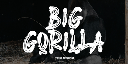 INTRODUCING This is a supercharged font, with natural brush, quick strokes and sharp details. Contains ALL CAPS, numbers, some punctuation and ligature. Perfect for challenging jobs, titles, movie,logos, apparel, t-shirts, hoodies, quotes, product packaging, or anything that needs a typographic turbo-boost and a typographic unique style. Thanks for checking out this font. I hope you enjoy it! AminMario
 - Hennepin by Josh Grzybowski,
$24.99 Hennepin derives from a bridge, a street and a county that share the same name in Minneapolis, MN. It is a serif font comprised of three agile weights: regular, light, and extra light. The character set contains typical OpenType features in addition to small caps, and old style numbers, but most importantly, it embraces stylistic alternatives that unite and complete this font.
 - Aguda by Graviton,
$20.00 Aguda font family has been designed for Graviton Font Foundry by Pablo Balcells in 2014. It is a modular, geometric typeface which has been conceived to be primarily a display typeface, but given its clarity it can also be used for composing short and intermediate length texts. Aguda consists of 8 styles. Each containing small caps and several alternate characters.
 - Night Still Comes by Ana's Fonts,
$16.00 Night Still Comes is a serif font in 4 weights, including italics, and includes over 550 glyphs for each font, including: - A-Z | a-z | 0-9 | Punctuation marks | Accents - Small caps - Ligatures - Old style & lining numbers - Superscript & subscript numbers and letters - Fractions - Swashes With classic and elegant lines, Night Still Comes is perfect for branding, magazines, resumes, and social media posts.
 - Wkwkwk by Motokiwo,
$15.00 Wkwkwk - a strong and bold typeface with inky brush style. This font is great for headline, specially for adventure or travel projects. It's all caps with multilingual support and textured brush strokes will catch every eyes into your projects. Wkwkwk is a word to express "laugh out loud" for Indonesian millennials. I create this font for adventure purpose, that's fun but still stronger.
 - Letter Sketch by Motokiwo,
$15.00 This fun typeface is great for quote, tagline, or headline. Letter Sketch is all caps hand drawn font with two style, rough sketch and filled version. It's have natural drawing feels in each characters and give personal touch to your projects. Letter Sketch Regular : a funky rough pencil sketch font Letter Sketch Bold : the filled version of Letter Sketch Regular
 - Mah Jongg by Bogusky 2,
$10.00No, it's not the complete set but a great way to send out invitations for Mah Jongg Parties, Notices, Posters, Banners and Flyers. Here's a menu of what's contained and take a look at the Character Chart for some close-ups. It may seem complicated but not really. Shift, Alphabet keys will give you caps Mah Jongg characters, tiles beside a letter of the alphabet. The "lower case" alphabet is the same letter font used in the caps but without a tile. The regular keys "1 through 9" are the actual Crack tiles with the correct oriental glyph. Numerals to match the "lower case" are found using Shift and the Number keys. The $ sign is the Forward Slash and the "¢" sign is the Back Slash Dragons: Left & Right brackets Nice One Bam symbols: Shift, Left & Right brackets Hitting Option & the keys, "A,S,F & C" will reveal attractive flower designs. Punctuation, period, comma, quotes, etc. are in their usual locations. You may want to print this menu as a handy guide. The license agreement stipulates that you may disassemble and use elements from this font to create colorful art as in the illustration shown with the font listing. - Turer by Eurotypo,
$28.00 Turer is a display font with a strong artistic personality. It is inspired by some works of Rudolph Koch (1876 - 1934) such as Wallau, Original Neuland or Koch Antiqua. It is characterised by its vertical strokes that thicken towards the ends, which hints at a serif without actually having it. Turer is composed of capitals; the lower case being small caps. It also has a great set of ligatures. Presented in two weight: Regular and Bold.
 - Kernel by JCFonts,
$19.00 Kernel is a square geometric type family in six weights with matching obliques and small caps. The design mixes slightly rounded terminals and shoulders with square counterforms, giving the shapes a strong masculine and futuristic look, great for applications like innovation, technology, sports and of course, sci-fi ! The fonts, delivered in Opentype format, include diacritics for most European languages and come with a variety of Opentype features : two stylistic sets, tabular figures, case-sensitive forms, fractions and more.
 - Trigar by Maulana Creative,
$13.00 Trigar is an all caps font. With 2 style stroke, fun character. To give you an extra creative work. Trigar font support multilingual more than 100+ language. This font is good for logo design, Social media, Movie Titles, Books Titles, a short text even a long text letter and good for your secondary text font with script or handwriting. Make a stunning work with Trigar font. Cheers, Maulana Creative
 - Birthstone by TypeSETit,
$80.00 The Birthstone Family is a set of fonts that are not only diverse but perfectly compatible to interchange styles in a single block of text. There are 3 precious gems: Script, Casual, and Formal. Plus for added luster, there's Bounce (both Medium and Light weights) plus a Titling font— A truncated version that includes caps and ending swashed forms. You won't believe your eyes. All 4 styles are uniquely compatible to one another, but distinctly different. See how easily the fonts may change according to the needs of the look. The Pro version contains the three main styles: Script, Casual and Formal plus the lighter weight version of Bounce. You will also have lots of Opentype feature options.
 - Off The Wall JNL by Jeff Levine,
$29.00Off the Wall JNL is a unique typeface that combines graffiti-style lettering with a brick wall background. special keystroke features give you a complete "wall of text": { (left bracket) places a smaller closed end cap on the left side of the text. } (right bracket) places a medium closed end cap on the right side of the text. [ (left brace) places a regular closed end cap on the left side of the text. ] (right brace places a regular closed end cap on the right side of the text. | (vertical bar key) adds a space between words. \ (backslash) adds a larger space between words. - Burgery by Arterfak Project,
$18.00 Say hello, to Burgery! A playful display font. Inspired by kids' games and snacks typography. Burgery designed in monoline concept and adjusted well to keep the legibility. Burgery is a flexible typeface that you can use for many kinds of stuff and themes. Burgery is an all-caps font, equipped with stylistic alternates, ligatures, Burgery is perfect for kids' merchandise, quotes, t-shirts, posters, social media, pillow, packaging, storybook, food menu, cafe decoration, logos, and much more! Mix and play your words with Burgery!
 - Claremont by Red Rooster Collection,
$45.00Claremont is a serif font family designed by Les Usherwood (Typsettra). Usherwood originally created four weights – a light, extra bold, light italic, and extra bold italic. Paul Hickson (P&P Hickson) and Steve Jackaman (ITF) digitized the family and created eight new weights, and it was released exclusively for the Red Rooster Collection in 1993. Claremont shares similarities to Bookman Old Style, but also shares properties with slab serif Egyptian-style typefaces. Like all Usherwood typefaces, the family was engineered with great care for maximum legibility and aesthetics. ©1993. International TypeFounders, Inc. - Smoothing by Hanzel Space,
$25.00 Smoothing is a stylish modern calligraphic font in an original handwriting style. It's perfect for branding, wedding invitations and cards, and maybe for red wine labels. Smoothing includes a full set of beautiful upper and lower case letters, numbers, a wide variety of punctuation marks and 46 ligatures. All lowercase letters include initial and final strokes, giving a realistic handwritten style. What did you get, honey? Full Set of standard alphabet and punctuation Extra set of ending swashed lowercase Handwritten ligatures Thanks so much for checking out my shop! Happy creating! Cheers! Hanief - Hanzel Space
 - Makise by Motokiwo,
$16.00 Makise is an all caps font created with a natural handwriting brush that was designed to be close to the Japanese calligraphy style. This font very useful for multipurpose projects such as logo, branding, poster, headline, and many more. Makise is easy to use, you don't need special design software to access all characters. It also support standard multilingual characters. I hope you enjoy the font!