10,000 search results
(0.063 seconds)
- Ephemera Shoemakers by Ephemera Fonts,
$30.00 Ephemera Shoemakers is a bold font with spurred serif & medium contrasted, vintage inspiration with letters in all caps. Traditionally this type of decorative font that emerged in Italy, France & England in the nineteenth century were used in large headlines and posters that were closely related to circus shows, carnival or environments of the Far West American. Perfect for signs, posters, handbills and other large format advertising. Ephemera Shoemakers Pdf Specimens
 - Krispiest Signature by Omotu,
$19.00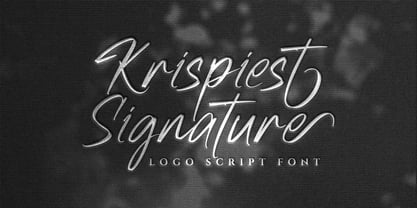 Krispiest Signature! A handwritten script brush font, all caps. Krispiest Signature font is suitable for branding, logotype, apparel, T-shirt, business card, product packaging, quotes, flyer, poster, book cover, advertising, etc. Whats Include? Opentype support Multilingual support PUA encoded Features: Uppercase, lowercase, numerals, punctuations, alternates, and ligatures Thanks for looking, and I hope you enjoy it! Please don't hesitate to drop me a message if you have any issues or queries.
 - Miraversa by Caligrafê,
$15.00 Miraversa is a display font inspired by calligraphic capitals. It's a typeface with characters of remarkable width, delicate serifs, and beautiful contrast. Most of the letterforms are round, with generous curves. It works as charming drop caps, beautiful titles, and nostalgic compositions. You can use this font on book/cover title designs, product labels, logos, posters and stationery. Features: Basic Alphabet All Uppercase and Punctuation Numbers and Symbols Language Support
 - Rowboat by Atlantic Fonts,
$26.00 Rowboat is delightful and dependable. Turn on discretionary ligatures and you will find a salty set of interlocking and double letter combinations. Access interlocking ligatures using all caps. Rowboat Pictures contains 26 original Amy Dietrich seaside illustrations from charming ocean animals to nifty nautical gear.... Go ahead and make a splash! Posters feature images from Atlantic Fonts picture fonts including Eeeek Images , Trailmap Pictures, and of course Rowboat Pictures!
 - Sweet Farm Story by Epiclinez,
$15.00 Sweet Farm Story is an informal and friendly handwritten font that can be used for all chalkboard quotes or teaching material! Its authentic look and feel will add a personal and realistic feel to your designs. This font supports Multi-Languages, including Afrikaans Albanian Catalan Danish Dutch English Estonian Finnish French German Italian Norwegian Portuguese Spanish Swedish Zulu. Features : Basic Latin All Caps Numbers, symbols, and punctuations Thank you
 - Blankone by Arterfak Project,
$16.00 Blankone is a solid freestyle brush font, created with expressive brush strokes, keeping the flows to gives the energetic effect, and get an eye-catchy combination between the uppercase and small caps, also complete with swashes Blankone is perfect for many themes such as urban, thriller, sporty, horror, psychedelic, vibrant, and youth taste! Good choice to use this font for Logo, Merchandise, Brand imagery, Apparel, Packaging, Simple quotes, and many more!
 - Antique Six by Wooden Type Fonts,
$15.00 A revival of one of the popular English Antique styles of the 19th century. The slab serif style was also used by American wood type manufacturers.
 - Mick by Oleg Stepanov,
$12.00 Mick is a hand-drawn typeface inspired by graffiti works of old style. The family contains Regular and Light styles. Cyrillic and extented latin character sets.
 - Antropos - Unknown license

- Rody by Discourse Type,
$5.00 Rody is the inspired by early russian typographic designs and works well with Lazar . It comes with small caps and a range of ligatures.
 - ASTYPE Ornaments Wine Grape A by astype,
$28.00 WineGrape uses the following OpenType features to set up to three different color layers: - Small Caps / changing direction - Superscript/Superior (Grapes) - Subscript/Inferior (Leafs)
 - Aston Script Pro by TRF,
$25.00 Aston Script is a calligraphy script font that comes with very beautiful changing characters, a kind of classic decorative copper script with a modern touch, designed with high detail to bring stylish elegance. Aston Script is attractive as a typeface that is smooth, clean, feminine, sensual, glamorous, simple and very easy to read, because there are many fancy letter connections. I also offer a number of viable style alternatives for many letters. The classic style is perfect to be applied in various formal forms such as invitations, labels, restaurant menus, logos, fashion, make up, stationery, novels, magazines, books, greeting / wedding cards, packaging, labels or any type of advertising purpose. Aston Script has 1330+ glyphs and 1039 alternative characters, including various language support. With OpenType features with alternative styles and elegant ligatures. The OpenType feature does not work automatically, but you can access it manually and for the best results needed for your creativity in combining this Glyph variation. ? New Update, Now the Aston Script font has been updated or has two styles with the Aston Script Bold version.
 - DF Dejavu Pro by Dutchfonts,
$39.00 This font is an orphanage where all the beautiful details of classical grotesque typefaces from the early twentieth century are gathered, and thus living together, are forming a ‘new’, happy family. The aim was to collect my favorite characters in one font. The start was an eclectic collection orientated on British types from the Caslon Doric No. 4, the Monotype Grotesque, the Gill, the Franklin Gothic up to the Transport. In this amalgamation I avoided the narrow apertures in the ‘e’, ‘c’ and in the numerals ‘5’, ‘6’ and ‘9’ and enlarged the x-height dramatically. To the classical slanted form of the italics I added real italic forms for ‘a’, ‘e’ and ‘g’ in order to obtain a more distinguished italic style. DF-Dejavu Pro supports all Latin-based languages (Western, Central-European, Eastern-European, Baltic and Turkish) and includes small capitals, ligatures, inferior & superior numerals and letters, fractions, various numeral styles: proportional lining, tabular lining, proportional old-style, tabular old-style and last but not least a slashed zero.
 - Kompot by VP Creative Shop,
$19.00 Introducing Kompot - This is the Greatest Font... actually typeface with 4 styles Kompot is swirly, vintage typeface with 4 styles to enchant your next project. They are loaded alternate glyphs, ligatures and multilingual support. Very versatile fonts that works great in large and small sizes. Basic latin, advanced latin, basic Cyrillic and advanced Cyrillic character sets are supported! Kompot is perfect for branding projects, home-ware designs, product packaging, magazine headers - or simply as a stylish text overlay to any background image. Uppercase numeral, punctuation & Symbol Regular Styled Outline Styled Outline Alternate glyphs Ligatures Multilingual support Basic and Advanced Cyrillic support How to access alternate glyphs? To access alternate glyphs in Adobe InDesign or Illustrator, choose Window Type & Tables Glyphs In Photoshop, choose Window Glyphs. In the panel that opens, click the Show menu and choose Alternates for Selection. Double-click an alternate's thumbnail to swap them out. Feel free to contact me if you have any questions! Mock ups and backgrounds used are not included. Thank you! Enjoy!
 - Bilya Layered by Cerri Antonio,
$30.00 Since 2010 I started my research and experimentation in layered fonts, and I immediately understood that the future of creative graphic fonts is precisely the exploration of it. Over the years I have tried different expressions on the use of the layered system ... but I realized that my propensity to use colors in the font led me to the creation of BILYA. The real creative cue of BILYA is the wonderful childhood memories where nostalgia for them generated the creation of it, which I dedicate to all lovers of glass marbles classic game and beyond. BILYA Base, Outline, Color One, Two, Three, Four, Five and Color Six is a 8 font system that can be layered in different ways to create infinite title effects used commonly in poster and logo design, in flat gradient color style for spectacular 3D emboss styles or realistic 3D logos design projects. BILYA’s layer combinations give you complete control in producing styles like, modern, 3D, beveled. It can be used alone and/or in layered and allows you adjust leading and kerning. Each font contains the similar metrics, so when your title is set, copy and paste in same position to create different layers styles combinations to build out your desired effect. BILYA works great in any graphics application that allows you to utilize layers or 3D graphics effects.
 - Malik by Zetafonts,
$39.00 Taking its name from the arabic word for "king", Malik is a flared sans serif typeface family designed in 2020 by Andrea Tartarelli. The designer wanted to find a way to bridge the classical letterforms of Roman Old Style typefaces with the readability of contemporary sans typefaces. This was achieved by using the so-called flared serif that emerges gradually from the stem of the letter, ending in a sharp angle. It's something that also reminds of the peculiar shapes of the Simoncini Method, invented by italian type designer Francesco Simoncini to get a sharper definition of letterforms. To this blend of classical elegance and modernist expertise, Malik adds the calligraphic influence of modern masters like Frederic Goudy or Ed Benguiat, visible in signature details like the reverse contrast uppercase B, or the calligraphic lowercase k. Malik also means "owner", and this font surely wants to rule the page. It manages to be extremely readable when used in body text size, but looks surprising and expressive in display use. The inclusion of the Malik Heavy Display weight, with its black texture balanced by deep inktraps, allows for striking logo design. The weight range of the family is extremely wide, including a Book alternative to the Regular weight for fine-tuning readability, a range of light display weights and a solid choice of bold weights for branding, all coming with matching true italics. The 16 cuts of Malik have been equipped with all the features you need to solve your editorial and design challenges, including a wide language coverage (thanks to over one thousand latin and cyrillic characters) and a complete set of open type features (including small capitals, positional numbers, case sensitive forms). Alternate characters and stylistic sets allow you to fine-tune your editorial and branding design by choosing variant letter shapes. Malik is the typeface for everyone who wants to design like a king...or like he doesn't care who the king is!
 - Neuliner by CozyFonts,
$20.00 The Neuliner Family is sleek, condensed, extremely legible & flexible available in 7 styles. The inspiration stems from the classic, slender Art Deco era. Designed with a repeated vertical theme Neuliner is consistent from style to style with variations in weight and character. With over 350 glyphs and applying in over 80 languages with Numerals, Dingbats & Euro accents this family is complete. At the time of its first release Neuliner is available in Medium, Bold, Italic, Outline, Drop, Rough, & Rounded. Other styles are in the works. As displayed in the posters, Neuliner works well, in any style, for headlines, by-lines, logos, titles, posters, signage, billboards, ads, main & end titles, monograms, numbering systems, wedding invites and stationary, etc. The Bold style works congruously with the Outline & Drop styles, for either 'trapped' or 'offset' effects. This family also has its roots and influence in Mid Century influenced architecture and design yet lends its style to contemporary and modern design in the 2020s. The Drop & Rough versions are unique styles that render well in Adobe Illustrator & Adobe Photoshop for use in a myriad of colors and effects. The rough-edged style resembles a stitched and weathered effect, while the drop version plays prominently as headlines in either bright or muted color combinations. The versatile, ever-classic outline style gives any image or photographs an impression of elegance and transparency without sacrificing legibility. Neuliner Rounded embosses and engraves either blindly or foil added with a lasting impression. Neuliner Family from Cozyfonts Foundry.
 - News Nook by Mix Fonts,
$13.00 Introducing NEWS NOOK – a font family that captures the essence of newspaper headlines and front pages, with a rugged twist. This versatile sans-serif pairing is perfect for creating a modern, professional look that is both eye-catching and easy to read. With its unique ruggedness, it makes it stand out and suitable for outdoor designs. The font family includes two distinct styles: NEWS NOOK, a bold headline font, and NEWS NOOK MINI, a thin and stout sans-serif font. Together, they provide a range of options for creating headlines, subheadings, and body text that are sure to grab attention. The headline font is particularly great for creating bold and sturdy design elements. Inspired by the traditional newspaper style, NEWS NOOK brings a touch of nostalgia to any design project. But this font family is not just a replication of traditional newspaper style, it’s more of a modern take on publishing type with a handwritten spin. This makes it perfect for any print project, including magazines, newspapers, and more, creating a polished and professional look that is suitable for outdoor designs. NEWS NOOK (Regular) comes with the following glyphs: ABCDEFGHIJKLMNOPQRSTUVWXYZ abcdefghijklmnopqrstuvwxyz 0123456789 !@#$%^&*()`~♥❤✿•· ÷×+−±≈=≠≥≤[]:;’”,.|/?{}“”‘’-–—_ …‚„©®™‹›«»°¹²³ªº¡¿₱¢€£¥¶§№† ÁÀÂÄÃÅĂĀĄÆĆĈČĊÇÐĐÉÈÊËĖĒĘḞǴĜǦḠĠĤȞḦḢIÍÌÎÏĪĮĴḰǨŁḾṀŃÑŇ ÓÒÔÖÕŌŐØŒṔṖŔŘṘŚŜŠŞȘŤṪȚÚÙÛÜŨŮŬŪŰŲẂẀŴẄẆÝŶŸŹẐŽŻƵ áàâäãåăāąæćĉčċçðđéèêëėēęḟǵĝǧḡġĥȟḧḣıíìîïīįĵḱǩłḿṁńñň óòôöõōőøœṕṗŕřṙśŝšşșťṫțúùûüũůŭūűųẃẁŵẅẇýŷÿźẑžżƶ NEWS NOOK MINI comes with the following glyphs: ABCDEFGHIJKLMNOPQRSTUVWXYZ abcdefghijklmnopqrstuvwxyz 0123456789 !@#$%^&*()`~♥❤✿•· ÷×+−±≈=≠≥≤[]:;’”,.|/?{}“”‘’-–—_ …‚„©®™‹›«»°¹²³ªº¡¿₱¢€£¥¶§№† ÁÀÂÄÃÅĂĀĄÆĆĈČĊÇÐĐÉÈÊËĖĒĘḞǴĜǦḠĠĤȞḦḢIÍÌÎÏĪĮĴḰǨŁḾṀŃÑŇ ÓÒÔÖÕŌŐØŒṔṖŔŘṘŚŜŠŞȘŤṪȚÚÙÛÜŨŮŬŪŰŲẂẀŴẄẆÝŶŸŹẐŽŻƵ áàâäãåăāąæćĉčċçðđéèêëėēęḟǵĝǧḡġĥȟḧḣıíìîïīįĵḱǩłḿṁńñň óòôöõōőøœṕṗŕřṙśŝšşșťṫțúùûüũůŭūűųẃẁŵẅẇýŷÿźẑžżƶ
 - Order by Typodermic,
$11.95 In the world of typography, finding the perfect balance between form and function is the ultimate goal. Enter Order, a condensed, technical plotter-style typeface with Univers proportions that effortlessly marries style and substance. With its contemporary technological aesthetic and octagonal design, Order can blend in seamlessly with the reader’s visual vernacular. But don’t be fooled by its unassuming appearance—this typeface is a powerhouse of precision and consistency. Order’s angular shapes and uniform strokes exude a sense of cold reason that is ideal for technical documents and data-driven content. Its condensed form allows for maximum legibility even at small sizes, making it perfect for charts, graphs, and diagrams. Available in three different weights and italics, Order offers versatility and flexibility that can adapt to any design situation. Whether you’re looking to add a touch of modern sophistication to a branding project or need a reliable font for technical reports, Order is the perfect choice. In a world that demands both style and substance, Order is the typeface that delivers. With its sleek, high-tech look and unparalleled precision, Order will elevate your message and bring a touch of uniformity to your designs. Most Latin-based European writing systems are supported, including the following languages. Afaan Oromo, Afar, Afrikaans, Albanian, Alsatian, Aromanian, Aymara, Bashkir (Latin), Basque, Belarusian (Latin), Bemba, Bikol, Bosnian, Breton, Cape Verdean, Creole, Catalan, Cebuano, Chamorro, Chavacano, Chichewa, Crimean Tatar (Latin), Croatian, Czech, Danish, Dawan, Dholuo, Dutch, English, Estonian, Faroese, Fijian, Filipino, Finnish, French, Frisian, Friulian, Gagauz (Latin), Galician, Ganda, Genoese, German, Greenlandic, Guadeloupean Creole, Haitian Creole, Hawaiian, Hiligaynon, Hungarian, Icelandic, Ilocano, Indonesian, Irish, Italian, Jamaican, Kaqchikel, Karakalpak (Latin), Kashubian, Kikongo, Kinyarwanda, Kirundi, Kurdish (Latin), Latvian, Lithuanian, Lombard, Low Saxon, Luxembourgish, Maasai, Makhuwa, Malay, Maltese, Māori, Moldovan, Montenegrin, Ndebele, Neapolitan, Norwegian, Novial, Occitan, Ossetian (Latin), Papiamento, Piedmontese, Polish, Portuguese, Quechua, Rarotongan, Romanian, Romansh, Sami, Sango, Saramaccan, Sardinian, Scottish Gaelic, Serbian (Latin), Shona, Sicilian, Silesian, Slovak, Slovenian, Somali, Sorbian, Sotho, Spanish, Swahili, Swazi, Swedish, Tagalog, Tahitian, Tetum, Tongan, Tshiluba, Tsonga, Tswana, Tumbuka, Turkish, Turkmen (Latin), Tuvaluan, Uzbek (Latin), Venetian, Vepsian, Võro, Walloon, Waray-Waray, Wayuu, Welsh, Wolof, Xhosa, Yapese, Zapotec Zulu and Zuni.
 - FF Hertz by FontFont,
$68.99 Low stroke contrast, generous spacing, and fine-grained weights from Light to Extra Bold make FF Hertz a workhorse text typeface which holds up well under today’s widely varying output conditions from print to screen. The quite dark Book style works well on e-ink displays which usually tend to thin out letters, as well as in print when you want to evoke the solid letter image of the hot-metal type era. Two sizes of Small Caps are included: A larger size for abbreviations and acronyms, and a smaller size matching the height of the lowercase letters. FF Hertz is a uniwidth design, that means each letter occupies the same space in all weights. This feature allows the user to switch between weights (but not between Roman and Italic styles) without text reflow. Jens Kutilek began work on FF Hertz in 2012. From a drawing exercise on a low-resolution grid (a technique proposed by Tim Ahrens to avoid fiddling with details too early), it soon evolved into a bigger project combining a multitude of influences which up until that point had only been floating around in his head, including his mother’s 1970s typewriter with its wonderful numbers, Hermann Zapf’s Melior as well as his forgotten Mergenthaler Antiqua (an interpretation of the Modern genre), and old German cartographic lettering styles. Jens likes to imagine FF Hertz used in scientific books or for an edition of Lovecraftian horror stories.
 - Quercus 10 by Storm Type Foundry,
$69.00 Quercus is characterised by open, yet a little bit condensed drawing with sufficient spacing so that the neighbouring letters never touch. It has eight interpolated weights with respective italics. Their fine gradation allows to find an exact valeur for any kind of design, especially on the web. Quercus serif styles took inspiration from classicistic typefaces with vertical shadows, ball terminals and thin serifs. The italics have the same width proportion as upright styles. This “modern” attitude is applied to both families and calls for use on the same page, e g in dictionaries and cultural programmes. Serif styles marked by “10” are dedicated to textual point sizes and long reading. The sans-serif principle is rather minimalistic, with subtle shadows and thinned joints between curved shapes and stems. Quercus family comprises of the usual functionality such as Small Caps, Cyrillics, diacritics, ligatures, scientific and aesthetic variants, swashes, and other bells & whistles. It excels in informational and magazine design, corporate identity and branding, but it’s very well suited for book covers, catalogues and posters as well. When choosing a name for this typeface I've been staring out from my studio window, thinking helplessly without any idea in sight. Suddenly I realised that all I can see is a spectacular alley of oaks (Quercus in Latin) surrounding my house. These oaks were planted by the builders of local ponds under the leadership of Jakub Krčín in the fifteenth century.
 - Quercus Whiteline by Storm Type Foundry,
$69.00 Quercus is characterised by open, yet a little bit condensed drawing with sufficient spacing so that the neighbouring letters never touch. It has eight interpolated weights with respective italics. Their fine gradation allows to find an exact valeur for any kind of design, especially on the web. Quercus serif styles took inspiration from classicistic typefaces with vertical shadows, ball terminals and thin serifs. The italics have the same width proportion as upright styles. This “modern” attitude is applied to both families and calls for use on the same page, e g in dictionaries and cultural programmes. Serif styles marked by “10” are dedicated to textual point sizes and long reading. The sans-serif principle is rather minimalistic, with subtle shadows and thinned joints between curved shapes and stems. Quercus family comprises of the usual functionality such as Small Caps, Cyrillics, diacritics, ligatures, scientific and aesthetic variants, swashes, and other bells & whistles. It excels in informational and magazine design, corporate identity and branding, but it’s very well suited for book covers, catalogues and posters as well. When choosing a name for this typeface I've been staring out from my studio window, thinking helplessly without any idea in sight. Suddenly I realised that all I can see is a spectacular alley of oaks (Quercus in Latin) surrounding my house. These oaks were planted by the builders of local ponds under the leadership of Jakub Krčín in the fifteenth century.
 - Quercus Serif by Storm Type Foundry,
$69.00 Quercus is characterised by open, yet a little bit condensed drawing with sufficient spacing so that the neighbouring letters never touch. It has eight interpolated weights with respective italics. Their fine gradation allows to find an exact valeur for any kind of design, especially on the web. Quercus serif styles took inspiration from classicistic typefaces with vertical shadows, ball terminals and thin serifs. The italics have the same width proportion as upright styles. This “modern” attitude is applied to both families and calls for use on the same page, e g in dictionaries and cultural programmes. Serif styles marked by “10” are dedicated to textual point sizes and long reading. The sans-serif principle is rather minimalistic, with subtle shadows and thinned joints between curved shapes and stems. Quercus family comprises of the usual functionality such as Small Caps, Cyrillics, diacritics, ligatures, scientific and aesthetic variants, swashes, and other bells & whistles. It excels in informational and magazine design, corporate identity and branding, but it’s very well suited for book covers, catalogues and posters as well. When choosing a name for this typeface I've been staring out from my studio window, thinking helplessly without any idea in sight. Suddenly I realised that all I can see is a spectacular alley of oaks (Quercus in Latin) surrounding my house. These oaks were planted by the builders of local ponds under the leadership of Jakub Krčín in the fifteenth century.
 - Quercus Sans by Storm Type Foundry,
$69.00 “Quercus” is characterised by open, yet a little bit condensed drawing with sufficient spacing so that the neighbouring letters never touch. It has eight interpolated weights with respective italics. Their fine gradation allows to find an exact valeur for any kind of design, especially on the web. Quercus serif styles took inspiration from classicistic typefaces with vertical shadows, ball terminals and thin serifs. The italics have the same width proportion as upright styles. This “modern” attitude is applied to both families and calls for use on the same page, e g in dictionaries and cultural programmes. Serif styles marked by “10” are dedicated to textual point sizes and long reading. The sans-serif principle is rather minimalistic, with subtle shadows and thinned joints between curved shapes and stems. Quercus family comprises of the usual functionality such as Small Caps, Cyrillics, diacritics, ligatures, scientific and aesthetic variants, swashes, and other bells & whistles. It excels in informational and magazine design, corporate identity and branding, but it’s very well suited for book covers, catalogues and posters as well. When choosing a name for this typeface I've been staring out from my studio window, thinking helplessly without any idea in sight. Suddenly I realised that all I can see is a spectacular alley of oaks (Quercus in Latin) surrounding my house. These oaks were planted by the builders of local ponds under the leadership of Jakub Krčín in the fifteenth century.
 - Fonzie by Jehoo Creative,
$- Fonzie redefining versatility. With four charming styles seamlessly blended together, it offers the perfect balance between tradition and innovation. Fonzie's basic style embodies timeless elegance with a Space-saving Condensed form with a modern twist. The SS01 explores futuristic aesthetics with a geometric style, or embraces the sophistication and form of the Extended with the SS02 features, and for the SS03 it is added for those of you who like the extreme extended style that is now a trend.
 - Corda by Hoftype,
$39.00 Corda – an elegant serif family with an easygoing, flowing ductus. It is semi-contrasted and even in the heavier styles appears light and breezy. Pleasant for reading and in display sizes very attractive. Corda comes in ten styles, in OpenType format and with extended language support for more than 40 languages. All weights contain standard and discretionary ligatures, proportional lining figures, tabular lining figures, proportional old style figures, lining old style figures, matching currency symbols, fraction- and scientific numerals.
 - Kara by Mostardesign,
$19.00 Designed in 2012 by Olivier Gourvat, this font family is inspired by the euskaran (basque language) font. Redesigned with modernism, this new font respects the traditional euskara language with lowercase addition. These nuances give Kara a traditional appearance for both text and headlines, but can be used for many more applications such as titles, decoration, posters, cartoons... Kara Text & Display support a wide range of languages, with more than 500 glyphs and OpenType features like case-sensitive forms, contextual alternatives, stylistic alternates, fractions, proportional and tabular figures. With its 2 fonts, Kara is an ideal font family for text, brand identity, signage, print and web design.
 - Hideko by Khaito Gengo,
$29.00 Hideko is a visually unique font that has the essence of both serif and san-serif fonts through integrating the body structure of san-serif while retaining the calligraphy from serif. Hideko was inspired by synthesizing Japanese calligraphy and western letters. During the process of creating Hideko, I attempted to make a font only for oriental use, but the result is a font with versatile uses. This multicultural font is most effectively used for oriental restaurants but is also ideal for western cafes, posters, books, etc. Along with the cultural synthesis of Japanese and western letters, Hideko features various ligatures, stylistic alternates, fractions, and languages as well.
 - Printout by Hanoded,
$15.00 Font naming is not all that difficult. Take Printout for example. I was busy working on this font, when my niece came over with a poem she needed to have printed. One of her classmates had the same request (they’re writing poems for our national Remembrance Day). As I was printing out these poems, I thought the name Printout would be perfect for the font I was working on. See? It’s not rocket science! Printout is a totally awesome, completely handmade font. I used an almost dried out Japanese brush pen to get the eroded effect. Maybe I should name my next font ‘Dried Out Brush Pen’? I’ll let you know.
 - Young Baroque by ITC,
$29.99Young Baroque was designed by Doyald Young, and the font first appeared in the ITC library in 1984. It is a delicate and elegant typeface, whose basic forms are those of baroque script. The generous spirals adorning the capital letters give the font its temperament and contrast beautifully with the small, heavily slanted lower case letters. The flowing, graceful characters create an overall image of aristocratic elegance and dignity. This font can be used advantageously for labels, invitations and certificates and its capitals as initials to contrast harmoniously with both serif and sans serif fonts. Young Baroque is best used for headlines or short texts. Featured in: Best Fonts for Tattoos - The Customs by Abo Daniel,
$23.00 Proudly Present THE CUSTOMS -Luxury Bold Signature Font- After going through a long process, finally, this stunning signature font is finished and released. This font is made with an extra careful process. THE CUSTOMS is designed for professional projects. It's great for logos, branding, business cards, flyers, posters, photography, t-shirts, watermark, and anything your projects that need elegant touch. 353 HANDWRITTEN LIGATURES I made 353 ligatures to keep this font look more natural and very user-friendly. you can see them in display pictures. FEATURES Uppercase Lowercase Number & Punctuations 353 Ligatures PUA Encoded Please enjoy this stunning signature font. I hope you love it regards, Abo Daniel Studio
 - Ah, the Art-Nouveau 1895 font, a typeface that whispers of a bygone era, as if it was plucked right out of a Parisian cafe where the clientele discuss philosophy and the latest Toulouse-Lautrec. Desi...
- Aaux Next Wide by Positype,
$22.00 When the original Aaux was introduced in 2002, I intended to go back and expand the family to offer more versatility. Years went by before I was willing to pick it up again and invest the proper time into building a viable and useful recut. Just putting a new designation and tweaking a few glyphs here and there would not do the designer or the typeface justice; instead, I chose to redraw each glyph's skeleton from scratch for the four main subsets of the super family along with their italics. Each glyph across the super family is 'connected at the hip' with each style—each character carries the no frills, simple architecture that endeared so many users to it. The new recut expands the family to an enormous 72 typefaces! The original has spawned Compressed, Condensed and Wide subsets—all with corresponding weights—for complete flexibility. Additionally, all of the original weight variants have all been incorporated within the OpenType shell: Small Caps and Old Style Figures are there along with new tabular figures, numerators and denominators, expanded f-ligatures and a complete Central European character set.
 - Aaux Next by Positype,
$22.00 When the original Aaux was introduced in 2002, I intended to go back and expand the family to offer more versatility. Years went by before I was willing to pick it up again and invest the proper time into building a viable and useful recut. Just putting a new designation and tweaking a few glyphs here and there would not do the designer or the typeface justice; instead, I chose to redraw each glyph's skeleton from scratch for the four main subsets of the super family along with their italics. Each glyph across the super family is 'connected at the hip' with each style—each character carries the no frills, simple architecture that endeared so many users to it. The new recut expands the family to an enormous 72 typefaces! The original has spawned Compressed, Condensed and Wide subsets—all with corresponding weights—for complete flexibility. Additionally, all of the original weight variants have all been incorporated within the OpenType shell: Small Caps and Old Style Figures are there along with new tabular figures, numerators and denominators, expanded f-ligatures and a complete Central European character set.
 - Geographica by Three Islands Press,
$29.00 Thomas Jefferys (ca. 1710–1771) was the best-known map maker in 18th-century England, chiefly because he won (and hyped) the title “Geographer to King George III.” Jefferys was really more an engraver/publisher than a geographer, since he mostly relied on the cartographic materials of others. Still, his maps of the North American colonies were well known. Geographica is a legible, four-style serif family modeled after the neat hand-lettered place names and peripheral text on Jefferys’s maps. With its long serifs, tall x-height, and robust curves, Geographica somehow combines classic elegance with a whiff of coastline and sea. The italic styles have the slant and warmth of the hand-drawn source materials. And the typeface comes with a slew of distinctive map-based ornaments—including compass wheels and sailing ships. This evocative serif works well in both display situations and long blocks of text, whether on paper or screen. OpenType features include small capitals, numerous ligatures, and two stylistic sets of titling caps. Geographica offers full support for Central and Eastern European languages—more than 1,200 glyphs in all.
 - Helios Antique by W Type Foundry,
$25.00 Helios Antique & Helios Stencil Check our PDF specimen for more details Helios type family is the result of a mixture between the early sans serif and the modern trends of our era. Its rational structure is subtly wider than the majority of the first sans, generating a higher impact in its uses. All the typeface terminals are more open in order to balance better the whites and blacks of Helios, and where the strokes meet it has a deeper contrast giving more legibility to the reader. Furthermore, in some letters it is possible to see some prominent features such as the leg of the "R" and the tail of the "Q", which are particular gestures that identify this type family. Helios Stencil is the tough version of this type family. All the stencil gaps were measured rigorously, thus in small sizes it conveys a neutral aesthetic whereas in big sizes a display logic appears. Helios Antique is composed by 36 styles, 782 glyphs and small caps. Besides, it has powerful OpenType features for each style, including alternates characters, ligatures, fractions, special numbers, arrows, extended language support and many more.
 - Aaux Next Cond by Positype,
$22.00 When the original Aaux was introduced in 2002, I intended to go back and expand the family to offer more versatility. Years went by before I was willing to pick it up again and invest the proper time into building a viable and useful recut. Just putting a new designation and tweaking a few glyphs here and there would not do the designer or the typeface justice; instead, I chose to redraw each glyph's skeleton from scratch for the four main subsets of the super family along with their italics. Each glyph across the super family is 'connected at the hip' with each style—each character carries the no frills, simple architecture that endeared so many users to it. The new recut expands the family to an enormous 72 typefaces! The original has spawned Compressed, Condensed and Wide subsets—all with corresponding weights—for complete flexibility. Additionally, all of the original weight variants have all been incorporated within the OpenType shell: Small Caps and Old Style Figures are there along with new tabular figures, numerators and denominators, expanded f-ligatures and a complete Central European character set.
 - Aaux Next Comp by Positype,
$22.00 When the original Aaux was introduced in 2002, I intended to go back and expand the family to offer more versatility. Years went by before I was willing to pick it up again and invest the proper time into building a viable and useful recut. Just putting a new designation and tweaking a few glyphs here and there would not do the designer or the typeface justice; instead, I chose to redraw each glyph's skeleton from scratch for the four main subsets of the super family along with their italics. Each glyph across the super family is 'connected at the hip' with each style—each character carries the no frills, simple architecture that endeared so many users to it. The new recut expands the family to an enormous 72 typefaces! The original has spawned Compressed, Condensed and Wide subsets—all with corresponding weights—for complete flexibility. Additionally, all of the original weight variants have all been incorporated within the OpenType shell: Small Caps and Old Style Figures are there along with new tabular figures, numerators and denominators, expanded f-ligatures and a complete Central European character set.
 - Ratherbe by Zane Studio,
$15.00 Ratherbe is a new modern brush font with an irregular baseline. A contemporary approach to design, natural handmade, suitable for use in designs for clothing, invitations, book titles, stationery designs, quotes, branding, logos, greeting cards, T-shirts, packaging designs, posters, and more. Complete with upper and lower case letters, and multi-language support, numbers, punctuation and several ligature. Thank you very much for searching and letting me know if you have questions.
 - ITC Atmosphere by ITC,
$29.00The Algerian designer Taouffik Semmad created the fonts in 1997. Taouffik Semmad grew up speaking Algerian-Arabic dialect and French, studied Russian, and is now living in Montreal. This could perhaps explain his current passion, to "find a universal writing", which he admits is a Utopian idea. Created with brush and Chinese ink, the characters of ITC Atmosphere came from Semmad's hand but only after they were fully formed in his mind's eye.
