10,000 search results
(0.038 seconds)
- Edifact by Typodermic,
$11.95 Welcome to the world of Edifact, a damaged display typeface that’s here to shake things up! With its roots in the magnetic ink lettering of the 1960s, this typeface is all about breaking the rules and forging a new path forward. But Edifact isn’t just any old font. Oh no, it’s so much more than that! With OpenType ligatures, you can unlock a world of custom combos that will bring a whole new level of realism to your work. And let’s be honest, who doesn’t love a little bit of extra pizzazz? But the real magic of Edifact lies in its unique blend of retro-futurism and post-apocalyptic roughness. This typeface isn’t afraid to get its hands dirty, and it’s not afraid to take risks. With Edifact, your message will stand out from the crowd and grab your audience’s attention like never before. So don’t be shy—embrace the wild, post-apocalyptic world of Edifact and let your creativity run wild! Most Latin-based European writing systems are supported, including the following languages. Afaan Oromo, Afar, Afrikaans, Albanian, Alsatian, Aromanian, Aymara, Bashkir (Latin), Basque, Belarusian (Latin), Bemba, Bikol, Bosnian, Breton, Cape Verdean, Creole, Catalan, Cebuano, Chamorro, Chavacano, Chichewa, Crimean Tatar (Latin), Croatian, Czech, Danish, Dawan, Dholuo, Dutch, English, Estonian, Faroese, Fijian, Filipino, Finnish, French, Frisian, Friulian, Gagauz (Latin), Galician, Ganda, Genoese, German, Greenlandic, Guadeloupean Creole, Haitian Creole, Hawaiian, Hiligaynon, Hungarian, Icelandic, Ilocano, Indonesian, Irish, Italian, Jamaican, Kaqchikel, Karakalpak (Latin), Kashubian, Kikongo, Kinyarwanda, Kirundi, Kurdish (Latin), Latvian, Lithuanian, Lombard, Low Saxon, Luxembourgish, Maasai, Makhuwa, Malay, Maltese, Māori, Moldovan, Montenegrin, Ndebele, Neapolitan, Norwegian, Novial, Occitan, Ossetian (Latin), Papiamento, Piedmontese, Polish, Portuguese, Quechua, Rarotongan, Romanian, Romansh, Sami, Sango, Saramaccan, Sardinian, Scottish Gaelic, Serbian (Latin), Shona, Sicilian, Silesian, Slovak, Slovenian, Somali, Sorbian, Sotho, Spanish, Swahili, Swazi, Swedish, Tagalog, Tahitian, Tetum, Tongan, Tshiluba, Tsonga, Tswana, Tumbuka, Turkish, Turkmen (Latin), Tuvaluan, Uzbek (Latin), Venetian, Vepsian, Võro, Walloon, Waray-Waray, Wayuu, Welsh, Wolof, Xhosa, Yapese, Zapotec Zulu and Zuni.
 - Brazarri Pro AOE by Astigmatic,
$24.00 The Brazzari Pro AOE is an unusual but fun geometric typestyle design. It is the historical revival and elaboration of the "Bizarre" typeface created by MacKellar, Smiths, & Jordan Co. in 1884. What began as a basic character set of Capitals, lowercase, numerals, and a small handful of punctuation characters has been expanded to a full character set including unlimited fractionals, superiors & inferiors, ordinals, tabular & proportional figures, and an expanded language glyph set, all with a smallcaps and Caps to Smallcap set to match. Definitely a niché use typeface, however, it has some great appeal. The letterforms of Brazarri Pro AOE are easy to convert to paths and extend various stems, making this revival something you can really let your imagination run wild with for your designs. WHAT'S INCLUDED: Enable the Stylistic Alternates feature for standardized letterforms without the extensions. Extensive language support. Invocation has accented and special characters that support the following languages: Afrikaans, Albanian, Basque, Bosnian, Breton, Catalan Cornish, Corsican, Croatian, Czech, Danish, Dutch, Embu, English, Esperanto, Estonian, Faroese, Filipino, Finnish, French, Galician, German, Hungarian, Icelandic, Irish, Indonesian, Italian, Kurdish, Leonese, Luxenbourgish, Malay, Maltese, Manx, Maori, Meru, Morisyen, North Ndebele, Norwegian Bokmål, Norwegian Nynorsk, Nyankole, Occitan, Oromo, Polish, Portuguese, Rhaeto-Romanic, Romanian, Scottish Gaelic, Scots, Serbian (Latin), Slovak, Slovenian, Spanish, Swahili, Swedish, Tagalog, Turkish, Walloon, & Welsh. One of my guilty pleasures is in taking the time to recreate historical typefaces as digital fonts, and expand on their character sets to enable them to be used more widely than their limited originals. A lot of incredible historical typestyles created as wood or metal type with bare bones character sets have been lost or only exist as limited specimen proofs in old books. These typefaces may have more niché uses than modern typefaces, but I believe it is important nonetheless to preserve these typefaces for future generations. These typefaces, if nothing else, can often inspire new creations.
 - Nagomi by Typodermic,
$11.95 Introducing Nagomi, a stunning brush display typeface that boasts a uniquely beautiful aesthetic. With its delicate strokes and flowing lines, this typeface brings a sense of tranquility and serenity to any design. Whether you’re working on a digital project or crafting something by hand, Nagomi is sure to enhance your work with its natural, organic feel. One of the standout features of Nagomi is its natural design. This typeface captures the essence of nature with its graceful curves and understated elegance. Its brush strokes evoke the feeling of leaves rustling in the wind or the gentle flow of a stream. When you use Nagomi in your designs, you’ll feel as if you’re bringing a touch of the natural world to your work. But Nagomi is more than just a typeface—it’s an experience. Its subtle beauty and gentle charm make it a true joy to use. Whether you’re designing a logo, creating a poster, or crafting a handwritten note, Nagomi will help you express yourself with grace and ease. So why not try Nagomi today and discover the natural beauty for yourself? Most Latin-based European writing systems are supported, including the following languages. Afaan Oromo, Afar, Afrikaans, Albanian, Alsatian, Aromanian, Aymara, Bashkir (Latin), Basque, Belarusian (Latin), Bemba, Bikol, Bosnian, Breton, Cape Verdean, Creole, Catalan, Cebuano, Chamorro, Chavacano, Chichewa, Crimean Tatar (Latin), Croatian, Czech, Danish, Dawan, Dholuo, Dutch, English, Estonian, Faroese, Fijian, Filipino, Finnish, French, Frisian, Friulian, Gagauz (Latin), Galician, Ganda, Genoese, German, Greenlandic, Guadeloupean Creole, Haitian Creole, Hawaiian, Hiligaynon, Hungarian, Icelandic, Ilocano, Indonesian, Irish, Italian, Jamaican, Kaqchikel, Karakalpak (Latin), Kashubian, Kikongo, Kinyarwanda, Kirundi, Kurdish (Latin), Latvian, Lithuanian, Lombard, Low Saxon, Luxembourgish, Maasai, Makhuwa, Malay, Maltese, Māori, Moldovan, Montenegrin, Ndebele, Neapolitan, Norwegian, Novial, Occitan, Ossetian (Latin), Papiamento, Piedmontese, Polish, Portuguese, Quechua, Rarotongan, Romanian, Romansh, Sami, Sango, Saramaccan, Sardinian, Scottish Gaelic, Serbian (Latin), Shona, Sicilian, Silesian, Slovak, Slovenian, Somali, Sorbian, Sotho, Spanish, Swahili, Swazi, Swedish, Tagalog, Tahitian, Tetum, Tongan, Tshiluba, Tsonga, Tswana, Tumbuka, Turkish, Turkmen (Latin), Tuvaluan, Uzbek (Latin), Venetian, Vepsian, Võro, Walloon, Waray-Waray, Wayuu, Welsh, Wolof, Xhosa, Yapese, Zapotec Zulu and Zuni.
 - Cori by HiH,
$8.00 You wrote on your school notebooks, didn't you. Of course, just about everyone did. And those that didn't are probably in therapy trying to overcome the repression and guilt. Balloon letters are fun, easy to draw and have a light-hearted presence. With little autonomy, what young person can resist the opportunity to make a public, personal statement on their notebook. Guess what! Adults do it too - with our cars, our houses, our toys, our accessories and so on. And how "grown-up" are we really? Anyway, my niece, Cori, made this nice, colorful, hand-drawn birthday card. It was so vibrant and fun - in warm circus colors - that I could not resist making it into a font. Use it for positive, fun stuff, stuff with a light touch - an invitation for an informal party perhaps, but probably not a formal dinner at the White House. This font is not comfortable in a bowtie. But don't be fooled. Casual as Cori is, you can set at least twelve major European languages with it, in addition to English: Albanian, Danish, Dutch, Finnish, French, German, Hungarian, Italian, Norwegian, Portuguese, Spanish and Swedish. Cori Valentine adds a decorative Valentine border to the upper case of Cori. By leaving out the bow in the upper center of the border we were able to fit the border around the accented caps. Similarly, we omitted the butterfly for the Ccedilla glyph. Blank versions of the regular border & the bowless border are provided at positions 135 & 137 in case you want to put a border around your signature or something like that. Just for reference, the letterforms for Cori Valentine are 75% the size as the regular Cori font. We would like to assure you that it is permissible to use Cori Valentine to create a romantic card, flyer or note during any month with less the 32 days.
 - Periodico by Emtype Foundry,
$69.00 Periódico (newspaper in Spanish), was originally commissioned by the Spanish daily newspaper ABC. Inspired by old Spanish typographic engravings, mostly from the second half of the 18th Century, we picked out the most relevant details of Spanish typography as the source of that inspiration, and instead of making a revival or an interpretation of these models, we started from scratch to create a truly original font family. The goal was to achieve a very distinctive family, functional and versatile at the same time, and reminiscent of old Spanish typography. Although we have borrowed many details from the old Spanish typography, like the nail, which is present in the letters U, G, or J, which we worked and evolved in order to be applied on other letters, we have also left behind several others. One example is the tilde of the ñ engraved by Gerónimo Gil, a very distinctive element of Spanish typography that was intentionally omitted for being too atypical to be used in a contemporary font. The letters a and g are probably the most distinctive of the Periódico family. The shape of the bowl in the letter a, with the top arch in diagonal position, is very characteristic of old Spanish types. In Periódico, we emphasized this detail by applying it to many other letters (such as g, j, and t) up to a point that it became the leitmotiv of this family. The formal finish of serifs and terminals is something that gives great personality to any typeface, so we came up with plenty of alternatives in order to find the exact shape we wanted: sober, elegant, and contemporary. Even though the serifs are geometric, the upper terminals have a curve with a dynamic very similar to the arch in the a or the notch in the j. The terminals in the capitals follow the same style, but, in this case, the inspiration comes from Pradell’s Missal, which on the other hand has been influenced by the types engraved by Johann Michael Fleischman in the Netherlands. Eighteenth-Century types were mostly used for printing books. Therefore, they had very generous proportions (large ascendents and descendants) and high contrast, but today, these characteristics do not work well in newspapers because of the worldwide demand for more space-saving fonts. The adaptation of the type’s proportions to be used for a newspaper was one of the most interesting parts of the project, specially the time taken to find the perfect balance between the x height\ and legibility. Periódico is presented in 30 different styles, for a total of 30 fonts—10 for text (from Light to Bold) and 20 for display sizes (from Thin to Ultra Black); this family results in an extensive system capable of solving all the needs of a large publication.
 - Wakefield by Galapagos,
$39.00A gentle breeze caressed his face as his body took on the easy posture of a dancer on break. Flickering sparklets of light sprinkled the glass-smooth surface of the aqua liquid on which he floated. His mind wandered; he was only days away from his scheduled departure date. This day was no different from a hundred other days he had spent melded to his windsurfer, skittering along the breadth of the modest lake, soaking up the sun's rays and forgetting about the entire rest of the world. Lake Quannapowitt, and the town of Wakefield, Massachusetts, were familiar to Steve, a long-time resident of the picturesque New England town. This is where he grew up; this is where he married and lived for many years; and this is the place he was preparing to leave, not one week hence. Not generally prone to nostalgia, it was in just such a state he nonetheless found himself once Zephyrus retreated, as was his custom, periodically, while patrolling the resplendent lake. Steve was going to miss the lake, and he was going to miss the town. How many hours of how many days had he spent exactly like this, standing on his motionless board, waiting for his sail to fill, and staring at the lake's shores, its tiny beach, the town Common with its carefully maintained greenery, and equally well-tended gazebo, the Center church - its spire shadow piercing the water's edge, like a scissor-cut the better to begin a full-fabric tear? Yes, he was going to miss this place - this town which all of a sudden had become a place out of time, just as he was about to become a person out of place. Once this idea struck him, he couldn't shake it. He was transported back in time four score years, now watching his ancestors walk along the shore. Nothing in view belied this belief - not the church's century old architecture, not the gazebo frozen in time, nor the timeless sands of the beach, nor the unchanging Common. Everything belonged exactly where it was, and where it always would be. This, he decided, was how he would remember his hometown. And this is when it occurred to Steve to design a typeface that would evoke these images and musings - a typeface with an old-fashioned look, reflected in high crossbars, an x-height small in size relative to its uppercase, and an intangible quality reminiscent of small-town quaintness. Wakefield, the typeface, was born on Lake Quannapowitt in the town for which it was named, shortly before Steve moved away. It is at once a tribute to his birthplace and a keepsake. - Adama MF by Masterfont,
$59.00 This font is unique by its calligraphic flow and contrast, enabling traditional typeface gain a new and clear flow and rhythm, while preserving the nib strokes.
 - FT Supervisor by Fenotype,
$29.95 Supervisor is a compact and tough retro font. The font has small caps and plenty of automatic ligatures. Supervisor will rock your record covers and posters.
 - Allegro by Bitstream,
$29.99A typeface with characteristics of roman and italic, fat face and stencil, modern and script. It was designed by Hans Bohn for Ludwig & Mayer in 1936. - Triangle by Suomi,
$30.00 A family with retro feel in four weights, Roman and Italic, all with Old Style Numerals and Small Caps, for both headlines and body text use.
 - Alien Segment by PizzaDude.dk,
$20.00Alien Segment has got rounded corners and even though being built up upon geometry, it deserves rich text - and works well in both upper- and lowercase. - Knappast by Cercurius,
$19.95 Sans-serif reversed capitals in circles, resembling typewriter keys. The font can be used for logos, signs and labels, and for markings on maps and charts.
 - TXT HunkaSpunk by Illustration Ink,
$3.00The name says it all. HunkaSpunk is whimsical, eye-catching, and fun. Download and use this cool TrueType font for lively scrapbook journaling and paper crafting. - Swirly by Trim Studio,
$12.00 Swirly is a cute handwritten font to share happy, loving, and cheerful vibes and moments in life like Easter, Valentine, Christmas, and for many other occasions.
 - Tip by Suomi,
$40.00 New, slightly calligraphic sans family with seven weights, Roman and Italic, all with Old Style Numerals and Small Caps, for both headlines and body text use.
 - BB book A by bb-bureau,
$65.00 bb-book A — breaking rules typeface Expressive book serif (triangular and curved) kicking up weight, width and contrast — in 4 styles: light, regular, medium and bold.
 - Merendina by Resistenza,
$29.00 Merendina has a geometric construction with an handwritten touch. This family contains regular and slanted and 6 weights. Do not miss all the alternates and swashes.
 - AvéAvé BB by Blambot,
$20.00Mix and match the upper and lowercase keys to access swash and non-swash letters in this unconventional serif font with a plethora of European characters. - Brown Peanut by Illushvara,
$14.00 Brown Peanut is a cute and colorful display font. It embodies playfulness and authenticity and is the perfect choice for any children activity or school project.
 - Cad by NicolassFonts,
$- CAD is brilliantly suited for graphic design and display use and perfect for logotypes, t-shirts, packaging, brand identity, books, magazines, newspapers, posters, billboards, and advertising.
 - Hebrew Saphire Std by Samtype,
$59.00 Beautiful font, good for posters, books, and folders. This is a complete font with all Nikud and also Shevana, Kamatz Katan, Dagesh Chazak, and Holam chaser.
 - Gaspa by La Boîte Graphique,
$19.00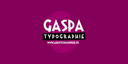 Fanciful, funny, hand-writting, decorative
 - ITC Johnston by ITC,
$29.00ITC Johnston is the result of the combined talents of Dave Farey and Richard Dawson, based on the work of Edward Johnston. In developing ITC Johnston, says London type designer Dave Farey, he did “lots of research on not only the face but the man.” Edward Johnston was something of an eccentric, “famous for sitting in a deck chair and carrying toast in his pockets.” (The deck chair was his preferred furniture in his own living room; the toast was so that he’d always have sustenance near at hand.) Johnston was also almost single-handedly responsible, early in this century, for the revival in Britain of the Renaissance calligraphic tradition of the chancery italic. His book Writing & Illuminating, & Lettering (with its peculiar extraneous comma in the title) is a classic on its subject, and his influence on his contemporaries was tremendous. He is perhaps best remembered, however, for the alphabet that he designed in 1916 for the London Underground Railway (now London Transport), which was based on his original “block letter” model. Johnston’s letters were constructed very carefully, based on his study of historical writing techniques at the British Museum. His capital letters took their form from the best classical Roman inscriptions. “He had serious rules for his sans serif style,” says Farey, “particularly the height-to-weight ratio of 1:7 for the construction of line weight, and therefore horizontals and verticals were to be the same thickness. Johnston’s O’s and C’s and G’s and even his S’s were constructions of perfect circles. This was a bit of a problem as far as text sizes were concerned, or in reality sizes smaller than half an inch. It also precluded any other weight but medium ‘ any weight lighter or heavier than his 1:7 relationship.” Johnston was famously slow at any project he undertook, says Farey. “He did eventually, under protest, create a bolder weight, in capitals only ‘ which took twenty years to complete.” Farey and his colleague Richard Dawson have based ITC Johnston on Edward Johnston’s original block letters, expanding them into a three-weight type family. Johnston himself never called his Underground lettering a typeface, according to Farey. It was an alphabet meant for signage and other display purposes, designed to be legible at a glance rather than readable in passages of text. Farey and Dawson’s adaptation retains the sparkling starkness of Johnston’s letters while combining comfortably into text. Johnston’s block letter bears an obvious resemblance to Gill Sans, the highly successful type family developed by Monotype in the 1920s. The young Eric Gill had studied under Johnston at the London College of Printing, worked on the Underground project with him, and followed many of the same principles in developing his own sans serif typeface. The Johnston letters gave a characteristic look to London’s transport system after the First World War, but it was Gill Sans that became the emblematic letter form of British graphic design for decades. (Johnston’s sans serif continued in use in the Underground until the early ‘80s, when a revised and modernized version, with a tighter fit and a larger x-height, was designed by the London design firm Banks and Miles.) Farey and Dawson, working from their studio in London’s Clerkenwell, wanted to create a type family that was neither a museum piece nor a bastardization, and that would “provide an alternative of the same school” to the omnipresent Gill Sans. “These alphabets,” says Farey, referring to the Johnston letters, “have never been developed as contemporary styles.” He and Dawson not only devised three weights of ITC Johnston but gave it a full set of small capitals in each weight ‘ something that neither the original Johnston face nor the Gill faces have ‘ as well as old-style figures and several alternate characters. - TT Ramillas by TypeType,
$39.00 TT Ramillas useful links: Specimen | Graphic presentation | Customization options TT Ramillas in numbers: • 28 styles: 7weights, 7 true italics, 4 decorative styles, 7 initials styles, and 3 variable fonts • 900 glyphs in each style (except decorative & initials styles) • Support for more than 180+ languages: extended Latin, Cyrillic • 25 OpenType features in each style (except outline styles): small capitals, ligatures, old-style figures, arrows and other useful features • Amazing Manual TrueType Hinting TT Ramillas is a fully reconsidered high contrast transitional serif, which is perfectly adapted to modern realities and requirements. When starting this project, we wanted to try to draw a modern serif with the precisely verified shapes, high contrast and detailed elaboration of each character. The visual features of TT Ramillas are high contrast, small flared serifs, variable slope of ovals, open aperture of signs, contrasting thin nodules and no drops. In addition, TT Ramillas has a characteristic flame-like element in the lowercase Cyrillic letter ? and a bright "tongue" in the letters ??, ductile legs in ??, ??, and ??, as well as a very interesting upper terminal in the letter a. TT Ramillas is perfect for use in magazines, in the fashion industry, in the branding of premium goods and services. TT Ramillas is quite versatile and suitable for use both in headings and in text arrays. In addition, we have done manual hinting in the typeface, and now it can be used with a clear conscience in the web and applications. In the process of working on TT Ramillas, we wanted to expand the functionality of the typeface a little more, and thus, after a few experiments, two pairs of decorative fonts were born: Outline, Decor and their oblique versions. These decorative fonts work great for headlines and bold accent lettering. We thought that in these decorative fonts, small caps and some specific features would not be needed, otherwise the composition of decorative fonts is identical to the basic ones. The TT Ramillas typeface consists of 28 styles: 7 weights and 7 corresponding italics, 4 decorative ones, 7 initials styles and 3 variable fonts. Each typeface style consists of 900 glyphs (except for the decoratives). TT Ramillas supports over 180+ languages, including Cyrillic support and Extended Latin support. When creating the typeface, we did not forget to add small caps, ligatures, old style figures, arrows, hands, card suits and many other useful characters and OpenType features. For the most demanding users, we have prepared a variable version of basic styles. Using the variability slider, you can adjust and select the individual thickness, without reference to the existing weight distribution. An important clarification — not all programs support variable technologies yet, you can check the support status here: https://v-fonts.com/support/. TT Ramillas OpenType features list: aalt, kern, ccmp, locl, subs, sinf, sups, numr, dnom, frac, ordn, tnum, onum, lnum, pnum, calt, ss01, ss02, ss03, ss04, c2sc, smcp, liga, dlig, case. TT Ramillas language support: Acehnese, Afar, Albanian, Aleut (lat), Alsatian, Aragonese, Arumanian, Asu, Aymara, Azerbaijani, Banjar, Basque, Belarusian (cyr), Belarusian (lat), Bemba, Bena, Betawi, Bislama, Boholano, Bosnian (cyr), Bosnian (lat), Breton, Bulgarian (cyr), Catalan, Cebuano, Chamorro, Chichewa, Chiga, Colognian, Cornish, Corsican, Cree, Croatian, Czech, Danish, Dutch, Embu, English, Erzya, Esperanto, Estonian, Faroese, Fijian, Filipino, Finnish, French, Frisian, Friulian, Gaelic, Gagauz (lat), Galician, Ganda, German, Gusii, Haitian Creole, Hawaiian, Hiri Motu, Hungarian, Icelandic, Ilocano, Indonesian, Innu-aimun, Interlingua, Irish, Italian, Javanese, Jola-Fonyi, Judaeo-Spanish, Kabuverdianu, Kalenjin, Karachay-Balkar (cyr), Karachay-Balkar (lat), Karaim (lat), Karakalpak (lat), Karelian, Kashubian, Kazakh (lat), Khasi, Khvarshi, Kinyarwanda, Kirundi, Kongo, Kumyk, Kurdish (lat), Ladin, Latvian, Leonese, Lithuanian, Livvi-Karelian, Luba-Kasai, Ludic, Luganda, Luo, Luxembourgish, Luyia, Macedonian, Machame, Makhuwa-Meetto, Makonde, Malagasy, Malay, Maltese, Manx, Maori, Marshallese, Mauritian Creole, Minangkabau, Moldavian (lat), Montenegrin (cyr), Montenegrin (lat), Mordvin-moksha, Morisyen, Nahuatl, Nauruan, Ndebele, Nias, Nogai, Norwegian, Nyankole, Occitan, Oromo, Palauan, Polish, Portuguese, Quechua, Rheto-Romance, Rohingya, Romanian, Romansh, Rombo, Rundi, Russian, Rusyn, Rwa, Salar, Samburu, Samoan, Sango, Sangu, Sasak, Scots, Sena, Serbian (cyr), Serbian (lat), Seychellois Creole, Shambala, Shona, Silesian, Slovak, Slovenian, Soga, Somali, Sorbian, Sotho, Spanish, Sundanese, Swahili, Swazi, Swedish, Swiss German, Tagalog, Tahitian, Taita, Tatar, Teso, Tetum, Tok Pisin, Tongan, Tsonga, Tswana, Turkish, Turkmen (lat), Ukrainian, Uyghur, Valencian, Vastese, Vepsian, Volapük, Võro, Vunjo, Walloon, Welsh, Wolof, Xhosa, Zaza, Zulu.
 - KG The Fighter by Kimberly Geswein,
$5.00 This pretty script is neat and legible and nicely connected.
 - Epsum by Sebastian Cabaj,
$5.00 Strong and modern geometric font, perfect for posters and branding.
 - Imagine Font by Jens Isensee,
$15.00 8 nice and simple futuristic fonts for headlines and styles!
 - Meruba MF by Masterfont,
$59.00 Square and serif font - perfect for heavy headlines and signage.
 - Clio by LeType,
$75.00 Clio, Clio XS and Clio Condensed —each available separately— is a big family of 72 fonts. They were designed by Gabriel de Souza in 2012. They are simple and stylish and they have the ideal appearance to your work. Furthermore, features such as italics, obliques, great language support and flexibility. They can be applied in many different forms but their primary use is indicated to display use and luxurious trade mark creation and also available for Clio Icons.
 - AS Noqta by Sallam Type,
$25.00 AS Noqta Font is a modern Arabic typeface designed by Ahmed Salllam. The design is inspired by the circle style contemporary tastes with wide open counters and short ascenders and descenders that minimize the hight. And has a high - contrast between the vertical and the horizontal to line up in harmony with Latin. and ligatures set. This makes it suitable for branding, editorial, packaging and advertising. AS Noqta Font consists of 7-weight versions from thin to Heavy.
 - Motor Mouth by T4 Foundry,
$31.00Motor Mouth provides racy type, oozing of high octane gasoline and selfconfidence. Designer Martin Fredrikson CORE, graffiti artist turned typeface designer and car paint expert, combines his sense of speed with raw power lettering. Sloped and cocky, Motor Mouth is an original design in the great tradition of Nascar and Indy 500 and makes you think of roaring muscle cars and hot asphalt. Swedish type foundry T4 premiere new fonts every month. Motor Mouth is our fourth introduction. - Sirkle by Invasi Studio,
$19.00 Sirkle is a semi-serif typeface for display, constructed with sharp and curvy characters. All Letters are handcrafted and made to fit each other perfectly without exception, with a modern and edgy style that gives them a unique look. Sirkle comes with ligatures, alternates, and supports 60+ Latin-based languages. The Sirkle is ideal for logotype, signage, posters, packaging, and much more! Features: Uppercase & Lowercase Numerals & Punctuation Alternates and Ligatures Multilanguage Supports 60+ Latin based languages
 - Halgeta by AF Type,
$10.00 Meet the slick new calligraphy font - Halgeta. This beautiful script is for those who need elegance and style for their designs and is perfect for wedding invitations, storing date cards, feminine branding and other necessities. This font is modern, simple, but still authentic. Halgeta includes a full set of Basic Uppercase and Lowercase Characters, Numbers and Punctuation. It also contains binders and lots of style alternatives to perfectly recreate natural calligraphy (check the preview to see them all).
 - Dalle by Stawix,
$40.00 Dalle was designed in 2012 by Stawix Ruecha, and has been continued to develop over the last two years in order to keep pace with the changing trends and to apply for different uses. Dalle comes with a large font family and is ideally suited for body texts and also display. This typeface has OpenType features including multi-ligatures support and tabular figures. Add Dalle (Sans) in your font menu and spice up your layouts with this new flavour!
 - Quamoclit by Enfeeltype,
$15.00 It is indeed a beautiful serif font that exudes luxury and exclusivity. Its elegant and refined design makes it a popular choice for high-end branding, editorial design, and fashion publications. I completely agree with you! Quamoclit's unique style and exquisite details make it a perfect fit for any project that requires a touch of sophistication and elegance. It is no wonder that it has become a go-to choice for luxury brands and high-end publications.
 - Fusaka by Adobe,
$29.00Fusaka was created by graphic designer Michael Want, a highly original and specialized display typeface which bridges Kanji and Roman letterform styles. As in Kanji, each character fits into a square. The shape and the placement of letter and decorative strokes can make Fusaka look like Asian writing at first glance and allow it to be set either horizontally or vertically. Use Fusaka for a unique look on CD covers, magazine headlines, book titles and Web sites. - Lemonade Peach by Letterhend,
$19.00 Introducing, Lemonade and Peach, a fresh display typeface. As you can see, this typeface has playful and fun look which is perfectly made to be applied especially in storybook cover, comics, cartoon characters, kids theme design, etc. Features : uppercase & lowercase numbers and punctuation multilingual alternates PUA encoded We highly recommend using a program that supports OpenType features and Glyphs panels like many of Adobe apps and Corel Draw, so you can see and access all Glyph variations.
 - Triat by Cuda Wianki,
$20.00 Triat is modern font suitable for sport and game related themes. It is perfect for headliners, titles etc. Thanks to its variations - full, fill and shadow you can create many color combinations. Triat fill and Triat shadow contains the same metrics so using them is so simple – just copy and paste in place in different layers and then play with colors, gradients, outlines as You like :) Triat full is combination of fill and outline in one color.
 - Mesveda by Agny Hasya Studio,
$9.00 Mesveda is a Clean Modern Typeface Sans Font Family, Simple Aesthetic yet Minimalist. Mesveda is Versatile and Variable and comes in 14 styles in weights from thin to bold including italics. Featured with Uppercase and Lowercase, Numeral and Punctuation, Multilingual Support, and Opentype Features. Suitable for your design projects Web design, UI design, Logos, Branding, Advertising, Product designs, Stationery, Magazine designs, Book/cover title designs, Photography, Art Quotes, Wedding designs, Fashion designs, Special events, Labels, Product packaging, and more.
 - Orchard Trees by Supfonts,
$15.00 Hello dears! I fulfilled my old dream and drew (wrote it to whom as you like :) a font in the Modern Calligraphy style. Also I added Ligatures and Swashes, have fun :) Orchard Trees will look beautiful on holiday invitations, wedding invites and stationery, logos, and more. Test it out below to see how it could look for your next project! Includes: Uppercase and lowercase Numbers and punctuation Foreign language support Check out my blog: https://www.instagram.com/zloillev pinterest.com/dmitriychirkov7