2,251 search results
(0.015 seconds)
- Zieder Danger by Sipanji21,
$16.00 Hello, this is Zieder Danger modern Graffiti Font! This Fonts designed so that users can use it more easily and make graffiti designs easier. Zieder Danger is very suitable for use in various media such as; packaging, logos, labels, posters, shirt designs, bulletins, typography, and many other media, especially with graffiti look. Features: All Caps PUA Encoded open Support for MAC or PC Simple installation for Adobe Illustrator, Corel Draw, Photoshop, or Procreate (New Updated) Support Multilanguage That's it! If you have any questions don't hesitate to ask! Stay Classy!
 - Meno Banner by Lipton Letter Design,
$29.00 Richard Lipton designed Meno in 1994 as a modest yet elegant workhorse serif family in seven styles. In 2016, he expanded this spirited oldstyle into a 78–style superfamily. The romans gain their energy from French baroque forms cut late in the 16th century by Robert Granjon, the italics from Dirk Voskens’ work in 17th-century Amsterdam. Meno consists of three carefully drawn optical sizes—Text, Display, and Banner, with Condensed and Extra Condensed widths added to the latter two cuts. Steadfast in text settings, Meno is replete with alternate forms, swashes, and other enhancements that showcase Lipton’s masterful calligraphic hand. The series offers a complete solution for achieving high-end editorial typography.
 - Doge's Banner by Greater Albion Typefounders,
$15.00 Doge’s Banner is one of a set of four typefaces, the others being Doge’s Delight, Doge’s Darker and Doge’s Venezia. Together they make up a splendid family of Victorian inspired Tuscan faces, allowing for an integrated design approach.
 - Center Screen by Peterland,
$44.00 Center Screen is a universal font dedicated to making office documents in popular text editors. Due to the interesting disign it is also used for making websites and advertising for films and posters. Center Screen font also allows to create images of work in many forms of marketing due to its versatility and adaptability to many languages of the world. Creating images and text with Center Font Screen allows you to gain competitive edge by highlighting your brand and by bringing attention to the originality of the presentation and the readability of the message.
 - Contract Banner by Solotype,
$19.95Our penchant for banner types lives on. This one is our take on an 1880s font called Mezzotint. Banner fonts give the appearance of art work, without having to do any. We like that. - MCF bad manners - 100% free

- KR Career Day - Unknown license

- Casper Comics Solid - Unknown license

- KG ROCK CONCERT - Unknown license

- Banner Year NF by Nick's Fonts,
$10.00An unnamed scroll typeface featured in the 1869 MacKellar Smiths and Jordan specimen book provided the pattern for this font. You may begin and end the scrolls with parentheses, braces or brackets, and employ the space bar as you normally would to construct headlines "in full-flowing draperies". Both versions of this font contain the complete Unicode 1252 (Latin) and Unicode 1250 (Central European) character sets, with localization for Romanian and Moldovan. - Rock Concert JNL by Jeff Levine,
$29.00 Rock Concert JNL is a playful free form type design inspired by the opening title and credits for the 1964 motion picture comedy “Send Me No Flowers” starring Rock Hudson, Doris Day, and Tony Randall. Strongly resembling hippie movement poster lettering of the mid-1960s, this fonts fits well with any retro project emulating the “Peace and Love” movement or (as its name implies) re-creating period piece rock concert posters.
 - Bodoni Classic Chancery by Wiescher Design,
$55.00 I became interested in designing Bodoni Classic because of a lazy graphic designer at Jacques Damase publishing house. He had to change a single letter on a bookcover about J. B. BODONI. The French call him Jean Baptiste instead of Giambattista! And that unknown graphic designer just took any old “J” from some newly cut Bodoni. All the new Bodoni cuts have square serifs, whereas the originals had rounded serifs and slightly concave feet. The single letter “J” with the squared off serif was for me like a road sign to start redesigning the entire Bodoni family. That’s exactly what I started in 1993 and a dozen years later I am finished. Okay, I am still adding new Bodoni Classics, but those are my personal additions. Yours very retro, Gert Wiescher
 - LHF Centennial Banker by Letterhead Fonts,
$42.00 A bold currency typeface that's perfect for replicating the style of money and old stock certificates. Includes drop caps on lowercase characters.
 - Conners Corners NF by Nick's Fonts,
$10.00 Here's another collection of ornate border elements gleaned from the 1888 specimen books of James Conner's Sons United States Type Foundry in New York City. Refer to the PDF guide for detailed, yet simple, instructions for constructing nine delightfully different border patterns.
 - ITC Zapf Chancery by ITC,
$29.99 Zapf Chancery font is a work of German designer Hermann Zapf. It was named after a typeface used in Anglo-Saxon lands during the Renaissance as well as inspired by such scripts. This font makes it possible to give printed items an individual character. The handwriting of the designer can be seen in the forms of this classic, elegant font.
 - Deco Banner JNL by Jeff Levine,
$29.00 Deco Banner JNL is composed of reverse lettering on a black background with Art Deco end caps. To create a banner, first type the plus sign for the left end cap, then your text. To add a space between words, use the bar on the shift position of the backslash key then continue on. To add the right end cap, type the equal sign.
 - Concert Series JNL by Jeff Levine,
$29.00 The design of Concert Series JNL is based on hand-lettering for a 1930s-era WPA (Works Progress Administration) poster for the Federal Music Project of New York City’s symphony concerts. Held every Sunday at the Theater of Music [located at 254 West 54th Street], the admission in those Depression-era days was 25 cents and 60 cents, with all seats reserved.
 - Frames And Banners by Outside the Line,
$19.00 32 illustrations of 15 Frames and 17 Banners. Most are line drawings with a reverse version. Lots of dots and grids, scallops and stripes to mix and match. Quick way to add some punch to your layouts. Great for mailing labels, labeling for jars, borders for this and that. Nice scrapbook additions too. Take a look at Rae's other frame fonts... Frames & Borders and Frames & Borders Too.
 - Mon Petit Cahier by Hanoded,
$15.00 My family and I are stuck in quarantine for a week; my eldest son tested positive for Covid19 (but everyone else tested negative), so we can’t go out. That means that the kids follow classes online. I noticed their notebooks and suddenly realised that a notebook used to be called a ‘cahier’, which is a French word meaning the exact same thing. I guess it sounded sophisticated at the time. Mon Petit Cahier (meaning: My Little Notebook) is a handmade script font. It is not meant to be awe-inspiring, nor do you want to use it for headlines or posters. It is a nice little font that feels at home wherever an unobtrusive script is needed. Comes with all the diacritics you want and a set of cool double letter ligatures.
 - Tulk's Victorian Banner by Greater Albion Typefounders,
$14.50 Tulk's Victorian Banner revives the tradion of 'Banner' typefaces-lettering within their own lozenge or cartouche, that made such an appealing feature in many old type foundries catalogues. Tulk's Victorian Banner makes a wonderful feature of lettering in any piece of period inspired design. It compleiments our recent Fitzgerald space especially well, but can be used alongside any typeface of your choice where you want to bring a touch of period flamboyance.
 - Appointment With Danger by Device,
$29.00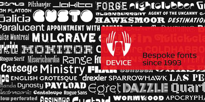
- Band Concert JNL by Jeff Levine,
$29.00 A poster circa 1930s-40s designed for the WPA Federal Art Project promoted free band concerts at the Brooklyn Museum in Brooklyn, New York. Its headline (“Free Band Concerts”) was hand lettered in a dual line Art Deco sans serif design. Now recreated digitally, the font takes its name after the poster’s topic. Band Concert JNL is available in both regular and oblique versions.
 - Danger Girl Hex by Comicraft,
$19.00 A dangerous charm. A death hex. A summoning. An Invocation. An enchantment. An incantation to raise the dead. A supernatural chant. Be careful what you spell out with this font, you might get what you wish for...
 - Cruz Cantera BT by Bitstream,
$50.99 Cruz Cantera is a crisp and stylish yet informal sans serif typeface created by NYC type designer Ray Cruz. It is a slightly condensed design. The vertical strokes have rounded terminals, and there are some characters with serifs. Notable characters include the upper and lowercase E. There are three weights and each works equally well alone, or together for both display and text. Original design by Ramon Cruz completed in 2002.
 - MCF bad manners ww - 100% free

- Hanzer Graffiti Display Font by Maulana Creative,
$14.00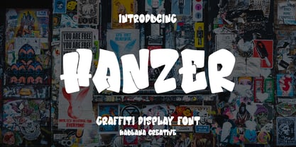 Hanzer graffiti display font. Bold stroke, fun character with a bit of ligatures and alternates. To give you an extra creative work. Hanzer font support multilingual more than 100+ language. This font is good for logo design, Social media, Movie Titles, Books Titles, a short text even a long text letter and good for your secondary text font with script or serif. Make a stunning work with Hanzer graffiti display font. Cheers, Maulana Creative
 - Pippi BV - Personal use only

- Candy Cane Personal Use - Personal use only

- TIES - Personal use only

- P22 Virginian by IHOF,
$24.95 P22 Virginian is an historic script font designed by Ted Staunton for his historic novel centered around a family bible and the handwritten annotation through 7 generations. The Virginian font is strongly influenced by classic “Chancery cursive” script.
 - Lambardo Graffiti by Yoga Letter,
$20.00 "Lambardo Graffiti" is a unique and elegant graffiti font. This font is equipped with uppercase, lowercase, numerals, punctuation, and multilingual support. Very suitable for logos, banners, posters, branding, stickers, invitations, rock music concerts, city street fonts, city walls, murals, and others.
 - ZiGzAgEo - Personal use only

- Kellion by Harvester Type,
$20.00 Kellion is a futuristic font that is inspired by science fiction and created to help convey the spirit of sci-fi in your design. The font, when used correctly, can convey brutalism with cyberpunk, wariness and concern, just like the game's cover itself. Font for posters, covers, logos, headlines, banners, and special products. It has great language support and well-placed kerning.
 - Dress Rehearsal JNL by Jeff Levine,
$29.00 In a career spanning the early 1900s through 1940, George M. Cohan wrote and produced over 50 plays, 300 songs and was also an actor, singer and dancer. Many of his works honored his Irish roots, and the cover of one piece of sheet music called “The Irish American” (1905) had its title hand lettered in a condensed Art Nouveau type design with tiny spurred serifs. This is now available digitally as Dress Rehearsal JNL, in both regular and oblique versions.
 - Appleton by Decade Typefoundry,
$35.00 Back to 1880-1900 when a number of events were coming together, the country was evolving from a local market economy to mass merchandising, rail systems were being built and color lithography was becoming more affordable. The first rail cars full of oranges were being shipped from Southern California to the East - what a treat during a cold winter’s day. Labels were pasted on every fruit crate and these labels had large images of oranges and orange groves. With technological advances in soldered cans, canneries popped up all over the country. In order to market their products many California Canneries pooled their resources to form the California Fruit Canners Assn. in 1899. This font was inspired from that era. Loaded with alternates, swashes, stylistic and multilingual support.
 - Fenton by Fatih Güneş,
$19.00 Fenton Font family comes with 6 weights. The design was inspired by (convex) camber. It has a higher lowercase structure than the normal ones. It has a modern, rounded and squared character. Each weight contains 364 glyph. It is a type family which you can use in brand and model names of technological devices, newspaper and magazine ads, jerseys, logos, posters, apps, banners and promo images.
 - Kirshaw by Kirk Font Studio,
$24.00 Kirshaw is not your grandfather's sans serif from the 1950s and 1960s. All those old classics like Helvetica, Futura, Franklin Gothic, and Univers are showing their age like an old Elvis Presley song. Kirshaw is a clean, rounded design with sharp contrasting edges. Like those classics, Kirshaw is easy to read in small body copy and captions, plus it's delightfully modern and stylish for headlines and logos. I designed Kirshaw and Kirkly while undergoing cancer treatment at Stanford Medical Center. Font design was always in the back of my mind and now I had extra time. Kirshaw is a distinctive, modern, easy-to-read sans serif family consists of 14 weights (including italics). It’s an Adobe Latin 3 Character Set containing 350 glyphs per style (including special characters).
 - Movember - Personal use only

- Jantze by Fontosaurus,
$19.95The Jantze font is a project undertaken by Dan Bailey of Fontosaurus and Michael Jantze, creator of the nationally-syndicated comic strip, The Norm. All their royalties from the font will go to The Lance Armstrong Foundation. For those that have been living under a rock for the last five years, Lance is a professional bike racer that overcame advanced testicular cancer to not only come back to his sport, but to dominate its premiere event, the Tour de France. In climbing to the top of his sport, he has become a legend among cyclists and a beacon of hope for those battling cancer and their families. His foundation provides financial grants to researchers working to improve our odds against the disease, individuals stricken with cancer, and survivors of the disease that are advocates for survivorship issues in their communities. Michael Jantze and Dan Bailey would like you to consider the quote from Ralph Waldo Emerson that brought us to this project: "The purpose of life is not to be happy. It is to be useful, to be honorable, to have it make some difference that you have lived and lived well. We hope that you will help us help Lance Armstrong's legacy be more than that of just sports legend. We hope that you will help those that may someday help you as much as we hope that you will never have to suffer the ravages of cancer. We hope. - Eurobia by Greater Albion Typefounders,
$24.00 Eurobia is a family of two typefaces - Regular and Plain. They are display faces with a strongly European feel and a strong flavour of the 1920s. My suggestion would be to use them for poster or banner work, or packaging or cover design, with the heading text set in Eurasia Regular and subsidiary text set in Eurobia plain. Why not give that European flavour to your next project? We see Eurobia as a fun typeface, for advertising products like confectionery or concerts. We had a lot of fun designing it and hope you'll like it too!


