10,000 search results
(0.036 seconds)
- Surfnik by Wing's Art Studio,
$9.00 Surfnik - A Hand-Made Font Influenced by Vintage Surf and Beatnik Culture Surfnik is a hand-drawn font inspired by beatnik and surfing culture of the 1950s and 60s. A fun, loose design that’s typical of pulpy fanzines, movie posters and advertising of the era. From promoting the local surf shop, burger joint or drive-in, it’s a font that evokes a bygone era with a playful, nostalgic feel. Surfnik features an all-caps design that includes unique uppercase and lowercase characters, punctuation, language support and numerals. It also comes with six styles that mix up weights and outlines that look great when creatively combined in titles and headlines. It’s a great choice for when you need a fun and lively look when creating menus, posters, movie titles, album covers and more! Check out the visuals for lots of examples.
 - Hawking by Latinotype,
$39.00 Hawking is a slab typeface with slightly squarish shapes and a rational, modern look. The font has a minimal modulation, generous counterforms and relatively large x-height with lowercase ascenders extending above the cap-height for more legibility. Serifs are composed of curved and straight lines, which give the font a robust appearance and strong personality. Hawking was specially designed for use in scientific publications (hence its name), but it can also be used with other type of continuous text, such as journalistic, technical or literary texts. Its heavier weights make it also well-suited for any display use (e.g. headlines) Hawking comes in 8 styles: 4 weights plus matching true italics. The font also includes ligatures, proportional oldstyle figures, and tabular and lining figures. The family comes with the Latinotype’s standard character set that supports 213 different languages.
 - Paganini by Canada Type,
$29.95 Designed in 1928 by Alessandro Butti under the direction of Raffaello Bertieri for the Nebiolo foundry, Paganini defies standard categorization. While it definitely is a classic foundry text face with obvious roots in the "oldstyle" of the Italian renaissance, its contrast reveals a clear underlying modern influence. In a typical Italian artistic fashion, Paganini manages to be a superb text face while having enough priceless ornamental moments to make it great in display uses as well: Check out the splayed M, the wide-tailed g, the flowing tail on the y, the high-armed k, etcetera. While the original metal version was limited to five basic fonts, this digital expansion includes small caps in the three main upright weights, plenty of alternate forms in all fonts, a super-seductive Open font, and an expanded language support covering the majority of Latin-based languages.
 - Cherubina by Hanoded,
$15.00 Cherubina means ‘Blessed’. It is a name derived from the Akkadian “karabu / kuribu”, meaning “blessing, blessed”. A cherub is a type of spiritual being mentioned in the Hebrew Bible, often depicted as a baby with wings. This font was based on the hand lettering I found on a 1962 Japanese poster for the movie “Mother Joanna Of The Angels”. The poster was designed by Hiroyoshi Oshima. Cherubina font is an all caps font (upper and lower case differ and can be used together) with a medieval feel to it. I tried to keep the ‘spirit’ of Hiroyoshi Oshima’s lettering, but changed the glyphs and designed most of them myself, as I had nothing but the title of the poster to work with. I have added some ligatures as well. Comes with my blessing and an eternity of diacritics.
 - Novel Mono Pro by Atlas Font Foundry,
$50.00 Novel Mono Pro is the monospaced typeface family within the largely extended award winning Novel Collection, also containing Novel Pro, Novel Sans Pro, Novel Sans Condensed Pro, Novel Sans Rounded Pro and Novel Sans Office Pro. Novel Mono Pro has a carefully attuned character design and a well balanced weight contrast. It combines the feeling of a modern humanist with the technical appearance of a typewriter. Many similarities with the other typeface families within the Novel Collection enable designers to combine the families and reach highest quality in typography. Novel Mono Pro [948 glyphs] comes in 12 styles and contains small caps for the uprights and the italics, ligatures, lining figures, hanging figures, small caps figures, positive and negative circled figures for upper and lower case, superior and inferior figures, fractions, extensive language support, arrows for uppercase and lowercase and many more OpenType™ features.
 - Dez Boulder by Dezcom,
$39.00 A Bold Display Family in Three Personalities: ego, id, and alter. Dez Boulder works like a character actor, presenting the author’s lines but not with the deadpan delivery of a news reporter. Boulder develops the role, adding meaning through facial expression, gesture, and body language. The Dez Boulder family of display faces acts in a supporting role to give meaning to message and context to content. It is a very bold face, not understated. Each of its three personalities (and their sub-personalities) have a different timbre to speak the nuance of your message in a bold voice. Dez Boulder averages more than 800 glyphs per style with uppercase, lowercase, small caps, proportional lining figures, small cap figures, superiors, inferiors, fractions, stylistic sets, alternates, ordinals, case specific punctuation, and more. It has a full range of diacritics and covers all European languages using the Latin script.
 - Glorious Song by Stiggy & Sands,
$24.00 A type from vintage Hollywood to your computer screen. Glorious Song is a display serif typestyle that was inspired by the poster lettering for the 1948 movie "Words and Music". It's an all capitals typeface that has alternate caps in the lowercase slots to convey all of the spunk and visual dance of the original inspiration. See the 5th graphic for a comprehensive character map preview. Glorious Song comes with features for customisation options: - An all capitals typeface with alternate capitals in the lowercase slots - A Ligatures feature that alternates between Capital and Alt Capitals characters. - A SmallCaps feature just to mix things up a little. - A Full set of Inferiors and Superiors for Limitless Fractions - Tabular and Proportional figure sets Approx. 546 Character Glyph Set: Glorious Song comes with a glyphset that includes standard & punctuation, international language support, basic ligatures, alternate numeral styles, subscript and superscript, and Small Cap letters.
 - The Fmiring Campotype One font, designed by Andi Aw. Masry, is a distinctive typeface that breathes life into the essence of organic and outdoor aesthetics. This font draws its inspiration from the n...
- Cute Letters by Harald Geisler,
$68.34 Cute Letters is a hand drawn font family in two styles with extensive character sets. Cute Letters - Hearted is a vibrant happily singing script, all capital as well as some lowercase letters are decorated with heart shapes. Second: Cute Letters - Heartless is still as vivid as it’s sister Hearted but a little less briskly, some straightened forms and without the decorative hearts. Both styles are readable and suitable for longer texts in medium point sizes. Cute Letters Hearted & Heartless is a part of the Light Hearted Font Collection that is inspired by a recording of Jean Baudrillard with the title, "Die Macht der Verführung" (The Power of Seduction) from 2006. Further inspiration came from the article, "The shape of the heart: I'm all yours". The heart represents sacred and secular love: a bloodless sacrifice. by British writer Louisa Young printed in EYE magazine (#43) London, 2002.
 - Calluna by exljbris,
$- Calluna was born more or less by accident. When I needed a little break from designing Museo I was just fiddling around a bit to see if maybe a full slab serif would be something to have a look at. The first thing I did, of course, was to put slab serifs on the stems of Museo. When I did, something nice happened. Slab-serifs with a direction! I ended up using the idea for something I always wanted to do: making a rather serious text face. The goal was to make a text font, but one with enough interesting details. In the end it all came down to finding the balance in a typeface between the robustness needed to function as a text face and enough refinement to look good as a display font. Check out Calluna Sans™ which is a great pair for Calluna™.
 - Sunshine by Chank,
$49.00 Sunshine is the unlikely alphabet collision of Gobbler and Liquorstore. Chank's napkin scrawl smashed into the letters commonly found on signage at the neighborhood liquor store. Gobbler's blotchy textures fragmented Liquorstore's uniform stroke. It began as a hideous lumpy thing with random vector points everywhere. Chank came to the rescue with his Alphabetician's first aid kit. He smoothed the blunt corners with a few hammer blows. He wrapped the font in extra strokes, in a sans serif Roman style, to increase its contrast. His industrial influence helped stabilize Gobbler's gloppy qualities and his grunge aesthetic softened Liquor store's checkerboard rigidity. The end result is a font with a solid structure and a painterly wiggle that creates a dirty display or a slightly clumsy text face. Because of its many detailed strokes, it tends to look a little better in print than on the web. All organic. Earthy.
 - Travel Kit SG by Spiece Graphics,
$39.00 Here’s an intriguing mixture of 1930s deco and modern tech fashion. Travel Kit Medium is a sturdy semi-serif hybrid with one foot in the past and another in the present. It is slightly low-waisted with extended crossbars on the capital A, E, F, H, K, and P. But the capital B, M, R and X are distinctively contemporary with the E and M repeated as unicase letters in the lowercase. Optional retro characters (notably the unicase e and m) have been provided if you prefer a more traditional overall look - and your software allows access to these characters. Simply find and replace the more modern letters with the older ones. In addition, small caps with even more alternate characters have been included for greater flexibility and convenience. Travel Kit Medium with Alternates is now available in the OpenType format. In addition to small caps, lining figures, oldstyle figures, and petite figures, this expanded OpenType version contains additional stylistic alternates and historical forms. These advanced features work in current versions of Adobe Creative Suite InDesign, Creative Suite Illustrator, and Quark XPress. Check for OpenType advanced feature support in other applications as it gradually becomes available with upgrades.
 - Poster Paint by Canada Type,
$24.95 Poster Paint is a fun shocard alphabet which came about from Jim Rimmer’s admiration of Goudy Stout, a design he liked in spite of the fact that Goudy himself claimed to detest it. Extremely eye-catching and humourous to a fault, Poster Paint is an ideal fit for fun environments like theme parks, concession stands, cofee and juice bars, and in print design for children books and fun food packaging. Poster Paint was updated and remastered for the latest technologies in 2012. It comes with a glyphset of over 375 characters, and supports the majority of Latin-based languges. 20% of this font’s revenues will be donated to a GDC scholarship fund, supporting higher typography education in Canada.
 - Runde Wien by Wannatype,
$36.00 Runde Wien Pro, the rounded sans serif by Ekke Wolf. Typeface lovers looking for a modern, well-developed sans serif font with a touch of retro and warm, individual lettering will get excited about a new addition to the font market. The more than complete Runde Wien Pro front comes in three styles and four different weights. In addition to the upright Runde Wien Pro there is the Runde Wien Pro Oblique with a moderate 6° slant and the Runde Wien Pro Superoblique with an 18° slant. Available weights are light, regular, medium, bold and black. These fonts are equipped with extended Latin alphabet for Central and Eastern Europe and also Cyrillic and Greek alphabet. The set of characters includes nine different sets of numbers, plus its own set for the small caps, as well as alternative characters and groovy ligatures. In addition, all Runde Wien Pro styles are also available as unicase with upper case and lower case x-height alignment. The style, metrics and proportions of Runde Wien Pro combine perfectly with the Liebelei Pro and the script fonts of the Calafati Pro.
 - Retro Games by Hexa,
$0.80 Introducing HEXA’s second family-font, Retro Games Font. The RetroGames font is a witty reinterpretation of the fonts found in 90s 16-bit games that we enjoyed when we were young, presented as bitmap imaged fonts. It offers superior legibility and aesthetic sensibility compared to many other existing bitmap fonts. For instance, while most bitmap fonts create one stroke with 1 pixel or have various thicknesses in pixels, we have standardized it to a maximum of one stroke with 1-3 pixels, enhancing both legibility and aesthetic appeal. Since there are many similar bitmap fonts, we wanted to reinterpret it as a genre of its own. Our latest designed fonts HEXA, we noticed some shortcomings in legibility, and we aim to address those shortcomings in this bitmap font, Retro Games. Our RetroGames font, which brings back memories of our analog past, can be a valuable design element in many design works." ※ RetroGames is Latin-based and a completely crafted font that consists of 2 typefaces. Each typeface contains 195 sets of characters. This font family is in all-caps fonts. ※The font family includes 'Dropline' and 'Black.' 'Dropline' comes with a shadow effect, while 'Black' is designed without a shadow for simplicity." ※RetroGames is a monospaced fonts. So kerning is not applied.
 - Stempel Sans Print Neo by TypoGraphicDesign,
$9.00 The typeface Stempel Sans Print Neo is designed from 2022 for the font foundry Typo Graphic Design by Manuel Viergutz. The display font based on a original set of 29 old rubber stamps (6 cm height). Digitized via hand-stamped, a scanner and Glyphs app. 3 font-styles (Rough, Misprint, Black) with 321 glyphs incl. decorative extras like icons, arrows, dingbats, emojis, symbols, geometric shapes (type the word #LOVE for ♥︎or #SMILE for ☻ as OpenType-Feature dlig) and stylistic alternates (6 stylistic sets). For use in logos, magazines, posters, advertisement plus as webfont for decorative headlines. The font works best for display size. Have fun with this font & use the DEMO-FONT (with reduced glyph-set) FOR FREE! Font Specifications ■ Font Name: Stempel Sans Print Neo ■ Font Styles: 3 font styles (Rough, Misprint, Black) + DEMO (with reduced glyph-set) ■ Font Category: Display Script for headline size ■ Glyph Set: 321 glyphs (incl. decorative extras) ■ Language Support (36 languages): Asu Bemba Bena Chiga Cornish English German Gusii Indonesian Kalenjin Kinyarwanda Luo Luyia Machame Makhuwa-Meetto Makonde Morisyen North Ndebele Nyankole Oromo Rombo Rundi Rwa Samburu Sangu Shambala Shona Soga Somali Swahili Swiss German Taita Teso Uzbek (Latin) Vunjo Zulu ■ OpenType features (16): aalt calt case ccmp dlig liga lnum onum ss01 ss02 ss03 ss04 ss05 ss06 mark mkmk ■ Design Date: 2022 ■ Type Designer: Manuel Viergutz
 - Mariachi by FontMesa,
$25.00 Mariachi is a new condensed version of our Maison Luxe font which is a revival of an old 1800's classic ornate French font. This new 2021 condensed version takes this old classic to an all new level by adding small caps, italics and a new solid black version. Mariachi is perfect for headlines and logos from advertising to product labels, t-shirt lettering and restaurant menus. Fill fonts are also part of this family, new to this font style is the half fill font for creating a two color effect on the letters, you'll need an application that works in layers to use the fill fonts in Mariachi. The regular fill font for Mariachi isn't meant to be used as a stand alone font so we've created a solid black version with thicker serifs on top and adjusted outlines throughout for a better appearance as a solo font. The difference between Mariachi and our Mi Casa font is that Mariachi has a squared off shadow on the top half of the letters. We hope you enjoy Mariachi as much as we did making it. Mariachi is a trademark of FontMesa LLC
 - Workhorse by Borges Lettering,
$35.00 Workhorse is a Sign Painter’s Gothic developed by Master Sign Painter Greg Reid. Workhorse captures the true essence of hand lettering. From the tapered waists to the elegant snaps of the brush; these elements present a warmth unseen in today’s mechanically stiff Gothics. Greg Reid and Charles Borges de Oliveira collaborated to bring this truly one of a kind typeface to fruition. With the power of Open type, Workhorse utilizes Contextual Alternates to create random variations of the capitals and lowercase letters. This allows your text to have subtle differences in the letters without losing form which helps to create an honest hand lettered look. This feature can be turned on or off to suit your individual style. You also have the ability to manually choose the glyph variations from the glyph pallet to help you create one of kind designs. Both versions of Workhorse feature complete variations of the capitals and lowercase letters (56 total), Small Caps and six alternates. The Small Caps are not just the capitals scaled down. They have been designed as a unique second set that adjusts the stroke thickness to match the existing letters, creating what we like to refer to as “Real Small Caps”. Workhorse is a timeless classic that can be used from early Americana advertising all the way up to present day modern use. No matter how you use Workhorse it always looks and reads well.
 - VVDS Ginsburg by Vintage Voyage Design Supply,
$10.00 Ginsburg it's a modern display all-caps font-family based on geometric forms and abstract wavy lines with an old school constructivism look. Inspired by Moses Ginsburg architecture projects. Playful, modern, suitable for many typography projects as headers, logos, block texts, etc. You may be more strict in your typography or you may be more groovy or playful with alternates characters. Use this family in vintage spirit for TV series, Podcasts titles, exhibition posters or design a modern extreme sport brochure, . Flexible, Catchy and Brazen — it's all about Ginsburg! Six widths: Thin / Light / Normal / Medium / Semi Bold / Bold. Opentype Features as Stylistic alternates, Oldstyle figures / Fractions. Multilingual
 - Niva by PeGGO Fonts,
$29.00 Niva is a display family font with 6 typographical groups in 10 weights each one, including a standard version, 2 italic widths, an alternative version and true small caps with italic version too. The creative idea follows concepts like future, technology, science, the structural principle focus in simplify complex details on letterforms ‘clean corners’ giving a luminous and sophisticated design with a ‘technologique’ touch, built in legible proportions which works as well as ‘display (titles)’ and even at small ‘text’ requirements. Specially recommended to be applied on digital and prints contexts as magazines, books, printed ads, UI & website design, digital graphics, video and TV screen contents as videogames and mobile apps.
 - Vanio by Eko Bimantara,
$24.00 Vanio is a wedge serif font family that crafted with precision, focused on both aesthetic and legibility. The letterforms and other typographic elements are made in a way to achieve optical recognition and fit for various typesetting. Its have a strong serif and spacious width letterforms on the upright styles. Its shown a medium contrast and caligraphic strokes. Its have a moderate vertical heights either at the x-height, caps, ascender or descender. Vanio consist of 10 styles from regular to extrabold with each matching italics. Its contain more than 460 glyphs which support broad latin languages. Also contain several opentype features; Ligature, oldstyle figures, fraction, and other variation of figures.
 - African Jungle by Scholtz Fonts,
$19.00Dominated by a vigorous, african-inspired, jungle-like pattern, this contemporary, 21st century, sans serif font - African Jungle - contains an eclectic mix of elements from the 20th century. It combines gentle curves with base and caps-line transgressions but is substantially more rounded than in most commercial-style sans serif faces. Terminal strokes are slightly rounded and occasional elements are strongly rounded. The African-inspired pattern fill is suggestive of dense vegetation without being too literal. African Jungle is readable and can be successfully used for headers in presentations, magazines etc, and for display use in newspapers, advertising and promotions. Professionally kerned and spaced with 256 characters. - Scala Jewel Pro by Martin Majoor,
$29.00 Scala Jewels is a set of four highly decorative typefaces, based on the bold capitals of Scala. Whereas Crystal and Pearl are modelled on historic examples, Diamond and Saphyr are original designs. Scala Jewels offers the possibility to set decorated borders, designed in the style of each of the four variations. There are corners and different sorts of long and short elements. One of the best ways to use Scala Jewels is as a two- or three-line drop cap at the start of a chapter. The award-winning Scala family (1990-1993) is a worldwide bestseller and has established itself as a ‘classic’ among digital fonts.
 - Danish Script Initials JNL by Jeff Levine,
$29.00 A set of transfer patterns for sewing decorative monogram initials on clothing was manufactured by Women's Day magazine circa the 1940s. Designed by renowned Copenhagen-born industrial artist and letterer Gustav Boerge Jensen [April 8, 1898 - June 27, 1954], these initials have been redrawn into a digital font entitled Danish Script Initials JNL. Large initials are on the uppercase A-Z keys, while smaller initials are on the lower case a-z keys and are centered to the larger cap height. An ornament is provided on the asterisk key, and can be placed between the small initials and the larger initial for decorative effect.
 - Sonny Gothic Vol 2 by W Type Foundry,
$25.00 Sonny Gothic Vol 2 is an extension of our popular font Sonny Gothic. All corners have been softened to get a friendlier and fluffy visual language. As Sonny Gothic, this typeface has ligatures inspired by the incredible work of Herb Lubalin, chiefly Avant Garde. We designed carefully Sonny’s Vol 2 ligatures, and we also created new ones to control the whites formed between softened characters such as FL, FB, FD, FE, FF, FH, FI, FK, FN, and FR. Developed with powerful OpenType features in mind. Each weight includes alternate characters, ligatures, fractions, special numbers, arrows, extended language support, small caps, and many more. Perfectly suited for graphic design advertising.
 - Cassius by W Type Foundry,
$23.00 Cassius & Cassius Italic are a postmodern typeface system from the Garaldes family. The main characteristic of this type family is its inverted anatomy and projected terminals. Cassius was meticulously designed with special focus on its structure. With its proposal for a fresh, attractive and rhythmic system, Cassius gives great personality to all kinds of composition. The family consists of 5 weights from regular to black, with respective Italics. Each instance includes; Case sensitives Accents, Ligatures, Fractions, Small Caps, Old Style Figures, Case Sensitives (symbols and punctuation) and more. This font is perfect for books and magazines compositions, and in general for the construction of immersive printed or digital texts.
 - 52-Kfx by ILOTT-TYPE,
$49.00 Where most fonts are available in varying weights, 52-Kfx is a family consisting of 3 heights; High, Mid and Low. These offer the typographer a full palette, Low is readable for setting copy while at the opposite end High is better suited for display—names, headlines and logotypes. 52-Kfx has a sophisticated and elegant period feel with clean, modern lines that remain relevant for contemporary application. Exaggerated ascenders and descenders of the lowercase and a tall cap-height give it a lofty stature while the low x-height keeps characters grounded. The spacing and lyrical rhythm are perfectly in sync and epitomized by the fluidity seen in the ligatures.
 - Modum by The Northern Block,
$- A contemporary serif font family. The design takes influence from traditional serif forms to develop a precise, highly functional text face with a low contrast. Smooth radius details are blended with carefully drawn angles that give a crisp, distinctive aesthetic when used across body copy. Modum is a stylish modern day serif with great charm, harmony and practicality that is best suited for complex hierarchical projects, such as editorials, newspapers and text based books. Details include 8 weights and true italics, over 800 characters with alternative lowercase a, e, g and y. 7 variations of numerals, true small caps with accents, ligatures, manually edited kerning and Opentype features.
 - Amnestia by Arterfak Project,
$14.00 Amnestia is a vintage serif typeface with a modern-classic feel. Inspired by vintage signage and minimalist serif style, this All-Caps font comes with 100+ alternates that gives you more options to get many variations in your designs. Amnestia has a medium height that looks perfect for display or sub-text. Amnestia available in 2 styles, distressed and normal, and is a great choice to be used in logos, insignia, apparel, labels, packaging, posters and more. Amnestia has a stylistic set 01 - 10 as the alternates of the letterforms. Some alternates have swashes and tails that you can explore to get more possibilities to create different typographic looks.
 - Galavant by Atlantic Fonts,
$32.00 Galavant will take you anywhere you want to go! Enjoy three font looks in one; a fun, chunky lower-case, a bold, animated upper-case, and in all-caps with discretionary ligatures turned on, Galavant is tightly interlocking. To explore the interlocking possibilities, turn some ligatures off and others on until you settle on the best combo. There are over 260 two, three, and four-letter ligatures available. Discover interlocking ligatures featuring lower-case "i" along the road as well. In sentence-case, turn discretionary ligatures off, except to add more handmade variation in double-letter pairs and to access a fine "ft". However you roam, Galavant aims to entertain.
 - Leonardo Sans by Factory738,
$10.00 Leonardo Sans is a modern sans serif with a geometric touch. It comes in 10 weights, clean and modern caps, thereby creating more variability. Designed with powerful opentype features in mind. Each weight includes extended language support, fractions, tabular figures, arrows, ligatures and more. Perfectly suited for graphic design and any display use. It could easily work for web, signage, corporate as well as for editorial design. 10 Weights (Thin, UltraLight, Light, Regular, Medium, SemiBold, Bold, ExtraBold, Black, Heavy) Oblique font is available Numbers & Punctuation Extensive Language Support Thanks for looking, and I hope you enjoy it. Check out Newgate which is a great pair for Leonardo Sans.
 - Stripes by profonts,
$41.99 Stripes is a caps only font and does not contain additional ligatures, because there is an easy way to create as many of them as you like. To form a ligature, convert your word or word string into vectors. Activate the corner points of the straight lines (not the round ones) of a letter and drag them over the next or the previous letter. This way you can create any ligature of your own. Beware of overkilling, it could decrease the legibility of your text. Besides the normal J, Stripes contains a stylistic alternate which should be used to avoid ugly gaps between critical letter pairs (see pdf document).
 - Super League by Arkitype,
$12.00 Super League is a display typeface created for the sports industry. The typeface itself doesn't lean too much in a particular sports category direction which makes it versatile in use across various sporting categories. Super League has loads of. options to make use of including; small caps, stylistic alternates, ligatures for vs, st, nd, rd and th that are very useful when handling typography for sports in particular. Use Super League in all your printed material or on screen. Create badges or print names and numbers sports kits. All weights come with an oblique version which makes the total number of 16 fonts in this typeface.
 - Impara by Hoftype,
$39.00 Impara was designed in 2010. It is a slightly contrasted sans serif with a lively stroke ductus and distinct humanistic characteristics. It represents a synthesis of linear coolness and classic elegance. It qualifies for informational text applications and, in display sizes, it reveals elaborate details. Impara comes in 10 styles in OpenType and TrueType format. Each font is equipped with an extended character set containing: standard and discretional ligatures, small caps, proportional lining figures, tabular lining figures, proportional old style figures, lining old style figures, matching currency symbols, fraction- and scientific numerals. Impara supports Western European as well as Central and Eastern European languages.
 - Arida by Latinotype,
$39.00 Árida pays homage to the Argentinian city of San Juan, located in the semi-desert Cuyo region, where cacti are abundant; a characteristic feature of arid habitats. Árida, inspired by the vegetation of the place, looks sharp and aggressive at large sizes but it also feels friendly at a smaller scale—portraying the dichotomy between humans and nature. Árida comes in 5 weights, ranging from Regular (with a matching italic) to Black. The Regular variant contains 773 glyphs and its Italic counterpart is composed of 939 glyphs. The font also includes small caps, different styles of figures, ligatures, and stylistic and contextual alternates, among other OpenType features.
 - Soundtrack by PintassilgoPrints,
$24.00 Simple and charming, Soundtrack is a lively all-caps font that brings two versions for each letter. Make your choices by simply typing the upper or lower case keys or switch on the Contextual Alternates feature on any OpenType savvy program to instantly alternate between lettershapes. Versatile, Soundtrack comes in two weights and is suited for a wide range of display applications, doing great also for small chunks of text. Handy dingbats are included in both versions. Pick them using a glyphs palette or character map or just turn on the OpenType ornaments feature for accessing them directly from your keyboard. Let music sound!
 - Sore by Omotu,
$18.00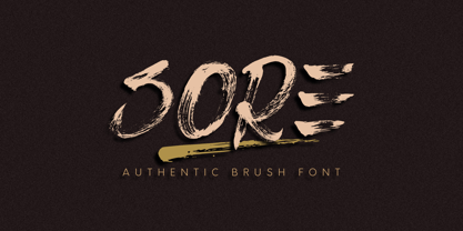 Sore is an authentic brush font, real brush texture. All caps characters. Sore is suitable for branding, logotype, apparel, T-shirts, Hoodies, product packaging, quotes, flyer, poster, advertising and more. Whats Include? 1. Uppercase and lowercase characters 2. Multilingual support. 3. Numerals, punctuations, alternate, and ligatures 4. Accessible in the Adobe Illustrator Glyphs panel, or under Stylistic Alternates in the Adobe Photoshop OpenType menu, Adobe InDesign, Corel Draw, even work on Microsoft Word. Please message me if you're unsure of any language support. Thanks for looking, and I hope you enjoy it! Please don't hesitate to drop me a message if you have any issues or queries. Omotu Studio
 - Price Tags JNL by Jeff Levine,
$29.00 Price Tags JNL is a multi-use dingbat font. Along with over twenty nostalgic price tags, there is a set of individual numbers [1 thru 0 keys] and number pairs [A-T and a-i keys] for creating old-style white-on-black price tags. Blank end caps are available on the parenthesis keys, the decimal point is on the period key, catch words FOR, DOZEN and EACH are on the left and right arrows and right brace respectively, and the dollars and cents marks are on the dollar and hyphen keys. You'll even find a few extras placed upon the bracket and left brace keys.
 - Rodge by Designova,
$15.00 Rodge is a unique display typeface perfect for headlines, big text, branding, logotypes & graphic design purposes such as posters, flyers and advertisements. This all-caps font can be an excellent choice for creating outstanding logos, promotional content, and marketing presentations that can bring uniqueness and freshness at its level best. The typeface comes with OpenType Stylistic Alternatives feature giving you the option to add some unique characters. Please see the examples shown above to get an idea of the capability of this typeface. Rodge comes with extended language support including Western European, Central European, and South-Eastern European character sets (total of 238 glyphs).
 - P22 Mackinac by IHOF,
$39.95 P22 Mackinac Pro spans four centuries of type design, bridging the Old World with the New. This family of four weights and corresponding italics is of old style construction, with a diagonal weight stress. Contrast between thick & thin is modest and proportioned the same for all fonts. The tall x-height recommends itself to a wide variety of text and display uses; including advertising, publishing, signage and packaging. P22 Mackinac Pro (pronounced Mackinaw) is a general-purpose, utilitarian design incorporating an abundance of OpenType features: small caps, ligatures, ordinals, numerous figure options plus a few bonus goodies. Mackinac supports 56 languages using extended Latin character sets.