10,000 search results
(0.026 seconds)
- Turntable Stencil JNL by Jeff Levine,
$29.00 A disc jockey-only promotional sleeve for a 1964 [45 rpm] release of “Close to Me” and “Let Them Talk” by Dan Penn featured the song titles printed in a stencil typeface on the record sleeve. Closely resembling a stencil version of Franklin Gothic but with its own unique characteristics, this design has been reinterpreted as Turntable Stencil JNL and is available in both regular and oblique versions. For trivia buffs, Dan Penn is a singer-songwriter-record producer, often collaborating with Dewey Lindon “Spooner” Oldham; both closely associated with the late Rick Hall’s Fame recording studios in Muscle Shoals, Alabama. In 1964, Hall started the Fame record label, and for a time it was distributed by Vee-Jay Records of Chicago, the first major Black-owned record label in the United States. Penn’s release was only the second for the new label; Fame 6402.
 - Quietism Variable by Michael Rafailyk,
$150.00 A smooth contemplative Antiqua with aspiring to the sky ascenders, inspired by the Quietism philosophy. Clarity of the mind is achieved by bringing the body into a state of calm and contemplation, and this is reflected in the design – the quiet horizontal serifs (body) are opposed to the peaky soaring ascenders (mind). The design also features four optical size subfamilies with different x-height and contrast, oldstyle diagonal stress, oldstyle figures by default, smooth details and slightly dark texture. Variable axes: Weight, Contrast, X-Height. Scripts: Latin, Greek, Cyrillic. Languages: 480+. The complete list of supported languages: michaelrafailyk.com/quietism Kerning: 4553 class-to-class pairs. Hinting: Not applied. Format: TTF – OpenType with TrueType outlines. Variable Font: Quietism Variable provides more options than static versions, and has three axes: Weight (Thin–Black), Contrast (Low-High), and X-Height (Low-High). Variable fonts includes thousands of styles that you can access using a sliders on graphic editor or via CSS on web browser. Mixing different axes gives you extra styles not represented by static fonts. Optical Size: The typeface is represented by four subfamilies: Text (low contrast, high x-height – for paragraph 10-20 pt), Deck (medium contrast, medium x-height – for subheading 20+ pt), Display (high contrast, medium x-height – for heading 72+ pt), Poster (high contrast, low x-height – for big size 120+ pt). Small Caps: Lowercase letters and Oldstyle Figures are replaced with Small Capitals forms. Capitals to Small Caps: Uppercase letters, all figures, and some punctuation are replaced with Small Capitals forms. Case Sensitive Forms: ()[]{}‹›«»-–—•·#%‰@ and Arrows are centered on capitals. Oldstyle figures are replaced with Lining figures. Oldstyle Figures: 0123456789 #%‰. Designed to work with lowercase letters. Used by default. Lining Figures: 0123456789 #%‰. Figures are the same height as uppercase letters (cap height). Proportional Figures: Lining, Oldstyle, Small Caps, Capitals to Small Caps. Tabular Figures: Lining, Oldstyle, Small Caps, Capitals to Small Caps. Ordinals: adehnorst. Superscript, Subscript, Numerator, Denominator: 0123456789. Fractions: ¼½¾⅐⅑⅒⅓⅔⅕⅖⅗⅘⅙⅚⅛⅜⅝⅞⅟ (precomposed). Any other fractions (even those typed through a slash) will also be displayed correctly, with the automatic replacement to Numerator + fraction + Denominator. Slashed Zero: All 0 figures. Contextual Alternates: Number sign character (#) before uppercase letters is replaced by its version centered on capitals. Hyphen character (-) between two uppercase letters is replaced by its version centered on capitals. First of two TT letters is replaced by its alternate form. Letters vwy before the letters fijmnprtuvwxy are replaced with an alternate shorter versions that fits better in the context. Contextual Alternates (Greek): ΆΈΉΊΌΎΏ. Greek uppercase accented characters lose their tonos accent and retain only dieresis in All Caps and Small Caps modes. Turned on by default. If you need tonos accents in All Caps then turn off Contextual Alternates (calt) feature. Stylistic Alternates: FTГТИЦЩцщ and their versions with diacritical marks. Stylistic Set 01 “Arrows”: Left <- Right -> Up Left Right <-> Up Down North West South East \> South West Stylistic Set 02 “Round-Square Cyrillic”: ДИЙЍЛФвгджзийѝклнптцчшщьъю characters are replaced with its Bulgarian or Russian forms. Stylistic Set 03 “Cyrillic Tse Shcha short tails”: ЦЩцщ characters are replaced with its alternate form with short tail. Stylistic Set 04 “Cyrillic I full serifs”: ИЙЍӢ characters are replaced with its alternate form with inner serifs. Stylistic Set 05 “FT bent inward serif”: FTГ characters and their versions with diacritical marks are replaced with its alternate form with right head serif that bent inside. Stylistic Set 06 “Small Caps centered on Capitals”: Small Caps are vertically centered on uppercase letters. Standard Ligatures: fi fl fb ff fh fj fk ffb ffh ffi ffj ffk ffl. Discretionary Ligatures: Th ct st. Localized Forms: 52 character substitutions for Azeri, Bulgarian, Catalan, Dutch, German, Kazakh, Macedonian, Moldavian, Polish, Romanian, Serbian, Tatar, Turkish. Glyph Composition/Decomposition (Diacritics): Full Latin and based Vietnamese set of diacritics (571 characters). Precomposed.
 - WetPaint - Unknown license

- Loulou by Wiescher Design,
$39.50 LouLou is a scriptlike typeface that looks as if it came right out of the sixties and seventies. Flowerpower! I enjoyed doing this one. Your swinging type designer Gert Wiescher
 - Sapore by Fonderia Serena,
$23.90 Sapore is a script font family, mostly monoline, inspired by the elegant handmade signs in the beautiful city of Venice, Italy, where I work and live. Many of these signs were made at the beginning of the 20th century by skillful craftsmen and artists, carrying that distinct vintage Italian flavour, and this is why I named the font Sapore, which means precisely flavour (also, one of the signs is from a pastry shop that makes the most delicious things). The design takes this retro vibe into the 21st century, making it up-to-date and fresh, while keeping it authentic. It is a script font, but I added some stand alone capitals that you can use in all caps words and texts effortlessly, as the open type code is taking care of using the right set of letters at the right time, I could have made two separate fonts, but I wanted to give you the best value I could and ease of use. Make sure contextual alternates are always on! There are also swashes, alternate styles, stylistic sets, small caps, 2 figure sets and decorative elements, all accessible through open type. I think the font is particularly suited for display use, as in logos, packaging design, branding, but it is readable enough for small text blocks. You can access the non-linking caps by clicking on the discretionary ligatures button. You can access the loopy caps by clicking on the titling alternates button. The main version has straight terminals but I included a round version and a calligraphic one, called “classico”. Hope you like it!
 - Sunshine Delivery by Hanoded,
$15.00 After a long period of wind, rain and cold, summer has finally arrived. It almost felt as if the sunny weather came as a special delivery! Sunshine Delivery is a handmade display font. It comes in a regular, angular version and a rounded one. Need Vietnamese support? Check! Want some Sami? Got it! Feel like a bit of Greek? Dive right in!
 - Shootout by Arendxstudio,
$14.00 Shootout - Street Typeface with sharp and beautiful letters that create fonts that are modern, trendy and elegant. Came with opentype features such stylistic alternates, stylistic sets & ligatures good for logotype, poster, badge, book cover, tshirt design, packaging and any more. Features : • Character Set A-Z • Numerals & Punctuations (OpenType Standard) • Accents (Multilingual characters) • Ligature • Alternate There it is! I really hope you enjoy it
 - Roast Serif by Konstantine Studio,
$18.00 You can be wild and bold in an elegant way. And serif typeface can be very wide and versatile without losing the characteristic. That’s where the ROAST came from. An elegant serif Display typeface with a lot of special alternate letters in every single letters. Elevate your elegant vibes with pushing the style in edgy way instantly with this font.
 - Arqua by DubbioGusto,
$15.00 I took Arquà’s curvy lines from some details in art nuveau posters from late 1800 / early ‘900, then I added to the mix a little bit of elegance with some weird contrast (look at the S). One hour in the hoven and a modern looking display font came out in 2 weights: Goodboy and the doppelganger Badboy perfect to mix up.
 - Mooners by Burntilldead,
$14.00 Make your design as a time machine with "Mooners" typeface. Inspired by the decorative victorian advertising poster, Mooners came to make make your document, poster, logo, etc... perfectly have a vintage victorian vibes. It's a solid combination that can bring your design, logo, document, website, etc. back to 1800 decade. Multilingual fonts-family and playful one with 165 alternate characters.
 - Quride by Arendxstudio,
$18.00 Introducing my new font - Quride Quride is a modern Serif with a very unique alternate and ligature Quride came with opentype features such stylistic alternates, stylistic sets & ligatures good for logotype, poster, badge, book cover, tshirt design, packaging and any more. Features : -Uppercase & Lowercase -Multilingual support -Number, -Symbol -Punctuation. -Support in Mac and Windows OS -Support in design application (photoshop, illustrator, and more) .
 - 1786 GLC Fournier by GLC,
$38.00This family was inspired by numerous documents and books printed in Paris during the end of the 1700s. Mainly, documents printed by P.G. Simon & N.H. Nyon, “Printers of the parliament” were used for the Normal and italic styles and “Caps”. “Titling” characters were coming from a collection of hymns printed by Nicolas Chapart. In France these Fournier characters, as Baskerville in Great Britain, were the most often in use in the late 1700s, just before the Didot designs. This font supports strong enlargements, specially the capitals of “Caps” file and “Titling”, remaining very smart, elegant and fine. - Neogrotesk by Los Andes,
$39.00 Not of the Alps but from Los Andes. It tastes a lot more like wine than cheese. Neogrotesk is a versatile and functional workhorse typeface with a neutral look and Latin flavor. The font includes multiple typographic features such as alternates, ligatures, small caps, case-sensitive punctuation, arrows as well as lining, old style and tabular figures. Neogrotesk is the perfect choice for editorial, corporate and advertising design. This 40-style type comes in 5 weights with matching italics and contains 770 glyphs. The complete set consists of 4 sub-families: Essential, Essential Alt, Pro and Small Caps.
 - Lempicka by Molly Suber Thorpe,
$17.99 Lempicka is a ligature-rich typeface duo with support for Latin and Greek. Lempicka Display and Small Caps are a pair of light, clean fonts with strong Art Deco character. Lempicka Display has over 150 ligatures and alternates (in Greek, too!), so it's extremely customizable and versatile. Lempicka Small Caps is Display's little sister: the perfect complement for creating hierarchy in a layout.⠀ This is a beautiful typeface for wedding invitations and personal stationery, as well as unique logo design and branding projects. The name of this type family is an homage to Art Deco painter Tamara de Lempicka.
 - Prelo Slab by DSType,
$55.00Prelo Slab is the serif companion to Prelo, a neutral, highly readable typeface, for identity, editorial and information design. With nine weights and nine italics, from Hairline to Black, Prelo Slab is a workhorse typeface, full of OpenType features such as Small Caps, Tabular Figures, Central Europe characters and Historical Figures, among others. Like other DSType fonts, most of the diacritics were designed to fit the gap between the x-height and the caps height, avoiding some common problems with the accented characters. The curves are soft and smooth, while the serifs are sharp and strong, providing legibility, even in very poor conditions. - Pseudographia by The Ampersand Forest,
$35.00 Pseudographia is a lighthearted, loving pastiche of “Greek-Style” type inspired by J.M. Bergling’s 1917 “Society Greek” lettering. Happily living in the world of kitschy cross-cultural fonts of the kind found on restaurant awnings around the US, Pseudos is blithely unconcerned with legibility. Instead, it embraces its own benign exoticism and revels in its own chicanery! Pseudographia’s standard letterforms are angular Roman forms. Its Stylistic Set One contains a simplified Small Caps version of the kind commonly seen at Mediterranean eateries. Its Stylistic Set Two contains a full set of outlined Ornamental caps. Opa! Part of The Ampersand Forest's Sondheim Series.
 - Circulo by MMD Fonts,
$6.29 Bound to rules, unbound in the usage. Hyper geometric, and minimal contrast. Circulo V1 is based on a font project I originally started because of a client I had. I wanted to create a display and text font for their product design brand, which is all about reducing the amount of necessary materials and production steps. Before I started the course at tipo-g it was called -“REDUCE“ and was more or less finished. The concept was based on the name. How far can letter shapes be reduced to their core geometric concepts and still be identified as letters? But in a way, it lacked a unique approach and was just a generic geometric Sans Serif with a lack of finesse. There was already a glimpse of characteristics visible which would later define Circulo V1. The high focus on geometric shapes was not of the same severity, and the angle on the stems was less intense. Those, as I call them, fake serifs turned out to be a significant factor in legibility and the characteristic of the font. Besides those changes and improvements, I decided to implicate a new feature to the concept, a condensed style. I quickly realised that it is impossible to keep my perfect circles and half-circles in this style without breaking my rules for the font. This „problem“ turned out to be the most crucial feature of the condensed set. Circular-based Letters will ignore the rules and boundaries of the condensed style and stay as they are. This feature allows the user to create a unique rhythm in their texts, and if you use the variable font, you can decide how intense this rhythm will be. In this situation, the user can choose which letters are allowed to keep their shapes and which will be put in their condensed corset. All, some or none of them, you decide.
 - Periodico by Emtype Foundry,
$69.00 Periódico (newspaper in Spanish), was originally commissioned by the Spanish daily newspaper ABC. Inspired by old Spanish typographic engravings, mostly from the second half of the 18th Century, we picked out the most relevant details of Spanish typography as the source of that inspiration, and instead of making a revival or an interpretation of these models, we started from scratch to create a truly original font family. The goal was to achieve a very distinctive family, functional and versatile at the same time, and reminiscent of old Spanish typography. Although we have borrowed many details from the old Spanish typography, like the nail, which is present in the letters U, G, or J, which we worked and evolved in order to be applied on other letters, we have also left behind several others. One example is the tilde of the ñ engraved by Gerónimo Gil, a very distinctive element of Spanish typography that was intentionally omitted for being too atypical to be used in a contemporary font. The letters a and g are probably the most distinctive of the Periódico family. The shape of the bowl in the letter a, with the top arch in diagonal position, is very characteristic of old Spanish types. In Periódico, we emphasized this detail by applying it to many other letters (such as g, j, and t) up to a point that it became the leitmotiv of this family. The formal finish of serifs and terminals is something that gives great personality to any typeface, so we came up with plenty of alternatives in order to find the exact shape we wanted: sober, elegant, and contemporary. Even though the serifs are geometric, the upper terminals have a curve with a dynamic very similar to the arch in the a or the notch in the j. The terminals in the capitals follow the same style, but, in this case, the inspiration comes from Pradell’s Missal, which on the other hand has been influenced by the types engraved by Johann Michael Fleischman in the Netherlands. Eighteenth-Century types were mostly used for printing books. Therefore, they had very generous proportions (large ascendents and descendants) and high contrast, but today, these characteristics do not work well in newspapers because of the worldwide demand for more space-saving fonts. The adaptation of the type’s proportions to be used for a newspaper was one of the most interesting parts of the project, specially the time taken to find the perfect balance between the x height\ and legibility. Periódico is presented in 30 different styles, for a total of 30 fonts—10 for text (from Light to Bold) and 20 for display sizes (from Thin to Ultra Black); this family results in an extensive system capable of solving all the needs of a large publication.
 - Organon Sans by G-Type,
$60.00 The six weight Organon Sans typeface is a stylish and feature-laden OpenType family which complements its sister Organon Serif, both components working in tandem to create an elegant, legible and thoughtfully designed suite of fonts which share similar cap & x heights, stem widths and ascender/descender values. Tapered stems give the Organon Sans fonts an attractively robust appearance.
 - Five And Dime NF by Nick's Fonts,
$10.00A font with a strong architectural feel, inspired by those great commercial emporiums of a bygone era. To cap the crossbars, use [brackets] to enclose uppercase letters, {braces} to enclose lowercase letters, and the upright bar | between upper- and lowercase letters. Both versions of the font include 1252 Latin, 1250 CE (with localization for Romanian and Moldovan). - Isfahan by Scriptorium,
$18.00Isfahan is based on the middle-eastern style decorative initials Willy Pogany drew for his edition of The Rubaiyat of Omar Khayaam. This font has both full-size capitals and reduced size small-caps versions of each letter, but although it could be used as a titling font, it is really intended more for decorative character placement. - Skippy Sharp by Chank,
$99.00 Skippy Sharp was drawn by Skippy McFadden in 1995 and faxed to Mister Chank Diesel. Chank completed the character set, added extensive kerning and created a very friendly, informal marker handwriting font. The font is also enhanced for OpenType use with Contextual Alternates for a more natural and organic handwriting style, and true Small Caps, too.
 - Douceur by Hanoded,
$15.00 Douceur (pleasantness in French) is an all caps, serif typeface with a flourish. It was created by hand in one go: no sketches, no try-outs. The font comes in two styles: regular (outlined) and black. Due to style naming issues, the black version will show up as a different font. Douceur comes with all diacritics.
 - Arequipa by Alan Meeks,
$45.00 Arequipa is a Latin font with serifs generally top left. The style is influenced by Aztec and Inca designs the Bold weight is excellant for Headline and the lighter weights work well in limited text. The geometric shape of the serifs, ij dots, full point, comma and cap Q give the font an unusual and distinctive look.
 - Blue Fires by Ana's Fonts,
$14.00 Blue Fires is a quick and easy handwritten font, with lots of ligatures and a bonus set of swashes, circles, arrows and ornaments. It is a versatile font that looks great in both short bursts and longer texts, in lower case and all caps. Use Blue Fires in logos, quotes and social media posts, branding and packaging, and merchandise.
 - Hai Brush by Sabrcreative,
$30.00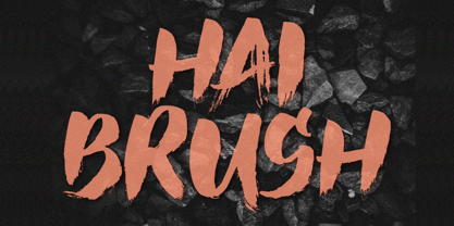 Unleash your creativity with the all-caps captivating Hai Brush Font. This unique typeface effortlessly combines the raw energy of hand brush strokes with a touch of elegance, making it an exceptional choice for a variety of design endeavors. Whether you're crafting logos, posters, or branding materials, Hai Brush Font adds an authentic, artistic flair to your projects.
 - Soapy Feelings by PizzaDude.dk,
$18.00 Soapy Feelings is my slightly rough-edged handmade fantasy (or perhaps even fairytale) font. I've added several swashes, which can be used for both starting and endings of words. I've also added 4 slightly different versions of each letter (and they automatically cycle as you type!) and lastly, of course Soapy Feelings has multilingual support! Caps Only Fonts
 - BROKEN STORM by Aminmario Studio,
$30.00 This is a supercharged font, with natural brush, quick strokes and sharp details. Contains ALL CAPS, numbers, some punctuation and ligature. Perfect for challenging jobs, titles, movie,logos, apparel, t-shirts, hoodies, quotes, product packaging, or anything that needs a typographic turbo-boost and a typographic unique style. Thanks for checking out this font. I hope you enjoy it!
 - BLACK PRANK by Aminmario Studio,
$20.00 This is a supercharged font, with natural brush, quick strokes and sharp details. Contains ALL CAPS, numbers, some punctuation and ligature. Perfect for challenging jobs, titles, movie,logos, apparel, t-shirts, hoodies, quotes, product packaging, or anything that needs a typographic turbo-boost and a typographic unique style. Thanks for checking out this font. I hope you enjoy it!
 - Roundlane by Zealab Fonts Division,
$10.00 Roundlane is a font inspired by retro badges antique labels, and includes all-caps, multilingual support, alternates signs, numbers & punctuation. It works well for album covers, video tittles, stickers, clothing brand names, t-shirt designs, badges designs, banner, flyer and more. I can’t wait to see what you guys will come up with with using this font!
 - Sanstara by Prasetype,
$12.00 Sanstara is rounded, modern all caps sans serif font. This font is PUA encoded which means you can access all of the glyphs and swashes with ease! Add it confidently to your favorite creations and let yourself be amazed by the outcome generated. -Letters, numbers, punctuation, multilingual support. -Italic and regular versions Any Questions? just ask!
 - Thintoys by Gassstype,
$23.00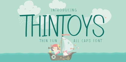 Hello Everyone, Introduce our new collection Thintoys - Fun All Caps Font and display for posters,t-shirt, packaging, branding, logotype and more. Thintoys font with strong and challenging nuances. very suitable for the title, branding projects,typography,Logo, Poster, magazines, brochures, packaging,Websites and much more for your design needs, making your designs more modern and professional.
 - Drop Dead Gorgeous by Hanoded,
$22.00 Drop Dead Gorgeous is a slightly slanted all caps Brush font. I made it with the last of my Chinese ink (I ordered a new batch, it should arrive tomorrow). Drop Dead Gorgeous is a very legible font, ideal for headlines, posters and book covers. Comes with alternates for lower case letters and a truly breathtaking amount of diacritics.
 - UpMax by NicolassFonts,
$99.99 UpMax is a modern font family. This family is ideally suited for graphic design and display use. Language support: extended Latin (including Vietnamese), Cyrillic (including Bulgarian), and Greek. It comes in 16 weights, 8 uprights, matching italics and Variable font. Each weight includes 2540 glyphs and 36 OpenType features (including Small Caps, Ligatures, Numerals, and Typographic Variants).
 - Party Pocket by Hanoded,
$15.00 I was doing the laundry the other day and, as usual, I was going through the pockets of my jeans. After I had emptied my party pockets, I figured it was a great name for a new font! So, without further ado: here’s Party Pocket: a handwritten all caps font - great for product packaging, greeting cards and posters!
 - ASTRALYS by Cerri Antonio,
$37.00 Astralys is a linear decorative font, works very well as a type of identity logo, poster and 3d works. It continues the tradition of precedent Xova but with a hard linear impact. Its interesting to note that with it its possible to play with straight corners to create endless couplings geometric styles and beyond. Caps only fonts.
 - Lyps by hgo,
$15.00 Lyps is a contemporary headline family designed by Heiko Hoos. There are 4 font styles: Lyps Regular, Lyps Small, Lyps Extra Small and Lyps Wide. Each font file has OpenType features for ligatures, caps and some alternative Type variations. The Lyps family is suitable for high impact situations like posters, headlines, titles, magazines, packaging and many others.
 - Gumok by Linecreative,
$14.00 Gumok - Ultra Condensend font and Minimalis Character, It's Perfect for logo, name card, magazin layout,headers, or oven large scale artwork What you get dear, you will get : 1. Gumok- A clean San serif font including Upper & Lowercase characters(ALL CAPS), 2. Stylistic alternates Character (9 Character) 3. Supports Multi linguage (Latin Western Europe), Numbers and Punctuation
 - A Pompadour by Ana's Fonts,
$12.00 A Pompadour is an elegant retro font family, inspired by vintage advertising. It includes two styles (plus variations!) that go together nicely. The fonts include OpenType features such as ligatures, small caps, and swashes. A Pompadour is perfect for short and long texts. Use it in magazine layouts, posters and advertising, branding and packaging, business cards, resumes, etc.
 - DEAD MARKER by Aminmario Studio,
$30.00 This is a supercharged font, with natural brush, quick strokes and sharp details. Contains ALL CAPS, numbers, some punctuation and ligature. Perfect for challenging jobs, titles, movie,logos, apparel, t-shirts, hoodies, quotes, product packaging, or anything that needs a typographic turbo-boost and a typographic unique style. Thanks for checking out this font. I hope you enjoy it!
