8,543 search results
(0.309 seconds)
- Forjada by Latinotype,
$26.00 Forjada—designed by Raúl Israel—is a monolinear, rounded and condensed typeface, belonging to the slab serif classification, inspired by wrought iron window and door grills on facades of historic buildings in America and Europe. Forjada is a rigid yet softly curved font with exquisite ornaments and optimized for great legibility. Forjada Family comes in 3 weights—Light, Regular and Bold—with matching italics and includes alternate swash caps and ligatures plus Ornaments and Catchwords sets that provide a wide range of choices for creating the most beautiful designs. The font character set supports 212 languages. Forjada is well-suited for branding, packaging, food & drinks menus, wedding invitations, party invitations, guidebooks to old cities or any glamorous design you want to add a fresh and modern touch to!
 - Zin Serif by CarnokyType,
$46.00 Zin Serif is a contemporary typeface designed for various situations of typographic usage. Characteristic feature is a large x-height and balance between neutral construction of letters (strictly vertical axis) and dynamic open forms (opened terminals). Another typical feature is a visually narrower connection between stems and strokes. The complete font family consist of three width proportions (Normal, Condensed and Extended). Every sub-family has 5 weights, ranging from Light to Black with matching Italics. Zin Serif can be effectively used for both text and display typesetting. It can be used especialy in magazine layouts and editorial design, as well in advertising typography, orientation systems, corporate identities and many other situations. Zin Serif is a member of the Zin super family, which also includes Zin Sans, Zin Slab and Zin Display fonts.
 - Quiza Pro by Mint Type,
$- Quiza Pro is a geometric display sans with added playfulness created around a single dot. Its peculiar rounded diamond shape has inspired many additional details such as similar cuts in diagonal strokes, or occasional serifs in ascenders and capital letters. Its low x-height together with friendly character makes Quiza Pro an interesting choice for packaging and branding purposes. Additionally, its balanced rhythm allows paragraph typesetting in corporate editorial projects – making it a real workhorse for an identity designer. Quiza Pro comes in 8 weights + matching italics each supporting numerous Latin-based languages as well as major Cyrillic languages. It is packed with OpenType features like ligatures, small caps, 6 sets of digits, 3 stylistic sets, superiors and inferiors, fractions, ordinals, respective punctuation varieties including all-cap punctuation, as well as language-specific alternates.
 - City Boys by Dharma Type,
$19.99 City Boys is a fashionable contrasted sans-serif that can be used in almost any situation. City Boys has basic, natural and neutral letterforms and skeletons for a wide range of usage. The glyphs are somewhat humanist yet they have vertical stress for modern and sophisticated impression. The ratio of the contrast was carefully designed for modern usage –websites, digital, printings and merchandises–. City Boys consists of 7 weights and their matching Italics for a wide range of usages. Farther, City Boys is supporting international Latin languages and basic Cyrillic languages including Basic Latin, Western Europe, Central and South-Eastern Europe. Also CSS covers Mac Roman, Windows1252, Adobe1 to 3. This wide range of international characters expands the capability of your works. City Boys Soft is a softly rounded version of this City Boys.
 - Parca by Vasava Fonts,
$30.00 Parca is a straightforward new take on the classic tradition of Grotesk sans, setting a new standard in the category. The letterforms are crafted with a gentle and careful drawing process that features small details like subtle tappering on the stems and optical corrections avoiding excessive geometry artefacts. Parca is indicated for design projects and branding when you are in the need of a neutral yet warm feeling allowing the content to be the focus and letting the forms to support it. A careful kerning and spacing features have been develop for the font, allowing it to be used either for small text or huge headlines. Parca is presented in a robust family of five weights plus matching italics and it supports most of the latin-based European languages.
 - Aestetico by Latinotype,
$29.00 This beautiful font explores 3 very individual styles of one typeface. Each style pays homage to classic sans serif typefaces while adding contemporary flair to its characteristics. With both formal and informal styles, Aestetico explores how the shapes and curves of letters change their perception and focus. The informal letters are rounder and more quirky while the formal style utilizes more traditional sans serif letterforms. The whole set (54 styles) consists of 3 sister families, each in 9 weights with matching italics. The 3 variants ensure every design project is covered by Aestetico; its versatile nature is perfect for a huge variety of applications from editorial design to branding, advertising, publications and digital. As you would expect from Latinotype, this font comes with a standard character set (395 glyphs) and supports over 200 languages.
 - City Boys Soft by Dharma Type,
$19.99 City Boys Soft is a fashionable contrasted sans-serif that can be used in almost any situation. City Boys has basic, natural and neutral letterforms and skeletons for a wide range of usage. The glyphs are somewhat humanist yet they have vertical stress for modern and sophisticated impression. The ratio of the contrast was carefully designed for modern usage –websites, digital, printings and merchandises–. City Boys consists of 7 weights and their matching Italics for a wide range of usages. Farther, City Boys is supporting international Latin languages and basic Cyrillic languages including Basic Latin, Western Europe, Central and South-Eastern Europe. Also CSS covers Mac Roman, Windows1252, Adobe1 to 3. This wide range of international characters expands the capability of your works. City Boys is a normal corner version of this City Boys Soft.
 - Apium by Spilling Type,
$14.99 Apium is a non-trivial serif typeface. Inspired by the lettering of an old advert, it aims to add fun to a serif with distinctive features. It comes in five weights with matching italics. The typeface performs well in display environment: headings, stand out text, packaging, posters and so on. The regular and medium weights work well as body text. The typeface is suitable for print and digital. Apium has Latin Extended A and Latin Plus Multi-Lingual support. OpenType features include: Small capitals, Discretionary ligatures, Standard ligatures, Lining figures, Oldstyle figures, Proportional figures, Tabular figures, Ordinals, Denominators, Numerators, Scientific inferiors, Subscript, Superscript and Fractions. The word apium is Latin for parsley. The original advert was for a vegetable margarine and that got me on the road of a food theme.
 - Vendura by Marc Lohner,
$- Meet Vendura, an elegant serif-family with a modern touch. While being a homage to the beloved high-contrast didone typefaces from the 18th and 19th century, Vendura comes up with some unique design details, giving this family a modern twist. It adds a lot of personality to any Editorial Design, Branding Project or User Interface. The seven weights of Vendura have lots of crisp sharp edges, while its matching italics create a slightly softer and warmer look. Vendura has an extensive character set to offer, covering more than 200 languages. Plus, there are ligatures, stylistic alternates, numerical variations, automatic arrows and so much more to find, making sure it can catch up with all your typographic demands. Offering 625 glyphs per font, Vendura is a truly versatile companion for your next design project.
 - Peckham by Los Andes,
$29.00 Peckham, designed by Daniel Hernández, is a contemporary and versatile slab serif of 8 weights (and matching italics)—ranging from an elegant Thin to a heavy Black—with strong serifs that give it a playful look while preserving the overall geometric structure of the font. Peckham comes with the standard Latinotype set of 395 glyphs resulting in a language support for 94% of the languages using the Latin alphabet. The font also includes stylistic alternates (A, R, Y, a) which provides extra versatility. The name of the font reminds us of the city that witnessed the birth of Vincent Figgins (1766). Figgins became known as the type designer who first included slab serif fonts in a commercial catalog. Peckham pays homage to classic typefaces yet looks very contemporary. Digital editing and corrections by Alfonso García.
 - Fabrikat Mono by HVD Fonts,
$40.00 Fabrikat Mono is a type family designed by Christoph Koeberlin. The monospaced Sans Serif family is published by HVD Fonts and consists of seven weights plus matching italics. It is an addition to the popular Fabrikat type family that emphasises its engineering roots. Compared to Fabrikat, the Mono version evens out not only the characters’ variable widths but also its more subtle characteristics: Letters like B and R are counterbalanced, the height difference between caps, ascenders and even “t” are eliminated, while characters like the percent sign together with the stressed punctuation give a nod to typewriter typefaces. The type family is equipped for complex, professional typography with OpenType Features like alternate letters, arrows and an extended character set to support Central and Eastern European as well as Western European Languages.
 - Best Choice by Dharma Type,
$9.99 Best Choice is a family of next-generation monospaced fonts for developing, programming, coding, and table layout. Some desirable features in monospaced fonts are listed below. 1.Easy to distinguish 2.Easy to identify 3.Easy to read Best Choice has very distinguishing letterforms for confusable letters such as Zero&Oh, One&I, and Two&Z. A lot of ingenuity makes this family very distinguishable. Italics have a very large inclination angle to be distinguished from their Roman. For the same reason, Italics are slightly lighter than Romans. Italic is not cursive Italic. It is near the slanted Roman. This is an intentional design to identify Italic letters. Cursive is not suitable for programming font. Very clean and natural letterform is good for reading. Common curvature for tails and hooks makes harmony and a sense of unity. Best Choice supports almost all Latin including Vietnamese and Cyrillic. Try this all-new experiment.
 - Drop_it by Just in Type,
$18.00Drop_it is a redesign of fonts originally created to be recognized by computers using OCR (optical character recognition) softwares. Strangely, human beings fell in love for the stylistic inconsistencies of these fonts made for machines. In small sizes, Drop_it emulates the appearance of fonts in antique operational systems monitors. In large sizes, its structure is composed of capsules and pills allude the universe of medicines, drugs and rave culture. Drop_it Dingbats follow the the same grid of its alphabetic version, and can be used side by side in sign projects. Besides the traditional symbols, it present specific images from the rave culture like DJ (Disc-Jockey) and VJ (Visual-Jockey). Drop_it italic set adds velocity to text compositions using six angle variations. All the fun starts with a very unusual Break version. Fall version is a kind of "anti-italic". Slow version put your text in another rhythm. Swing have a little italic emphasis. Italic is, you know, italic. And Speed version run away. - SF Intellivised - Unknown license

- Elio & Oliver v2 by SilverStag,
$19.00 Embark on a journey of refined typography with the Elio & Oliver Font Family v2, an exquisite upgrade that seamlessly integrates italics into its nine meticulously crafted weights, so you will get 18 fonts, 9 weights - from Thin to Black, and an italics version for each of them. Inspired by the timeless elegance and undeniable allure of Italy, this sans serif typeface captures the essence of sophistication and refinement, now enhanced with a touch of expressive flair. Italic Magnificence - A Symphony of Style The new italics bring a captivating dimension to the Elio & Oliver family, adding a graceful fluidity and dynamic rhythm to your designs. Each italic weight complements its corresponding roman counterpart, creating a cohesive and harmonious visual aesthetic. Unveiling the Full Spectrum of Elegance From the delicate Ultra Light to the bold intensity of Black, Elio & Oliver v2 offers an expansive range of weights, allowing you to tailor your designs to any project or mood. Whether you're crafting elegant editorial layouts, crafting impactful branding materials, or crafting sophisticated digital interfaces, this font family seamlessly adapts to your creative vision. Language Versatility for Global Impact Recognizing the power of language diversity, Elio & Oliver v2 boasts full language support, enabling you to communicate your message effectively to a global audience. With seamless compatibility across English, Italian, French, Spanish, and beyond, this font embraces the richness and cultural nuances of diverse languages. Captivate Attention, Leave a Lasting Impression Elio & Oliver v2 elevates your creative projects to new heights of sophistication, infusing them with an aura of refined elegance. Its graceful curves, captivating italics, and versatile weights will effortlessly capture attention and leave a lasting impression on viewers. Step into the Realm of Timeless Design Immerse yourself in the world of Elio & Oliver v2, where every letter narrates a story and every curve embodies the essence of impeccable design. Let the spirit of Italian chicness and timeless elegance guide your creative endeavors. Unleash the Power of Elio & Oliver v2 and Elevate Your Designs Discover Elio & Oliver v2 and transform your creative projects into masterpieces of timeless elegance. Join the ranks of designers who elevate their work with this exquisite typeface and unleash the power of sophisticated typography. Happy creating everyone!
 - Ines - 100% free

- Dealoras Font Duo by Attract Studio,
$17.00 Dealoras is a duo font that is all geometric typeface with simplicity and directness that stands out with its modern minimalist style and clean feel. There are also Dealoras Outline and Dealoras Signature to help you mix and match to match your creative work in harmony. perfect for magazine pictures, for wedding invitations, for branding, poster design and more.
 - Lunaquête by Erwin Krump,
$27.00 The Lunaquête family is a collection of Serif fonts with 6 styles and true Italics. It was designed for book typography. Especially Regular and Text are suitable for this purpose. Medium, Semibold and Bold can be used for text highlighting. Light and Light Italic are suitable for headlines.
 - Snoofer by Cool Fonts,
$19.95 Snoofer is a modern font that works for both display and text. It comes in 4 weights(Regular, Italic, Bold, Bold Italic). Snoofer was inspired by a character in stories my dad told me as a kid. Somehow they always ended with "... and they never left home again." Enjoy!
 - Bombalurina by Sarid Ezra,
$15.00 Bombalurina Script Family contains 4 styles including alternates, Ligatures, Swash, and also Underline. It comes in Regular, Italic, Bold, and Bold Italic. Bombalurina Script is a signature font that you can use to make a logo for branding, beautiful fashion design, or a handwritten quote. Also already PUA Encoded.
 - Dysanian by Gassstype,
$28.00 Dysanian is Hand Drawn Sans Font with a natural style and dramatic movement.is a Authentic Font that is written casually and quickly. Dysanian is has 4 style Normal,Italic,Black and Black Italic styles is perfect for the purposes of designing templates, brochures, videos, advertising branding, logos and more.
 - IA Morning Star by Invisible Art Studio,
$14.99 IA Morning Star is a readable universal comic book dialogue font that adorns any book. The family includes Regular, Italic, Bold, and Bold Italic. Added a set of European characters, Cyrillic; auto ligatures to replace repeating characters, and contextual autoreplacing crossbar "I" in words like I, I'm, etc.
 - Chauncy Pro by Chank,
$99.00 Chauncy Pro is a bouncy, artistic, childish handwriting font that comes in four practical weights: Regular, Italic, Bold and Bold Italic. The jaunty little font is based on the left-handed penmanship of an artist and it's ready to go play with some of your fanciful, light-hearted designs.
 - Metafiz by Java Pep,
$17.00 Hello, proudly present my newest serif font. Metafiz is an elegant typeface that presenting standout, classy, sophisticated, and outstanding purpose. Metafiz comes with 4 styles - regular, italic, bold, and bold italic. Don't worry about the features, Metafiz completed with uppercase & lowercase, numeral, punctuations, and multilingual that support 17 languages.
 - Mr. Jenkins by Lindstrom Design,
$13.00 Mr. Jenkins is designed to fill the void between the crazy, wacky and reckless comic style fonts, and the standard boring but very readable sans-serif typefaces. It makes for a distinctive bold headline, but is also quite legible at small sizes. It’s just off kilter enough to not take itself too seriously. A deceptively care-free font, each character was carefully drawn. The spacing and kerning of each letter and letter combination were painstakingly considered. Particular attention was paid to maintaining consistent optical weights and a spontaneous appearance. Mr. Jenkins is inspired heavily by humanist sans-serif faces such as Myriad and Lucida Sans, with its open apertures, and low contrast but almost calligraphic line weights. The lowercase a is single story in the italic face, but two story in the regular face. It contains uncommon features amongst many “quirky” fonts, including a full set of latin accented characters, lining and proportional figures, math symbols, standard fractions, foreign currency marks, contextual alternates, and even a few ligatures.
 - Lagarto by Sudtipos,
$39.00 Some years ago, a good friend and typophile, Gonzalo García Barcha, approached me with the idea of designing a typeface for his editorial project Blacamán Ediciones. He had just came across an hitherto unknown manuscript by Luis Lagarto, a colonial illuminator and scribe, working in Mexico City and Puebla in the late 1500s. The manuscript calligraphy was incredible and stunningly original. It featured three different hands by the scribe, intermingled in the text: a kind of baroque «Roman» roundhand; a very ornate, lively «Italic»; and some sort of irregular, playful, even funny «small caps». All imbued with an eccentric, convoluted zest and vivacious rhythm. Lagarto is the final result of translating these extraordinary hands into a digital type family. Since the manuscript had no numerals, math signs and many other characters now in use, part of the fun of the job was to infer them from the stylistic peculiarities of Luis Lagarto's calligraphy. Lagarto received an Award of Excellence at the Type Directors Club of New York annual competition.
 - Psychopath by DawnCreative.Id,
$12.00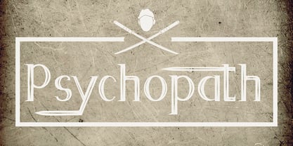 Psychopath is a display font with a katana effect. It'll match spooky, horror, and Halloween theme design.
 - Lasta by Tour De Force,
$25.00 Lasta is small serif font family with simple elegant shapes, refreshing Italics and poetic endings. Containing 2 weights and 2 italics, with lower x-height which brings more air (empty space, white space...) into paragraphs making text more graceful and legible. Thin serifs bring small touch of dynamic into letter forms, just enough to bring specific tone to paragraph. Beside being mainly imagined as fully text family, Lasta is suitable titles or decorative typography as well for, especially the Italics with fancy curvy endings.
 - The Seasons by My Creative Land,
$25.00 The Seasons is an elegant classic serif font family consisting of a high contrast serif fonts with a vintage chic look, with corresponding calligraphic cursive italics that are based on a number of humanist italic scripts and written with a Pilot Parallel Pen. Both upright and italic fonts (6 in total) share same style soft terminals with a sharp cut and are enhanced by OpenType features such as ligatures and stylistic alternates. The Seasons can be used in high-end branding, logo designs, magazines, product packaging & invitations.
 - Drive Eddie by Ingrimayne Type,
$4.95 DrivEddie was an attempt to create a rough, hand-drawn typeface that was quirky but easily readable. It has a few serifs so it is almost but not quite san serif. All vertical stems are curved. For almost 25 years DrivEddie was a one-font family and one-font families often have limited applications. In 2020 I returned to this typeface to increase its possible uses by adding five new styles: italic, semibold, semibold-italic, bold, and bold-italic. I also corrected mistakes and added characters.
 - Galonia by Milan Pleva,
$18.00 Galonia is an elegant display typeface with flared serif. It has harmonic and classical look thanks to high contrast stroke. Includes ligatures, special alternative glyphs, old style figures and case sensitive glyphs. Features: Basic latin alphabet A-Z 77 Ligatures & Alternates 112 Accented characters Numbers, Punctuation, Currency, Symbols, Math symbols & Diacritics Old style figures Case sensitive glyphs Enjoy Galonia!
 - Chocolatier by Milan Pleva,
$18.00 Chocolatier is an all caps display serif typeface with soft edges. Includes ligatures, special alternative glyphs and old style figures. Chocolatier is ideal for headlines, headers, logos, labels, packaging, postcards, presentations, magazines, invitations, etc. Features: Basic latin alphabet A-Z 36 Ligatures & Alternates 56 Accented characters Numbers, Punctuation, Currency, Symbols, Math symbols & Diacritics Old style figures Enjoy Chocolatier!
 - Creolia by Milan Pleva,
$18.00 Creolia is a bold rounded serif typeface in modern and classy style. OpenType features include old style figures and ligatures. Creolia is ideal for headlines, headers, logos, labels, packaging, postcards, presentations, magazines, invitations, etc. Features: Basic latin alphabet A-Z 56 Ligatures & Alternates 112 Accented characters Numbers, Punctuation, Currency, Symbols, Math symbols & Diacritics Old style figures Enjoy Creolia!
 - Grand Prairie NF by Nick's Fonts,
$10.00This addition to the Whiz-Bang Woodtype series in based on a 100+ year-old typeface originally named Medallic. Due to the highly ornate nature of this font, it has a limited character set (no math operators or footnote accessories). The Opentype version of this font supports Unicode 1250 (Central European) languages, as well as Unicode 1252 (Latin) languages. - Cholens by Mevstory Studio,
$20.00 Cholens is a bold, rounded script typeface in a modern and classy style. OpenType features include old style figures and ligatures. Cholens is ideal for headlines, headers, logos, labels, packaging, postcards, presentations, magazines, invitations, and more. Features: Basic latin alphabet A-Z Ligatures & Alternates Accented characters Numbers, Punctuation, Currency, Symbols, Math symbols & Diacritics Old style figures
 - Astronoma by Milan Pleva,
$7.00 Astronoma is a clean modern and geometric sans serif typeface inspired by industrial design and technical fonts. Includes OpenType features & supports many languages. Astronoma is ideal for headlines, headers, logos, labels, packaging, presentations, magazines, invitations, etc. Features: Basic latin alphabet A-Z 11 Ligatures & Alternates 56 Accented characters Numbers, Punctuation, Currency, Symbols, Math symbols & Diacritics Enjoy Astronoma!
 - Bandar by Afkari Studio,
$10.00 Bandar is a sans serif sans-serif font family comes in 5 weights; regular, italic, bold, bold italic and outline. Bandar works well in any graphic design project and purpose both as a display typeface and in smaller sizes. Bandar is perfect to use for any kind of design such as branding projects, logo, brochures, business card, social media posts, advertisements, product packaging, product designs, label, photography, watermark, invitation, brand company, stationery and any projects. Features: Regular style Bold Style Italic Style Bold Italic Style Outline Style Alternate Style Works on PC & Mac Simple installations Accessible in the Adobe Illustrator, Adobe Photoshop, Adobe InDesign, even work on Microsoft Word PUA Encoded Characters Fully accessible without additional design software. Multilingual Support
 - Anno by Linotype,
$29.99The impulse behind André Maaßen’s design of the Anno typeface was the design of a New Year’s card for the year 2000 (Anno 2000). His desire to create the perfect printed image developed into a family with four styles: Anno 1, Anno 1 Italic, Anno 2, and Anno 2 Italic. Anno 1 and its Italic are semi-classicist typefaces, with a high degree of stroke contrast, while Anno 2 and its Italic are semi-grotesks, with less stroke contrast. Both Anno 1 and Anno 2 are sans serifs typefaces, but they each offer a new interpretation of the genre. The Anno typeface may be used in a number of applications and sizes. And it is naturally suitable for New Year’s greetings and other cards, of course! - Amico by Hackberry Font Foundry,
$24.95 This is a new barely modulated, slightly narrow, sans serif font family. It has eight styles: thin, thin italic, regular, italic, bold, bold italic, black, & black italic grouped into two 4-font families: Amico Thin with the Bold; and Amico with the Black. Amico has the standard feature set developed at the end of 2007. It has many OpenType features and 654 character/glyphs: Caps, lower case, small caps, ligatures, discretionary ligatures, swashes, small cap figures, old style figures, numerators, denominators, accent characters, ordinal numbers (1st-infinity): lining and oldstyle), and so on. It is designed for text use in body copy. However, Amico really shines as the choice for heads & subheads when using Amitale or Brinar for the text family.
 - Hazelnut Milk Tea by Fikryal,
$18.00 Introducing this very simple sans serif font that is Hazelnut Milk Tea font. I created this font with the inspiration of simplicity and it is very friendly to look at, with four versions, namely regular, italic, bold, bold italic. Very suitable to be applied in various aspects of design, Also it’s perfect for logo, branding, title, social media posts, advertisements, product packaging, product designs, label, photography, watermark, special event, magazine, web designs, etc. Features : Hazelnut Milk Tea Regular ( Uppercase, Lowercase ) Hazelnut Milk Tea Regular Italic ( Uppercase, Lowercase ) Hazelnut Milk Tea Bold ( Uppercase, Lowercase ) Hazelnut Milk Tea Bold Italic ( Uppercase, Lowercase ) Symbols multilingual support If you have any questions please don’t hesitate to contact me follow my Instagram: @fkryall Thank you

