10,000 search results (0.025 seconds)
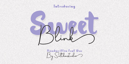
  1. Sweet blink play by Sulthan Studio, $10.00
    Sweet Blink is a cute and friendly handwritten font duo that is perfect for creating charming and playful designs. Its delicate and whimsical letters feature playful curves and loops, giving it a warm and inviting personality. This font is perfect for invitations, greeting cards, and other projects that require a personal and charming touch. The font’s cute and friendly personality is sure to make viewers smile.
  2. Adegoke by Wildan Type, $15.00
    Introducing new font_ "Adegoke". This is a sans serif font, designed with contrasting countur differences. Gives a simple impression with a thick serif flavor. Some alternative characters are available to give each user freedom in creating headings such as magazines, posters or brands. While the basic character can be used as body text. This font family is also available in oblique style to add variety of users.
  3. Kis Antiqua Now TB Pro by Elsner+Flake, $99.00
    In the course of the re-vitalization of its Typoart typeface inventory, Elsner+Flake decided in 2006 to offer the “Kis Antiqua” by Hildegard Korger, in a re-worked form and with an extended sortiment, as an OpenType Pro-version. After consultation with Hildegard Korger, Elsner+Flake tasked the Leipzig type designer Erhard Kaiser with the execution of the re-design and expansion of the sortiment. Detlef Schäfer writes in “Fotosatzschriften Type-Design+Schrifthersteller”, VEB Fachbuchverlag Leipzig, 1989: No other printing type has ever generated as far-reaching a controversy as this typeface which Jan Tschichold called the most beautiful of all the old Antiqua types. For a long time, it was thought to have been designed by Anton Janson. In 1720 a large number of the original types were displayed in the catalog of the „Ehrhardische Gycery“ (Ehrhardt Typefoundry) in Leipzig. Recently, thanks to the research performed by Beatrice Warde and especially György Haimann, it has been proven unambiguously that the originator of this typeface was Miklós (Nicholas) Tótfalusi Kis (pronounced „Kisch“) who was born in 1650 in the Hungarian town of Tótfal. His calvinistic church had sent him to the Netherlands to oversee the printing of a Hungarian language bible. He studied printing and punch cutting and earned special recognition for his Armenian and Hebrew types. Upon his return to Hungary, an emergency situation forced him to sell several of his matrice sets to the Ehrhardt Typefoundry in Leipzig. In Hungary he printed from his own typefaces, but religious tensions arose between him and one of his church elders. He died at an early age in 1702. The significant characteristics of the “Dutch Antiqua” by Kis are the larger body size, relatively small lower case letters and strong upper case letters, which show clearly defined contrasts in the stroke widths. The “Kis Antiqua” is less elegant than the Garamond, rather somewhat austere in a calvinistic way, but its expression is unique and full of tension. The upper and lower case serifs are only slightly concave, and the upper case O as well as the lower case o have, for the first time, a vertical axis. In the replica, sensitively and respectfully (responsibly) drawn by Hildegard Korger, these characteristics of this pleasantly readable and beautiful face have been well met. For Typoart it was clear that this typeface has to appear under its only true name “Kis Antiqua.” It will be used primarily in book design. Elsner+Flake added two headline weights, which are available as a separate font family Kis Antiqua Now TH Pro Designer: Miklós (Nicholas) Tótfalusi Kis, 1686 Hildegard Korger, 1986-1988 Erhard Kaiser, 2008
  4. Green Fairy by Maria Montes, $39.00
    Green Fairy is a chromatic font family highly ornamented for display purposes. Green Fairy’s characters have been specifically designed to accommodate its loops and ornaments following a modern typeface structure. Green Fairy has four chromatic weights: 1. Green Fairy Outline 2. Green Fairy Dots 3. Green Fairy Stencil 4. Green Fairy Full The outline weight has been created as the base or structure for the other weights. You can combine these weights as well as add colours to obtain multiple effects and type styles. Green Fairy has also three combined weights (combos) to simplify your work flow, for these occasions when you only want to use one single colour in your font: 5. Green Fairy Dots Combo 6. Green Fairy Stencil Combo 7. Green Fairy Full Combo GREEN FAIRY ORIGINS The origin of this typeface is the lettering I designed in October 2015 as part of my illustrated cocktail artwork called “Absinthe. La Fée Verte (The Green Fairy)”. Originally, this lettering only featured eight letters “AB·SINTHE” vector drawn in Illustrator. Right after creating the full-colour artwork, I designed a fountain-letterpress print version of it, in collaboration with Ladies of Letters, A.K.A. Carla Hackett and Amy Constable from Saint Gertrude Fine Printing. At the beginning of 2016 –and thanks to the project @36daysoftype– I found the motivation, and most importantly the deadline, to draw the rest of the twenty-six letters of the uppercase alphabet using Illustrator. I started 2017 having my first two calligraphy courses sold out, so I took this amazing opportunity to devote myself to Green Fairy for a few months. In February 2017, I purchased the font software Glyphs and I started to re-draw all twenty-six letters of the uppercase alphabet again. PRODUCTION PROCESS Green Fairy started being one weight, but quickly turned into a layered/chromatic font. Things were going more or less fine till I arrived to the Dots weight: 1) I started drawing squares following a grid; 2) Then, the squares turned into diamonds following the same grid; 3) Then, the grid wasn’t working so well on the round letters so I tried randomising the position of the diamonds but it didn’t work; 4) So I went back to the grid, and this time scaled down the size of the diamonds creating a visual half-tone effect. I spent over four weeks working on the Dots weight and I felt like I was in the middle of a very long tunnel and I couldn’t see the light at the end. I encountered many other problems along the way but by June 2017, I felt I was back on track again. I kept working, tweaking, re-drawing and re-adjusting, and then the diacritics came on board… And then more re-drawing, re-tweaking, re-adjusting and then numbers… And then spacing, symbols, and currencies… And then more spacing, kerning, contextual kerning for triplets… In September 2017 I told myself “that’s it, I’m going to finish it now!” But guess what? More re-tweaking, testing, hinting, testing, rendering, testing… For those of you not familiarized with typeface design, it is extremely time consuming and it requires a lot of hard work, focus and determination. This project could not have been possible without the help of these generous professionals: Jose Manuel Urós, typeface designer based in Barcelona and my teacher twice in the past; Jamie Clarke, freelance letterer and typeface designer who has released a couple of chromatic fonts recently; Troy Leinster, Australian full-time typeface designer living and working in New York City; Noe Blanco, full-time typeface designer and hinting specialist based in Catalonia; And Nicole Phillips, typographer currently relocating from Australia to New Zealand. To all of you: THANK YOU VERY MUCH!
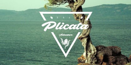
  5. Plicata by Mans Greback, $59.00
    Plicata is a hand crafted typeface. It's script style is legible and clear, and it brings an edge to your graphic projects. Created with care by Måns Grebäck, this is the perfect store front logo font.
  6. Savarella by Slex Studio, $12.00
    LOVE angelo is a beautiful Font Duo that's perfect for branding, wedding invitations, and other romantic projects. Font Features: -Lowercase beginning and end swash -lowercase swash up and down -ligature -1 multilingual Serif font. All the features and special characters of this font are included in one file. So that it is easily accessible by using programs or software that support opentype such as Microsoft Word, Excel, Adobe Illustrator, Adobe Photosop, and Adobe Indesign). This font is also very easy to use as it is compatible for all software even for supported non-opentypes. Are you wondering how to find out a special feature or character? Dont worry. You will get a guide with the file if you download this font. Please send a message if you have any questions or concerns, and feel free to say hi on Instagram: https://www.instagram.com/slex_studio/
  7. Origram Pro by Nuno Dias, $21.00
    ORIGRAM PRO is the full version of ORIGRAM Free Font, a font with over 100k downloads, and counting! This font was already featured in dozens of websites and Design Blogs. I decided to remake this font, smoothing out a few rough edges - so to speak - and adding value to the end result, with several different interesting tweaks and updates. Inspired in the Origami and Tangram tradition, the basic shape is an octagon. Geometrical and regular, resulting in a neat and captivating display font. Not particularly conceived to be used in common text, this stylized font will add value to any large scale image within the realm of logos & branding, outdoors, packaging, titles, magazines, posters, signs, shirts, scrap-booking... Your imagination is the limit. This display font comes now with Uppercases, updated Lowercases, Numbers, and a slew of new Diacritic Marks and Punctuation Marks. A large number of special characters was included in the package, enriching the font’s versatility and usability.
  8. Fosho by Chank, $49.00
    For more than 70 years the 10-foot tall letters displaying the word FOSHAY have illuminated the Foshay Tower in the Minneapolis skyline. However, the typestyle has never been made into a font before. This new modern font family, dubbed Fosho Book, is optimized for book print usage as well as functioning as big bold display type on screen. The Fosho fonts are available in three styles: Outlines, Dotted Bulb Inlines and Composite with both. You can use the three styles in overlapping colors for dramatic chromatic effects.
  9. Inferno Corner by Sipanji21, $15.00
    "Inferno Corner" is a 3D layered graffiti font characterized by sharp corners. Fonts like this incorporate multiple layers to create a three-dimensional effect and emphasize angular or pointed edges, often enhancing the font's dynamism and visual impact. This font is particularly fitting for various street-related projects where a bold and edgy typographic style is desired. Whether used in posters, street art, or any design endeavor aimed at the urban environment, "Inferno Corner" can lend a striking and attention-grabbing aspect to your text, contributing to the overall street-style aesthetics of your project.
  10. Glotona by deFharo, $10.00
    Glotona's Black & White are four modernist typographies written by hand and combinable with each other by layers to create multi-colored typographic headlines. Glotona is my tribute to Bodoni fonts, revolutionary fonts when they appeared in the S XVIII and still in force today. The great contrast between antlers, give foot to the design maintaining the elegance of the modernist typefaces, the manual writing and the roundness of the serif and antlers bring freshness and empathy, the careful configuration of the kerning and the proportions give maximum readability to these fonts.
  11. GHEA Granshan by Edik Ghabuzyan, $40.00
    GHEA Granshan is a super font family. It has 9 upright weights and their Italics. It supports Latin Pro, Armenian, Greek, Cyrillic, Bulgarian & Ukrainian alternatives alphabet systems. The weights from Regular to Bold and their Italics can be used as text fonts. The weights thinner than Regular and thicker than Bold can be used as Display fonts. It is an easily readable fond and the eyes don't get tired while reading. GHEA Granshan has a slight contrast style and at the same time is quite bright and clear.
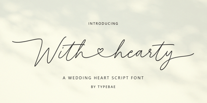
  12. With Hearty by Typebae, $19.00
    With Hearty Font is an exquisite and delicate handwritten script font that exudes elegance. It features captivating letter alternatives and enchanting tails at the beginning and end of each stroke. The font's distinctive attribute lies in its heart-shaped connecting tail, which adds a touch of romance and charm. With its graceful design, With Hearty Font is sure to captivate and inspire. To use alternates, heart connector, beginning and ending swashes, you don't need to use software that supports opentype, because we have made it separately so it's very easy to use.
  13. Slam Bang Theater NF by Nick's Fonts, $10.00
    This ultrabold headline font is basically patterned after the font Nubian Black, designed by Willard T. Sniffin for American Type Founders in the 1920s, but includes an unusual inline treatment of the caps. Named for the local television show on KFJZ-TV (later KTVT) in Fort Worth, Texas, that introduced a whole new generation of kids to the Three Stooges, and hosted by the erstwhile Icky Twerp. Both versions of this font contain the Unicode 1252 (Latin) and Unicode 1250 (Central European) character sets, with localization for Romanian and Moldovan.
  14. Rolling Pen by Sudtipos, $79.00
    After doing this for so many years, one would think my fascination with the old history of writing would have mellowed out by now. The truth is that alongside being a calligraphy history buff, I'm a pop technology freak. Maybe even keener on the tech thing, since I just can't seem to get enough new gadgets. And after working with type technologies for so many years, I'm starting to think that writing and design technologies as we now know them, being about 2.5 post-computer generations, keep becoming more and more detached from what the very old humanity arts/tasks they essentially want to facilitate. In a world where command-z is a frequently used key combination, it’s difficult to justify expecting a Morris-made book or a Zaner-drawn sentence, but accidental artistic “mutations” become welcome, marketable features. When fluid pens were introduced, their liquid saturation influenced type design to a great extent almost overnight an influence professional designers tend to play down. Now round stroke endings are a common sight, and the saturation is so clean and measured, unlike any liquid-paper relationship possible in reality. Some designers even illustrate their work by overlaying perfect circles at stroke ends, in order to illustrate how “geometric” their work was. Because if it’s measured with precise geometry, it’s got to be meaningful design. And once in a while, by a total freak accident, the now-cherished mutations prove to have existed long before the technology that caused them. Rolling Pen was cued by just such a thing: A rounded, circular, roll-flowing calligraphy from the late nineteenth century seemingly one of those experimental takes on what inspired Business Penmanship, another font of mine. Looking at it now it certainly seems to be friendlier, more legible, and maybe even more practical and easier to execute than the standard business penmanship of those days, but I guess friendliness and simplicity were at odds with the stiff manner business liked to present itself back then, so that kind of thing remained buried in the professional penman’s oddities drawer. It would be quite a few years before all this curviness and rounding were thought of as symbolic of graceful movement, which brought such a flow closer to the idea of fine art. Even though in this case the accidental mutation just happens to not be a mutation after all, the whole technology-transforms-application argument still applies here. I'm almost sure “business” will be the last thing on people’s minds when they use this font today. One extreme example of that level of disconnect between origin and current application is shown here, with the so-called business penmanship strutting around in gloss and neon. Rolling Pen is another cup of mine that runneth over with alternates, swashes, ligatures, and other techy perks. To explore its full potential, please use it in a program that supports OpenType features for advanced typography. Enjoy the new Rolling Pen designed by Ale Paul with Neon’s visual poetry by Tomás García.
  15. TT Barrels by TypeType, $29.00
    TT Barrels useful links: Specimen PDF | Graphic presentation | Customization options TT Barrels is an elegant scotch style modern serif with strong industrial accents in its design. The TT Barrels project was born from a fictional technical assignment in which we tried to combine the technological effectiveness of industrial production used in engineering and the restrictions imposed by it with a beautiful scotch style serif. We decided to create a typeface that could be used to press letters on the metal body of a car, all while the typeface being elegant, and possessing sophisticated details that are typical of the classic text fonts of the late 19th and early 20th centuries. In the process of designing and sketching, we reconsidered certain aspects and abandoned some of the requirements imposed by the technology of metal letter pressing, for example, from the extensive application of visual compensators, the decreased strokes contrast, and the hyperdeformation of individual letter elements to preserve a more pronounced rhythm of these elements. First of all, we wanted both to maintain the ease of reading for the entire text array and follow the rules of aesthetics of each letter in the typeface, while still leaving some influence of industrialism. In the end, this influence is best manifested in serifs, which are quite massive and have a technologically exaggerated wedge shape. TT Barrels consists of 12 fonts: Light, Regular, DemiBold, Bold, Extrabold, Black and the corresponding Italics. Each outline consists of more than 750 glyphs and includes small capitals, ligatures (for Latin and Cyrillic alphabets), stylistic alternates, old-style figures, and many other useful features. FOLLOW US: Instagram | Facebook | Website TT Barrels OpenType features: ordn, c2sc, smcp, case, frac, sinf, sups, numr, dnom, tnum, onum, lnum, pnum, dlig, liga, calt, salt (ss01). TT Barrels language support: Acehnese, Afar, Albanian, Alsatian, Aragonese, Arumanian, Asu, Aymara, Banjar, Basque, Belarusian (cyr), Bemba, Bena, Betawi, Bislama, Boholano, Bosnian (cyr), Bosnian (lat), Breton, Bulgarian (cyr), Cebuano, Chamorro, Chiga, Colognian, Cornish, Corsican, Cree, Croatian, Czech, Danish, Embu, English, Erzya, Estonian, Faroese, Fijian, Filipino, Finnish, French, Friulian, Gaelic, Gagauz (lat), Galician, German, Gusii, Haitian Creole, Hawaiian, Hiri Motu, Hungarian, Icelandic, Ilocano, Indonesian, Innu-aimun, Interlingua, Irish, Italian, Javanese, Judaeo-Spanish, Judaeo-Spanish, Kalenjin, Karachay-Balkar (lat), Karaim (lat), Karakalpak (lat), Kashubian, Khasi, Khvarshi, Kinyarwanda, Kirundi, Kongo, Kumyk, Kurdish (lat), Ladin, Latvian, Laz, Leonese, Lithuanian, Luganda, Luo, Luxembourgish, Luyia, Macedonian, Machame, Makhuwa-Meetto, Makonde, Malay, Manx, Maori, Mauritian Creole, Minangkabau, Moldavian (lat), Montenegrin (lat), Mordvin-moksha, Morisyen, Nahuatl, Nauruan, Ndebele, Nias, Nogai, Norwegian, Nyankole, Occitan, Oromo, Palauan, Polish, Portuguese, Quechua, Rheto-Romance, Rohingya, Romanian, Romansh, Rombo, Rundi, Russian, Rusyn, Rwa, Salar, Samburu, Samoan, Sango, Sangu, Scots, Sena, Serbian (cyr), Serbian (lat), Seychellois Creole, Shambala, Shona, Slovak, Slovenian, Soga, Somali, Sorbian, Sotho, Spanish, Sundanese, Swahili, Swazi, Swedish, Swiss German, Swiss German, Tagalog, Tahitian, Taita, Tatar, Tetum, Tok Pisin, Tongan, Tsonga, Tswana, Turkish, Turkmen (lat), Ukrainian, Uyghur, Vepsian, Volapük, Võro, Vunjo, Xhosa, Zaza, Zulu.
  16. TT Berlinerins by TypeType, $29.00
    TT Berlinerins useful links: Specimen PDF | Graphic presentation | Customization options Please note! If you need OTF versions of the fonts, just email us at commercial@typetype.org About TT Berlinerins: TT Berlinerins is a contrast pair of typefaces which is basically our tribute to Berlin. Just like in the city itself where historicity and modernity are intertwined, the elegant script in our font family symbolizes the modern Berlin, and the grotesque inspired by the wood-type poster types of the first third of the 20th century is responsible for the historic component of the city. The idea of this project emerged in the beginning of 2016 when we've met Evgenia Pestova, a calligrapher from Berlin, who shared the contemporary perspective on calligraphy and the city impressions with us. The wood-type grotesque appeared later, after our another colleague had visited Berlin and told us her fascinating story about the things she had seen. The city is full of contrasts—it is very modern and very vintage at the same time. The photographs and the impressions from the trip have also become the basis of our project. That is how we've added a little of old Berlins roughness and inhomogeneity. TT Berlinerins Script contains 998 glyphs, including more than 240 swashes for which we've written a special feature. We've also drawn a large number of ligatures for TT Berlinerins Script and integrated wide support of OpenType features: ordn, frac, case, sups, sinf, numr, dnom, tnum, pnum, calt, liga. TT Berlinerins Grotesk consists of uppercase letters, includes a set of unusual ligatures and wide support of OpenType features: ordn, frac, sups, sinf, numr, dnom, tnum, pnum, liga, salt and two stylistic sets ss01, ss02 for the ampersand. FOLLOW US: Instagram | Facebook | Website TT Berlinerins language support: Acehnese, Afar, Albanian, Alsatian, Aragonese, Arumanian, Asu, Aymara, Banjar, Basque, Belarusian (cyr), Bemba, Bena, Betawi, Bislama, Boholano, Bosnian (cyr), Bosnian (lat), Breton, Bulgarian (cyr), Cebuano, Chamorro, Chiga, Colognian, Cornish, Corsican, Cree, Croatian, Czech, Danish, Embu, English, Erzya, Estonian, Faroese, Fijian, Filipino, Finnish, French, Friulian, Gaelic, Gagauz (lat), Galician, German, Gusii, Haitian Creole, Hawaiian, Hiri Motu, Hungarian, Icelandic, Ilocano, Indonesian, Innu-aimun, Interlingua, Irish, Italian, Javanese, Judaeo-Spanish, Judaeo-Spanish, Kalenjin, Karachay-Balkar (lat), Karaim (lat), Karakalpak (lat), Kashubian, Khasi, Khvarshi, Kinyarwanda, Kirundi, Kongo, Kumyk, Kurdish (lat), Ladin, Latvian, Laz, Leonese, Lithuanian, Luganda, Luo, Luxembourgish, Luyia, Macedonian, Machame, Makhuwa-Meetto, Makonde, Malay, Manx, Maori, Mauritian Creole, Minangkabau, Moldavian (lat), Montenegrin (lat), Mordvin-moksha, Morisyen, Nahuatl, Nauruan, Ndebele, Nias, Nogai, Norwegian, Nyankole, Occitan, Oromo, Palauan, Polish, Portuguese, Quechua, Rheto-Romance, Rohingya, Romanian, Romansh, Rombo, Rundi, Russian, Rusyn, Rwa, Salar, Samburu, Samoan, Sango, Sangu, Scots, Sena, Serbian (cyr), Serbian (lat), Seychellois Creole, Shambala, Shona, Slovak, Slovenian, Soga, Somali, Sorbian, Sotho, Spanish, Sundanese, Swahili, Swazi, Swedish, Swiss German, Swiss German, Tagalog, Tahitian, Taita, Tatar, Tetum, Tok Pisin, Tongan, Tsonga, Tswana, Turkish, Turkmen (lat), Ukrainian, Uyghur, Vepsian, Volapük, Võro, Vunjo, Xhosa, Zaza, Zulu.
  17. Merside by Putracetol, $28.00
    Merside - Premium Serif Font Merside - Premium Serif Font is a stunning typeface that exudes sophistication and elegance. The font's clean and crisp lines make it a versatile choice for various design projects, from high-end branding to classic book covers and posters. The font was crafted with the utmost care and attention to detail, resulting in a timeless typeface that will elevate any design. Merside - Premium Serif Font is the perfect choice for designers who want to convey a sense of luxury and exclusivity in their work. The font's classic serif style adds a touch of refinement, while the clean lines give it a modern twist. Whether you are designing a logo for a luxury brand, creating marketing materials for a high-end fashion label, or designing a product packaging, Merside will add a touch of elegance and sophistication to your project. One of the standout features of Merside - Premium Serif Font is its OpenType features, which include alternates and ligatures. These features give designers more creative freedom, allowing them to customize the font and create unique and eye-catching designs. The font also includes uppercase and lowercase letters, as well as number, punctuation, and symbol glyphs. Additionally, Merside supports multiple languages, making it an excellent choice for global brands. The font is compatible with a wide range of design software and platforms. You can easily install and use Merside - Premium Serif Font on your computer or device, making it a convenient and accessible choice for designers. If you are looking for a premium serif font that will make your design stand out, Merside - Premium Serif Font is an excellent choice. With its elegant and refined style, it is perfect for creating luxury branding, elegant design, and high-end fashion. This font will give your project a timeless and classic look that will never go out of style. In summary, Merside - Premium Serif Font is a stunning and versatile font that is perfect for designers who want to create high-end and sophisticated designs. With its classic serif style, OpenType features, and multilanguage support, it is a font that will elevate any design project.
  18. Metal Cry by Fabulous Rice, $25.00
    Metal Cry is a font family that was inspired by countless hours spent playing video games, watching old movies or reading comic books. And even more hours closely analysing the design of all these things. The art of creating beautiful letters has slowly declined with the rise of the digital age and its solid-colour, 2D fonts. And most of the time, the care given to typography in cultural products just isn't what it used to be anymore. This was the inspiration for Metal Cry, a family of 4 layerable fonts that can bring a feeling of depth to its letters, and offers endless possible combinations. Metal Cry Outlands is the basic shape of all the characters, it can be used as the bright side of the bevel. Metal Cry Front is the inline border font that can be used as the front side of the bevel. Metal Cry Shadow can be used as the dark side of the bevel. Metal Cry Depth can be used to flash out the inside shape of the letter. But of course, any font can be combined with any other font(s) to obtain various results. The planets in the above visuals are courtesy of 3D artist Thomas Veyrat / veyratom.com
  19. Wind Soul by Nathatype, $29.00
    Wind Soul is a whimsical display font that floats into the visual realm with an airy charm. Crafted in uppercases and playful design elements, Wind Soul is a delightful typeface that brings a sense of lightness and joy to any creative project. This is ALL CAPS font. The characters in Wind Soul are generously sized, enhancing the font's playful and larger-than-life aesthetic. The thick font weight adds a comforting solidity, while the design, reminiscent of a balloon's roundness, infuses a sense of fun and lightheartedness into each letter. Enjoy the features here. Features: Alternates Stylistic Sets Multilingual Supports PUA Encoded Numerals and Punctuations Wind Soul fits in headlines, logos, posters, flyers, branding materials, greeting cards, print media, editorial layouts, and many more designs. Find out more ways to use this font by taking a look at the font preview. Thanks for purchasing our fonts. Hopefully, you have a great time using our font. Feel free to contact us anytime for further information or when you have trouble with the font. Thanks a lot and happy designing.
  20. Happy Land by Yumna Type, $15.00
    It can be a real challenge to deliver messages through designs due to the very ordinary display fonts lacking prominent characters. Let us present you the Happy Land, a prominent display font to add firm touches to any of your designs. The letters made all in capital can enhance certain effects on your designs. The font’s simple shapes with strong contrasts affect the legibility. As a result, it is suitable to apply for big text sizes. In addition, this font provides a clipart bonus for you. Enjoy the available features available here. Features: Stylistic Sets Multilingual Supports PUA Encoded Numerals and Punctuations Happy Land fits best for various design projects, such as brandings, posters, banners, headings, magazine covers, quotes, printed products, merchandise, social media, etc. Find out more ways to use this font by taking a look at the font preview. Thanks for purchasing our fonts. Hopefully, you have a great time using our font. Feel free to contact us anytime for further information or when you have trouble with the font. Thanks a lot and happy designing.
  21. Heavy Heap, designed by the talented Ray Larabie, is a font that truly stands out in the dynamic world of typography. Its design channels the bold spirit of the 1960s and '70s, particularly drawing i...
  22. Tusch Touch 3 is a distinctive display font created by Måns Grebäck, a renowned typeface designer known for his craftsmanship in calligraphy and script fonts. This font stands out for its unique blen...
  23. The Circus Ornate font, created by Dieter Steffmann, is a typographic delight that harkens back to the golden age of circus posters and Victorian decorative arts. This font stands out with its detail...
  24. The font SF Speakeasy Shaded, crafted by ShyFoundry, embodies a unique blend of nostalgia and contemporary design, making it a standout choice for those seeking to add a touch of vintage flair to the...
  25. The font Potrzebie, crafted by Patrick Broderick, is an intriguing typeface that showcases a unique blend of style and personality. It draws inspiration from a mix of retro and contemporary design el...
  26. SF Orson Casual Heavy, a distinctive typeface from ShyFoundry, radiates a unique charm that is hard to ignore. Crafted with a blend of casual flair and robust presence, this font strikes a balance be...
  27. Jokewood, crafted by Fontalicious, is a typeface that seemingly jumps straight out of a whimsical comic book or animated series from a bygone era, encapsulating the essence of fun and playfulness in ...
  28. The font MissingLinks, crafted by the prolific font designer Manfred Klein, is a captivating and unique typeface, infused with a blend of artistic flair and whimsical irregularities. Manfred Klein, k...
  29. Microsoft Sans Serif by Microsoft Corporation, $39.00
    Microsoft Sans Serif™ Regular is a very legible User Interface (UI) font. It was designed to be metrically compatible with the MS Sans bitmap font that shipped in early versions of Microsoft Windows. The original MS Sans was in the inflexible .fon bitmap format and could not be scaled. Microsoft Sans Serif Regular is much more flexible and legible as it font antialiasing and scalable user interfaces. Character Set: Latin-1, WGL Pan-European (Eastern Europe, Cyrillic, Greek and Turkish).
  30. Hey there! Let me tell you about a super cool font called Vacaciones. This creation is from the imaginative mind of deFharo, a Spanish type designer known for crafting fonts with unique personalities...
  31. Upheaval TT BRK by AEnigma is a testament to the creative and rebellious spirit that fonts can embody. At its core, Upheaval TT BRK is a display font that demands attention, breaking away from the co...
  32. The Kool Ding font by Blue Vinyl Fonts is a remarkable and playful decorative typeface that truly lives up to its name. Its unique design is centered around a collection of fun and quirky dingbats, m...
  33. As of my last knowledge update in early 2023, the font AddCityboy is not a widely recognized or standard typeface in the vast world of typography. This could mean that it's a niche, custom-made, or n...
  34. The font named SAVE THE HONEYBEE, created by SpideRaY, is a distinctive and purpose-driven typeface, conceived with the intention of raising awareness about the critical issue of honeybee conservatio...
  35. The Ink Tank (BRK) font, crafted by the creative entity known as AEnigma, is an embodiment of inventive typographic artistry that transcends the mere assembly of letters. This font is a bridge betwee...
  36. Ah, Scatterbrained Restrained by StimulEye Fonts — a name that sounds like what happens when a caffeine-addicted squirrel tries its hand at typography. This font is the charming eccentric of the font...
  37. The font named "Ash" brings to mind an elegant yet robust typeface that likely balances traditional design elements with modern flair. Without having a specific, widely-known font called "Ash" availa...
  38. The "Janda Closer To Free" font, designed by Kimberly Geswein, embodies a perfect blend of casual charm and heartfelt emotion, making it stand out in the realm of typography. This font captures the e...
  39. The "Surrendered Heart" font, crafted by the talented Kimberly Geswein, is a testament to the raw emotional power that typography can hold. This font, with its bewitching blend of elegance and whimsy...
  40. Imagining a font named "Funk" transports us into a realm where typography ceases to be merely about readability and dives headfirst into the expressive, the evocative, and the playfully rhythmic. Fun...
Looking for more fonts? Check out our New, Sans, Script, Handwriting fonts or Categories
abstract fontscontact usprivacy policyweb font generator
Processing