5,226 search results
(0.013 seconds)
- Donthank by Letterhend,
$19.00 Introducing, Donthank Script Typeface. Donthank is a script typeface with swash.This font is perfect for quotes, branding, packaging, etc. What will you get: Including number and symbol. Support Multi Language Ligatures Alternates This font also support PUA Encoded! So, grab your own. Thank You!
 - Merchandising JNL by Jeff Levine,
$29.00 With some slight variation, Merchandising JNL was modeled from the lettering on a display box for Meyercord Decal letters and numbers. The phrase "make your own signs with decals" was lettered in a casual brush-like style, and is reproduced for the first time digitally.
 - Caffe Lungo by Hanoded,
$15.00 Caffe Lungo is a beautiful set of handmade fonts. Lungo is very legible, very clear, but has that authentic ‘handmade’ look. Caffe Lungo comes in three weights, each with its own Italic style. I also added ligatures for the g_j and j_j letter combinations.
 - Celliqath by Letterena Studios,
$10.00 Proudly present Celliqath Typeface , created by Storytype, A serif modern and classic typeface that has own unique style & modern look. This typeface is perfect for an elegant & luxury logo, book or movie title design, fashion brand, magazine, clothes, lettering, quotes, and so much more.
 - Cellosia by Bluestudio,
$20.00 Cellosia is made to resemble hand scratches, so it looks like a natural style like your own hand scratches. Cellosia offer beautiful typographic harmony for a variety of design projects, including watermark, logos, branding, wedding designs, social media posts, advertisements, product designs, magazines and others.
 - Versatylo Rounded by Variatype,
$14.00 Versatylo is a very strong and outstanding branding font that is usable in any company that wants to make its image look modern and high technology. So, let's make your own logotype with this font. FONT FEATURES Additional Accents 66 Languages Kerning Alternates Ligatures
 - Zalcony by HandletterYean,
$16.00 Introducing Zalcony, a captivating handmade font exuding a simple yet alluringly distorted brush aesthetic. Every letter and character carries its own unique size, beautifully showcasing the authentic, natural flow of handwritten script. With Zalcony, add a touch of genuine, personalized charm to your designs.
 - Salamanca TF by TypeFaith Fonts,
$24.00 Salamaca TF is a fun to use typeface. First released in 1994 but completely redesigned in 2013. With the OpenType options or the glyphs palette you make your own special typo's. The font is based on the wall typography of the city of Salamanca.
 - Ayulinda by Patria Ari,
$17.00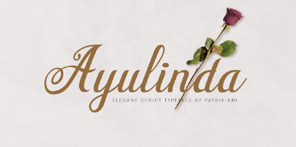 Ayulinda is a luxurious wedding script typeface with its own beautiful alternate glyphs that you can experiment with. Ayulinda is perfect for branding projects, wedding invitation, branding, logo, social media posts, advertisements, product packaging, product designs, label,poster, and any projects that you work on.
 - Maroko by Goodigital13,
$20.00 Perfectly suited to stationery, logos and much more. It looks stunning on wedding invitations, thank you cards, quotes, greeting cards, logos, business cards and every other design which needs a handwritten touch. Made your own design cards, poster, or anything else you might think of!
 - Mallory by Letterena Studios,
$10.00 Proudly present Mallory Typeface , created by Storytype, A serif modern and classic typeface that has own unique style & modern look. This typeface is perfect for an elegant & luxury logo, book or movie title design, fashion brand, magazine, clothes, lettering, quotes, and so much more.
 - Mehriban by Michael Browers,
$25.00Mehriban is a deconstructivist revival inbred from Michael Browers' previous work: Formasi and Disjecta. Formasi characters were morphed with their Disjecta counterparts, and in some cases with previously unpublished letterforms from Disjecta's concepting stages, resulting in a grunge font with its own unique swagger. - Saritha by Bluestudio,
$20.00 Saritha is made to resemble hand scratches, so it looks like a natural style like your own hand scratches. Saritha offer beautiful typographic harmony for a variety of design projects, including watermark, logos,branding, wedding designs, social media posts, advertisements, product designs, magazines and others.
 - Dreamy Notes Script by Subectype,
$15.00 The Dreamy Notes Duo is a stunning and comprehensive duo font (script and sans serif), ideal for giving your projects a branded but friendly feel. The two included styles can be combined together perfectly but are also beautiful on their own. Thank You, Subectype
 - Merry Fleurons by Greater Albion Typefounders,
$3.95 Merry Fleurons is a bit of fun for Christmas, New Year and the holidays. It's ideal for decorating your own cards, party banners and any sort of Christmas publications. Need Holly? Christmas Trees? Baubles? Candy Canes? Angels? Merry Fleurons is just what you need.
 - Ah, the elusive Font called Font, a font so enigmatic and self-referential it has become the meta of all typography. Picture, if you will, a typeface caught in an identity crisis, perpetually ponderi...
- Hamlet by Canada Type,
$24.95Based on a specimen of an obscure and uncredited old face called Kitterland, Hamlet is one of those curiosities hardly ever noticed in the world of modern fonts, the kind that infuses a variety of historic Blackletter and calligraphy traits in an otherwise Roman alphabet. Such typefaces, what few of them exist, are almost always classified by typophiles as traditional decorative Roman alphabets. We beg to differ. We think such hybrids are fascinating enough to deserve a classification of their own. And we think today's aspiring letterers and type designers would benefit from paying special attention to this kind of hybrid alphabet, not only because it has much more hand than machine in it, but also because it is a prime example of how to succeed in mixing different lettering techniques into one self-contained and distinctly functional alphabet. As in any efficient mixture of lettering methods, Hamlet ended up with characters that are uniquely its own, such as the cupped A, M, V, W and Y, the very luscious and inviting curves on the arms of E, F, L and T, both single- and double-story forms of the a, and the humblest, friendliest g and y ever. A dozen alternate characters are sprinkled throughout the character set, so check out the map for a few pleasant surprises. We also made the Handtooled and Headstone styles because we thought these friendly forms were just crying out for such treatments. The Handtooled version turned out quite lovely, if we may say so ourselves, perhaps even better than the main font. The Headstone version is available as a free bonus to those who purchase the complete Hamlet package. All Hamlet styles come with lining figures as well as old style ones. Hamlet comes in all popular font formats. The OpenType fonts contain push-button swapping alternates and figures, which come in handy in software programs that support this kind of thing. - Bromello by Alit Design,
$10.00 Introducing Bromello modern script typeface, using style hand made with brushing. Bromello is beautiful for wedding card design, logotype, blog or website header, fashion design, YouTube video thumbnails and any more. Bromello uses classic handwriting techniques to create a beautiful, modern design. Bromello is very popular at the moment and unique for so many reasons. People use the font to create and express their own style, create beautiful projects, promote their brands and projects and more. Remember, be inspired with your own styles and ideas and have fun! Product Content : • bromello typeface (OTF & TTF Format) • bromello italic typeface (OTF & TTF Format) Features : • Character Set A-Z • Numerals & Punctuations (OpenType Standard) • Accents (Multilingual characters) • Contextual Alternates • Swash • Stylistic Alternates
 - CA Smut by Cape Arcona Type Foundry,
$19.00 Sometimes the ugliest pets can be the cutest ones. And the dirtiest fonts can be the most charming ones. Like CA Smut which comes in two styles that can be stacked on top of each other. “Regular” is the shadow, while “Fill” is the filling. Create little masterpieces by playing with different colors, offset or deviating tracking. You can even try to use the “Fill” style on its own, but do so at you own risk. The spacing and kerning is optimized for the use with “Regular”, so be open minded for surprising results. If you ever had the intention to design a horror movie poster, there’s no way around CA Smut.
 - Dunhill Script by Lipton Letter Design,
$29.00 A bit of happenstance and accident are always full of possibility — Richard Lipton’s Dunhill Script is based on observations of the work of his left-handed calligraphy students and then from a small detail generated by his own freehand sketching. Like his other script typefaces, Dunhill was born from the desire to achieve a certain visual drama. Many details show the pen at work, like the terminal shapes and the caps and ascenders. Dunhill also has a range of alternate stylistic glyphs and contextual features that can transform it into a connected script. It’s a great choice for editorial display or advertising and branding settings on its own or paired with a Roman sans or serif.
 - Singolare by Latinotype,
$29.00 Singolare is a contemporary geometric Sans Serif with angular terminals and a great x height. Its main feature is the style difference between the lighter and heavier weights. The more weight it gains, the higher its singularity. With its weights, styles and layers variety, it's perfect for display use and short texts that require a visual impact. Singolare is composed by five weights, from Ultralight to Black. Every weight has its own stencil variation with expressive cuts and four decorative versions: three outline and one inline version, that can work on it’s own or overlapped to the black normal version (changing the colors of each layer) in order to amplify its usage possibilities.
 - Dry Erase by Zap Studio,
$20.00 This font is my first attempt at typeface design. It is based on my own handwriting and I tried to maintain the natural quality, where the letters are quite loose, some going in different directions, thickness and position. It has Open Type features including contextual alternatives, stylistic sets and ligatures. Trying to maintain natural quality of handwriting each glyph has four styles which randomly appear when you type. For example, when there are double letters, the two letters are slightly different. You may also switch off the random feature and use the four styles on their own. The many alternates are best activated in OpenType-aware programs, such as Word 2010, Illustrator CS4+, InDesign CS4+ and QuarkXpress 7+.
 - Lillius by Aga Silva,
$22.50 This font contains images in two variants, that is: tiles (seamless, endless) and dingbats showing plants, leaves, blooms, frogs, butterflies and ants. Note: Please be aware that you may need to prepare those patterns in order to work with them in CAD-CAM or if you intend them for bolt cutter etc.
 - Henderson Slab by Sudtipos,
$39.00 A few bold caps drawn by Albert Du Bois for the 1906 Henderson Sign Painter book started me in the direction of looking at how sign painters approached slabs after the industrial revolution. The usual happened from there. My exercise in the early lettering roots of what eventually became the definition of geometric typography ended up having a life of its own. The majuscules led to minuscules, one idiosyncratic bold weight led to six more, and uprights led to italics. What was kind-of-interesting in the early twentieth century persuaded me to make it interesting enough a century later. This of course meant alternates, swashes, the standard baggage that keeps calling my name. Henderson Slab is a family of seven weights plus italics, all full of open features and extended Latin language support. Part of this family’s appeal is its coverage of nearly the entire of the slab serif through the last 100 years — the basis is the manual, humanist origins, the swashed forms come right out of the phototypesetting era, and the alternates and mostly modern constructs of contemporary ideas. The result is a set with the ability to function in modern spaces, from corporate to editorial, in text or display, while both winking and nodding at the roots of what is now considered a geometric endeavor. (Basic version do not include alternates, swashes, etc).
 - Sultan by Canada Type,
$24.95Sultan is a revival and expansion of a 1954 Matrin Kausche typeface called Mosaik. This design highlights the unmistakable Arabic/Moorish calligraphy influence on Celtic lettering, by way of the highly active Andalusian culture from the ninth century until the crusades in the early eleventh century. Although Celtic lettering evolved on its own and prompted different calligraphic styles after the crusades, elements of the Arabic influence survived with it, its appeal remaining evident to this very day. For instance, this kind of lettering is very similar to the one Louis Tiffany used to make the most recognizable athletic insignia in North America - the New York Yankees logo, which is now over 110 years old, and has inspired hundreds of spin-offs in many athletic and non-athletic fields all over the world. The original character set made by Kausche was quite minimal, consisting of only numerals and uppercase letters along with a few alternates. But in this digital version the set has been considerably expanded into uppercase, lowercase, numerals, punctuation, a complete set of accented characters, and more than 15 alternate letters built into the font. Sultan is a great font choice particularly for design contexts of fantasy, middle ages legend, mystical and new age content, pirate literature, and Irish history. But it is also an excellent all-purpose display and poster font in general. - Jannon Pro by Storm Type Foundry,
$55.00 The engraver Jean Jannon ranks among the significant representatives of French typography of the first half of the 17th century. From 1610 he worked in the printing office of the Calvinist Academy in Sedan, where he was awarded the title "Imprimeur de son Excellence et de l'Academie Sédanoise". He began working on his own alphabet in 1615, so that he would not have to order type for his printing office from Paris, Holland and Germany, which at that time was rather difficult. The other reason was that not only the existing type faces, but also the respective punches were rapidly wearing out. Their restoration was extremely painstaking, not to mention the fact that the result would have been just a poor shadow of the original elegance. Thus a new type face came into existence, standing on a traditional basis, but with a life-giving sparkle from its creator. In 1621 Jannon published a Roman type face and italics, derived from the shapes of Garamond's type faces. As late as the start of the 20th century Jannon's type face was mistakenly called Garamond, because it looked like that type face at first sight. Jannon's Early Baroque Roman type face, however, differs from Garamond in contrast and in having grander forms. Jannon's italics rank among the most successful italics of all time – they are brilliantly cut and elegant.
 - Grit Sans by Baseline Fonts,
$39.00 Grit Sans is a font balanced enough to stand strong on the tippy-toes of its pointed "t" ascenders. Even all caps communicates calm. Dashes of whimsy in the proportionately plump X-Heights tell of the accountant drinking too much sherry at the office Christmas party, but thick, consistent strokes never lets you forget his job title. Ascenders and descenders consistently reach the same heights and depths, further attesting to the reliability of this typeface, at even very small sizes. Available in both regular and bold face, Grit Sans is a faithful complement to thin fonts with a pinch of frivolity such as Heirloom Artcraft. It is ideal in use for titles, subheadings, menus, playbills, custom stamps, logos - anywhere a solid font can speak at a volume just above all others.
 - Beauchef by Latinotype,
$26.00 Beauchef is a sans serif typeface originally created to meet the needs of Centro de Modelamiento Matemático de la Universidad de Chile (University of Chile Center for Mathematical Modeling). Beauchef is a typeface with rough strokes that features subtle optical compensation and does not strictly follow the laws of perception. This typeface might not be too cheerful, but shows a very particular idiosyncrasy of form. Beauchef is as tough as advanced mathematics; however, it is as legible and exact as numbers themselves. This is an avant-garde typeface that resembles the development of mathematics, but at the same time it is as conservative, calm and respectful as clients who require its services. Beauchef is so astonishing as mathematical formulas that mathematicians work with, but at the same time it is as humble as resulting figures.
 - Dewave by Luxfont,
$12.00 Introducing a distorted wavy Sans Serif font family. Interesting combination of elongation and distortion is embodied in the Dewave typeface. This font family is best suited for headlines and short text as an eye-catching accent. Due to its appearance, the font is well suited for the entertainment industry and everything connected with it both in offline life and in online projects. Dewave family has two types of tilt in different directions and 2 types of distortion - calm and strong, and all this is done in 3 types of thickness - this gives a lot of freedom of choice for the use of the font in the design. Features: Distorted letters in waveform 12 fonts in family: - 2 types of tilt - 3 thicknesses - 2 types of distortion Kerning ld.luxfont@gmail.com
 - Zing Sans Rust by Fontfabric,
$29.00 Zing Sans Rust is a textured handmade typeface with wide and calm proportions perfect for short text in small sizes, but also pleasant enough to use as an isolated display headline. It has a distinctive geometric spirit, smoothed with handmade details such as a slightly slanted axis visible in the terminals. The combination of Zing Script TM and Zing Sans TM brings a balanced completeness. Zing Goodies As a dessert, we serve you Zing GoodiesTM that tops off the whole package, making it an extraordinary delicacy! It has 4 basic forms — Bakery, BBQ, Banners, and Words — with two styles each, which contain plenty of adorable icons for any food and taste, elaborate banners, ribbons, and ornaments, and even a beautiful selection of useful words to accentuate your design.
 - Boos by Fontex,
$29.00 A lot of time and effort has been put into the process of creation the Boos Font. A careful analysis of the current font market and overly increasing customer needs have shaped Boos' final appearance and content. We don't have a precise target audience for Boos, since the amazing amount and structure of the chosen characters enables a very wide utilization. It will be best suited for headlines for classy magazines. It's look and feel came from a different designing approach, so that it can successfully satisfy the needs of even the neediest. Shining with calm and dignity, while in the roots being aggressive, it has successfully connected classic and modern styles - representing it's largest value. Medium, bold, black and light versions are included in the complete package, at a discounted price!
 - Arpona Sans by Floodfonts,
$49.00 Arpona Sans is a contemporary sans serif family inspired by the work of Edward Johnston and Eric Gill for London Underground. As well as its serif companion Arpona it is a symbiosis of different design concepts. Arpona Sans combines the esthetics of a geometric Sans with the usefulness of the humanist concept and the calm of the modernist proportions. Arpona Sans is a good choice for editorial design, branding, app design and web design – a workhorse well readable even in running text on screen. The family has nine weights, ranging from Thin to Black plus corresponding italics. Each style includes 590 glyphs supporting all western-, eastern- and central-european languages including four sets of figures and various currency symbols. If you want to go into details visit the microsite: https://www.floodfonts.com/arponasans
 - Wild Muerayam by Luhop Creative,
$10.00 Wild Muerayam is an elegant, modern and functional unique featuring a calm text and an expressive display. This font looks harmonious in books and other periodicals, on posters or on magazine covers. The scope is not limited to the printing industry, because Wild Muerayam looks aesthetically pleasing wherever text is used. Wild Muerayam a serif display font with a modern yet luxurious style. Aesthetic and unique letterforms, as well as soft curves and wild shape of the letters make this font so iconic. Wild Muerayam Features: Uppercase and lowercase Multilingual Numerals Punctuation PUA Encoded Alternates Ligatures To be able to access alternative fonts, make sure the software you use can support opentype features such as Microsoft Word, Paint, Adobe, Corel draw, Cricut and other applications. I hope you enjoy!
 - Kwun Tong JNL by Jeff Levine,
$29.00 Loosely based on a hand lettered title found on vintage sheet music for the song "Hong Kong", the design for Kwun Tong JNL emulates the letters and numbers formed from pieces of bamboo stalk. Kwun Tong JNL is named for a locality in Hong Kong although (according to Wikipedia) "the Hong Kong Government is unitary and does not define cities and towns as subsidiary administrative units."
 - Louisville Script by Ascender,
$50.99 Louisville Script is an informal script font based loosely on the handwriting of its designer, Steve Matteson. It was named for the town of Louisville, Colorado (pronounced "Lewis-ville"). Louisville Script is a youthful, casual handwriting script font. It is ideal for casual correspondence including cards, scrapbooks, menus and flyers. Louisville Script is also great for educational materials including the school newsletter or yearbook!
 - Round Rock NF by Nick's Fonts,
$10.00Woodtype wizard Rob Roy Kelly identified the inspiration for this typeface in his 100 Wood Type Alphabets simply as "No. 154". Funky, chunky, round and robust, it’s clearly a barrel of fun. Named after a small town in Central Texas, which just happens to be the home of Dell Computer. Both versions of the font include 1252 Latin, 1250 CE (with localization for Romanian and Moldovan). - Breuckelen by Glyphobet,
$14.99 Breuckelen was inspired by the regular patterns of the New York City plan. The grid of any large modern city is immediately recognizable by the distinctive pattern of major roads curving or slanting through it. This face is intended to be recognizable in the same way. It is named after the Dutch town after which Brooklyn is named, a word which also roughly translates as "broken land".
 - New Boston NF by Nick's Fonts,
$10.00Another addition to the Whiz-Bang Woodtype series, this offering is patterned after a typeface issued by the old Boston firm of Baker & Greele in 1826. Named after a small town in Texas just a hop, skip and a jump from the Red River and Arkansas. Both versions of this font include the complete Latin 1252 and CE 1250 character sets, with localization for Romanian and Moldovan. - Sleepy Bear by Missy Meyer,
$12.00 I've been learning to read Cyrillic and Greek letters lately, mainly because I've been playing the game GeoGuessr. (If you haven't played it, I highly recommend! It plops you down somewhere in the world in Google Street View, and you have to figure out where you are.) Cyrillic shows up in so many more places than Russia! You can see it in Bulgaria, Mongolia, Serbia, Montenegro, Kyrgyzstan, and more. Because of that, I made sure to include a fun double-uppercase version of those alphabet sets in Sleepy Bear. They're styled the same way as the Latin characters: all uppercase height, with some lowercase-styled letters thrown in at that same height for a fun look for all ages. I've also made two weights of Sleepy Bear: a plump and smooth regular weight, and a lighter weight that's built to stack on top of the regular (though you can use it on its own). Just type out a word in Sleepy Bear, copy it, and then change the copy to Sleepy Bear Light. You'll get a great outline look in seconds! All characters are extensively cleaned up, with smooth curves and rounded ends. Sleepy Bear is great for all print projects, and also cuts out of all materials like a dream. It's a cute and quirky monoline font family that's great for all of your family's designs. Each font contains over 850 glyphs, and includes: - Latin and extended Latin characters to support over 100 languages; - Cyrillic and Greek double-uppercase alphabet sets; - 18 fractions; - Punctuation galore; - 38 double-letter ligatures for variety (including international pairs like KK and II); - And a half-dozen alternates for even more variety!
 - Flink by Identity Letters,
$25.00 The joy of pure geometry, revisited. Geometric typefaces are a staple in every typographer’s toolbox since the 1920s. It was a time when iconic faces such as Futura, Erbar, and Kabel appeared on the scene and turned the world of type upside-down. Inspired by those early giants as well as later epigones with a legacy of their own (such as 1970’s Avant Garde Gothic), Flink is the Identity Letters take on this genre, characterized by a clean and focused appearance. With neat shapes and the look of pure geometry, Flink adapts to a vast range of applications and topics, from the fine print in contract to website body copy to logo design to billboard-size slogans. Its x-height is considerably larger than in classic geometric sans-serif fonts; its proportions are harmonized as opposed to strictly constructed. This makes for a more contemporary look, setting it apart from the classics. To further reduce the rigidity of a purely geometric composition, you can replace some letters with more humanist alternates, such as a, g, j, etc. This font family comes along in 8 weights from Thin to Black. Each weight consists of an Upright and Italic version. There are more than 750 characters per style, including two stylistic sets that offer variations to the look and feel of Flink, making it even more versatile. Plenty of additional Open Type Features like ligatures, case sensitive forms, old-style figures, and symbols make Flink a valuable tool for the discerning typographer. Flink is the reimagination of a classic genre, designed to suit the needs of our time. ––––– Please note: There is an upgraded Version available: Flink Neue