5,712 search results
(0.038 seconds)
- Gallos by W Type Foundry,
$25.00 What comes to your mind if I say Architype, Geometric, Gaelic, and Uncial? An impossible combination of features? An unrealistic setup of tastes as weird as your music list? Or some part of a joke told by your favourite comedian? Just chill and stick to the idea that is possible. Gallos combines the conceptual historical elegance of the Uncials with the practical rationalism of the Geometric style. Moreover, this typeface is composed by two sub families: Gallos Uncial and Gallos Architype. The letters “M”, “N”, “W”, “a”, “m”, “n”, “r”, and “w” differ between these two models. The first one is related to both: The Uncial script aspect displaying the leaned “a” with a closed bowl, and the classical geometric style depicting more conventional uppercase and lowercase letters “m” and “n”. The Architype one is inspired by Paul Renner’s Architype model, thus the leaned “a” has an open counter, the “r” is composed by a stem and a dot, and the rest of the mentioned letters were built using square rational features. Both models are connected by classical Uncial features such as the curved stroke “e” and curved shaft “t”, and with Gaelic vibes which can be seen in uppercase and lowercase letters “K” and “X”. Also, the curved descender “g” and “y”, alongside the curved stem “z” connect really well with the rest of the system and provide more uniqueness to the Gallos type family. Without further ado, we say to you: let’s make Uncials popular again!
 - Carlos by CastleType,
$59.00 Carlos was inspired by a Spanish typeface designed by Carlos Winkow called 'Elektra' (c. 1940), available elsewhere as Casablanca. Carlos is an exceptionally graceful, condensed art deco sans serif design that supports all European languages that use the Latin alphabet as well as those that use the Cyrillic alphabet, and includes OpenType features, arbitrary fractions, and a collection of geometrics, dingbats & fleurons.
 - Cally by Gleb Guralnyk,
$15.00 Cally is a classic looking typeface with decorative vintage elements. It is perfectly suited for label design and for various lettering postcards and invitations. Cally includes the English alphabet, punctuation, numbers and Western European multilingual characters (check out the screenshots with all available characters). Also there are few ligatures and swashes. To access swash glyphs, just type underscore character and number 1-5, like this _1. Using "standard ligature" feature this symbols will be automatically replaced with one of the swash symbols.
 - Duly Noted NF by Nick's Fonts,
$10.00This upscale offering, with its understated elegance, is based on a release from the 1912 American Type Founders specimen catalog named, quite simply, "Freehand". Use it for any occasion which otherwise might require the services of a skilled Osmiroid wrangler. Guaranteed to please and to impress. Both versions of the font include 1252 Latin, 1250 CE (with localization for Romanian and Moldovan). - Dusty Rose NF by Nick's Fonts,
$10.00Based on the logotype lettering for the Dutch magazine Geillustreerd Schildersblad in 1940, this devilishy different Deco font will add a bit of naive charm to any project it graces. This font contains the complete Latin language character set (Unicode 1252) plus support for Central European (Unicode 1250) languages as well. - Caslon Initials - Unknown license

- Caslon Antique - Unknown license

- Future Sallow - Personal use only

- Caslon Antique - Unknown license

- Gentleman Caller - Unknown license

- Caslon SB by Scangraphic Digital Type Collection,
$26.00Since the release of these fonts most typefaces in the Scangraphic Type Collection appear in two versions. One is designed specifically for headline typesetting (SH: Scangraphic Headline Types) and one specifically for text typesetting (SB Scangraphic Bodytypes). The most obvious differentiation can be found in the spacing. That of the Bodytypes is adjusted for readability. That of the Headline Types is decidedly more narrow in order to do justice to the requirements of headline typesetting. The kerning tables, as well, have been individualized for each of these type varieties. In addition to the adjustment of spacing, there are also adjustments in the design. For the Bodytypes, fine spaces were created which prevented the smear effect on acute angles in small typesizes. For a number of Bodytypes, hairlines and serifs were thickened or the whole typeface was adjusted to meet the optical requirements for setting type in small sizes. For the German lower-case diacritical marks, all Headline Types complements contain alternative integrated accents which allow the compact setting of lower-case headlines. - Caslon Openface by Bitstream,
$29.99A small x-height typeface, originating with engravers near the start of the twentieth century, appearing in type in the 1923 ATF specimen. - Caslon #540 by ITC,
$29.00The Englishman William Caslon punchcut many roman, italic, and non-Latin typefaces from 1720 until his death in 1766. At that time most types were being imported to England from Dutch sources, so Caslon was influenced by the characteristics of Dutch types. He did, however, achieve a level of craft that enabled his recognition as the first great English punchcutter. Caslon's roman became so popular that it was known as the script of kings, although on the other side of the political spectrum (and the ocean), the Americans used it for their Declaration of Independence in 1776. The original Caslon specimen sheets and punches have long provided a fertile source for the range of types bearing his name. Identifying characteristics of most Caslons include a cap A with a scooped-out apex; a cap C with two full serifs; and in the italic, a swashed lowercase v and w. Caslon's types have achieved legendary status among printers and typographers, and are considered safe, solid, and dependable. A few of the many interpretations from the early twentieth century were true to the source, as well as strong enough to last into the digital era. These include two from the American Type Founders Company, Caslon 540 and the slightly heavier Caslon #3. Both fonts are relatively wide, and come complete with small caps, Old style Figures, and italics. Caslon Open Face first appeared in 1915 from the Barnhart Bros & Spindler Foundry, and is not anything like the true Caslon types despite the name. It is intended exclusively for titles, headlines and initials, and looks elegant whether used with the more authentic Caslon types or by itself. - Gallows Hill by Hanoded,
$15.00 I am creating new fonts for my Halloween collection and Gallows Hill is the latest one. It was made using a cheap brush, gouache mixed with Chinese ink and paper. The result is a very messy, rough and scary font. As a bonus, I have added double letter ligatures for the lower case.
 - Easy Callig by Intellecta Design,
$17.90Note: The Italic style is no longer available due its complexity and the resulting memory and performance issues. - Big Caslon by Carter & Cone Type Inc.,
$60.00 - Caslon #3 by Linotype,
$29.99The Englishman William Caslon (1672–1766) first cut his typeface Caslon in 1725. His major influences were the Dutch designers Christoffel van Dijcks and Dirck Voskens. The Caslon font was long known as the script of kings, although on the other side of the political spectrum, the Americans used it as well for their Declaration of Independence. The characteristics of the earlier Renaissance typefaces are only barely detectable. The serifs are finer and the axis of the curvature is almost or completely vertical. The overall impression which Caslon makes is serious, elegant and linear. Next to Baskerville, Caslon is known as the embodiment of the English Baroque-Antiqua and has gone through numerous new interpretations, meaning that every Caslon is slightly different. American Type Founders presented a Caslon in 1905 which is true to the forms of the original. This font is relatively wide and comes complete with small caps and old style figures. - My Sallome by RahagitaType,
$15.00 My Sallome is a beautiful script in a natural handwritten style. Its casual charm makes it appear wonderfully down-to-earth, readable and - ultimately - incredibly versatile. My Sallome will look outstanding in any context, whether it’s being used on busy backgrounds or as a standalone headline.
 - Calton Elegance by Lemonthe,
$8.00 Calton Elegance is a perfect mix modern calligraphy and sans-serif font. It was created to help you designing makes gorgeous logos, posters, wedding invitations, blog posts, social media, and more! NOTE: Quick access swash and titling with ligature, add 2x underscore before or after lowercase a-z.
 - Caslon Bold by ParaType,
$30.00 The Bitstream version of Caslon Bold of the American Type Founders, 1905. Based on William Caslon I’s first English Old Style typefaces of 1725. Caslon modeled his designs based on late 17th century Dutch types, but his artistic skills enabled him to improve those models, bringing a variety of forms and subtlety of details. Strokes in Caslon fonts are somewhat heavier than in earlier Old Style fonts, serifs are thicker and a bit stubby. Italic letters have uneven slope. A text set in Caslon looks legible and aesthetically appealing. Caslon is a favorite font of English printers for setting of classical literature. Cyrillic version was developed for ParaType in 2002 by Isay Slutsker and Manvel Shmavonyan.
 - Caslon Antique by Linotype,
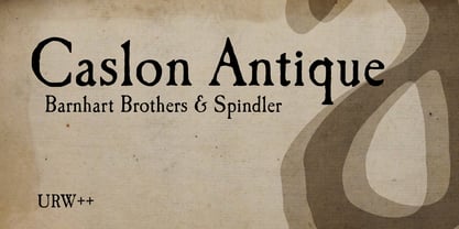
$40.99 Caslon Antique was designed by Berne Nadall and brought out by the American type foundry Barnhart Bros & Spindler in 1896 to 1898. It doesn’t bear any resemblance to Caslon, but has the quaint crudeness of what people imagine type looked like in the eighteenth century. Use Caslon Antique for that “old-timey” effect in graphic designs. It looks best in large sizes for titles or initials.
 - LTC Caslon by Lanston Type Co.,
$24.95 - Challore Script by Ironbird Creative,
$20.00 Thanks for checking out Challore Script a lovely modern Calligraphy that bring luxury feel. The natural hand writing script is suitable for you who needs a typeface to make your text stand out - perfect for logos, printed quotes, invitations, cards, product packaging, headers and whatever your imagination holds. This typeface is comes in uppercase, lowercase, punctuations, symbols & numerals, stylistic set alternate, ligatures, etc also support multilingual. NOTE: For all the characters are also available, accessible in the Adobe Illustrator Glyphs Panel, or in Adobe Photoshop Character Open Type Panel. Thanks for purchasing and have fun! Regards, Ironbird Creative
 - Benguiat Caslon by House Industries,
$33.00 Designed to be set in big, large and huge sizes in classic TNT (tight-not-touching) style, Benguiat Caslon is dynamite for a wide range of display demands. We also included outline and drop-shadow versions as well as numerous swash caps, ligatures, contextual alternates and automatically-shifting punctuation. Ed Benguiat originally designed this alphabet for the Photo-Lettering library during his tenure as the legendary type house’s art director. When we purchased Photo-Lettering in 2003, one of the first things we did was start picking some of our favorite films to digitize as fonts. Photo-Lettering partner Christian Schwartz chose this expressive serif specimen for its high contrast strokes that stand up to the most vigorous display typography demands without withering against pesky design limitations like screen resolution, ink spread and dot gain. FEATURES: Alternate characters, ligatures and contextual substitutions add an unexpected flair to words and phrases. We also provided a drop shadow to add depth and dimension. Shifting punctuation marks take care of those optical tricks so you don't have to. A delicately expressive outline version adds color even in black and white. BENGUIAT CASLON CREDITS: Typeface Design: Ed Benguiat Typeface Digitization: Christian Schwartz, Bas Smidt Typeface Production: Ben Kiel, Jason Campbell Like all good subversives, House Industries hides in plain sight while amplifying the look, feel and style of the world’s most interesting brands, products and people. Based in Delaware, visually influencing the world.
 - Caltons Typeface by Tacikworks,
$16.00 Proudly present Caltons Typeface. This font is inspired by vintage designs with clean and rough lines. Make the classic impression of this font stand out more. This font has approximately 600 glyph characters including uppercase, lowercase, discretionary ligatures and standard ligatures alternatives. It is suitable for creating vintage designs such as logo posters, merchandise, clothing, brochures, business cards and others. It can be accessed by using Open Type savvy programs like Adobe Illustrator and Adobe InDesign. features can be accessed by using Open Type save programs such as Adobe Illustrator, Adobe InDesign, Adobe Photoshop, Corel Draw X version and Microsoft Word. And this has given PUA unicode font (specially coded fonts). So that all the alternate characters Easily can be accessed in full by a Craftsman or designer. Features: Uppercase Lowercase Numbers Punctuations Stylistic Alternates & Ligatures Multilingual Languages Supported Format File: TTF,OTF, Web HOW TO ACCESS ALTERNATE CHARACTERS Open Glyphs Panel: In Adobe Photoshop go to Window - glyphs In Adobe Illustrator go to Type - glyphs Please contact us if you have any question!
 - Caslon Graphique by URW Type Foundry,
$35.00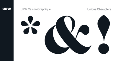
- Caslon Titling by Monotype,
$29.99Monotype Caslon Titling was made available for hot metal casting in 1932. The capital Monotype Caslon Titling letters were based on types from the Stephenson Blake Foundry, previously the Caslon Foundry. Originally designed by William Caslon in the eighteenth century, Caslon is considered an old face although it has characteristics which were later found in the transitional typefaces. The Monotype Caslon Titling font has a distinctive style, generous width and strong color, ideal for use in advertising, magazines and on book jackets. - Caslon Stencil by URW Type Foundry,
$35.99 - Caslon No337 by URW Type Foundry,
$35.00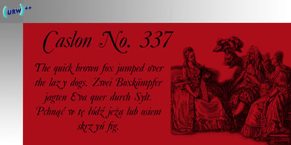
- Calton Hosvesk by UICreative,
$23.00 Introducing our new product the name is Calton Hosvesk Stensil Sans Serif Font Family comes with 9 different weights. Modern Serif font that feels beautiful classy, elegant, and modern. This font is perfectly suited for a wide variety of projects, such as signature, stationery, logo, wedding, typography quotes, magazine or book cover, website header, clothing, branding, packaging design, and more. Also for fashion-related branding or editorial design and displays both masculine and feminine qualities.
 - Adobe Caslon by Adobe,
$35.00The Englishman William Caslon punchcut many roman, italic, and non-Latin typefaces from 1720 until his death in 1766. At that time most types were being imported to England from Dutch sources, so Caslon was influenced by the characteristics of Dutch types. He did, however, achieve a level of craft that enabled his recognition as the first great English punchcutter. Caslon's roman became so popular that it was known as the script of kings, although on the other side of the political spectrum (and the ocean), the Americans used it for their Declaration of Independence in 1776. The original Caslon specimen sheets and punches have long provided a fertile source for the range of types bearing his name. Identifying characteristics of most Caslons include a cap A with a scooped-out apex; a cap C with two full serifs; and in the italic, a swashed lowercase v and w. Caslon's types have achieved legendary status among printers and typographers, and are considered safe, solid, and dependable. Carol Twombly designed this Caslon revival for Adobe in 1990, after studying Caslon's own specimen sheets from the mid-eighteenth century. This elegant version is quite true to the source, and has been optimized for the demands of digital design and printing. Adobe Caslon? makes an excellent text font and includes just about everything needed by the discriminating typographer: small caps, Old style Figures, swash letters, alternates, ligatures, expert characters, central European characters, and a plethora of period ornaments. - Caslon Manuscript by BA Graphics,
$45.00An antiqued looking Caslon type letter, very retro but works well for many of today's applications. This font also works very well for text settings. - Caslon 2000 by Intellecta Design,
$19.95 - Caslon 540 by ParaType,
$30.00 The Bitstream version of Caslon 540 of the American Type Founders, 1902. Based on William Caslon I's first English Old Style typefaces of 1725. Caslon modeled his designs based on late 17th century Dutch types, but his artistic skills enabled him to improve those models, bringing a variety of forms and subtlety of details. Strokes in Caslon fonts are somewhat heavier than in earlier Old Style fonts, serifs are thicker and a bit stubby. Italic letters have uneven slope. A text set in Caslon looks legible and aesthetically appealing. Caslon is a favorite font of English printers for setting of classical literature. Cyrillic version was developed for ParaType in 2002 by Isay Slutsker and Manvel Shmavonyan.
 - Caslon Classico by Linotype,
$29.99The Englishman William Caslon (1672-1766) first cut his typeface Caslon in 1725. His major influences were the Dutch designers Christoffel van Dijcks and Dirck Voskens. The Caslon font was long known as the script of kings, although on the other side of the political spectrum, the Americans used it as well for their Declaration of Independence. The characteristics of the earlier Renaissance typefaces are only barely detectable. The serifs are finer and the axis of the curvature is almost or completely vertical. The overall impression which Caslon makes is serious, elegant and linear. Next to Baskerville, Caslon is known as the embodiment of the English Baroque-Antiqua and has gone through numerous new interpretations, meaning that every Caslon is slightly different. Caslon Classico appeared in 1993 and was designed by Franco Luin, the designer of various interpretations of classic typefaces. Luin kept his design true to the original and Caslon Classico consists of two cuts with corresponding italic and small caps characters. - Caslon #540 by Linotype,
$29.99The Englishman William Caslon punchcut many roman, italic, and non-Latin typefaces from 1720 until his death in 1766. At that time most types were being imported to England from Dutch sources, so Caslon was influenced by the characteristics of Dutch types. He did, however, achieve a level of craft that enabled his recognition as the first great English punchcutter. The original Caslon specimen sheets and punches have long provided a fertile source for the range of types bearing his name. Identifying characteristics of most Caslons include a cap A with a scooped-out apex; a cap C with two full serifs; and in the italic, a swashed lowercase v and w. A few of the many interpretations from the early twentieth century were true to the source, as well as strong enough to last into the digital era. These include two from the American Type Founders company, Caslon 540 and the slightly heavier Caslon #3. Both fonts are relatively wide, and come complete with small caps, old style figures, and italics. - Caslon 540 by URW Type Foundry,
$89.99 William Caslon (1692-1766) laid the foundation for English typefounding, when he cut his first roman face in London in 1722. He modeled his designs on late seventeenth-century Dutch types; thus his typefaces are classified as Old Styles. The original Caslon punches have been preserved, enabling a perfect recutting of his faces. Notice the hollow in the apex of A and the two full serifs or beaks in the C. The italic capitals are irregular in their inclination. The Caslon font family is distinctive for use in subheadings or continuous text.
 - MVB Calliope by MVB,
$39.00Gayle Sato, longtime friend of MVB Fonts, has amazing handwriting. It’s a natural, simple hand, with perfect rhythm. Devoid of flourishes, it doesn’t try to be beautiful. It’s just genuine, quick, and clean — the handwriting we all wish we had. The digitization by Mark van Bronkhorst captures these qualities. Retaining the roughness of a felt pen, MVB Calliope is a handwriting typeface that feels much more authentic than most, highly legible but still raw. The Regular was released in 2005, with the other weights shortly thereafter. - Caslon Gotisch by RMU,
$25.00 A blackletter font by William Caslon (1692-1766), with Dutch influences, which appeared for the first time in a font sample book of William Caslon & Son, London, 1763. To access all ligatures in this font, it is recommended to activate both OT features Standard and Discretionary Ligatures. The round s occupies the number sign key, and typing N - o - period and activating this combination with the OT feature Ordinals gives you the numero sign.
 - Caslon Antique by URW Type Foundry,
$35.00