10,000 search results
(0.023 seconds)
- Drumonz by WingBuk Studio,
$27.00 Drumonz is a death metal font made with a touch of darkness, featuring a heavy and death metal feel to compliment your design. Drumonz is very easy to use in any variation or writing combination, also perfect for metal band logos, merchandise, clothing, apparel, or anything else that calls for a metal feel. Here is tutorial how to use it : https://youtu.be/a0uHeXSmsCo Recomended Software to use: Corel Draw Adobe Photoshop Adobe Illustrator Clip Studio Paint
 - Retro Thunders by Lettersiro,
$25.00 This is our newest product, inspired by retro style. We call this font "Retro Thunders". Retro Thunders is perfect for any retro project, poster, logo, label, clothing, music album cover, and many others. Comes with solid and extrude style, you can use this font easily, and make save a lot of your time in creating. Retro Thunders also contains: - Opentype Features : swash, ligatures, stylistic alternate, ss01, ss02 , ss03 - 8 end swashes - Basic Latin Language Support (AÀÁÂÃÄÅCÇDÐEÈÉÊËIÌÍÎÏNÑOØÒÓÔÕÖUÙÜÚÛWYÝŸÆßÞþ )
 - Arbour Soft by TypeUnion,
$35.00 Arbour Soft is the cheeky version of it's big brother, Arbour. The soft version creates a smooth finish that flows perfectly across screens and print. Arbour Soft comes in 7 weights, from a delicate extra-light to a soft, strong black, with matching soft italics for each upright. The soft black weights are perfect for your new brand or article headlines, and the light weights are great for calling out text. The mid weights are perfect for longer texts.
 - Qonitta by Zamjump,
$17.00 Called QONITTA is a serif display with a character that is beautiful, and elegant. With the addition of beautiful ligatures and alternatives to make your typography truly unique. No special software is required to type standard Typeface characters. To access Opentype Ligatures and Alternates, you need software that supports the Opentype feature in fonts. multi language support File Included : - Upper case and Lower case - Ligature - Alternate - Uniq dot (a underscore underscore, b underscore underscore, c underscore underscore)
 - Biscuit Kids by PizzaDude.dk,
$19.00 The other day, a couple of kids at work (I work as a kindergarten teacher!) played this game where they were detectives. Not the usual detective, but someone who worked for cookies and biscuits! They called themselves The Biscuit Kids, and I knew instantly that I had to make a font with that name! My Biscuit Kids font is a playful comic book font, but also suitable for anything that needs a fresh extra spicy attention!
 - Coin Ding Dong by Inumocca,
$18.00 Coin Ding Dong pixel Font inspired from 8 bit game with beautiful stylized pixelized, game machine really reminds me of my childhood, with coins you can play it, in my country machine games are called "dingdong", inspired me to create this pixel font name. Really Beautiful font to covering your Project, like For Game Names, Poster art, Magazine, Branding, Logos, and more your project design. - Unique glyphs - Multilingual Characters - UPPERCASE - Lowercase - Numeric - Symbol - Punctuation Character - PUA encoded inumoccatype
 - Chaslow by Twinletter,
$18.00 You don’t have to question when to use a vintage font. Introducing our newest font called Chaslow. This font has a very strong and bold personality, making it perfect for any design that needs a unique touch. Thin lines are contrasted against thick ones, which makes them stand out from all other fonts. This font will give your work that extra zest! You can use it to create all kinds of designs, including logo designs, posters, flyers, and more!
 - Childish by alphArt,
$20.00 Hello everyone, this time we would like to introduce a funny script font that we just made with passion and enthusiastic, this font comes with a touch of funny font. Introducing this handwritten font called "Childish | Funny Script Font", this funny font comes with uppercase letters, lowercase letters, ligatures, multilingual support, numbers and punctuation. This font is suitable for you to use as logos, quotes, instagram posts, invitations, magazines, cards, product packaging, headers and whatever your imagination.
 - VLNL Dream Meal by VetteLetters,
$6.00 Nowadays, everything is ‘In The Cloud’. So why not put information in clouds directly? Here it is: a happy dreamy cloudy font. It’s called Dream Meal. Don’t read, just dream away; about nice food and typographic sensations. You can set whole texts 'in the cloud'. Every character makes up a part of a cloud. The clouds can float to the left or to the right. It’s an Open Type font. Actually: This font is a dream!
 - Al Boulevard Signature by Aluyeah Studio,
$125.00 Hello Aluyeaholics! Boulevard Signature, an exclusive handwritten signature font. Coming with 100+ stunning and super easy to use alternates and ligatures. Very suitable for your wedding invitation, packaging, apps, magazine, headline, website, ads and all type of design project you have. Super Easy to Use alternates - You can easily call alternates using special combination like a.2 k.3 b.4 t.h c.c etc. To get results like the preview just type Boul.4evard.3 Sig.4nature
 - Cicero by Présence Typo,
$36.00Cicero was the first typeface designed by Thierry Puyfoulhoux in 94. It is what could be called a semi-serif. Only the serifs which occur naturally when drawing letters with a flat nib pen have been retained. The absence of certain serifs allows for much tighter spacing. The remaining serifs still stabilize the baseline, although less effectively than a "full-serif" typeface. By borrowing features from both the sans and serif styles, Cicero truly stands at their crossroads. - Lundoon by Mazkicibe,
$11.00 Description Hello gaes! How are you guys ? I'm sure it's very good. Introducing, this is our newest product, we call this produc Lundoon Font.. Lundoon Font is Handwritten and modern font combined with a sweet touch and beautifully curved each letter. using a touch of soft curves so that it is pleasing to the eye Lundoon Font Spirit is great for: Wedding invitations, fashion magazines, logos, signatures, and suitable for watermark photography. Features: -Uppercase, -Lowercase, -Numeral, -Punctuation,
 - Treasure Trove by Comicraft,
$19.00 X marks the spot -- and the height of the lower case letters -- in this cartographic calligraphy mapped out for you by lettering landlubber Jolly ’JG’ Roshell and his trusty crowquill. Mapquest "Mystery Island" and be sure to keep your eyes on those scurvy dogs that call themselves your crew, this font is spilling over with dubloons and pirate booty and it’s finders keepers! Artwork by Chris Bachalo from Captain Stoneheart and the Truth Fairy and Carlos Pacheco from Arrowsmith
 - Monkey Rhumble by WingBuk Studio,
$27.00 Monkey Rhumble is an exclusive piece made with a touch of darkness, featuring a heavy and death metal feel to compliment your design. Monkey Rhumble is very easy to use in any variation or writing combination with extra custom bracket, also perfect for metal band logos, merchandise, clothing, apparel, or anything else that calls for a metal feel. Here is tutorial how to use it : https://youtu.be/ezNu7hCqV-w Recomended Software to use: Corel Draw Adobe Photoshop Adobe Illustrator
 - Brignell Sunday by IB TYPE Inc.,
$40.00 BRIGNELL SUNDAY is an eight font family designed by Ian Brignell. A relaxed, easy-reading companion for any day of the week. A clean, modern, friendly sans serif characterized by an open style with occasionally rounded corners, occasional curved junctures on diagonals and a slightly sloped lower case A. Brignell Sunday was born in 2006 and was inspired by corporate custom font ideas Ian designed for an LG Electronics sub-brand called Best Shop. Extended Latin set.
 - Isabel by Letritas,
$30.00 Isabel was made out of necessity to create a new font for children and teenagers, that could be enough friendly and versatile for text in words or even easy-to- read long texts. The purpose of Isabel is to combine all the nice and friendly features of the simple letters that the teachers teach to the pupils at primary school, as they starting to learn to read, together with the normal editorial fonts we read every day. In this way it generates a very joyful serif font, or even friendly font, with some conservative aspects. In other words, Isabel is a font that, despite of being a “classic features” typography, is proud to show its innocent and ingenuous elements, this gives to the font a new point of view. The family is composed of 3 parts: the regular version, the italic version and the unicase version. Each one of them has 5 weights, 551 characters and is composed of 208 languages.
 - Mundbind NL by Hanoded,
$15.00 I just visited my good friend Jakob Fischer from Pizzadude.dk in Denmark. As always we talked fonts, drank coffee and walked endlessly through Copenhagen, the city where he lives. We thought it would be a fun idea to each create a font from a handmade sign we saw in the city. We only had like 7 glyphs to work with, so the rest was up to our imagination. We also thought it would be nice to give the fonts a similar name. Mundbind means mask in Danish. When you Google translate it, it will give you the wrong translation (it will say 'mouth piece'), so trust me on this one! My font is called Mundbind NL - where the NL stands for Netherlands. Jakob will hopefully call his finished font Mundbind DK - where the DK stands for Denmark. Mundbind NL comes with a monster load of diacritics (including Vietnamese) and two alternate glyphs for the lower case letters that will cycle as you type.
 - Antique Vignette by Putracetol,
$32.00 Antique Vignette is a quirky vintage script font. I call this font quirky font because the concept of this font uses a very visible difference in the thickness of the font. Because of its thickness, it makes this font look more unique and has a more vintage feel. The perfect combination of vintage/groovy style with classic lettering. So this font is suitable for your projects with vintage/retro/groovy themes. In addition, this font is also suitable for logos, branding, lettering, badges / emblems, quotes, posters, svg, book titles, packaging, t-shirts / apparel and others. Come with Opentype feature with a lot of alternates, its help you to make great lettering. This font is also support multi language.
 - Schotis Text by Huy!Fonts,
$35.00 Schotis Text is a workhorse typeface designed for perfect reading on running texts. Its design is based in Scotch Roman 19th-century style but designed from scratch, with a more contemporary and not nostalgic look. It has seven weights plus matching italics, with 1100 glyphs per font, with a very extended character set for Latin based languages as well as Vietnamese, and shows all its potential with OpenType-savvy applications. Every font includes small caps, ligatures, old-style, lining, proportional and tabular figures, superscript, subscript, numerators, denominators, and fractions. The Scotch Romans were one of the most used letters during the 19th and early 20th century, but they don’t have their own place in the main typographical classifications. They appeared at the beginning of the 19th century with Pica No. 2 in the catalog of William Miller (1813) and assumed the British route towards high contrast and vertical axis modern Romans. In fact, they were called just Modern. In opposition to the continental route of Fournier, Didot, and Bodoni, the English way opted for a wider, more legible letter also resistant to bad printing conditions. The name Schotis comes from the misspelling of Scottish that gave the name to a popular dance in Madrid in the 19th-century. It first was called Schotis and today is knows as Chotis.
 - Galiba by Juraj Chrastina,
$29.00 Give your voice an eye-catching hand-drawn look thanks to this playful font family. You'll get three styles, along with OpenType features including alternates, ligatures and stylistic sets. Galiba Regular works very well with his small brothers Light and Thin. In addition Galiba Light can be used at smaller size along with the other styles to keep the same line thickness. To achieve a random-like effect, the regular style is packed with 4 different variants of each glyph, that automatically cycle if stylistic alternates are turned on. Also you can choose from 5 stylistic sets to easily change the look of a given string, or pick alternates by hand. Not to mention that we've attentively fine-tuned the kerning that’s crucial for this kind of typeface.
 - Crox Rounded by NumidiaType,
$25.00 Crox™ Rounded is a sans-serif professional typeface created using Crox™ family curves that comes in 14 harmonic weights plus 2 poster styles with upright and italic variants, as well as a maximum x-height for great optical reading. All styles have over 25 professional OpenType features and a wide range of Western languages coverage. with a variety of styles and substitute characters: sets 1, 2, 4, 10, 11. Furthermore, operational styles 6 and 7 for the fit-derived SI units format and pricing styles: sets 5, 8, and 9 for business and marketing, ADS and web design, branding, or products design, as well as other OpenType features such as ligatures, old-style numerals, ordinals, swashes,... Specimen Crox™ is a trade mark of Yassine Abdi.
 - Ciutadella by Emtype Foundry,
$69.00 Ciutadella was originally commissioned by Mario Eskenazi’s studio. It is a versatile geometric sans serif, a simple, clean and direct family. Its power resides in an overhaul simplicity that reflects an “open” personality, easily suitable to be used across a wide range of applications, from identity systems to publications. Although it has been conceived to be used as a display typeface, it performs well in intermediate length texts mostly because of some specific characteristics such as the alternate two-story ‘a’. It is available in Open Type format and includes Alternate Characters, Ligatures, Tabular Figures, Fractions, Numerators, Denominators, Superiors and Inferiors. It supports Central and Eastern European languages. The type family consists of 10 styles, 5 weights (Light, Regular, Medium, SemiBold and Bold) plus italics. See also Ciutadella Rounded and Ciutadella Slab. Ciutadella PDF.
 - Yink by Eclectotype,
$40.00 Yink takes big, bulbous, ball terminals up a notch, by repeating the shapes not only in the black but in the white space too. This interplay between black and white shapes is reminiscent of the yinyang symbol in places, which is where the name Yink originates. It's a shamelessly over-the-top font, and should be set large. There's a handful of OpenType features, including ligatures and alternates: Ligatures for ff, fft, ft, tt, gj Alternates are grouped into stylistic sets: 1. An alternate u, possibly more legible, but definitely not as much fun! 2. Again, a more boring version of m, just in case the default is ambiguous. 3. A more exuberant L 4. A blackletter informed T 5. Alternate P and R 6. An alternate 1 (one)
 - Combi by AVP,
$25.00 The Combi collection includes Sans, Sans Oblique, a true Italic, Serif, Serif Oblique and a set of Openface capitals. Combi fonts have 5 compatible weights and metrics allowing them to be used in free combination. Inspiration came from Jan Van Krimpen’s 'Romulus' (Enschedé, 1931). In addition to the Roman style, Van Krimpen created a set of open capitals, a simple oblique variant and subsequently, an attractive calligraphic italic, Cancelleresca Bastarda. In addition to Van Krimpen’s idea, Combi has been influenced by features from many faces including Bembo, Melior and Optima. The object was to create a versatile family of body text and titling faces for use in books, magazines and on the web. Glyphs are available for most Latin based languages and all text fonts include small caps, proportional numerals and other Opentype features.
 - Like Butterflies by Bogstav,
$10.00 Now here's a font that is named Like Butterflies, but has got nothing to do with butterflies! What? Why? Well, I recently heard the song "Even flow" by Pearl Jam and took a trip down memory lane - back to my early twenties. I remember how the lyrics affected me, and had an impact on how my life changed the years to follow. Maybe the style of the font does not reflect the inner meaning of the song, but it does reflect a look back in time for me - and the change that took place. Nevertheless, I hope you enjoy the somewhat simple, handmade style of Like Butterflies and the 4 versions that works very well together! Please notice that each letter has got 5 slightly different versions to choose from!
 - Kulture Grotesk by SilverStag,
$19.00 I am thrilled to present you the KULTURE GROTESK, a brand new sans serif font meticulously crafted to elevate your design projects to new heights. This contemporary typeface seamlessly blends modernity, chic aesthetics, and boundless creativity to offer a truly unique and captivating visual experience. With its clean lines and refined forms, this grotesk font embodies a perfect balance of simplicity and sophistication. Designed with the utmost attention to detail, it brings a breath of fresh air to the world of typography. Its versatility knows no bounds, making it the ideal choice for a wide range of applications, from editorial design and branding to web design and advertising. Whether you are looking to create a sleek corporate identity or add a touch of elegance to your personal projects, this font will undoubtedly leave a lasting impression. One of the most exciting features of the new font is the inclusion of over 300 alternate letters and ligatures.These unique characters offer a world of possibilities, allowing you to create stunning and original typography. From distinctive logo designs to captivating headlines, this grotesk font enables you to break free from the ordinary and infuse your creations with a touch of individuality. KULTURE GROTESK - Modern Sans Serif Font Includes: Over 300 ligatures and alternate letters Numerals & Punctuation Language Support Web Font Kit is included as well Detailed instructions on how to use alternates in most of the apps on your computer as well for Canva Would you like to get 5 completely free fonts worth over $75? No tricks, no hidden words, terms or anything. Just subscribe to my newsletter, make sure to check your email to approve the subscription, add me to your contacts so that the emails don't end up in spam folder and you will get 5 fonts for free. The fonts are packed with alternates, ligatures and some even come with extra goodies. Happy creating everyone!
 - Mercurial by Grype,
$16.00 Geometric/Technical style logotypes have been developed for car chrome labels since the early 1980’s, but automobile companies don't monopolize the style by any means. During the 80’s and 90’s, a lot of these logos leaned towards the geometric sans styles and the swiss styling of fonts like Handel Gothic, while playing with varying degrees of squared rounds and varying expanded widths per logotype. Mercurial has this flavor, but it wasn’t derived from logotypes. Instead, it began as a digitization of a film typeface from LetterGraphics in the early 70's known as "Sam". It visual ties to this genre of automotive logotypes and fonts like Handel Gothic lend a familiarity to it, yet it has an identity all its own. As with so many automotive logotypes, this singular style film typeface, lacked an expansive family which shows off all potential the logotypes have and what they "could" be and do. And that's where we come in. What originally began as this family’s Regular Width - Bold Style has been expanded into a collection of 3 Width Families, each containing 5 Weights. Here’s what’s included with the Mercurial Complete bundle: 396 glyphs per style - including Capitals, Lowercase, Numerals, Punctuation and an extensive character set that covers multilingual support of latin based languages. (see the final poster graphics for a preview of the characters included) 3 widths in the collection: Narrow, Regular, & Wide 5 weights in each width family: Light, Book, Regular, Medium & Bold. Here’s why the Mercurial Family is for you: - You’re in need of stylish sans font family with a range of widths and weights. - You’re love those 80’s automotive logos, but want more range of use. - You’re looking for an alternative to Handel Gothic. - You’re looking for a clean techno typeface for your rave poster designs. - You just like to collect quality fonts to add to your design arsenal.
 - ITC Oldbook by ITC,
$29.99For some time, Eric de Berranger had wanted to create a distressed typeface design - one that gave the appearance of antique printing and showed signs of wear, yet was still highly readable. He was busy designing a new face called Maxime, when an idea struck: I realized that I could use these lettershapes as the basis for my antique typeface," he says. The two faces ended up being designed in tandem. While ITC Oldbook clearly captures the flavor of aged, uneven and imperfect printing, it also meets de Berranger's goal of being exceptionally readable in text sizes. Beginning with well-drawn characters was the key, and these were carefully modeled into the distressed forms. "The process was more difficult than I originally thought," says de Berranger. "The antique letters had to be tested and modified several times to work correctly." ITC Oldbook elegantly simulates antique printing in both text and display sizes. And while stroke weights are uneven and curves are irregular, the design has remarkably even color when set in blocks of text copy. Add to this the design's inherent legibility, and ITC Oldbook acquires a range far beyond replication of things old; it's suitable for any project that calls for warm and weathered typography. ITC Oldbook is available in roman and bold weights with complementary italic designs. Small caps, old style figures and a suite of alternate characters and ornaments provide additional flexibility and personality to the design." - Classification JNL by Jeff Levine,
$29.00 Sometimes it's easy to find a name to fit a font design, other times it's a struggle because of the sheer number of digital fonts available and the number of names already taken. Classification JNL stretches a point to arrive at its name. The attractive sans design was found as a hand-lettered title on a piece of vintage sheet music called "My Hawaiian Souvenirs". During the 1940s, the popular mode of travel to other countries was by steamship. Steamship passengers were assigned their accommodations by the type of passage they booked (such as First Class and Tourist), thus they were in various levels of classification. This aside, Classification JNL is a nice alternative to "standard" condensed fonts for design projects.
 - Kalix by Linotype,
$29.99I have a notation that the summer of 1994, when I worked with Kalix, was a warm one. I had no special typeface in mind when drawing the characters of Kalix, but many typefaces contributed to it, e.g. my own Omnibus from which I borrowed the looks of the smal case g. I think it is a lovely typeface whose use is mainly for books and magazines. Kalix is the name of a northern Swedish town situated along a river called Kalixälven. Its name is of sami origin, *káles, meaning cold. There comes the connection to the warm summer of 1994! But even the Latin word for chalice, calix, has something to do with my choice of name. Kalix was released in 1994. - 1431 Humane Niccoli by GLC,
$38.00 Niccolo Niccoli (1364-1437) was a wealthy bibliophile and an acclaimed scribe, in Florence (Italy). He was one of the most important Italian calligrapher in this early time of rediscovering Roman script. Of rare accomplishment was his adaptation of the so called Italian humanistic minuscule script. We were inspired from his late work to create this present Font. We have added a lot of accented and other characters (U/V, I/J...) who was not existing in the original and replacing "long s" by a small "s" for a modern use. The OTF encoding was used for intelligent alternates, permitting to use different forms of the same lower case or capital in a single word, reproducing easily the charming variety of a real manual scripture.
 - FF Eureka by FontFont,
$65.99 Slovakian type designer Peter Bil'ak created this serif FontFont in 1998. The family has 5 weights, ranging from Regular to Bold (including italics) and is ideally suited for advertising and packaging, book text, editorial and publishing as well as wayfinding and signage. FF Eureka provides advanced typographical support with features such as ligatures, small capitals, alternate characters, case-sensitive forms, fractions, and super- and subscript characters. It comes with a complete range of figure set options – oldstyle and lining figures, each in tabular and proportional widths. FF Eureka received several awards: the National Slovak Design Centre award in 1997 and the The Best Design in the Category of Type 19th International Biennale of Graphic Design Brno award in 2000. This FontFont is a member of the FF Eureka super family, which also includes FF Eureka Mono and FF Eureka Sans.
 - Zin Display by CarnokyType,
$46.00 Zin Display is a contemporary typeface designed for various situations of typographic usage. Characteristic feature is a large x-height and balance between neutral construction of letters (strictly vertical axis), dynamic open forms (opened terminals) and sharp instrokes, outstrokes and serifs. Another typical feature is a visually narrower connection between stems and strokes. The complete font family consist of three width proportions (Normal, Condensed and Extended). Every sub-family has 5 weights, ranging from Light to Black with matching Italics. Zin Display can be effectively used especially for display typesetting but works for longer text as well. It can be used especialy in magazine layouts and editorial design, as well in advertising typography, orientation systems, corporate identities and many other situations. Zin Display is a member of the Zin super family, which also includes Zin Sans, Zin Slab and Zin Serif fonts.
 - RQND Pro V.2 by Tondi Republk,
$25.00 Introducing RQND Pro 2 - The Futuristic and Industrial Sans Serif Font Welcome to the world of RQND Pro 2, a cutting-edge sans serif font designed to elevate your designs to new heights. With its industrial aesthetic and futuristic appeal, this font is the perfect choice for projects seeking a bold and contemporary look. Key Features: 1,201 Glyphs: RQND Pro 2 boasts an extensive character set, offering you a vast array of design possibilities. Supports 123 Languages: No matter where your audience is, this font ensures that your message is conveyed clearly and effectively. 20 Font Styles: With 5 font weights and 5 font widths, RQND Pro 2 offers 20 unique styles to suit every creative vision. Expanded to Extra Condensed: Whether you need a spacious layout or a compact design, this font delivers unmatched versatility. 18 OpenType Features: Unlock the full potential of RQND Pro 2 with various OpenType features, including small caps, alternate characters, standard numerals, circled numerals, fractions, and more. All Caps Font: Embrace the power of uppercase letters with this font, enhancing the impact of your message. Full Character Set: From standard numerals to punctuation marks, mathematical symbols to special characters, RQND Pro 2 has everything you need for seamless communication. Latin and Cyrillic Support: Perfect for international projects, this font provides complete support for both Latin and Cyrillic languages. RQND Pro 2 empowers designers, creatives, and typographers to explore new design territories. Its sleek and modern appearance makes it ideal for tech branding, UI design, editorial projects, advertisements, web design, and more. Discover a font that combines sophistication with contemporary flair. Elevate your designs with RQND Pro 2 and leave a lasting impression on your audience. Explore the full range of styles and unleash your creativity today.
 - TT Octosquares by TypeType,
$35.00 TT Octosquares useful links: Specimen | Graphic presentation | Customization options TT Octosquares is a fresh, revised, expanded, and significantly improved version of our first commercial typeface TT Squares and its narrow version TT Squares Condensed. With all our love for the original font family, it felt there was a lack of functionality, character composition, features, and design freshness, which prompted us to the idea of a complete restart. Now TT Octosquares can be safely called a superfamily consisting of 4 widths (Compressed, Condensed, Standard, Expanded), 72 faces (18 in each width), and 1 incredible variable font in which variability works jointly on three axes. In addition to working on the contours themselves and their design, we completely revised the composition of the typeface. First, we added two completely new widths: Compressed and Expanded. Secondly, we increased the number of weights in each of the subfamilies—while in the old versions there were 5 weights, now in each of the subfamilies there are 9 weights. At the stage of working with the contours of characters, we revised the roundings, changed the forms of shoulder and stem crossings, added noticeable shelves at the letters, removed the sharpness from the triangular characters and cut off all sharp endings. From the very beginning of work on TT Octosquares, we planned to make a variable 3-axis version of it sewn into 1 font file. This means that by installing just one variable font file, you get access to three axial adjustment of the font: by thickness, width and inclination. Thanks to this flexibility in settings, you can always choose a custom combination of thickness, width or inclination that best suits your tasks. Due to the increased language support and the appearance of a bunch of useful OpenType features, the number of glyphs in the typeface has increased from 480 to 825 in each style. Now you can use stylistic alternates, standard and discretionary ligatures, or use old-style figures, numbers in circles and even slashed zeros in your design. Full list of features: aalt, mark, mkmk, ccmp, subs, sinf, sups, numr, dnom, frac, ordn, lnum, pnum, tnum, onum, case, zero, dlig, liga, salt, ss01, ss02, ss03, ss04, ss05, ss06, ss07, ss08, ss09, ss10, ss11, ss12, calt, locl. To use the variable font with three variable axes on Mac you will need MacOS 10.14 or higher. For other software and browsers, you can check the support status here: v-fonts.com/support/.
 - Blessings through Raindrops - Personal use only

- FF Screenstar by FontFont,
$41.99 German type designers Steffen Sauerteig, Kai Vermehr and Svend Smital created this display FontFont in 2003. The family has 5 weights, ranging from Regular to Bold and is ideally suited for logo, branding and creative industries, music and nightlife, small text, software and gaming as well as web and screen design. FF Screenstar provides advanced typographical support with features such as ligatures. It comes with tabular lining and proportional lining figures.
 - Quitter by Hatftype,
$15.00 Is a font with groovy retro style. With distinctive handwritten characters perfect for branding projects, logos, wedding designs, media posts, advertisements, product packaging, product designs, labels, photography, watermarks, invitations, stationery, and any project who need handwritten dishes. Features : 1. Uppercase & Lowercase 2. Multilingual support 3. Number 4. Symbol 5. Punctuation 6. Support in Mac and Windows OS -Support in design application (photoshop, illustrator, and more) I really hope you enjoy it.
 - Honeymoon Phase by Hatftype,
$17.00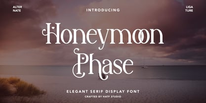 Is a elegant serif font with distinctive handwritten characters perfect for branding projects, logos, wedding designs, media posts, advertisements, product packaging, product designs, labels, photography, watermarks, invitations, stationery, and any project who need handwritten dishes. Features : 1. Uppercase & Lowercase 2. Multilingual support 3. Number 4. Symbol 5. Punctuation 6. Support in Mac and Windows OS -Support in design application (photoshop, illustrator, and more) I really hope you enjoy it.
 - Halfway There by Hanoded,
$15.00 Halfway There… We love to go camping as a family and we usually go to France (because France is only a 5 hour drive from where we live, it is usually sunny and they have the best bread in the world - enough said!). Somewhere around Lille, or Luxembourg City (depending on our destination in France), the kids always ask: ‘are we almost there?’ and my answer is always: ‘we’re halfway there!’.
