10,000 search results
(0.045 seconds)
- Flinscher by Greater Albion Typefounders,
$16.00 The Flinscher family contains twenty display typefaces, in weights that vary from light to black, and widths that extend from condensed to expanded. The family’s design inspiration traces its roots to the early portion of the twentieth century. In essence, it is a calligraphic script typeface family with blackletter influences. The letter forms are decorative and distinctive, yet clear and easy to read, and in use set up a regular rhythm that leads the eye from character to character. The Flinscher typefaces are well suited to design work that needs to combine formality with fun. Just the thing for a certificate or a book cover!
 - Dequindre by Alex Jacque,
$30.00 Dequindre is a monolinear blackletter typeface, and was drawn as if grade school handwriting practice sheets came in a blackletter variety. Dropping the thin/thick calligraphic contrast of traditional blackletter glyph construction and instead sticking to the bare skeleton of the typeface, Dequindre manages to bring forth a delicate, contemporary aesthetic that plays off of a core blackletter form. Overall portrayed with a softer, more friendly take on the angular, severe forms of 16th century blackletter style, and through pulling some of the curvier, smoother stroke qualities of Antiqua while still maintaining the overall construction and flourish of Fraktur, Dequindre sits in a unique space in the pantheon of blackletter typefaces.
 - Sassafras by Monotype,
$49.00Arthur Baker's display script Sassafras, designed in 1995, is based on the natural inline effect created when writing with a split-metal nibbed pen. Black and white are nicely balanced, giving this calligraphic face a remarkably smooth appearance. The regular and italic versions of Sassafras include two alternate faces: one with long, tall ascenders and regular-length descenders, and one with shortened ascenders and descenders that allow it to fit where its companion might not. In both, the ascenders increase in width as they move upward, while the descenders taper to a fine point. This variety of form makes Sassafras a very flexible choice for display work. - Loxley by Canada Type,
$24.95 Drawn shortly before Jim Rimmer's passing in 2010, Loxley was designed to be used in a fine press edition of the folklore story of Robin Hood. It was named after the cited birthplace of the story's classic hero. Loxley's shapes were inspired the same early Roman faces (such as Subiaco from the late 1400s) that influenced Frederick Goudy's Aries, Franciscan and Goudry Thirty types. It exhibits the preculiarities of Jim's left-handed calligraphy, as well as his outside-the-box thinking with exit strokes and serif variations. Loxley was remastered for the latest technologies in 2013. Now it comes with a character set of over 450 glyphs, including plenty of stylistic alternates, a full compliment of f-ligatures, a Th-ligature, basic fractions, ordinals, a long s for historic setting, comprehensive class-based kerning, and extended Latin language support. 20% of this font's revenues will be donated to the Canada Type Scholarship Fund, supporting higher typography education in Canada.
 - Structia by Typodermic,
$11.95 As you consider the words you need to convey, it’s clear that you’re looking for something that feels just as precise and intentional as the message you’re promoting. Structia is a typeface that does not shy away from its influence—it leans into the hard edges and geometries that are typically associated with brutalist architecture. And yet, even as it draws inspiration from an austere and somewhat daunting aesthetic, Structia also possesses a sense of control and discipline that is undeniably alluring. At the core of Structia’s appeal is its mechanical precision. Every line, every curve, is carefully calculated and crafted to create a sense of mathematical accuracy that is difficult to resist. There is no room for error or imperfection in Structia—every stroke is sharp and precise, with chamfered corners that add an extra layer of texture and visual interest. This is not a typeface that allows for ambiguity—it demands clarity and specificity, and it delivers both with remarkable consistency. But Structia is more than just a collection of angular shapes and precise lines. It is a typeface that conveys a sense of scientific accuracy and chilly logic—a kind of elegance and refinement that is unexpected. There is a beauty in the way that Structia balances the hard-edged geometries of brutalism with a sense of control and finesse that is undeniably modern. It is a typeface that feels at once futuristic and timeless—a design that can be used in a wide variety of contexts and still feel fresh and relevant. And then there are the two effect styles—Structia Panel and Structia War—which take the basic geometry of the typeface and push it even further into the realm of science fiction. Structia Panel feels like something you might see on a spacecraft or in the architecture of an alien planet, with thin, laser-like struts that give it a futuristic edge. Structia War, meanwhile, takes the concept of Structia Panel and adds a layer of battle damage, as if the letters have been through a cosmic conflict and emerged victorious. In the end, Structia is a typeface that demands attention and respect. It is not a typeface that will fade into the background or blend in with the crowd—it is a design that is meant to be noticed and admired. And yet, even as it draws your eye with its hard-edged geometries and precise lines, it also possesses a sense of elegance and refinement that is undeniably alluring. Structia is a typeface that balances the old and the new, the hard and the soft, the mechanical and the human—and the result is something truly remarkable. Most Latin-based European, and some Cyrillic-based writing systems are supported, including the following languages. A Afaan Oromo, Afar, Afrikaans, Albanian, Alsatian, Aromanian, Aymara, Bashkir (Latin), Basque, Belarusian (Latin), Bemba, Bikol, Bosnian, Breton, Bulgarian, Cape Verdean, Creole, Catalan, Cebuano, Chamorro, Chavacano, Chichewa, Crimean Tatar (Latin), Croatian, Czech, Danish, Dawan, Dholuo, Dutch, English, Estonian, Faroese, Fijian, Filipino, Finnish, French, Frisian, Friulian, Gagauz (Latin), Galician, Ganda, Genoese, German, Greenlandic, Guadeloupean Creole, Haitian Creole, Hawaiian, Hiligaynon, Hungarian, Icelandic, Ilocano, Indonesian, Irish, Italian, Jamaican, Kaqchikel, Karakalpak (Latin), Kashubian, Kikongo, Kinyarwanda, Kirundi, Komi-Permyak, Kurdish (Latin), Latvian, Lithuanian, Lombard, Low Saxon, Luxembourgish, Maasai, Macedonian, Makhuwa, Malay, Maltese, Māori, Moldovan, Montenegrin, Ndebele, Neapolitan, Norwegian, Novial, Occitan, Ossetian, Ossetian (Latin), Papiamento, Piedmontese, Polish, Portuguese, Quechua, Rarotongan, Romanian, Romansh, Russian, Sami, Sango, Saramaccan, Sardinian, Scottish Gaelic, Serbian, Serbian (Latin), Shona, Sicilian, Silesian, Slovak, Slovenian, Somali, Sorbian, Sotho, Spanish, Swahili, Swazi, Swedish, Tagalog, Tahitian, Tetum, Tongan, Tshiluba, Tsonga, Tswana, Tumbuka, Turkish, Turkmen (Latin), Tuvaluan, Uzbek (Latin), Venetian, Vepsian, Võro, Walloon, Waray-Waray, Wayuu, Welsh, Wolof, Xhosa, Yapese, Zapotec Zulu and Zuni.
 - Watermint Script by Mans Greback,
$79.00 Watermint Script is a formal typeface that epitomizes the essence of elegance and sophistication. Envisioned for formal settings, its calligraphic strokes evoke a sense of classic beauty, making it an ideal choice for invitations or logotypes that demand a touch of class. Watermint Script is a harmonious blend of cute and lovely, wrapped in a feminine and romantic design. Its light and fresh appearance breathes life into each word, offering a clean and flawless presentation. The font's perfection lies in its attention to detail, with each character exuding a classy aura that enhances the overall visual experience. The font is built with advanced OpenType functionality and guaranteed top-notch quality, containing stylistic and contextual alternates, ligatures and more automatic and manual features; all to give you full control and customizability. It has extensive lingual support, covering all Latin-based languages, from North Europa to South Africa, from America to South-East Asia. It contains all characters and symbols you'll ever need, including all punctuation and numbers. Designed by Mans Greback, Watermint Script is a testament to his commitment to creating fonts that are not just tools of communication, but artworks that enrich the visual landscape.
 - TessieXtraBirds by Ingrimayne Type,
$13.95 A tessellation is a shape that can be used to completely fill the plane—simple examples are isosceles triangles, squares, and hexagons. Tessellation patterns are eye-catching and visually appealing, which is the reason that they have long been popular in a variety of decorative situations. These Tessie fonts have two family members, a solid style that must have different colors when used and an outline style. They can be used separately or they can be used in layers with the outline style on top of the solid style. For rows to align properly, leading must be the same as point size. To see how patterns can be constructed, see the “Samples” file here. Shapes that tessellate and also resemble real-world objects are often called Escher-like tessellations. TessieMoreStuff contains mostly Escher-like tessellations with no clear organizing principle. Most or all of these shapes were discovered/created by the font designer during the past twenty years in the process of designing maze books, colorings books, and a book about tessellations. (Earlier tessellation fonts from IngrimayneType, the TessieDingies fonts, lack a black or filled version so cannot do colored patterns. The addition of a solid style that must be colored makes these new fonts a bit more difficult to use but offers far greater possibilities in getting visually interesting results.)
 - Duvall by John Moore Type Foundry,
$19.95 Duvall is an idealization created from the Edward J. Duvall lettering. Mr. Duvall was a teacher in lettering, who was well known for his book “Modern Sign Painting” in the late 40s and early 50s. Duvall cursive script is presented in five weights, Duvall 1, as a light version, to Duvall 5 as a bold version, and Duvall Style a decorative typeface with Inline, ideal for set in color layers combined with Duvall 5. Duvall is a Script font with low contrast, not intended to be used as a type of reading, but is however well adapted to small sizes because its simple form is easy to read. It is advisable to use this font for large to medium sizes. Duvall is ideal for composition, ordinal, superior and inferior numbers, and thanks to the OpenType features you can compose with alternate characters, old style numbers and with a complete set of glyphs for Eastern and Western European languages. The Duvall set comes with a font called Duvall Ribbons, a dingbats font with which you can create interesting headlines with the taste of the advertising of the 50s. Duvall FunWords is a dingbats playing with funny words in English, French and Spanish phrases. Duvall is ideal for packaging, signs, banners, branding and graphic design in general and can be combined harmonically with your favorite sans fonts.
 - Winter Flowers by Great Studio,
$14.00 Winter Flowers, a font duo, is a unique and modern hand script that provides a large selection of alternative characters to choose from as well as ligatures that look natural and add to the authenticity of the letters. Winter Flowers is a modern handwritten font, loaded with awesome OpenType features, and a set of alternative characters for uppercase and lowercase letters. Make all the extra decorative and unique choices you wish with the included swashes, endings, and alternative letters. Designed to work harmoniously, Winter Flowers is also equipped with a sans font, to perfect your design. This font is perfect for branding, logos, web and editorial design, branding, prints, invitations, handicrafts, quotes, and more. Winter Flowers features OpenType stylistic alternates, ligatures and International support for most Western Languages is included. To enable the OpenType Stylistic alternates, you need a program that supports OpenType features such as Adobe Illustrator CS, Adobe Indesign & CorelDraw X6-X7, Microsoft Word 2010 or later versions. Winter Flowers is coded with PUA Unicode, which allows full access to all the extra characters without having special designing software. Mac users can use Font Book , and Windows users can use Character Map to view and copy any of the extra characters to paste into your favourite text editor/app. Need help? If you need help or advice, please contact me by e-mail Greatstudio92@gmail.com Thank you, Great Studio
 - African Pattern by Scholtz Fonts,
$19.00 The use of pattern is strongly integrated into African art, craft and culture. If you are creating designs which are to have an African look, then the African Pattern Fonts are an essential resource. The patterns vary tremendously -- either gently rounded in shape, or with a stark African angularity they reflect the ethos of Africa. Some of the fonts (African Patterns 01 and 02) have been inspired by the designs of Africa without regard for specific tribes or ethnic borders. They create a strong sense of "African-ness" without a narrow connection to any specific tribe. African Patterns 03 (Zulu and Ndebele) and 04 (Mali), in contrast, have been closely based on traditional patterns that are currently in use by the better known pattern-using African tribes. You can use the fonts as elements in graphic designs (using Adobe Illustrator, Adobe Photoshop, Adobe Freehand or equivalent programs). However, you don't have to be a graphic designer to use these fonts: you can easily make borders and patterns in word processing packages such as Microsoft Word. (See the Gallery Images for instructions). Each African Pattern font contains 52 different pattern units. You can combine these in a myriad of ways giving an almost unlimited number of patterns. You can even overlay one pattern with another, allocating a different color to each layer. Explore your own creativity -- experiment!
 - TessieMoreStuff by Ingrimayne Type,
$11.95 A tessellation is a shape that can be used to completely fill the plane—simple examples are isosceles triangles, squares, and hexagons. Tessellation patterns are eye-catching and visually appealing, which is the reason that they have long been popular in a variety of decorative situations. These Tessie fonts have two family members, a solid style that must have different colors when used and an outline style. They can be used separately or they can be used in layers with the outline style on top of the solid style. For rows to align properly, leading must be the same as point size. To see how patterns can be constructed, see the “Samples” file here. Shapes that tessellate and also resemble real-world objects are often called Escher-like tessellations. TessieMoreStuff contains mostly Escher-like tessellations with no clear organizing principle. Most or all of these shapes were discovered/created by the font designer during the past twenty years in the process of designing maze books, colorings books, and a book about tessellations. (Earlier tessellation fonts from IngrimayneType, the TessieDingies fonts, lack a black or filled version so cannot do colored patterns. The addition of a solid style that must be colored makes these new fonts a bit more difficult to use but offers far greater possibilities in getting visually interesting results.)
 - Sweet Upright Script by Sweet,
$39.00Sweet Upright Script is the first release for Sweet Fonts Collection, published by MVB Fonts. It is an interpreted revival of a vintage, social engraving lettering style that was popular during the 20th Century. It is probably the first digital version of the design. With the advent of the engraving machine (a pantograph device) around 1900, commercial engraving moved from the use of hand-cut plates to the use of masterplates (lettering patterns). Lettering was traced from the masterplate using the engraving machine, letter by letter, onto a coated steel plate, that would then be etched in a chemical bath. The resulting plate was used to print engraved stationery with the raised print distinctive to the process. Many of these lettering styles were used for decades for commercial and social applications (letterheads, wedding invitations, etc.), but as they were merely traced alphabets, were not "fonts". Many remain unavailable in digital form. Over time, a number of the most popular styles were adapted to phototype, which sped up the process of plating for engraving, avoiding the need to trace each letter by hand with the engraving machine. Later, when type went digital, these phototype fonts were revived as digital fonts. As a result, the styles offered by engravers narrowed over time, as has the range of engraving styles revived in digital form. - TessieMiscellaneous by Ingrimayne Type,
$13.95 A tessellation is a shape that can be used to completely fill the plane—simple examples are isosceles triangles, squares, and hexagons. Tessellation patterns are eye-catching and visually appealing, which is the reason that they have long been popular in a variety of decorative situations. These Tessie fonts have two family members, a solid style that must have different colors when used and an outline style. They can be used separately or they can be used in layers with the outline style on top of the solid style. For rows to align properly, leading must be the same as point size. To see how patterns can be constructed, see the “Samples” file here. Shapes that tessellate and also resemble real-world objects are often called Escher-like tessellations. Most of the shapes contained in TessieMiscellaneous are Escher-like tessellations. Most or all of these shapes were discovered/created by the font designer during the past twenty years in the process of designing maze books, colorings books, and a book about tessellations. (Earlier tessellation fonts from IngrimayneType, the TessieDingies fonts, lack a black or filled version so cannot do colored patterns. The addition of a solid style that must be colored makes these new fonts a bit more difficult to use but offers far greater possibilities in getting visually interesting results.)
 - TessieAnimals by Ingrimayne Type,
$18.95 A tessellation is a shape that can be used to completely fill the plane. Simple examples are isosceles triangles, squares, and hexagons. Tessellation patterns are eye-catching and visually appealing, which is the reason that they have long been popular in a variety of decorative situations. These Tessie fonts have two family members, a solid style that must have different colors when used and an outline style. They can be used separately or they can be used in layers with the outline style on top of the solid style. For rows to align properly, leading must be the same as point size. To see how patterns can be constructed, see the “Samples” file here. Shapes that tessellate and also resemble real-world objects are often called Escher-like tessellations. This typeface contains many Escher-like tessellations that resemble animals including horses, goats, rabbits, fish, frogs, and other vertebrates. Most or all of these shapes were discovered/created by the font designer during the past twenty years in the process of designing maze books, coloring books, and a book about tessellations. (Earlier tessellation fonts from IngrimayneType, the TessieDingies fonts, lack a black or filled version so cannot do colored patterns. The addition of a solid style that must be colored makes these new fonts a bit more difficult to use but offers far greater possibilities in getting visually interesting results.)
 - TessieFlyingBirds by Ingrimayne Type,
$19.95 A tessellation is a shape that can be used to completely fill the plane—simple examples are isosceles triangles, squares, and hexagons. Tessellation patterns are eye-catching and visually appealing, which is the reason that they have long been popular in a variety of decorative situations. These Tessie fonts have two family members, a solid style that must have different colors when used and an outline style. They can be used separately or they can be used in layers with the outline style on top of the solid style. For rows to align properly, leading must be the same as point size. To see how patterns can be constructed, see the “Samples” file here. Shapes that tessellate and also resemble real-world objects are often called Escher-like tessellations. This typeface contains many Escher-like tessellations that resemble flying birds. Most or all of these shapes were discovered/created by the font designer during the past twenty years in the process of designing maze books, colorings books, and a book about tessellations. (Earlier tessellation fonts from IngrimayneType, the TessieDingies fonts, lack a black or filled version so cannot do colored patterns. The addition of a solid style that must be colored makes these new fonts a bit more difficult to use but offers far greater possibilities in getting visually interesting results.)
 - Love Girl by Zane Studio,
$12.00 girl love Script is a sweet calligraphy writing while maintaining its elegance. This will increase your design stand out! girl love is the perfect typeface for all your types of projects, such as advertising, branding, graphic design, quotes, wedding designs, logos for online or offline businesses, photography, and more. Make your business more beautiful! girl in love has 2 VERSIONS of the regular script with slanted tails. Feature: - Uppercase and lowercase letters (including PUA coded extra glyphs) - Numbers and Punctuation - Most Multilingual Accent - Can be used in any software, such as Adobe Photoshop, Illustrator, Silhouette Studio, even Microsoft Word, PowerPoint and others. HOW TO ACCESS SWASH: PC: Using the character map. Easier to use Character Map UWP (Free Download from Microsoft store) Feel free to chat with us if you have any questions. Thank you :)
 - Kris by Characters Font Foundry,
$25.00 Kris is a powerful typeface based on humanistic minuscule with a touch of Uncial script. An alphabet with an unusual appearance. It is based on the paradigm of classical handwriting. Kris is handwritten with a broad nib pen and ordinary black ink. The somewhat fanciful shapes are created by lifting the pen randomly left and right. This causes unpredictable frayed edges that make the typeface exciting. It bursts with character and is very versatile. Kris is written by the Dutch calligraphy artist Corrie Smetsers. Corrie threw all basic characters in a plastic bag and René Verkaart built the typeface and created all remaining characters. “Most special about this project was collaborating with Corrie. She's an expert in handwriting and has developed writing systems for the educational sector for decades”, René says.
 - ITC Cyberkugel by ITC,
$29.99ITC Cyberkugel is the work of British designer Timothy Donaldson, who occasionally likes to write with an extra-fine ballpoint pen. I like the spindly scrawny forms that it gives me when I follow all the usual 'italic' writing conventions", he says. And there lie the origins of ITC Cyberkugel, although the creative process was moved from pen and paper to software and a Wacom tablet. "I like the fact that people will be buying it to give them a 'human', 'organic', 'non-digital' look, and yet no ink has soiled paper. Although the movements of the hand are still the essence, the whole thing was created in cyberspace." The name comes from combining cyberspace and Kugelschreiber, the German word for ballpoint pen. ITC Cyberkugel is a fresh interpretation of traditional calligraphy." - Millie by Kyle Wayne Benson,
$10.00 Millie is a stressed, geometric script who spends her days as industrial lettering and her nights paired with blackletter on the patches of motorcycle gangs. Millie was weighted by the conventions of broad nib calligraphy, inspired by the Milwaukee Tools logo, and finds herself best used in logos and titles. She was designed to be used on about a 20 degree angle, though she looks just fine on a level plane. By using opentype, many ligatures, and two sets of stylistic alternates, Millie was developed to look great with any string of letters. Access the first stylistic set for a disconnected script look, and the second set for even more connections and fluid script than standard. Millie Round takes the edge off a bit, giving the entire set a more approachable and versatile feel.
 - Port by Onrepeat,
$25.00 Detailed guided tour available here. Port is an experimental Didone typeface with a modern twist, inspired in the well known forms of typography masters such as Bodoni and Didot and the exuberance and elegance of calligraphy typefaces. Port melds the straight lines and strong contrasts of the Didone typefaces with the elegant lines of calligraphy in a geometric way, resulting in exuberant characters with geometric swashes that can be combined in countless ways. The result of this experiment is Port, an unique and rich display typeface meant to be used on big sizes and it’s main perk is the amount of alternative characters it features. Port is Open-Type programmed and includes hundreds of alternates, from swashes to titling alternates, ligatures and stylistic sets with each character having a thin version of itself, giving complete freedom to all your creative needs. Port is available in several flavours: Port Regular, being the base version and featuring the whole base character set; Port Regular Decorated, featuring richer forms and containing more ornamentated and more extravagant characters; Port Medium and Port Medium Regular, designed for the occasions you need a bit more thickness and the decoration variants: Port Ornaments, containing a wide set of elements meant for the creation of fillets, vignettes and fleurons, resulting in an almost infinite number of possible combinations to embellish your designs and Port Words, a set of some of the most common words used in English, Spanish, French, German, Italian and Portuguese. It’s strongly recommended that you use it on big sizes, for better performance you can also set the Photoshop text anti aliasing settings to Strong when you type, for a better understanding of all the uses of Port and the full character list I recommend the reading of the manual.
 - New Yorker Type Pro by Wiescher Design,
$45.00 New-Yorker-Type was one of the first typefaces I tried my hand at in 1985. I meant it as a revival of the typeface used by the New Yorker magazine. I did not scan it. I just looked at the type and redrew it completely by hand. Only much later did I come to know, that there is a bundle of similar typefaces of that period. Rea Irvin's design for New-Yorker magazine was just one of them, maybe the best. In the next step I repaired some of the mistakes that I made more than thirty years ago. Now on the eve of 2020 I gave the font a complete overhaul and added a set of Swash Initials, Cyrillic and Greek glyphs and many ligatures. The font now has 1075 glyphs and is all set for most latin writing systems. On top of that I made two versions, a Classic one with rounded corners and a pointed Pro version for a more up-to-date look. Take your pick. Yours sincerely, honoring Rea Irvin a great type- and magazine-designer, Gert Wiescher
 - Wingman by Fontforecast,
$23.00 Wingman consists of nine fonts, that can work together in perfect harmony to create beautiful designs. Like a true wingman they reinforce each others potential and offer mutual support. Wingman Brush takes the lead and is, with its six styles, well equipped for many challenging typographic tasks. All Brush styles (except Brush Extra) have 815 glyphs and are packed with Open Type magic, e.g. contextual alternates, that automatically replace beginning and ending glyphs as you type. There are lots of swashes to choose from, organized in several stylistic sets. The bold and the regular styles have matching shadow versions. Brush Bold and Brush Silhouette fit together also. Nice logo-like effects can be achieved by layering these styles. On top of that Brush Vintage was added for a rustic feel. Brush Extra has 322 design elements in both smooth and vintage style. Wingman Serif was designed to use together with the brush styles. It comes in a solid and outline version. Both fonts can fly solo, but together with Wingman Brush they make a powerful formation. Wingman Family requires the use of an Open Type savvy application.
 - Quartal by ParaType,
$25.00 Quartal is a family of stylish sans serif typefaces of condensed proportions. The family consists of 5 regular weights, 4 condensed ones and 13 extended styles (7 upright and 6 italic). At first there was intention to release just 4 condensed weights for headlines and advertising texts, but later 5 styles of wider proportions were added. As the result the area of applications becomes much wider due to possibility to use the font for smaller point sizes. The name "Quartal", which in this case means city quarter, according to author's associations emphasizes the advertising nature of the design most suitable to the urban environment. Character set of the fonts covers alphabets of Western Europe and basic Cyrillic languages. In addition, it includes a range of alternatives, especially in Cyrillic part. Design was done by Oleg Karpinsky. Released by ParaType in 2010. In 2011 13 new styles of extended proportions were added to Quartal family by the same author. 7 new weights and 6 corresponding italics make Quartal useful for setting not very long texts in advertising and display matter, and for magazines as well.
 - Antafeda by Gloow Studio,
$15.00 Antafeda is our another retro script typeface. Use this typeface and you will make a retro design with ease! Combined your design with dozens of stylistic alternates and elegant swashes which is included in this typeface, this retro typeface is really perfect for logo design, t-shirt, vintage and retro badge, vintage quotes, branding, packaging, etc. Antafeda features: A full set of upper & lowercase characters Numbers & punctuation Multilingual language support PUA Encoded Characters +320 Glyph Up to 80 Stylistic Alternates with Swashes and Ligatures! OpenType Features To enable the OpenType Stylistic alternates, you need a program that supports OpenType features such as Adobe Illustrator CS, Adobe InDesign & CorelDraw X6-X7, Microsoft Word 2010 or later versions. There are additional ways to access alternates/swashes, using Character Map (Windows), Nexus Font (Windows), Font Book (Mac) or a software program such as Pop Char (for Windows and Mac). Thankyou for purchasing our product, hope you like and have fun with our product. If you have any queries, questions or issues, please don't hesitate to contact us directly. If you satisfied with our product, please give 5 stars rating. Happy Designing...
 - Daiquiri by Wiescher Design,
$39.50 Daiquiri is a revival of a handlettered font in two weights, from an ad for Puerto Rico Rum dating back to the forties or fifties. I found the ad on a French antique market on my last visit for Mardi Gras in Nice. The ad read "Breeze through the heat, be a Daiquiri fan". That's why they had this "fan" in the illustration! Did they want you to rotate like a fan when you had enough Daiquiris? Or did they just do it for that little "Jeu des mots"? Anyway I found the handlettering very pretty, so I took those few letters and made a whole font out of them. I think Daiquiri has that touch that brings those happy and uncomplicated times back when advertising was still fun. I started something like 20 years later in advertising and things had gotten more stringent. We already had to satisfy those marketing guys with their scholarly attitude. They have taken all the fun out of the job, for the creators as well as for the consumers. I would like to see more uncomplicated ads like this again, yours Gert Wiescher
 - Histeria Dinamond by Mega Type,
$12.00 INTRODUCING Histeria Dinamond is a new variant of beautiful script type with linkable hearts that is here to complete your script font collection. Histeria Dinamond comes with additional alternate characters up to 1254 glyphs. Histeria Dinamond is perfect for branding, wedding invitations, business cards, posters, quotes and other romantic projects. Histeria Dinamond features OpenType stylistic alternates, ligatures and International support for most Western Languages is included. To enable the OpenType Stylistic alternates, you need a program that supports OpenType features such as Adobe Illustrator CS, Adobe Indesign & CorelDraw X6-X7, Microsoft Word 2010 or later versions.How to access all alternative characters using Adobe Illustrator: https://www.youtube.com/watch?v=XzwjMkbB-wQ Histeria Dinamond is coded with PUA Unicode, which allows full access to all the extra characters without having special designing software. Mac users can use Font Book , and Windows users can use Character Map to view and copy any of the extra characters to paste into your favourite text editor/app.How to access all alternative characters, using Windows Character Map with Photoshop: https://www.youtube.com/watch?v=Go9vacoYmBw If you need help or have any questions, please let me know. I'm happy to help :) Thanks & Happy Designing!
 - Shelflife by Aah Yes,
$6.95 Shelflife is a display typeface with some extras under the lid. It features all the Standard Open-Type features you'd expect, like Class Kerning and Ligatures, plus some other useful additions and of course accented characters for most European languages and others. In essence it's an easy-to-read headline font with clean lines and a bit of character. There's an outline version that can be layered with the standard version to give the shadow effect seen in the accompanying graphics, simplicity itself to do. There's boxed headlines for SALE, SPECIAL, DISCOUNT (20 in total) all ready-made, plus some which can be tilted at an angle, and done automatically - just easily typed in; easy-to-do bullet numbers; a choice of square or rounded dots on j,ffi, and so on in Stylistic Alternatives; and shorter alternatives for U and N with accents. Details are included in the zip files. The zip file will contain both the OTF and TTF versions of the font. Install only one version, either the OTF or TTF, but not both - otherwise you will get all sorts of incompatibility issues and problems.
 - Cladey by Craft Supply Co,
$20.00 Introducing Cladey – Display Typeface A Striking Serif Display Cladey is a remarkable Display Typeface with a unique twist that sets it apart. Its central serif feature is the key to its stunning appearance. Captivating in Display Cladey is not just visually stunning; it’s also perfectly tailored for attention-grabbing displays. Its distinctive serif at the center adds an extra layer of elegance that captivates the eye. Versatile for Various Designs Going beyond its captivating display prowess, Cladey also boasts versatility. It seamlessly harmonizes with a wide range of creative projects, making it a font of choice for designers seeking flexibility. A Display Typeface with Impact Cladey ensures that your content exudes an aura of elegance and leaves a significant impact on your audience. It commands attention and resonates with viewers, ensuring a memorable experience. In Conclusion In summary, Cladey – Display Typeface is a font that truly stands out in the world of display typography. Its unique central serif feature adds stunning elegance to your projects. Whether it’s for branding, posters, or various creative endeavors, Cladey’s versatile and impactful design caters to a broad readership, ensuring your content leaves a lasting and striking impression.
 - Lialisa by Gatype,
$14.00 Lialisa is a smooth, elegant and flowing handwritten font. It has a beautifully balanced character, goes well with many designs. Lialisa features varied baselines, smooth lines, beautiful glyphs, and stunning alternatives. Hand-drawn design elements allow you to create many beautiful typographic designs in an instant such as branding, web and editorial designs, prints, crafts, quotes, It's great for logo types, wedding invitations, romantic cards, labels, packaging, name spelling and other . Add to your most creative ideas and see how they make it happen. Lialisa is coded with PUA Unicode, which allows full access to all additional characters without having to design special software. Mac users can use Font Book , and Windows users can use Character Map to view and copy any additional characters to paste into your favorite text editor/application. Lialisa includes OpenType style alternatives, ligatures, and International support for most Western Languages. To enable the OpenType Stylistic alternative, you need a supporting program such as Adobe Illustrator CS, Adobe Indesign & CorelDraw X6-X7, Microsoft Word 2010 or a later version. How to access all alternative characters using Adobe Illustrator: https://www.youtube.com/watch?v=XzwjMkbB-wQ
 - New Yorker Type Classic by Wiescher Design,
$45.00 New-Yorker-Type was one of the first typefaces I tried my hand at in 1985. I meant it as a revival of the typeface used by the New Yorker magazine. I did not scan it. I just looked at the type and redrew it completely by hand. Only much later did I come to know, that there is a bundle of similar typefaces of that period. Rea Irvin's design for New-Yorker magazine was just one of them, maybe the best. In the next step I repaired some of the mistakes that I made more than thirty years ago. Now on the eve of 2020 I gave the font a complete overhaul and added a set of Swash Initials, Cyrillic and Greek glyphs and many ligatures. The font now has 1075 glyphs and is all set for most latin writing systems. On top of that I made two versions, a Classic one with rounded corners and a pointed Pro version for a more up-to-date look. Take your pick. Yours sincerely, honoring Rea Irvin a great type- and magazine-designer, Gert Wiescher
 - Pompeian Cursive by Wordshape,
$30.00 Pompeian Cursive is a calligraphically-inspired display typeface featuring a limited number of alternate characters and a handful of graceful ligatures. A lively set of non-lining numerals accompanies, as well as a few calligraphically-inspired flourishes for ornament. The history of this typeface: Oswald Cooper’s relationship with the Barnhart Brothers & Spindler foundry was one instigated under the auspices of creating new styles of type in lieu of following stylistic trends. In 1927, BB&S requested that Cooper create a script-like cursive typeface design in step with Lucien Bernhard’s Schoenschrift and ATF’s similarly-styled Liberty typeface. In response to BB&S’s desire to emulate instead of innovate, Cooper wrote to Mcarthur, “I am desolated to see Barnhart’s hoist the black flag. Your own efforts through the years to boost the foundry into a place in the sun as an originator seem wasted.” Still, Cooper took up the task at hand, creating a delicate, sophisticated type design which he named Pompeian Cursive. The typeface featured a limited number of alternate characters and a handful of graceful ligatures. A lively set of non-lining numerals accompanied, as well as a few calligraphically-inspired flourishes for ornamenting the end of lines of type accompanied the typeface, as well. By reviewing the few remaining original drawings for the type, as well as copious samples of Pompeian Cursive from both Cooper & BB&S' proofing process and period-specific type specimens, Wordshape presents the first digital version of this classic hybrid script/sans typeface, complete with all original alternate characters and ornaments. Pompeian Cursive has been intensively spaced and kerned for the finest setting for weddings, announcements, and general display work. - What was the inspiration for designing the font? While researching a biographic essay for Japan’s IDEA Magazine, I came across the original proofs and drawings for Pompeian Cursive. While a number of foundries have released interpretations of Cooper’s assorted typefaces, they stray from the original rather dramatically in parts. Cooper is without a doubt my favorite type and lettering designer, and to bring a refined return to his original intentions is an immense gift. - What are its main characteristics and features? Pompeian Cursive is a typeface which functions as both a display face and a limited text face. It features classy, thoughtful, and delicate swash capitals and rugged lowercase characters with a low x-height and gracefully long ascenders and descenders. - Usage recommendations: Display type or text-setting. Perfect for newspaper work, editorial design, materials intended to invoke an "old-timey" flavor, or just about anything in need of personality.
 - Amira Madison Script by Jamalodin,
$17.00 Introducing Amira Madison Script! Amira Madison Script is modern calligraphy script font, every single letters has been carefully crafted to make your text looks beautiful. With modern script style this font will perfect for many different project, example: invitations, greeting cards, posters, name card, quotes, blog header, branding, logo, fashion, apparel, letter, stationery and more! Amira Madison Script come with 780+ glyphs. The alternative characters were divided into several Open Type features such as Swash, Stylistic Sets, Stylistic Alternates, Contextual Alternates. The Open Type features can be accessed by using Open Type savvy programs such as Adobe Illustrator, Adobe InDesign, Adobe Photoshop Corel Draw X version, And Microsoft Word. And this Font has given PUA unicode (specially coded fonts). so that all the alternate characters can easily be accessed in full by a craftsman or designer. Amira Madison Script Contains: - Uppercase & Lowercase - International Language & Symbols - Punctuation & Numbers - PUA Unicode - Standard Stylistic Alternates - Stylistic Set 1-23 - Character Variant Contextual. The ZIP file are include the following : Amira Madison Script.otf If you don't have a program that supports OpenType features such as Adobe Illustrator and CorelDraw X Versions, you can access all the alternate glyphs using Font Book (Mac) or Character Map (Windows). If you have any question, don't hesitate to contact me by email: jamalodin11@gmail.com
 - Glorial by Runsell Type,
$17.00 Introducing Glorial - An Elegant Script Font The handwritten calligraphy script works perfectly for classy designs. Glorial Script includes a full set of uppercase & lowercase letters with beginning swashes , a full set of lowercase letters with ending swashes, a full set of contextual alternates lowercase letters , 50+ ligatures features that makes the font look more natural. Glorial fonts that special for fashion and matches applies in some designs such as the logotype, brand, magazine, website or blog headlines, packaging, branding, quotes, invitation cards, greeting cards, business cards, and wedding more. Glorial is coded with PUA Unicode, which allows full access to all the extra characters without having special designing software. Mac users can use Font Book, and Windows users can use Character Map to view and copy any of the extra characters to paste into your favorite text editor/app. Glorial Includes: - 50+ Ligatures, Contextual alternates, Stylistic alternates, and Swash - Uppercase, lowercase, numeral, punctuation and symbol - .OTF format files - PUA Encoded Characters - Fully accessible without additional design software - Multilingual support for English, French, Italian, Spanish, Portuguese, German, Swedish, Norwegian, Danish, Dutch, Finnish, Indonesian, Malay, Hungarian, Polish, Croatian, Turkish, Romanian, Czech, Latvian, Lithuanian, Slovak, Slovenian How to get access alternate glyphs with designing software to open type fonts check this link : http: //adobe.ly/1m1fn4Y If you have any question please do not hesitate to contact me. Happy creating!
 - Patched by Mans Greback,
$39.00 Patches is a multi-faceted, victorian-era serif typeface for when you need something more than plain text. Get that extra attention while adding a genuine, original appearance to your message. Patches was designed from scratch to give a sense quality and depth. Its designer Mans Greback has created a typeface with a complex structure, yet one that will be easy to master. This work will suit every style, taste and skill level. It is a decorative and completely hand-drawn design in vintage lettering, with the perks and flexibility of present-day technology, which is exactly what you'd expect from a modern typeface. Whether you are making a decorative floral headline, drawing a cowboy logo, or creating a unique design based on this ornamental font, the hopes are that Patches can give you a set of tools and inspiration to bring out the best of your artistry. Standing on the shoulders of giants, it was inspired by a wide range of works, and will hopefully be able to continue to teach and inspire future artists. Or at least help you become a better designer when you're designing an elegant and classic headline. Set the coloring of Patches to light gold and cream tones to apply a luxurious look, or in dark tones for a more rugged impression. Bold, bright colors will make it appear In the mid-1800s, decorative design flourished in the Western major cities. Victorian style thrived and encouraged techniques such as enamelling, embroidery and calligraphy. From the 1880s onwards, there were a series of reactions to higher Victorian tastes, with Art Deco reaching the heights of the 20th century. However, the Victorian art persisted popularity, as it changed to more sophisticated designs which made it more attractive to specific professions and groups. The evolution of the Victorian style in the mid-20th century was a key factor in the succession of the movement. Classic shops and salons, sport designs and traditional festivals, and later Rock'n'Roll and Harley Davidson-themed graphics inspired the continued development of the art. Aspiring to carry on this tradition, this typeface family consists twelve different high-quality variations. The main ones are Patched and Patched In – an outlined variation – and each one provided in five weights: Thin, Light, Medium, Bold and Black. Additionally, the two rough fonts Hangaround and Prospects, that tries to grasp the rough, earthy atmosphere of a shady motorcycle club. The font is built with advanced OpenType functionality and has a guaranteed top-notch quality, containing stylistic and contextual alternates, ligatures and more features; all to give you full control and customizability. It has extensive lingual support, covering all Latin-based languages, from North Europa to South Africa, from America to South-East Asia. It contains all characters and symbols you'll ever need, including all punctuation and numbers.
 - Ladington by Gloow Studio,
$25.00 Ladington is a retro and modern typeface inspired by 60s - 80s designs with more unique exploratory styles such as swoshes and alternative characters. This font is made from a manual sketch with lots of strokes then finished into a font. Create your design project with this font and extra illustrations to make it more beautiful. This font is also suitable for designs such as logos, stickers, t-shirt designs, banners, posters, signs, display designs, packaging and other amazing designs! Enyoy with our products and feel free to contact us for support! Feature : Complete Set of Uppercase & Lowercase Characters Numbers & Punctuation Multilingual Language PUA encoded Open Type Feature To use the alternative features of OpenType Stylistic (including swosh), you must use a program that supports OpenType such as Adobe Illustrator CS, Adobe Indesign, Corel Draw X6-X7 and Microsoft Office 2010 or later versions. An additional way to access alternatives/swoshes is using Character Map (Windows), Nexus Font (Windows), Font Book (Mac), or any of the more programs that have Character Pop. Thank you for buying our products and supporting us! We hope that this font will become part of your design project. If you have any other questions, inquiries or concerns, don't hesitate and have fun contacting us directly. We'd love to be able to help you even more! If you are satisfied with our product, please put your star in our design review, it is very great moment for us. Thank You! :)
 - Evelyna stranger by Straight.Co,
$12.00 Evelyna Stranger is a modern calligraphy design, including Regular. This font is casual and beautiful with swash. Can be used for various purposes. such as logos, product packaging, wedding invitations, branding, headlines, signage, labels, signatures, book covers, posters, quotes, and more. Evelyna Stranger includes a change of the OpenType language style, binding and international support for most Western languages. To activate the OpenType Stylistic alternative, you need a program that supports OpenType features such as Adobe Illustrator CS, Adobe Indesign & CorelDraw X6-X7, Microsoft Word 2010 or newer versions. How to access all alternative characters using Adobe Illustrator: https://www.youtube.com/watch?v=XzwjMkbB-wQ Evelyna Stranger is coded with PUA Unicode, which allows full access to all additional characters without having to design special software. Mac users can use the Font Book, and Windows users can use Character Map to view and copy one of the additional characters to insert into your favorite text editor / application. How to access all alternative characters, using Windows Character Map with Photoshop: https://www.youtube.com/watch?v=Go9vacoYmBw If you need help or have questions, please let me know. I am happy to help :) Thank you & Congratulations on Designing!
 - Alifia by Natural Ink,
$12.00 Alifia Script is a modern calligraphy design. This font is casual and beautiful with swashes. It can be used for various purposes such as logos, product packaging, wedding invitations, branding, headlines, signage, labels, signatures, book covers, posters, quotes, and more. Alifia Script includes a change of the OpenType language style, binding and international support for most Western languages. To activate the OpenType Stylistic alternative, you need a program that supports OpenType features such as Adobe Illustrator CS, Adobe Indesign & CorelDraw X6-X7, Microsoft Word 2010 or newer versions. How to access all alternative characters using Adobe Illustrator: https://www.youtube.com/watch?v=XzwjMkbB-wQ Alifia Script is coded with PUA Unicode, which allows full access to all additional characters without having to design special software. Mac users can use the Font Book, and Windows users can use Character Map to view and copy one of the additional characters to insert into your favorite text editor / application. How to access all alternative characters, using Windows Character Map with Photoshop: https://www.youtube.com/watch?v=Go9vacoYmBw If you need help or have questions, please let me know. I am happy to help!
 - Kathia Script by Straight.Co,
$12.00 Kathia script is a modern calligraphy design. This font is casual and beautiful with swash. It can be used for various purposes. such as logos, product packaging, wedding invitations, branding, headlines, signage, labels, signatures, book covers, posters, quotes, and more. Kathia script includes a change of the OpenType language style, binding and international support for most Western languages. To activate the OpenType Stylistic alternative, you need a program that supports OpenType features such as Adobe Illustrator CS, Adobe Indesign & CorelDraw X6-X7, Microsoft Word 2010 or newer versions. How to access all alternative characters using Adobe Illustrator: https://www.youtube.com/watch?v=XzwjMkbB-wQ Kathia script is coded with PUA Unicode, which allows full access to all additional characters without having to design special software. Mac users can use the Font Book, and Windows users can use Character Map to view and copy one of the additional characters to insert into your favorite text editor / application. How to access all alternative characters, using Windows Character Map with Photoshop: https://www.youtube.com/watch?v=Go9vacoYmBw If you need help or have questions, please let me know. I am happy to help :) Thank you & Congratulations on Designing!
 - Bully Gatte by Natural Ink,
$17.00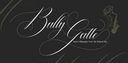 Bully Gatte is a calligraphy design, including Regular. This font is casual and beautiful with swash. Can be used for various purposes. such as logos, product packaging, wedding invitations, branding, headlines, signage, labels, signatures, book covers, posters, quotes, and more. Bully Gatte Script includes a change in the OpenType language style, binding and international support for most Western languages. To activate the OpenType Stylistic alternative, you need a program that supports OpenType features such as Adobe Illustrator CS, Adobe Indesign & CorelDraw X6-X7, Microsoft Word 2010 or newer versions. How to access all alternative characters using Adobe Illustrator: https://www.youtube.com/watch?v=XzwjMkbB-wQ Bully Gatte Script is coded with PUA Unicode, which allows full access to all additional characters without having to design special software. Mac users can use the Font Book, and Windows users can use Character Map to view and copy one of the additional characters to insert into your favorite text editor / application. How to access all alternative characters, using Windows Character Map with Photoshop: https://www.youtube.com/watch?v=Go9vacoYmBw If you need help or have questions, please let me know. I am happy to help :) Thank you & Congratulations on Designing!
 - Stacylia by Straight.Co,
$10.00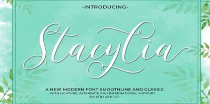 Stacylia is a modern calligraphy design, including Regular. This font is casual and beautiful with swash. Can be used for various purposes. such as logos, product packaging, wedding invitations, branding, headlines, signage, labels, signatures, book covers, posters, quotes, and more. Stacylia includes a change of the OpenType language style, binding and international support for most Western languages. To activate the OpenType Stylistic alternative, you need a program that supports OpenType features such as Adobe Illustrator CS, Adobe Indesign & CorelDraw X6-X7, Microsoft Word 2010 or newer versions. How to access all alternative characters using Adobe Illustrator: https://www.youtube.com/watch?v=XzwjMkbB-wQ Stacylia is coded with PUA Unicode, which allows full access to all additional characters without having to design special software. Mac users can use the Font Book, and Windows users can use Character Map to view and copy one of the additional characters to insert into your favorite text editor / application. How to access all alternative characters, using Windows Character Map with Photoshop: https://www.youtube.com/watch?v=Go9vacoYmBw If you need help or have questions, please let me know. I am happy to help :) Thank you & Congratulations on Designing!