6,846 search results
(0.031 seconds)
- Fondamento Pro by Stiggy & Sands,
$29.00 Fondamento and Fondamento Italic are calligraphic lettering styles based on the traditional Foundational Hand, a basic teaching style created by Edward Johnston in the early 20th century. The letterforms are clear and cleanly legible, basic and formal. Opentype features include: - Stylistic Alternates for a collection of alternate Small Caps - Full set of Inferiors and Superiors for limitless fractions - Lining and Proportional figure sets, several discretionary ligatures/alternates as well as a collection of ligatures.
 - Castagna by Eurotypo,
$48.00 Castagna is a contemporary calligraphic font with classical roots. It is carefully designed, with a special emphasis on the connection of the letters, with high ascenders to give rise to the ornaments of the different letters. There is a special search for high readability. Castagna includes a wide selection of stylistic sets, contextual and stylistic alternates, initial forms, swashes, and ligatures to preserve the qualities of handwriting, in order to accommodate various design aesthetics.
 - La Sonnambula by deFharo,
$18.00 The Sonnambula is a handwritten and expanded font with terminal ornaments, designed to write very elegant titles or calligraphic texts. The name of this typography is dedicated to the opera La Sonnambula by Vincenzo Bellini. - Use the following characters for terminal ornaments: () [] - 380 glyphs. Latin Extended-A • OTF & TTF - OpenType Functions: Discretionary Ligatures, Kerning, All Alternates, Additional languages, Standard Ligatures, Slashed Zero, Capital Spacing, Ornaments, Ordinals, Mathematical Greek, Fractions, Localized Forms. - Bitcoin symbol: b# (ligatures)
 - Mamshooq by MAKYN,
$40.00 Mamshooq is a Bilingual Contemporary Typeface designed by Kholoud Khaled Essawy. It is classified as a script typeface, that is inspired by handwriting. It is characterized by having a monolinear stroke thickness, and the skeleton of the Arabic font is based on Naskhi calligraphic manuscripts. It is familiar, soft, heartfelt and romantic looking typeface that has an honest voice that brings trust to the words and makes it comfortable for continuous reading.
 - Ardila by Subectype,
$15.00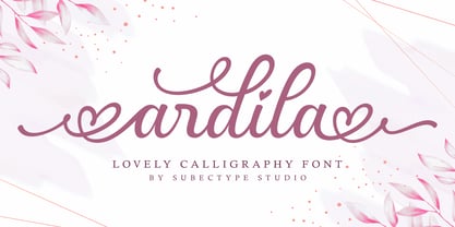 Ardila is a lovely calligraphic font with a lot of love swashes. Equipped with lovely alternative letters for beginning and ending and also up to 5 stylistic alternates which makes this letter very beautiful and attractive. Ardila is suitable for logos, headlines, clothing, branding, quotes, invitations, stationery, wedding design, album covers, business cards, clothing, magazines, posters, and more! Thank you for your purchase! and hope you have fun with Ardila. Happy creating!
 - Gaheris by Scriptorium,
$12.00Gaheris is a decorative font in the same tradition as our Goddard and Ganelon fonts, but with a somewhat more calligraphic look. It is suitable for use as a text or title font, but has some characteristics of a script font, which gives it an unusual and appealing appearance. It's based on early 20th century advertising type of a style which you don't see much any more, but which deserves to be preserved. - Raleigh by ParaType,
$30.00 Raleigh was produced in 1977 by Robert Norton based on Carl Dair’s Cartier typeface which was designed for the 1967 Montreal World's Fair. It was renamed after Dair’s death. Adrian Williams added three weights for a display series, and Robert Norton developed the text versions. A contemporary old style serif with calligraphic features. For use both in text and display typography. Cyrillic version was developed at ParaType in 2001 by Vladimir Yefimov.
 - Legnano by Nick's Fonts,
$10.00 Here's something you don't see every day—Italian Art Deco woodtype. It's suave but unsophisicated, an unpretentious charmer. Both versions support the Latin 1252, Central European 1250, Turkish 1254 and Baltic 1257 codepages.
 - Talsmann NF by Nick's Fonts,
$10.00 Plain and simple, here's a faithful reproduction of the Advocate font for IBM Selectric typewriters from the 1960s. Both versions support the Latin 1252, Central European 1250, Turkish 1254 and Baltic 1257 codepages.
 - a Morris line by JOEBOB graphics,
$9.00 Here's a Morris line; a traditional and legible font in small sizes, but almost abstract in big sizes. Named after my son Morris and it's got nothing to do with a certain musical...
 - Yalta Sans by Linotype,
$29.00 Yalta Sans combines the warmth of a traditional humanist design, the clarity of a grotesque and the modernity of a square sans. Several design traits contribute to this melding of diverse typographic concepts. Characters find their foundation in stroke-based shapes rather than constructed forms. Curve stokes are also slightly squared and counters are open. Curved strokes join verticals at nearly right angles to create a strong horizontal stress, aiding the reading process. The resulting design is exceptionally legible while still inviting. Although Yalta Sans is clearly differentiated from its calligraphic ancestors, many details of the design emulate the distinctive characteristics of typefaces from the Renaissance. Tapering horizontal stokes also give Yalta Sans a dynamic relationship with linear grotesque while its angled stroke terminals echo the work of a calligraphic brush Yalta Sans italics are cursive designs that are in keeping with humanistic letterforms and are markedly narrower than the Roman characters. Lining and old style figures, small caps and a suite of ligatures also make for a remarkably versatile typeface family.
 - Hatmaker by ITC,
$29.99Jean Evans' interest in type design dates back to her third-grade fascination with fancy script writing. Years later, work at a sign-painting school she found in the Yellow Pages® cemented her relationship with letterforms. Evans went on to study with master calligraphers and type designers, including the likes of Donald Jackson, Hermann Zapf and Matthew Carter. Evans' designs have been exhibited and collected around the globe, and her distinctive calligraphic style has been lauded by leading trade organizations, annuals and publications. Hatmaker, one of Evans' more popular typefaces, was originally developed for the Boston-based broadcast design firm of the same name. Inspiration for the design came from Ben Shahn's famous hand-constructed alphabet. Shahn's alphabet, however, was limited to capital letters. Daunted by the idea of designing a lowercase that would measure up to Shahn's capitals, I developed a second set of caps-simple, quirky, yet almost classic-to work as 'lowercase' with the Shahn-like caps," explains Evans. Mixing the two in Hatmaker, creates a lively interplay of light and dark." - Zapfino Arabic by Linotype,
$29.99 Zapfino Arabic is designed by Nadine Chahine as the Arabic companion to Hermann Zapf’s iconic Zapfino typeface, with the approval of Prof. Zapf. The design is an evolution of Arabic calligraphic traditions that combines Naskh and Nastaaliq to form a backward slanted calligraphic style. The character proportions refer to Naskh traditions but the isolated and final forms bring with them an exaggerated swash-like movement that references the extravagant ascenders and descenders of Zapfino. The font contains a large number of contextual variants that work to create a smooth flow of pen movement, as well as 10 stylistic sets. The character set supports the Arabic language as well as basic Latin. Zapfino Arabic is meant to be used as a display typeface, for logos, greeting cards and short headlines. It could also work for short pieces of text, for poetry or chapter introductions, when used in a generous type size and with ample space around it. Its design is soft and elegant, and leaves a lot of room for typographic playfulness.
 - Apadana by Naghi Naghachian,
$100.00 Apadana is a new creation of Naghi Naghashian. Apadana design fulfills the following needs: A. Explicitly crafted for use in electronic media fulfills the demands of electronic communication. Apadana is not based on any pre-digital typefaces. It is not a revival. Rather, its forms were created with today's technology in mind. B. Suitability for multiple applications. Gives the widest potential acceptability. C. Extreme legibility not only in small sizes, but also when the type is filtered or skewed, e.g., in Photoshop or Illustrator. Apadana's simplified forms may be artificial obliqued in InDesign or Illustrator, without any loss in quality for the effected text. D. An attractive typographic image. Apadana was developed for multiple languages and writing conventions. Apadana supports Arabic, Persian, and Urdu. It also includes proportional and tabular numerals for the supported languages. E. The highest degree of geometric clarity and the necessary amount of calligraphic references. This typeface offers a fine balance between calligraphic tradition and the contemporary sans serif aesthetic now common in Latin typography.
 - Ekbatana by Naghi Naghachian,
$75.00 Ekbatana is a new creation of Naghi Naghashian. Ekbatan design fulfills the following needs: A. Explicitly crafted for use in electronic media fulfills the demands of electronic communication. Ekbatana is not based on any pre-digital typefaces. It is not a revival. Rather, its forms were created with today's technology in mind. B. Suitability for multiple applications. Gives the widest potential acceptability. C. Extreme legibility not only in small sizes, but also when the type is filtered or skewed, e.g., in Photoshop or Illustrator. Ekbatana's simplified forms may be artificial obliqued in InDesign or Illustrator, without any loss in quality for the effected text. D. An attractive typographic image. Ekbatana was developed for multiple languages and writing conventions. Ekbatana supports Arabic, Persian, and Urdu. It also includes proportional and tabular numerals for the supported languages. E. The highest degree of geometric clarity and the necessary amount of calligraphic references. This typeface offers a fine balance between calligraphic tradition and the contemporary sans serif aesthetic now common in Latin typography.
 - Mellow Serif by ParaType,
$30.00 Mellow Serif is a soft and friendly typeface. It looks compelling in large point sizes due to the rounded terminals and calligraphic details. Mellow Serif also works well in body text with a small leading size as it has even proportions and a large x-height. Mellow Serif includes ten styles—five upright and five italic, ranging from Light to Extra Bold. The typeface supports extended Latin, extended Cyrillic, and Greek. The character set also includes old style figures, small caps in the Light, Regular, and Medium upright styles as well as stylistic alternate sets that slightly change the way Mellow Serif looks in large point sizes. The Regular style also has alternative letterforms with swashes. Mellow Serif is great for book printing (from fiction and children’s books to science literature), headings, and large texts on the web as well as for toys and confectionary packaging. It also works perfectly with a rounded sans serif Mellow Sans. Mellow Serif was created by Natalya Vasilyeva, an expert in designing text and calligraphic typefaces, and released by Paratype in 2023.
 - Mangerica by Ndiscover,
$25.00This design incorporates different styles into a consistent look. A pinch of script, a little of geometric and some humanistic shapes as well create a very distinguishable sans-serif. It has an overall good feeling specially on the heavier weights that have intended contrast irregularities to create a 'cartoonish' look. On the intermediate weights the design will preform well on small font sizes because of its large counters, low contrast and large x-height, but as you go to the extremes you will see shapes full of personality that will pop out in large font sizes. The font is loaded with opentype features such as small caps, ligatures, alternates, old style figures, and much more. The italic version is deeply rooted in the calligraphic heritage of the Italics. This way the brush inspired strokes are emphasized as well as an overall calligraphic look. Far from being a mere slant, Mangerica Italic had every lowercase glyph redesigned as well as some uppercase, besides that, every glyph was optically adjusted to ensure not only aesthetics but functionality too. - Envelove by Sudtipos,
$39.00 «Envelove» is the brand new typographic challenge handwritten by Yani Arabena and designed along with Guille Vizzari and Ale Paul, for Sudtipos. It all started as a game for Yani. A carefree and spontaneous calligraphy, making use of the pointed nib with black ink, exploring its expressive possibilities pressing against paper. With time that nib turned into her dearest tool to flow through her writing, breeding this particular style of hers that let her trespass the barrier that kept personal and professional passions apart. All that inspiration is present in «Envelove», a play on words that reflects the love of letters. An expressive free-and-easy typeface that follows no formal calligraphic model and lets itself go with the meaning of words, rhythm and sensations. «Envelove» successfully joins three different fonts, «Envelove Script»—free, spontaneous and unique of its kind—going together with «Envelove Caps»—an uppercase style that builds controlled but dynamic words thanks to its alternates and ligatures, and to its own true Small Caps set as well—and «Envelove Icons», ideal to decorate and bring to life any written message. «Envelove» encourages you to write as if you have a nib, ink and an envelope. It invites you to take part in other worlds like a magic cocktail, a summer night, a long-awaited reunion, a first dance, a dish cooked with your own hands. The fashion world, gourmet, stationery, scrapbooking and everyone where a Handmade or Handcrafted feel is craved for, save a special place for «Envelove». (The illustration series that are shown with «Envelove» were made by the incredible Argentine illustrator Eugenia Mello.)
 - Baystar Script by Mans Greback,
$59.00 Baystar Script is a high-quality script typeface. Drawn and created by Mans Greback in 2021, this calligraphic font has power, style and stamina. The type’s organic, handwritten lettering is well suited for a variety of applications: from happy, playful designs, to super sleek web graphics and vivid logotypes. It has velocity like a mustang, a brilliant look and–with its hundreds of alternates–is truly dynamic. It flows with quick turns, marking out brush strokes and connecting tails, like a genuine, hand-painted writing should. Write multiple underscores to make swashes of different lengths. Example: Corvette_______ Baystar Script is legible and professional while retaining the personality that is valued in handwriting. Drawn in accordance with the latest trends in design, but is inspired by retro logotype lettering such as Chevrolet Chevelle and Camaro. A modern calligraphy, fast as a sport race car or sharp as a stingray, the letters are characterized by thorny edges and tall ascenders. It comes in three weights; Light, Medium and Bold, making it useful in any size and context. The font is built with advanced OpenType auto-functionality and guaranteed top-notch quality, containing stylistic and contextual alternates, ligatures and more automatic and manual features; all to give you full control and customizability. It has extensive lingual support, covering all Latin-based languages, from North Europa to South Africa, from America to South-East Asia, as well as Cyrillic (Russian, Serbian, Bulgarian) and the Greek alphabet. It contains all characters and symbols you'll ever need, including all punctuation and numbers. Let this font help you to transform your professional work into an energetic piece of handmade art!
 - Crippy MF by Masterfont,
$59.00 Horror movies? Tattoo? Yes, here is the ideal font for you.
 - FG Tonya by YOFF,
$13.95 Here you have FG Tonya who's a social, charmingly writing female.
 - Wordless Script by Sudtipos,
$59.00 We are very happy to announce the release of our first collaboration with master calligrapher, designer and illustrator Gabriel Martínez Meave from México. The first in the series of new designs is Wordless Script, an emotional calligraphic typeface published by Sudtipos. Speechless. Breathless. Wordless. There are letters that transcend simple functionality and sheer legibility, to be recognized instead by their style, their charm, their emotion. It’s like when we don’t remember the exact sentences, but we recall the tone of the voice of a loved one: it just doesn’t matter WHAT he or she said, but HOW he or she said it. Wordless Script is the font of choice for writing those things that go beyond words. Based on the connected-scripts of late 18th-century England, this typeface preserves the irregular finish and gestural strokes of the pointed nib. It is, so to speak, a personal rendition of the English roundhand as originally executed with the bird’s quill. Imbued with a Rococo, neoclassical, romantic spirit, Wordless radiates the gallantry of a time when the celebrated «douceur de vivre» that Talleyrand was so fond of was still alive and well; echoes of which still haunt us in our eclectic 21st-century, which has once again come to appreciate these magnificent styles of old. Wordless features alternate variants of most letters, ligatures and multiple calligraphic endings, ideal for elegant labels, high-end packaging and personalized stationery, as well as compositions for selected brands, exquisite titlings, verses, letters and short texts, like those meant to be read with the eyes only or intended for whispering into someone’s ear.
 - Brussels by Solotype,
$19.95The Stephenson Blake foundry in England, made two fonts, Flemish Expanded and Flemish Condensed. In our view, one was too wide, the other too narrow; so we redrew it and renamed it Brussels. Why not? Belgium is one of the few places where you may still hear Flemish spoken. - Orchest by Arendxstudio,
$14.00 Orchest is a Luxury Caliigrphy that is luxurious in a casual and distinctive style that is perfect for your branding design, and will also be very beautiful in your wedding invitations and business cards and especially for your brand name logotype Orchest has beautiful Uppercase and Lowercase, figures and ligature standards that are very realistic
 - Van Den Velde Script Pro by Intellecta Design,
$59.95 Van den Velde Script Pro is the definitive edition of the original Van den Velde Script, by Intellecta Design, a free interpretation of the work of the famous master penman Jan van den Velde, to be found in the “Spieghel der schrijfkonste, in den welcken ghesien worden veelderhande gheschrifften met hare fondementen ende onderrichtinghe. ” (Haarlen, 1605). This font has evocative ancient ligature forms from the XVII Century Dutch master penman Jan van den Velde. Your indescritible writing-book was important not only with regard to the specific period it represents, but also in relationship to the entire history of calligraphy as an art: Van den Velde is rightly credited with having introduced and perfected a new trend in Dutch calligraphy. Our font, Van den Velde Script, merges modern necessities or better legibility without loosing the taste of his archaic origins. This enhanced OpenType version is a complete solution for producing documents and artworks whith an evocative and voluptuous style of calligraphic script: Van den Velde Script PRO has - more glyphs than the original Van den Velde Script. We created hundred of new glyphs, deactivated old non-representative glyphs and redesign the remaining library of original glyphs. Van den Velde Pro is more functional, soft and beauty than the original. - to keep the powerful of this unusual kind of script we make a tour-de-force kerning work: 771 glyphs in this font was adjusted in 5400 kerning pairs handly. - hundreds of contextual alternates combinations, some of them with three or more letters, - historical ornaments and fleurons in the typical style (and motifs) from the XVII century at the Lower Countryes accessed with the glyph palette using the Ornaments feature); - an extensive set of ligatures (100s of contextual alternates plus discretionary ligatures) providing letterform variations that make your designs really special, resembling real handwriting on the page; .... and, much better, Van den Velde Scriopt PRO is plus cheap than the original font !!! In non-OpenType-savvy applications it works well as an unusual and beautiful script style font. Because of its high number of alternate letters and combinations (over 700 glyphs), we suggest the use of the glyph palette to find ideal solutions to specific designs. The sample illustrations will give you an idea of the possibilities. You have full access to this amazing stuff using InDesign, Illustrator, QuarkXpress and similar software. However, we still recommend exploring what this font has to offer using the glyphs palette: principally to get all the power of the Contextual Alternates feature. Van den Velde Script PRO has original letters designed by Iza W and overall creative direction plus core programming by Paulo W.
 - Van den Velde Script by Intellecta Design,
$68.90 Iza and Paulo W (Intellecta Design) are proud to announce Van den Velde Script. A free interpretation of the work of the famous master penman Jan van den Velde, to be found in the “Spieghel der schrijfkonste, in den welcken ghesien worden veelderhande gheschrifften met hare fondementen ende onderrichtinghe. ” (Haarlen, 1605). Van den Velde Script has evocative ancient ligature forms from the XVII Century Dutch master penman Jan van den Velde. Your indescritible writing-book was important not only with regard to the specific period it represents, but also in relationship to the entire history of calligraphy as an art: Van den Velde is rightly credited with having introduced and perfected a new trend in Dutch calligraphy. Our font, Van den Velde Script merges modern necessities o better legibility without loose the taste of his archaic origins. This enhanced OpenType version is a complete solution for producing documents and artworks whith a evocative and voluptuous style of calligraphic script: - dozens of stylistic alternates for each letter (upper- and lowercase), accessed with the glyph palette; - historical ornaments and fleurons in the typical style (and motifs) from the XVII century at the Lower Countryes accessed with the glyph palette using the Ornaments feature); - an extensive set of ligatures (100s of contextual alternates plus discretionary ligatures) providing letterform variations that make your designs really special, resembling real handwriting on the page; - a tour-de-force kerning work: over 700 gliphs in this font was adjusted to your kern pairs handly. In non-OpenType-savvy applications it works well as an unusual and beautiful script style font. Because of its high number of alternate letters and combinations (over 700 glyphs), we suggest the use of the glyph palette to find ideal solutions to specific designs. The sample illustrations will give you an idea of the possibilities. You have full access to this amazing stuff using InDesign, Illustrator, QuarkXpress and similar software. However, we still recommend exploring what this font has to offer using the glyphs palette: principally to get all the power of the Contextual Alternates feature. You can has an idea of the power of this font looking at the “Van den Velde User Guide”, a pdf brochure in the Galçlery section. Two last things: take a special look at the Van den Velde Words (ready words) font and another super script font, Penabico. Van den Velde Script has original letters designed by Iza W and overall creative direction plus core programming by Paulo W.
 - Second Song by Supfonts,
$16.00 Here's my new experiment, Second Song. This font breaks the boundaries even more. Now the inscription looks as authentic as possible. Includes: Regular Script Uppercase and lowercase Numbers and punctuation Foreign language support Ligatures
 - Rosemary by Chank,
$99.00Here is a nice sign-painterly display font inspired by the 1920s. - Mabsut MF by Masterfont,
$59.00 Feel naughty, childish and happy - here is the perfect font for you.
 - Choujun is not just a font; it's an immersive experience in typographical form, designed to bridge the gap between traditional calligraphy and contemporary digital expression. Named after the Chinese...
- Myteri Script, crafted by the renowned font designer Måns Grebäck, stands as an exquisite testament to the beauty and intricate nature of script typefaces. This particular font falls under the catego...
- La Pejina ffp - Personal use only

- SoulCalibuR - 100% free

- Tribal Dragon - Personal use only

- 99 Names of ALLAH Elegant by Islamic Calligraphy75,
$12.00 We have transformed the “99 names of ALLAH” into a font. That means each key on your keyboard represents 1 of the 99 names of ALLAH Aaza Wajal. The fonts work with both the English and Arabic Keyboards. We call this Calligraphy "Elegant" because we thought this is the most elegant one we have designed. Everything is so clear, nothing overlaps, decorative symbols are not too much nor too little. The first "Alef" has a "fatha", this indicates to pronounce the first letter. So instead of saying "R-RAHMAAN" you say "AR-RAHMAAN" (in the zip file you will find a pdf file explaining the differences in the "harakat", pronunciation and spelling according to the Holy Quran). The "Ye" at the end of names doesn't have the two dots, and we used a decorative small letter "Ye". Purpose & use: - Writers: Highlight the names in your texts in beautiful Islamic calligraphy. - Editors: Use with kinetic typography templates (AE) & editing software. - Designers: The very small details in the names does not affect the quality. Rest assured it is flawless. The MOST IMPORTANT THING about this list is that all the names are 100% ERROR FREE, and you can USE THEM WITH YOUR EYES CLOSED. All the “Tachkilat” are 100% ERROR FREE, all the "Spelling" is 100% ERROR FREE, and they all have been written in accordance with the Holy Quran. No names are missing and no names are duplicated. The list is complete "99 names +1". The +1 is the name “ALLAH” 'Aza wajal. Another important thing is how we use the decorative letters. In every font you will see small decorative letters, these letters are used only in accordance with their respective letters to indicate pronunciation & we don't include them randomly. That means "mim" on top or below the letter "mim", "sin" on top or below the letter "sin", and so on and so forth. Included: Pdf file telling you which key is associated with which name. In that same file we have included the transliteration and explication of all 99 names. Pdf file explaining the differences in the harakat and pronunciation according to the Holy Quran. --------------------------------------------------------------------------------------------------------------------------- Here is a link to all the extra files you will need: https://drive.google.com/drive/folders/1Xj2Q8hhmfKD7stY6RILhKPiPfePpI9U4?usp=sharing ---------------------------------------------------------------------------------------------------------------------------
 - Port Vintage by Onrepeat,
$25.00 Guided tour available here. Port Vintage is a new typeface expanded upon the original Port typeface, released in 2013, and being an experimental Didone typeface with a modern twist, inspired by the well known forms of typography masters such as Bodoni and Didot and the exuberance and elegance of calligraphy typefaces. A lot of changes were made, the whole typeface is now softer and has less rough edges, the time it took to mature made it possible to achieve an entirelly new and distinct flavour from the original Port, giving away the rough edges from Port and giving place to the soft transitions and curved connections between the stems and serifs of Port Vintage. Port Vintage melts the straight lines and strong contrasts of the Didone typefaces with the elegant lines of calligraphy in a geometric way, resulting in exuberant characters with geometric swashes that can be combined in countless ways. The result of this experiment is Port Vintage, an unique and rich display typeface meant to be used on big sizes and it’s main perk is the amount of alternative characters it features. Port Vintage is Open-Type programmed and includes hundreds of alternates, from swashes to titling alternates, ligatures and stylistic sets with each character having a thin version of itself, giving complete freedom to all your creative needs. Port Vintage is available in 10 different styles: Port Vintage Regular, being the base version and featuring the whole base character set; Port Vintage Regular Decorated, featuring richer forms and containing more ornamentated and more extravagant characters; Port Vintage Medium and Port Vintage Medium Decorated, designed for the occasions you need a bit more thickness and the decoration variants: Port Vintage Ornaments, containing a wide set of elements meant for the creation of fillets, vignettes and fleurons, resulting in an almost infinite number of possible combinations to embellish your designs and Port Vintage Words, a set of some of the most common words used in English, Spanish, French, German, Italian and Portuguese. All styles, except Port Vintage Ornaments and Port Vintage Words, include italic styles. For a better understanding of all the uses of Port Vintage and the full character list the reading of the manual is recommended.
 - Semper by Linotype,
$29.99Semper is slightly angular since it is in part based on callygraphic lettering. That is not as evident as in the italic of Jenson Classico. On the contrary, the text looks even and harmonious, which makes the typeface easy to use. The name is Latin meaning always, but you knew that already. Semper was released in 1993. - Maestrale by Catharsis Fonts,
$25.00 Maestrale is a paradigm-breaking new take on calligraphy, built around a compact, serif-style core and outrageously long, flamboyant extenders. At large sizes, its confident, charismatic lettershapes are ideally suited for branding and decorative uses, whereas longer texts at smaller sizes naturally weave themselves into a flowing texture. The font comprises 1299 glyphs, including many stylistic alternates, ligatures, small capitals, and initial, terminal, and linking forms, and offers extensive OpenType programming to support them. The calligraphic form of Maestrale is complemented by a matching text font (Maestrale Text) with short extenders, available in three cuts (a serif-style Roman, an upright Cursive, and a tilted Italic). Maestrale is all about the lowercase; its capitals are deliberately understated so as not to steal the limelight. In fact, the font works very well when set exclusively in lowercase. Maestrale�s small capitals are fitted into the core space of the lowercase, allowing them to be freely interspersed with lowercase characters. Alternately, an OpenType feature is available to replace a and e in small-caps text with their lowercase equivalents for a fresh unicase look. Since alternates and ligatures play such an important role, Maestrale offers three different modes of use. The most straightforward approach is simply to start typing using Maestrale Pro � the extensive OpenType programming will ensure that collisions between extenders are avoided and attractive ligatures are substituted for common glyph combinations. A more interactive approach is provided by the font Maestrale Manual, which allows the user to manually select alternate forms and ligatures even in typographically unsavvy applications, such as PowerPoint (as long as standard ligatures are supported). Stylistic alternates are simply represented as ligatures of their base forms with one or more instances of the rarely-used by easily-accessed characters "~" (ASCII tilde) and "`" (spacing grave accent); linking forms are built with �_� (underscore), multi-character ligatures with "|" (pipe), and initial and terminal forms with the �less than� and �greater than� characters. For instance, the Maestrale wordmark in the posters above was simply typeset with the string (`ma`est|r_a```l```e)| in Maestrale Manual (The parentheses represent �less than� and �greater than� characters here.) Feel free to type this string into the test line below and see what happens! Make sure Standard Ligatures are enabled. An instruction sheet listing all alternate forms and their accessibility is available from the Gallery tab on this page. The third mode of usage is aimed at professional designers, who make use of sophisticated software with extensive OpenType support. These power users are advised to use the font Maestrale Pro again, where all glyphs are accessible as stylistic alternates. Maestrale Text is a less extravagant but more versatile variation on the design of Maestrale, replacing Maestrale�s swashes with efficiently compact extenders. It is intended to serve as a perfectly matching text companion to Maestrale calligraphy, but constitutes a full-fledged typeface in its own right. It is equally at home at display sizes as it is in pull quotes, titles, and high-impact blocks of text. Maestrale Text comes in three complementary faces: A serif-style Roman, an upright Cursive, and a tilted Italic. Maestrale is the Italian word for �masterful�. It is also the traditional Italian name for the northwesterly mediterranean wind, better known by its French name, Mistral. Acknowledgements: I am grateful to the helpful souls on the Typophile forums for extensive feedback and encouragement on Maestrale, and to the TypeDrawers forum for feedback on Maestrale Text. This font is dedicated to Simone.
 - Jeunes by Etewut,
$30.00 Here is a new typeface JEUNES. Script font with alternates and some ligatures.
 - CalliSans Variable by 38-lineart,
$140.00 Hello. this is the variable version of CalliSans : a revolution in typography. 14 fonts, 7 regular and 7 italic, seamlessly blend calligraphy's grace with sans-serif simplicity. Perfect for projects demanding elegance, from books to digital screens. Make a bold statement with its distinctive style. Timeless yet contemporary, it transcends trends. Your creative secret weapon. CalliSans Pro: where art meets design.


