10,000 search results
(0.027 seconds)
- ArabicNaskhSSK - Unknown license

- Oloron Tryout - Unknown license

- Gaheris Demo - Unknown license

- Schwabacher - Personal use only

- Stonecross - Unknown license

- Alisal by Monotype,
$29.99 Matthew Carter has been refining his design for Alisal for so long, he says, that when he was asked to complete the design for the Monotype Library, it was almost as if he were doing a historical revival of his own typeface. The illusion even extended to changes in his work process: although he now does all his preliminary and final drawing on screen, the first trial renderings of Alisal were done as pencil renderings. Alisal is best classified as an Italian old style design. Originally created between the late 15th and mid-16th centuries in northern Italy, the true Italian old styles were some of the first roman types. They tend to be the most calligraphic of serifed faces, with the axis of their curved strokes inclined to the left, as if drawn with a flat-tipped pen or brush. These designs offer sturdy, free-flowing and heavily bracketed serifs, short descenders, and a modest contrast in stroke weight. Alisal has nearly all the classic Italian old style character traits, plus a few quirks of its own. It is calligraphic in nature, with more of a pen-drawn quality than faces like Palatino or Goudy Old Style. It is more rough-hewn than either Goudy's Kennerley or Benton's Cloister, and is generally heavier in weight than most of the other Italian old style designs. One place where Alisal makes a clean break with traditional old style designs is in the serifs. While sturdy and clearly reflecting pen-drawn strokes, Alisal's serifs have no bracketing and appear to be straight strokes crossing the main vertical. Like Caslon or Trajanus, Alisal is a handsome design when viewed as a block of copy. Ascenders are tall and elegant, and serve as a counterpoint to the robust strength of the rest of the design. Alisal is available as a small family of roman and bold with a complementary italic for the basic roman weight, providing all that is needed for the majority of text typography. Alisal is not as well-known as some of Carter's other typefaces, but this lovely and long-incubated design was certainly worth the wait.
 - Some's Style - Unknown license

- Vtks Relaxing Blaze - 100% free

- Simple Ronde by JBFoundry,
$20.00 Simple Ronde is conceived for young pupils. This upright script is based on the french use at primary schools. A large set of ligatures make the links between characters more natural, especially with o, b, v and w.
 - Little Mess by Gleb Guralnyk,
$12.00 Hi! Introducing this handcrafted calligraphic script named "Little Mess". It's made with a calligraphic pen in a casual rough style. It has a multilingual support and several ligatures. Thank you and have a great day!
 - Japanese Brush - Unknown license

- Handtalk - Personal use only

- Ugly Face - Unknown license

- Clamshell by Jafar07,
$20.00 Clamshell Modern Caligraphy Script font is a harmonious blend of elegance and contemporary flair, seamlessly adaptable to modern and classic design landscapes. It effortlessly radiates timeless elegance and is tailored to meet the needs of professionals seeking designs that are both sophisticated and versatile. Easy to use yet rich in detail, this font is the ideal choice for designers who value both beauty and functionality in their work. Explore this font collection now and infuse your designs with the captivating essence of calligraphy.
 - Gin by Bykineks,
$12.00 Gin is a futuristic decorative font that combines calligraphy, graffiti and typography. This font is inspired by the street art called calligraffiti where it is abstract and elegant. This font is suitable for those who are anti mainstream and out of the zone, this is a new face in the world of fonts, for those who are against this font it will be considered broken but for those who are from the future, this font is an answer to futuristic design needs
 - Kashi by Naghi Naghachian,
$64.00 Kashi is the Persian word for tile. This font is inspired from building decorations of 16th and 17th centuries in Iran. It is extremely legible even in very small size. Kasha design fulfills the following needs: A Explicitly crafted for use in electronic media fulfills the demands of electronic communication. B Suitability for multiple applications. Gives the widest potential acceptability. C Extreme legibility not only in small sizes, but also when the type is filtered or skewed, e.g., in Photoshop or Illustrator. Nima’s simplified forms may be artificial obliqued in InDesign or Illustrator, without any loss in quality for the effected text. D An attractive typographic image. Kasha was developed for multiple languages and writing conventions. Kashi supports Arabic, Persian and Urdu. It also includes proportional and tabular numerals for the supported languages. E The highest degree of calligraphic grace and the clarity of geometric typography.
 - Felbridge by Monotype,
$29.00 The impetus behind Felbridge was both ambitious and highly practical: to develop an ideal online" typeface for use in web pages and electronic media. Robin Nicholas, the family's designer, explains, "I wanted a straightforward sans serif with strong, clear letterforms which would not degrade when viewed in low resolution environments." Not surprisingly, the design also performs exceptionally well in traditional print applications. In 2001, to achieve his goal, Nicholas adjusted the interior strokes of complex characters like the M and W to prevent on-screen pixel build-up and improve legibility. Characters with round strokes were drawn with squared proportions to take full advantage of screen real estate. In addition, small serifs were added to characters like the I, j and l to improve both legibility and readability. "The result," according to Nicholas, "is a typeface with a slightly humanist feel, economical in use and outstanding legibility - even at relatively small point sizes. Most sans serif typefaces have italics based on the simple "sloped Roman" principle, but italic forms for Felbridge have been drawn in the tradition of being visually lighter than their related Roman fonts, providing a strong contrast when the italic is used for emphasis in Roman text. The italic letter shapes also have a slightly calligraphic flavor and distinctive "hooked" strokes that improve fluency. Felbridge is available in four weights of Roman - Light, Regular, Bold and Extra Bold - with complementary italics for the Regular and Bold designs. The result is a remarkably versatile typeface family, equally comfortable in magazine text copy or in display work for advertising and product branding. As a branding typeface, Felbridge works in all environments from traditional hardcopy materials to web design, and is even suitable for general office use. As part of a corporate identity, this no-nonsense typeface family will be a distinctive and effective communications tool." Felbridge™ font field guide including best practices, font pairings and alternatives.
 - Orto by LetterPalette,
$20.00 Orto is a type family of sans serif fonts in eight weights. It's a humanist typeface with real cursive, containing both Roman and Italic styles. The letters are designed to look good on screen, they have a bit narrower proportions and simple shapes. Their structure is based on flat horizontal and vertical strokes, which are emphasized wherever possible. That’s where the name comes from: Orto is an abbreviation of the word orthogonal. Thanks to its narrow width, the typeface is less space-consuming and adapts well to the screens of smaller devices. It is legible in small sizes, thanks to the larger x-height. The characteristic details, like bent ends of diagonal strokes, stand out when used in larger sizes. Orto can be used equally good in print and its overall neutral look fits different contexts. However, its character is pretty recognizable. Orto contains Latin and Cyrillic script and covers six codepages: Latin 1, Latin 2, Cyrillic, Turkish, Windows Baltic and MacOS Roman. It has basic OpenType features like ligatures, oldstyle numerals, proportional and tabular lining figures, fractions, superiors, etc. Capital German sharp S shows up when the lowercase is typed between two uppercase letters, and the Contextual Alternates feature is turned on. The Stylistic Set 01 changes the shape of the Cyrillic b. The Stylistic Set 02 is a shortcut for using Serban Cyrillic alternatives that differ from Russian in cursive.
 - Independence Script by Alan Meeks,
$50.00 Independence Script, designed by Alan Meeks and top British calligrapher Satwinder Sehmi, is an old style calligraphic handwritten script. The name is derived from the Declaration of Independence of which the font bears a slight resemblance.
 - Lagarto by Sudtipos,
$39.00 Some years ago, a good friend and typophile, Gonzalo García Barcha, approached me with the idea of designing a typeface for his editorial project Blacamán Ediciones. He had just came across an hitherto unknown manuscript by Luis Lagarto, a colonial illuminator and scribe, working in Mexico City and Puebla in the late 1500s. The manuscript calligraphy was incredible and stunningly original. It featured three different hands by the scribe, intermingled in the text: a kind of baroque «Roman» roundhand; a very ornate, lively «Italic»; and some sort of irregular, playful, even funny «small caps». All imbued with an eccentric, convoluted zest and vivacious rhythm. Lagarto is the final result of translating these extraordinary hands into a digital type family. Since the manuscript had no numerals, math signs and many other characters now in use, part of the fun of the job was to infer them from the stylistic peculiarities of Luis Lagarto's calligraphy. Lagarto received an Award of Excellence at the Type Directors Club of New York annual competition.
 - NFL Falcons - Unknown license

- Tattooz - Unknown license

- Kabanoss - Unknown license

- Willgray by NicolassFonts,
$35.00 The Willgray family offers three options: A, B, and C, each equipped with 20 fonts. This versatile family is ideal for a wide range of applications, including signage, packaging, brand identity, software, editorial design, and web and screen design.
 - P22 Shibumi by IHOF,
$24.95 Shibumi is a brush-titling face that has an "Eastern" feel. It was designed with a Speedball B (round nib [heavily manipulated]). Its sheer weight exudes authority while the Eastern influence and gentle curves lend a sense of grace.
 - Mrs. Santhi by Abo Daniel,
$15.00 Proudly present Mrs. Santhi, a fancy Signature Font. This font is very unique. I designed it for you who want something different from the others. It is perfect for branding, photography, invitations, quotes, watermarks, advertisements, product designs, labels, and much more! I created 194 ligatures to keep this font look natural: aa ab ah ak al am an at ant all amm ann att bh bt cc ch ct dd eb ee ek em en et enn ent ett ff gh hh ii ib ik in it inn int itt ix ixx kh ll mm mt nt nn oo oh on ob ok ol oll om ot ont ott oot onn ox oxx ph pt and more as you can see on the presentation pictures. Mrs. Santhi also features punctuations and multilingual support. Hope you love it!
 - Kingthings Conundrum Pro by CheapProFonts,
$10.00 This pearl by Kevin King was the best faux chinese font I've ever come over, and now it can be used for setting themed text and menus in many more languages! :) Kevin King says: "I have said before you know - I can if I want to (Stamp! Scowl!). Cod Chinese of the worst kind, I wanted a "Chinese" font for a project and couldn't find what I wanted. I painted this font with a Chinese brush and imported the resultant mess - it's been a while since I did any Chinese calligraphy - add that to the fact that I don't read or speak Chinese..." ALL fonts from CheapProFonts have very extensive language support: They contain some unusual diacritic letters (some of which are contained in the Latin Extended-B Unicode block) supporting: Cornish, Filipino (Tagalog), Guarani, Luxembourgian, Malagasy, Romanian, Ulithian and Welsh. They also contain all glyphs in the Latin Extended-A Unicode block (which among others cover the Central European and Baltic areas) supporting: Afrikaans, Belarusian (Lacinka), Bosnian, Catalan, Chichewa, Croatian, Czech, Dutch, Esperanto, Greenlandic, Hungarian, Kashubian, Kurdish (Kurmanji), Latvian, Lithuanian, Maltese, Maori, Polish, Saami (Inari), Saami (North), Serbian (latin), Slovak(ian), Slovene, Sorbian (Lower), Sorbian (Upper), Turkish and Turkmen. And they of course contain all the usual "western" glyphs supporting: Albanian, Basque, Breton, Chamorro, Danish, Estonian, Faroese, Finnish, French, Frisian, Galican, German, Icelandic, Indonesian, Irish (Gaelic), Italian, Northern Sotho, Norwegian, Occitan, Portuguese, Rhaeto-Romance, Sami (Lule), Sami (South), Scots (Gaelic), Spanish, Swedish, Tswana, Walloon and Yapese.
 - Poynter Old Style by Font Bureau,
$40.00 In the 1670s, Christopher Plantin was the largest publisher of his day. Hendrik van den Keere cut for him an astounding series of romans. As Stanley Morison once observed, such types adopted features of Flemish blackletter to strengthen elegant French romans. Large on the body, strong in color, economical in fit, widely (if anonymously) distributed, they established effective standards for all that followed; FB 1997–2000
 - Newstyle by Matteson Typographics,
$19.95 Goudy’s Newstyle typeface was desiged in 1921 began as an experiment in creating a phoentic alphabet with different shapes for letters depending on their unique sound. The design is strongly influenced by the Venetian Romans of Aldus which Goudy believed to be the most readable letterforms. Steve Matteson digitized the roman faithfully to Goudy’s original and designed the companion italic in the spirit of Goudy’s style.
 - Kegina by Attract Studio,
$19.00 Kegina is a sans serif font family with sharp curves that look clean in a minimalist look. Kegina is equipped with a variety of attractive font alternatives and natural ligature bonds, each version of the Roman style equipped with an Italic style version to produce your extraordinary design needs. Include: 18 Weights (Roman & Italic) 1 Variable Font Replacement & Binding OpenType support Multilingual PUA Encoded.
 - P22 Amelia Jayne by IHOF,
$39.95Amelia Jayne is Ted Staunton's updated revision and expansion of his own Amelia decorative cap font. Amelia Jayne started as a Roman font to accompany the Amelia initials but has taken on a new life as a Pro Roman font with small caps and several variations of new matching initial companion fonts. (The initials are not included in the pro font but come bundled with the set.) - Hacky Sack NF by Nick's Fonts,
$10.00Ross George in his numerous Speedball chapbooks called the pattern for this typeface Stunt Roman. A studious observer may discern that many of the wackier letterforms were tamed to produce the popular font University Roman; however, this version remains unapoligetically true to the original. All versions of this font include the Unicode 1250 Central European character set in addition to the standard Unicode 1252 Latin set. - Pacific Northwest Letters by Cultivated Mind,
$29.00 Pacific Northwest Letters is a fun, handwritten font by Cultivated Mind. Pacific Northwest has been carefully hand painted and comes in two styles (Regular/Rough). This font includes a set of lower case letters and Pacific Northwest hand painted Labels B.
 - Pasquale by Monotype,
$39.00Pasquale was designed by Tony Stan. The Pasquale font family has short ascenders, and the lowercase and caps A, B, D, E and Q are open. This versatile warm design is suitable for advertising, magazines, brochures, letterheads and text work. - Window Dressing JNL by Jeff Levine,
$29.00 A picture of some cast metal letters in a 1950s architectural signage catalog was the basis for Window Dressing JNL. The clean, simple lines as well as the unusual letter form of the B and R inspired this digital interpretation.
 - Black Pink Summer by Letterara,
$13.00 Introducing a new beautiful calligraphy font, Black Pink Summer, the monoline version of Black Pink Signature, created for summer. Black Pink Summer is perfect for beautiful and elegant logos, upscale packaging, wedding stationery, websites, and any other projects requiring a handwritten and luxurious touch. A wide range of swashes (a-z) and alternates (A-Z) are included so that you can give your logo or name a custom, hand-calligraphic look. Moreover, Black Pink Summer was created to look as close to a natural handwritten script as possible by including 109 ligatures. With built in Opentype features, this script comes to life as if you are writing it yourself.
 - Melandria by Akrtype Studio,
$19.00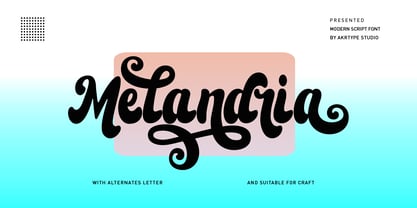 Melandria script is a magical script font carefully created with a touch of elegance. This is a beautiful combination of timeless elegance and authentic calligraphy. It features an incredibly classic style, while still keeping a friendly feel. Melandria script is the perfect font for making original and outstanding designs. This script supports multilingual and many alternative lowercase and uppercase characters, allowing you to make your design truly unique. The Melandria script is a beautiful, classic calligraphic font which will add a sweet, elegant, and perfect feel to your design. It’s perfect for logo projects, wedding invitation cards, branding, home designs, product packaging, and every other design that needs an elegant typeface.
 - Erimboo by Typehead Studio,
$25.00 The "Erimboo" font is a perfect embodiment of the beauty and elegance of calligraphic style. Key Features: ~ Smooth lines and beautiful handwriting flow. ~ Elegance and a classic touch, suitable for designs that require a luxurious ambiance. ~ Creative and diverse letter characters, making it perfect for titles, logos, invitations, and much more. ~ Includes various opentype options like ligatures, alternate characters, and numerals for flexibility and variation in your designs. The "Erimboo Script " font is the perfect choice for those who appreciate the beauty of calligraphy in their designs. With its unique characters and unparalleled quality, this font will be a valuable asset in your collection.
 - Aranjuez Pro by Sudtipos,
$59.00 Aranjuez is the latest Koziupa and Paul adventure. This time, they max out on calligraphic art deco, then add a healthy dose of the thick-and-thin mantra that's been so trendy for quite a few years now. The result is neo-psychedelia in an upright cross-breed of pseudo-wood deco and ornamental calligraphy, complete with alternates, swashes, endings, playful contrast treatments, and even background possibilities. This font is quite expressive, and its elegance is meant to be shown prominently. So use it for packaging, book covers, or wherever the message needs to be delivered clearly and with a precisely controlled touch of class.
 - Kuenstler 480 by ParaType,
$30.00 The Bitstream version of Trump Mediaeval of Linotype, 1954-60, by Georg Trump, a prolific German type designer. It seems to be his best typeface. It has a vigorous and assumed oldstyle roman and italic that is the sloped roman, except for the letters a, e, f. With its crisp angularity and wedge-shapes serifs, Trump Mediaeval appears carved in stone. It is a strong text typeface that is highly legible and especially useful for low-resolution output. It is useful in display work too. Cyrillic version developed for ParaType by Vladimir Yefimov and Isabella Chaeva and released in 2010. Cyrillic italics maintain the main feature of Trump Mediaeval to be the sloped roman, except for the letters г, д, и, й, n, т. There are old style figures, additional ligatures and fractions available at all styles and small caps at the Roman 55. Black style was added in 2011 by Vladimir Yefimov.


