10,000 search results
(0.034 seconds)
- Pseudo-Hellenic by Simeon out West,
$18.00 Pseudo-Hellenic is a font based the Greek typeface of Firmin Didot. The original Greek typeface became standard during the Victorian era and remained popular until the last part of the twentieth century. Pseudo-Hellenic seeks to create an environment reminicent of the many Greek texts and is meant to re-create their ethos while communicating with a non-Greek speaking audience. Pseudo-Hellenic with full punctuation, a character 221 glyph character set that allows the user to type in most Western European Latin alphabet languages. Being a decorative font, it works best at larger point sizes.
 - Blacken by Talavera,
$30.00 Blacken is a contemporary blackletter with some fraktur flavour and a deep dark spirit. With its 420 characters covering 219 Latin-based languages, this font is ideal for your posters, book covers, logos, tattoos, and to play with its strong and thick characters. Among its inspirations are the gothic-cholo style, Mexican sign painting (the one in tacos and tortas, of course) and some delicious Belgian beer! Besides the Regular width, Blacken comes with Condensed and Expanded versions and Mix, which combines the three widths as OpenType features. You can also get Blacken Variable to create your own ideal width!
 - Cabrito Semi by insigne,
$24.00 Relax. Deep breath. And step away to font nirvana with Cabrito Semi. Like its Cabrito relatives, Semi’s handwriting-inspired feel is mellow and care-free. But don’t misunderstand us. Even with its fun-loving peculiarities, this free spirit will command whatever party you invite it to. It’s a perfect blend of unique and functional. So what’s the secret of this little one’s strength? It’s pure balance. Cabrito Semi’s energy surges from deep within the relaxed, balanced tones of its humanist structure and calligraphic crafting. The 36 fonts of this well-crafted semi serif originate from the popular Cabrito, an insigne design slab serif developed for the kid’s book, The Clothes Letters Wear. Along with its other amigos, Inverto and Sans, Cabrito Semi rounds out this easy-going household of fonts. The four fonts play well together on anything from meals and candy to toys and cars. With the support of the other three, Semi makes a great choice for titles and moderately long text like you would use for websites, flyers, and packaging. Semi’s complete pack of alternates is accessible in any OpenType-enabled system. This kiddo has loads of alternates, swashes, and alternate titling caps to add a bit of sweetener to the balance. Also bundled are swash alternates, old style figures, and compact caps. Preview any and all of these features in the interactive PDF brochure. This font members of the family also consists of your glyphs for 72 languages. So who says you can’t love quirky? Take a look at Cabrito Semi--and any of the other members of the Cabrito family. You’re bound to find yourself loving fun all over again.
 - Rubis by Nootype,
$45.00 Rubis is a contemporary serif typeface with a sharp aspect designed for long running text. It’s a family with a serious aspect but it keeps a certain charm. The idea behind Rubis was to create a typeface with flawless curves, every letter and symbol has been designed in this idea, it can be seen in the terminals which finish the letter with an extreme fluidity. It’s a family which mixes classical influence such as the calligraphic terminaison and the sharpness of a modern typeface. The Regular and Medium are optimized for long text while the Light and Black can be useful for Title. The range of style give a good flexibility to this family. It’s an excellent family for editorial use. Rubis consists in a 10 styles family, from Light to Black with their corresponding italics. Each font includes OpenType Features such as Small Caps, Proportional Figure, Tabular Figures, Numerators, Superscript, Denominators, Scientific Inferiors, Subscript, Ordinals, Fractions and ligatures. Rubis family supports Latin and Cyrillic, all these languages are covered: Latin language support: Afar, Afrikaans, Albanian, Asturian, Azeri, Basque, Bosnian, Breton, Bulgarian, Catalan, Cornish, Corsican, Croatian, Czech, Danish, Dutch, English, Esperanto, Estonian, Faroese, Filipino, Finnish, Flemish, French, Frisian, Friulian, Gaelic, Galician, German, Greenlandic, Hungarian, Icelandic, Indonesian, Irish, Italian, Kurdish, Latin, Latvian, Lithuanian, Luxembourgish, Malagasy, Malay, Maltese, Maori, Moldavian, Norwegian, Occitan, Polish, Portuguese, Provençal, Romanian, Romansch, Saami, Samoan, Scots, Scottish, Serbian, Slovak, Slovenian, Spanish, Swahili, Swedish, Tagalog, Turkish, Walloon, Welsh, Wolof Cyrillic language support: Adyghe, Avar, Belarusian, Bulgarian, Buryat, Chechen, Erzya, Ingush, Kabardian, Kalmyk, Karachay-Balkar, Karakalpak, Kazakh, Komi, Kyrgyz, Lak, Macedonian, Moldovan, Mongol, Permyak, Russian, Rusyn, Serbian, Tatar, Tofa, Tuvan, Ukrainian, Uzbek .
 - Sapore by Fonderia Serena,
$23.90 Sapore is a script font family, mostly monoline, inspired by the elegant handmade signs in the beautiful city of Venice, Italy, where I work and live. Many of these signs were made at the beginning of the 20th century by skillful craftsmen and artists, carrying that distinct vintage Italian flavour, and this is why I named the font Sapore, which means precisely flavour (also, one of the signs is from a pastry shop that makes the most delicious things). The design takes this retro vibe into the 21st century, making it up-to-date and fresh, while keeping it authentic. It is a script font, but I added some stand alone capitals that you can use in all caps words and texts effortlessly, as the open type code is taking care of using the right set of letters at the right time, I could have made two separate fonts, but I wanted to give you the best value I could and ease of use. Make sure contextual alternates are always on! There are also swashes, alternate styles, stylistic sets, small caps, 2 figure sets and decorative elements, all accessible through open type. I think the font is particularly suited for display use, as in logos, packaging design, branding, but it is readable enough for small text blocks. You can access the non-linking caps by clicking on the discretionary ligatures button. You can access the loopy caps by clicking on the titling alternates button. The main version has straight terminals but I included a round version and a calligraphic one, called “classico”. Hope you like it!
 - Baroniene ML by HiH,
$12.00 Genovaite Baroniene is former school teacher and a native of Lithuania who loves fancy letters. When she writes, she likes to add extra flourishes to her handwriting and printing. It simply appeals to her to do so. While living in the United States a few years ago and working in the health care field, she put pen to paper to provide a specimen of her writing from which a font could be developed. The process has taken longer than either of us expected. Now we are finally able to present Baroniene ML, a stylishly unique example of what we call Lithuanian Folk Baroque. Baroniene ML has a total of 362 glyphs, including the Unicode Latin Extended-A glyphs (0100 to 017F), covering the more widely-used Central European languages. To resolve the cedilla/undercomma conundrum, we have chosen to design a hybrid disconnected accent for use with C, G, K, L, N, R, S & T. We hope this solution is acceptable to users of Albanian, Catalan, French, Latvian, Portuguese, Romanian and Turkish. Baroniene ML also comes with four ligatures: gh, Th, th and Ch (167, 172, 177 and 181). Baroniene ML is certainly not the polished script of a professional calligrapher. It is very personal. The human source is still visible in its form. The letter spacing is uneven. Some of the curves are not quite perfect. In sum, the individuality has not been refined out of it. That is why it is so charming. If you want for a font that has a very different look, perhaps Baroniene ML is what you need.
 - Baskerville Neo by Storm Type Foundry,
$69.00 One of the most widely used typefaces in the world is actually a legacy of 18th century aesthetics, representing the spirit of late Baroque design, architecture, fashion and society. It has been created and printed for millions of readers around the world for more than two and a half centuries. It influenced many modern typographers. It shaped culture, education, entertainment and science, but also the development of typography itself. As a calligrapher and technical innovator, Baskerville invented new design, papermaking and printing methods, and his typography is very natural and legible to this day. Graphic design today calls for clean and minimalistic solutions, where the use of historical typefaces can achieve a vivid contrast with contemporary elements on the page or screen. Baskerville is undoubtedly the best choice for any kind of publishing house. In keeping with the original inventor’s spirit of excellence, we hereby offer its most advanced digital version. This is not a precise remake of rare Baskerville prints or a restoration of the original punches cut by John Handy, but rather our ideal essence of transitional typography. The old masters were limited by the technology of the time, but today we can dare to have very fine lines, unlimited ligatures, size variations and sophisticated OpenType functions. Drawing, programming, proofing and testing took us many years of development and brought thousands of new letters and dozens of language options. We are convinced that your readers will enjoy this font mainly for reading extensive works, but also for creating corporate identity, orientation systems and cultural posters. Baskerville is perfectly modern in its antiquity, striking in its modesty and timeless in its transiency.
 - ITC Medea by ITC,
$40.99The designer of ITC Medea , Silvio Napoleone said: “I've always had an interest in early letter shapes, particularly how they influenced modern typographic designs. While I was on vacation in Greece, I had a chance to see, first-hand, examples of early letterforms and typography. They really made an impression on me.” The idea of combining the ancient and the modern to create something new was the primary inspiration behind ITC Medea. ITC Medea is essentially a careful blending of the modern sans serif with the elegant forms of the uncial. At first glance, Medea appears to be constructed of geometric shapes. However, closer inspection reveals many calligraphic subtleties. Stroke terminals are flared slightly in characters like the 'e' and 'c.' The top curve of the 'd' is more pronounced than the bottom, and characters like the 'o' are elliptical rather than round. “I gravitated towards the simplicity and legibility of the uncial and half-uncial,” Napoleone recalls. “I thought it would make a great titling font, and I was surprised at how attractive ITC Medea looked in a body text.” - Hedgerow by Typodermic,
$11.95 Step into a world of magic and enchantment with Hedgerow, the phenomenal calligraphic typeface. Inspired by the liner notes of Led Zeppelin IV, Hedgerow captures the mysticism and wonder of a bygone era. With its Art Nouveau tone and intricate interlocking letters, Hedgerow adds a touch of elegance and sophistication to any design. But it’s not just beautiful; in OpenType savvy applications, Hedgerow’s capricious character pairs will surprise and delight you, taking your words to the next level. Hedgerow is more than just a typeface; it’s a journey through time. Let it add a touch of magic to your designs and captivate your audience with its bewitching voice. Most Latin-based European writing systems are supported, including the following languages. Afaan Oromo, Afar, Afrikaans, Albanian, Alsatian, Aromanian, Aymara, Bashkir (Latin), Basque, Belarusian (Latin), Bemba, Bikol, Bosnian, Breton, Cape Verdean, Creole, Catalan, Cebuano, Chamorro, Chavacano, Chichewa, Crimean Tatar (Latin), Croatian, Czech, Danish, Dawan, Dholuo, Dutch, English, Estonian, Faroese, Fijian, Filipino, Finnish, French, Frisian, Friulian, Gagauz (Latin), Galician, Ganda, Genoese, German, Greenlandic, Guadeloupean Creole, Haitian Creole, Hawaiian, Hiligaynon, Hungarian, Icelandic, Ilocano, Indonesian, Irish, Italian, Jamaican, Kaqchikel, Karakalpak (Latin), Kashubian, Kikongo, Kinyarwanda, Kirundi, Kurdish (Latin), Latvian, Lithuanian, Lombard, Low Saxon, Luxembourgish, Maasai, Makhuwa, Malay, Maltese, Māori, Moldovan, Montenegrin, Ndebele, Neapolitan, Norwegian, Novial, Occitan, Ossetian (Latin), Papiamento, Piedmontese, Polish, Portuguese, Quechua, Rarotongan, Romanian, Romansh, Sami, Sango, Saramaccan, Sardinian, Scottish Gaelic, Serbian (Latin), Shona, Sicilian, Silesian, Slovak, Slovenian, Somali, Sorbian, Sotho, Spanish, Swahili, Swazi, Swedish, Tagalog, Tahitian, Tetum, Tongan, Tshiluba, Tsonga, Tswana, Tumbuka, Turkish, Turkmen (Latin), Tuvaluan, Uzbek (Latin), Venetian, Vepsian, Võro, Walloon, Waray-Waray, Wayuu, Welsh, Wolof, Xhosa, Yapese, Zapotec Zulu and Zuni.
 - Certainly! Gondola SD is a charming and distinctive font designed by Steve Deffeyes that seems to transport you to another time and place, reminiscent of narrow Venice streets and serenading gondolie...
- By Starlight is a captivating font that seems to have been delicately woven from the whispers of evening dreams and the shimmering light of distant stars. It embodies a graceful blend of elegance and...
- Alright, let's dive into the unique world of the font named Dead Letter Office by Channel Zero! Capturing the essence of mystery and nostalgia, Dead Letter Office is not your everyday font. It seems ...
- Emalia Script is the epitome of grace and elegance in the realm of typography, a stunning font that effortlessly marries the classic appeal of traditional script with contemporary sensibilities. At f...
- Zhang QA - Unknown license

- Stempel Sans Print Neo by TypoGraphicDesign,
$9.00 The typeface Stempel Sans Print Neo is designed from 2022 for the font foundry Typo Graphic Design by Manuel Viergutz. The display font based on a original set of 29 old rubber stamps (6 cm height). Digitized via hand-stamped, a scanner and Glyphs app. 3 font-styles (Rough, Misprint, Black) with 321 glyphs incl. decorative extras like icons, arrows, dingbats, emojis, symbols, geometric shapes (type the word #LOVE for ♥︎or #SMILE for ☻ as OpenType-Feature dlig) and stylistic alternates (6 stylistic sets). For use in logos, magazines, posters, advertisement plus as webfont for decorative headlines. The font works best for display size. Have fun with this font & use the DEMO-FONT (with reduced glyph-set) FOR FREE! Font Specifications ■ Font Name: Stempel Sans Print Neo ■ Font Styles: 3 font styles (Rough, Misprint, Black) + DEMO (with reduced glyph-set) ■ Font Category: Display Script for headline size ■ Glyph Set: 321 glyphs (incl. decorative extras) ■ Language Support (36 languages): Asu Bemba Bena Chiga Cornish English German Gusii Indonesian Kalenjin Kinyarwanda Luo Luyia Machame Makhuwa-Meetto Makonde Morisyen North Ndebele Nyankole Oromo Rombo Rundi Rwa Samburu Sangu Shambala Shona Soga Somali Swahili Swiss German Taita Teso Uzbek (Latin) Vunjo Zulu ■ OpenType features (16): aalt calt case ccmp dlig liga lnum onum ss01 ss02 ss03 ss04 ss05 ss06 mark mkmk ■ Design Date: 2022 ■ Type Designer: Manuel Viergutz
 - As of my last update in early 2023, the "Bharatic-Font" does not reference a specific, widely recognized typographical design or font family within the extensive array of available fonts worldwide. H...
- Bibliophile Script by Sudtipos,
$79.00 A friend once jokingly told me that what I really do is mine extinct arts for parts to use in modern things, like going to the scrapyard to pick up bumpers, quarter-panels and dashboards off of Datsuns and Ponies to build a shiny new Ferrari. I still kind of grin at that, but I certainly do spend a lot of time looking at old things and imagining ways they would work today. This shiny new Ferrari here is called Bibliophile, and it contains scrap heap parts from various pages by Louis Prang, the Prussian-American printer and publisher who inspired my Prangs fonts. This is my second engagement with the late 19th century man, and it’s quite a bit more intricate than just an italic Didone with a connected lowercase. Bibliophile marries Round Hand calligraphy with Italian capitals, two styles not often relayed in the same alphabet, but work together beautifully when combined well. When you combine them well with a few long-practised tricks of the trade, then mix in a few trusted features from my previous work over the years, you get my usual crazy exuberance, like 17 different shapes for the d, 21 different forms for the y, endings, beginnings, swashes, ornaments, and so on. It’s no secret that I can get carried away when I’m so consumed by an idea. — Bibliophile comes in 2 weights, each of them with over 900 glyphs covering all the latin languages. Bibliophile also comes with a bold weight, something I’m always reluctant to do with something as adventurous and complex as the structure of this historical mashup. But I couldn’t chase away the idea of increasing the contrast while maintaining the hairlines in a lowercase this narrow. Part of it was the curiosity about the outcome, and part was the sheer challenge of it. I think it turned out OK. Words set in either weight will show delicateness and elegance, and the more time you spend inside the font and micro-manage the setting, the more ways you will find to magnify either. Bibliophile can be as muted or luxurious as you want it to be. This is the kind of alphabet that fits well in fashion marketing and high-end packaging, from the very subdued to the super-exquisite. Enjoy the gleaming new vehicle made with freshly polished old parts.
 - Schism One by Alias,
$55.00 Schism is a modulated sans-serif, originally developed from our Alias Didot typeface, as a serif-less version of the same design. It was expanded to three sub-families, with the thin stroke getting progressively heavier from Schism One to Schism Three. The different versions explore how this change in contrast between thick and thin strokes changes the character of the letterforms. The shape is maintained, but the emphasis shifts from rounded to angular, elegant to incised. Schism One has high contrast, and the same weight of thin stroke from Light to Black. Letter endings are at horizontal or vertical, giving a pinched, constricted shape for characters such as a, c, e and s. The h, m, n and u have a sharp connection between curve and vertical, and are high shouldered, giving a slightly square shape. The r and y have a thick stress at their horizontal endings, which makes them impactful and striking at bolder weights. Though derived from an elegant, classic form, Schism feels austere rather than flowery. It doesn’t have the flourishes of other modulated sans typefaces, its aesthetic more a kind of graphic-tinged utility. While in Schism Two and Three the thin stroke gets progressively heavier, the connections between vertical and curves — in a, b, n etc — remain cut to an incised point throughout. The effect is that Schism looks chiselled and textural across all weights. Forms maintain a clear, defined shape even in Bold and Black, and don’t have the bloated, wide and heavy appearance heavy weights can have. The change in the thickness of the thin stroke in different versions of the same weight of a typeface is called grading. This is often used when the types are to used in problematic print surfaces such as newsprint, or at small sizes — where thin strokes might bleed, and counters fill in and lose clarity, or detail might be lost or be too thin to register. The different gradings are incremental and can be quite subtle. In Schism it is extreme, and used as a design device, giving three connected but separate styles, from Sans-Didot to almost-Grotesk. The name Schism suggests the differences in shape and style in Schism One, Two and Three. Three styles with distinct differences, from the same start point.
 - Sortie Super by Lewis McGuffie Type,
$40.00 Sortie Super is a take on one of the kings of display lettering - Caslon's high-contrast, reversed stress 'Italian' style. It looks great at big sizes and in short flurries... and shouldn't be used in confined spaces. When compared with the original face, the weight and contrast of Sortie Super has been exaggerated. To add gravity to the letters I've increased their width overall and reduced the spacing to a hair-line fracture for added visual impact. Characters like 'S', 'E','O' and 'Z' are relatively close to their historical precedents - however the terminals on the 'C-G-S-З-Є', which have been drawn so to be more consistent. Other aspects, such as the leg of the 'R' and 'Я', the apex of the 'A' and the spur of the 'G' are revised and simplified, to help spacing and optical weight across the alphabet. Also, to reduce visual noise terminals in characters like 'C', 'J' and 'R'' are horizontally aligned. Meanwhile, the central horizontal strokes in the 'B', 'P' and 'R' etc are reduced to a hairline, so as to create a more simplified system of thick-to-thin. The temptation when drawing this kind of esoteric display alphabet is to start to rely on modular components. Which, while copy-paste-repeat is a sure-fire way to make the face more visually consistent, it's a lazy method that risks allowing the font become soulless and mechanical. An early experiment I made was making a monospaced version, which was useful in headlines, but it lost that loving feeling. So, by maintaining a handful of flourishes – the tail of the '?', the inky drop of the '!', the bulbous gloop of arms of the 'Ж' and 'К', the swirling legs in the 'R', 'Я' and 'Л', the big-bowling weight of the 'J' and 'U' – plus a few in-built inconsistencies and a bit of its own silliness, Sortie Super retains some of the organic warmth of its ancestor. Conversely, the counters, apertures and negative space are largely rigidly geometric, which helps give the revival font a bit of a modern touch. Sortie Super is an uppercase-only display font that comes with Western, Central and East European Latin, extended Cyrillic, Pinyin, as well as a set of hairline graphic features and symbols.
 - Klothilde by Fontroll,
$20.00 Klothilde is a handwriting font which came to life in one of my doodling sessions (I must admit I still doodle with pen and paper). The idea was to create a font which resembles writing with a quill on paper with exaggerated ball terminals. Sometimes there is too much ink which makes the letters fat and the strokes uneven. The paper soaks the ink resulting in blurred line crossings. The form gets blurry. On the other hand, when the quill runs out of ink the stroke gets thinner looking like the light version of Klothilde. In order to emulate the different looks, I created six fonts with a common skeleton but different appearance which can be altered seamlessly by using the Variable Fonts technology (e.g. in latest Adobe apps or CorelDRAW Graphics Suite) along the Weight and Blurred sliders. But even without, Klothilde can be used even in longer copy. Use it from 18 pt upwards, flush left with tight leading and intersecting ascenders and descenders. Due to extensive manual kerning, it gives your text an even colour. To my knowledge, Klothilde is one of the first script Variable fonts in different weights. No, Klothilde’s letters are not connecting. But I added a whole bunch of connecting ligatures which are simply activated by the ligature feature of your app. Even Microsoft Word can do that. Thus Klothilde comes to life, as it should be expected from a handwriting font. In order to add to variety there are additional glyphs for some critical initial and standalone letters. Repeating letter combinations like nn, mm or rr are avoided by replacing the second letter by an alternative form. All features are activated by the standard ligature feature. Ligatures are available for most European languages, some even in Cyrillic (some special Serbo-Croat letters included and accessible through localization or Style Set 08 features). Romanian comma-accent characters and ligatures are accessible through the OpenType locl feature. For the topping on the cake, I added an alternate ampersand (stylistic set 1) and asterisk (ss04), an alternate Cyrillic b (ss02) and t (ss03), a few fleurons, arrows and a skull (OpenType feature ornm), fractions (frac feature), circled numbers (ss06) and an interrobang (ss07) which result in exactly 900 glyphs in each of the six fonts. There should be enough to play with. Should you be missing a special character, do give me a hint.
 - Schism Three by Alias,
$55.00 Schism is a modulated sans-serif, originally developed from our Alias Didot typeface, as a serif-less version of the same design. It was expanded to three sub-families, with the thin stroke getting progressively heavier from Schism One to Schism Three. The different versions explore how this change in contrast between thick and thin strokes changes the character of the letterforms. The shape is maintained, but the emphasis shifts from rounded to angular, elegant to incised. Schism One has high contrast, and the same weight of thin stroke from Light to Black. Letter endings are at horizontal or vertical, giving a pinched, constricted shape for characters such as a, c, e and s. The h, m, n and u have a sharp connection between curve and vertical, and are high shouldered, giving a slightly square shape. The r and y have a thick stress at their horizontal endings, which makes them impactful and striking at bolder weights. Though derived from an elegant, classic form, Schism feels austere rather than flowery. It doesn’t have the flourishes of other modulated sans typefaces, its aesthetic more a kind of graphic-tinged utility. While in Schism Two and Three the thin stroke gets progressively heavier, the connections between vertical and curves — in a, b, n etc — remain cut to an incised point throughout. The effect is that Schism looks chiselled and textural across all weights. Forms maintain a clear, defined shape even in Bold and Black, and don’t have the bloated, wide and heavy appearance heavy weights can have. The change in the thickness of the thin stroke in different versions of the same weight of a typeface is called grading. This is often used when the types are to used in problematic print surfaces such as newsprint, or at small sizes — where thin strokes might bleed, and counters fill in and lose clarity, or detail might be lost or be too thin to register. The different gradings are incremental and can be quite subtle. In Schism it is extreme, and used as a design device, giving three connected but separate styles, from Sans-Didot to almost-Grotesk. The name Schism suggests the differences in shape and style in Schism One, Two and Three. Three styles with distinct differences, from the same start point.
 - Schism Two by Alias,
$55.00 Schism is a modulated sans-serif, originally developed from our Alias Didot typeface, as a serif-less version of the same design. It was expanded to three sub-families, with the thin stroke getting progressively heavier from Schism One to Schism Three. The different versions explore how this change in contrast between thick and thin strokes changes the character of the letterforms. The shape is maintained, but the emphasis shifts from rounded to angular, elegant to incised. Schism One has high contrast, and the same weight of thin stroke from Light to Black. Letter endings are at horizontal or vertical, giving a pinched, constricted shape for characters such as a, c, e and s. The h, m, n and u have a sharp connection between curve and vertical, and are high shouldered, giving a slightly square shape. The r and y have a thick stress at their horizontal endings, which makes them impactful and striking at bolder weights. Though derived from an elegant, classic form, Schism feels austere rather than flowery. It doesn’t have the flourishes of other modulated sans typefaces, its aesthetic more a kind of graphic-tinged utility. While in Schism Two and Three the thin stroke gets progressively heavier, the connections between vertical and curves — in a, b, n etc — remain cut to an incised point throughout. The effect is that Schism looks chiselled and textural across all weights. Forms maintain a clear, defined shape even in Bold and Black, and don’t have the bloated, wide and heavy appearance heavy weights can have. The change in the thickness of the thin stroke in different versions of the same weight of a typeface is called grading. This is often used when the types are to used in problematic print surfaces such as newsprint, or at small sizes — where thin strokes might bleed, and counters fill in and lose clarity, or detail might be lost or be too thin to register. The different gradings are incremental and can be quite subtle. In Schism it is extreme, and used as a design device, giving three connected but separate styles, from Sans-Didot to almost-Grotesk. The name Schism suggests the differences in shape and style in Schism One, Two and Three. Three styles with distinct differences, from the same start point.
 - Bunken Tech Sans Wide by Buntype,
$49.00 The Bunken Tech Sans superfamily: A reminiscence of constructed fonts of the modern age designed with considerably cleaner forms. •See other members of the Superfamily: Bunken Tech Sans •For further details, view the Specimen PDF. Bunken Tech Sans Wide follows in the best tradition of the straight-lined and somewhat angular structures of its predecessors while offering a much more open and mild design. The shapes of the letters are therefore reduced to the most essential elements: The spurs on a, b, n and other lower case letters occur just as little as decorative or style details, the lightly rounded inside edges are more pleasing to the eye than certain historic role models and make for a harmonic, flowing style. Use In particular Bunken Tech Sans Wide stands out as an easy, distinctive headline font with its straight-lined, technical design. Open counters and large x-height make it equally suited for use in shorter texts. It is also perfectly complemented by Bunken Sans or Bunken Slab in longer texts (available soon). Features Available in 16 styles with widths ranging from Light to Heavy with associated Italics. All of the styles are very extensive: Support for at least 58 languages, Small Capitals, 9 number sets (e.g. Lining, Oldstyle, Tabular and Small Cap Figures), ligatures, alternate characters, numerous Opentype functions, and lots of other small features that make it more pleasant to work with the font on a daily basis as well as fulfilling typographic desires. Each style contains more than 870 characters! Each style is available in a professional (Pro) standard (Std) and Small Caps (SC) edition with a different range of functions. (Language support, OpenType features and number of glyphs). Details can be found on the respective pages. Bunken Tech Sans Wide is part of the Bunken Tech superfamily and is available in Condensed, Normal and Wide. Also of interest: The slab serif variation Bunken Tech Slab Features in Detail: 16 Weights: -Light -Book -Medium -SemiBold -Bold -ExtraBold -UltraBold -Heavy and corresponding Italics 3 Widths: -Condensed -Normal -Wide Alternate Characters: A, E, F, L, S, e, f, t, s, y, etc. Small Capitals 5 Sets of Figures: -Lining Figures -Old Style Figures -Tabfigures -Old Style Tabfigures -Small Cap Figures Automatic Ordinals Automatic Fractions Extended Language Support and more...
 - Banks and Miles by K-Type,
$20.00 K-Type’s ‘Banks & Miles’ fonts are inspired by the geometric monoline lettering created for the British Post Office in 1970 by London design company Banks & Miles, a project initiated and supervised by partner John Miles, and which included ‘Double Line’ and ‘Single Line’ alphabets. The new digital typeface is a reworking and extension of both alphabets. Banks & Miles Double Line is provided in three weights – Light, Regular and Dark – variations achieved by adjusting the width of the inline. Banks & Miles Single Line develops the less used companion sans into a three weight family – Regular, Medium and Bold – each with an optically corrected oblique. Although the ‘Banks & Miles Double Line’ and ‘Banks & Miles Single Line’ fonts are based on the original Post Office letterforms, glyphs have been drawn from scratch and include numerous adjustments and impertinent alterations, such as narrowing the overly wide Z and shortening the leg of the K. Several disparities exist between the Post Office Double and Single Line styles, and K-Type has attempted to secure greater consistency between the two. For instance, a wide apex on the Double Line’s lowercase w is made pointed to match the uppercase W and the Single Line’s W/w. Also, the gently sloping hook of Single Line’s lowercase j is adopted for both families. The original Single Line’s R and k, which were incongruously simplified, are drawn in their more remarkable Double Line forms, and whilst the new Single Line fonts are modestly condensed where appropriate, rounded letters retain the essentially circular form of the Double Line. Many characters that were not part of the original project, such as @, ß, #, and currency symbols, have been designed afresh, and a full set of Latin Extended-A characters is included. The new fonts are a celebration of distinctive features like the delightful teardrop-shaped bowl of a,b,d,g,p and q, and a general level of elegance not always achieved by inline typefaces. The Post Office Double Line alphabet was used from the early 1970s, in different colours to denote the various parts of the Post Office business which included telecommunications, counter services and the Royal Mail. Even after the Post Office was split into separate businesses in the 1980s, Post Office Counters and Royal Mail continued use of the lettering, and a version can still be seen within the Royal Mail cruciform logo.
 - FS Millbank by Fontsmith,
$80.00 A sign of something better When designer Stuart de Rozario surveyed the fonts used in signage on London’s public transport systems, he reached a dead end. They seemed staid, sterile, lacking in personality, and ill-suited to use by modern brands. He was pointed in another direction entirely. ‘The driving force behind my thoughts was to design something more current and fresh without compromising legibility and clarity. A font with both personality and function, that’s versatile and large and small sizes, and effortless to read, but which also says something new.’ Speed reading Late for a meeting and can’t find your way? Trying to catch a flight? Lost in a hospital? Reading signs is a different business to reading a book or a newspaper. Text on signs needs to be deciphered quickly and effortlessly. So the legibility criteria for signage letterforms are different to those for normal reading, too. Throughout FS Millbank’s uppercase and lowercase alphabets, characters have been given features for extra definition, including: wide ink traps on the A, K, M, V, W, X and Y; a serifed i, accentuated spurs on the a, d, l u; and different x-height shapes on the b, g, p and q. Distinctive forms and generous, open internal shapes all help the quick reading of sign text, and wide, open terminals and counters allow similar letter shapes to be distinguished easily when viewed at different angles. Running down a corridor, maybe... Positive/negative Standard type tends to glow on the kind of dark backgrounds often used for signage, and look heavier than its true weight. To correct the imbalance caused by this optical trick, special weights of the typeface have to be drawn for these ‘negative’, light-on-dark applications. These are lighter than their comparable positive weights to overcome the ‘glow’ effect. After extensive tests of the negative weights, at all sizes, we achieved the right optical balance. Glowing, glowing, gone. Icons This wouldn’t be a signage typeface without its own set of icons, or symbols, to help people find what they’re looking for. So, to sit alongside the positive and negative fonts, we’ve created a comprehensive set of 172 icons, covering a wide range of applications from transport and user interface to information and directional. Designed within the typeface capital height, they sit on the baseline and are spaced centrally.
 - Ghibli by Eyad Al-Samman,
$- The word ‘Ghibli’ per se refers to a Saharan hot and dry wind commonly known as the Sirocco. In Arabic language, ‘Ghibli’ is known as ‘Qibli or Kibli’, meaning ‘Southern’ for those Arabic nations who live in the North of Africa. The ‘Ghibli’ wind is most common during spring and autumn, and can blow at almost 60mph; it is this wind which is responsible for the dry, dusty conditions on the Mediterranean coast of North Africa. ‘Ghibli’ can last for days making life miserable and is therefore feared by the desert dwellers in that region. It can also have profound effect on the landscape by moving vast quantities of sand and dunes. Inspired by the Studio Ghibli’s unique and magical characters, the ‘Ghibli’ typeface is designed as a Latin free and literary serif typeface. It strongly expresses transition, imagination, sharpness, characterization, and modernization. It is a literary type that can capture the eyesight of readers and other observers with its acute and stylistic letterforms, dots, and numerals. It has transitional serifs and it is generally based upon the Latin printing style of the 18th and 19th centuries, with a pronounced vertical contrast in stroke emphasis (i.e., vertical strokes being heavier than the horizontal strokes). It has more regular forms in which serifs are bracketed and more symmetrical. The main characteristic of ‘Ghibli’ typeface is in its new designed serif letters. Special letters that can be described as having modern designs include small ‘g’, ‘p’ (with their open ends), ‘x’, and capital ‘B’, ‘P’, ‘Q’, and ‘R’ (with their open ends). ‘Ghibli’ typeface has also both of lining and old-style numerals which makes it more suitable for any literary and printing purposes. This gratuitous font comes in only two weights (i.e., Ghibli Regular and Ghibli Bold). It is absolutely preferable to be used in the wide fields related to literature and publication industry. This includes typing titles of diverse literary and academic books, readable texts of novels, novellas, short stories, prose, poetry, textbooks, newspapers, and magazines. It is also notable if chosen for designs that include movies’ titles, logos of academic institutions such as colleges and universities, organizations and associations’ names, medical packages such as those dedicated for tablets and syrups, and also other different educational and social materials. ‘Ghibli’ is simply a free literary typeface dedicated for all who want to write and read using a modern and stylish serif font. Enjoy it.
 - o-wee-ental - Unknown license

- Chaleum by Sronstudio,
$20.00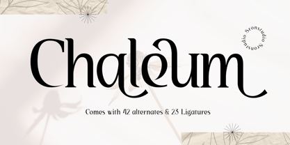 Chaleum Display Font comes with an elegant and modern touch this font is perfect for branding, invitation, stationery, wedding designs, social media posts, advertisements, product packaging, product designs, label, photography, watermark, special events, and more. Features: Uppercase and lowercase letters 42 Alternates Swashes 23 Ligatures Multilingual, numerals, and punctuation
 - Philips Dutcher by Almarkha Type,
$35.00 Philips Dutcher - Stylish Ligature Script is a Quality script that is written casually and quickly with 41 ligature. Letters are made with Sign on paper. Then scanned and carefully drawn into vector format. Philips Dutcher is perfect for homeware designs,branding projects, Logo, design, Quotes, Product packaging, Photography, Watermark.
 - Qiunels by Almarkha Type,
$35.00 Hello Introducing, Qiunels - Elegant Luxury Display Serif is an unique font that uses line to describe the impression of elegance and modern. Perfect for adding a unique twist to word-mark logos, monograms or pull quotes. Qiunels has 21 Alternate can be turned off if required standard writing needs.
 - Odyssea 632 by Thinkdust,
$10.00 Odyssea 632 is the follow up to a http://www.hypefortype.com exclusive font called Odyssea which was originally designed by Pablo Alfieri. Odyssea 632 contains all of the features of the original font and also supports 42 languages. Check out the gallery for a full character set, and other imagery!
 - Bourne by Greater Albion Typefounders,
$12.00 Bourne is a comprehensive text and display sans-serif family consisting of 21 typefaces, all with a range of features including stylistic alternates, discretionary ligatures, as well as old-style and tabular numeral forms and fractions. The 21 typefaces include two widths and three weights of type as well as square and round terminal forms and oblique faces. Three specialised display faces are also included. The face is ideal for establishing a consistent 'look' across a range of projects and could readily become the basis of an organisation's house publication style. Bourne works well in poster and large scale design work, as well as for the setting of large amounts of text. Individual faces are priced economically and substantial discounts are offered for packs of multiple typefaces.
 - Berling Nova by Linotype,
$29.99Swedish designer Karl-Erik Forsberg created the original Berling typeface in 1951. Owned by Verbum in Sweden, Berling was completely redesigned and released in 2004, under the name Berling Nova. Forsberg (1914–1995) is considered one of Sweden’s most masterful graphic designers, and his original Berling has come to be seen as possibly the most definitive Swedish typeface. But a redesign was necessary in order to secure that the spirit of Berling would survive in the digital age. Linotype, the distributor of the original Berling™ , provided its collection of source materials to the designers working on Berling Nova. Additionally, Akira Kobayashi — Linotype’s Type Director — lent them his advice as their project advanced. Berling Nova is available in two optical sizes: Text and Display. The original Berling was a classic Renaissance roman face, with fine terminals and sharp, beak-like serifs. If one looks at Berling’s old lead type proofs in the smaller type sizes, it is clear that these had a fuller and more readable form than in later digital versions. So, in order to help return the new Berling Nova to its original splendor, both the base forms and the serifs were softened and inflated. In the text version, the x-height has been increased a bit (by 4%), the diagonal axis is less apparent, and special glyph ranges, such as those for small caps and old style figures, have been included in the font’s character sets. The display version still has the unmistakable “Berling” character that displays Forsberg’s mastery. Berling Nova is well suited for longer text passages in books, publications, and magazines. This typeface fulfils all the demands that one can make on a legible newspaper typeface. Access to both text and display versions are important to the demanding typographer. This is the first time since the typeface was digitalized that it is possible to use it in order to create truly beautiful and functional typography in all type sizes. - Mauritius by Canada Type,
$29.95 Ten years or so after his unique treatment of Garalde design with Trump Mediaeval, Georg Trump took on the transitional genre with Mauritius, which was to be his last typeface. He started working on it in 1965. The Stuttgart-based Weber foundry published a pamphlet previewing it under the name Barock-Antiqua in 1967, then announced the availability of the metal types (a roman, a bold and an italic) a year later. The global printing industry was already in third gear with cold type technology, so there weren't that many takers, and Weber closed its doors after more than 140 years in business. Subsequently, Trump’s swan song was unfairly overlooked by typography historians and practitioners. It never made it to film technology or scalable fonts. Thus, one of the most original text faces ever made, done by one of the most influential German type designers of the 20th century, was buried under decades of multiple technology shifts and fading records. The metal cuts of Mauritius seem to have been rushed in Weber’s desperation to stay afloat. So the only impressions left of the metal type, the sole records remaining of this design, show substantial problems. Some can be attributed to technological limitations, but some issues in colour, precision and fitting are also quite apparent, particularly in Mauritius Kursiv, the italic metal cut. This digital version is the result of obsessing over a great designer’s final type design effort, and trying to understand the reasons behind its vanishing from typography’s collective mind. While that understanding remains for the most part elusive, the creative and technical work done on these fonts produced very concrete results. All the apparent issues in the metal types were resolved, the design was expanded into a larger family of three weights and two widths, and plenty of 21st century bells and whistles were added. For the full background story, design analysis, details, features, specimens and print tests, consult the PDF available in the Gallery section of this page.
 - Fleur by Lián Types,
$39.00 La vie est une fleur dont l'amour est le miel Fleur is the French for flower and I've chosen this language for a good reason. Over the past 5 years, I've had the opportunity to travel a lot to Paris and I've always tried to catch every moment and detail of this delightful city through the eyes of the designer inside me. Paris is full of surprises, mainly for us, artists. In fact, I believe the city is a museum itself. Every corner of any street has something inspiring. But, there’s something I particularly love and I want to address here: The Palais Garnier. Built between 1861 and 1875, this opera house is a dream made true for many of us, who love somptuosité. Garnier, the architect of this magnificent building, said that the style he proposed was not Grecian nor Roman/baroque, he created something new and called it Napoleonic: Luxurious at its best. Fleur is inspired in this palace which, in fact, has some similar letters inside. Garnier put his name at the ceiling of the Rotonde des Abonnés: Letters are interlacing each other with nicely done art nouveau curves. I thought I could take this idea and achieve something very delicate and imposing at the same time if the font consisted entirely of caps with the logic of a didone and a bit of art-nouveau. This mix of elegance and flamboyance gave birth to Fleur which has a wide range of uses but was mainly intended for perfumes, fashion magazines, storefronts, book covers or logos. Not only you'll find many decorative glyphs, but also a vast amount of unique ligatures will make you really adore this font. Get Fleur and profite de la vie TECHNICAL As suggested above, the font has many open-type coded alternates and a vast amount of unique ligatures. Install the font in applications that support them, like Adobe Illustrator or Photoshop.
 - PF DIN Stencil by Parachute,
$39.00 DIN Stencil on Behance. DIN Stencil: Specimen Manual PDF. Despite the fact that over the years several designers have manually created stencil lettering based on DIN for various projects, there has never been a professional digital stencil version of a DIN-based typeface. After the successful introduction of DIN Monospace a few months earlier, PF DIN Stencil now completes Parachute’s extensive library of DIN superfamilies. It was based on its original counterpart DIN Text Pro and was particularly designed to address contemporary projects, by incorporating elements and weights which are akin to industries such as fashion, music, video, architecture, sports and communications. Traditionally, stencils have been used extensively for military equipment, goods packaging, transportation, shop signs, seed sacks and prison uniforms. In the old days, stencilled markings of ownership were printed on personal possessions, while stencilled signatures on shirts were typical of 19th century stencilling. Two companies dominated the market in the mid-twentieth century: the Marsh Stencil Machine Company in the United States and the Sächsische Metall Schablonen Fabrik in Germany. Ever since the late 1930s, it was the German Sächsische Metall Schablonen Fabrik which used heavily the new DIN 1451 standard font (introduced in 1936), attempting to overthrow the reign of the Didot-style modern roman which was at the time the most common stencil letter in Germany. These letters were manufactured mainly as individual zinc stencils which could be ordered in sizes between 10 and 100mm. The DIN Stencil family manages to preserve several traditional stencil features, but introduces additional modernities which enhance its pleasing characteristics and make it an ideal choice for a large number of contemporary projects. Furthermore, the spacing attributes of the glyphs were redefined and legibility was improved by revising the shape of the letterforms. The DIN Stencil family consists of 8 diverse weights from the elegant Hairline to the muscular Black. Currently, it supports Latin, Eastern European, Turkish and Baltic.
 - FS Albert by Fontsmith,
$80.00 The x factor How do you make a font like FS Albert unique, distinctive? “When designing a font I try to question every letter,” says Jason Smith, “but all you need is a few that have an x factor. With FS Albert, they’re the lowercase ‘a’ and ‘g’ and the uppercase ‘I’ and ‘J’. “I remember a friend saying, ‘Why on earth have you designed the ‘a’ like that? Isn’t it too friendly for this kind of font?’ And, in a way, that’s what I wanted – honesty and warmth, because a lot of big brands at the time really needed to show a more human side.” Range of weights and styles FS Albert is a charismatic type: a warm, friendly sans serif face with a big personality. Open, strong and amenable, and available in a wide range of weights and styles, FS Albert suits almost every task you put it to. Fontsmith has crafted five finely-tuned upright Roman weights and four italic weights, as well as a special Narrow version to provide the best coverage and give headlines and text an easy-going character. The chunky kid “FS Albert was inspired by – and named after – my son, who was a bit of a chunky kid,” says Jason Smith. “I designed an extra bold weight because I always felt that the really big font heavy weights had the most personality. “I recently told Albert this story. He laughed, and forgave me for thinking he was a fat baby. He liked the big personality bit, though.” 1000s of glyphs Not content with a character set that covered Europe and the whole of the Western world, the studio decided to go further afield. There are now FS Albert character sets that cover western and eastern European languages, including those of Russia, as well as Cyrillic, Arabic and Greek scripts. In fact, the font now covers more than 100 languages, making it ideal for bringing a consistent typographic style to the communications of global brands.
 - Anglecia Pro by Mint Type,
$- Anglecia Pro is an exquisite and versatile system of three transitional serif typefaces designed to work together in editorial design. Sharing the same skeleton, vertical axis, and trapezoidal uncurved serifs, each of these faces bears different key dimensions and different contrast typical for three different type epochs. Anglecia Pro Text is a typeface designed for general typesetting in average reading sizes. Although it features a vertical axis, its soft skeleton, relatively small x-height and prominent ascenders and descenders give the typesetting a traditional warm texture with a slight contemporary touch. Anglecia Pro Title incorporates proportions of familiar transitional serif typefaces but exposes higher-than-average vertical contrast which makes it useful for setting captions, pull quotes or general purpose text in sizes of 12 pt and above. Anglecia Pro Display, still having non-rectangular serifs and the same soft skeleton as the rest of Anglecia Pro system, features extreme contrast, much thinner serifs and exaggerated ball terminals typical for Didone modern serif families. Its large x-height and tighter letter spacing suggests larger text sizes e.g. in decorative headlines, extra large pull quotes or logos. Altogether these three typefaces form 36 styles – each supporting numerous Latin-based languages as well as major Cyrillic languages. In roman styles the Cyrillic script comes in two flavours accessible via OpenType alternates – to choose either more traditional and curvy (default) or more formal and rigid type texture. In italics this feature affects uppercase and small caps. Also, each style is packed with OpenType features: ligatures, small caps, six sets of digits, superiors and inferiors, fractions, ordinals, and respective punctuation varieties including all-cap punctuation. There are also language-specific alternates for Polish kreska, Romanian Ș/ș, Catalan punt volat, and correct small-cap versions for Turkish/Azerbaijani i/ı. Some of the styles of Anglecia Pro can be found in Mint Type Editorial Bundle together with other fonts which make some great pairs. Check it out!
 - Tiresias by Bitstream,
$29.99Tiresias was designed for subtitling by Dr. John Gill from the Royal National Institute for the Blind (RNIB), in the United Kingdom. The Tiresias font is designed to have characters that are easy to distinguish from each other, especially important for the visually impaired. The following key factors were considered during the design process: character shapes, relative weight of character stokes, intercharacter spacing, and aspect ratios that affect the maximum size at which the type could be used. The benefits of the Tiresias font are greatest on lower resolution displays, such as televisions, train and airline information terminals, and low resolution displays on wireless communication and handheld devices. InfoFont is for printed instructions on public terminals where legibility is the primary consideration; these instructions are often read at a distance of 30 to 70 cm. Infofont is not designed for large quantities of text. The Tiresias LPfont is a large print typeface specifically designed for people with low vision. Large print publications should be designed to specifically help with reading problems, and should not just be an enlarged version of the ordinary print. The Tiresias LPfont family, made up of roman, italic, and bold weights, was designed to address and solve these issues. The RNIB developed PCfont for people with low vision to use on computer screens. It is designed for use at larger sizes only. PCfont includes delta hinting technology in the font to ensure pixel-perfect display at key sizes. Signfont is for fixed (not internally illuminated) signage. The recommended usage is white or yellow characters on a matt dark background. Note that the “Z” versions have slashed zeroes, and are identical in all other respects. These faces were developed together with Dr. John Gill of the National Institute of the Blind, Dr. Janet Silver; optometrist of Moorfields Eye Hospital, Chris Sharville of Laker Sharville Design Associates, and Peter O'Donnell; type consultant. Tiresias himself is a figure from Greek mythology, a blind prophet from Thebes. - Code Next by Fontfabric,
$39.00 10 years later, one of the first geometric typefaces in our portfolio and a popular favorite of yours is rising to a whole new level! We’re revealing the stand-alone type family Code Next—a staggering evolution from Code Pro in functionality, versatility, and application. The transformation includes 6 new weights, 10 new Italics, full support of Extended Cyrillic and Greek, full redesign and glyphs refinement, 2 variable fonts, to name but a few. Going back to 2011, the grotesque-inspired Code Pro was designed to complement memorable pieces that make a statement. Balancing between stylization and simplification, it was encoded with the distinct voice of basic organic shapes to stand the test of time. Little did we know, it would expand and live up to the potential of a “font from the future” as the new Code Next. Today, a type family of 22 styles, this geometric sans solidifies its relevance and carries a strong constructive aesthetic through simplified forms with a twist. These fit any modern design in print, web, and display visualization. Developed to go above and beyond, Code Next comes prepared for multi-script projects with Extended Latin, Extended Cyrillic, and Greek. Explore Code Next’s versatility and switch things up with the help of 2 variable fonts, more than 1280 glyphs, and an extensive OpenType features set including small caps, standard and discretionary ligatures, contextual and stylistic alternates, stylistic sets, case sensitive forms, and much more. Overview: • Font family of 22 fonts • 10 weights • Languages - Full support of Extended Latin; Extended Cyrillic; Greek • Entirely refined design and metrics • Glyph count - 1288 • Variable fonts - 2 fonts OpenType features: • Small Caps • Standard Ligatures • Discretionary Ligatures • Contextual Alternates • Stylistic Alternates • Stylistic Sets • Case-Sensitive Forms • Ordinals • Localized Forms • Lining Figures • Proportional Figures • Tabular Figures • Oldstyle Figures • Subscripts • Scientific Inferiors • Superscripts • Numerators and Denominators • Fractions • Roman figures • Extensive mathematical support • Navigation symbols

