10,000 search results
(0.095 seconds)
- Yngreena by Ingrimayne Type,
$12.95 Yngreena is a serifed typeface with calligraphic origins. In updating it in 2011, I began to add alternative letters and reached the point where it made sense to create an alternative family of faces rather than include all the alternatives as part of an OpenType font. The letters K, R, V, W, Y, f, g, k, t, v, and w are tamer in Yngreena Alt. As a result, though it is still a decorative text face, Yngreena Alt is better suited for lengthier blocks of text than is the original Yngreena face.
 - Orev Edge by Typesketchbook,
$39.00 Orev Edge is altered modified from the form of the original "Orev" typeface. We added curved line in both inner and outer edges, including the structure of typeface. Import to be more friendly, the font family has smoother terminals that harmonize with the newly-added curved lines. With all of these features , "Orev Edge" is a prominent, eye-catching and unique typeface. It comes with 9 weights and italic type in order to suit for a multifunctional usage, especially for cooperative work, such as website, magazine, editorial, publishing , as well as packaging.
 - Baisteach by Fontdation,
$15.00 Introducing Baisteach, our latest all-caps vintage serif. Inspired from early 1900's typography that often used in sign paintings, packaging labels, and advertisements. This typeface is made of sharp serifs, clean edges and strong form, give you a simple yet impactful feels. Suits best for headline, logo/logotype, and many more. If you're a fan of classic typography, make sure you add this font to your design toolbox. Last but not least, don't forget to activate its OpenType Feature to get the wider selection of letter combinations.
 - Flounder Pro by Dominik Krotscheck,
$10.00 The Flounder Pro is a simple and clean condensed all-caps sans serif font. It is a close relative of the Floz, but has rounded edges. It comes with Cyrillic, Greek and Latin alphabets, the latter including loads of accented characters. It is also equipped with a bunch of ligatures, as well as alternates for the letters J, W, Q, Z, Ω and Ξ. Those features are easily accessible via opentype features. This family includes three weights with their respective italics and backslanted versions. The Flounder works well for Logos, Headlines, or short texts.
 - 1751 GLC Copperplate by GLC,
$38.00 This family was inspired by an engraved plate from Diderot & Dalembert's Encyclopedia (publication beginning in 1751), illustrating the chapter devoted to letter engraving techniques. The plate bears two engravers names : "Aubin" (may be one of the four St Aubin brothers ?)and "Benard" ( which name is present below all plates of the Encyclopedia printed in Geneva ). It seems to be a transitional type, but different from Fournier or Grandjean. Small caps are included in fonts for TTF and OTF version, separate files are included in the family sets of the Mac TT version.
 - Blantika by Letterhend,
$19.00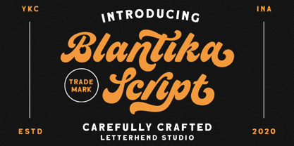 Introducing, Blantika Script - a bold script which is purposely made for logotype. This type of font perfectly made to be applied especially in logo, and the other various formal forms such as invitations, labels, logos, magazines, books, greeting / wedding cards, packaging, fashion, make up, stationery, novels, labels or any type of advertising purpose. Features : uppercase & lowercase numbers and punctuation multilingual alternates and ligatures PUA encoded We highly recommend using a program that supports OpenType features and Glyphs panels like many of Adobe apps and Corel Draw, so you can see and access all Glyph variations.
 - Karben 205 by Talbot Type,
$19.50 Karben 205 is inspired by the classic, no nonsense DIN, and has a form that follows its highly legible function. Based on a lozenge, it has a clean and pure geometry with even stroke weights. Karben 205 is available in a family of five weights, and is also available with character variations as Karben 105. There are also monospaced variants of both Karben 105 and Karben 205 and a stencil version. All of the Karben fonts feature an extended character set, including accented characters for Central European languages.
 - Ridge Cliff by Letterhend,
$17.00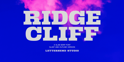 Ridge Cliff is a slab serif typeface with strong look and feel.This type of font perfectly made to be applied especially in logo, headline, signage and the other various formal forms such as invitations, labels, logos, magazines, books, greeting / wedding cards, packaging, fashion, make up, stationery, novels, labels or any type of advertising purpose. Features : uppercase & lowercase numbers and punctuation multilingual PUA encoded We highly recommend using a program that supports OpenType features and Glyphs panels like many of Adobe apps and Corel Draw, so you can see and access all Glyph variations.
 - Sloop Script Pro by Lipton Letter Design,
$29.00 Richard Lipton originally released Sloop Script in 1994 through Font Bureau. Sloop Script Pro is the new, improved, rethought version, offering expanded language support and smart OpenType features. All of the new enhancements can be activated via human-readable stylistic sets whose names precisely describe what they do: “Entry Swashes,” “Exit Swashes,” “Smaller Caps,” and so on. Every weight of Sloop Script includes the available styles. Applying these features is straightforward and, thanks to automatic ligatures and contextual alternates, Sloop Script sets beautifully right out of the box.
 - Begina Display by Masa Type,
$17.00 Begina Display is a modern vintage serif font packaged in a modern and classy style, complete with access to your OpenType features to access a large selection of alternates letters and ligatures, the choice of letters you like from variations of uppercase and lowercase letters to get a display luxurious and elegant. What is included: Begina Display Regular BeginaDisplay Italic Begina Display Outline Features All Uppercase and Lowercase Number & Symbol Supported Languages Alternates and Ligatures PUA Encoded If you have any questions, don't hesitate to contact me. Thank you,
 - Alessia Harvey by Letterhend,
$19.00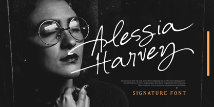 Introducing, Alessia Harvey - an authentic hand writing with natural signature style. This type of font perfectly made to be applied especially in logo, and the other various formal forms such as invitations, labels, logos, magazines, books, greeting / wedding cards, packaging, fashion, make up, stationery, novels, labels or any type of advertising purpose. Features : uppercase & lowercase numbers and punctuation multilingual alternates and ligatures PUA encoded We highly recommend using a program that supports OpenType features and Glyphs panels like many of Adobe apps and Corel Draw, so you can see and access all Glyph variations.
 - Noyh Geometric Slim by Typesketchbook,
$55.00 Noyh Geometric Slim is altered modified from the form of the original “Noyh”(2015) typeface. We added sharp corners in apex, including the structure of typeface. Import to be more Corporate, the font family has flat terminals that harmonize with sharp corners. With all of these features , “Noyh Geometric Slim” is a prominent, eye-catching and unique typeface. It comes with 9 weights and italic type in order to suit for a multifunctional usage, especially for cooperative work, such as website, magazine, editorial, publishing , as well as packaging.
 - Whakatani by Jadugar Design Studio,
$20.00 Whakatani is a new font with only have Bold option at the moment, beautifully kerned letters and multi language supporting. About Whakatani---- Whakatane invites you to throw away your watch, relax in the sunshine, experience the special lure of the ocean and marvel at the relaxed friendliness of the people - as you discover all the little things that make Whakatane so exceptional. Renowned for great weather, beautiful beaches, culture and a relaxed lifestyle, the Whakatane region is one of New Zealands most attractive locations for visitors and relocators.
 - Alghera Pro by Red Rooster Collection,
$60.00 Alghera Pro is a casual script font family. It was digitally engineered in 1996 by Pat Hickson of P+P Hickson and Steve Jackaman of International TypeFounders, Inc. (ITF). Jackaman revamped the family in 2017 and added wider language support to include Western, Central, and Eastern European languages. Alghera Pro has a hand-written, antique feel, and was inspired by an old label on a bottle of Portuguese wine. As with all the Red Rooster “Pro” versions, the family contains a 40% larger glyph set and improved designs.
 - Maritosca by Letterhend,
$19.00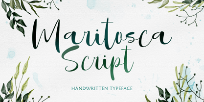 Introducing, Maritosca Script - a typeface inspired by natural handwritten.. This type of font perfectly made to be applied especially in logo, and the other various formal forms such as invitations, labels, logos, magazines, books, greeting / wedding cards, packaging, fashion, make up, stationery, novels, labels or any type of advertising purpose. Features : uppercase & lowercase numbers and punctuation multilingual alternates and ligatures swashes PUA encoded We highly recommend using a program that supports OpenType features and Glyphs panels like many of Adobe apps and Corel Draw, so you can see and access all Glyph variations.
 - Nelson by Laura Worthington,
$25.00 Evocative of paint on weathered wood, Nelson’s engraved capital letters are as rustic and confident as the Old West. Combine the engraved face with bold and rough versions to create handsome wordmarks, or use Nelson to captivate customers of food packaging, restaurant menus, and roadside attractions. See what’s included! Engraved • Ornaments • Rugged • Bold *NOTE* Basic versions DO NOT include swashes, alternates or ornaments These fonts have been specially coded for access of all the swashes, alternates and ornaments without the need for professional design software! Info and instructions here: http://lauraworthingtontype.com/faqs/
 - Sogate by Letterhend,
$19.00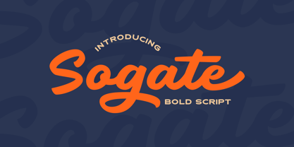 Introducing, Sogate - a bold script which is purposely made for logotype. This type of font perfectly made to be applied especially in logo, and the other various formal forms such as invitations, labels, logos, magazines, books, greeting / wedding cards, packaging, fashion, make up, stationery, novels, labels or any type of advertising purpose. Features : uppercase & lowercase numbers and punctuation multilingual alternates and ligatures PUA encoded We highly recommend using a program that supports OpenType features and Glyphs panels like many of Adobe apps and Corel Draw, so you can see and access all Glyph variations.
 - Thirtylane Script by Letterhend,
$19.00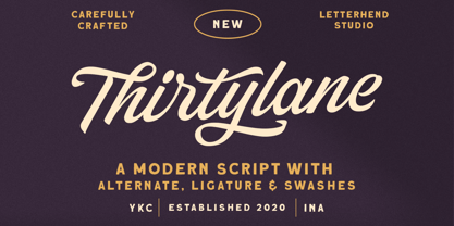 Introducing, Thirtylane - a bold script which is purposely made for logotype. This type of font perfectly made to be applied especially in logo, and the other various formal forms such as invitations, labels, logos, magazines, books, greeting / wedding cards, packaging, fashion, make up, stationery, novels, labels or any type of advertising purpose. Features : uppercase & lowercase numbers and punctuation multilingual alternates and ligatures PUA encoded We highly recommend using a program that supports OpenType features and Glyphs panels like many of Adobe apps and Corel Draw, so you can see and access all Glyph variations.
 - Welroseltone by Letterhend,
$19.00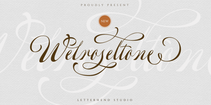 Introducing, Welroseltone - a script typeface with beautiful unique swashes. This type of font perfectly made to be applied especially in logo, and the other various formal forms such as invitations, labels, logos, magazines, books, greeting / wedding cards, packaging, fashion, make up, stationery, novels, labels or any type of advertising purpose. Features : uppercase & lowercase numbers and punctuation multilingual alternates and swashes PUA encoded We highly recommend using a program that supports OpenType features and Glyphs panels like many of Adobe apps and Corel Draw, so you can see and access all Glyph variations.
 - Mellodate by Letterhend,
$19.00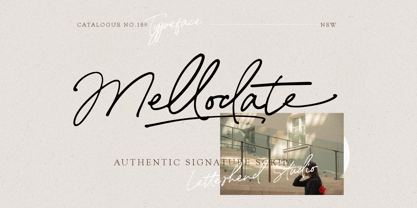 Introducing, Mellodate Script - an authentic hand writing with natural signature style. This type of font perfectly made to be applied especially in logo, and the other various formal forms such as invitations, labels, logos, magazines, books, greeting / wedding cards, packaging, fashion, make up, stationery, novels, labels or any type of advertising purpose. Features : uppercase & lowercase numbers and punctuation multilingual alternates and ligatures swashes PUA encoded We highly recommend using a program that supports OpenType features and Glyphs panels like many of Adobe apps and Corel Draw, so you can see and access all Glyph variations.
 - Frio by Lamatas un Slazdi,
$28.00 Frio is a geometric monoline sans-serif typeface consisting of 15 styles: 5 weights and 3 widths plus italics. Clean, neutral and technical, Frio was inspired by the form of super ellipse and Eurostile by Aldo Novarese. The font contains stylistic and contextual alternates, ligatures, discretional ligatures for use in German, ornaments and other OpenType features. It supports all the European languages using Latin alphabets. The main thing that sets it apart from the other typefaces is a possibility of using simple typing combined with stylistic sets to add colored backgrounds to numerals.
 - Timberland by Letterhend,
$16.00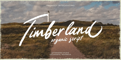 Timberland is a casual script with organic style. This type of font perfectly made to be applied especially in logo, and the other various formal forms such as invitations, labels, logos, magazines, books, greeting / wedding cards, packaging, fashion, make up, stationery, novels, labels or any type of advertising purpose. Features : Uppercase & lowercase Numbers and punctuation Alternates & Ligatures Multilingual PUA encoded We highly recommend using a program that supports OpenType features and Glyphs panels like many of Adobe apps and Corel Draw, so you can see and access all Glyph variations.
 - Salda by Hurufatfont,
$19.00 Salda; It is a modern sans serif family that blends old and new generation sans serif fonts in the same body. It has a wide usage area with its light narrow structure, sharp and clean lines, humanist touches. It provides clean and smooth visuals in vertical screens, mobile applications and block texts. With two different x heights (xL-xS), the body offers richness in text and headings. It consists of a total of 40 styles. Ideal for all kinds of editorial design, packaging, corporate identity, brand, application, web and desktop.
 - Karben 105 by Talbot Type,
$19.50 Karben 105 is inspired by the classic, no nonsense DIN, and has a form that follows its highly legible function. Based on a lozenge, it has a clean and pure geometry with even stroke weights. Karben 105 is available in a family of five weights, and is also available with character variations as Karben 205. There are also monospaced variants of both Karben 105 and Karben 205 and a stencil version. All of the Karben fonts feature an extended character set, including accented characters for Central European languages.
 - Ansylia by Letterhend,
$19.00 Introducing, Ansylia Script - an authentic hand writing with natural signature style. This type of font perfectly made to be applied especially in logo, and the other various formal forms such as invitations, labels, logos, magazines, books, greeting / wedding cards, packaging, fashion, make up, stationery, novels, labels or any type of advertising purpose. Features : uppercase & lowercase numbers and punctuation multilingual alternates and ligatures swashes PUA encoded We highly recommend using a program that supports OpenType features and Glyphs panels like many of Adobe apps and Corel Draw, so you can see and access all Glyph variations.
 - Retrouvailles by Hanoded,
$15.00 Retrouvailles is a French word, which means ‘the feeling one gets after reuniting after a long time’. This script font was based on a couple of handwritten letters and postcards and my own imagination. I used a drawing tablet for the ligatures and the connecting strokes. Retrouvailles comes in 3 distinct styles: the slightly slanted regular style, an Italic style and a back slanted style. Retrouvailles has an abundance of goodies under the hood: it comes with a lot of ligatures and all the diacritics you could poke a stick at.
 - Darjeeling by FaceType,
$30.00 Darjeeling combines British Elegance and Indian Flavor. It is flared like Optima, with a scent of Bodoni. By layering “Regular” and “Ornaments” over each other you will create astounding pieces of colorful typography. Additionally there is “Regnaments” which combines the two other styles. Darjeeling is great as a display font, but also perfectly legible at text sizes. Use the ornaments only to add spice to Your design. Make sure to use applications supporting all these lavish OpenType features like small caps, various sets of figures, fractions and the 102 discretionary ligatures.
 - Sonata Allegro by Tamar Fonts,
$35.00 “The Emperor Has Clothes” Like in music — the Allegro Sonata form consists of three main sections—the Exposition (section), the Development, and the Recapitulation — so in regard to this Allegro Sonata font family — there is an Exposition (font), a Development, and a Recapitulation—in which each theme is restated alongside its development material. While the Recapitulation font is perfect for titling and branding, the Exposition is perfect for branding {as demonstrated in the Inspiration Gallery pertaining this font} as well as being a comfortable read in long runs of text. The Exposition rounded, mono-line, with great x height, contemporary—A Synthesis Between Geometric & Hand-drawn—font, is at times geometric and at times hand drawn; in the end it all came down to finding the balance in a typeface between the robustness needed to function as a text face and enough refinement to look good as a display font. Following the Exposition, comes the Development (section), decorative, botanic-like, exuberant and playful font, signifying ABUNDANCE [of possibilities] & BENEVOLENCE—in regard to each theme/character, and to demonstrate—that 'structures' in music, are solid structures—like architecture {contrary to the words of J. W. von Goethe, who said: “Music is liquid architecture; Architecture is frozen music”}, just in some spiritual domain that is far beyond one's physical senses to grasp. Like in my art and music works in which I consider its 'Texture' element of vital importance, so is the case when it comes to type, as apparent in my previous Phone Pro/Polyphony font, as well as in this current Sonata Allegro/Development font. Each glyph has its own uniqueness, and when meeting with others, will provide dynamic and pleasing proximity. And due to the [individualistic] nature of this Development font, just a minimal amount of kerning/pairing were necessary... The development font is an extravagant design that looks best when used at large sizes—perfect for titling, logo, product packaging, branding project, wedding, or just used to express words against some [light or dark] background. Finally, “The (Exposition Font) Emperor Has (the Development Font) Clothes!” As said, there are three fonts/styles altogether in this Sonata Allegro type family, designed with the intention of harmonizing between Latin and Hebrew, which makes it an ideal font for the side-by-side use of Latin and Hebrew characters. However, they are being sold separately (kindly search for “Sonata Allegro Hebrew” on this MyFonts site), so they are economical for those interested just in either one of them. My aim is to shake up the type-design world with a range of distinctive fonts which break away from the generic letterforms, to make your design projects stand out—as a graphic designer, add this font to your most creative ideas for projects. This typeface has [lots of ligatures /] OpenType features, to enhance your designs even more — happy designing! Sonata Allegro Features: · 3 Weights/Styles · Multilingual Support · Proportional Figures & Ligatures While using this product, if you encounter any problem or spot something we may have missed, please don't hesitate to write to us; we would love to hear your feedback—in order to further fine-tune our products. Copyright Tamar Fonts/Hillel Glueck 2022 ALL RIGHTS RESERVED Any unauthorized distribution of my work is strictly prohibited, and will be prosecuted; do the right thing, and do not participate in the piracy of my typefaces; if you appreciate my work, then please pay for it and help me prosper — thank you!
 - Sonata Allegro Hebrew by Tamar Fonts,
$35.00 “The Emperor Has Clothes” Like in music — the Allegro Sonata form consists of three main sections—the Exposition (section), the Development, and the Recapitulation — so in regard to this Allegro Sonata font family — there is an Exposition (font), a Development, and a Recapitulation—in which each theme is restated alongside its development material. While the Recapitulation font is perfect for titling and branding, the Exposition is perfect for branding {as demonstrated in the Inspiration Gallery pertaining this font} as well as being a comfortable read in long runs of text. The Exposition rounded, mono-line, with great x height, contemporary—A Synthesis Between Geometric & Hand-drawn—font, is at times geometric and at times hand drawn; in the end it all came down to finding the balance in a typeface between the robustness needed to function as a text face and enough refinement to look good as a display font. Following the Exposition, comes the Development (section), decorative, botanic-like, exuberant and playful font, signifying ABUNDANCE [of possibilities] & BENEVOLENCE—in regard to each theme/character, and to demonstrate—that 'structures' in music, are solid structures—like architecture {contrary to the words of J. W. von Goethe, who said: “Music is liquid architecture; Architecture is frozen music”}, just in some spiritual domain that is far beyond one's physical senses to grasp. Like in my art and music works in which I consider its 'Texture' element of vital importance, so is the case when it comes to type, as apparent in my previous Phone Pro/Polyphony font, as well as in this current Sonata Allegro/Development font. Each glyph has its own uniqueness, and when meeting with others, will provide dynamic and pleasing proximity. And due to the [individualistic] nature of this Development font, just a minimal amount of kerning/pairing were necessary... The development font is an extravagant design that looks best when used at large sizes—perfect for titling, logo, product packaging, branding project, wedding, or just used to express words against some [light or dark] background. Finally, “The (Exposition Font) Emperor Has (the Development Font) Clothes!” As said, there are three fonts/styles altogether in this Sonata Allegro type family, designed with the intention of harmonizing between Latin and Hebrew, which makes it an ideal font for the side-by-side use of Latin and Hebrew characters. However, they are being sold separately (kindly search for “Sonata Allegro Hebrew” on this MyFonts site), so they are economical for those interested just in either one of them. My aim is to shake up the type-design world with a range of distinctive fonts which break away from the generic letterforms, to make your design projects stand out—as a graphic designer, add this font to your most creative ideas for projects. This typeface has [lots of ligatures /] OpenType features, to enhance your designs even more — happy designing! Sonata Allegro Features: · 3 Weights/Styles · Multilingual Support · Proportional Figures & Ligatures While using this product, if you encounter any problem or spot something we may have missed, please don't hesitate to write to us; we would love to hear your feedback—in order to further fine-tune our products. Copyright Tamar Fonts/Hillel Glueck 2022 ALL RIGHTS RESERVED Any unauthorized distribution of my work is strictly prohibited, and will be prosecuted; do the right thing, and do not participate in the piracy of my typefaces; if you appreciate my work, then please pay for it and help me prosper — thank you!
 - TT Livret by TypeType,
$39.00 If you still think that an antiqua is a typeface with a strong historical character that difficult to apply in modern realities, meet the new typeface from TypeType! TT Livret is an elegant, modern and functional antiqua featuring a calm text and an expressive display subfamily. TT Livret useful links: Specimen | Graphic presentation | Customization options This font looks harmonious in books and other periodicals, on posters or on magazine covers. The scope is not limited to the printing industry, because TT Livret looks aesthetically pleasing wherever text is used. The text subfamily has uniwidth proportions and a calm spirit, oval round characters, free spacing and more open apertures. The glossy display subfamily is proportional and has round signs that are as close to a circle as possible, the apertures are closed, and the spacing is dense. The font has an intermediate subfamily - Subhead, which can look more relaxed when used as text font, or be contrasting and used as a display font. In TT Livret, we have embodied the idea of an antiqua that will be comfortable to use in modern realities. This is a functional font, where the text face does not distract from reading, and the display face, on the contrary, attracts attention. The TT Livret font family consists of 32 faces: 15 upright, 15 oblique, and 2 variable fonts. Each face has 1031 glyphs. The font contains 26 OpenType features, as well as a large number of ligatures. There are many alternative characters in italics, which are especially diverse in Cyrillic.
 - Trepa by Tipo Pèpel,
$22.00 From time to time at Tipo Pèpel we like to play like children and get our hands dirty with whatever implement that can be used to mark or draw on the walls, even if the grown-ups don’t like it. And this is more or less what happened with “Trepa” (catalan for “stencil”), a typeface with a fresh and uninhibited appearance, inspired by commercial signs and the 1950’s French art movement “Graphie Latine”. Far removed from the straight lines of vector art, “Trepa” has the necessary roughness to make this class of font stand out and what’s more it has an extensive range of latin characters covering more than 200 languages, and a pair of complementary texture fonts which further multiply its creative possibilities. If you want to protest with elegance, “Trepa” is your best choice.
 - Didonesque Stencil by Monotype,
$31.99 Less is More. This stencilled version takes away some of Didonesque’s structure while adding another level of distinguished style and supreme elegance. The Elegante fonts epitomise the style required for high-end fashion and beauty applications with their crisp curves combined with tapered serifs and terminals – instantly creating a polished and fashionable aesthetic. Didonesque Stencil was designed for large display purposes, branding, corporate identities, headlines, advertising, wedding invitations and the like. Of particular note are the minimal ball terminals which are available by activating Stylistic Set 2 – they’re perfect for adding that extra bit of magic to your typographic designs. Key Features: • 4 Stencil weights in Roman and Italic styles • 4 Stencil Elegante weights in Roman and Italic styles • 4 weights in Condensed style • Small Caps, Petite Caps, Alternates, Ligatures and Contextual Alternates • Full European character set (Latin only) • 780 glyphs per font.
 - Helight by Edignwn Type,
$16.00 The font collection is called "Helight", it is a display font with crafted themes. These collections contain sans serif, script and dingbat. The sans serif comes with 3 style typefaces (regular, inline and outline). This product give more extras illustration pack (13 hand-drawn illustrations). The Helight matches apply in some designs such as the logotype, poster, label, badge, packaging, apparel, branding, and more custom design. Helight features : 3 style typefaces in sans serif (regular, inline and outline) Uppercase, lowercase, numeral, symbol, punctuation, ligatures in script All-caps, numeral, symbol and punctuation in sans serif Multilingual PUA Encoded Helight includes : 5 fonts (script, sans serif and dingbat) 13 hand-drawn illustrations in dingbat Thank you for your support and choosing us.
 - Bushwhacked NF by Nick's Fonts,
$10.00Central Type Foundry of St. Louis issued this quirky little gem under the name of Quaint Roman around the turn of the twentieth century. This version is a little less gnarly than the original, but retains all of its eccentric charm. - Baluno by Luxfont,
$22.00 Introducing is a fun and playful pouty Baluno font. Font has embodied the graphic trend of cartoon flat illustrations and will successfully complement modern designs. The font has 2 types of faces, which can be used both independently and together by alternating letters in one word to avoid repeating letters, creating a unique heading. Family is ideal for children's themes, because the font resembles inflated balloons. Creates a relaxed mood and has fun. Set comes in many different carefully selected colors and gradient color options. Check the quality before purchasing and try the FREE DEMO version of the font to make sure your software supports color fonts. P.s. Have suggestions for color combinations? Write me an email with the subject "Baluno Color" on: ld.luxfont@gmail.com Features: Free Demo font to check it works. 2 types of faces. Lots of ready-made matched colors. Gradient color variants. Kerning. IMPORTANT: - Multicolor OTF version of this font will show up only in apps that are compatible with color fonts, like Adobe Photoshop CC 2017.0.1 and above, Illustrator CC 2018. Learn more about color fonts & their support in third-party apps on www.colorfonts.wtf -Don't worry about what you can't see the preview of the font in the tab "Individual Styles" - all fonts are working and have passed technical inspection, but not displayed, they just because the website MyFonts is not yet able to show a preview of colored fonts. Then if you have software with support colored fonts - you can be sure that after installing fonts into the system you will be able to use them like every other classic font. Question/answer: How to install a font? The procedure for installing the font in the system has not changed. Install the font as you would install the other fonts. How can I change the font color to my color? · Adobe Illustrator: Convert text to outline and easily change color to your taste as if you were repainting a simple vector shape. · Adobe Photoshop: You can easily repaint text layer with Layer effects and color overlay. ld.luxfont@gmail.com
 - Pluto Sans by HVD Fonts,
$40.00 Pluto Sans - the straight companion of the Pluto Family - was designed by Hannes von Döhren in 2012. This clear Sans Serif family is based on the Pluto architecture and it still has a hint of the friendly feeling the quirky Pluto conveys. With its geometric forms and its large x-height it is perfect for long texts in small sizes and usage in print & on screens. Both Pluto Sans and Pluto have the same range of weights and styles and can perfectly be used together. Pluto Sans is equipped for complex, professional typography. The OpenType fonts have an extended character set to support Central and Eastern European as well as Western European languages. Each font includes alternate letters, fractions, lining-, tabular numbers, scientific superior/inferior figures and a set of arrows. The fonts are manually hinted to deliver the best performance on all screens.
 - 1592 GLC Garamond by GLC,
$38.00 This family was inspired by the pure Garamond pattern set of fonts used by Egenolff and Berner, German printers in Frankfurt, at the end of the sixteenth century. All the experts said it was the best and most complete set of the time. The italic style used with it was Granjon’s, as in 1543 Humane Jenson. A few fleurons from the same printers have been added. It can be used variously for web-site titles, posters and flyers design, publishing texts looking like ancient ones, or greeting cards, various sorts of presentations, as a very elegant and legible font... This font supports very large sizes as easily as small sizes, remaining very smart, elegant and fine. Its original cap height is about five millimeters. Decorated letters like 1512 Initials, 1550 Arabesques, 1565 Venetian, 1584 Rinceau from GLC Foundry, can be used with this family without anachronism.
 - Honey Splash by Yumna Type,
$15.00 Honey Splash is a stylish display font to express unique, fun impressions focusing on various line style combinations in friendly curves. Furthermore, the different shapes and heights makes the font visually unique. In addition, Honey Splash gives you a special bonus called the clipart. Use this font for big text sizes for a legibility reason and make use of the available interesting features to beautify your designs as well. Features: Multilingual Supports PUA Encoded Numerals and Punctuations Honey Splash fits for various design projects, such as posters, banners, logos, magazine covers, quotes, headings, printed products, merchandise, social media, etc. Find out more ways to use this font by taking a look at the font preview. Thanks for purchasing our fonts. Hopefully, you have a great experience using our font. Feel free to contact us for further information when you have a problem using the font. Thank you. Happy designing.
 - Flipante by Resistenza,
$39.00 Our condensed to extended font is perfect for multiple uses, from branding to packaging designs. Its extendable and variable design makes it great for all kinds of projects. Its tubular shapes, ink traps and juicy curves make it both aesthetic and functional. Its condensation also allows a great flexibility, allowing you to adapt it to any project's need. Its versatility also makes it great for both print and digital projects. With this font's easy to use features, your designs will look good on any project or medium.
 - Nautical Fabulous by Letterhend,
$14.00 The Nautical Fabulous font features a perfect blend of boldness and condensed letterforms. Its clean lines and sharp edges give it a catchy look that is ideal for modern branding, striking headlines, and impactful displays. With its commanding presence, this font effortlessly stands out in any design composition. This font perfectly made to be applied especially in logo, and the other various formal forms such as invitations, labels, logos, magazines, books, greeting / wedding cards, packaging, fashion, make up, stationery, novels, labels or any type of advertising purpose. Features : Uppercase & lowercase Numbers and punctuation Alternates & Ligatures Multilingual PUA encoded We highly recommend using a program that supports OpenType features and Glyphs panels like many of Adobe apps and Corel Draw, so you can see and access all Glyph variations.