10,000 search results
(0.038 seconds)
- Block Marys by Kulokale,
$17.00 Block Marys is a blocky display sans font. Block Marys is well-suited for advertising, branding, logotypes, packaging, titles, headlines and editorial design. This font comes in 4 styles, Regular, Oblique, Outline, and Outline Oblique Version. This font is encoded with Unicode PUA, which allows full access to all additional characters without having special design software. Mac users can use Font Book, and Windows users can use Character Map to view and copy one of the extra characters to paste into your favorite text editor / application. We highly recommend using a program that supports OpenType features and Glyphs panels such as Adobe Illustrator, Adobe Photoshop CC, Adobe InDesign, or CorelDraw, so you can see and access all Glyph variations. We hope you enjoy the font. Thanks for purchasing and have fun!
 - Figgins Sans by Shinntype,
$79.00 The first sans serif types were made in London in the early 19th century. They were severely modern, all caps and bold. The Figgins foundry, inventor of the term sans serif, showed a ?ne example in its specimen of 1836. The extra bold weight of Figgins Sans is a close revival of the original, with the addition of a lower case which retains its partly geometric, partly grotesque quality. The family is rounded out with other weights and an italic, and extended into Cyrillic and Greek, all executed in what is assumed to be as authentic a manner as possible, given the hypothetical nature of the exercise. Together with Scotch Modern, comprises The Modern Suite of matched fonts.
 - TessiePuzzlePieces by Ingrimayne Type,
$9.00 After exploring tessellations for several years, I decided to see how many ways I could tessellate puzzle pieces. I began with a square template and used the same asymmetrical shape for all four edges. By flips or rotation each edge could be fitted in four ways. Eventually I discovered that, given this way of forming tiles, there were 15 distinct shapes that tessellate and these shapes can take a total of 96 orientations. (A note in the November 2016 issue of Mathematical Gazette has the proof for the 15 shapes.) This typeface contains those 15 shapes and 96 orientations. A pdf note here shows some of the tilings possible using only one shape in a pattern. An unlimited number of patterns are possible if shapes are mixed. There are two members of the family, a solid style that must have different colors when used and an outline style. They can be used separately or they can be used in layers with the outline style on top of the solid style. For rows to align properly, leading must be the same as point size. (Earlier tessellation fonts from IngrimayneType, the TessieDingies fonts, lack a black or filled version so cannot do colored patterns.)
 - November Starlight by Set Sail Studios,
$14.00 Thanks for checking out November Starlight! A lovingly hand-painted script font, fantastically elegant & eccentric with a sprinkle of carefree fun. November Starlight doesn't play by the rules - with extra bouncy characters, long vertical brush strokes and authentic hand-painted edges, it's bound to make a bold statement on anything from greeting cards and invitations, to personalised logos and handwritten quotes. November Starlight consists of 4 fonts; November Starlight • A cursive font containing upper & lowercase characters, numerals and a large range of punctuation. November Starlight Alt • This is a second version of November Starlight, with a completely new set of lowercase characters. If you wanted to avoid letters looking the same each time to recreate a custom-made style, or try a different word shape, simply switch to this font for an additional layout option. November Starlight Clean & Clean Alt • Totally clean versions of each of the November Starlight fonts, with all rough brush textures removed. Perfect for specialised printing techniques such as laser & vinyl cutting, or simply for a silky smooth finish to your text. Special Characters are also available for several lowercase letters, with added beginning & end swashes - please see the character map image for a full list. These characters are accessible via software with a glyphs panel, e.g. Photoshop CC, Adobe Illustrator.
 - Philadelphian by FontMesa,
$29.00 Philadelphian is a revival of a MacKellar, Smiths & Jordan font from 1867 by the same name. The regular version with shadow outline was the only style that was offered in 1867. We've taken the original design further by creating two additional weights of medium and bold plus plain black versions. The medium and bold weights are unique because only the horizontal strokes increase in thickness while the vertical strokes remain the same in each weight. Philadelphian Nite is the plain black version of this font family, Nite is the casual spelling of the word Night meaning dark or black. In the late 1800's Philadelphian was a very popular typeface which can be seen on many billheads and letterheads through the early 1900's. If you're looking for a western style font that doesn't look like any other then Philadelphian is the right choice. While the name doesn't remind you of the cowboy genre we've kept the original name for historical reasons because this font was so popular in its day. We plan on going forward with a weathered version of Philadelphian which will be released under a southwestern style name. With Philadelphian we've decided to set the complete family price to an amount that may be considered on sale all of the time.
 - Punchado Punch by MyAnvil,
$20.00 This font was inspired by the original "Punchado" font; and this evolved font is named the "Punchado Punch". The "Punchado Punch" font features similar sharp edges and measured right angles with a greater impact of design . The theme of this font is perhaps best suited for: science, science fiction, engineering, mathematics, future, video games, gaming, computers, etc.
 - Grand Prairie NF by Nick's Fonts,
$10.00This addition to the Whiz-Bang Woodtype series in based on a 100+ year-old typeface originally named Medallic. Due to the highly ornate nature of this font, it has a limited character set (no math operators or footnote accessories). The Opentype version of this font supports Unicode 1250 (Central European) languages, as well as Unicode 1252 (Latin) languages. - MBF Hourglass by Moonbandit,
$10.00 a display typeface inspired by the elegant and exotic shape of hourglass. This typeface is perfect if you are in need of a fresh new elegant, rich and expensive feel. This font is filled with unique shaped glyph and several alternate letters. This typeface also comes with 2 styles, regular and connected. Switch in between according to your liking.
 - Royal Paradise by Jehansyah,
$9.00 Royal Paradise This is a beautiful thin font, with a variety of alternatives that you can use, this font is perfect for anything that has a romantic feel or looks simple elegant and will complement the luxurious side of your design. make sure you don't miss this font. include : Numeric latin Alternate Thank you very much
 - Stuckeez by Arendxstudio,
$14.00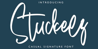 Stuckeez - Signature Font is a handwritten signature script with a natural & stylish flow. This collection of scripts is perfect for personal branding. this works well for many applications. Everything from personal branding & wedding invitations to advertising could benefit from this collection of signature fonts Features : • Character Set A-Z • Numerals & Punctuations (OpenType Standard) • Accents (Multilingual characters) • Ligature
 - Weatherglass by Arendxstudio,
$15.00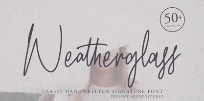 Weatherglass Signature is a handwritten signature script with a natural & stylish flow. This collection of scripts is perfect for personal branding. this works well for many applications. Everything from personal branding & wedding invitations to advertising could benefit from this collection of signature fonts Features : • Character Set A-Z • Numerals & Punctuations (OpenType Standard) • Accents (Multilingual characters) • Ligature
 - Mocombo JNL by Jeff Levine,
$29.00Mocombo JNL is a slightly modified version of one of the numerous alphabets created by the late Alf R. Becker for Signs of the Times Magazine during the period of the 1930s through the 1950s. Tod Swormstedt of ST Media—who is also the curator of the American Sign Museum in Cincinnati, Ohio—supplied Jeff Levine a wealth of source material from which this font is derived. The angular style of this typeface was originally referred to as “German Poster Lettering” by Becker, but it can represent many styles from 1940s night clubs to African safaris and just about anything in-between. - Jukebox Hero by Grype,
$19.00 As one of the most popular rock bands of the world, Foreigner has rocked the charts with 10 multi-platinum albums and sixteen top 30 hits in the last 40 years. But one might ask what a band this successful has been missing all these years? No head games here...a consistent typeface based on their logo is the answer. As fans of Foreigner, we've taken the essence of their iconic logotype and expanded it out into a full typeface in regular and bold weights to celebrate their 40th anniversary tour. The Jukebox Hero Family celebrates the typographic stylings of Foreigner, with the soft rounded terminals and an open geometric feel, including the unique stencil flavor of the original logo. It inherited the friendly stylings of the all Capitals logo that inspired it, and goes on to include a full standard character set with expansive international support of latin based languages, and two weights jumping from regular to a beefy bold. This family is ready to rock the charts for your designs towards that of a modern, comfortable appeal. Here's what's included with Jukebox Hero Family bundle: 413 glyphs - including Capitals, Lowercase, Numerals, Punctuation and an extensive character set that covers multilingual support of latin based languages. (see the 3rd graphic for a preview of the characters included) 2 weights: Regular & Bold. Fonts are provided in TTF & OTF formats. The TTF format is the standard go to for most users, although the OTF and TTF function exactly the same. Here's why Jukebox Hero Family bundle is for you: You're a die-hard Foreigner fan, and have a case of "Double Vision" and need both font weights. You're looking for a stylish and sophisticated soft sans-serif stencil typeface family. You've been waiting for fonts like these. You're looking for a Sci-fi vibe typeface that has a look that feels familiar. You just like to collect quality fonts to add to your design arsenal
 - Kiez by Blackmoon Foundry,
$24.00 The “Kiez“ is an old school style font designed by Elena Albertoni in 2016. Inspired by shop and bar signage of the sixties and seventies, which can still be found today in the so called “Kiez“ in Hamburg St. Pauli or in one or another “Kiez“ in Berlin, which means neighborhood here. It also has a cinematic touch, again: think of the sixties and seventies or your favorite b-movie.
 - Business Letter JNL by Jeff Levine,
$29.00 One of the text fonts showcased within the pages of the John Ryan Foundry (Baltimore, MD) specimen book from 1894 is a squared type face with rounded corners called “Geometric”. The original design has been updated slightly by substituting straight lines for the inner corner curves to add a small contemporary touch to a classic alphabet from the 19th century. Business Letter JNL is available in both regular and oblique versions.
 - Bodoni Classic Swashes by Wiescher Design,
$39.50 Bodoni Classic Swashes is my personal addition to Bodoni’s family of typefaces. Bodoni did not design a decorative version. His quest was for purity in book design. Even though in his days it was not called design; he thought of himself purely as a printer. But I think, especially after visiting the Bodoni museum in Parma, if Giambattista were alive today he would design a decorative typeface. Yours classico, Gert Wiescher
 - Tangram by Présence Typo,
$51.00 Tangram is the famous Chinese puzzle, perhaps one of the oldest games in the world. It consists of seven pieces called Tans obtained from a square cut up in a certain way. These seven Tans (5 different-sized triangles, a square and a parallelogram) have to be used to form the figures. The Tangram collection represents 1772 different shapes spread in 15 fonts. Each font exists in 2 styles: plain & inline.
 - Throughway JNL by Jeff Levine,
$29.00 From the pages of a small book entitled “A Portfolio of Alphabet Designs for Artists, Architects, Designers & Craftsmen” [Irene K. Ames, 1938] comes a bold Art Deco sans poster display face. The digital version is called Throughway JNL, and is available in both regular and oblique versions. [To note, throughway (or sometimes spelled thruway) is a popular term from the 1950s and 1960s for a major road or highway.]
 - Pigeon Post by Hanoded,
$15.00 I have no particular love for pigeons, but I read an interesting article about war pigeons being used to send messages to an fro. One pigeon (called William of Orange) even saved more than 2000 soldiers during the Battle of Arnhem. Pigeon Post is a lovely cartoon and kids font. It comes in a sans and a serif style, so there’s really no excuse for not using it!
 - Stateside by Studio K,
$45.00 Stateside is a bold condensed serif with a vintage feel. It has an urban and, I like to think, urbane character which puts me in mind of classic Thirties architecture like the Rockefeller Centre or the Empire State Building. I did consider calling it Rockefeller, but the family might think it a bit of a liberty, and I can’t afford to get into a copyright battle with them!
 - Invites by Just My Type,
$20.00 Invites is a digital recreation of a 1920’s mechanical script that has never existed. I designed it for my wedding invitations last year and named it in honor of my (ex)wife. Who said it wasn’t her. And she was right. So now it’s called something different. I wanted a sweet, romantic name ... Iris? Taken. Lily? Taken. Iris Lily? Cumbersome. I wanted something short and inviting. Uh ... hmmm.
 - Semilla by Sudtipos,
$79.00 I spend a lot of time following two obsessions: packaging and hand lettering. Alongside a few other minor obsessions, those two have been my major ones for so many years now, I've finally reached the point where I can actually claim them as “obsessions” without getting a dramatic reaction from the little voice in the back of my head. When you spend so much time researching and studying a subject, you become very focused, directionally and objectively. But of course some of the research material you run into turns out to be tangential to whatever your focus happens to be at the time, so you absorb what you can from it, then shelf it — like the celebrity bobblehead that amused you for a while, but is now an almost invisible ornament eating dust and feathers somewhere in your environment. And just like the bobblehead may fall off the shelf one day to remind you of its existence, some of my lettering research material unveiled itself in my head one day for no particular reason. Hand lettering is now mostly perceived as an American art. Someone with my historical knowledge about lettering may be snooty enough to go as far as pointing out the British origins of almost everything American, including lettering — but for the most part, the contemporary perspective associates great lettering with America. The same perspective also associates blackletter, gothics and sans serifs with Germany. So you can imagine my simultaneous surprise and impatience when, in my research for one of my American lettering-based fonts, I ran into a German lettering book from 1953, by an artist called Bentele. It was no use for me because it didn't propel my focus at that particular time, but a few months ago I was marveling at what we take for granted — the sky is blue, blackletter is German, lettering is American — and found myself flipping through the pages of that book again. The lettering in that book is upbeat and casual sign making stuff, but it has a slightly strange and youthful experimentation at its heart. I suppose I find it strange because it deviates a lot from the American stuff I'm used to working with for so long now. To make a long story short, what’s inside that German book served as the semilla, which is Spanish for seed, for the typeface you see all over these pages. With Semilla, my normal routine went out the window. My life for a while was all Bezier all the time. No special analog or digital brushes or pens were used in drawing these forms. They're the product of a true Bezier process, all starting with a point creating a curve to another point, which draws a curve to another point, and so on. It’s a very time-consuming process, but at the end I am satisfied that it can get to pretty much the same results easier and more traditional methods accomplish. And as usual with my fonts, the OpenType is plenty and a lot of fun. Experimenting with substitution and automation is still a great pleasure for me. It is the OpenType that always saves me from the seemingly endless work hours every type designer must inevitably have to face at one point in his career. The artful photos used in this booklet are by French photographer and designer Stéphane Giner. He is very deserving of your patronage, so please keep an eye out for his marvelous work. I hope you like Semilla and enjoy using it. I have a feeling that it marks a transition to a more curious and flexible period in my career, but only time will tell.
 - AG Stencil - 100% free

- Lightnin' by ITC,
$29.99Lightnin' is the work of British designer Alan Meeks. Generous initial capitals complement a more reserved lowercase alphabet, both of which were designed to meet the needs of current fashions in headline typography. Lightnin' will light up all kinds of display work with its robust, angular script style. - Godfrey Sykes Initials by Celebrity Fontz,
$24.99This illustrative alphabet was inspired by the decorations of Godfrey Sykes, whose work was greatly influenced by that of Raphael and Michelangelo. This tile alphabet follows a Venetian 16th-century tradition of letters decorated with figures symbolizing each initial, a High Renaissance style. Includes one set of A-Z ornamental initials conveniently assigned to both the upper and lower case alphabet characters. Perfect for artistic publications, storybooks, fairy tales, and texts conveying the feel of the apogee of the visual arts in the Italian Renaissance. - Original Garamond by ParaType,
$30.00 The Stempel foundry in Germany produced this version of Garamond in 1925 as a replica of a typeface of a French punchcutter Claude Garamond (middle of the 16th century). This design has an angular incised appearance which is unlike other Garamond types. It is also slightly heavier in weight, and is highly readable as a text face. Well suited for a wide range of applications and treatments. Original Garamond is the Bitstream version of Stempel Garamond. Cyrillic version was developed for ParaType in 2002 by Gayaneh Bagdasaryan..
 - Youthink by 38-lineart,
$16.00 'Youthink'. An energetic handwritten font, a reflection of the lifestyle of young people with an expression of what it is. Equipped with unique ligature makes this font appear with unpredicted surprises, worthy of a young soul that always accentuates freedom of work and thought. In short, this Font is an analogy from young people's creations. YOUTH - THINK - INK. from these words we put it together as Youthink. Pure handwriting makes this font more personal touch, complemented by multi-language support makes it free to appear in any part of the world, plus some alternate makes it more stand out. This font is very suitable for young and modern designs, very suitable for YouTube broadcasts, brand logos, prints for crafts and t-shirts, adrenaline sports hobbies, Journey Caption and certainly very instagramable. Stay safe and enjoy the font. Thanks
 - Lorna by FontaZY,
$30.00 Lorna by Fontazy is a rounded connected script of narrow proportion in both vertical and slanted styles. Lorna consist of six fonts (Light, Regular and Bold and matching italics). All fonts in the family have Latin (West, Central and Baltic) and Cyrillic encoding for multilingual support. Lorna has Contextual Alternates to keep a true connected handwriting look and plenty of Swashes Alternates and a bunch of Ligatures for striking appearance. Ampersand and copyright symbols have Stylistic variants (available from Glyph panel), figures made in Standard and Oldstyle variants. Lorna is perfect for all variety of print design, advertising, packaging, logo making, branding etc.
 - Very Frank by Up Up Creative,
$16.00 Meet Very Frank, a font that won’t feed you any lines or tell you any lies. Straight and tall and lacking in all but the subtlest softening details (look at the leg on that uppercase K, though…). Very Frank is a condensed sans serif display font (in regular and italic) with tall, straightforward lines and subtle curves to soften things up. It includes a ton of standard and discretionary ligatures and two stylistic sets to spice things up and add some fun. It's perfect for headlines, editorial design, monograms, branding, logos, poster design, and more. Very Frank includes approximately 540 glyphs and more than 75 standard and discretionary ligatures. Additional OpenType features include character variants, stylistic sets, and multilingual support (including multiple currency symbols). The OpenType features can be very easily accessed by using OpenType-savvy programs such as Adobe Illustrator and Adobe InDesign. (To access these awesome features in Microsoft Word, you'll need to get comfortable with the advanced tab of Word's font menu.)
 - Gara Gara by Daylight Fonts,
$50.00 This is a new generation of Garamond. This delicate and powerful Roman will captivate you and those who have seen your typography!
 - Sticky Glue by Putracetol,
$28.00 Sticky Glue is Quirky Bold Font. This font is a quirky font with a lot of character ligatures, as many as 325 ligatures. The concept of this font is to make the letters stick together, like glue. This font theme is more fun, playful and childish with quirky characters and displays. This font is suitable for your projects such as logos, branding, packaging, crafting, titles, books, headlines, posters, t-shirts, films and others. This font can be used and supported in various programs and OS, such as procreate, cricut, windows, macOS and others. Come with lot of ligatures character, its help you to make great lettering, quote, logos. This font is also support multi language.
 - Menor by Twinletter,
$15.00 Menor is a graffiti font with a distinctive and appealing abstract shape that has a unique shape in each character, making this font appropriate for your outstanding project. This font also contains an alternation of enormous letters to beautify your project, so don’t wait. Use this typeface once more to create a lovely and stylish project. This graffiti font is great for product logos, poster titles, headlines, packaging, film titles, logotypes, gorgeous writing, and trendy graffiti designs, among other things. Of course, if you utilize this font in your numerous creative projects, they will be perfect and outstanding. Use this typeface right away for your one-of-a-kind and remarkable projects.
 - Graphie by Dharma Type,
$24.99 Graphie is a modern geometric sans-serif family designed by Ryoichi Tsunekawa and the whole family consists of 16 style: eight weights from Thin to ExtraBold and their matching Italics. The range of styles provides flexibility for title, headline and body text. And the clear-cut-corner, vibrant straight lines and large x-heights give them legibility, readability and keenness. The basic skeleton of their letterform was designed geometrically and optically corrected. The sophisticated geometric design gives them universality, neutrality and sense of unity and make it possible to be used across a wide range of applications in all medias, all purposes. Graphie supports almost all European languages: Western, Central, South Eastern Europeans and afrikaans. And superior figures, inferior figures, denominators, numerators and fraction can be accessed by using OpenType features.
 - Winsel Variable by insigne,
$129.99 At this pivotal juncture, where every choice casts long shadows, the imperative of pinpointing the archetype of typefaces is of paramount importance. One mere oversight, and the soul of your endeavor risks being lost in the mists of time. Yet, amidst these crossroads, "Winsel" emerges as the North Star in your typographical odyssey. Birthed in the revered sanctums of insigne design, this typeface is a magnum opus, echoing the artistic brilliance of British poster craft from epochs of golden jazz to times of renaissance. Winsel, in its sheer magnificence, stands as a testament to artistry, each stroke demanding undivided reverence. Be it the valiant weights reminiscent of a guardian sentinel or the graceful finesse mirroring a maestro's touch, Winsel is an unparalleled behemoth. Imbued with the finesse of OpenType, it's poised to embrace the multifaceted European Latin tapestry, while its Small Caps and Titling Caps take pride of place across its grand suite of nine weights. Sculpted with precision, Winsel is the beacon that challenges the ordinary and pledges to be an immortal testament. Seldom has the cosmos aligned to present such an illustrious moment. Fortified with Winsel, you stand on the precipice of legend. Carve your tales into the annals of perpetuity, voice your ethos with unyielding conviction, and let each letter be a symphony of undying commitment. In this epoch, in this narrative, Winsel beckons you to etch history.
 - Maison Luxe by FontMesa,
$25.00 Maison Luxe is a revival of a very old font designed in France in or around the year 1820. You may have seen this font in the past under the names of Circus, Roma, Madame and Gillé Classic. As of November 2016 we have changed the name of this font from Gillé Classic to Maison Luxe which means Luxury House in French. For many years Joseph Gillé was credited as the original designer of this font however we've recently been contacted by a type historian in France reporting that he could not find any evidence supporting Joseph Gillé as the designer and to the best of his knowledge an artist by the name of Sylvestre may be the true designer. If you love this classic font then you're sure to enjoy the alternate version also with a matching lowercase available from FontMesa under the name of Home Style. This version of the classic with its squared off shadow is true to the original design where Home Style has diagonal lines creating a cast shadow. New in 2016 for Maison Luxe is a new matching lowercase, an uppercase German Double S (versal eszett), Greek character set, opentype features including case sensitive forms and old style numerals. We know you'll enjoy the new additions to this timeless classic design.
 - Olivine by URW Type Foundry,
$35.00 In an era of typographic neutrality, Pria Ravichandran adds spirit and flavour to the humanist sans, a genre that is known for legibility. Introducing Olivine. Olivine is a versatile type family that performs admirably across sizes. It is designed with maximum care ensuring legibility across various sizes, angles and distances. The sturdy shapes and the exaggerated ink traps fade to produce an even typographic colour and a lively texture in smaller text sizes. In larger display settings, the details become self-conscious and highlight the spectacular quality of the design. Olivine is neither experimental nor minimal, striking a balance between formality and friendliness. Olivine is clean as well as organic at the same time. Consisting of seven weights in roman and italics, the type-family address typographic hierarchy for texts of all kinds and sizes. Distinctive, yet neutral letterforms add personality to the type family. The counter-forms are large and open giving the design plenty of internal space which is balanced against the generous spacing of the characters. These features of Olivine make the reading process enjoyable in digital as well as the print medium. No squinting to read this type-family! If you are looking to add some flavour into your design, try Olivine. It is a trend-setting typeface that we predict is going that extra mile. Try before you buy, Olivine Medium and Medium Italic are available free for unlimited commercial usage.
 - Mayville JNL by Jeff Levine,
$29.00Mayville JNL is a re-drawing of an all-caps Clarendon Wood Type font from the 1800s. - Praysire by Letterhend,
$19.00 Praysire is a sophisticated sans serif with beautiful swashes. It has many alternates which you can play around to match your project, whether for a standout headline, or for a tagline, you name it. The unique letterform makes this font one of a kind! Perfectly to be applied to the other various formal forms such as invitations, labels, logos, magazines, books, greeting / wedding cards, packaging, fashion, make up, stationery, novels, labels or any type of advertising purpose. Features : uppercase & lowercase numbers and punctuation multilingual alternates & ligatures PUA encoded We highly recommend using a program that supports OpenType features and Glyphs panels like many of Adobe apps and Corel Draw, so you can see and access all Glyph variations.
 - Balega by Linotype,
$29.99 Balega is stencil-like display font, created by German designer Jürgen Weltin in 2002. Balega's letters are very bold, and have a slight italic slant. While some of the uppercase forms appear somewhat sharp, the lowercase is definitively round and friendly. Text set in Balega has a very forward moving motion, as the slant makes all of the letters seem to be lunging toward the right. This gives the typeface a very dynamic feel. Because the counterforms in and between the letters are very narrow, we recommend using Balega in posters and other larger displays, where its design may be truly appreciated. Balega is part of the Take Type 5 collection, from Linotype GmbH."
 - Born Spirit by Dora Typefoundry,
$17.00 Introducing the Born Spirit font, it is a display typeface that demands attention with a bold vintage look. Sharp hooks and strong lines create a sense of toughness. It's great to tap into designers or product owners who need solutions to make their designs look more uniquely elegant. Features: Uppercase, numbers, punctuations; Multilingual support. PUA Encoded We highly recommend using a program that supports OpenType features and Glyphs panels like Adobe apps and Corel Draw, so you can see and access all Glyph variations. This type of family has become the work of true love, making it as easy and fun as possible.I really hope you enjoy it! Thank you Enjoy the font and go get creative :)
