10,000 search results
(0.039 seconds)
- Brick Stone by Alit Design,
$22.00 Introducing the "Brick and Stone Victorian Typeface" – a timeless and elegant font that beautifully captures the essence of the Victorian era. This exquisite typeface is a masterful blend of intricate craftsmanship, vintage charm, and artistic flair, making it the perfect choice for designers, typographers, and creatives seeking to evoke a sense of classic refinement and sophistication in their projects. The Brick and Stone Victorian Typeface boasts a rich repertoire of design elements that truly set it apart. With meticulously crafted ornaments, graceful swashes, captivating ligatures, and versatile alternates, this font provides an extensive toolkit to elevate any typographic endeavor. Whether you're working on invitations, branding, packaging, signage, or any other creative pursuit, this typeface lends an air of prestige and distinction to your work. Each character of this Victorian typeface has been thoughtfully created to reflect the ornate and elegant aesthetics of the 19th century. The font captures the essence of engraved stone and brickwork, giving your text an authentic vintage touch. The ornamental details add an extra layer of opulence, making every word feel like a work of art. Whether you're designing for weddings, formal events, historical projects, or simply seeking to add a touch of classic sophistication to your work, the Brick and Stone Victorian Typeface will exceed your expectations. Embrace the elegance of the past and unlock a world of creative potential with this remarkable font.
 - Star Castle by Nathatype,
$29.00 Star Castle is a sophisticated serif font. It's a versatile tool that allows you to infuse your projects with a sense of elegance and modernity. The deliberate use of high contrast ensures not only readability but also adds a touch of modern elegance to this timeless typeface. The characters in Star Castle are meticulously crafted, each possessing an elongated and rectangular form that contributes to the font's unique visual identity. The thin weight offers a delicate touch, allowing the tall letter design to stand out while maintaining an overall sense of grace. Enjoy the features here. Features: Ligatures Multilingual Supports PUA Encoded Numerals and Punctuations Star Castle fits in headlines, logos, posters, flyers, branding materials, greeting cards, print media, editorial layouts, and many more designs. Find out more ways to use this font by taking a look at the font preview. Thanks for purchasing our fonts. Hopefully, you have a great time using our font. Feel free to contact us anytime for further information or when you have trouble with the font. Thanks a lot and happy designing.
 - Feedbag NF by Nick's Fonts,
$10.00 Horse Tank, an admittedly wacky offering from Fotostar, provided the pattern for this friendly little face, full of retro charm. Both flavors of this font feature the 1252 Latin, 1250 Central European, 1254 Turkish and 1257 Baltic character sets.
 - Chachka by Slonica,
$9.00 Natural forms inspired us to design this font. A very simple, cute and somewhat playful font. The use of this font is various, and we would especially recommend it when the design requires the theme of nature and health.
 - Strezed by Gholib Tammami,
$14.00 This font is for anyone who wants to give a touch of pain and horror to their project. This handwritten font is suitable for display use, titles, and some designs with the theme of sadness, fatigue, or anything alike.
 - Slimpick by IbeyDesign,
$15.00 Slimpick Brush Stroke Font results out of a stunning pairing of a brush pen and pencil that makes it look incredibly endearing and authentic. Use this gorgeous and unique this handwritten font to bring any DIY project to life!
 - Sinoreta by Mans Greback,
$69.00 Sinoreta is a classic serif font with a bold retro style that adds sophistication and elegance to any design. The decorative alternates add a touch of uniqueness, making Sinoreta perfect for projects that require a bold and proper typographic presence. Whether it's branding, logos, headlines, or editorial designs, Sinoreta will bring a timeless and tasteful touch to your work. This font is designed by Mans Greback in 2023 and combines traditional serif style with modern design elements. Choose Sinoreta for a retro, elegant and versatile font that will make your designs stand out. The Sinoreta family consists of four high-quality fonts: Regular, Italic, Bold and Bold Italic The font is built with advanced OpenType functionality and has a guaranteed top-notch quality, containing stylistic and contextual alternates, ligatures and more features; all to give you full control and customizability. It has extensive lingual support, covering all Latin-based languages, from Northern Europe to South Africa, from America to South-East Asia. It contains all characters and symbols you'll ever need, including all punctuation and numbers.
 - White Lotus by Mans Greback,
$59.00 White Lotus is a beautifully wild handwriting typeface. This thin script font will give any project the attention it deserves. Use it for a vivid logotype or cute headline to give your work that extravagant look. Use underscore _ to make an underline swash. Example: Love_letter Use asterisk * to make a flower. Example: White*Lotus Use multiple underscores and asterisks to make different underlines and flowers. Hand______writer*** The White Lotus family consists of the styles Regular as well as two Alternate styles. It comes in the weights Regular and Black, and each font as Italic. Together making up a package of 12 high-quality fonts. The font is built with advanced OpenType functionality and has a guaranteed top-notch quality, containing stylistic and contextual alternates, ligatures and more features; all to give you full control and customizability. It has extensive lingual support, covering all Latin-based languages, from Northern Europe to South Africa, from America to South-East Asia. It contains all characters and symbols you'll ever need, including all punctuation and numbers.
 - Spaza by Scholtz Fonts,
$15.00In parts of Africa, in the poorer, rural and peri-urban areas there are many small shops or convenience stores which are called "Spaza" shops. The owners of these shops often don't have access to commercial signwriting and write their signs themselves. The font "Spaza" is based on these hand-lettered signs. This lettering has a refreshing simplicity and spontaneity, yet retains great legibility. In the font "Spaza", there are three styles: - Spaza Regular - with normal upper and lower case; - Spaza Small Caps - in which the lower case is a true "small caps" and not a shrunken version of the upper case (generated by the operating system); - Spaza Double Caps - in which the lower case characters have been replaced by an alternate set of capital letters. The font thus contains two sets of differing upper case characters. You can use characters from both these sets to give a true feeling of randomness because if the same character occurs twice in a word, different versions of the character can be used. Spaza can be used with great effect in a great variety of applications such as advertisements, flyers, posters and in magazine pages. Spaza contains a full character set and has been carefully spaced and kerned. - Cocogoose Pro by Zetafonts,
$39.00 Discover Cocogoose Pro Narrow Weights! Designed by Cosimo Lorenzo Pancini in 2013, Cocogoose was first expanded in 2015 with the help of Francesco Canovaro who co-designed the decorative display weights and Andrea Tartarelli who developed the condensed widths. In 2020 a full redesign of the typeface has been published: Cocogoose Pro now includes new widths, weights, open type features and characters, thanks to the help of Mario De Libero. Influenced by vernacular sign-painting and modernist ideals, Cocogoose is drawn on a classic geometric sans skeleton, softened by rounded corners and slight visual corrections. Its very low contrast, dark color and tall x-height make it a solid choice for all designers looking for a powerful display typeface for logos, headings and vintage-inspired branding. The tall x-height makes texts set in Cocogoose very readable even at small sizes, while the bold regular weight allows for maximum impact when used as a branding, signage or decorative typeface. Cocogoose Pro was designed as a highly reliable tool for design problem solving, and given all the features a graphic designer needs, starting from its wide range of widths and weights. Its 2000+ latin, cyrillic and greek characters make sure it covers over 200 languages worldwide, while its comprehensive set of open type features allows faultless typesetting thanks to small capitals, positional numbers & case sensitive forms. A wide range of alternate letterforms, developed along nine different stylistic sets, gives you an extra level of design fine-tuning. The layerable and color-ready display variants include inline, outline, shadow and a letterpress version that can simulate the effect of old print, also thanks to programmed randomization of its letters. Cocogoose Pro has been completely re-engineered in 2020 to include extra features and technologies. A variable font version allows you to fine tune precisely the appearance of the text while minimizing download size on the web. A darkmode weight range has been added to the whole family, to keep consistency of effect when the typeface is used in reverse on the web and in dark mode interfaces. Also, a new text subfamily has been developed for body text usage, to keep the look and feel of Cocogoose while maximizing readability on screen and on the printed page.
 - An Electronic Display LED LCD LED7 Seg 3 by Fortune Fonts Ltd.,
$15.00 * For when you need the most realistic looking electronic display. * See User Manuals Main advantages: - Spacing between characters does not change when entering a decimal point or colon between them. - Custom characters can be produced by selecting any combination of segments to be displayed. Low cost electronic displays have a fixed number of segments that can be turned on or off to represent different symbols. A digital watch would be the most common example. Fonts typically available for depicting electronic displays are often in the artistic style of these common LED or LCD displays. They provide the look-and-feel, but fall short when technical accuracy is required. Failure to represent an accurate and consistent representation of the real thing can be a cringe-worthy experience for the product design and marketing team, or even the hobbyist for that matter. To solve this problem, Fortune Fonts has released a range of fonts that accurately depict the displays typically found on low cost electronic devices: watches, answering machines, car stereos, alarm clocks, microwaves and toys. These fonts come with numbers, letters and symbols predefined. However, they also allow you to create your own segment combinations for the custom symbols you need. When producing manuals, marketing material and user interfaces, accuracy is an all-or-nothing concept. Instructions in the user manual describe how to turn these fonts into realistic displays according to your own design, in the manner of the images above. If you cannot see a license option for your specific application, such a license may be purchased from here. By purchasing &/or using &/or distributing the fonts the buyer user and distributor (including Monotype Imaging Inc. & Monotype Imaging Hong Kong) agree to (1) indemnify & hold harmless the foundry, for any consequential, incidental, punitive or other damages of any kind resulting from the use of the deliverables including, but not limited to, loss of revenues, profits, goodwill, savings, due to; including, but not limited to, failure of the deliverables to perform it’s described function, or the deliverable’s infringement of patents, copyrights, trademarks, design rights, contract claims, trade secrets, or other proprietary rights of the foundry, distributor, buyer or other parties (2) not use the fonts to assist in design of, or be incorporated into, non-software displays
 - An Electronic Display LED LCD LED7 Seg 2 by Fortune Fonts Ltd.,
$15.00 * For when you need the most realistic looking electronic display. * See User Manuals Main advantages: - Spacing between characters does not change when entering a decimal point or colon between them. - Custom characters can be produced by selecting any combination of segments to be displayed. Low cost electronic displays have a fixed number of segments that can be turned on or off to represent different symbols. A digital watch would be the most common example. Fonts typically available for depicting electronic displays are often in the artistic style of these common LED or LCD displays. They provide the look-and-feel, but fall short when technical accuracy is required. Failure to represent an accurate and consistent representation of the real thing can be a cringe-worthy experience for the product design and marketing team, or even the hobbyist for that matter. To solve this problem, Fortune Fonts has released a range of fonts that accurately depict the displays typically found on low cost electronic devices: watches, answering machines, car stereos, alarm clocks, microwaves and toys. These fonts come with numbers, letters and symbols predefined. However, they also allow you to create your own segment combinations for the custom symbols you need. When producing manuals, marketing material and user interfaces, accuracy is an all-or-nothing concept. Instructions in the user manual describe how to turn these fonts into realistic displays according to your own design, in the manner of the images above. If you cannot see a license option for your specific application, such a license may be purchased from here. By purchasing &/or using &/or distributing the fonts the buyer user and distributor (including Monotype Imaging Inc. & Monotype Imaging Hong Kong) agree to (1) indemnify & hold harmless the foundry, for any consequential, incidental, punitive or other damages of any kind resulting from the use of the deliverables including, but not limited to, loss of revenues, profits, goodwill, savings, due to; including, but not limited to, failure of the deliverables to perform it’s described function, or the deliverable’s infringement of patents, copyrights, trademarks, design rights, contract claims, trade secrets, or other proprietary rights of the foundry, distributor, buyer or other parties (2) not use the fonts to assist in design of, or be incorporated into, non-software displays
 - An Electronic Display LED LCD LED7 Seg Platz by Fortune Fonts Ltd.,
$15.00 * For when you need the most realistic looking electronic display. * See User Manuals Main advantages: - Spacing between characters does not change when entering a decimal point or colon between them. - Custom characters can be produced by selecting any combination of segments to be displayed. Low cost electronic displays have a fixed number of segments that can be turned on or off to represent different symbols. A digital watch would be the most common example. Fonts typically available for depicting electronic displays are often in the artistic style of these common LED or LCD displays. They provide the look-and-feel, but fall short when technical accuracy is required. Failure to represent an accurate and consistent representation of the real thing can be a cringe-worthy experience for the product design and marketing team, or even the hobbyist for that matter. To solve this problem, Fortune Fonts has released a range of fonts that accurately depict the displays typically found on low cost electronic devices: watches, answering machines, car stereos, alarm clocks, microwaves and toys. These fonts come with numbers, letters and symbols predefined. However, they also allow you to create your own segment combinations for the custom symbols you need. When producing manuals, marketing material and user interfaces, accuracy is an all-or-nothing concept. Instructions in the user manual describe how to turn these fonts into realistic displays according to your own design, in the manner of the images above. If you cannot see a license option for your specific application, such a license may be purchased from here. By purchasing &/or using &/or distributing the fonts the buyer user and distributor (including Monotype Imaging Inc. & Monotype Imaging Hong Kong) agree to (1) indemnify & hold harmless the foundry, for any consequential, incidental, punitive or other damages of any kind resulting from the use of the deliverables including, but not limited to, loss of revenues, profits, goodwill, savings, due to; including, but not limited to, failure of the deliverables to perform it’s described function, or the deliverable’s infringement of patents, copyrights, trademarks, design rights, contract claims, trade secrets, or other proprietary rights of the foundry, distributor, buyer or other parties (2) not use the fonts to assist in design of, or be incorporated into, non-software displays
 - An Electronic Display LED LCD LED7 Seg dots 2 by Fortune Fonts Ltd.,
$15.00 * For when you need the most realistic looking electronic display. * See User Manuals Main advantages: - Spacing between characters does not change when entering a decimal point or colon between them. - Custom characters can be produced by selecting any combination of segments to be displayed. Low cost electronic displays have a fixed number of segments that can be turned on or off to represent different symbols. A digital watch would be the most common example. Fonts typically available for depicting electronic displays are often in the artistic style of these common LED or LCD displays. They provide the look-and-feel, but fall short when technical accuracy is required. Failure to represent an accurate and consistent representation of the real thing can be a cringe-worthy experience for the product design and marketing team, or even the hobbyist for that matter. To solve this problem, Fortune Fonts has released a range of fonts that accurately depict the displays typically found on low cost electronic devices: watches, answering machines, car stereos, alarm clocks, microwaves and toys. These fonts come with numbers, letters and symbols predefined. However, they also allow you to create your own segment combinations for the custom symbols you need. When producing manuals, marketing material and user interfaces, accuracy is an all-or-nothing concept. Instructions in the user manual describe how to turn these fonts into realistic displays according to your own design, in the manner of the images above. If you cannot see a license option for your specific application, such a license may be purchased from here. By purchasing &/or using &/or distributing the fonts the buyer user and distributor (including Monotype Imaging Inc. & Monotype Imaging Hong Kong) agree to (1) indemnify & hold harmless the foundry, for any consequential, incidental, punitive or other damages of any kind resulting from the use of the deliverables including, but not limited to, loss of revenues, profits, goodwill, savings, due to; including, but not limited to, failure of the deliverables to perform it’s described function, or the deliverable’s infringement of patents, copyrights, trademarks, design rights, contract claims, trade secrets, or other proprietary rights of the foundry, distributor, buyer or other parties (2) not use the fonts to assist in design of, or be incorporated into, non-software displays
 - An Electronic Display LED LCD LED7 Seg dots1 by Fortune Fonts Ltd.,
$15.00 * For when you need the most realistic looking electronic display. * See User Manuals Main advantages: - Spacing between characters does not change when entering a decimal point or colon between them. - Custom characters can be produced by selecting any combination of segments to be displayed. Low cost electronic displays have a fixed number of segments that can be turned on or off to represent different symbols. A digital watch would be the most common example. Fonts typically available for depicting electronic displays are often in the artistic style of these common LED or LCD displays. They provide the look-and-feel, but fall short when technical accuracy is required. Failure to represent an accurate and consistent representation of the real thing can be a cringe-worthy experience for the product design and marketing team, or even the hobbyist for that matter. To solve this problem, Fortune Fonts has released a range of fonts that accurately depict the displays typically found on low cost electronic devices: watches, answering machines, car stereos, alarm clocks, microwaves and toys. These fonts come with numbers, letters and symbols predefined. However, they also allow you to create your own segment combinations for the custom symbols you need. When producing manuals, marketing material and user interfaces, accuracy is an all-or-nothing concept. Instructions in the user manual describe how to turn these fonts into realistic displays according to your own design, in the manner of the images above. If you cannot see a license option for your specific application, such a license may be purchased from here. By purchasing &/or using &/or distributing the fonts the buyer user and distributor (including Monotype Imaging Inc. & Monotype Imaging Hong Kong) agree to (1) indemnify & hold harmless the foundry, for any consequential, incidental, punitive or other damages of any kind resulting from the use of the deliverables including, but not limited to, loss of revenues, profits, goodwill, savings, due to; including, but not limited to, failure of the deliverables to perform it’s described function, or the deliverable’s infringement of patents, copyrights, trademarks, design rights, contract claims, trade secrets, or other proprietary rights of the foundry, distributor, buyer or other parties (2) not use the fonts to assist in design of, or be incorporated into, non-software displays.
 - An Electronic Display LED LCD LED14 Seg 1 by Fortune Fonts Ltd.,
$15.00 * For when you need the most realistic looking electronic display. * See User Manuals Main advantages: - Spacing between characters does not change when entering a decimal point or colon between them. - Custom characters can be produced by selecting any combination of segments to be displayed. Low cost electronic displays have a fixed number of segments that can be turned on or off to represent different symbols. A digital watch would be the most common example. Fonts typically available for depicting electronic displays are often in the artistic style of these common LED or LCD displays. They provide the look-and-feel, but fall short when technical accuracy is required. Failure to represent an accurate and consistent representation of the real thing can be a cringe-worthy experience for the product design and marketing team, or even the hobbyist for that matter. To solve this problem, Fortune Fonts has released a range of fonts that accurately depict the displays typically found on low cost electronic devices: watches, answering machines, car stereos, alarm clocks, microwaves and toys. These fonts come with numbers, letters and symbols predefined. However, they also allow you to create your own segment combinations for the custom symbols you need. When producing manuals, marketing material and user interfaces, accuracy is an all-or-nothing concept. Instructions in the user manual describe how to turn these fonts into realistic displays according to your own design, in the manner of the images above. If you cannot see a license option for your specific application, such a license may be purchased from here. By purchasing &/or using &/or distributing the fonts the buyer user and distributor (including Monotype Imaging Inc. & Monotype Imaging Hong Kong) agree to (1) indemnify & hold harmless the foundry, for any consequential, incidental, punitive or other damages of any kind resulting from the use of the deliverables including, but not limited to, loss of revenues, profits, goodwill, savings, due to; including, but not limited to, failure of the deliverables to perform it’s described function, or the deliverable’s infringement of patents, copyrights, trademarks, design rights, contract claims, trade secrets, or other proprietary rights of the foundry, distributor, buyer or other parties (2) not use the fonts to assist in design of, or be incorporated into, non-software displays
 - AF LED7Seg 1 by Fortune Fonts Ltd.,
$15.00 * For when you need the most realistic looking electronic display. * See User Manuals Main advantages: - Spacing between characters does not change when entering a decimal point or colon between them. - Custom characters can be produced by selecting any combination of segments to be displayed. Low cost electronic displays have a fixed number of segments that can be turned on or off to represent different symbols. A digital watch would be the most common example. Fonts typically available for depicting electronic displays are often in the artistic style of these common LED or LCD displays. They provide the look-and-feel, but fall short when technical accuracy is required. Failure to represent an accurate and consistent representation of the real thing can be a cringe-worthy experience for the product design and marketing team, or even the hobbyist for that matter. To solve this problem, Fortune Fonts has released a range of fonts that accurately depict the displays typically found on low cost electronic devices: watches, answering machines, car stereos, alarm clocks, microwaves and toys. These fonts come with numbers, letters and symbols predefined. However, they also allow you to create your own segment combinations for the custom symbols you need. When producing manuals, marketing material and user interfaces, accuracy is an all-or-nothing concept. Instructions in the user manual describe how to turn these fonts into realistic displays according to your own design, in the manner of the images above. If you cannot see a license option for your specific application, such a license may be purchased from here. By purchasing and/or using and/or distributing the font, the buyer, user and distributor (including Monotype Imaging Inc. & Monotype Imaging Hong Kong) agrees to (1) indemnify and hold harmless the font foundry and neither the font foundry nor distributor is responsible to the buyer or user or any other party for any consequential, incidental, special, punitive or other damages of any kind resulting from the use of the deliverables including, but not limited to, loss of revenues, profits, goodwill, savings or expected savings, due to; including, but not limited to, failure of the deliverables to perform it’s described function, or the deliverable’s infringement of patents, copyrights, trademarks, design rights, contract claims, trade secrets, or other proprietary rights of the foundry, distributor, buyer or other parties, (2) not use the fonts to assist in design of, or be incorporated into, non-software displays.
 - Hello Heart by Romie Creative,
$13.00 Hello Heart Script is an elegant calligraphy font, designed to convey elegance and style. It's sleek, feminine and friendly, this font is casual and pretty with crap. Can be used for various purposes. such as logos, product packaging, wedding invitations, branding, headlines, signage, labels, signatures, book covers, posters, quotes, and others. Hello Heart Script features an OpenType style of alternative styles, ties and international support for most Western languages including. To activate the OpenType Stylistic alternative, you need a program that supports OpenType features such as Adobe Illustrator CS, Adobe Indesign & CorelDraw X6-X7, Microsoft Word 2010 or newer versions. How to access all alternative characters using Adobe Illustrator: https://www.youtube.com/watch?v=XzwjMkbB-wQ Hello Heart Script is encoded with Unicode PUA, which allows full access to all additional characters without having special design software. Mac users can use Letter Books, and Windows users can use Character Maps to view and copy any of the additional characters to paste into your favorite text editor / application. How to access all alternative characters, using Windows Character Map with Photoshop: https://www.youtube.com/watch?v=Go9vacoYmBw If you need help or have questions, let me know. I am happy to help :) Thank you & Happy Designing!
 - Bovary by Eurotypo,
$24.00 Bovary is an elegant, stylized and expressive script font inspired by those beautiful calligraphies of yesteryear, but in a modern point of view. Bovary is full of personality! When I designed it, I started from the Clauques Script. Therefore, Bovary can be perfectly combined with Clauques Sans. Bovary includes almost 900 glyphs with many stylistic variations, swashes, ending and initial forms, catchwords and ligatures for both uppercase and lowercase, assuring almost infinite combination possibilities. In addition, the font includes a set of very useful ornaments to combine and give an ornamental aspect to the calligraphic text. All our fonts are carefully controlled and tested in both aspects: readability and technical aspects. We deal with the kerning pairs, optimization of hinting information to avoid pixel grid, and the precise programming of the OpenType features; as well as drawing smooth curves points and the final touch of each glyph. Remember that to access to all additional characters, you must use software that is truly compatible with OpenType, such as Adobe CS applications, or we recommend using the Glyphs palette. This family font is perfect for logos, magazines and book covers, fashion, headlines and short phrases, cards, posters, websites, and packaging. Bovary is the brand new modern script, designed by Carine de Wandeleer and published by Eurotypo.
 - Jantar Sharp by CAST,
$45.00 Jantar Sharp is a text family with flared terminals that eludes the categories of serif or sans. Its most recognisable features are taken from both styles to achieve proper design and high legibility standards. Jantar Sharp performs especially well when used for continuous reading including texts on web platforms. Its personality lies in the flared stroke endings and certain details which make its shapes neither sans nor serifs. Rather than following any particular historical model, it picks up elements from various periods to achieve an organically dynamic look which is entirely compatible with the reading process. Jantar Sharp Italic makes a nice contrast, though the pace and proportions are not drastically different from the upright. This allows for effortless reading of longer passages of italicised text. Jantar Sharp – as well as its teammate Jantar Flow – has been designed in seven weights from ExtraLight to Heavy, all with accompanying italics; it has a tabular and proportional set of figures in both old style and lining options are included together with a special set of hybrid figures sitting between x-height and capitals. Superscripts and subscripts are provided together with a vast collection of diacritics covering all European language and a set of case-sensitive characters.
 - Mynalos by Maulana Creative,
$11.00 Mynalos is a condensed sans serif font. With bold tall sharp edge stroke, fun character with a bit of ligatures and alternates. To give you an extra creative work. Mynalos font support multilingual more than 100+ language. This font is good for logo design, Social media, Movie Titles, Books Titles, a short text even a long text letter and good for your secondary text font with sans or serif. Make a stunning work with Mynalos font. Cheers, Maulana Creative
 - Portsmouth by Rocket Type,
$19.95 Portsmouth is a strong, sturdy typeface with historical character. Its inspiration comes from the height and strength of the wooden tall ships that sailed into port in their day. With caps and small caps, this typeface is great for headlines or subheads for design projects that need a historical or retro feel, such as from the 1940s and earlier. Seven different styles that can be layered allow for different colored drop shadows, outlines and fill for even more customization.
 - Norlandy by Maulana Creative,
$22.00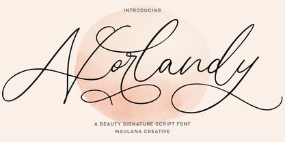 Norlandy is a beauty signature script font. With thin tall contrast stroke, fun character with a bit of ligatures and stylistic alternates. To give you an extra creative work. Norlandy font support multilingual more than 100+ language. This font is good for logo design, Social media, Movie Titles, Books Titles, a short text even a long text letter and good for your secondary text font with sans or serif. Make a stunning work with Norlandy font. Cheers, Maulana Creative
 - Mellowly by Maulana Creative,
$11.00 Mellowly is an expressive signature script font. With high contrast stroke, Tall and fun character with a bit of ligatures and alternates. To give you an extra creative work. Mellowly font support multilingual more than 100+ language. This font is good for logo design, Social media, Movie Titles, Books Titles, a short text even a long text letter and good for your secondary text font with sans or serif. Make a stunning work with Mellowly font. Cheers, MaulanaCreative
 - MC Langrove by Maulana Creative,
$16.00 Langrove is a modern tall sans serif font. With medium stroke, fun character with a bit of ligatures and alternates. To give you an extra creative work. Langrove font support multilingual more than 100+ language. This font is good for logo design, Social media, Movie Titles, Books Titles, a short text even a long text letter and good for your secondary text font with script or serif. Make a stunning work with Langrove font. Cheers, Maulana Creative
 - Avento by Larin Type Co,
$16.00 Avento this is a wonderful vintage font designed in the Art Deco style. With it, you will be transported to the era of the 20s-60s. it will add charm, estetica and create a unique atmosphere of this time in your design project. this font includes four styles : regular, InLine, thin outline and bold outline, as well as it has many alternates that you can use to play with the dynamics of the font. This font is easy to use and has OpenType features. Following international .
 - Revolancer Pro by Popskraft,
$18.00 The Revolancer Pro font was designed in addition to the unique Revolancer font, so this font looks more familiar. But this is only at first glance. This typeface combines the simplicity of classic grotesque typefaces with the freedom and independence of a Revolancer typeface. This font will give you freedom. The freedom to be unique, not like everyone else. Each character in Revolancer font knows its place, and it is impossible to achieve such a smooth and organic flow of words using a regular font.
 - Educator JNL by Jeff Levine,
$29.00Educator JNL joins the large library of Jeff Levine's stencil fonts and was re-drawn from a set of individual letter stencils with the distinctive look of Franklin Gothic. All of the irregularities of the original die-cut letter forms were left intact, giving a "real world" look to the font. - Aladdin by CozyFonts,
$20.00 Aladdin Black is the 3rd member of our Aladdin Bold Font Family. This new style is extra bold and slightly rounded on the outsides of the glyphs. It is fat, fancy, fearless, forward, devilish, heavy, and stylized. Aladdin Bold was my first font introduced in 2012. I've always felt there were possibilities of adding styles to this family and something triggered the decision, so...here it is. I took much time deliberating over many of the finer details in this version of Aladdin and I hope the 'devil is in the details' for whoever decides to try on Aladdin Black.
 - Brandogram Monogram Typeface by Design A Lot,
$45.00 After months of testing and development, we have managed to put together the Brandogram Typeface, an ultimate tool for monogram design. With the help of this typeface you can easily create a monogram in less than a minute. Thanks to the way we have created and optimised Brandogram, the uppercase letters effortlessly fit together with the small caps that are activated by the lowercase letters. Using the Brandogram typeface you can create unlimited monogram combos with 2, 3 or even 4 letters in some cases. And these are all possible thanks to features like: Multiple letter widths, from condensed to wide; Both sans serif and slab serif letter designs; Up to 24 different designs per letter; All letter variations are available as alternates so you can easily choose your favorite; Accents are available for each letter alternate; Uppercase and lowercase activated letters are constructed to perfectly center and middle align; There are 5 solid ready-made weights; There are another 2 stencil weights that can bring a new touch to your designs. The 7 weights of Brandogram Monogram Typeface: Thin Light Regular Medium Bold Stencil One Stencil Two Each of these weights are thought to express different levels of heaviness. The thicker the weight of the font gets, the less white space will be left between the letters when they are combined, therefore your design gets heavier. The role of the stencil weights is to create depth in the monogram designs. With those you can easily delete the extra overlapping shapes of the letters and create passages between the letters and give an interlocking impression. This typeface combined with your creativity can have no limits!
 - Ollie by Eclectotype,
$40.00 Meet Ollie, a casual signage script whose friendly, bouncy exterior belies a heart of sophisticated OpenType programming. This font is designed to make the most of OpenType savvy applications, and as such is recommended for professional design use. Or to put it another way: Make sure that contextual alternates and ligatures are always turned on! Ollie includes about 900 glyphs, many of which are automagical substitutions to keep the text flowing smoothly, and to pseudo-randomly pick different glyphs to avoid repetition. With contextual alternates turned on (as they should be by default), most lowercase letters will alternate between at least two different forms. The powerful OpenType programming makes the font itself ‘look back’ (up to eight characters) on previously used letters; typing “banana” will give you three different a’s and two different n’s (the last a is a special ‘end form’ character). The calt feature controls many other ‘special effects’ which all add together to give a smooth-flowing, hand-lettered look. These effects include start and end forms (and indeed, ‘loner’ forms) of many letters, which are automatically substituted in at beginnings or ends of words, or when the previous or next letter doesn't connect. Another special feature tests to see if there is room for the crossbar of t (or tt ligature) to extend further over the previous or next letter, or both, as is often the case. The last main effect of the calt feature is to substitute certain letters typed before any ‘e’ character, to make for a more natural connection (see the pe combination in ‘Eclectotype’ in the first poster). Ligatures should be on by default, for a much nicer looking tt combination, and a few others besides. The swash feature should be used sparingly (one glyph at a time, really) to apply a more extravagant look to g,j and y in the lower case, and quite a few of the upper case too. Oldstyle figures are included, as well as the lining defaults. Now to delve into the stylistic alternates... These are all included in the salt feature, or for uses of applications that support them, separated into stylistic sets thus: ss01 - (with swash feature on) L and G swashes get even swashier. ss02 - standard s changes to a connected script s form. ss03 - r takes on a script form. ss04 - z also gets a scriptier look. [the previous three sets also change any versions of s, r or z with diacritics] ss05 - a useful underline function. When enabled, typing two or more underscores will extend a cool underline under the previous letters. More underscores = longer underline. ss06 - the Polish script lslash changes to its more standard form. ss07 - E, S and B change to a more top-heavy alternate form. ss08 - An alternate form for A characters. ss09 - Alterative rounder forms of M and N. ss10 - An alternate ampersand. That about wraps up the features. Now all that’s left is for you to license the font and get experimenting!
 - Digital Stitch by 2D Typo,
$28.00 Digital Stitch is the embroidery of digital era. This font is a blend of pixel stylization of traditional cross-stitch embroidery and stylization of printed circuit boards. There is a big collection of ornaments in the symbols set.
 - Marmellata Jar 01 by Fontscafe,
$39.00 When you think of marmalade or jam (that’s Marmellata in Italian), images of a happy breakfast table are conjured up into the mind, with of course the unforgettable emotive response accompanied. These emotions are exactly what our Marmellata fonts can conjure up for your designs as well (we agree, nothing can beat marmalade on a hot toast)! Our Jar 1 is ideal for all designs where you need to send across a feeling of care, childhood, comfort, motherhood or friendship...amongst all those ideas you will get on your own! With that classic breakfast table feel, you are sure to connect on a very comforting level with all those who view your designs using these fonts. May we suggest, these fonts go very well with unusually dull colours, and can add a spark of life to the most mundane of words! Try getting a taste of our Jar 2 if you want even more of the classic taste (sorry, touch!).
 - Anthrope by Ilhamtaro,
$23.00 ANTHROPE is a serif font with a grunge style so it feels like a retro font, with a thick body that makes this font very manly. This font is perfect for designs related to male hobbies such as motorbikes. Besides that, this font is an all caps font, so this will add to the manly impression. All caps here still have the difference between Uppercase and Lowercase, which have different heights and different letter shapes. To enable the OpenType Stylistic alternates, you need a program that supports OpenType features such as Adobe Illustrator CS, Adobe Indesign & CorelDraw X6-X7. Guides to access all alternates glyphs : http://adobe.ly/1m1fn4Y Cheers!
 - Hontana - Personal use only

- Relost Brush by Colllab Studio,
$15.00 Presenting Relost Brush! An All-caps Brush Font with Texture. This font made with the perfect combination of each character. You can combine with Extra to get a unique combination. It looks original and can be used for all your project needs. Each glyph has its own uniqueness and when meeting with others will provide dynamic and pleasing proximity. This font can be used at any time and in any project. You can see in the presentation picture above, Relost Brush looks strong and wild on design projects. So, Relost Brush Font can't wait to give its touch to all your design projects such as quotes, Adventure themes, poster design, personal branding, promotional materials, website, logotype, product packaging, etc. WHAT'S INCLUDED? Relost Brush • It comes with uppercase, lowercase (All-caps), ligatures, numeral, punctuation, symbols, Alternates, and Standard Latin Multilingual Support (Afrikaans, Albanian, Catalan, Danish, Dutch, English, French, German, Icelandic, Indonesian, Italian, Malay, Norwegian, Portuguese, Spanisch, Swedish, Zulu, and More). Extra Swashes • Included 9 Underline Swashes. You can feature all with typing c_1 until c_9 (Opentype Feature) or using Characters Map. A Million Thanks Colllab Studio
 - Sharung by Twinletter,
$14.00 Sharung, our newest font family, is now available! This font family is opulent and one-of-a-kind. This collection includes 18 various styles, making it ideal for a wide range of projects. Each style was built from the ground up to optimize beauty and personality. This font was created specifically for a wide range of display design and branding requirements. Sharung has everything you’ll need to create stunning graphics, including titles, texts, banners, posters, and more. Get a unique design look with this font right now! of course, your various design projects will be perfect and extraordinary if you use this font because this font is equipped with a font family, both for titles and subtitles and sentence text, start using our fonts for your extraordinary projects.
 - Doriss Girls by Open Window,
$- Dorriss girls were the dancing troop at the Moulin Rouge. I had the idea for this font while trying to come up with an alternative to beveling. I thought it would be interesting to create this sort of stepped effect as I've never really seen this treatment on a font before. Then my need to create chaos shows up again with Doriss Girls informal. A hand drawn take on the forms. This seemed like it would appear on an old art nouveau poster by the great Toulouse Lautrec, so there you have the genesis of this font. I've been somewhat compelled by the letterforms so I may expand and create a more normal version of this font someday with a range of weights. That would be the bees knees.
 - Chlorophyll by Alit Design,
$18.00 Introducing "Chlorophyll" - A Sans Serif Font with a Refreshing Natural Elegance Unveil the beauty of nature in your design projects with "Chlorophyll," a stunning sans serif font that combines modern simplicity with the organic charm of leaf illustrations. This elegant typeface is designed to infuse your creations with a sense of natural harmony, making it perfect for a wide range of applications, from branding to packaging and beyond. Key Features: Sans Serif Sophistication: "Chlorophyll" boasts a clean and versatile sans serif style, making it ideal for both display and body text. Its balanced letterforms exude a sense of modern sophistication, ensuring legibility and impact in all your design endeavors. Leafy Delight: With meticulously crafted leaf illustrations integrated into the font's characters, "Chlorophyll" embodies the spirit of the great outdoors. Each letter and symbol subtly incorporates the elegance of leaves, creating a seamless connection to the natural world. Elegance in Simplicity: "Chlorophyll" captures the essence of natural beauty through its simplicity. This font is a testament to the idea that less is more, allowing your content to shine while adding a touch of eco-friendly charm. Versatile Usage: Whether you're designing a logo for an eco-conscious brand, creating invitations for a garden wedding, or crafting a menu for a farm-to-table restaurant, "Chlorophyll" adapts effortlessly to diverse design projects. It's a versatile tool that can evoke a sense of elegance and sustainability in any context. Extensive Character Set: "Chlorophyll" includes an extensive character set, encompassing uppercase and lowercase letters, numerals, punctuation, and a wide range of special characters. This ensures compatibility with multiple languages and enables you to express your message with clarity and grace. Digital and Print Ready: "Chlorophyll" is delivered in multiple formats, making it ready for both digital and print applications. Its high-quality vectors ensure crisp and sharp rendering in any size or medium. Embrace the allure of nature and elevate your design projects with "Chlorophyll." This sans serif font, inspired by the beauty of leaves and the elegance of simplicity, brings a touch of the natural world to your creative endeavors. Elevate your designs, evoke a sense of harmony, and make a lasting impression with "Chlorophyll" today.
 - Quarter Braille by Echopraxium,
$20.00 Presentation QuarterBraille (Abbreviated as "QB" thereafter) is a decorative, steganographic and lattice font. Its core design concept is that Braille dots are represented as "quarters of a square"[1]. This is illustrated by posters 1 and 2 (NB: these glyph parts will be called "QB dots" thereafter). The other glyph parts (see poster 3) are purely decorative and meaningless in terms of Braille dots encoding[2]. All glyph parts are meant to generate a wide variety of patterns from horizontal and vertical combinations of glyphs. There is also a graphic convention to differentiate uppercase from lowercase letters with the presence or absence of shape subparts (in the "endings", "quarter of a circle with a ring" and "quarter of a diamond with a small square in the middle") like shown by poster 4. This font is suitable for very short texts (e.g. logos, acronyms, quotes, ambigrams, pangrams, palindromes, etc...) but on the other hand it may be used for steganographic purpose like geocaching as well as fictive alphabets (e.g. Alien/SciFi/Fantasy/Antique civilizations). Posters 1. Font Logo: the displayed text is " Quarter " followed by " Braille". There's a rainbow layer above the text to highlight the "QB dots", this is achieved by A..Z glyphs with "only QB dots" (codes 230..255) 2. Anatomy of a Glyph (L) and "QB Dots" (quarters of a square) 3. Glyphs Parts: Square and Cross (Inverted square), Circle and Inverted Circle (with or without the small circle in the middle), Diamond (with or without the small square in the middle), Inverted Square and Circle, Shape combos, Ending 4. Uppercase vs Lowercase (tiny shape subparts are shown in red) 5. Sample 1: Bathroom sink with QB tiles on the credence 6. Sample 2: Hands knuckle tatoos: "LOVE/HATE"[4] 7. Sample 3: Poker Hand: pocket Aces. It's an Ace of Hearts (Ah) on the left and an Ace of Spades (As) on the right. Like in regular cards, the card value (e.g. Ah) is displayed twice: at the top and rotated by 180 degrees at the bottom. This poster also illustrates that QB could be used to print embossed playing cards with tactile and visual display of card values. 8. Sample 4: Pangram: "Adept quick jog over frozen blue whisky mix" 9. Sample 5: Latin Magic Square: "SATOR AREPO TENET OPERA ROTAS" (NB: for compensation of the 2/3 glyph ratio, letters on each line are separated by a space: "S A T O R", ...). 10. Sample 6: Quote of Mahatma Gandhi: "Learn as if you will live forever, live like you will die tomorrow.". This is also a demonstration of border glyphs combinations. 11. Sample 7: Steganography use case: the text is a sequence of 64 aminoacids (1 Letter notation), this protein was described in a research paper "The complete Aminoacid sequence of an amyloid fibril protein AA of unusual size (64 residues) 1975". 12. Sample 8: Border Glyphs with the provided styles and mixed styles. The words are the same than in poster 9 ("SATOR AREPO TENET OPERA ROTAS"). Despite the 2/3 glyph ratio, the "TENET cross" was achieved by both inserting spaces in horizontally ("T ENE T") and by using the "thin borders glyphs". Notes a. Border glyphs[3] are meant to enhance the esthetics of text samples displayed with QB b. Special characters (e.g. *$()[].,;:&@# ...) are provided and follow the NABCC (North American Braille Computer Code) convention. c. A..Z Glyphs with only the "QB dots" are provided as demonstrated by posters 1 and 2 (A/N: this was very useful to create them). d. Glyph Map: 32..64: Special characters - 161..187: "Thin variant" of Border glyphs, 192..229: Border glyphs, 230..255: A..Z with only the "QB dots" - Codes 176 an 181 are "regular SPACE" (empty glyph). Footnotes 1. There is indeed two shapes which represent the braille dot: the "quarter of a square" and the "quarter of a cross". It's because a cross may be considered as an "inverted square" because the square corners are merged in the center. 2. That's why the SPACE glyph is only made of decorative/meaningless glyph parts (i.e. no "QB dots"). 3. For other fonts with border glyphs, please take a look at my other "decorative Braille fonts" (GoBraille, HexBraille, KernigBraille, StackBraille, MaBraille, DiamondBraille, LorraineBraille). 4. LOVE/HATE knuckle tatoos are inspired by the anthology scene from "The Night of the Hunter" movie (Charles Laughton 1955), it also appearead in "Do The Right Thing" movie (Spike Lee 1989). Disclaimer This font is not appropriate and not meant to print text documents in Braille for the blind readers audience.
